Ayer by Miguel Reyes
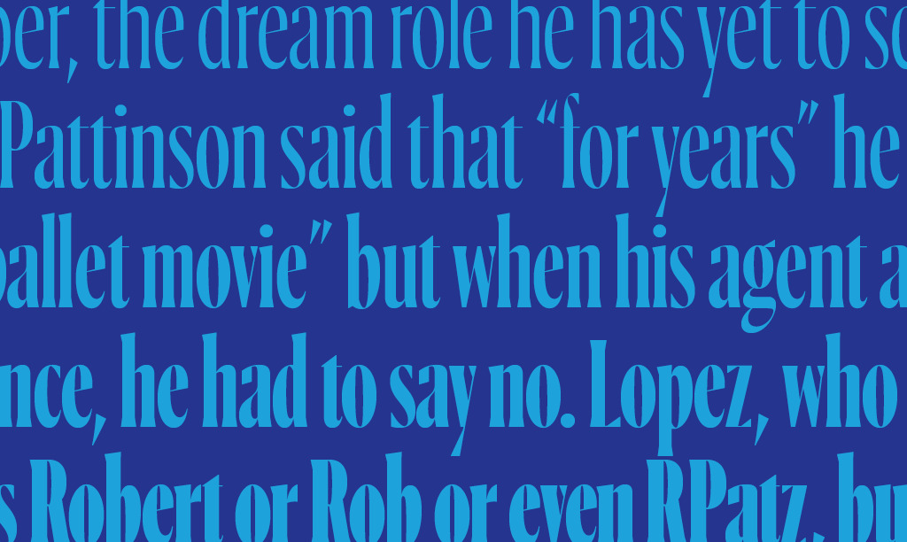
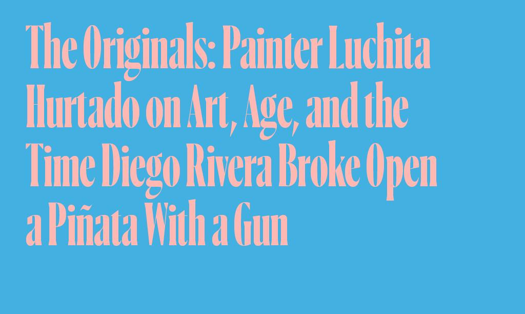
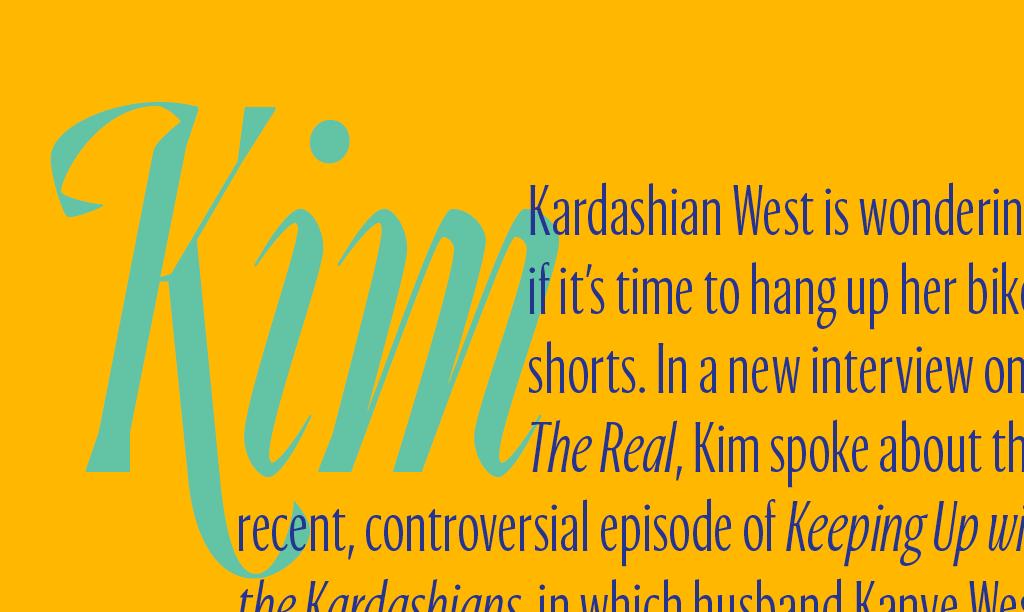
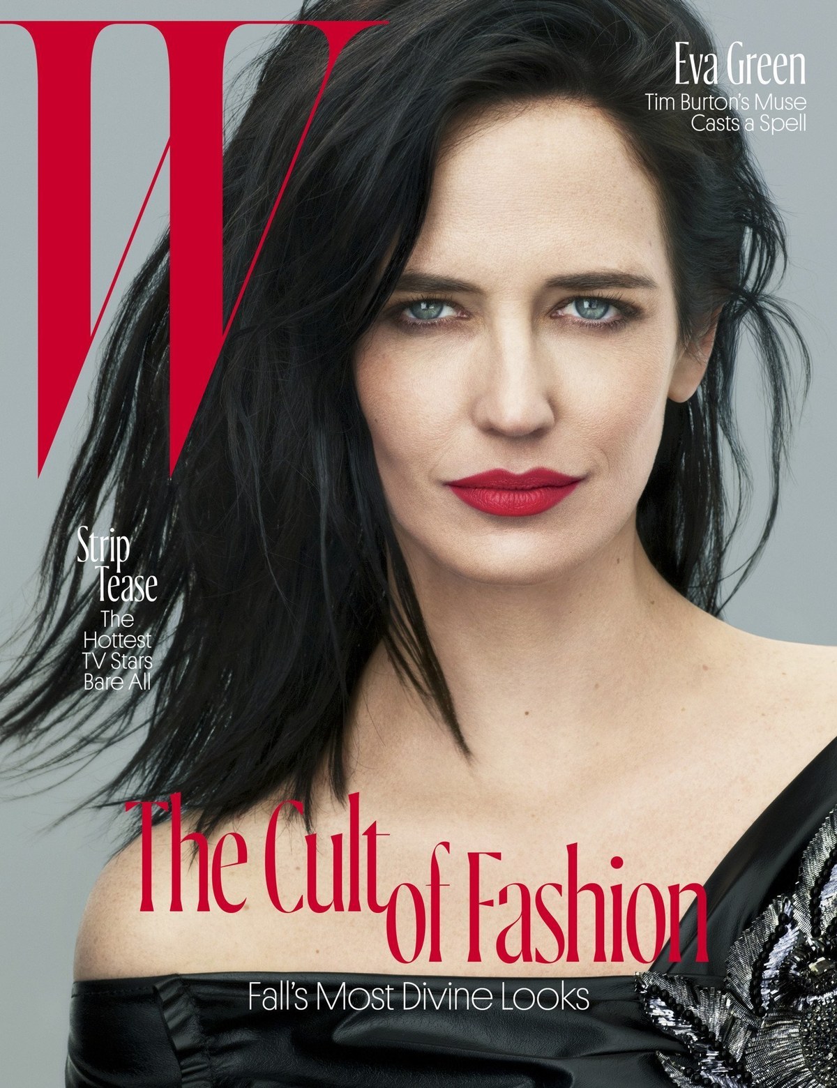
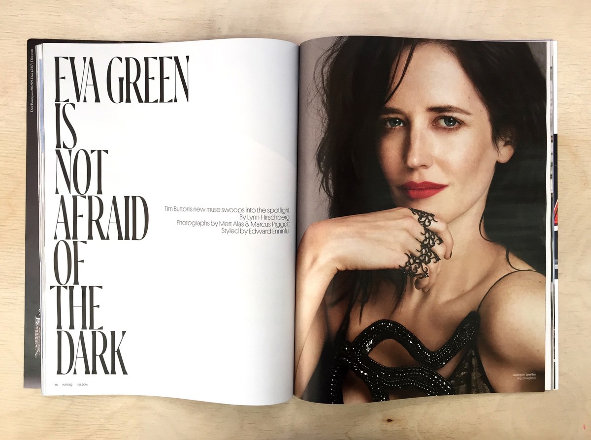
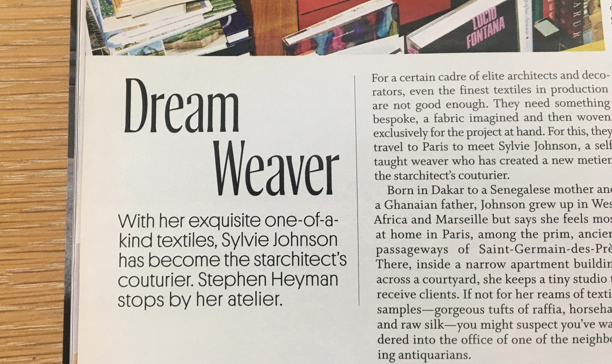
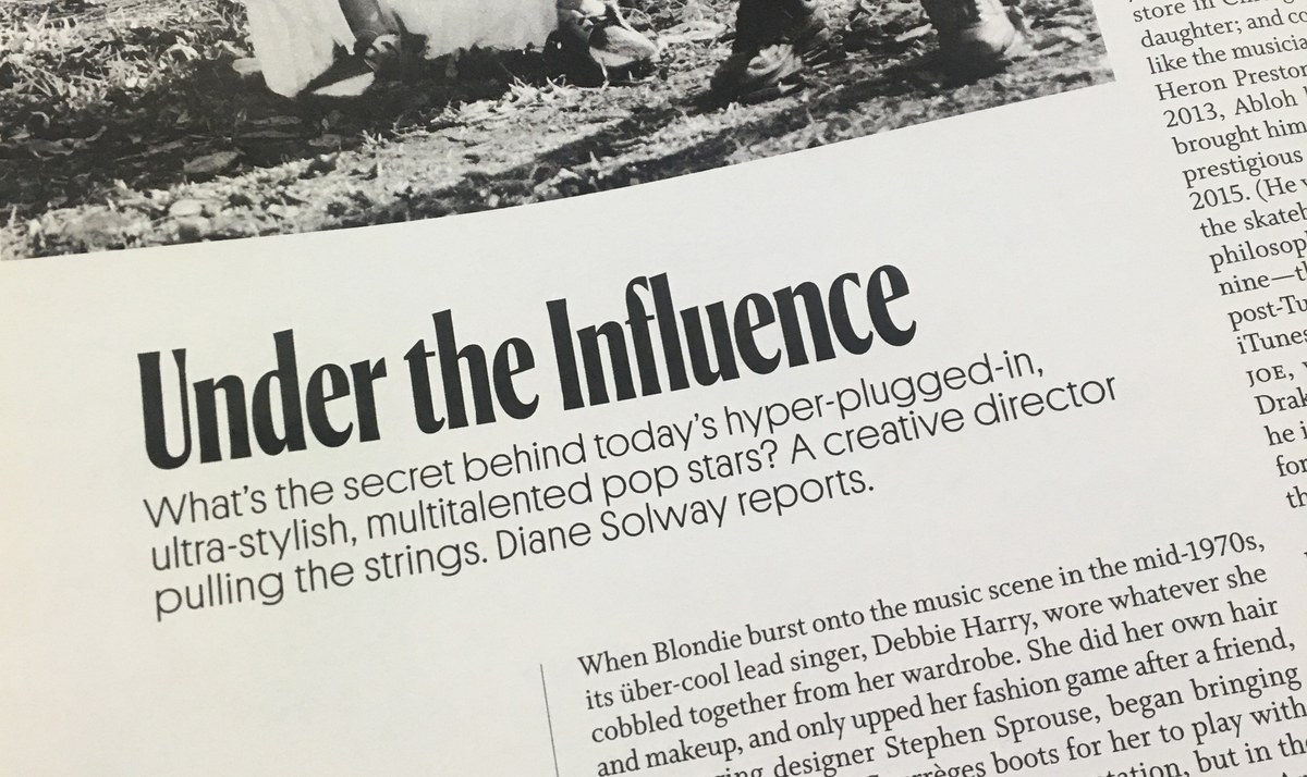
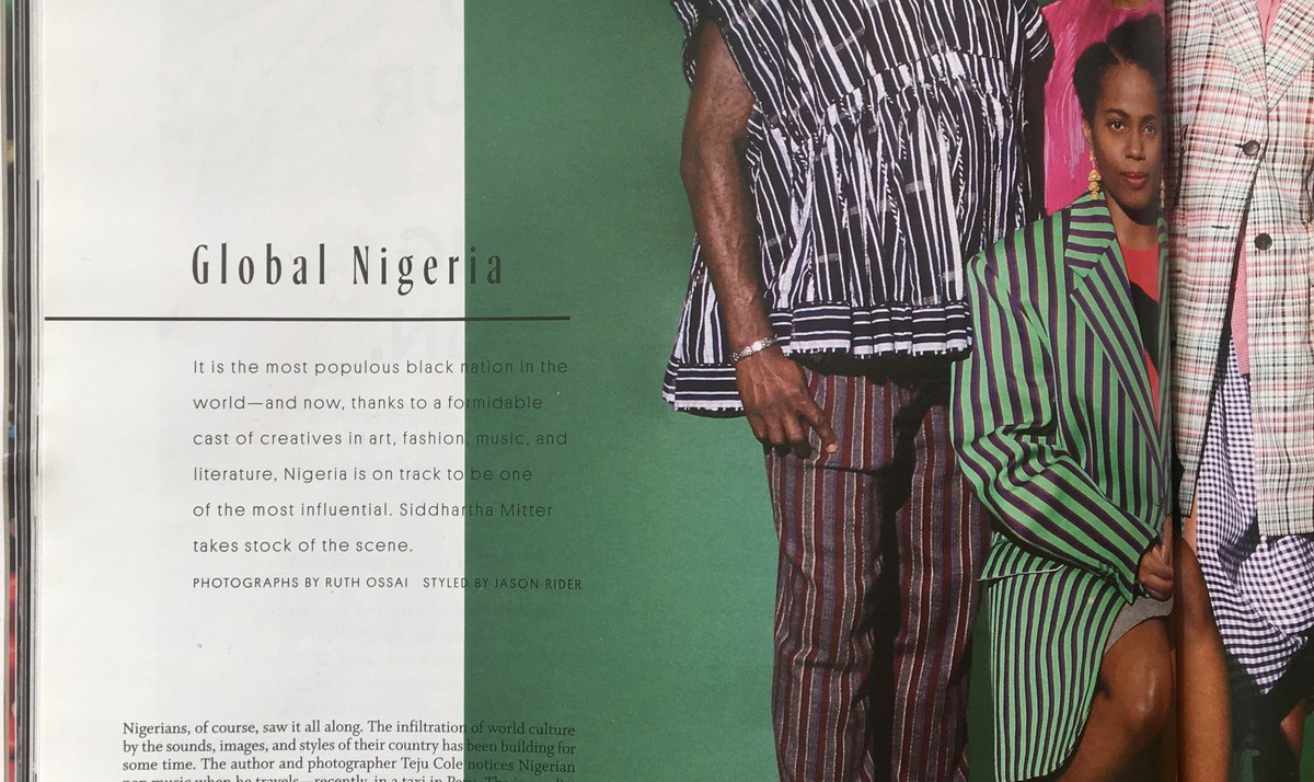
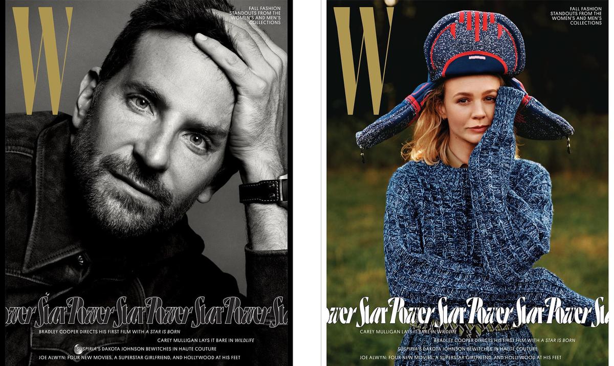
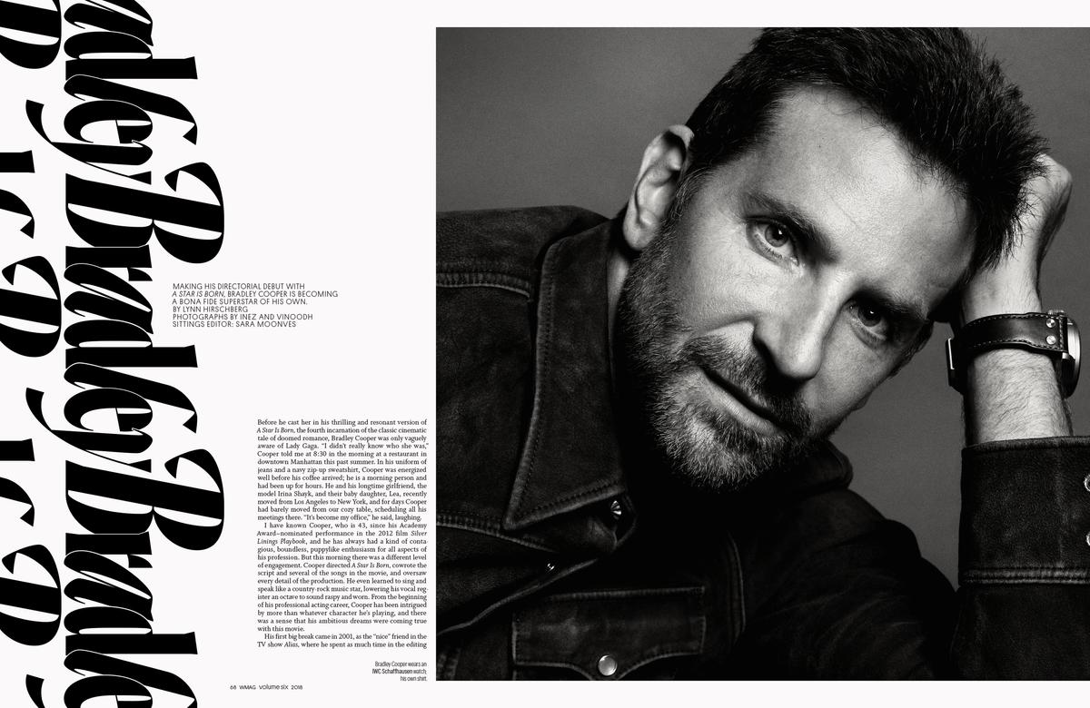
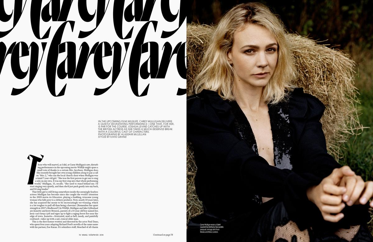
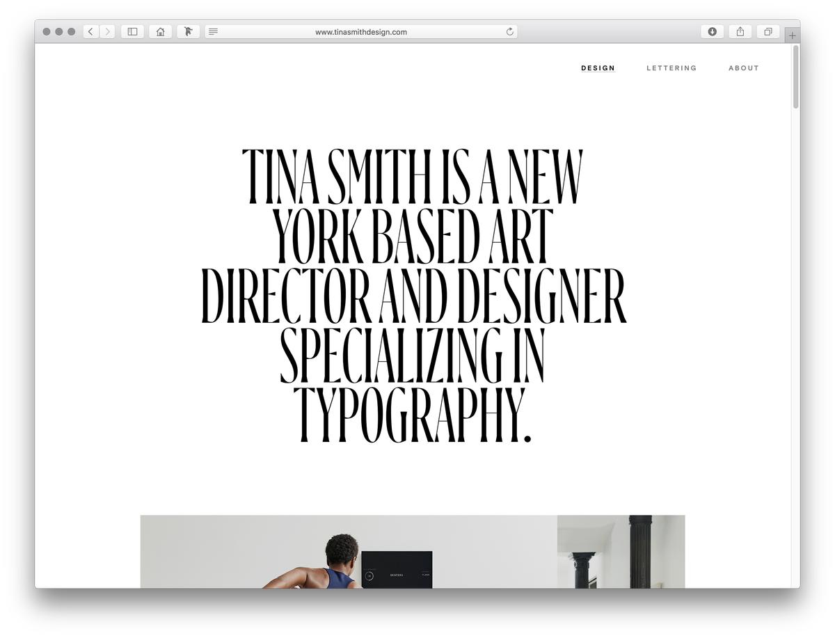
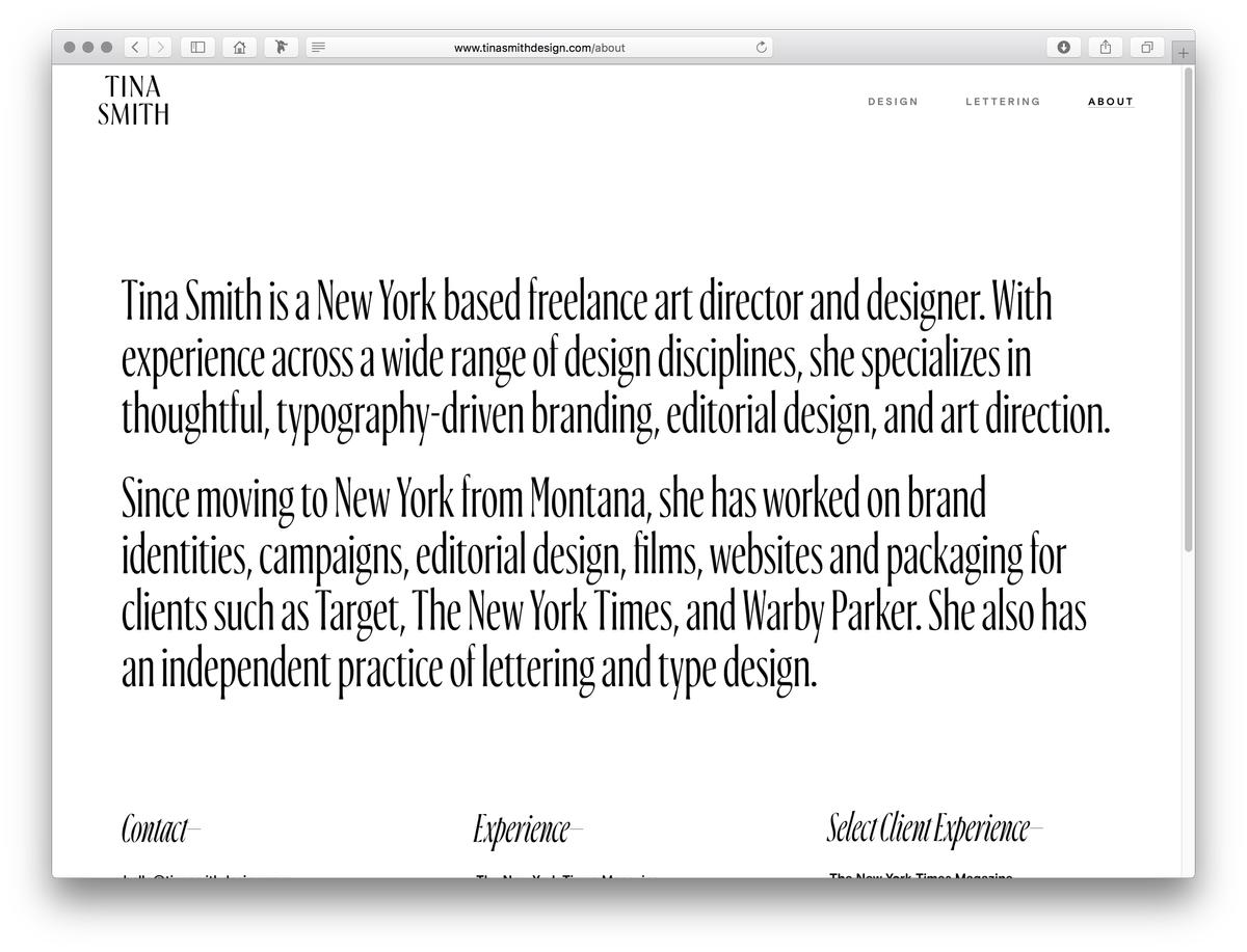
Ayer is an elegant condensed display typeface designed by Miguel Reyes between 2016 and 2019 for W, a large format fashion magazine. Creative director, Cian Browne, and art director, Jeffrey Burch, needed a malleable typeface able to assert a strong personality at a variety of scales, in order to keep type treatments fresh and vibrant, even in just a handful of characters. Ayer is the synthesis of a number of different influences: Italian Moderne lettering from the early twentieth century, the high-contrast sans serifs common in fashion and beauty applications, the sharp corners favored by digital drawing tools, and the designer’s own joy in experimenting with the different shapes letters can take.
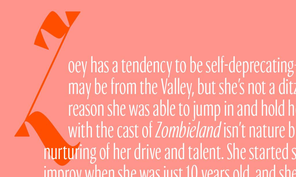
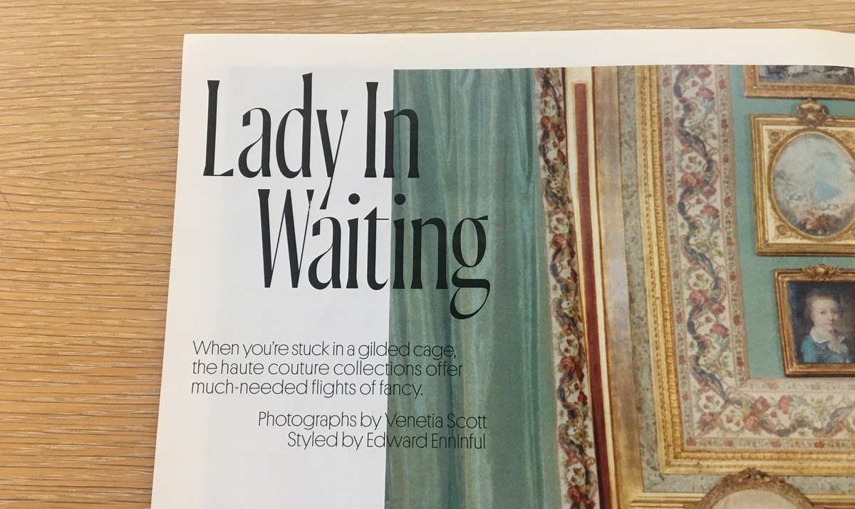
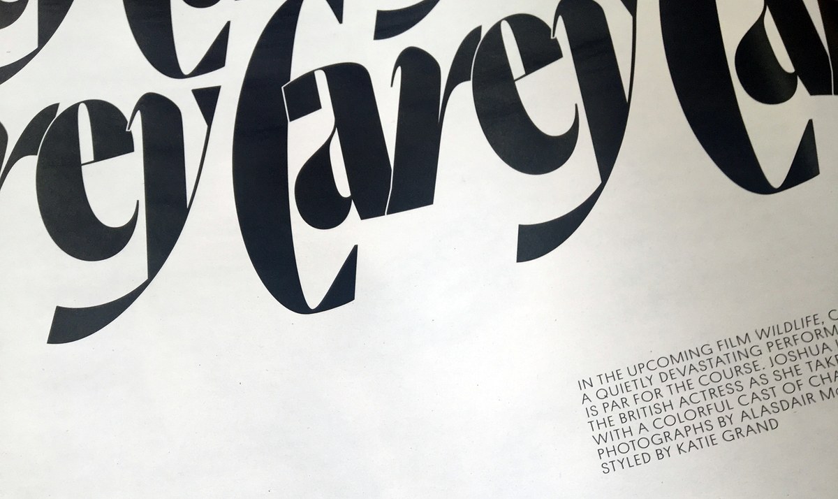
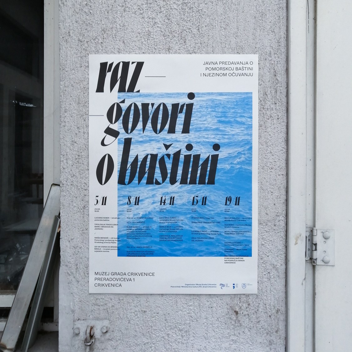
Display typefaces for fashion magazines need flexibility in order to extend their lifespan beyond a couple of seasons. The four different italics in the Poster size is one way Ayer fills this need. In addition the workmanlike italic featured in all optical sizes, Poster also features a chaotically beautiful Cursive with a full complement of swash capitals, a sharply stylized Angular, and Reyes’s modish interpretation of the staid Blackletter genre. The four italics differ in structure and angle of inclination, but are tied together by weight, contrast, and proportion, making each work with the uprights and even enabling them to be mixed together in adventurous layouts. Ayer Poster also has an additional weight not included in the other optical sizes: a Black, inspired in part by the lasting and unavoidable influence of Herb Lubalin and his stable of lettering artists, who transformed magazine design in New York during the 1960s and 70s.
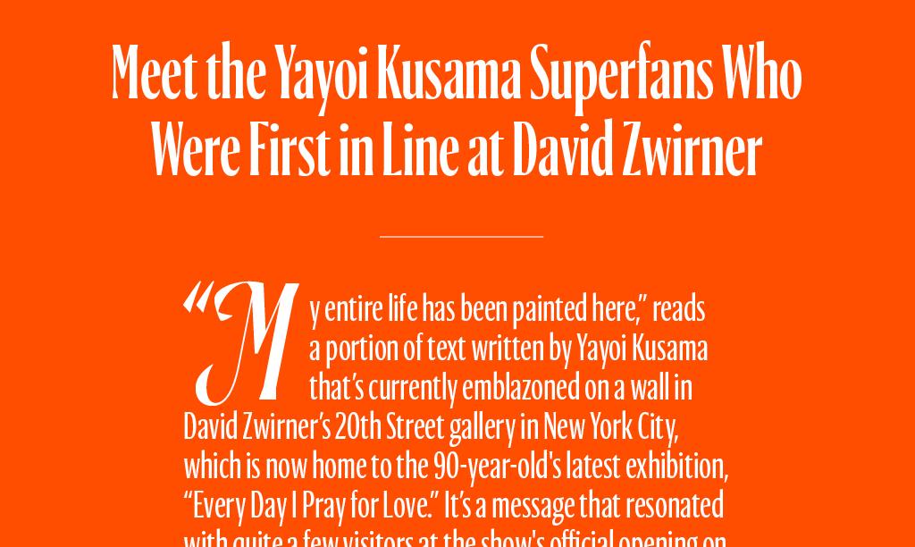
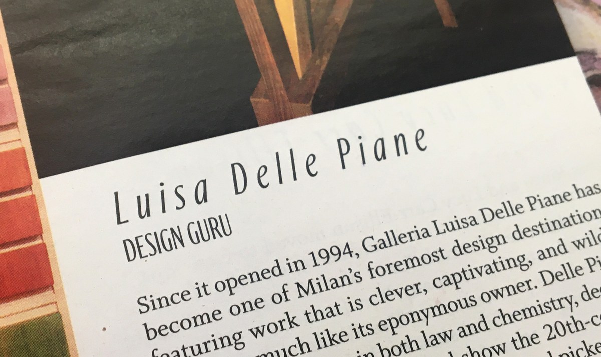
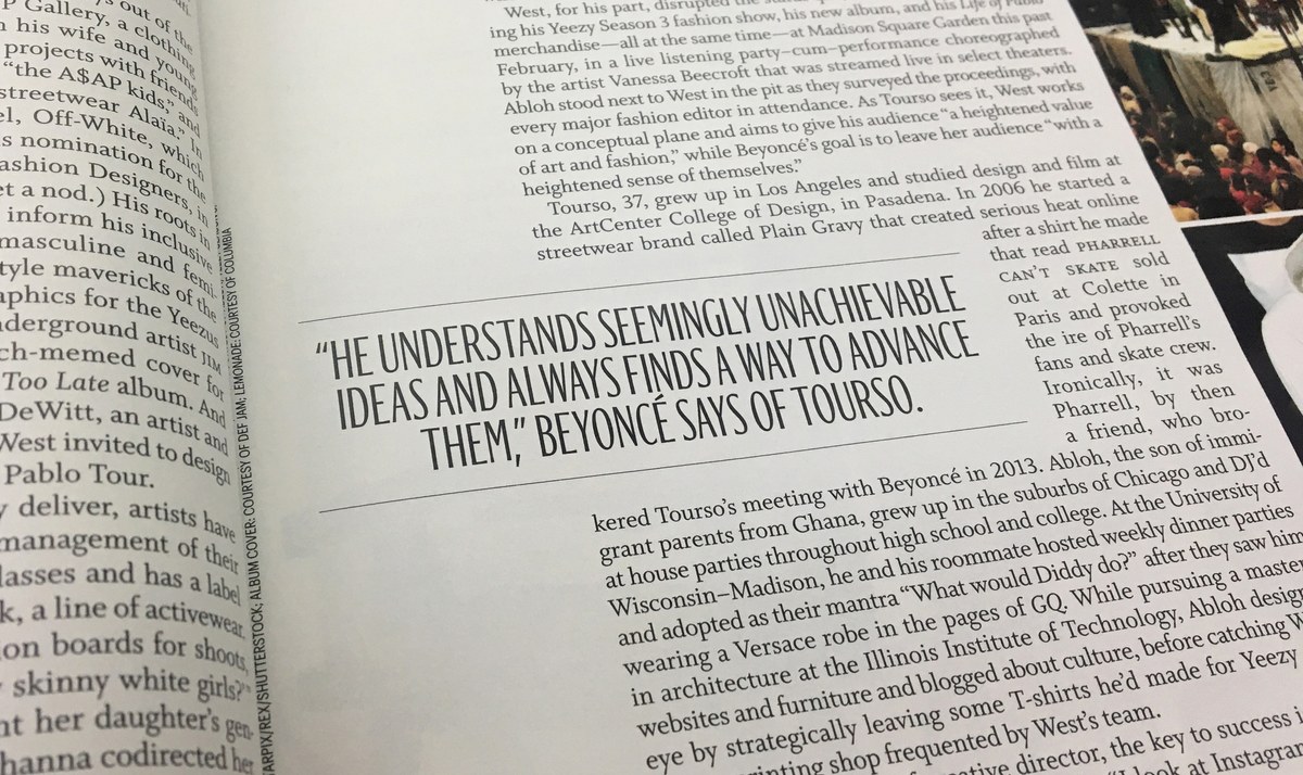
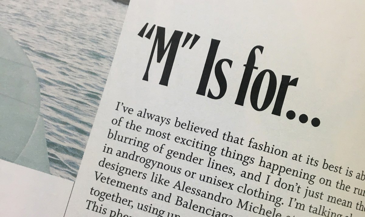
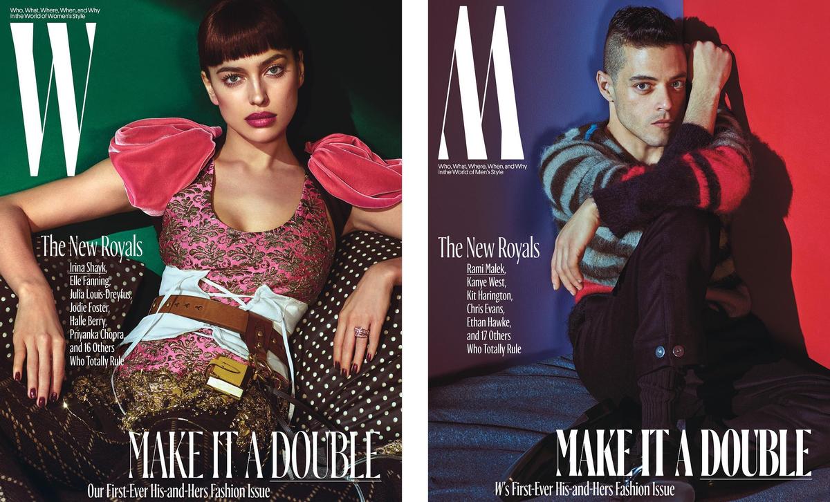
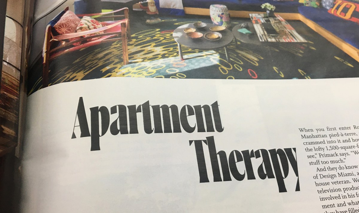
Ayer Poster has the extremely high contrast that is typical of a fashion typeface, making it best suited to use at 100pt and up. Ayer also has high contrast, though less so than the Poster, and is designed be used from 60pt and up, or for knocking headlines out of a dark background. Designed to bring the personality of Ayer to the dense pages of W’s front section, Ayer Deck shines in small display applications, such as subheads and pullquotes, or headlines on the web. It can also function as a stylish low-contrast headline typeface when the tracking is tightened. The heavier weights of Ayer Deck were first used in M, the men’s portion of W’s periodic ‘his-and-hers’ fashion issue. Its louder typographic voice helped to differentiate M’s from W’s features while maintaining coherence throughout the issue.
In addition to editorial design, Ayer is at home on posters, book covers, websites, and environmental branding. See more and license the family here.

