Atlas Grotesk & Typewriter by Atelier Carvalho Bernau
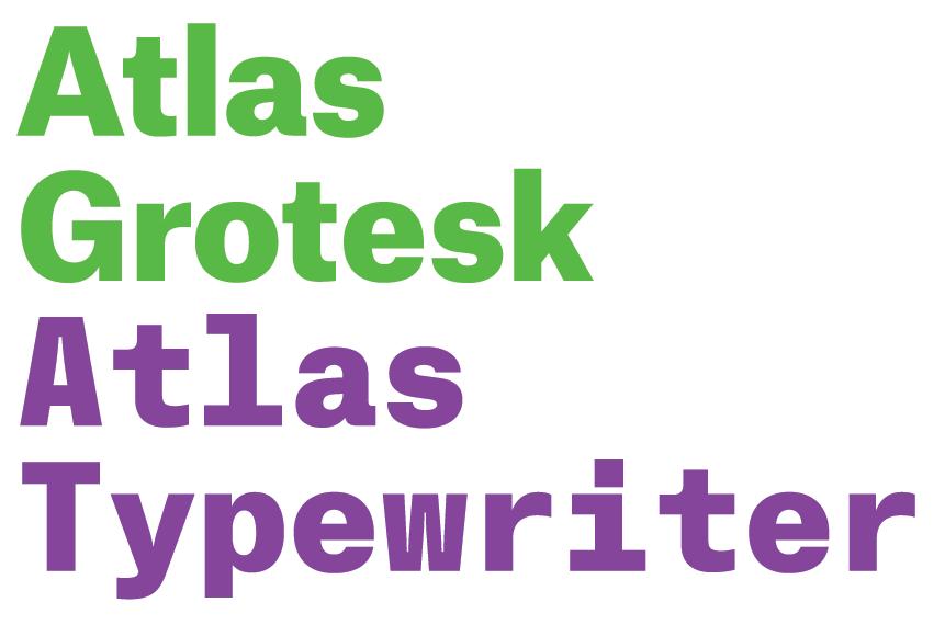
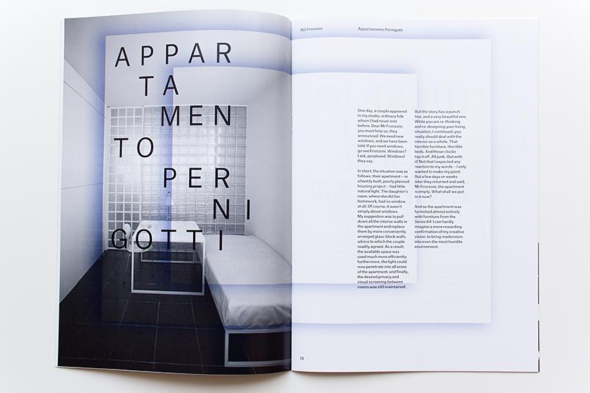
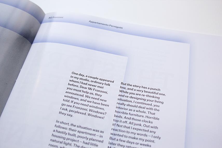
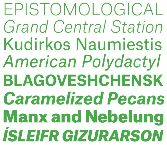
We're delighted to announce the release of a new pair of typefaces by Atelier Carvalho Bernau: Atlas Grotesk, an all-new sans serif family in six weights; and Atlas Typewriter, a companion monospaced family also in six weights.
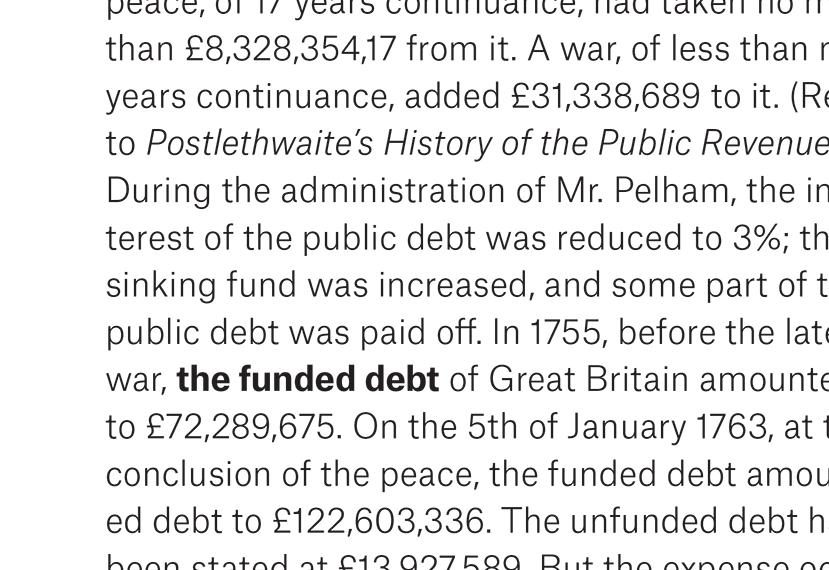
Atlas Grotesk was originally designed by Susana Carvalho and Kai Bernau of Atelier Carvalho Bernau with Christian Schwartz as the corporate typeface for Munich Re Group, one of the world’s largest reinsurance companies. The client commissioned a clean and respectable sans serif that would retain familiar 20th century European grotesk roots and avoid passing trends in corporate design. While Atlas takes most of its stylistic cues from European grotesks (in particular Mercator, designed by Dirk Dooijes and released in 1957 by the Amsterdam Type Foundry), its vertical proportions are decidedly more similar to the American gothics. The relatively long ascenders but very short descenders allow the typeface to feel spacious and comfortable for extended reading even when it is set with tight leading. This allows the typeface to be very economic in setting, saving space over the previous corporate face and saving a significant amount of paper in the process over the hundreds of publications, reports, and other documents produced by the company each year. Atlas Grotesk is available in 6 weights from Thin to Black, all with italics and small capitals.
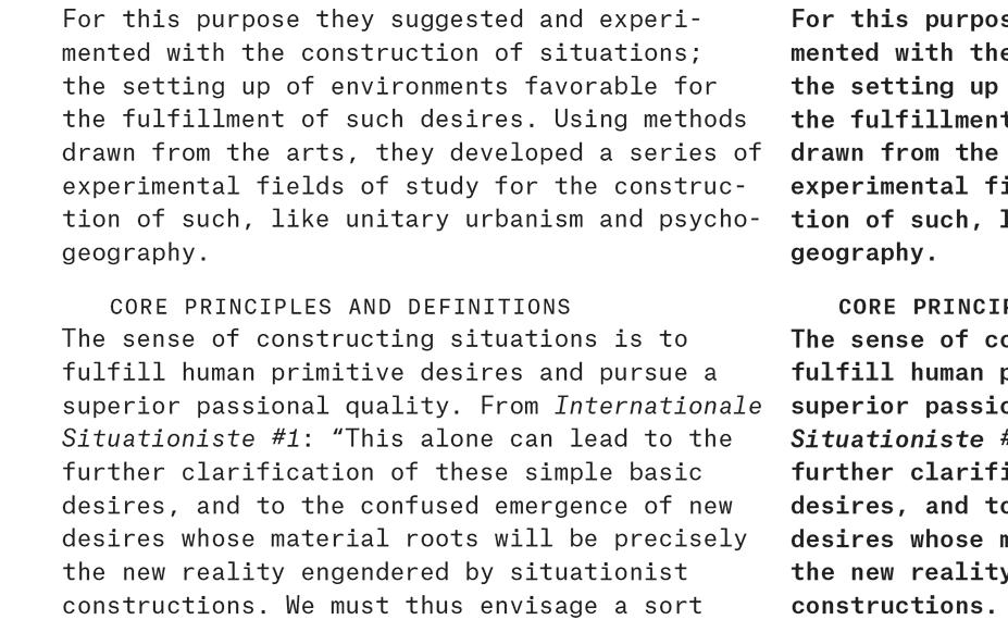
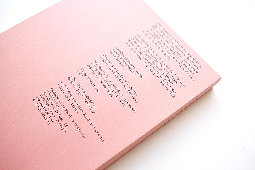
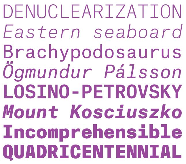
Atlas Typewriter, designed by Atelier Carvalho Bernau, extends the usefulness of the Atlas Collection. A distinctive monospaced face, it is well suited for a wide range of uses, from art catalogues to personal correspondence, through to data visualization. Rather than following existing models from typewriters or OCR types, Atlas Typewriter simply aims for an even, readable texture and the same effortless tone as the Grotesk. Characters like lowercase ‘f‘ and ‘t’ are distinctively symmetrical, while the lowercase ‘r’ is unadorned with extraneous serifs or terminals, making it neater and less distracting in text than in a typical monospaced sans. Like Atlas Grotesk, Atlas Typewriter is drawn for both text and display use in a full range of six weights from Thin to Black, all with italics and small capitals. Please click here to see more of this collection.
