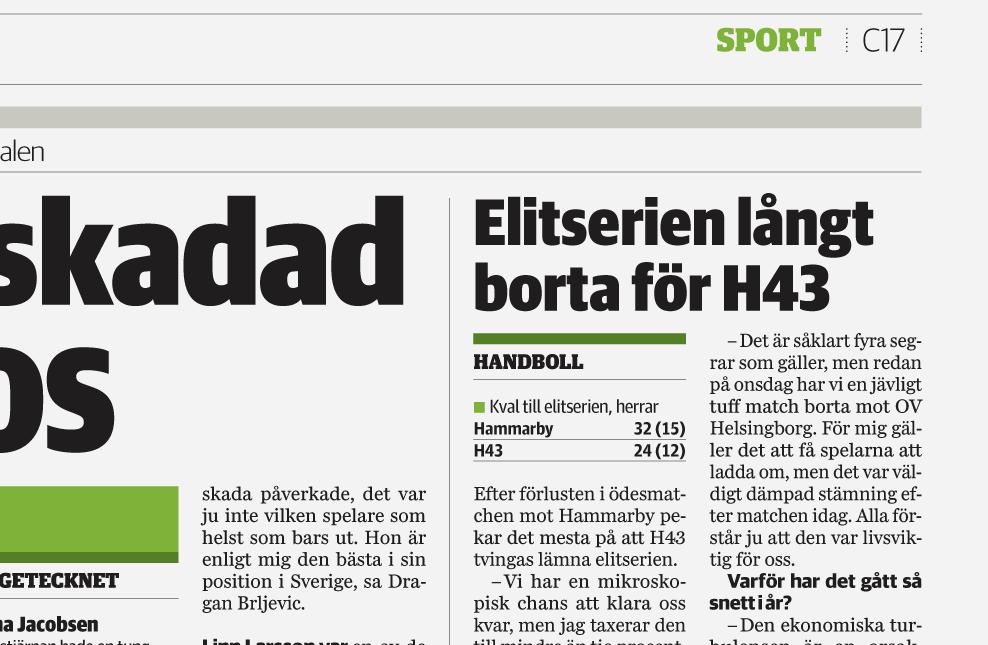
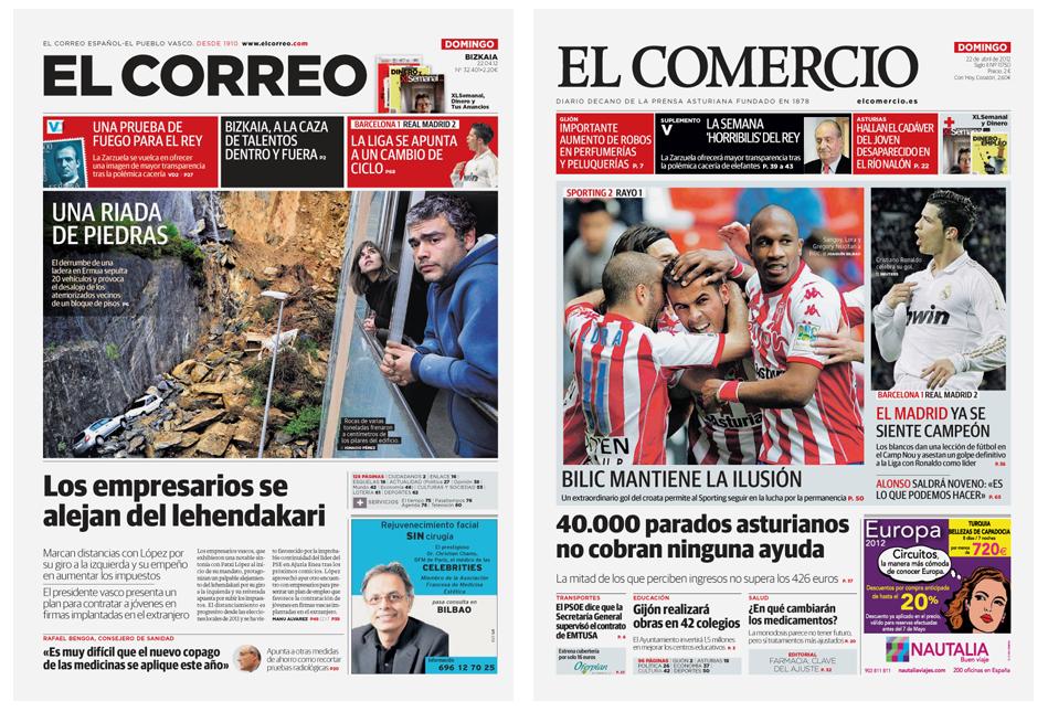
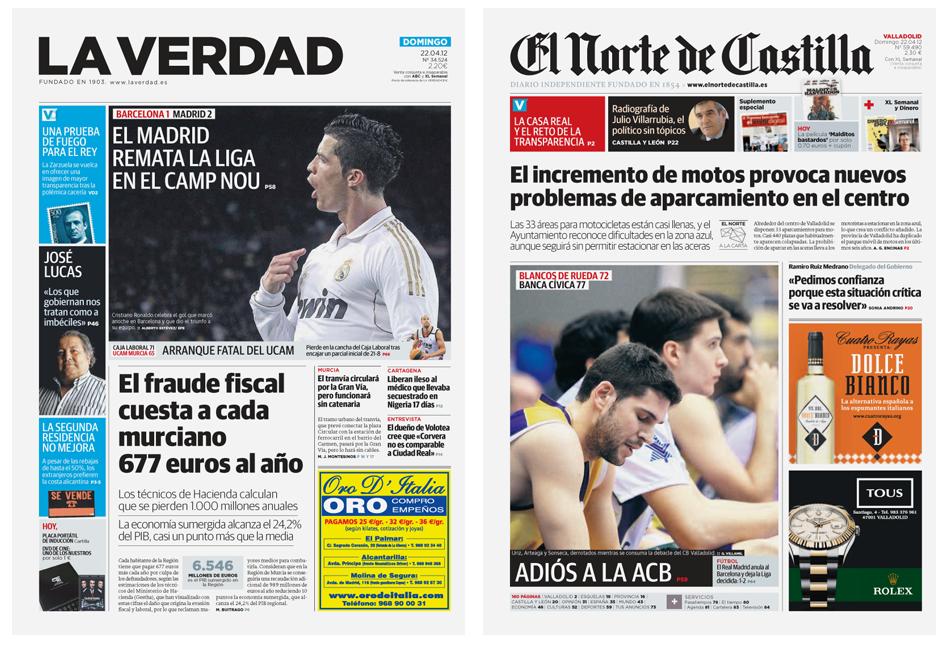
Three new widths of Guardian Sans Headline
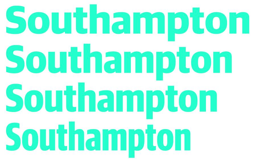
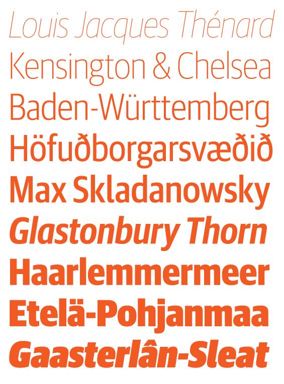
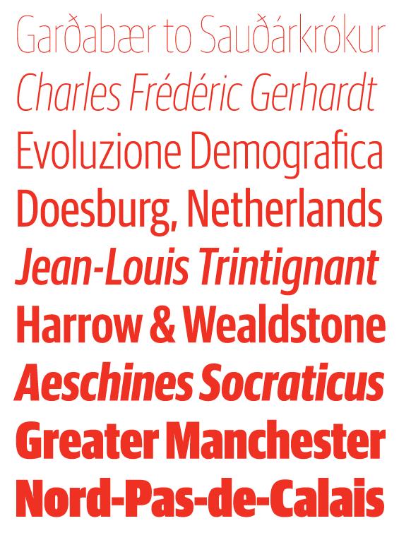
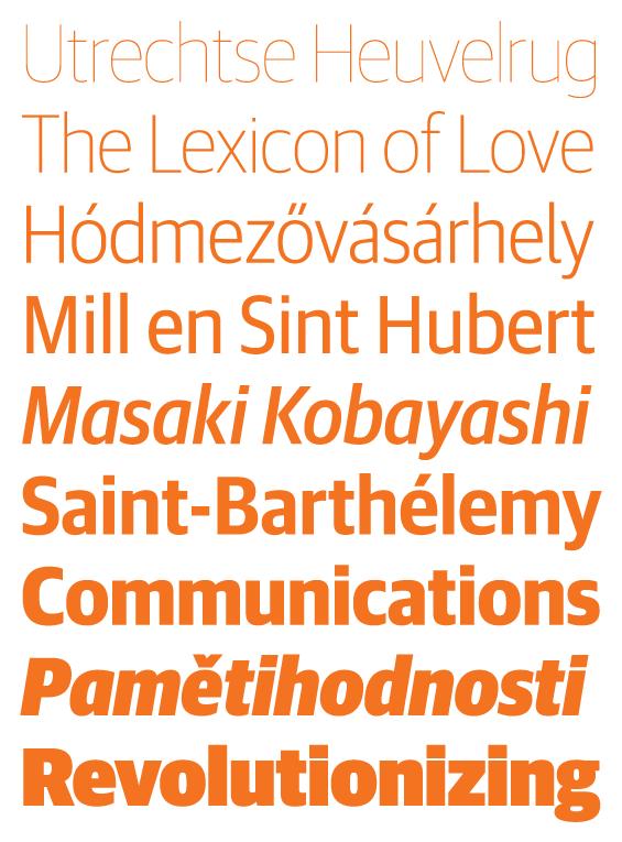
Guardian Sans Headline has undergone a major expansion with the addition of three narrower widths: Narrow, Condensed, and X Condensed. Each is available in 9 weights with italics. Creating a condensed humanist sans serif is often a difficult proposition, as the round and friendly forms have a tendency to look squashed and ungainly. However, the subtle squareness of curves in Guardian Sans Headline allows the new widths to fit in naturally with the original design. Guardian Sans Headline is thoroughly unadorned, making it adaptible to many tasks, combining not just with Guardian Egyptian, but with a wide range of other typefaces as well. With 72 fonts now in total, Guardian Sans Headline has expanded beyond its newspaper roots, and is ideal for editorial design, corporate identities, signage systems, and general graphic design.
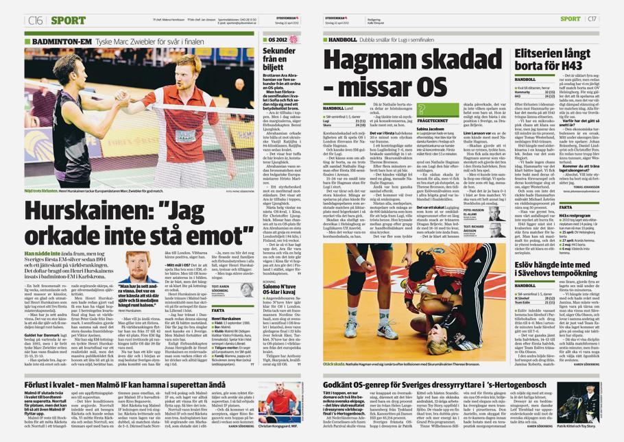
This family expansion has been expertly carried out by Commercial Type designer Berton Hasebe, under direction from Paul Barnes and Christian Schwartz, who designed the rest of the family for The Guardian's major redesign in 2005. These new widths were first seen in Al Triviño's redesign of the regional newspapers for the Vocento group in Spain and in a redesign of Sydsvenskan in Malmö, Sweden.
Each of the three new widths is particularly well suited to its own set of uses. Graphic designers often need sans serifs which are compact enough to increase economy without feeling explicitly like a condensed typeface. Guardian Sans Headline Narrow is this sort of weight, particularly useful in corporate identities and signage programs. Headlines of all kinds usually have one thing in common: a lot to say with not enough space to say it in. Guardian Headline Sans Condensed solves this issue without looking cramped or squashed, keeping the same quiet, neutral tone of the normal width. The most condensed of the new Guardian Sans Headline widths, the X Condensed, exaggerates the subtle squareness of the original design, allowing it to maintain the humanist forms without sacrificing its economy. Particularly useful in editorial and newspaper situations, it truly turns the Guardian Sans Headline family into a complete workhorse. Please click here to see more.
