Action Text by Erik van Blokland
Erik van Blokland is a thoughtful designer whose work consistently goes beyond form to reflect on performance. Action Text picks up where his Action Condensed, a narrow geometric grotesque designed mainly for onscreen display use, left off. The new family opens up, stretches out, and digs in for the hard work of setting dynamic paragraphs and interface copy.
Type primarily destined for the challenging medium of screens and live servers has very specific exigencies. What can make it not just functional, but exceptional? How can it flex to adapt to its environment?
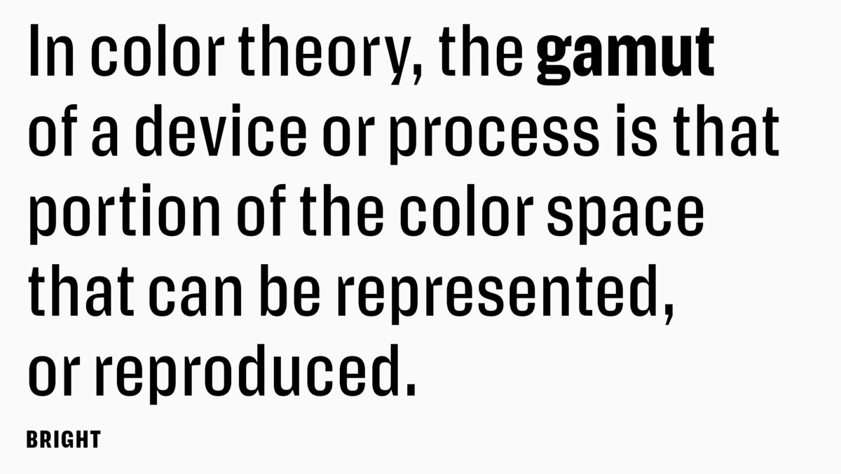
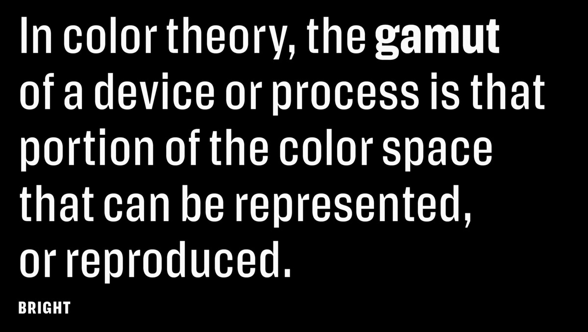
One way Action Text answers these questions is by arriving in the form of a variable font with weight and grade axes, theoretically enhancing performance by requiring only one call to the server for a single file containing all styles, instead of a call for each style. This speeds up sites and puts maximum control in the hands of typographers, who can access and fine-tune the styles via CSS (or, in the case of print, via control panels in design apps like Illustrator and InDesign). Action Text also comes in a “flat” version in four distinct weights with matching italics and a Bright and Dark grade for each weight.
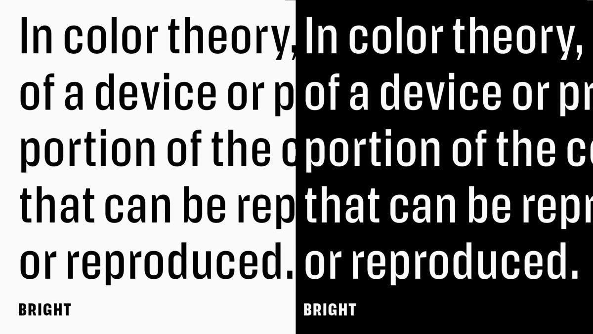
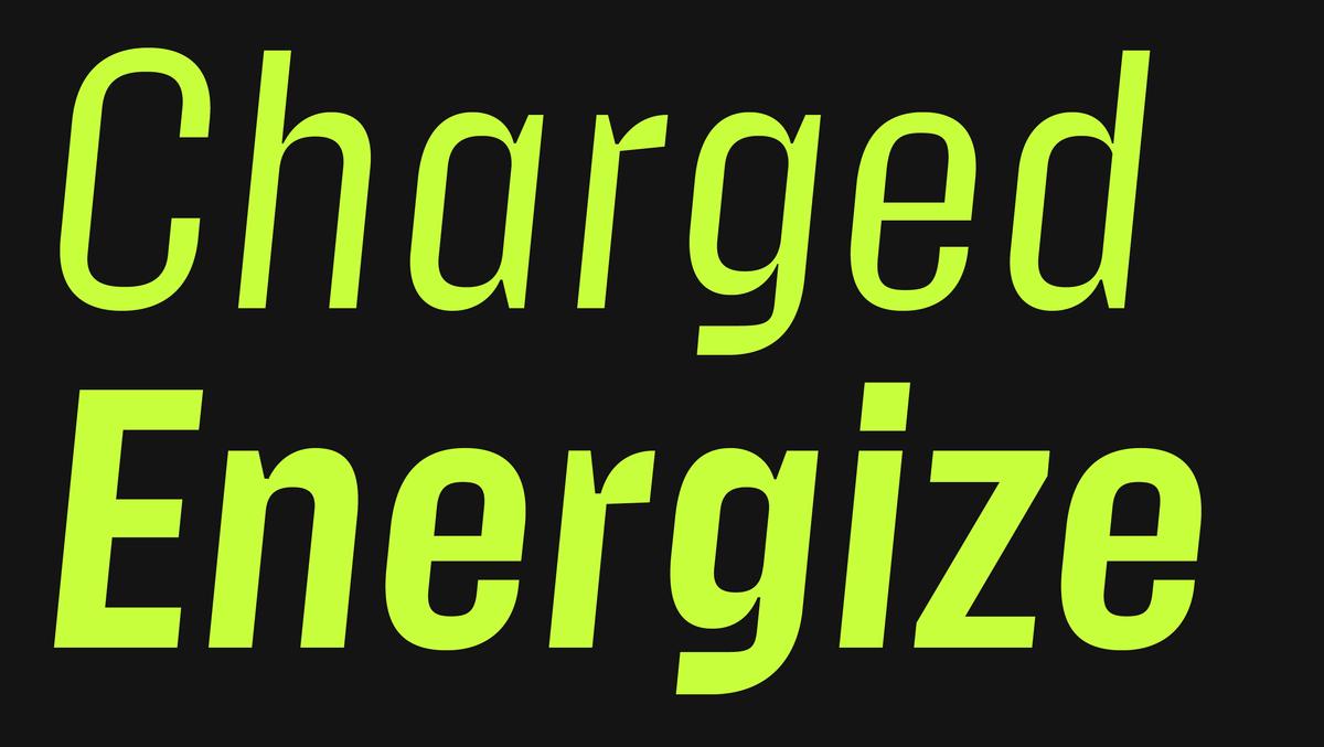
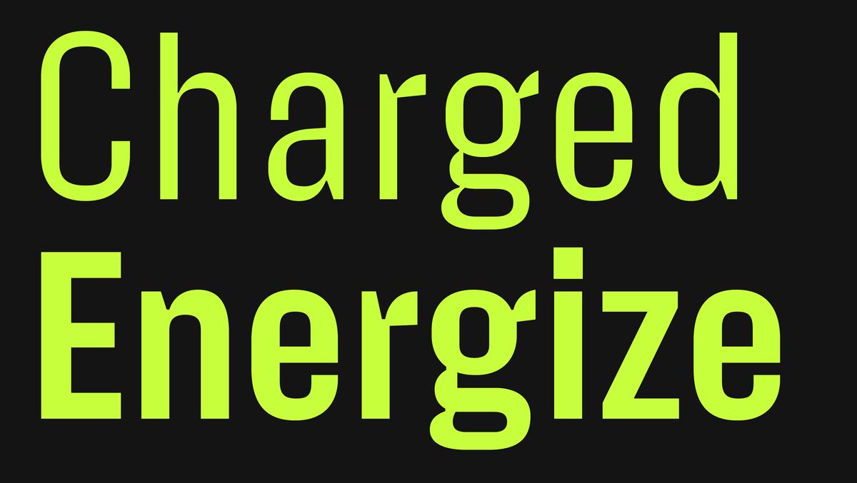
Grades are another way Action Text recommends itself as a screen-first design, which may seem paradoxical at first blush. After all, text grades were initially developed to compensate for environmental effects (like varying paper stocks, printers, and humidity) on printed type, allowing text to achieve consistent color across media without affecting copyfit. But grades are proving equally useful in our glossy, glassy, mobile world. In night mode, for example, text reversed out of a dark background can appear too heavy; Action Text’s Bright grade solves that problem. Grades also work well for subtly adjusting text elements on hover, tap, or focus, or for creating other interactive effects. On hover, for instance, you can make text seem to bulk up by using Action Text’s Dark grade. Because the underlying metrics are the same, the text won’t shift, as it typically would if you styled it as bold or strong.
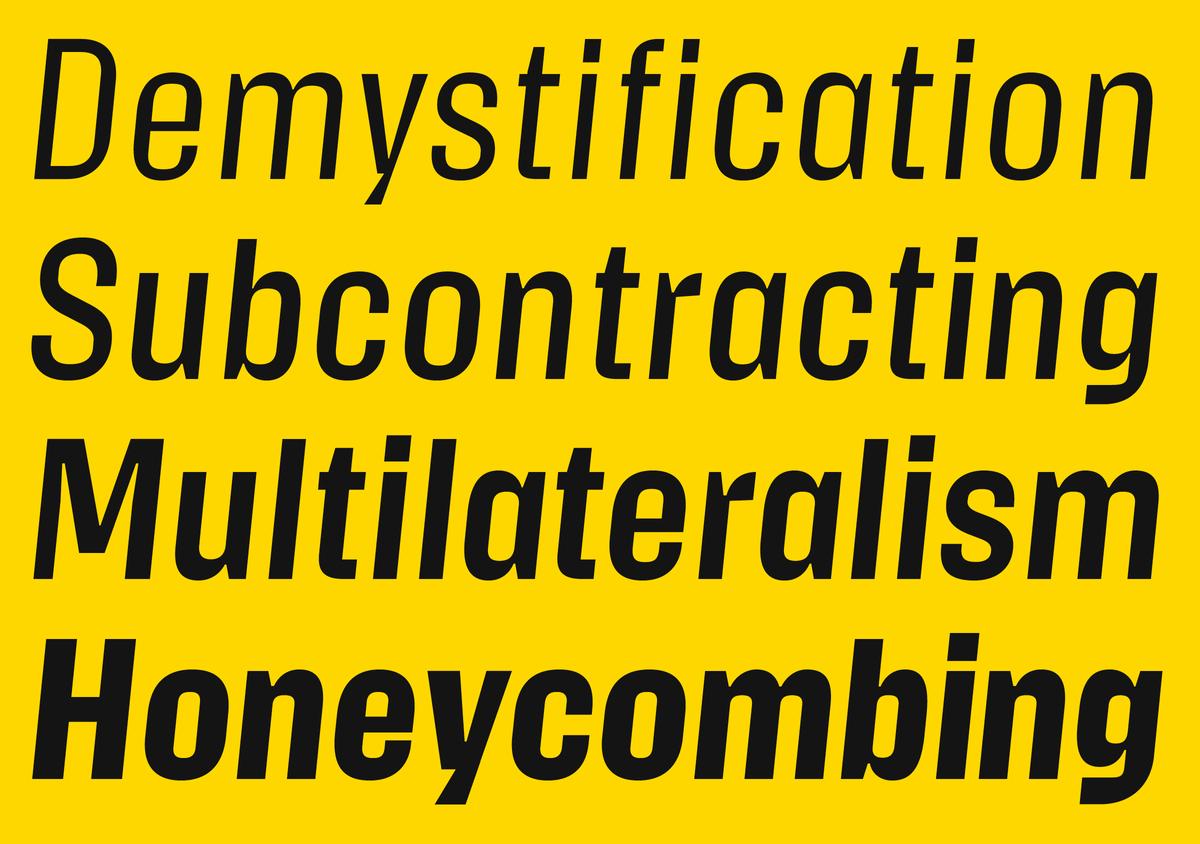
You can use Action Text’s italics for these kinds of effects, too. Its duplexed structure ensures that the italics occupy the same horizontal footprint as their upright counterparts. No more jarring, jumpy, jittery web.
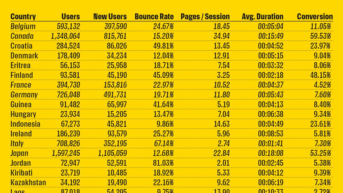

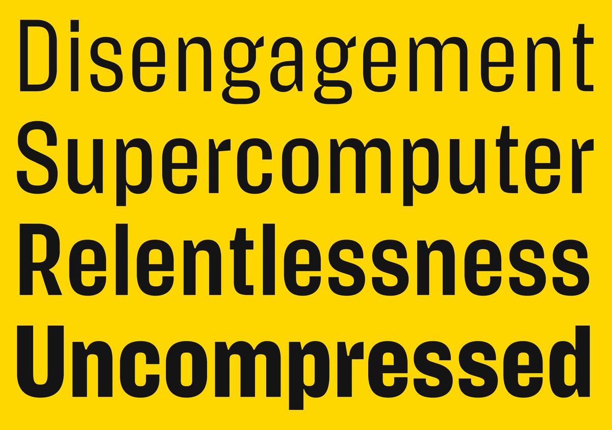
All extraneous details have been stripped away from Action Text. What remains has been simplified and exaggerated. The unusual forms, derived directly from function, look almost carved or sculpted rather than drawn, with their surprising asymmetries, pinches, bulges, and notches. Like its predecessor Action Condensed, Action Text emerged from a desire to design a performant typeface for interfaces and other complex screen typography that didn’t adopt a self-consciously “neutral” stance. Because here’s the thing: the attention of someone reading text on screen is desultory, flittering. Glyphs need grit and interest. Equipped for setting long-form continuous text and typographically complex documents like charts, lists, and financial reports, Action Text proves that the type that flows past us on screens every day can be serious as well as—dare we say—fun.
Action Condensed was our first release to be developed primarily for screens (even though it also looked spectacular on the cover of the Village Voice). Action Text, designed for the more workaday, labor-intensive aspects of screen typography, represents another first: our first variable font release. Both families press the erstwhile print-focused technologies of multiplexing and grading into service to deliver the sort of designs required by today’s sophisticated, screen-focused typesetting. Cohesive and resonant in tandem but just as striking solo, Action Condensed and Action Text have a bit of an edge, a bit of a bite—and bring welcome personality to an otherwise too-bland, too-smooth web.
Read more about the design process in Erik van Blokland's own words over at his site.
Related fonts

