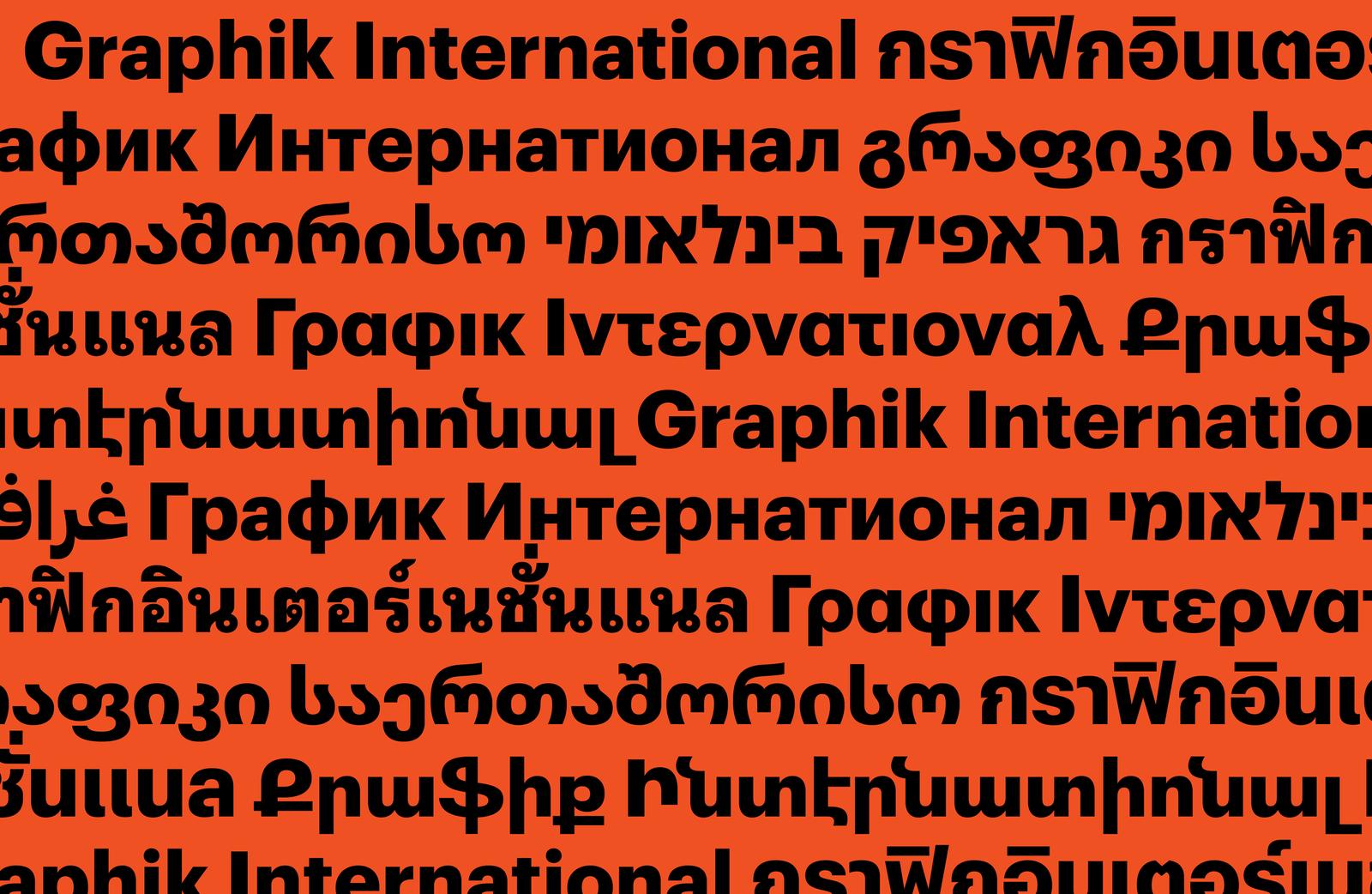
Graphik International with Armenian, Georgian, Hebrew, and Thai
First published in 2009, Graphik has become a contemporary classic that resists easy categorization. Drawn by Christian Schwartz and originally used under the name Plakat for his own branding, the family was further fleshed out for Condé Nast Portfolio, and later surfaced in Wallpaper*, Bon Appétit, Esquire, and T: The New York Times Style Magazine, among other publications.
Graphik quickly emerged as an editorial workhorse that could dress up or down, whose low contrast, open counters, and compact descenders recommended it for use in tight settings like subheads, captions, labels, and running text. The hybrid design offset the round bowls typical of a geometric sans with the architecture and proportions of a European grotesk, without the baggage of more dogmatic, overused sans serifs mired in postwar modernism. Human touches like round dots (echoing the spherical bowls) and other details also made the face dazzle when set large, as on posters, supergraphics, and signage. But there was a hitch: Graphik only knew how to write in the Latin script.
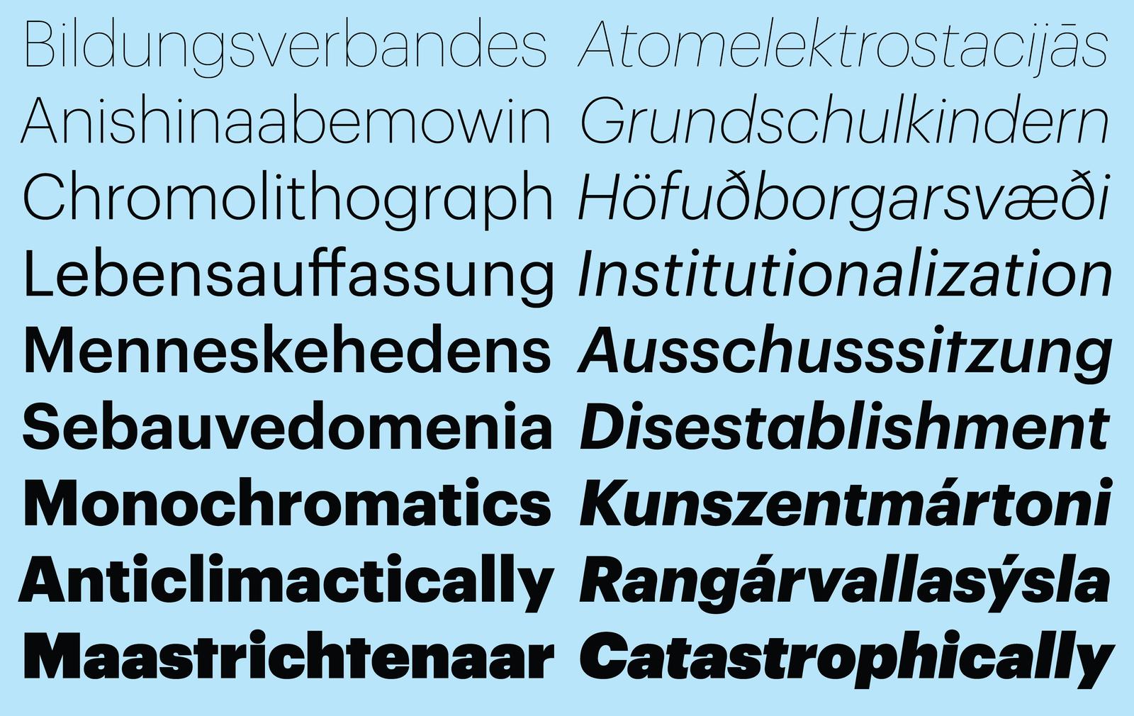
Over the years, an international team has coalesced around Graphik to help push it beyond Latin. Perhaps the thorniest challenge posed by this growth was preserving Schwartz’s original concept of Graphik as a “vanilla” sans serif—a chameleonlike, almost affectless design capable of circulating effortlessly among genres, contexts, and cultural spheres. Schwartz had long admired mid-twentieth century graphic design, especially posters, featuring sans serifs that were willfully plain, capable of playing both lead and supporting roles. But more than to the prominent heavy hitters—Helvetica, Futura, and Univers—Schwartz found himself drawn to “sleeper” sans serifs like Plak, Folio, Maxima, Neuzeit Grotesk, and Recta. How to port the tenor of these deliberately ordinary sans serifs into other writing systems? The solution was to translate not literally, but liberally.
The various scripts, far from being forced into a prescribed box that would make them “look like” the Latin version, had free rein to do what comes naturally to them, often with intriguing results. They translate the spirit, rather than the letter, of Schwartz’s original vision: a deliberately ordinary, deadpan typeface evocative of mid-twentieth century graphic design but free of any reflexive associations to modernism.
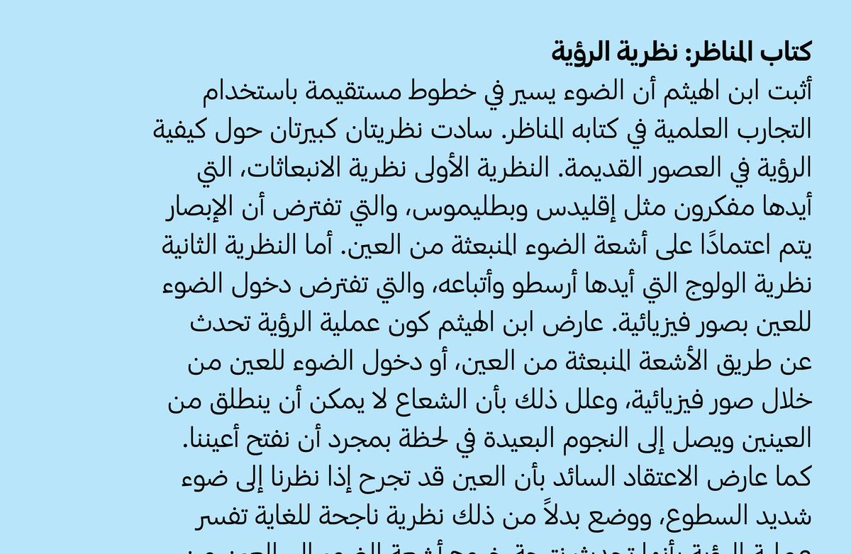
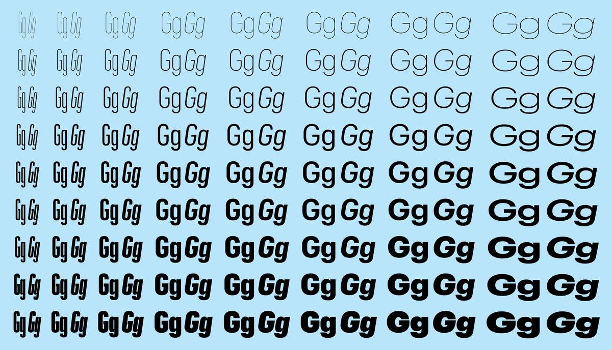
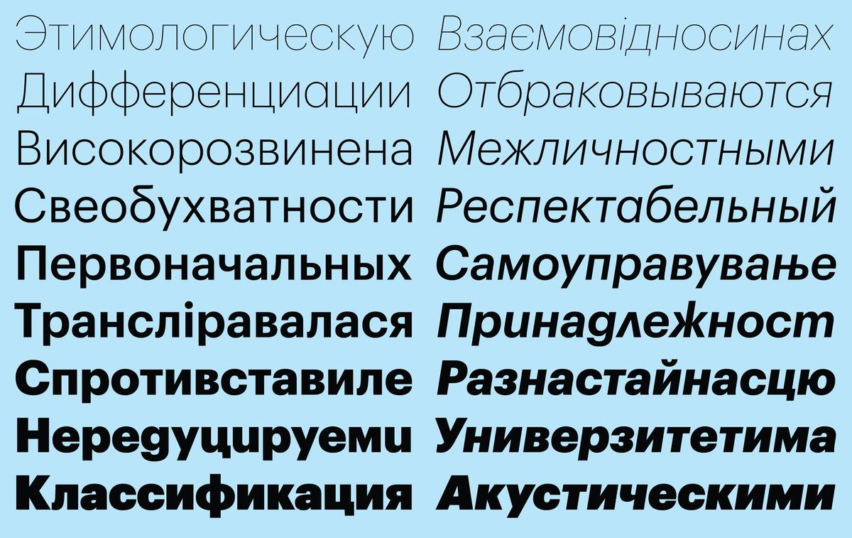
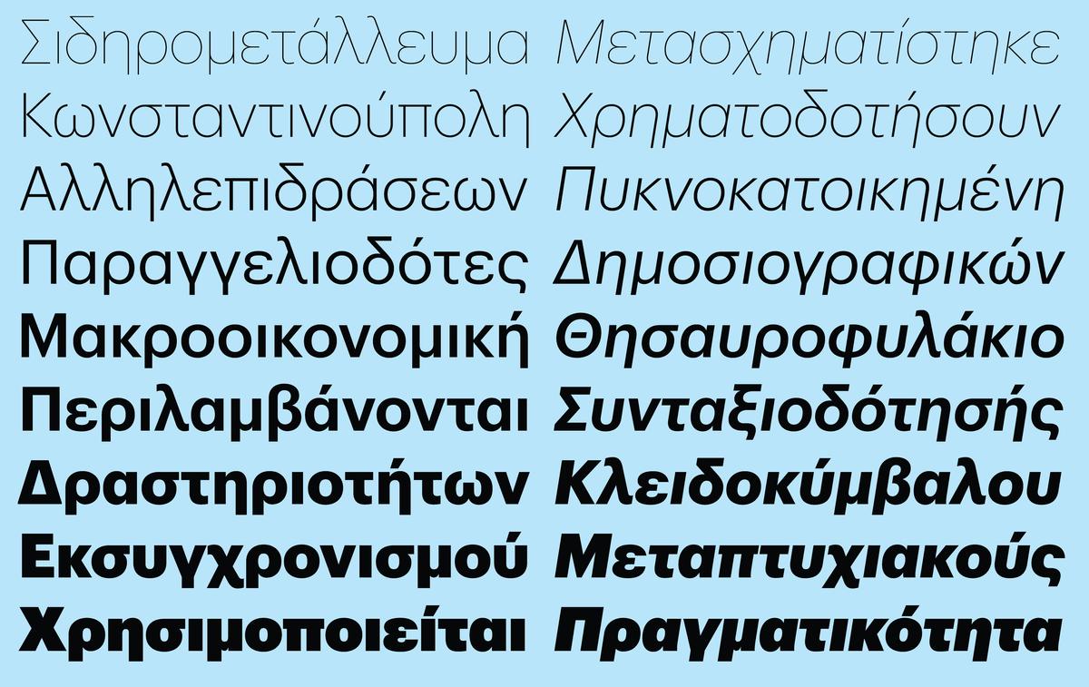
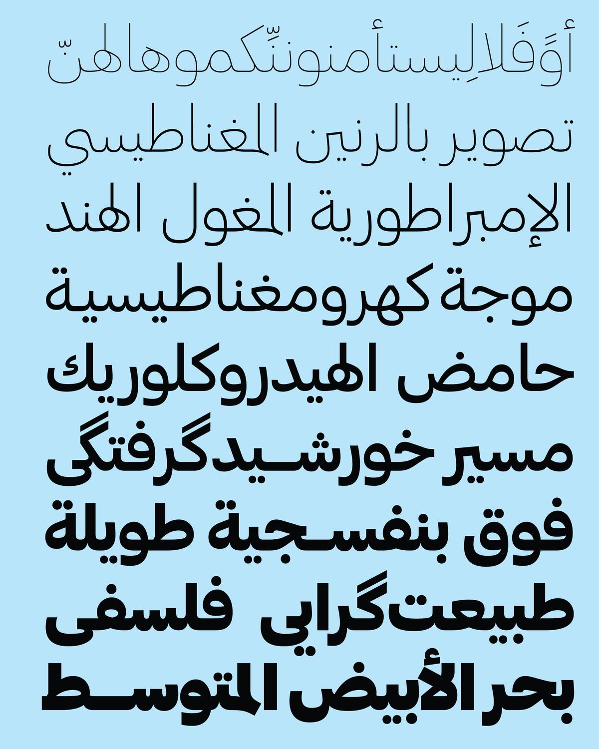
First came Cyrillic and Greek in 2015. The new extensions, drawn by Ilya Ruderman and Panos Haratzopoulos, respectively, marked sensitive adaptations of the Latin into closely related scripts. Two years later, Waël Morcos and Khajag Apelian designed Graphik Arabic, which departed from more customary calligraphic detailing based on the heavily constructed Kufic style in favor of a utilitarian plainness that drew on the fluid structures of the Naskh script. During the same period, in 2017–18, the Latin collection became even more useful by introducing a vast range of widths, from the mind-bending and legibility-defying Graphik XXXX Condensed (drawn with the assistance of Croatian designer Hrvoje Živčić) to the majestic, space-hogging Wide.
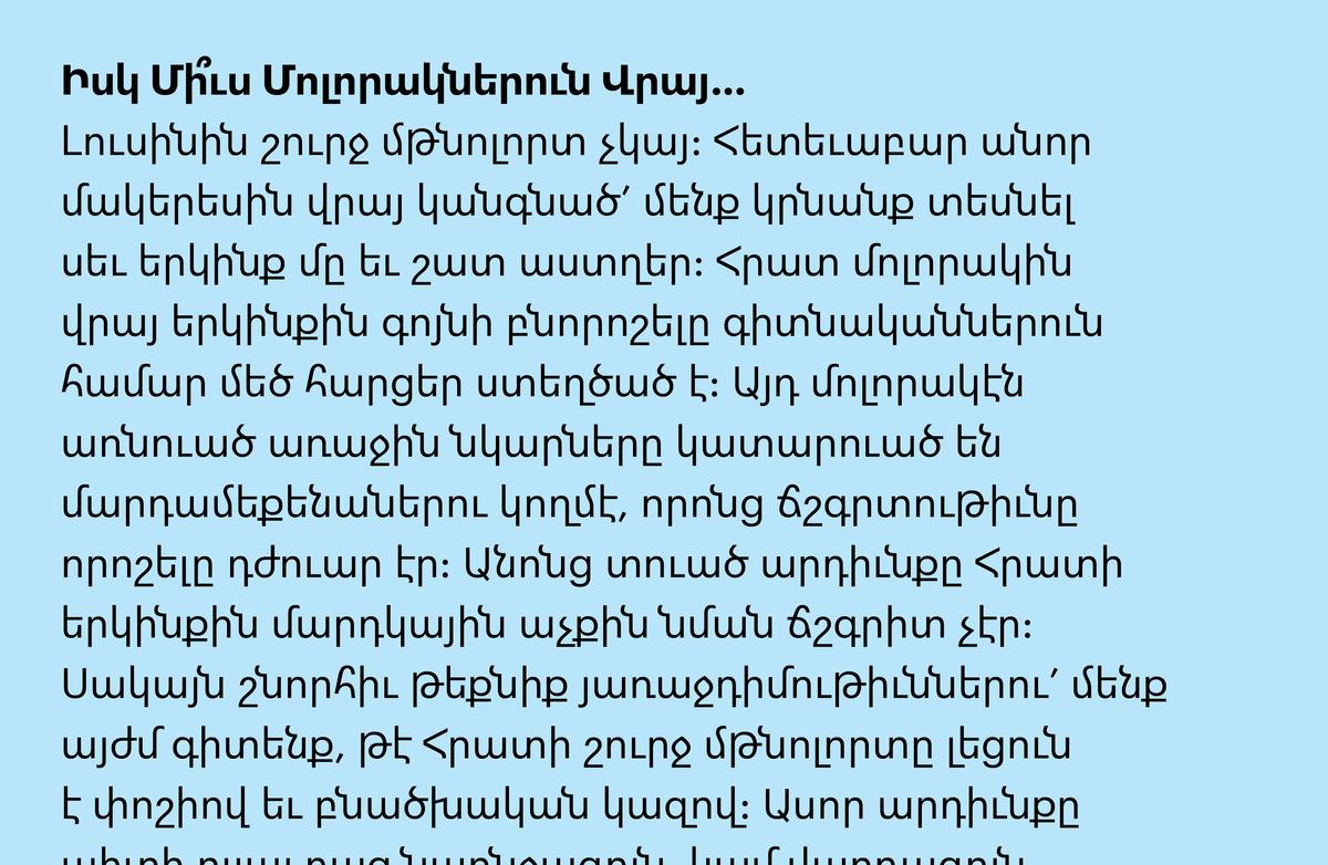
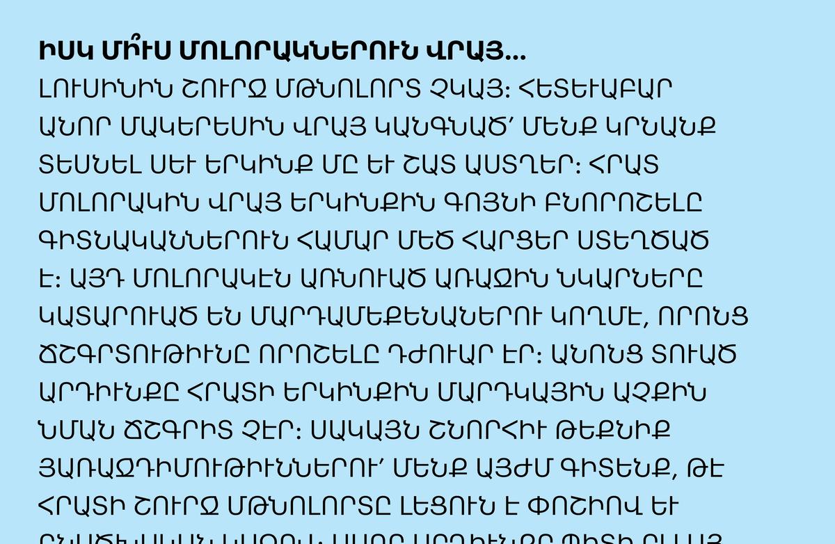
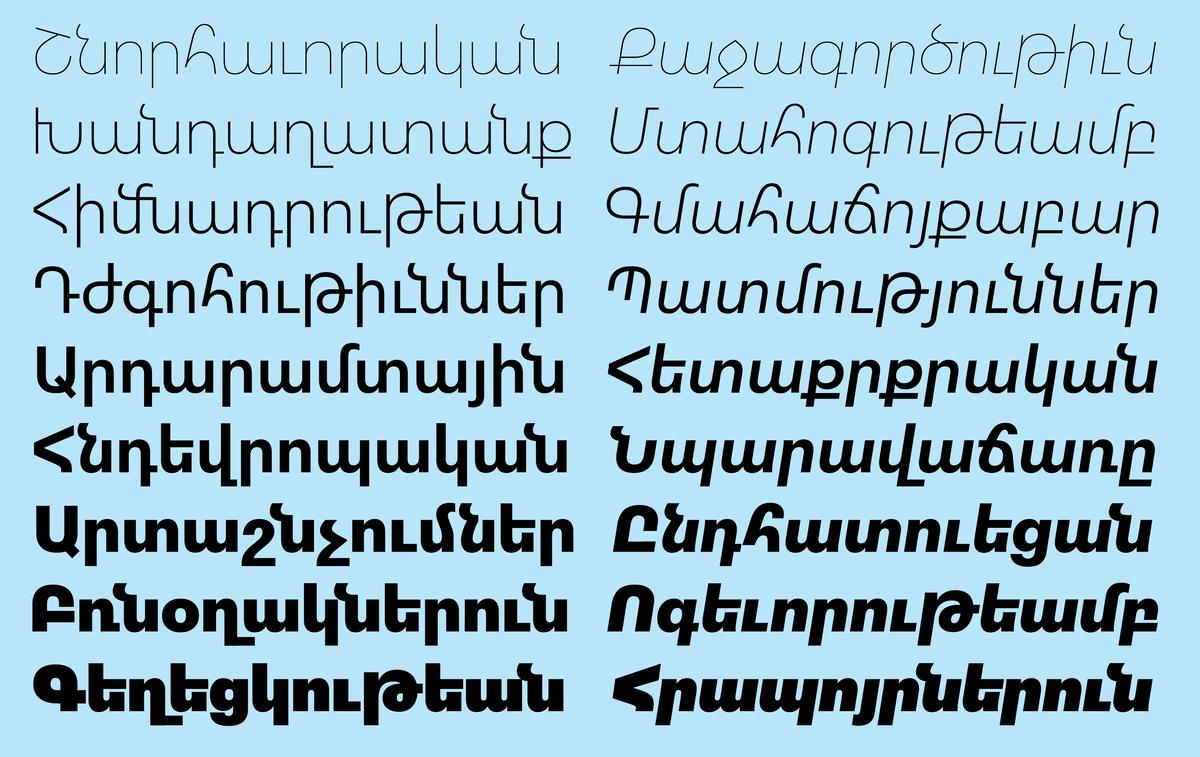
And now, in 2020, Graphik welcomes four new counterparts: Armenian, Georgian, Hebrew, and Thai. Khajag Apelian has returned to design Graphik Armenian, deftly intercutting history and innovation in a way that pushes the script forward. He has streamlined the design, for example, by eliding parts of letterforms long viewed as fundamental. But he has also included contextual alternates that lengthen ascenders and descenders to follow more traditional forms, stopping short of a sweeping compromise that would simply truncate the extenders or cause them to curl back in on themselves. He also decided to retain the traditional form of հ rather than include the now-common (and overly Latinized) h-like form. For this savvy blend of old and new, Apelian had strong encouragement from the graphic design community in Yerevan, who tested the family at various stages of development.
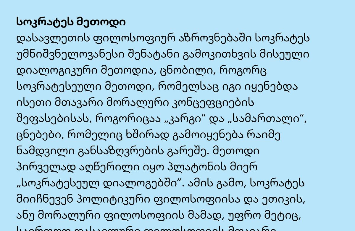
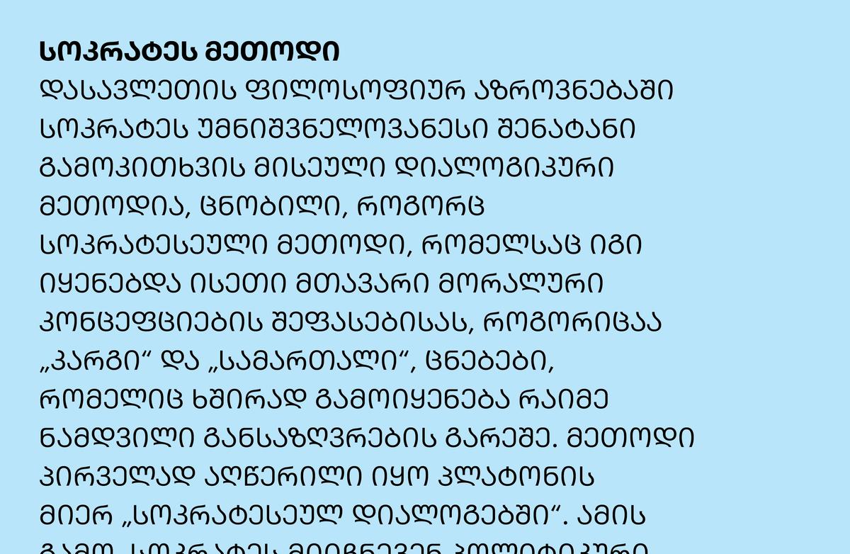
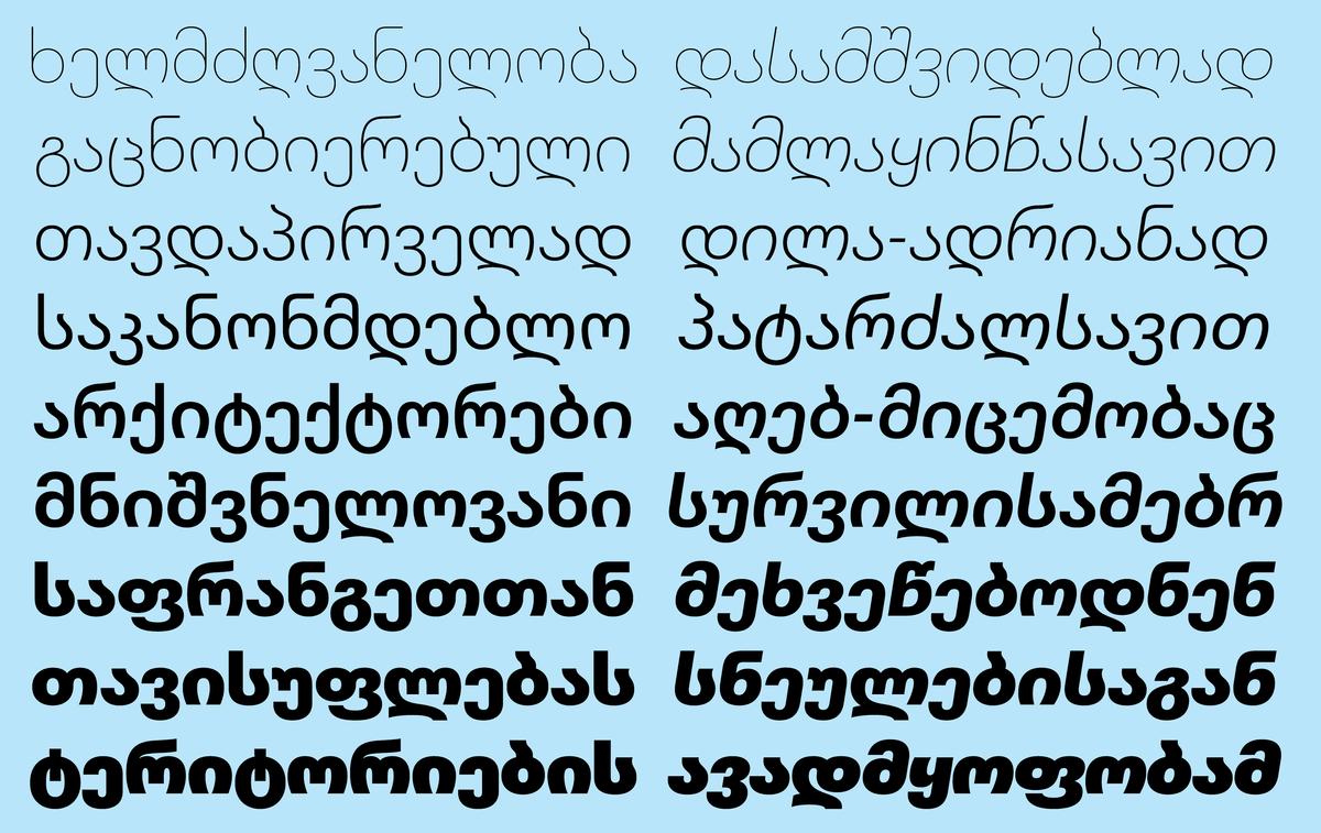
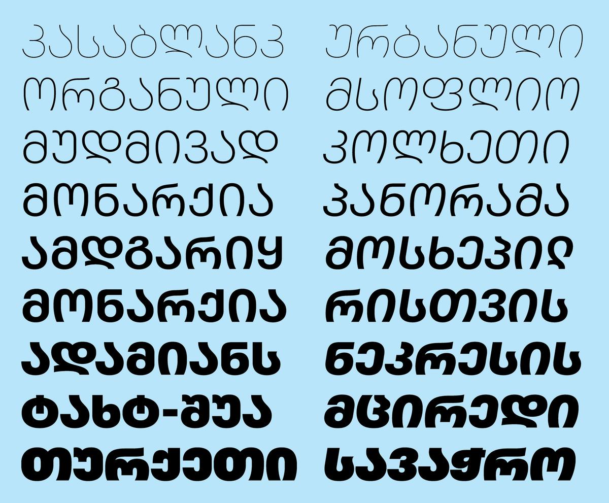
Similarly, for Graphik Georgian, Yury Ostromentsky has artfully balanced tradition with contemporization. Modern Georgian is unusual in that it has both upper- and lowercase forms, but they never appear in mixed-case use; they only ever occur separately, with uppercase forms often used for headings and emphasis. Ostromentsky, a Russian designer who developed a fascination with the unique script after spending a considerable amount of time in Georgia, has simplified shapes that are typically more complex to create an even text color.
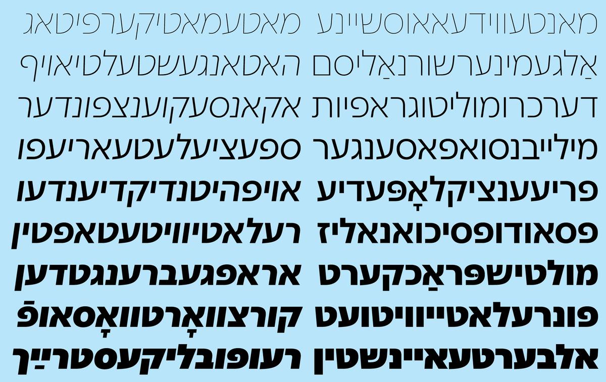
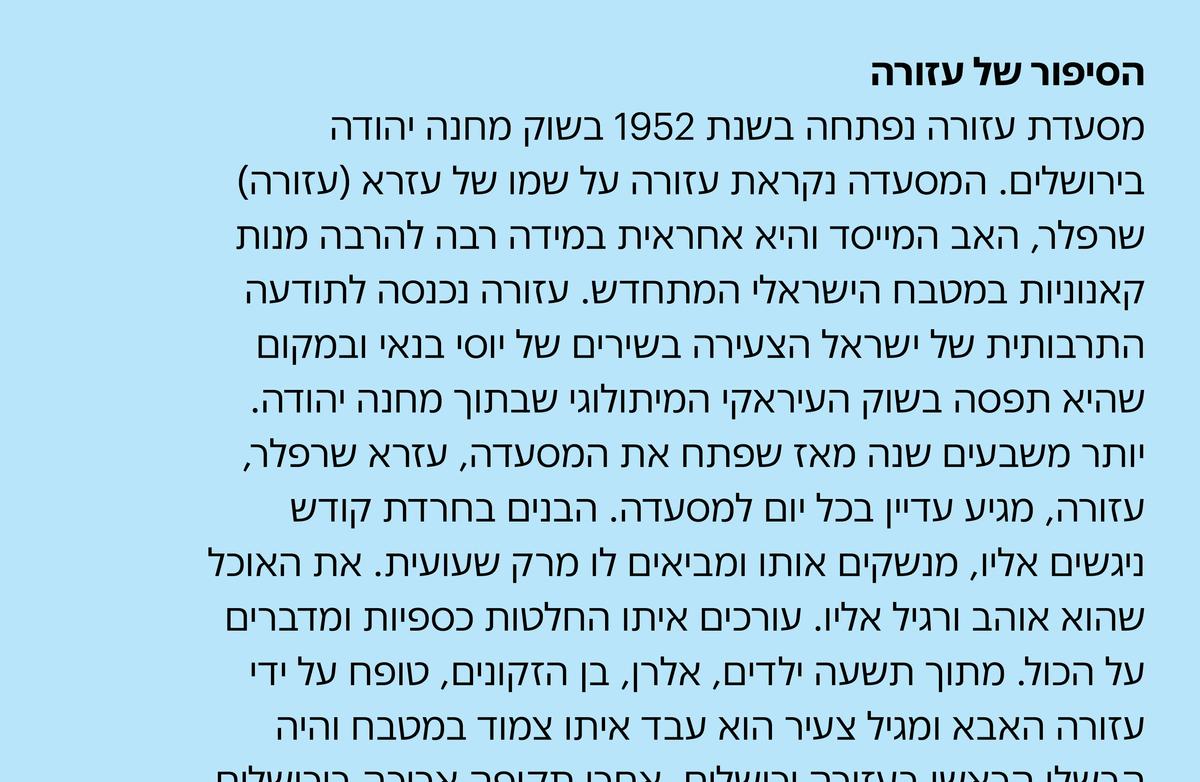
For Graphik Hebrew, designers Yanek Iontef and Daniel Grumer have injected Graphik’s unadorned, straightforward approach to letterform construction into a script that has no real equivalent to the grotesk genre. Iontef and Grumer generated numerous options for different lettershapes, which they then (along with Schwartz) mixed and matched until the overall disposition and tone felt right. The sharp corners of Z and 2, subtly evident in the Latin, have been deployed in the Hebrew version for added texture. The family also includes Yiddish extensions and precomposed characters.
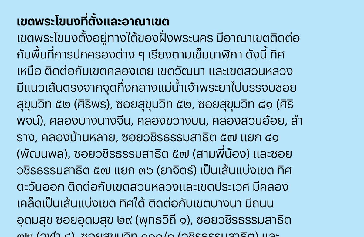
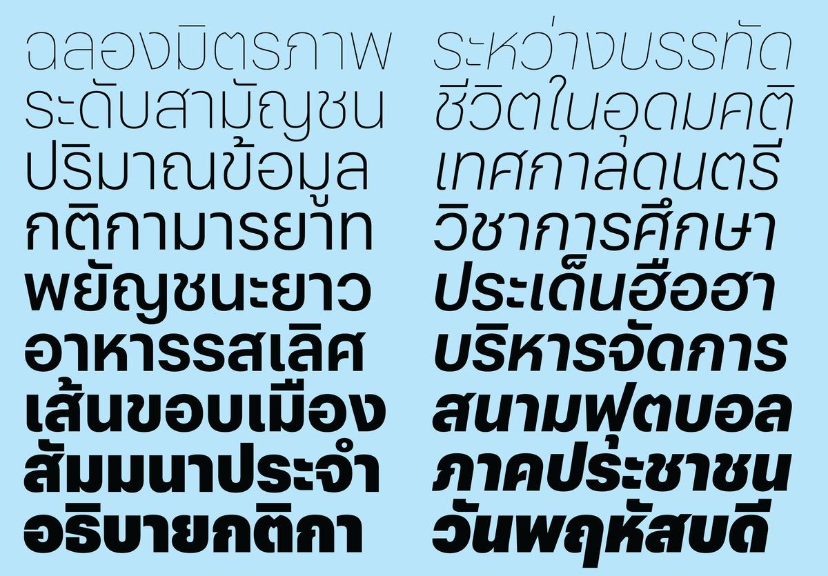
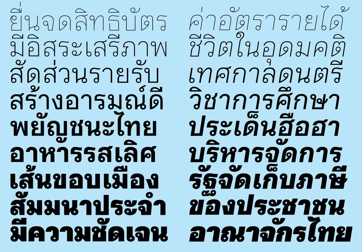
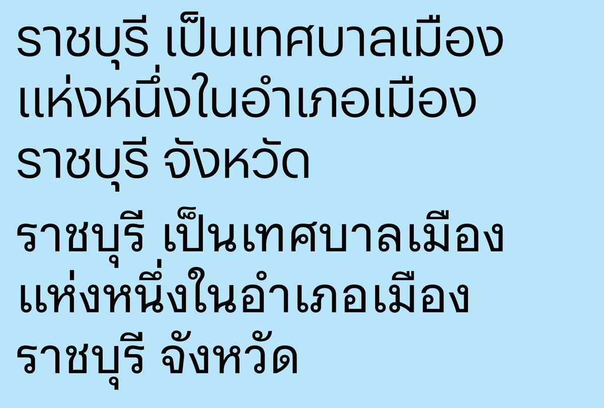
The challenge posed by Graphik Thai was that it required two distinct variants—with and without loop terminals—to function as a vanilla typeface for both text and display. Instead of choosing one over the other, the team at Cadson Demak in Bangkok recommended keeping both versions. The lithesome loopless variant was drawn by Smich Smanloh and Anuthin Wongsunkakon, who got assistance from Knaz Uyamathiti on the more traditional Graphik Thai Loop.
From a personal fixation on the relatively obscure, unvarnished sans serifs he so appreciated in mid-twentieth century graphic design, Schwartz built a hardworking sans serif useful in a wide range of sizes and degrees of expressivity. Since its humble beginnings as a custom branding face, Graphik has slowly matured, making its way around the world and becoming conversant in multiple scripts—an international workhorse without the International Style.
And that is the story of Graphik. For now.