Review by Berton Hasebe
When you know the rules inside and out—and Berton Hasebe knows the rules of typeface design inside and out—you can strategically break them.
A time-tested rule, or convention, of typeface design involves the stabilization of vertical metrics. Our eyes believe that curved or pointed lettershapes like O and A, whose bulk recedes from both baseline and cap height, are smaller than squarer neighbors like H or X, which sit on the baseline and are also flush with the cap height (or x-height, as with lowercase letters). To make up for this misperception, typeface designers draw what are called overshoots, which make round and pointed glyphs both taller and deeper so they appear equal to their squarer cohorts. A hallmark of a well-made typeface is this vertical evenness.
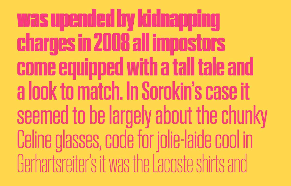
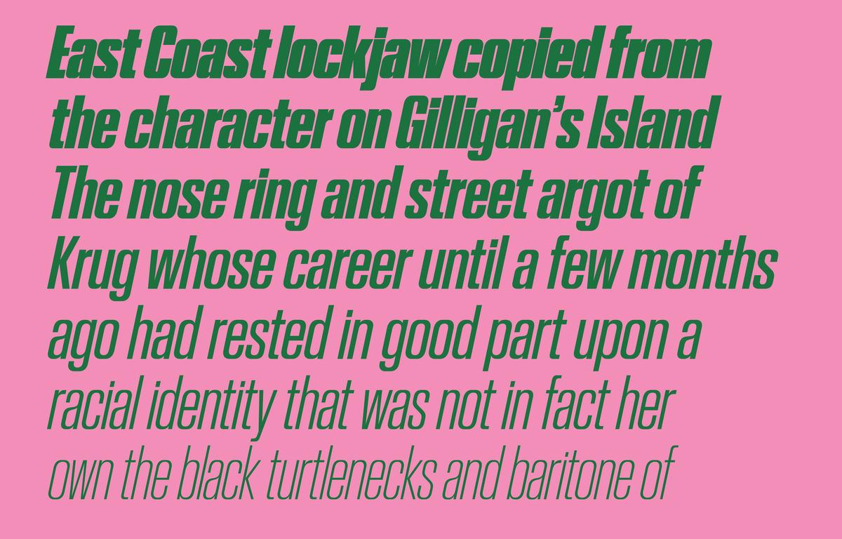
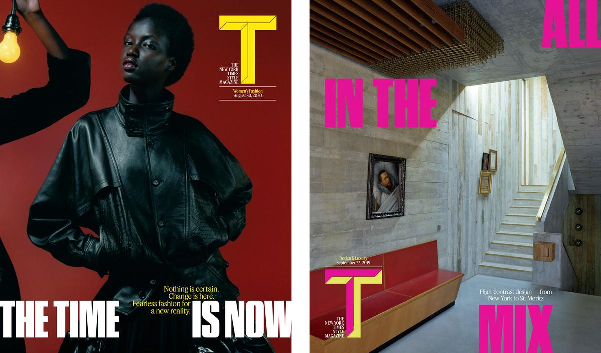
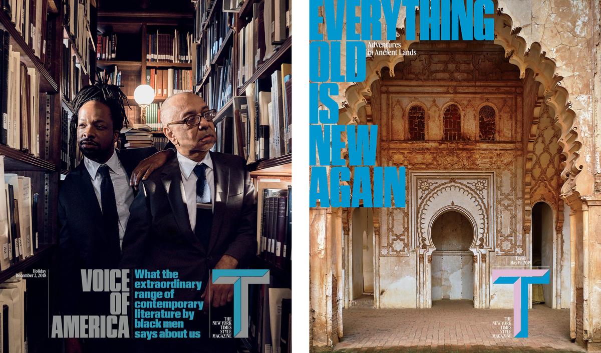
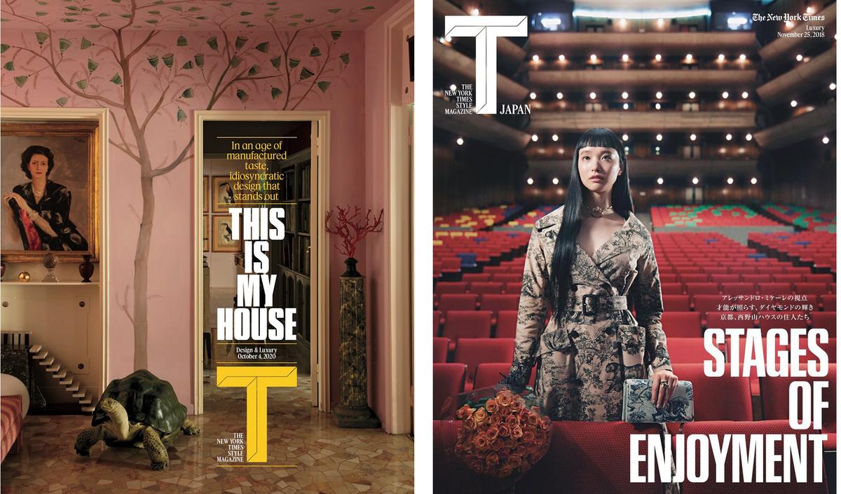
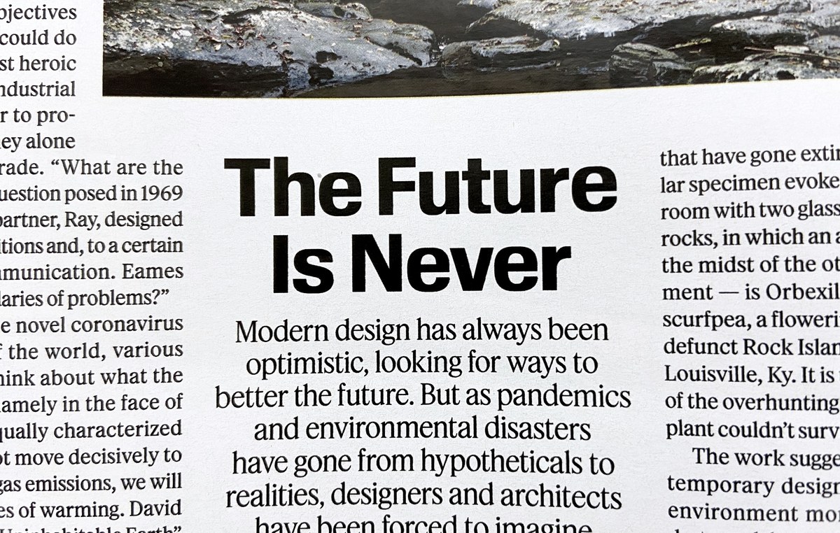
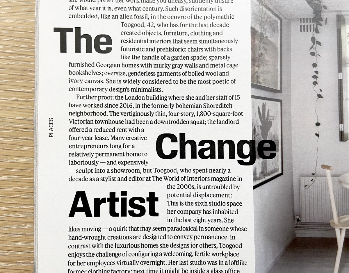
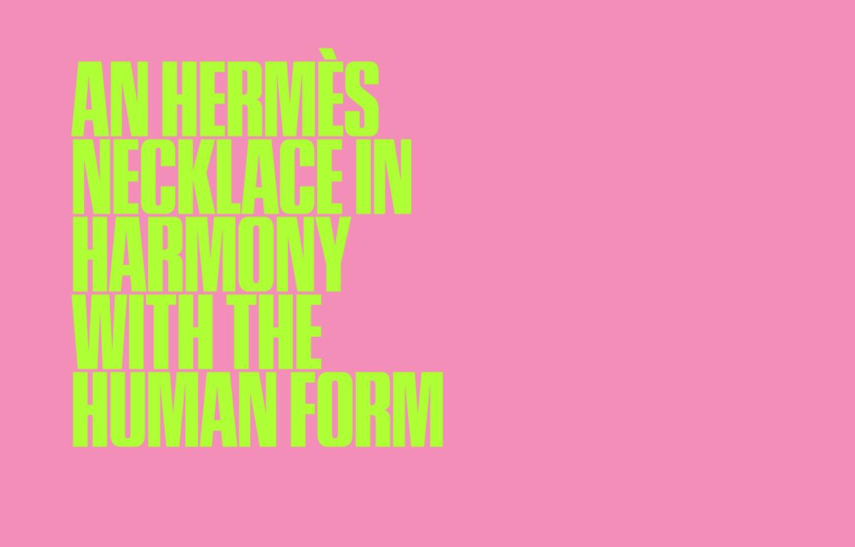
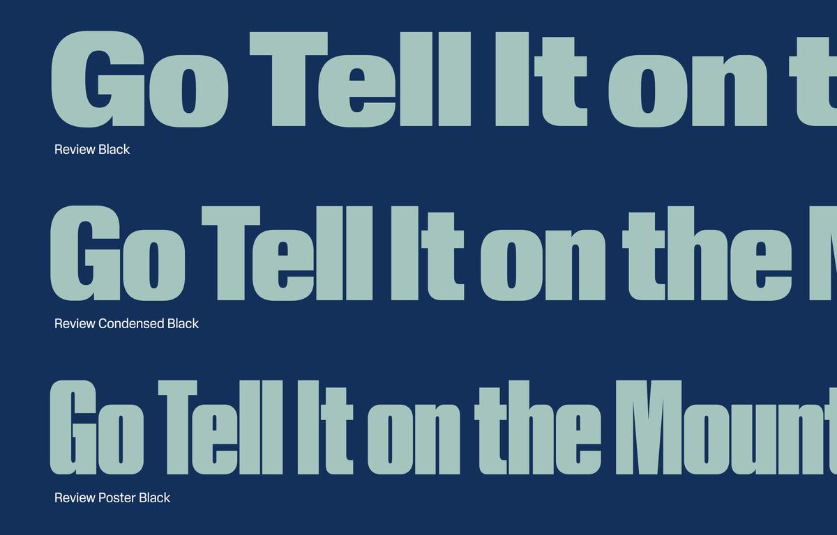
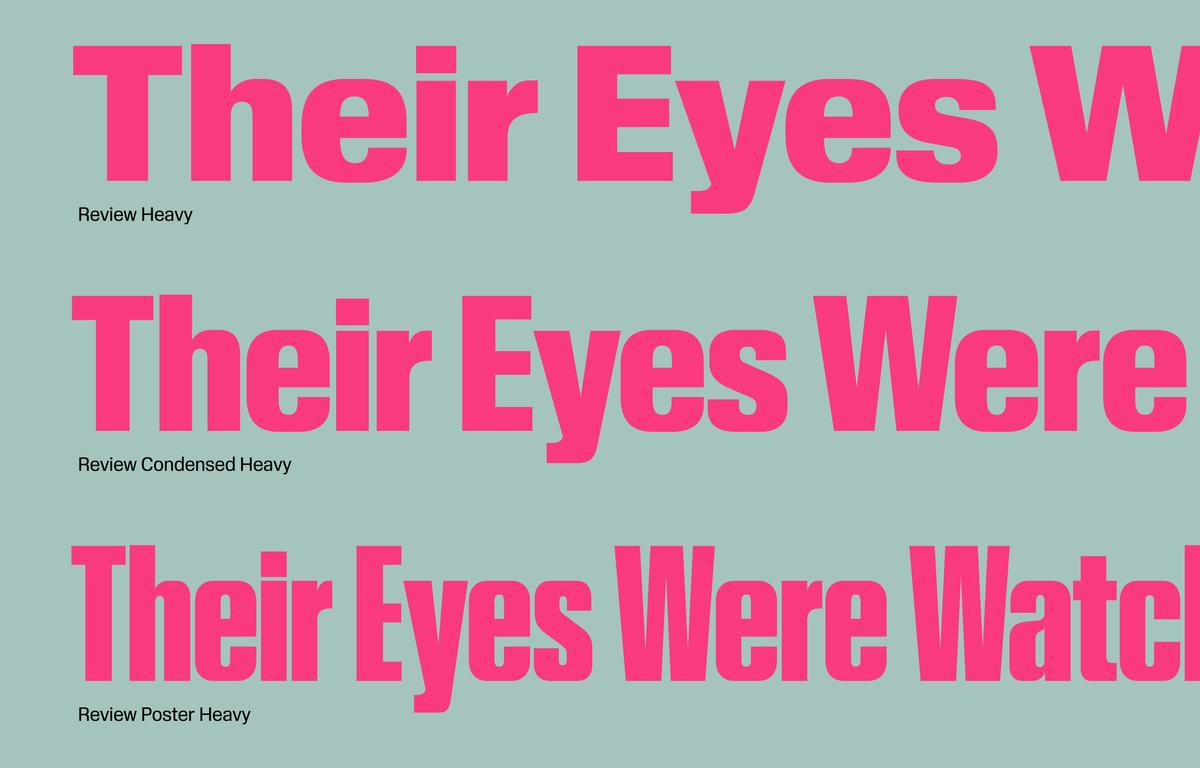
And yet one of the first things you notice about Berton Hasebe’s Review is that the rounder and pointier glyphs look foreshortened. Hasebe has deliberately lopped off the typeface’s overshoots and blunted its exterior curves, producing a dynamic tension with its round counters. This design decision forces a double take, a moment of hesitation—which is exactly what Review needed to do in its original role (under the name Kippenberger) as one of the primary typefaces for T: The New York Times Style Magazine.
In 2017, T got a new editor in chief, Hanya Yanagihara, who pushed for a total rethinking of the book from front to back. Under its previous editorship, the magazine had been airy and image-driven, supported by an elegant, accordion-like serif called Schnyder, designed by Hasebe and Christian Schwartz. Yanagihara, who moonlights as an acclaimed novelist, envisioned a publication that was equally text-focused. She has said that when she took the position at T, literary friends snarked that they hadn’t realized T actually contained any words worth reading. Review and its companion serif make sure you know the magazine not only contains words, but revolves around them.
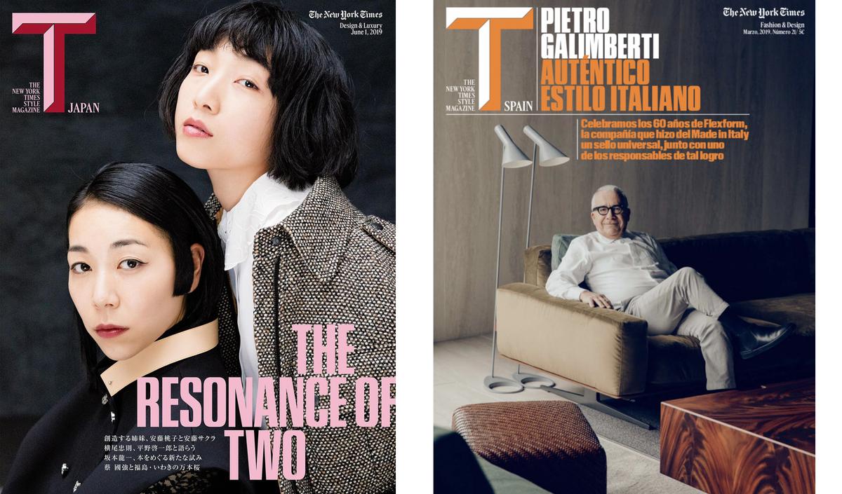
Yanagihara also insisted that T not shy away from current affairs and, as the US entered its second year under the Trump regime, that it communicate a sense of urgency. T’s somewhat unusual status practically cried out for rule-bending: because it is both part of and entirely independent from the larger New York Times, it needs to be typographically and visually distinct from it; and, because it is a magazine free of the constraints of newsstand traffic, it can afford to experiment. Having already worked with Hasebe and Schwartz on the magazine’s previous incarnation, creative director Patrick Li tapped them for the redesign.
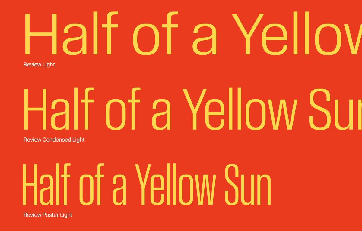
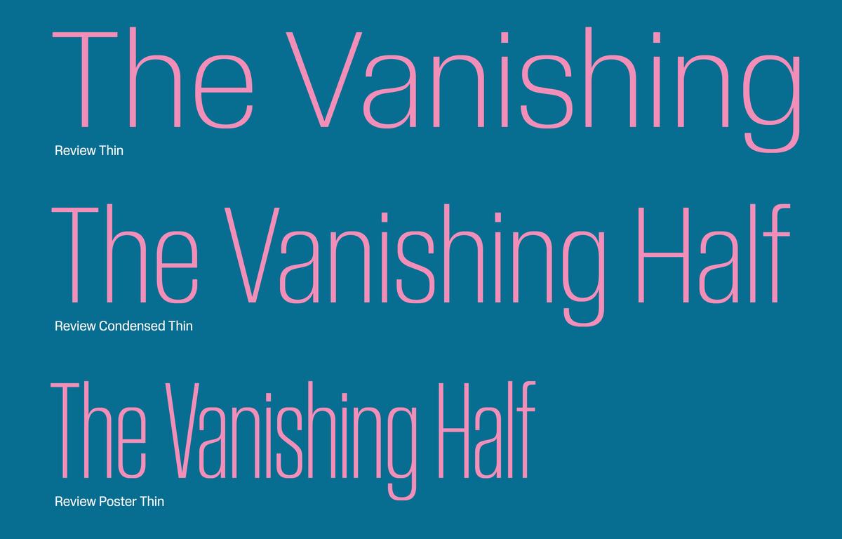
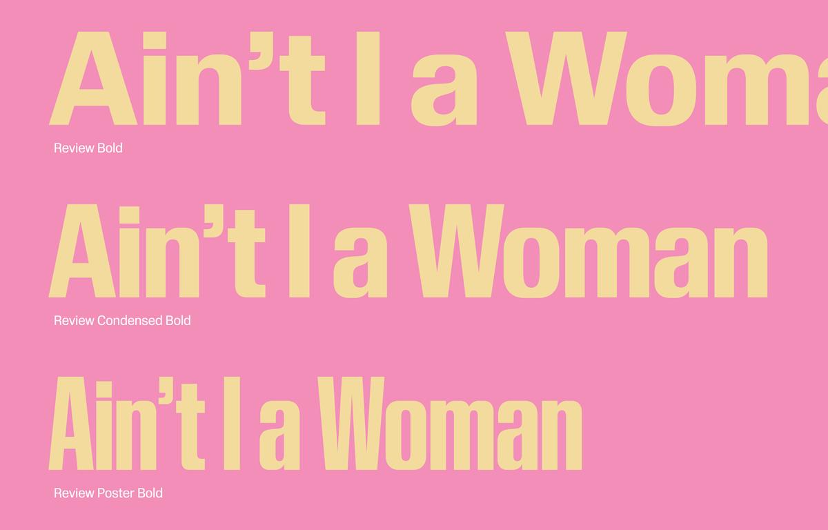
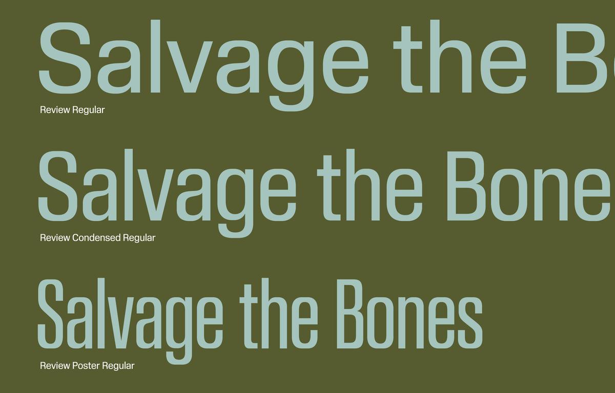
Li and his team sought a flexible system of typefaces that would be just as comfortable playing a starring role as a supporting one, depending on the content. The resulting faces—the blocky Review (in three widths: Poster, Regular, and Condensed), accompanied by a narrow serif called Feature (formerly Fact, designed by Hasebe and Schwartz and currently being prepped for release in 2021)—mined an exciting period in the history of graphic design, a moment spanning the sixties and seventies that produced Herb Lubalin’s covers for fact, Karl Gerstner’s programmable grid systems, and gritty artist-published zines slapped together with Letraset and paste-up strips of phototype.
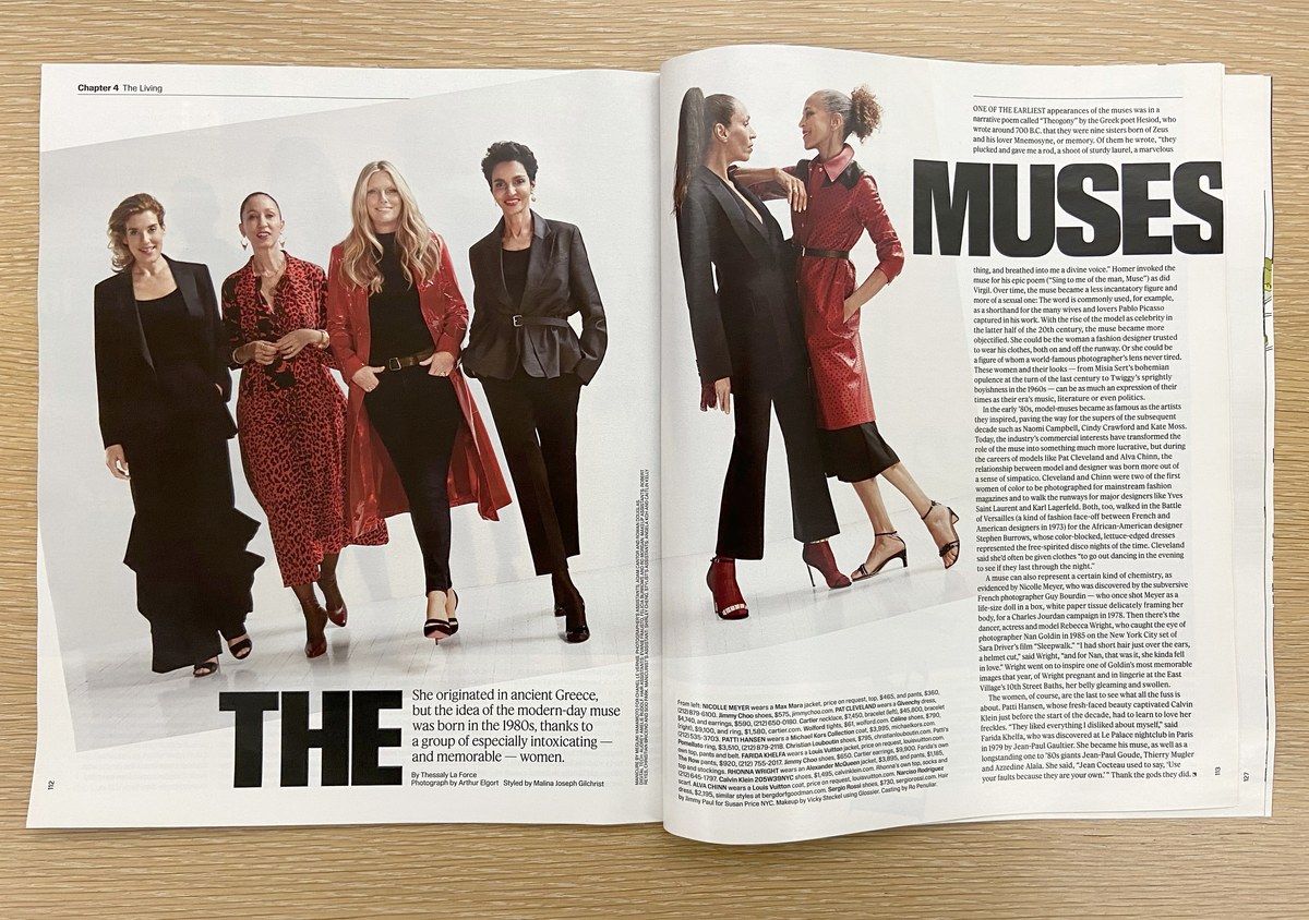
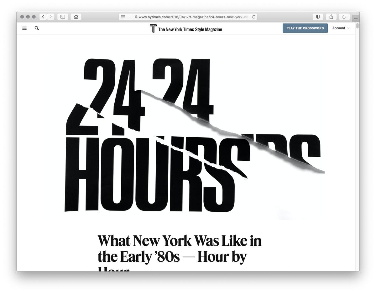
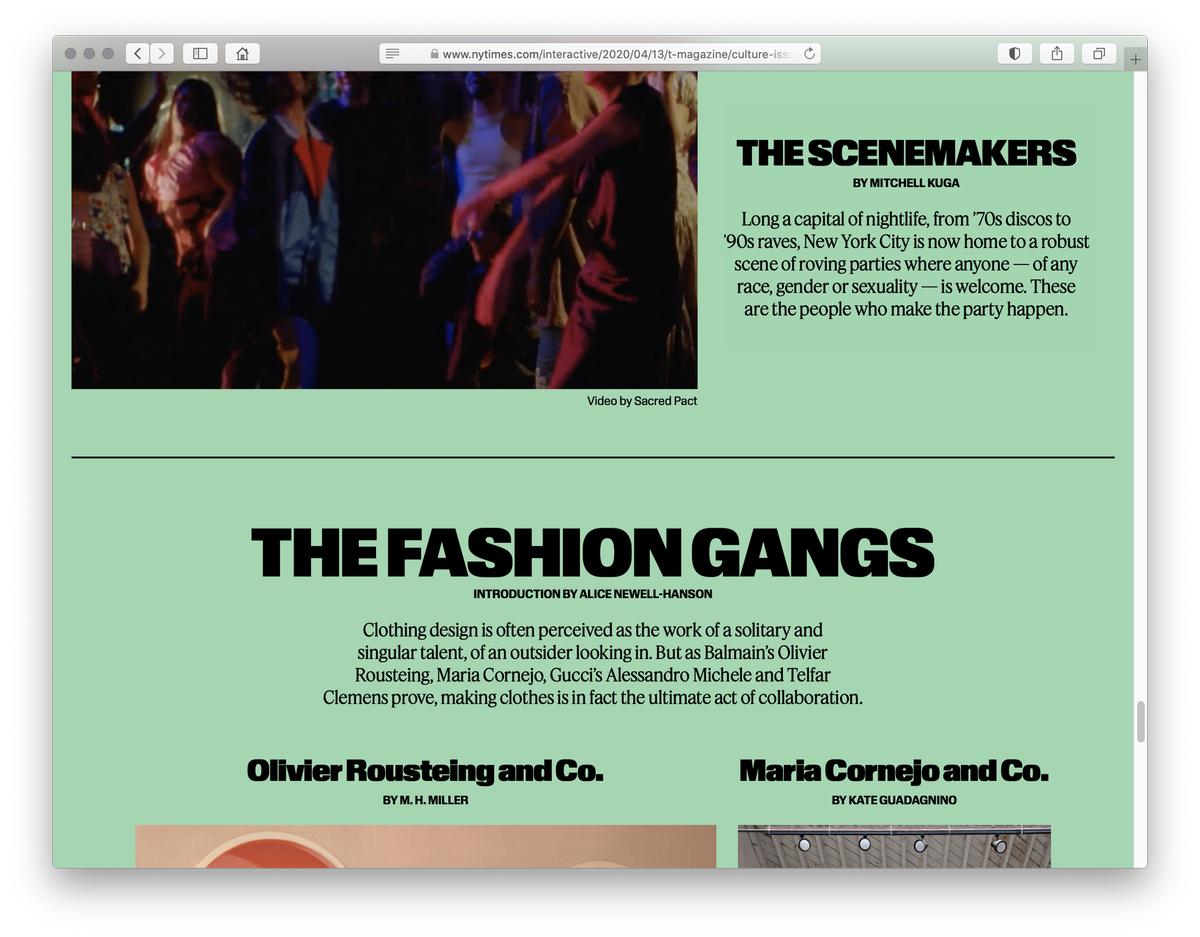
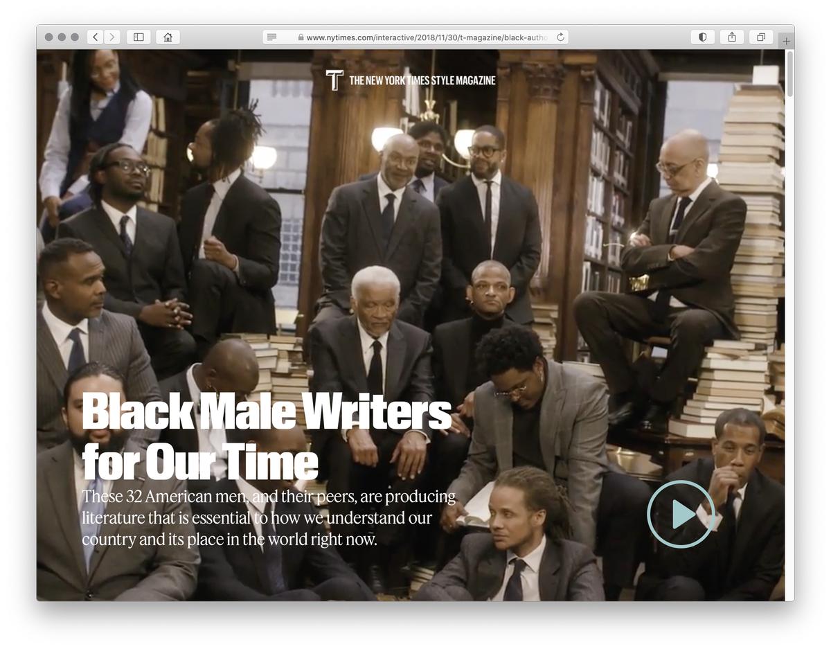
For Review, Hasebe also studied precursors like Phil Martin’s Helvetica-Eurostile hybrid Heldustry from 1978; Fred Lambert’s 1963 Compacta; and Folio Extra Bold, a squared-off, oddball style of Folio bearing a loose relationship to the rest of the family, released by Bauer in the late 1950s. Stately Feature, a Timesian serif, proves a perfect foil for its more experimental sans partner. Working in tandem, the pair offers a compelling cocktail of audacity and understated elegance. The revamped T launched in print and online in February 2018, with Review doing much of the heavy lifting in heads, subheads, and captions.
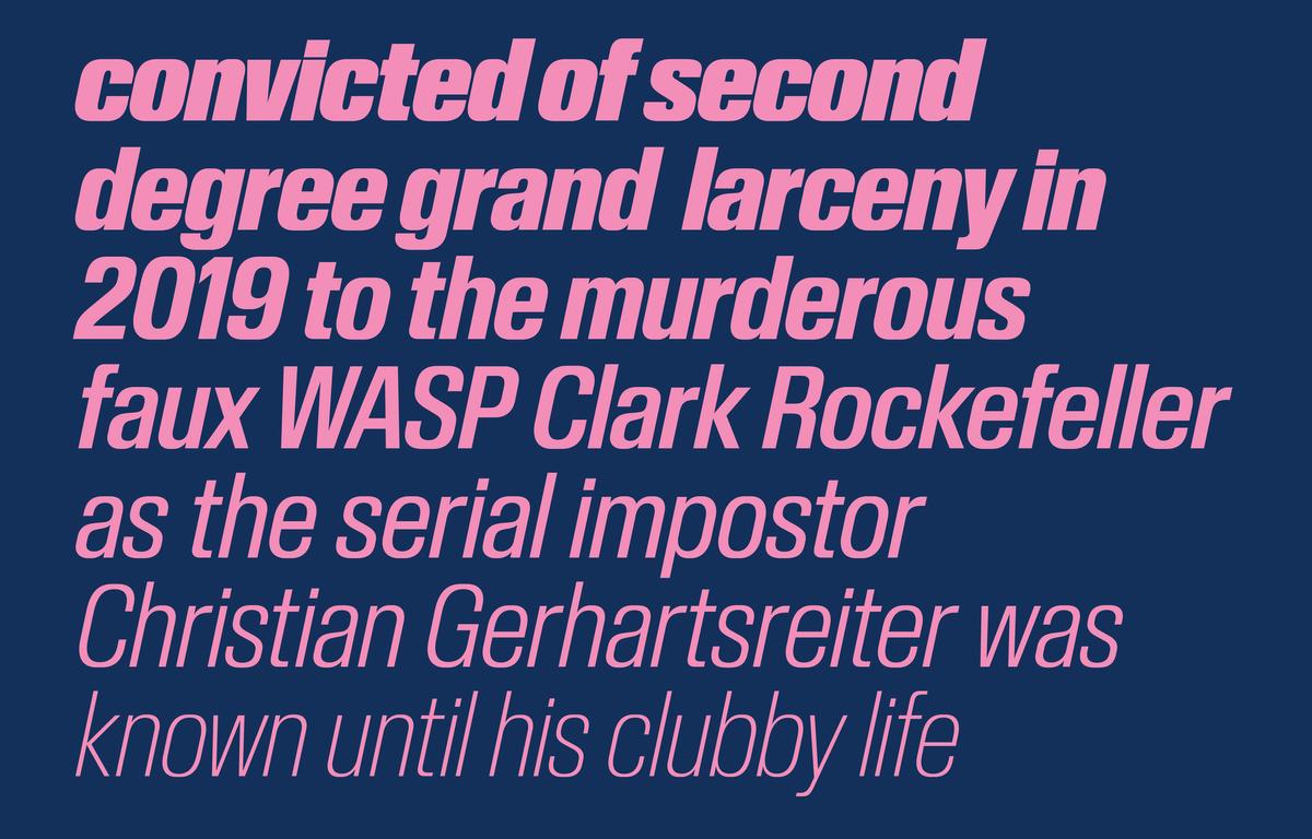
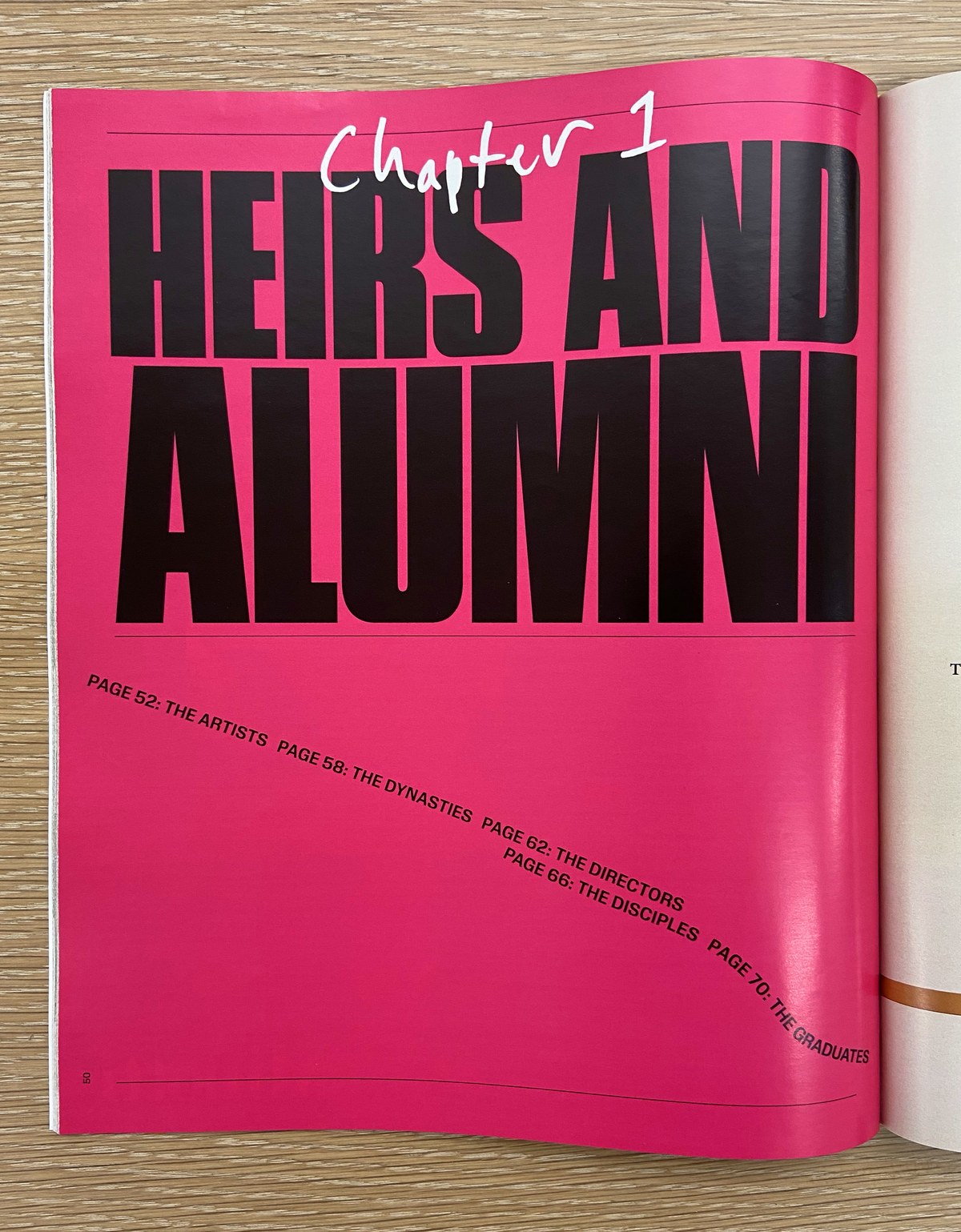
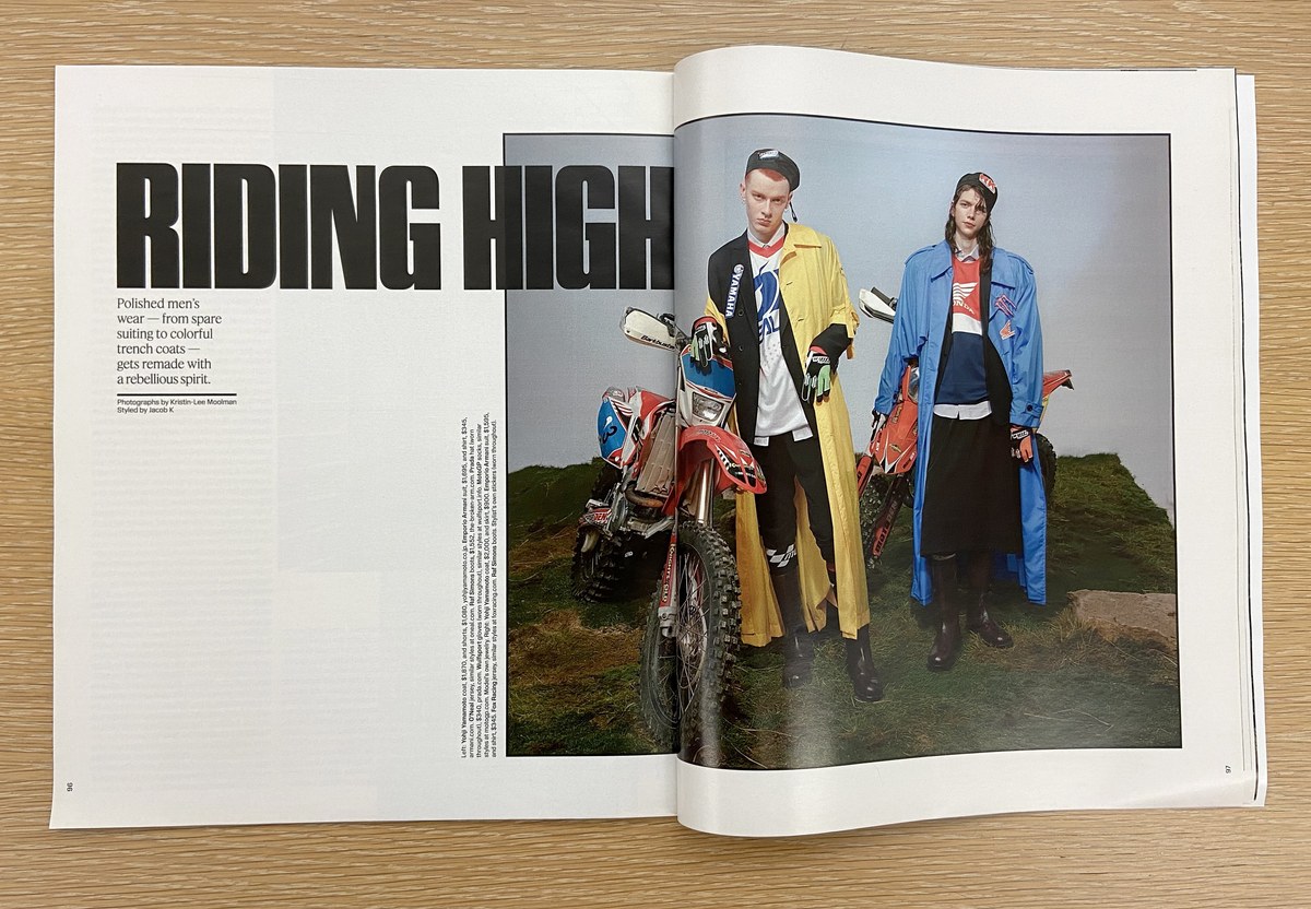
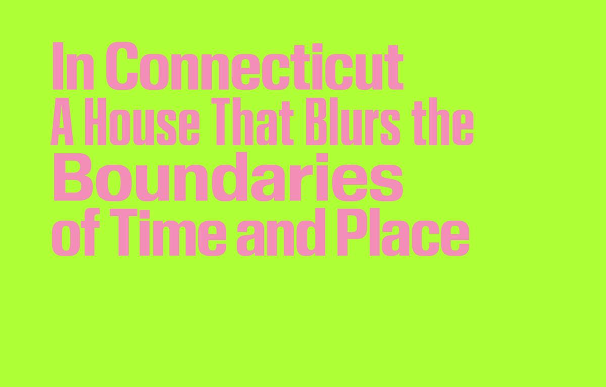
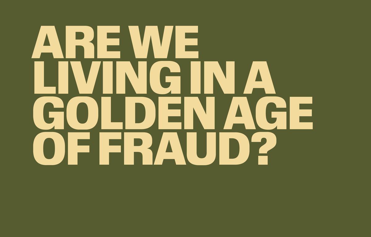
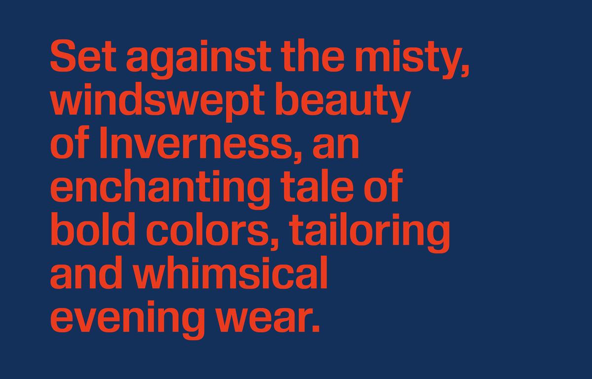
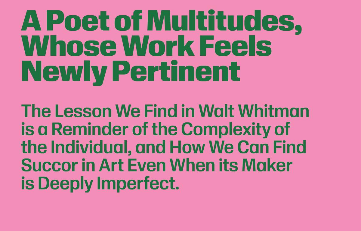
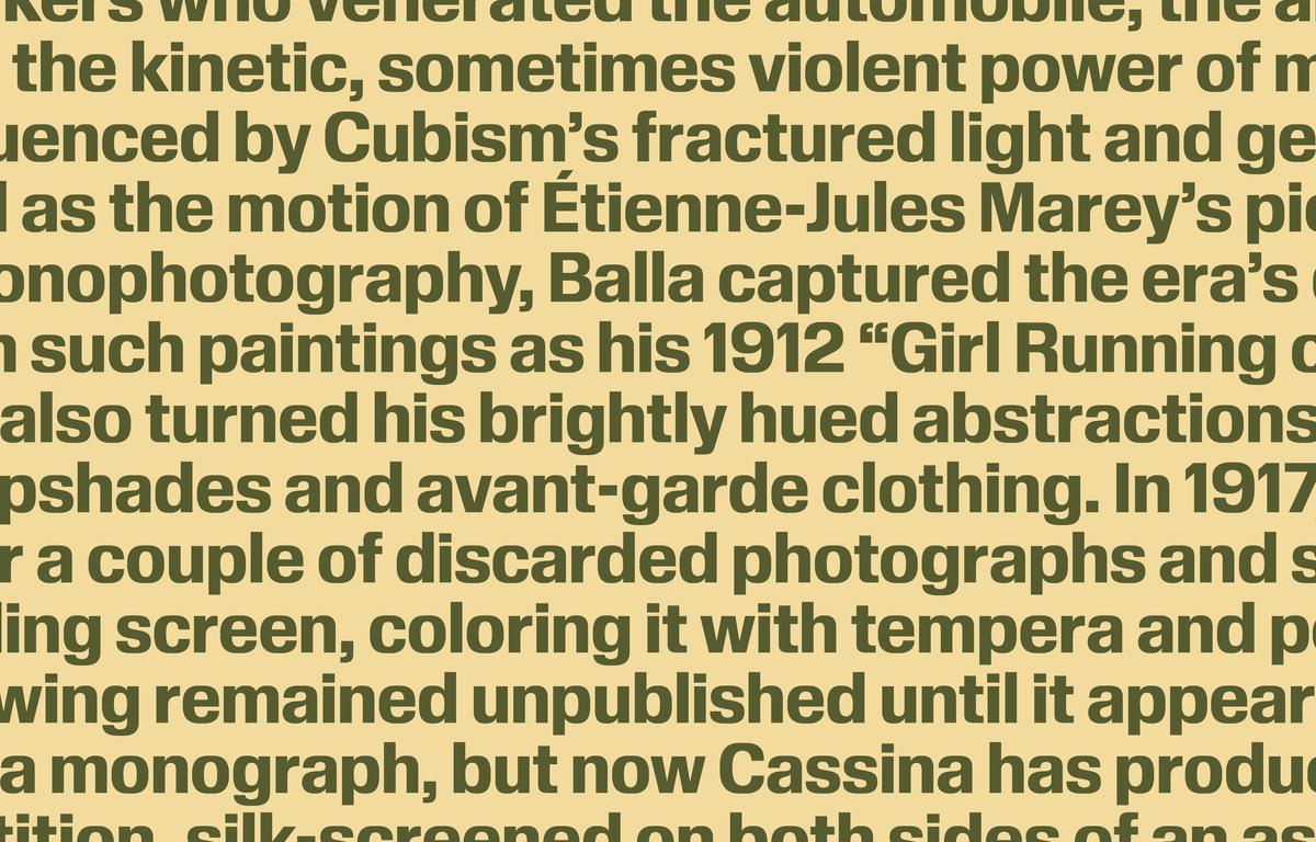
Review’s compact descenders and absent overshoots facilitate tight setting both horizontally and vertically, yielding strong horizontal bands of text that evoke ribbons of embossing tape without getting mired in nostalgia. This effect is especially striking with Review Poster. Dense walls of letterforms produce a dramatic text image while remaining comfortably legible and readable thanks to the typeface’s ample counters and high x-height.
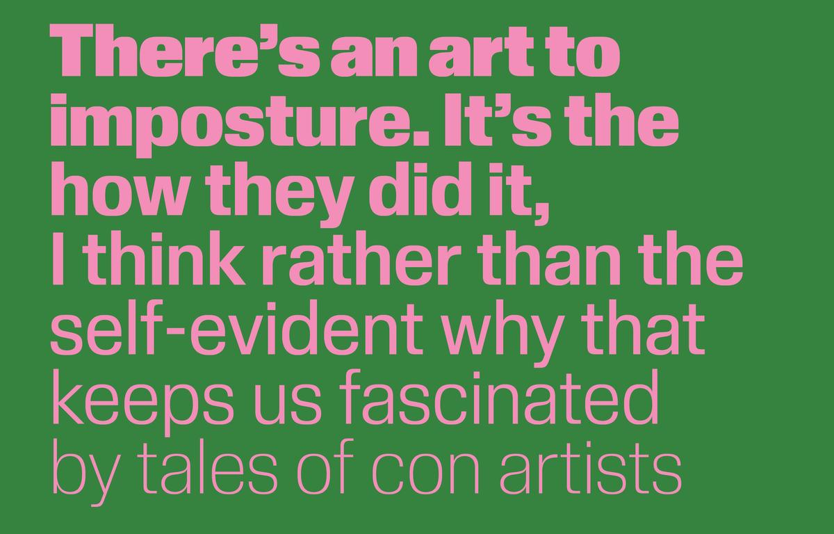
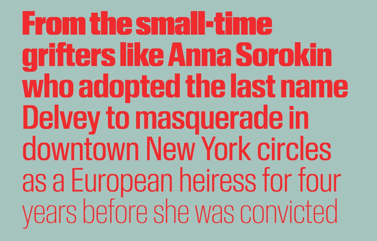
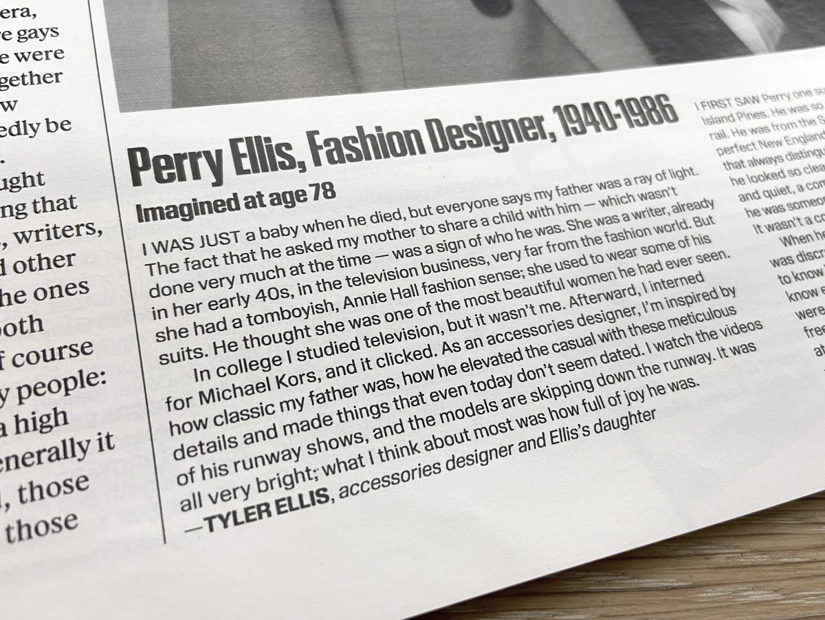
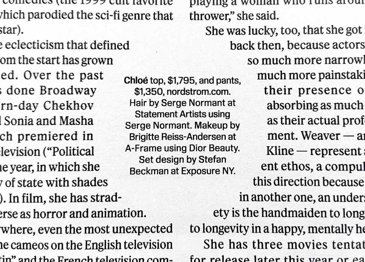
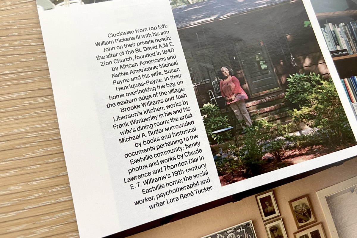
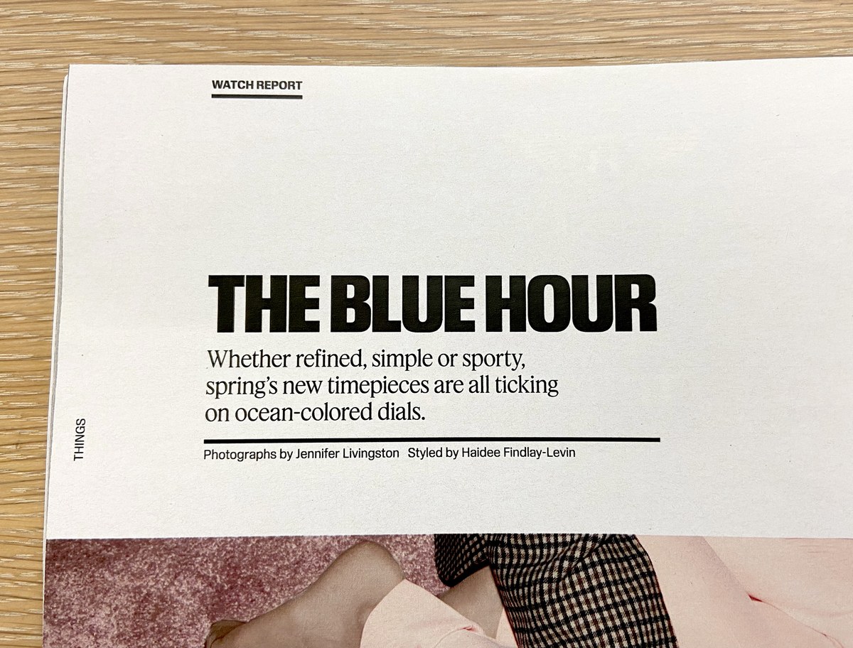
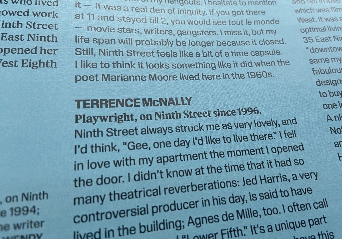
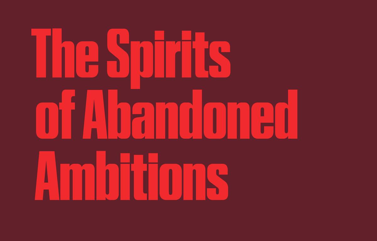
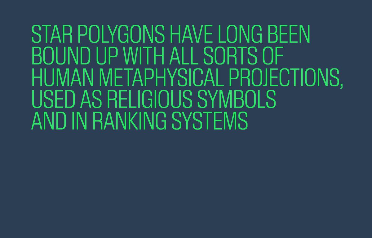
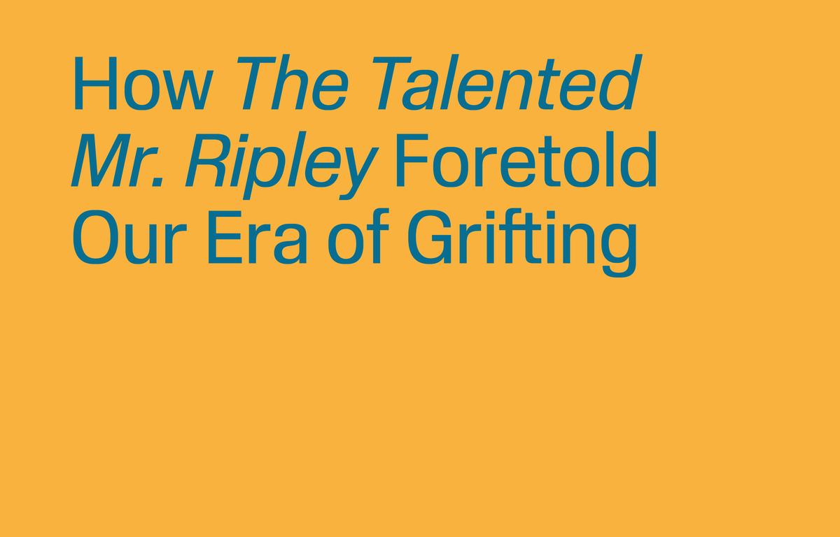
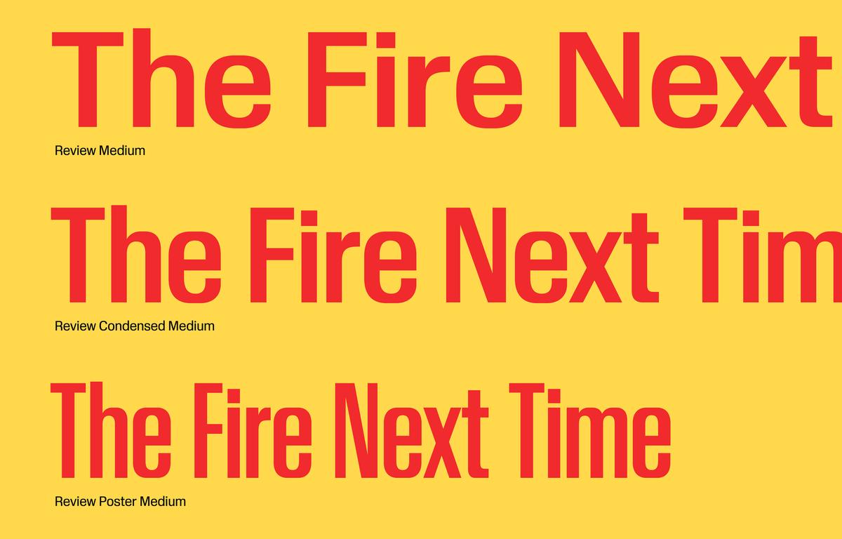
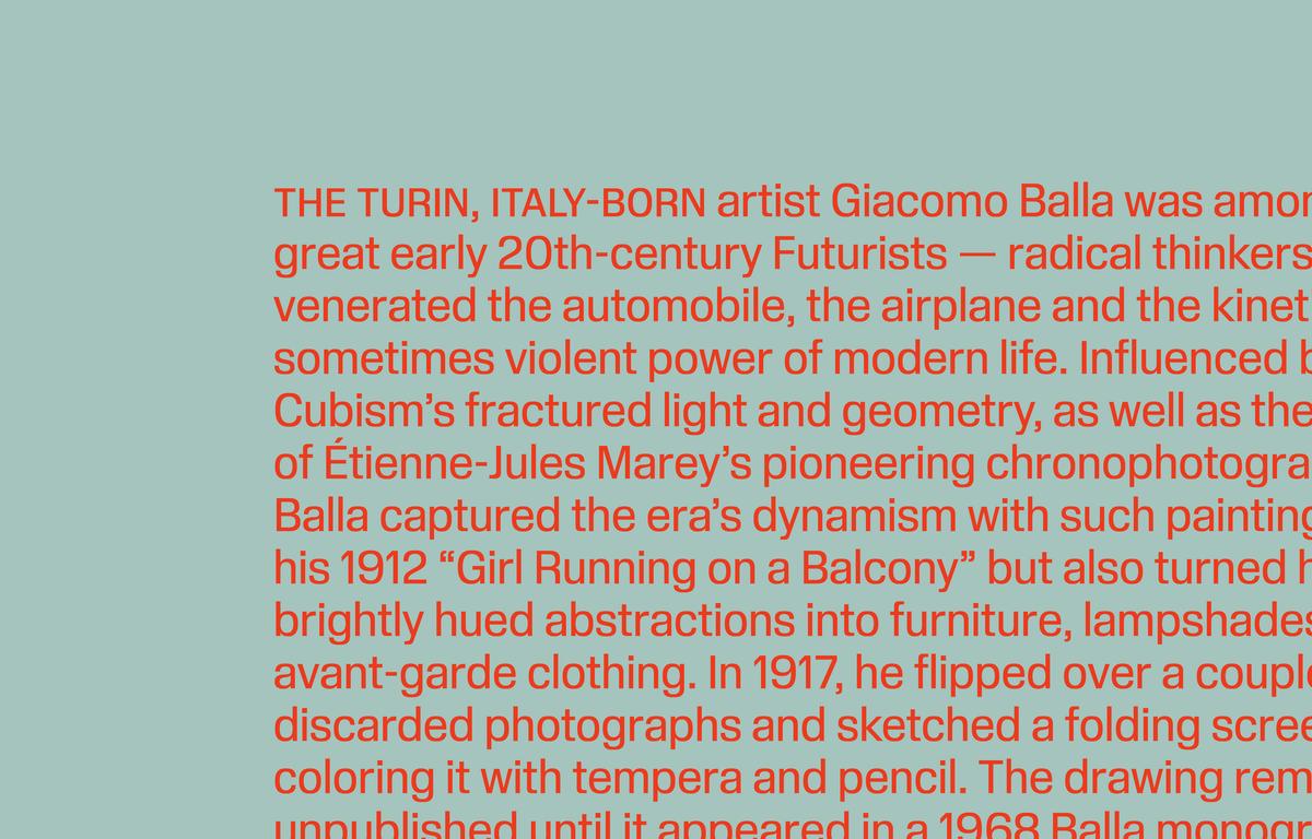
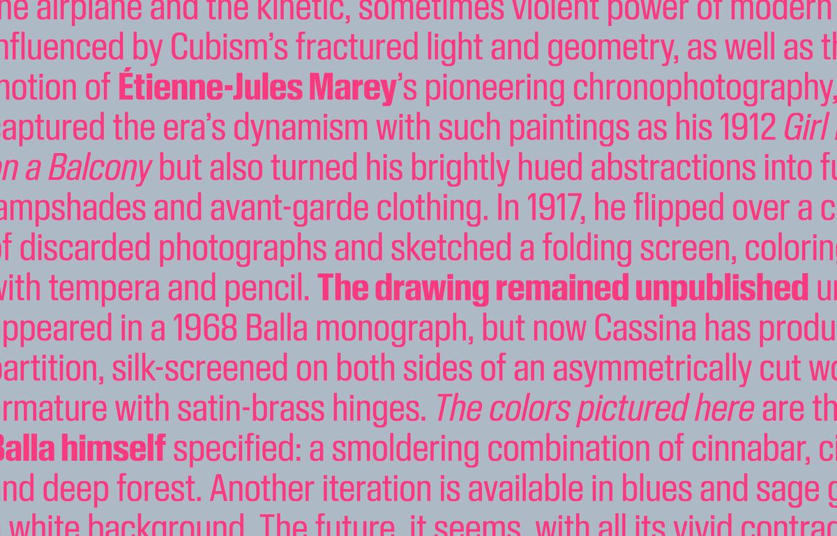
The more general-purpose Review and Review Condensed can be used at a wide variety of scales, from headlines and larger applications down to caption text and microcopy. Open counters and the typeface’s general horizontal vibe promote readability, even at tiny sizes. Set small, the lack of overshoots is only subtly perceptible, and in fact creates a lively rhythm. It works because of Review’s overall squarishness, which preserves some mass near the baseline, x-height, and cap height.
When space is at a premium, as with captions and labels, the condensed cut is a smart choice. Tracked out and generously leaded, the regular width performs well as running text; the productive tension between round and blunt shapes adds bounce without being jarring. All three cuts of Review come with an array of useful alternates, including round dots, which modulate the typeface’s overarching squareness with a softer element. The regular width comes with small caps.
Having proven itself in a demanding editorial context with a global distribution, Review is now available to the public. With help from Tim Ripper, Hasebe has expanded all three families to seven weights, from Thin to Black. Review makes you look, and look again. It provides a flexible palette for editorial work, but is also ready to move beyond pages and screens to the built environment: museum walls, building facades, supergraphics, signage, projections.
