Kaiser and Zizou for Fast Company
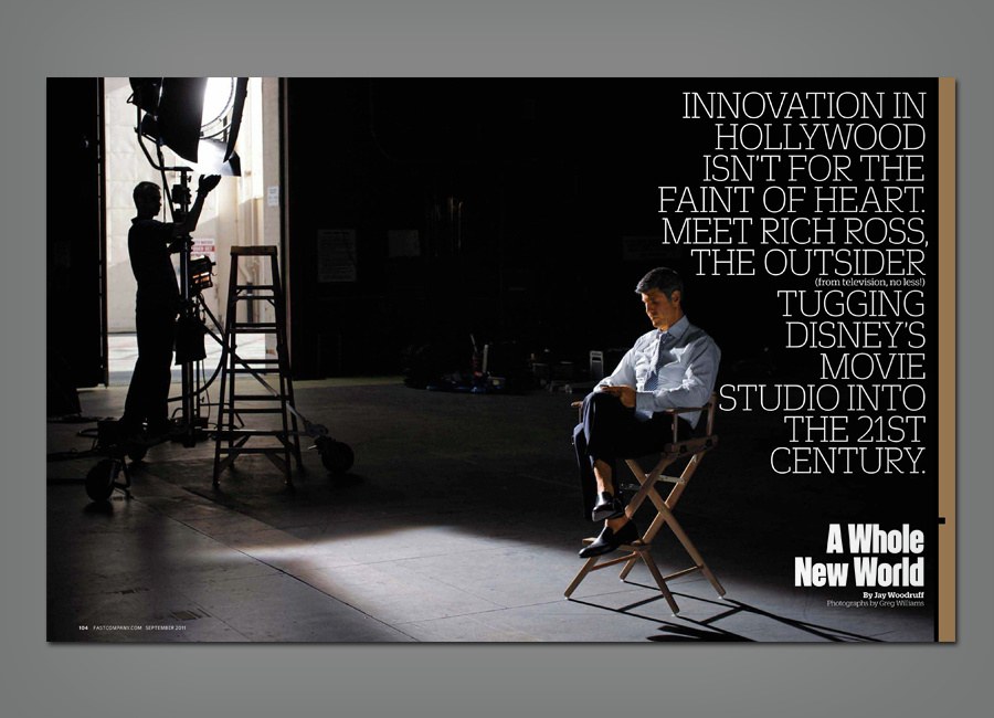
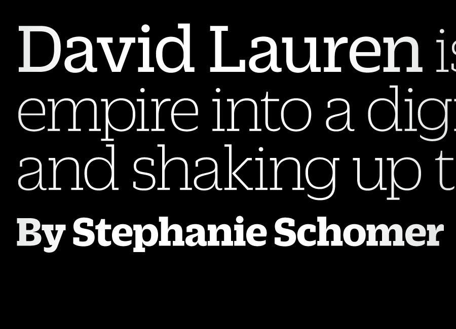
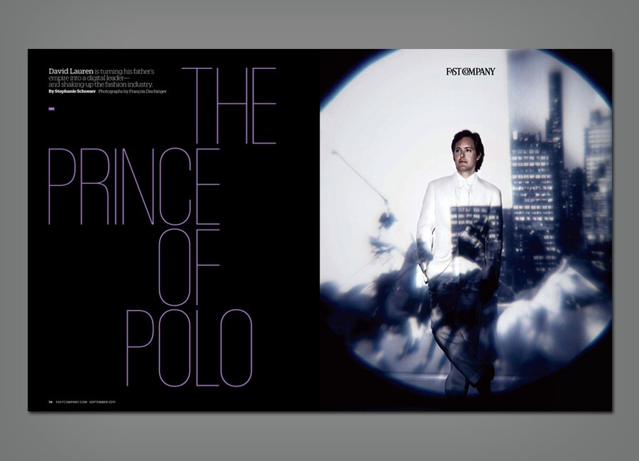
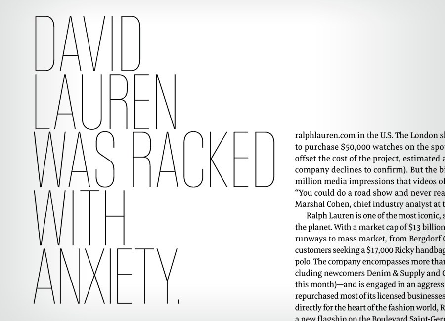
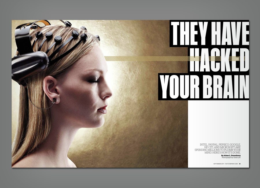
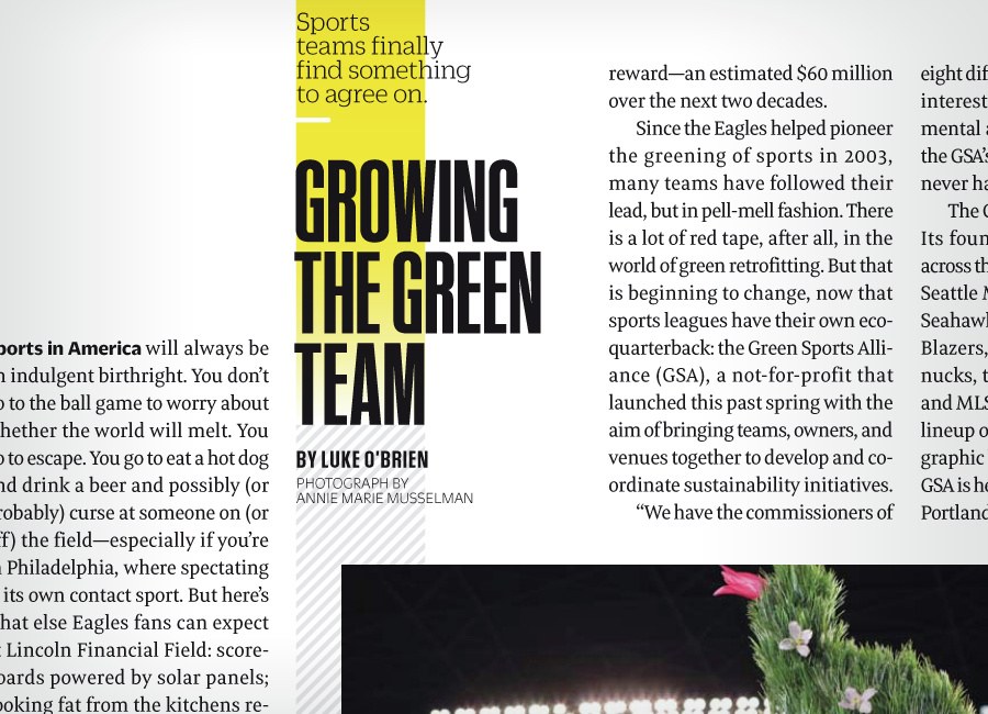
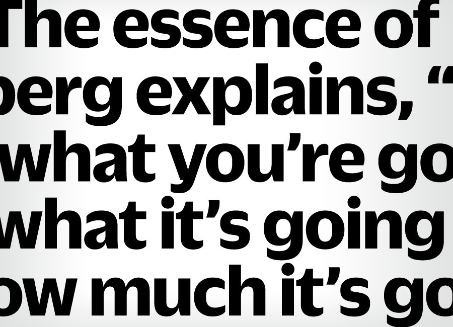
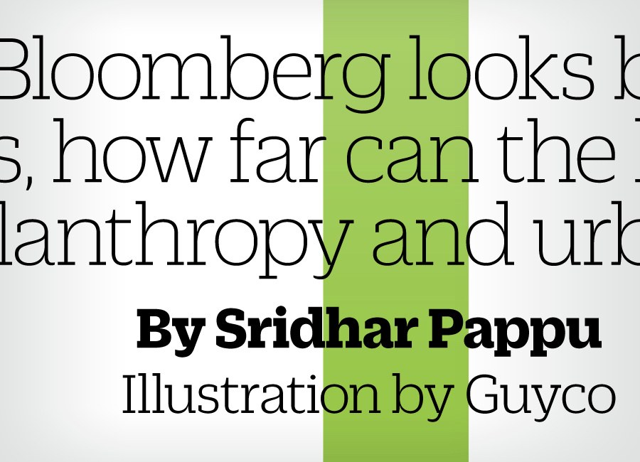
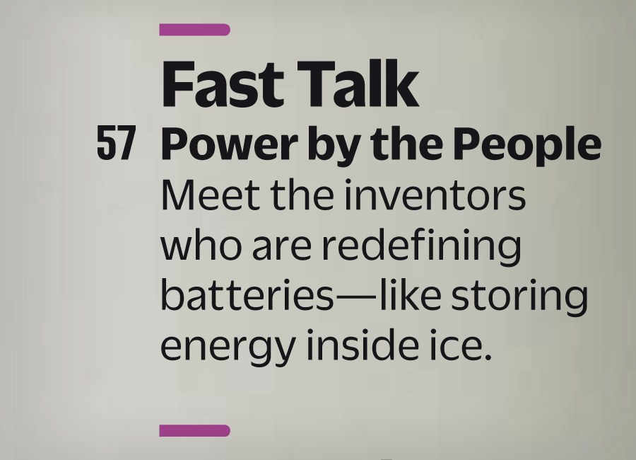
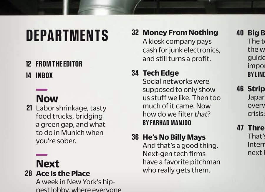
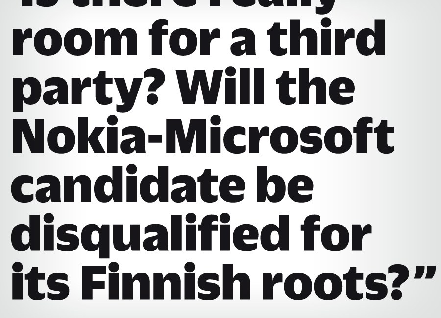
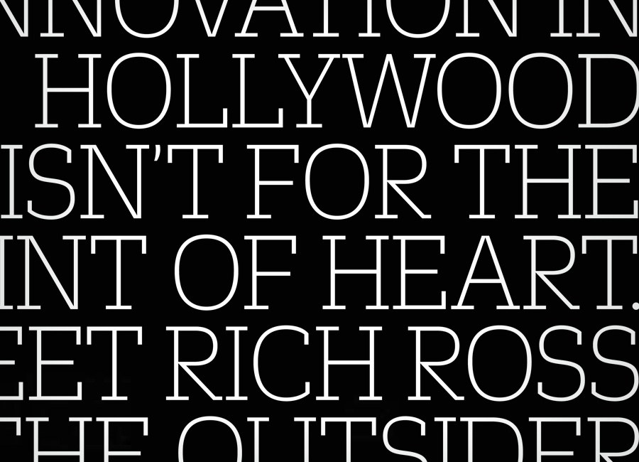
The September 2011 issue of Fast Company is the latest step in a redesign by creative director Florian Bachleda, with Alice Alves and Ted Keller, introducing three new typeface families from Commercial Type: Kaiser, Zizou Sans, and Zizou Slab. Edit: For unforseen legal reasons, Zizou was renamed to Duplicate for release, and is available to the general public as of December 2013.
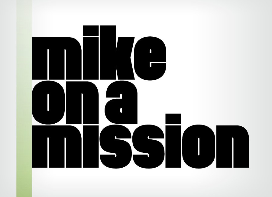
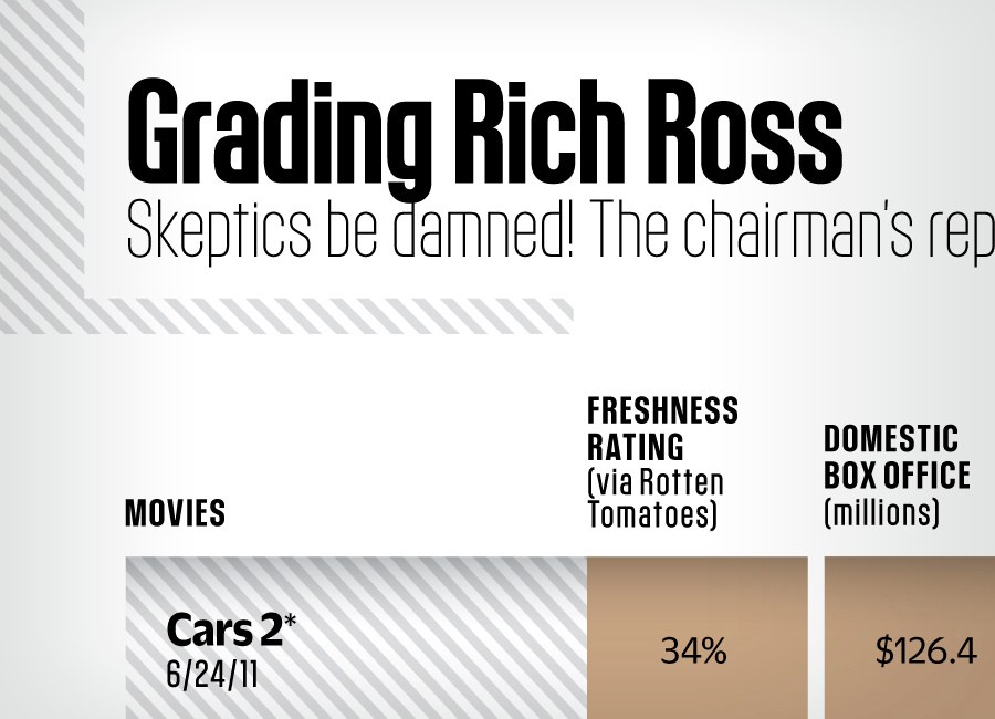
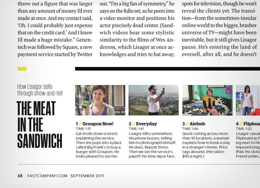
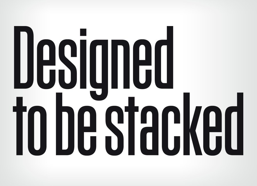
Kaiser, a condensed sans serif in 3 widths designed by Vincent Chan, is used for display and is the primary typeface on the cover. Insipred by 1920s and 30s-era German display typefaces, it is characterized by tight and regular spacing, and by a highly simplified lowercase. Zizou Sans originally began as Christian Schwartz’s attempt to draw Antique Olive from memory, but ended up with its own distinct personality. Zizou Slab takes a straightforward approach in adapting these forms into a slab serif, resulting in a simple, personable and compact slab serif. These two families are used at a wide range of point sizes for headlines, captions, sidebars and info graphics throughout the magazine.
Rounding out the type palette is Meret, originally designed as Nils Thomsen’s degree project at Type]Media in The Hague. This family has been released by OurType. Section head lettering in the front of book section by Simon Page.
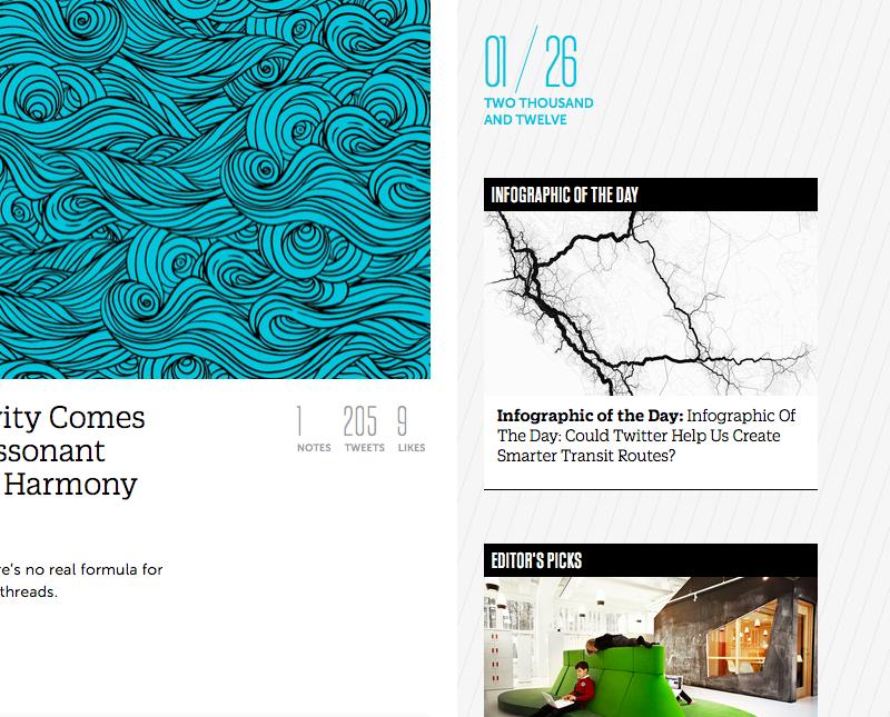
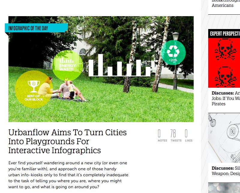
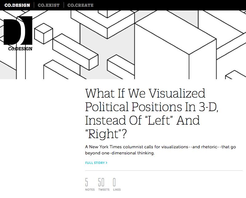
In January 2012, fastcodesign.com launched a redesign by Simple.Honest.Work using a selection of styles from the Kaiser and Zizou families to help extend the feel of the print magazine to the web. These styles were carefully hinted to ensure that they would be attractive and readable on all browsers.
