Corridor by Tim Ripper for the MIT Alumni association

Serendipity sometimes plays a crucial role in bringing together designer and client to provide the impetus for completing unfinished sketches. Such was the case with Corridor, a custom typeface drawn by Tim Ripper for Pentagram’s 2021 rebrand of the MIT Alumni Association.
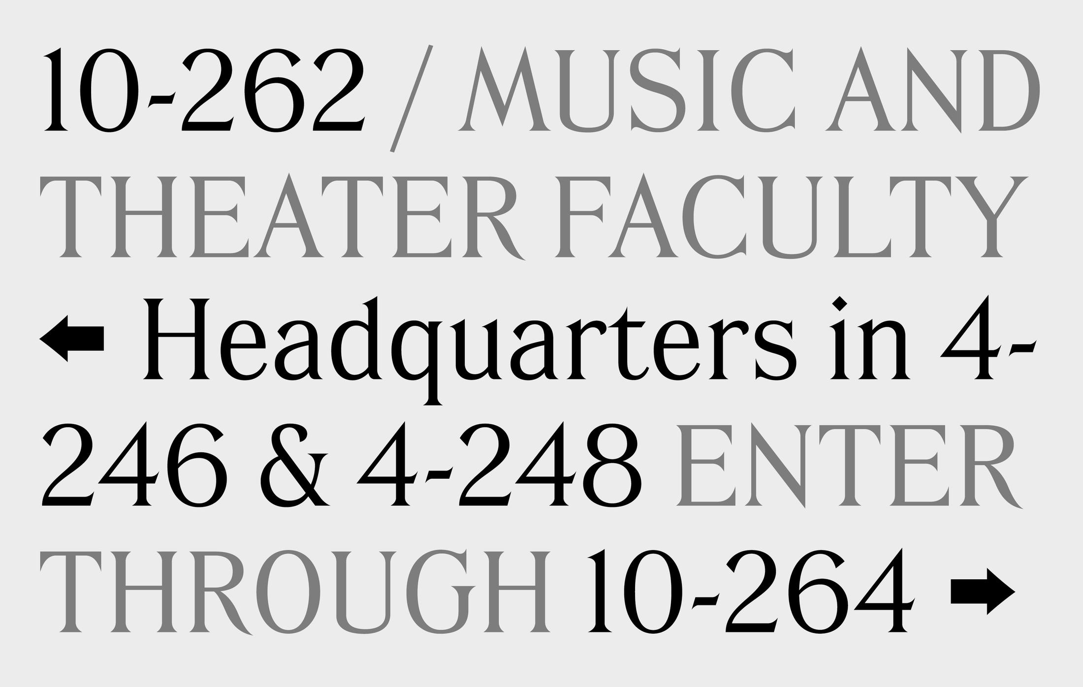
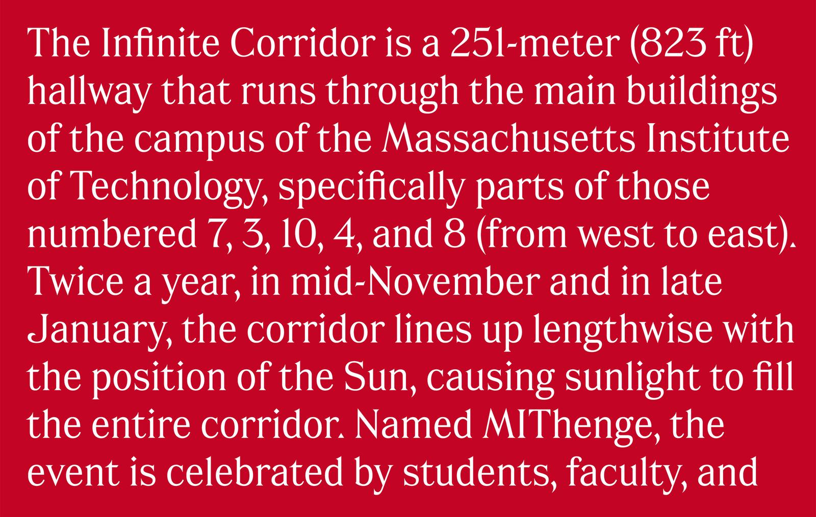
Corridor is a digital interpretation of the lettering work of Glenn Silva, whose hand-painted signage has been displayed for nearly three decades along the “Infinite Corridor” through MIT’s main campus. Michael Bierut’s team at Pentagram, working with the Alumni Association on the rebrand, felt Silva’s lettering perfectly embodied the creative traditions of the institution, and proposed developing it into a typeface for the brand identity.
Coincidentally, Ripper had also become fascinated by Silva’s work after exploring the MIT campus and documenting the unexpected profusion of hand-drawn signage. While first studying type design in 2013, Ripper sketched a typeface based on these letterforms. However, the project lay unfinished until a mutual friend showed it to designer Sachi Chandiramani from Bierut’s team, who drafted a branding direction using a beta version of the font. The Alumni Association was enthusiastic about Pentagram’s proposal and gave the go-ahead to officially complete and license Corridor.

Silva continues the tradition of a long line of artists who have hand-lettered the Institute’s signage for over a century. According to him, the MIT sign painters all preserved the same essential lettering style over the years, while each adding their own individual touches. As current keeper of the flame, Silva’s letters are steeped in an unmistakably Beaux-Arts flavor like the original 1916 buildings they inhabit. However, unlike printing types of that era, they are also shaped by virtue of being drawn to fit certain spaces and, frequently, to modify pre-existing signage text in situ. Over time, this creates a unique palimpsest of lettering from different eras with subtly differing proportions and styles.

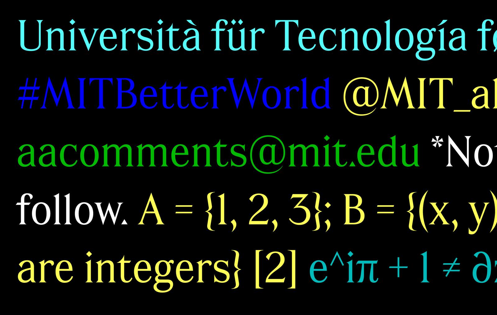
In drawing Corridor, Ripper embraced the subtle chaos of the MIT lettering as a governing principle, rather than an inconsistency to smooth over. Where a typeface might normally use similarly shaped terminals—such as the lowercase a, f, j, r, and y—Corridor mixes different shapes, all culled from samples of Silva’s (and perhaps other painters’) lettering. Similarly, Ripper avoided over-refining the proportions of the distinctive uppercase, which tend towards a modular width and favor rational construction. He also employed this geometric approach, mixed with the calligraphic logic of Silva’s brushwork, to extend the character set with a full complement of punctuation, diacritics, and symbols not found in the original signage.
Pentagram’s rebrand pairs Corridor with Christian Schwartz’s revival of Neue Haas Grotesk in a nod to the Modernist graphic design notably innovated by Muriel Cooper and Jacqueline Casey at MIT Press and the MIT Media Lab. Together, the two typefaces express a dichotomy central to the identity of MIT’s alums: the value of both cutting-edge advancement and idiosyncratic tradition.
More about Glenn Silva and his lettering work at MIT can be found at MIT News.