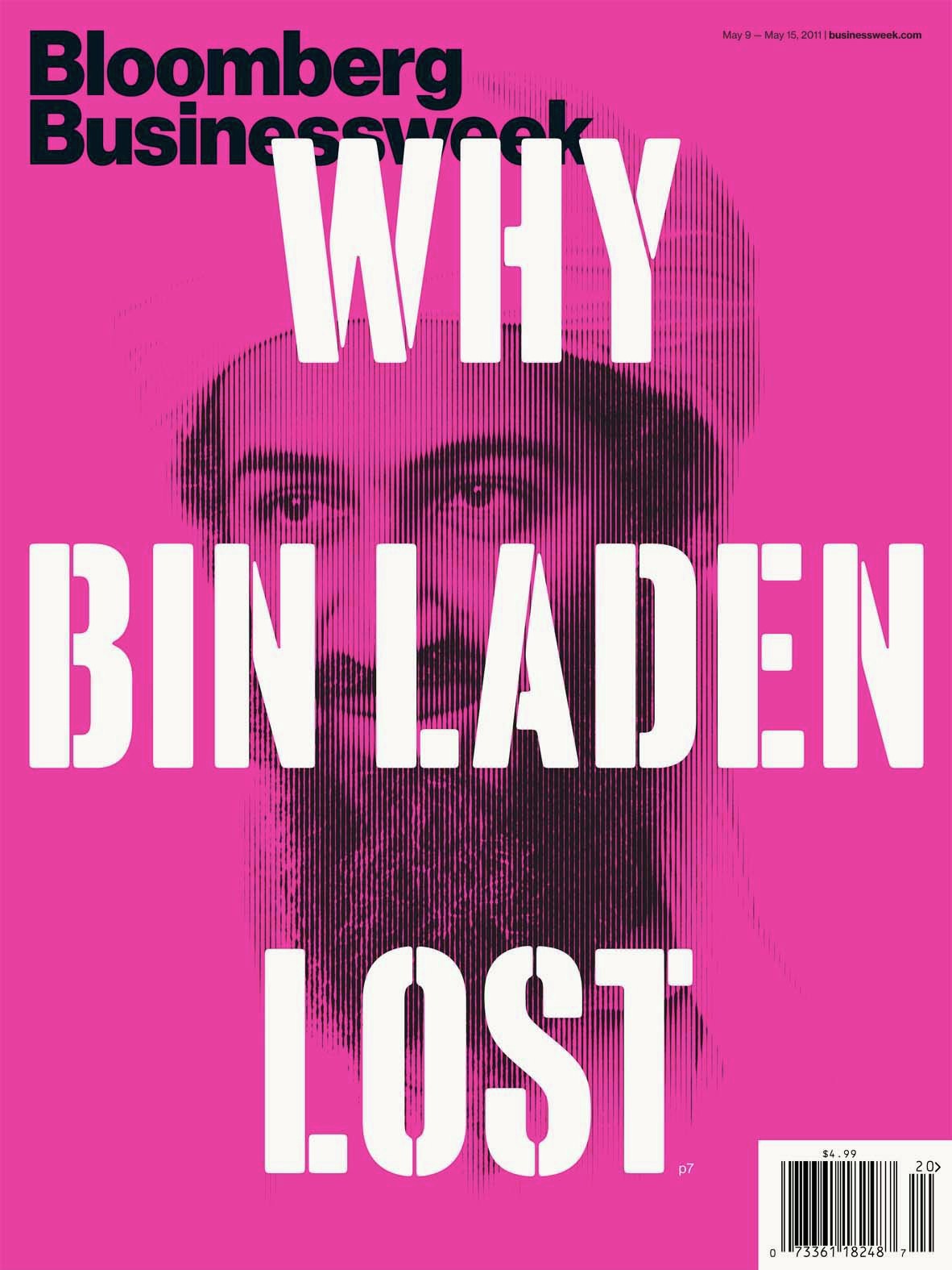
Lettering and typefaces for Bloomberg Businessweek
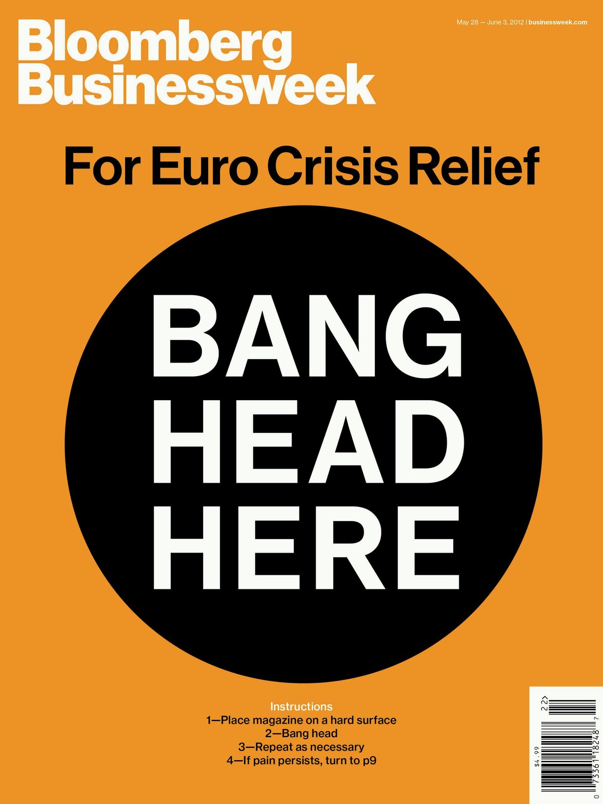
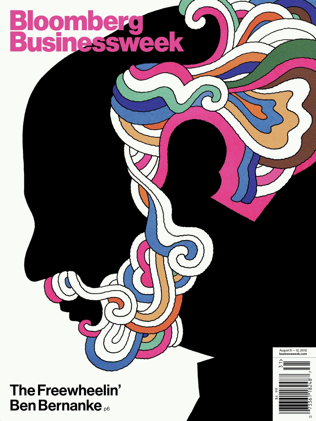
In 2010, BusinessWeek relaunched as Bloomberg Businessweek under editor Josh Tyrangiel and creative director Richard Turley with a redesign that was polarizing – and misunderstood – at first, but soon came to make the magazine one of the most influential and talked about pieces of editorial design of its era.
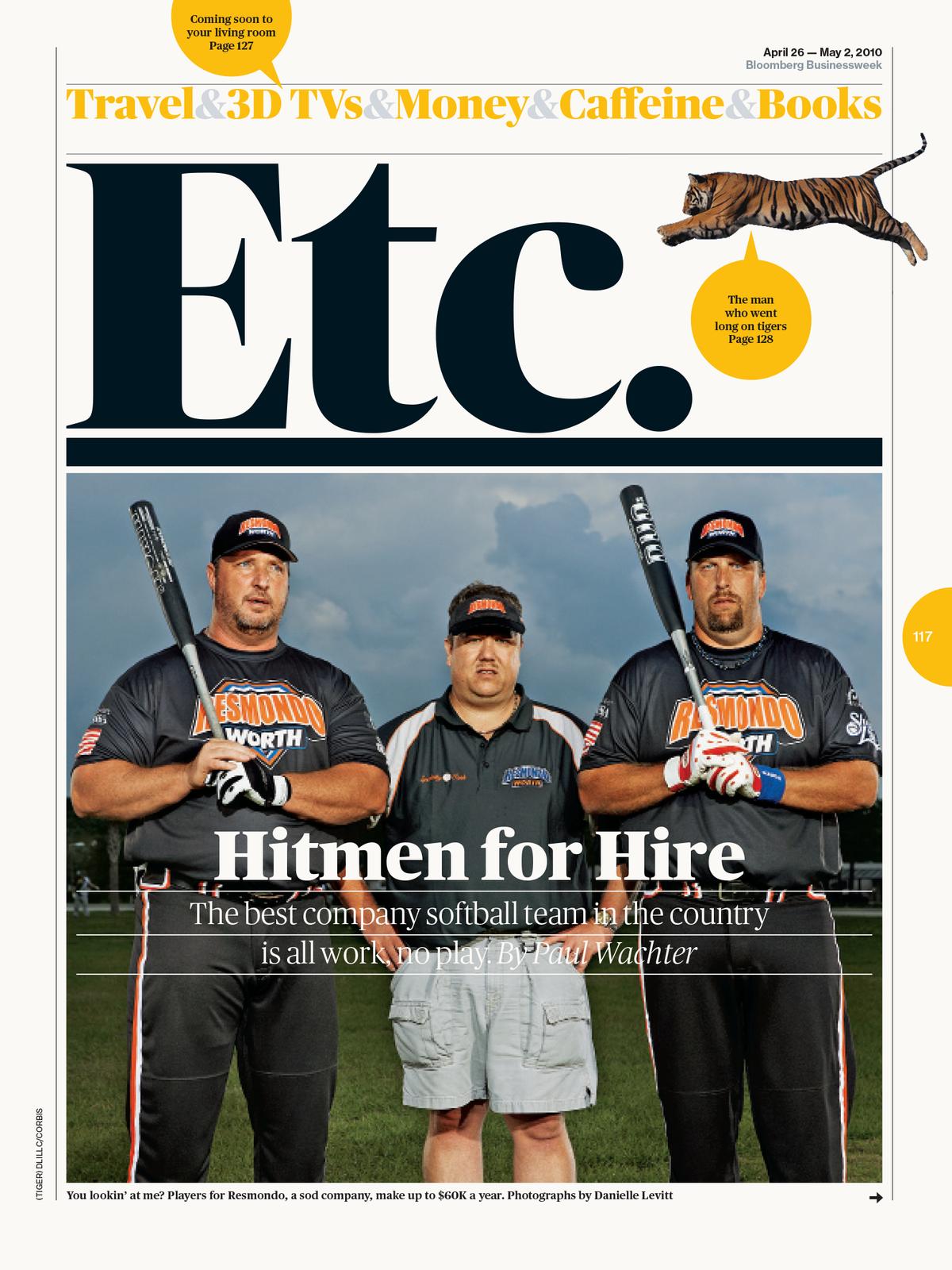
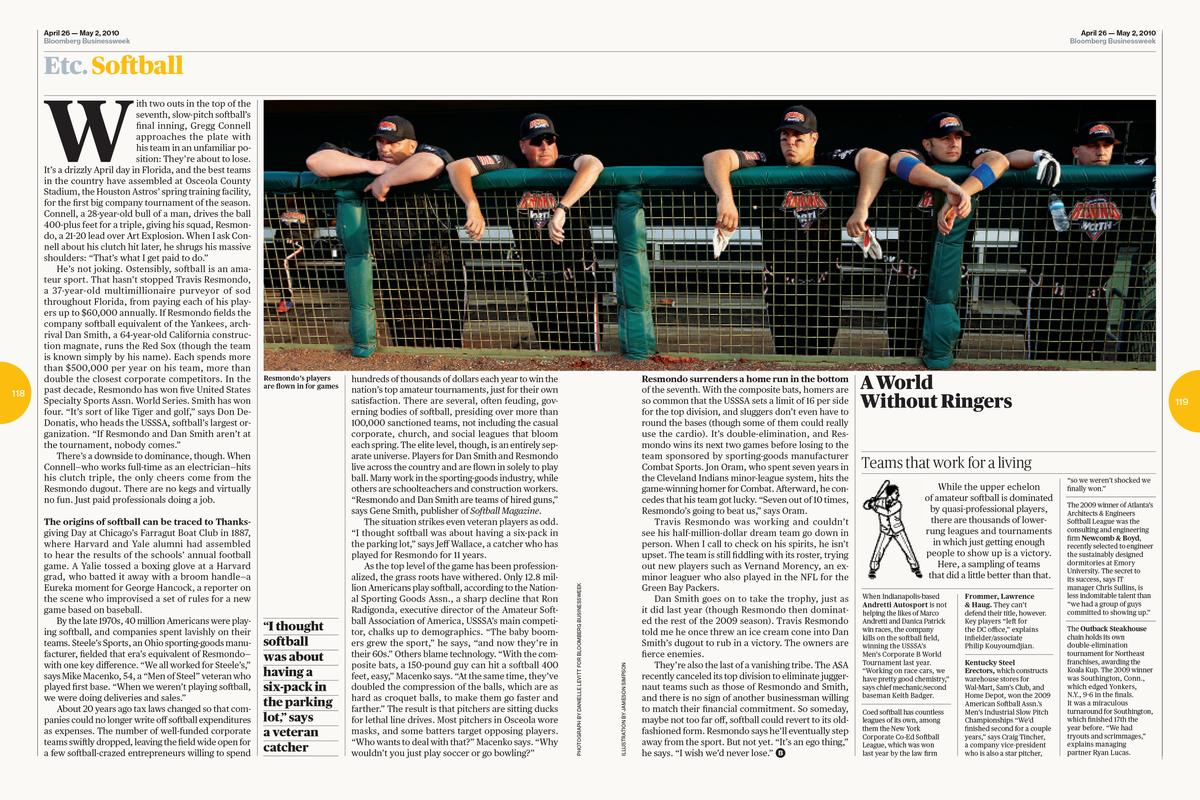
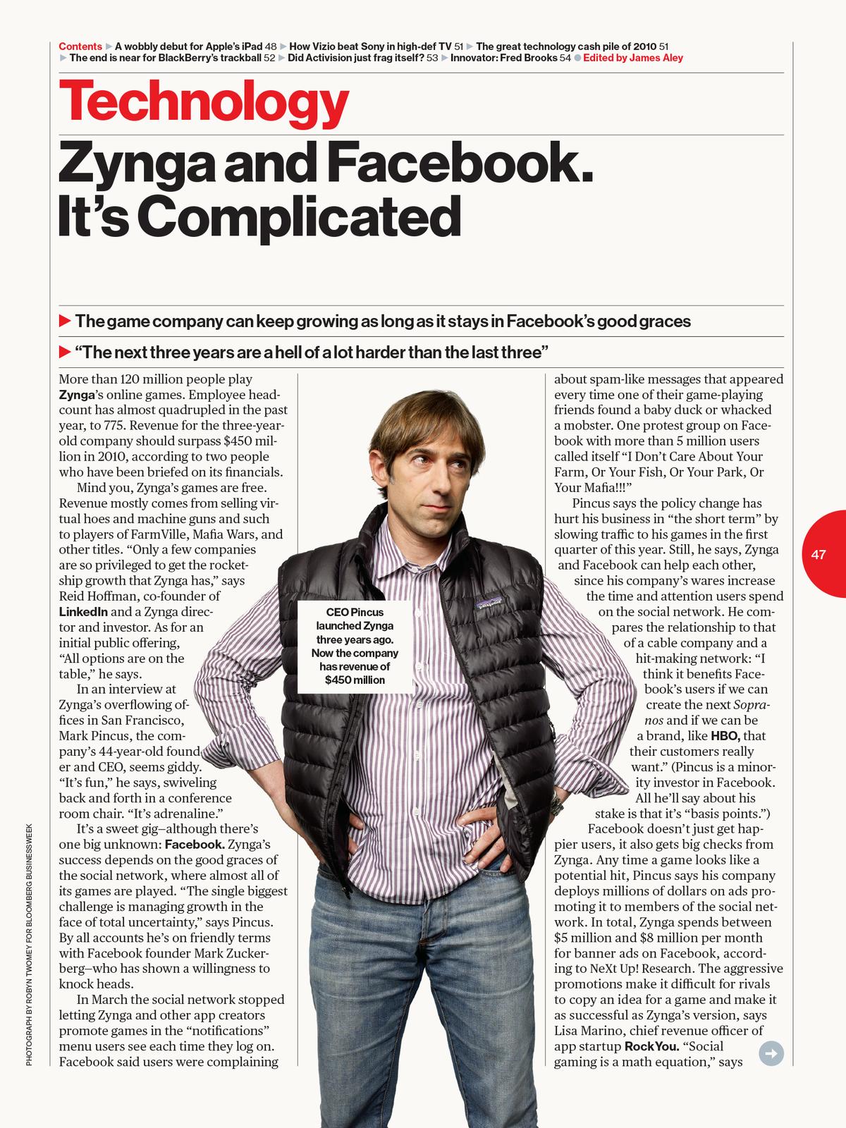
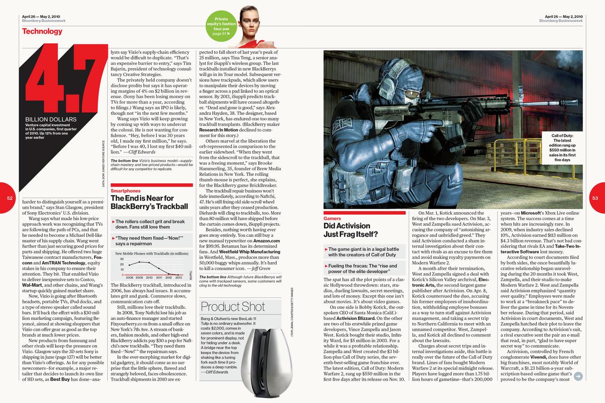
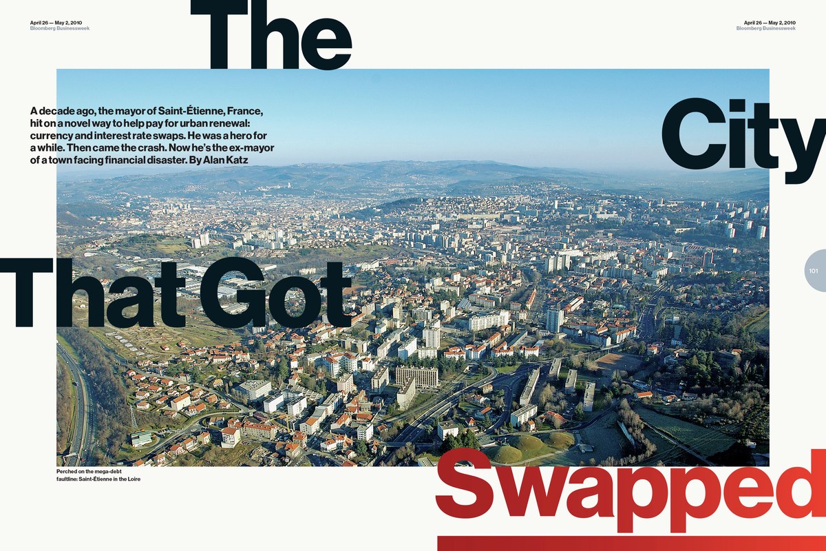
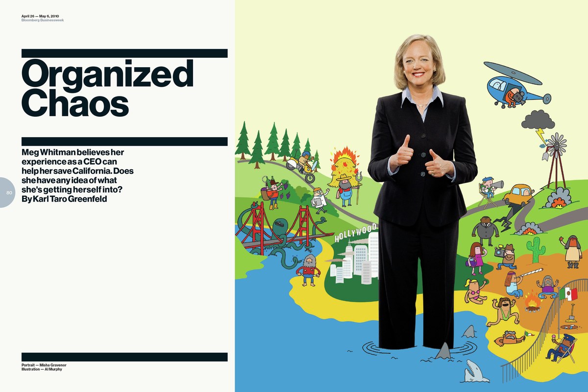
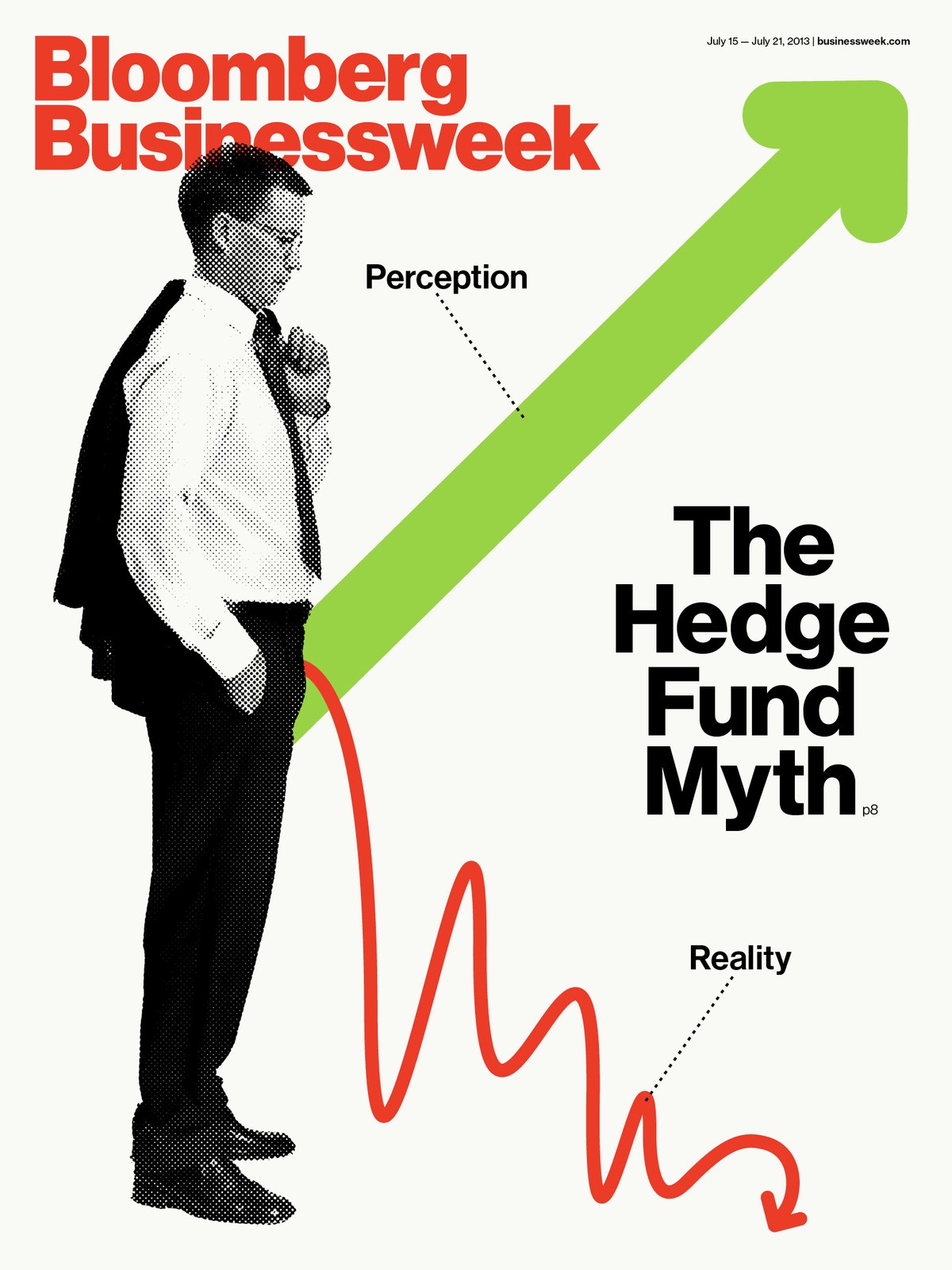
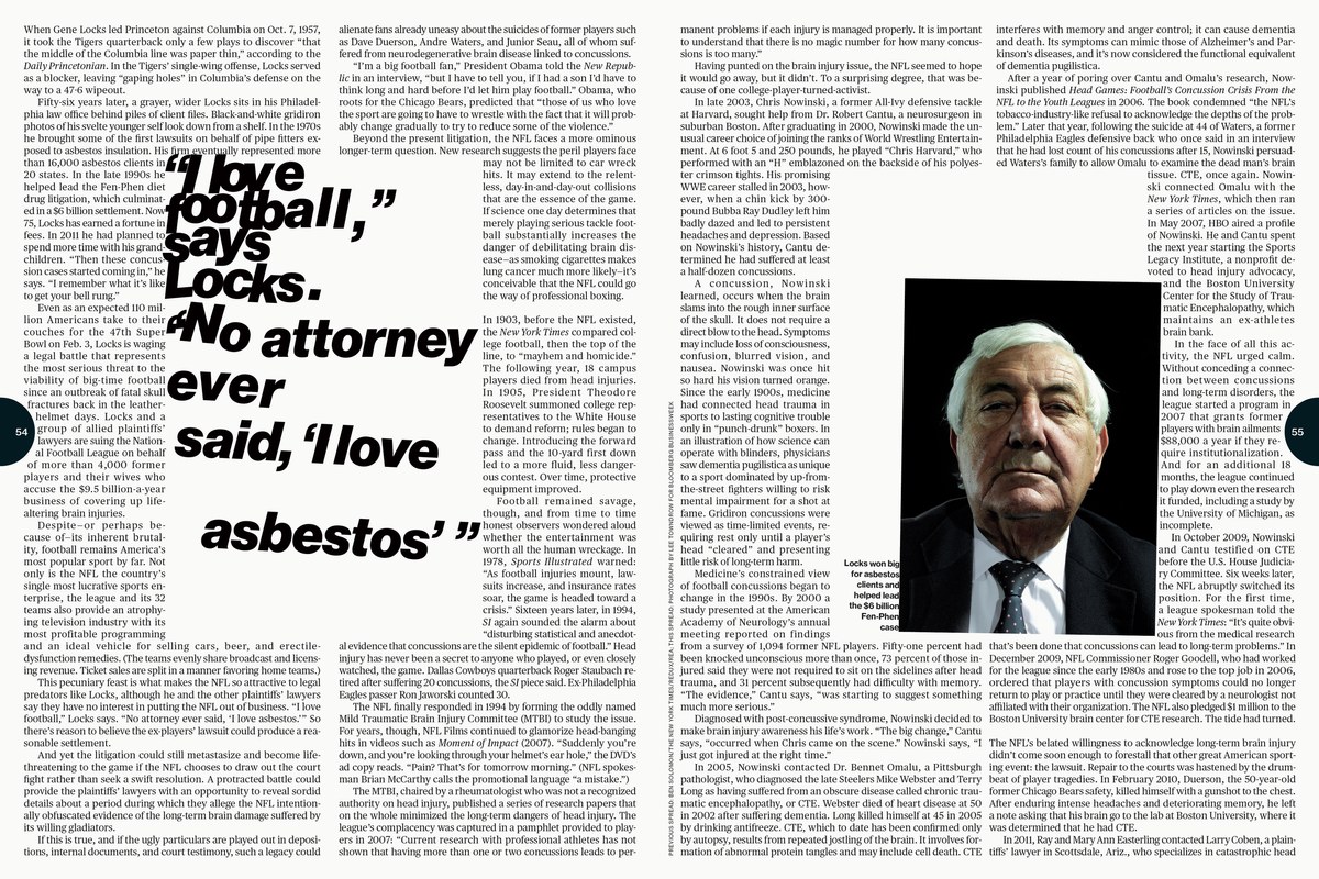
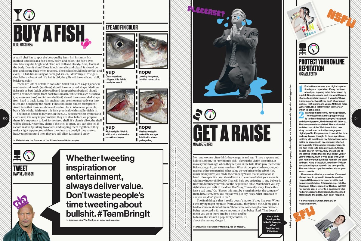
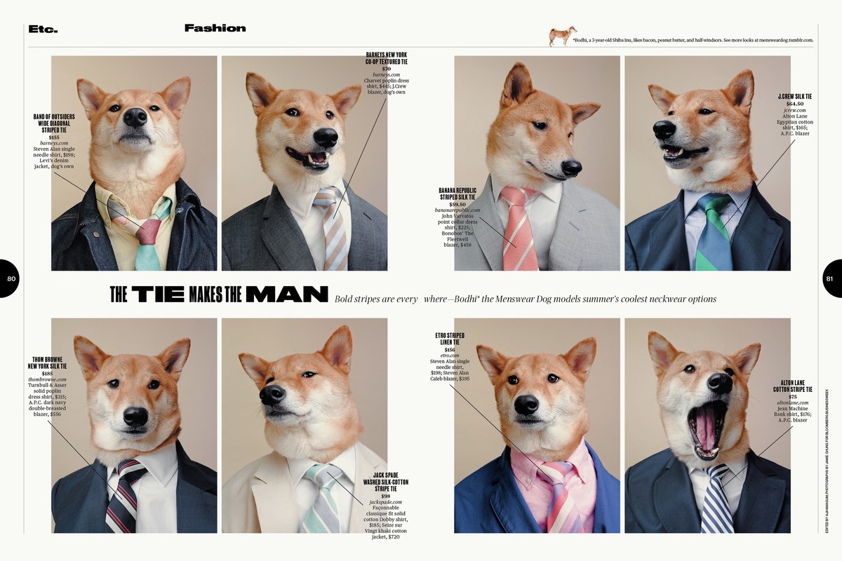
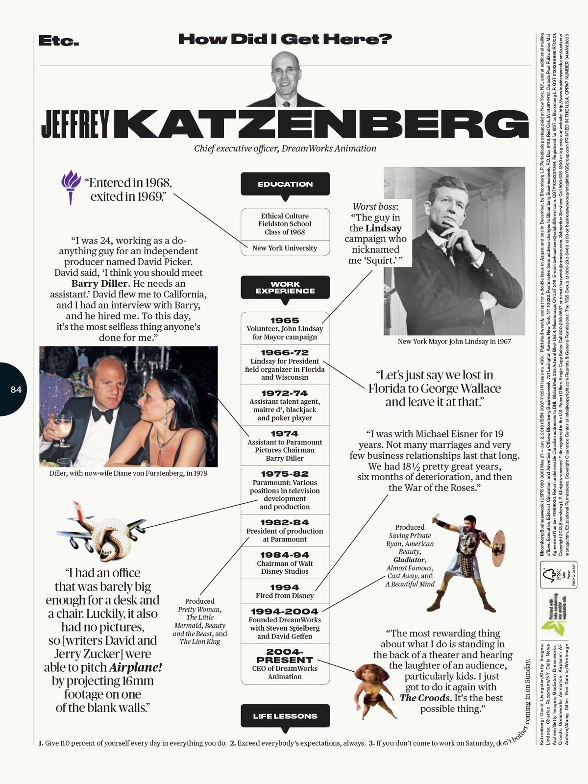
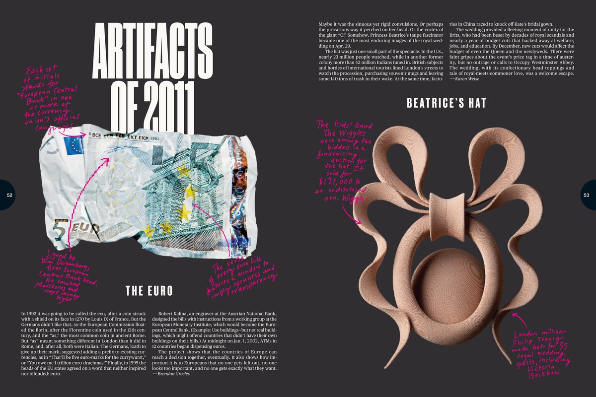
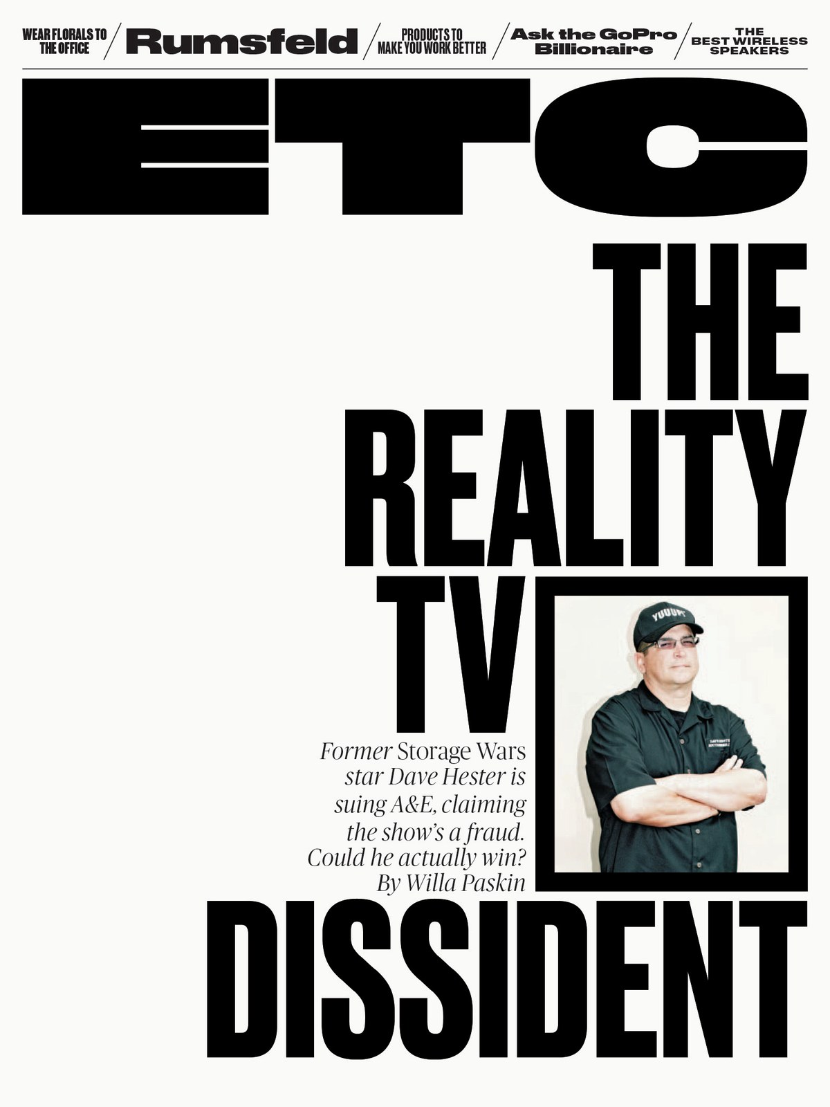
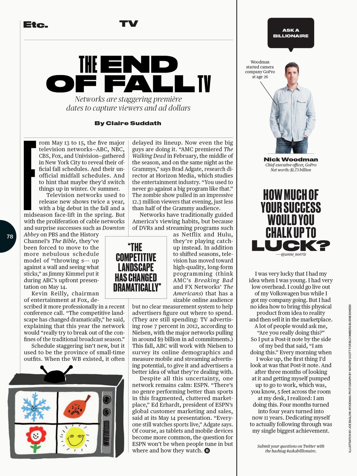
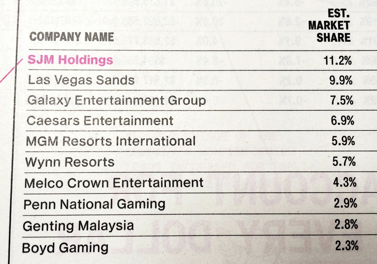
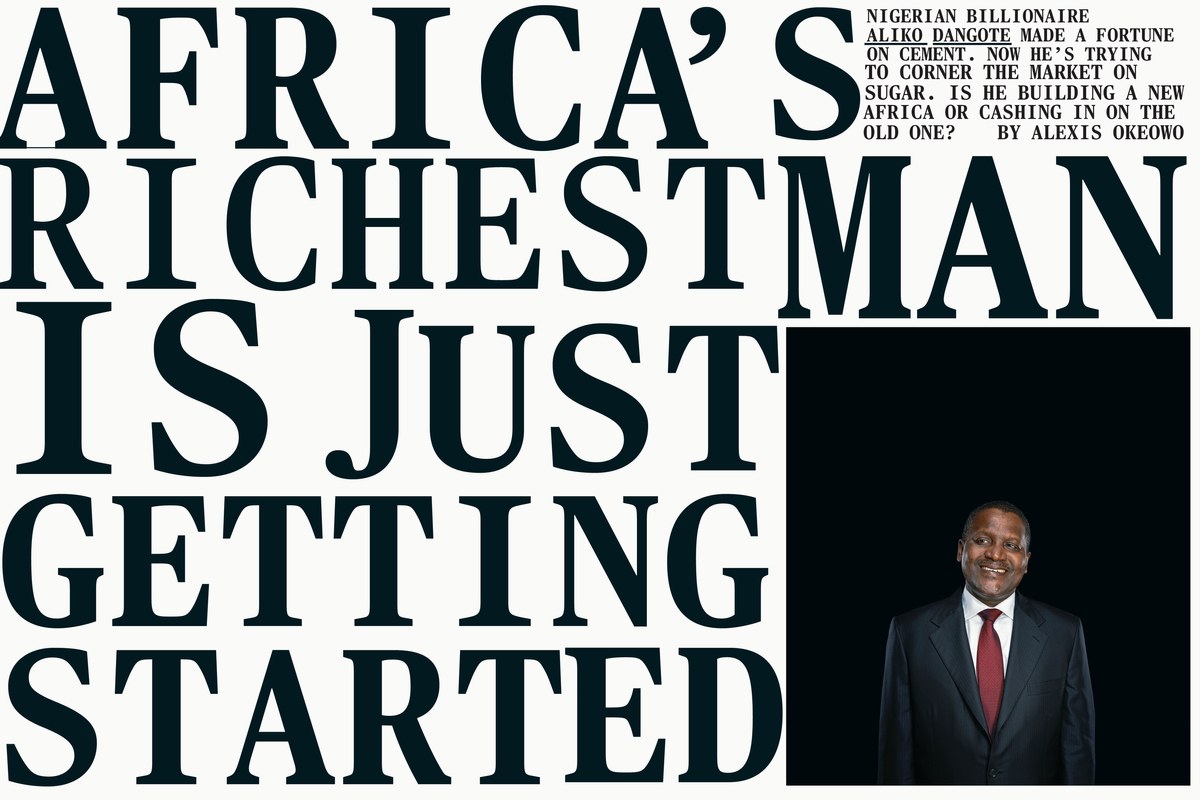
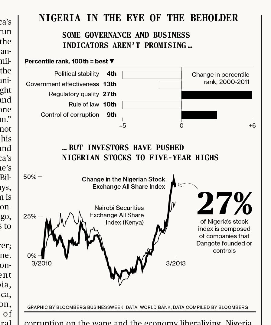
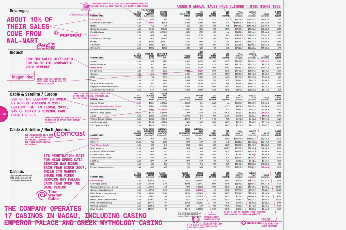
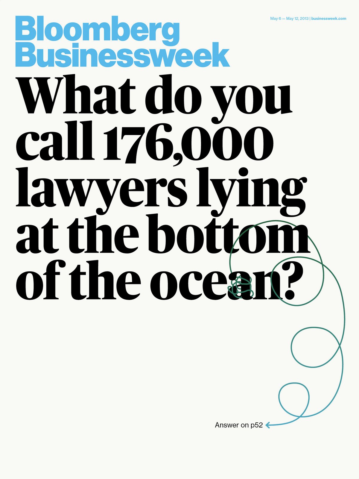
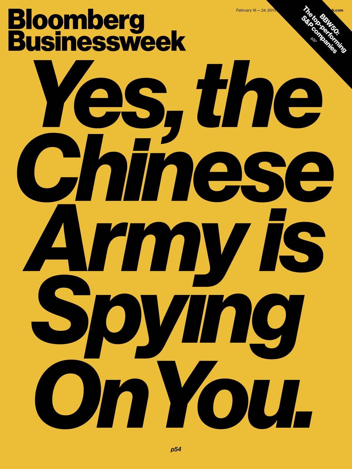
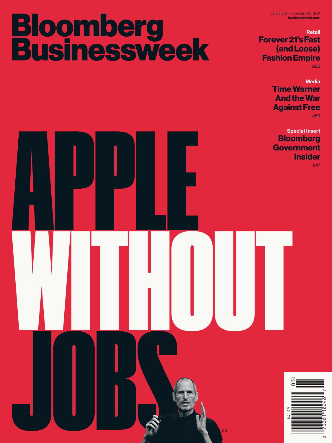
Turley enlisted Christian Schwartz to finish the painstakingly faithful digital revival of Max Miedinger's original Neue Haas Grotesk, which had been commissioned but not ultimately used by The Guardian in 2004. Christian Schwartz and Berton Hasebe completed and expanded the family, reviving Meidinger's italics and adding lighter weights than he might have imagined possible. Hasebe also designed several sets of display-only condensed numerals, used as an accent throughout the magazine. Publico completed the typographic palette, used as text throughout and for display in the Etc section in the back of book. The pages of Bloomberg Businessweek were built on a precise grid, and intricately structured so that a “layer of chaos on top” would add to the storytelling rather than disrupting the flow of each issue.
An incredible team of designers worked on the magazine during this period: we worked most often with Tracy Ma, Rob Vargas, Jennifer Daniel, and Cynthia Hoffman, in addition to Richard Turley.
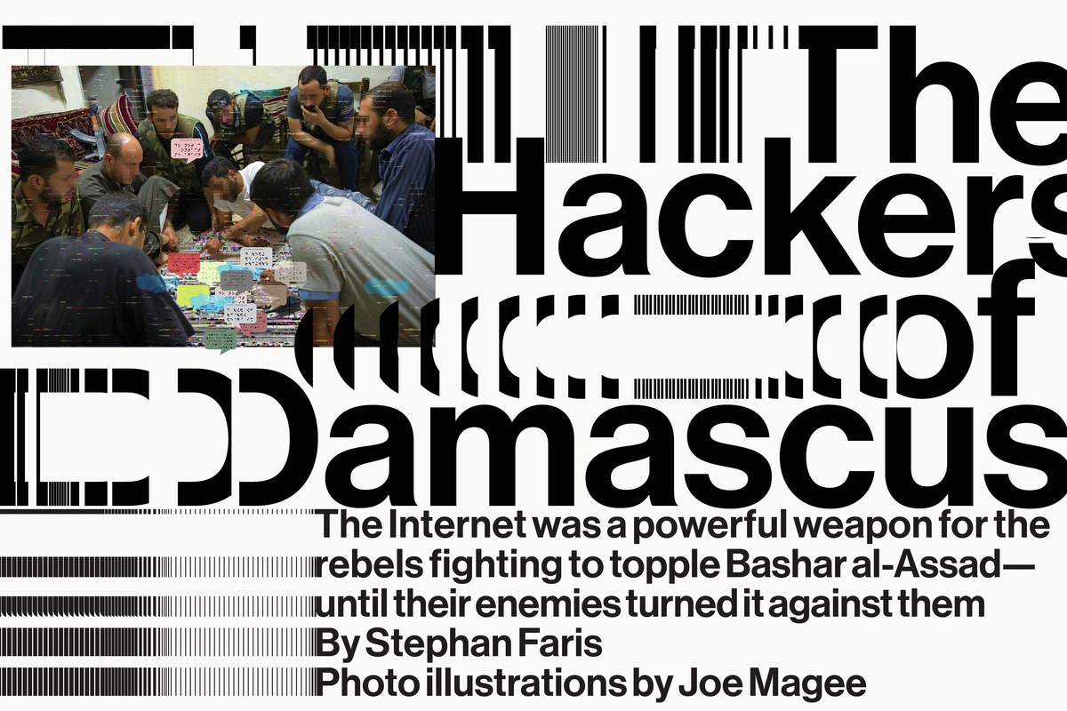
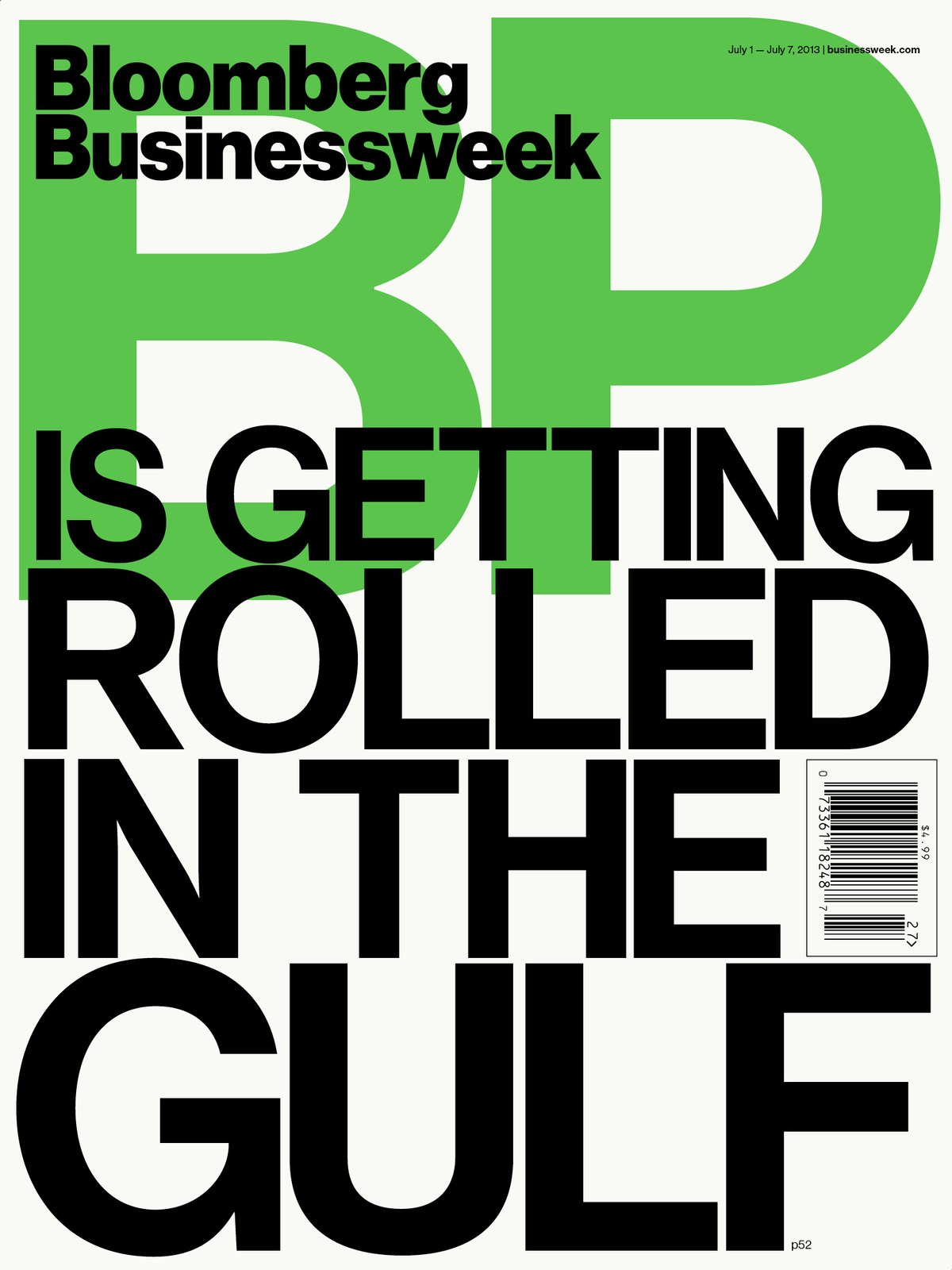
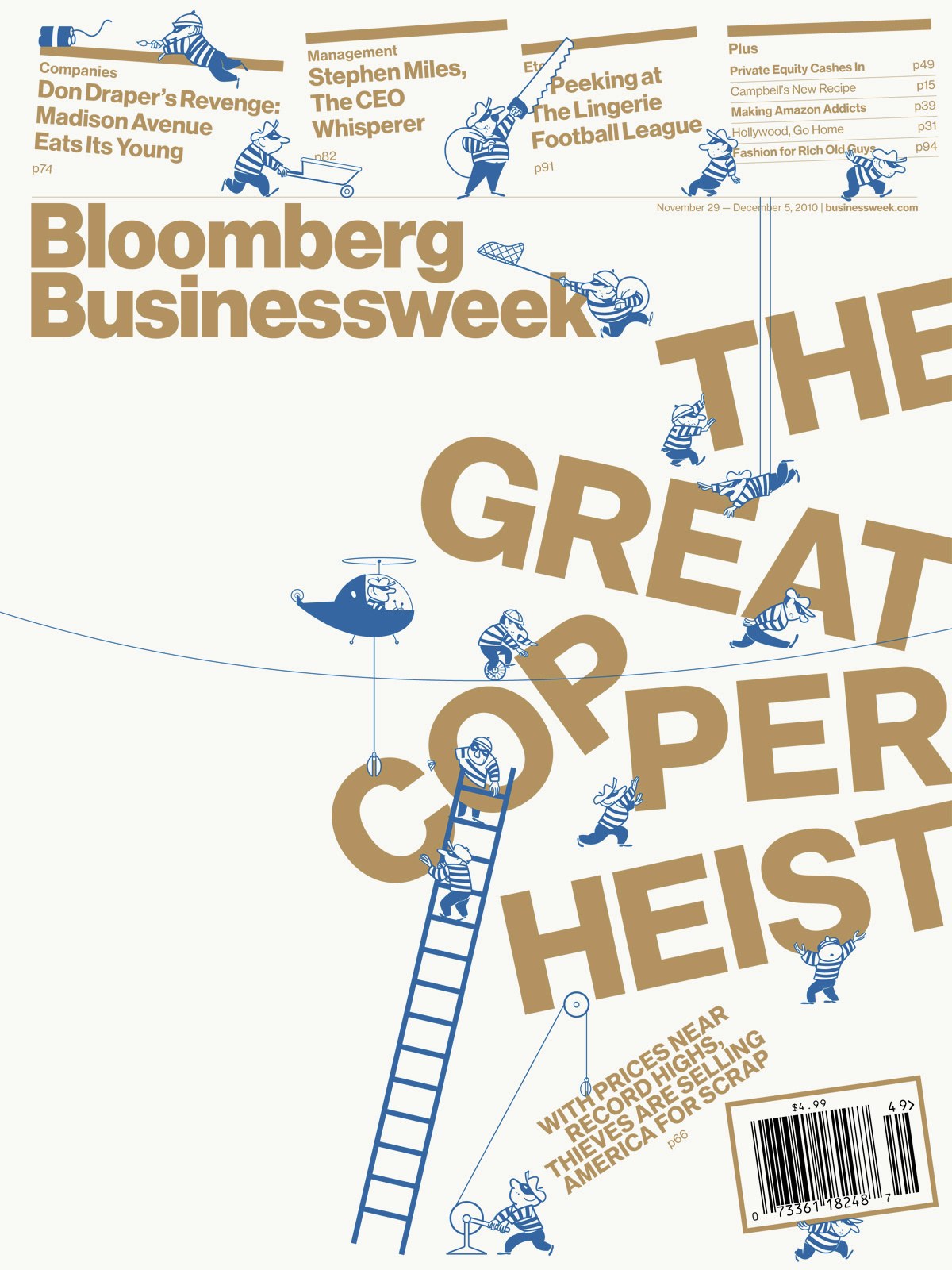
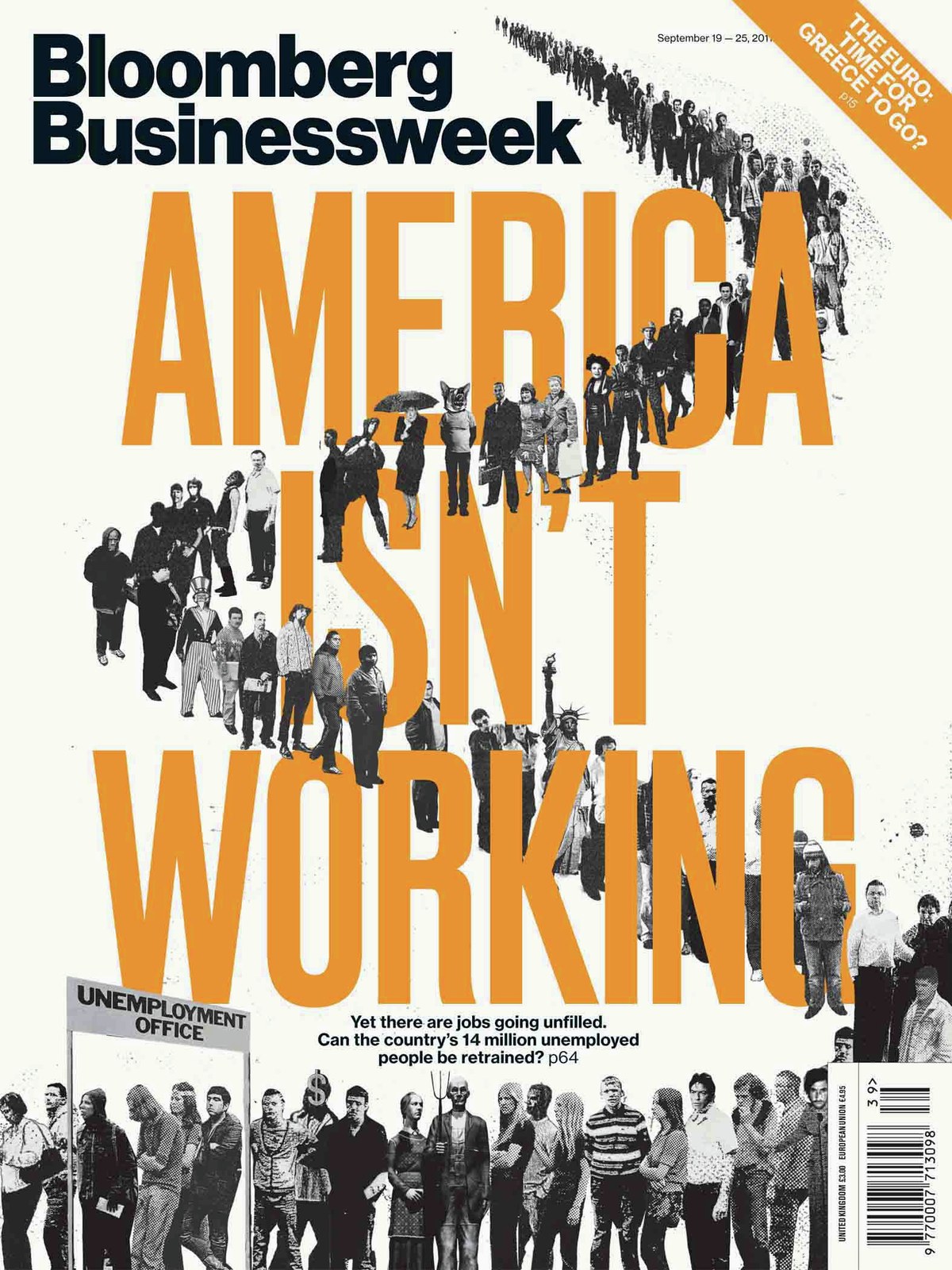
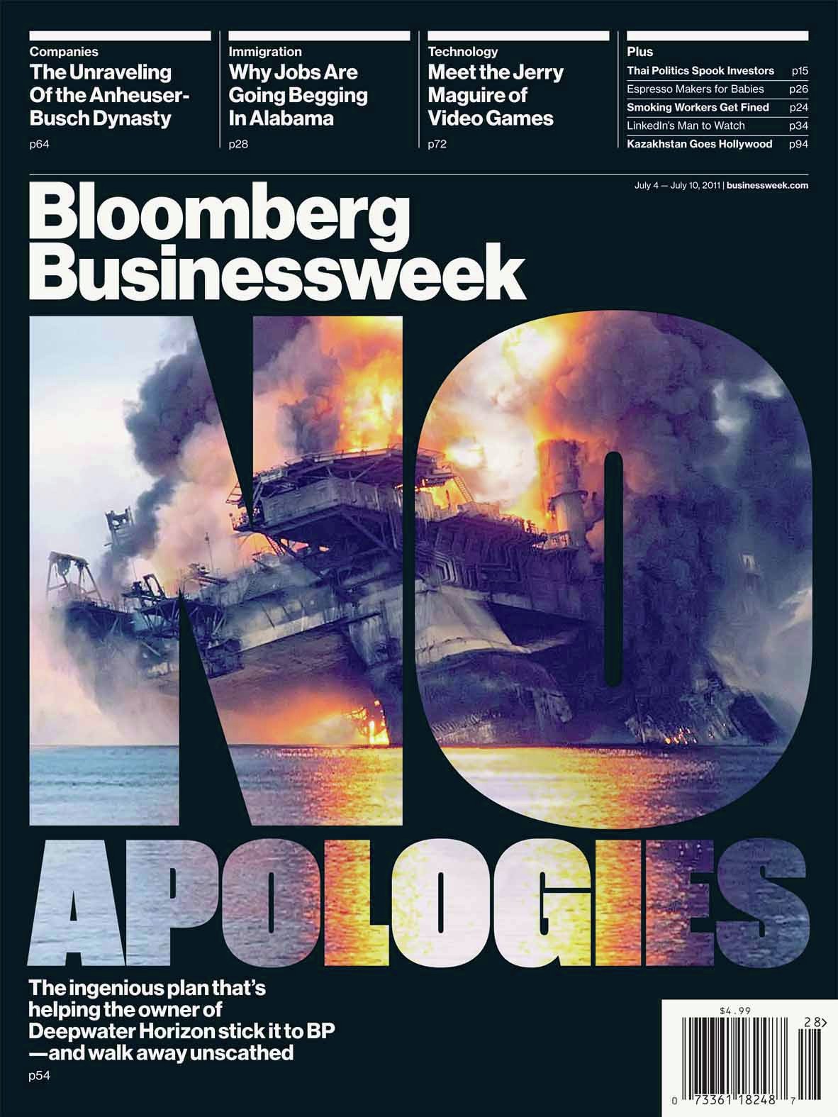
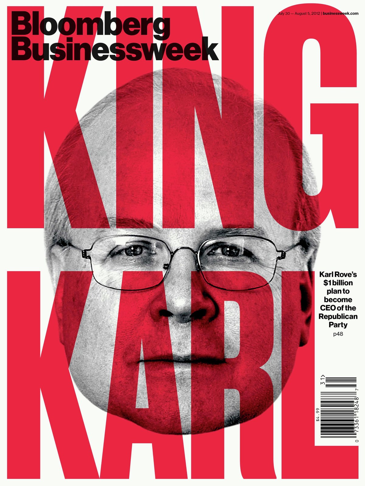
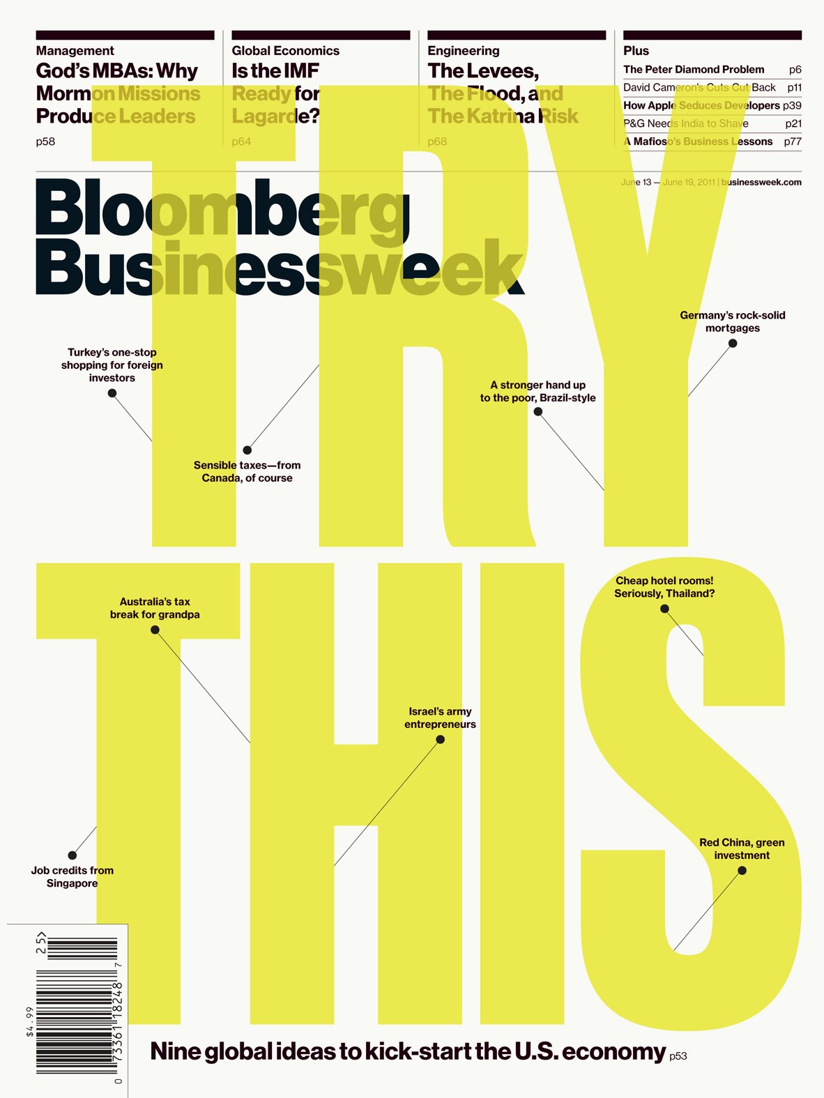
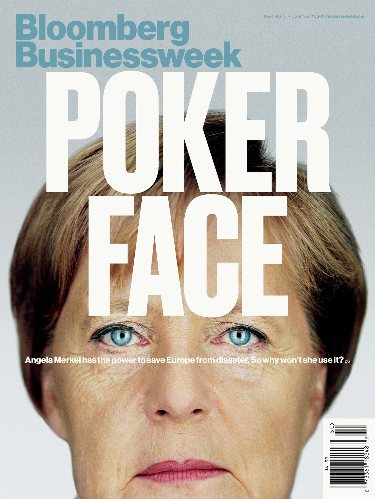
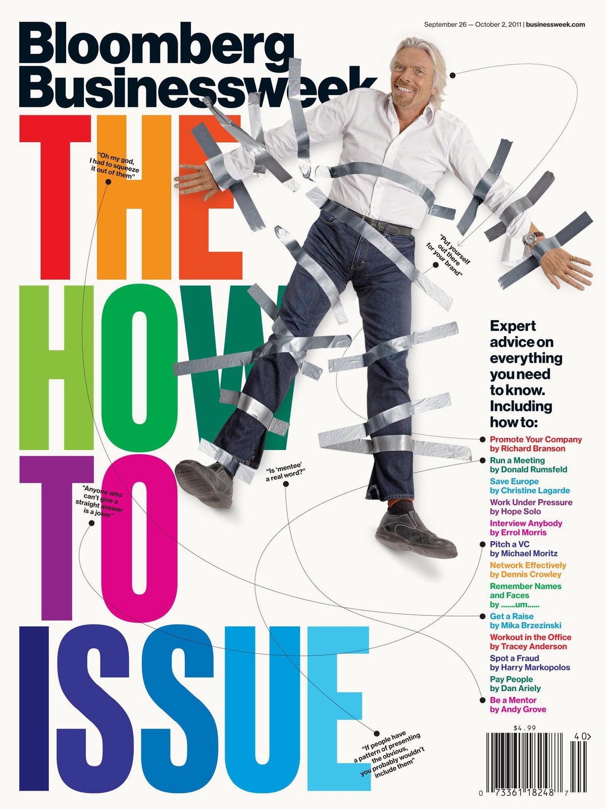
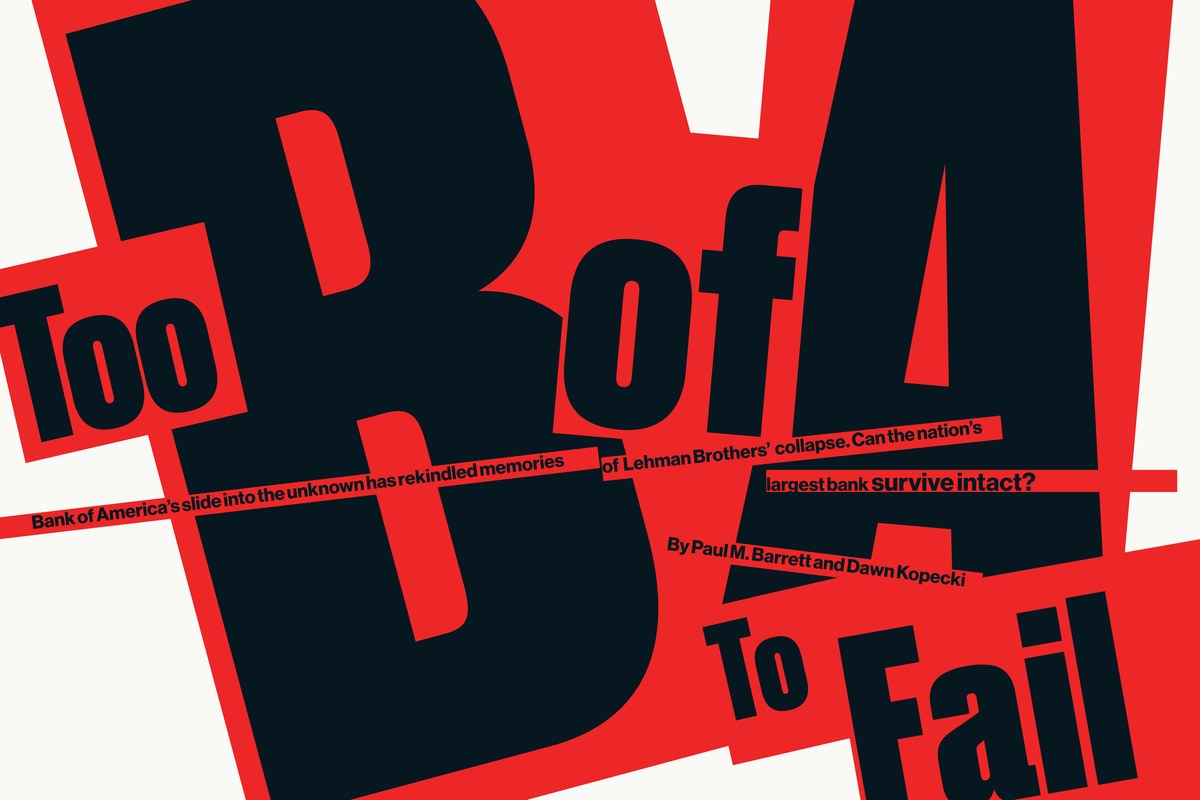
Neue Haas Grotesk proved to be an inspired choice: eminently familiar and malleable, able to take center stage when needed, be chopped up and manipulated into typographic illustrations, or quietly play a supporting role to both illustration and photography. Using Miedinger’s little-seen straight-legged alternate R had a surprisingly big impact how the typeface felt in the magazine.
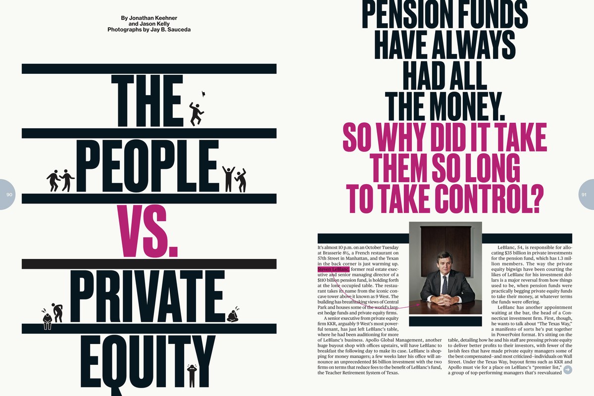
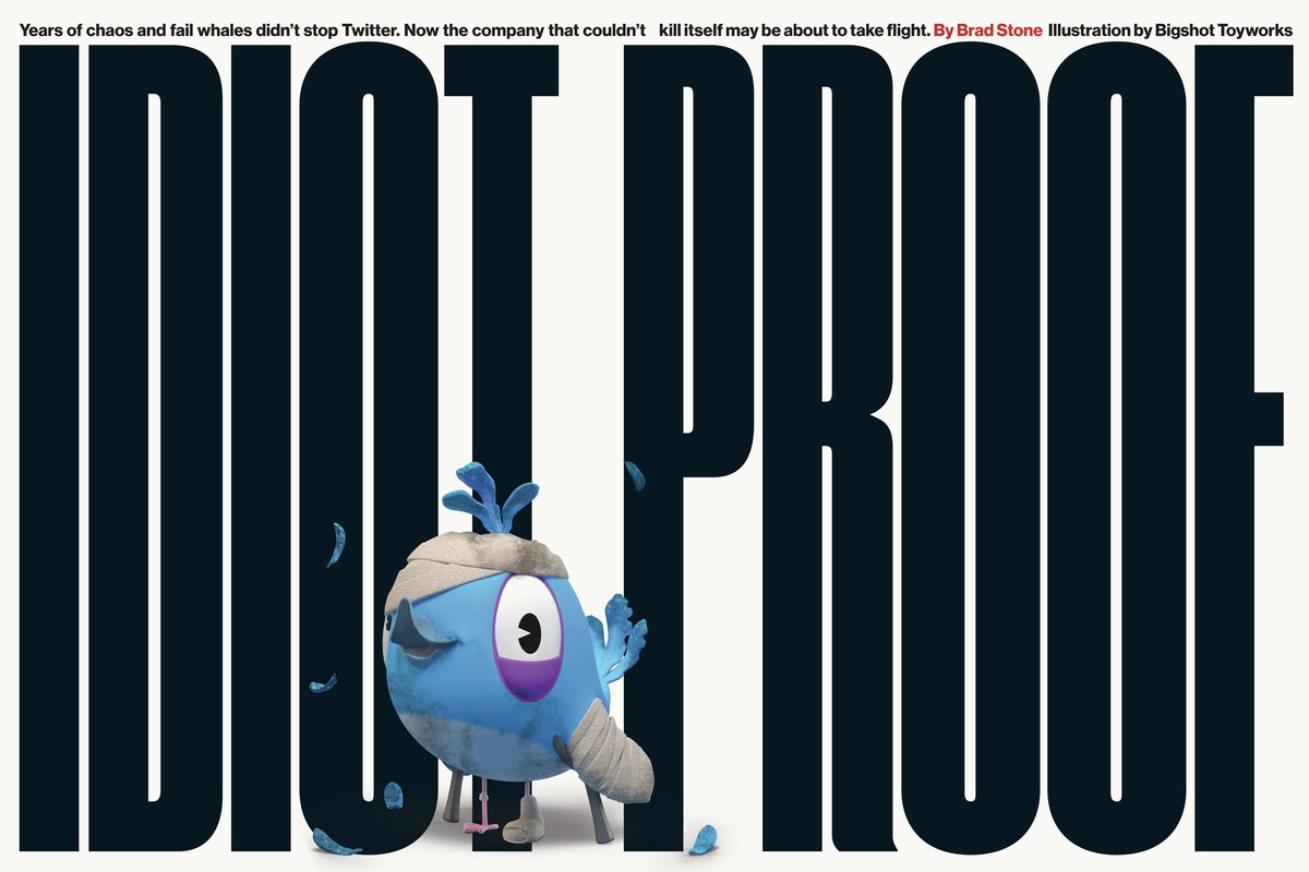
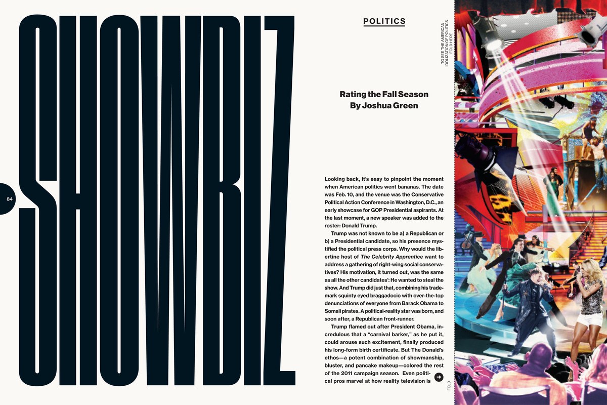
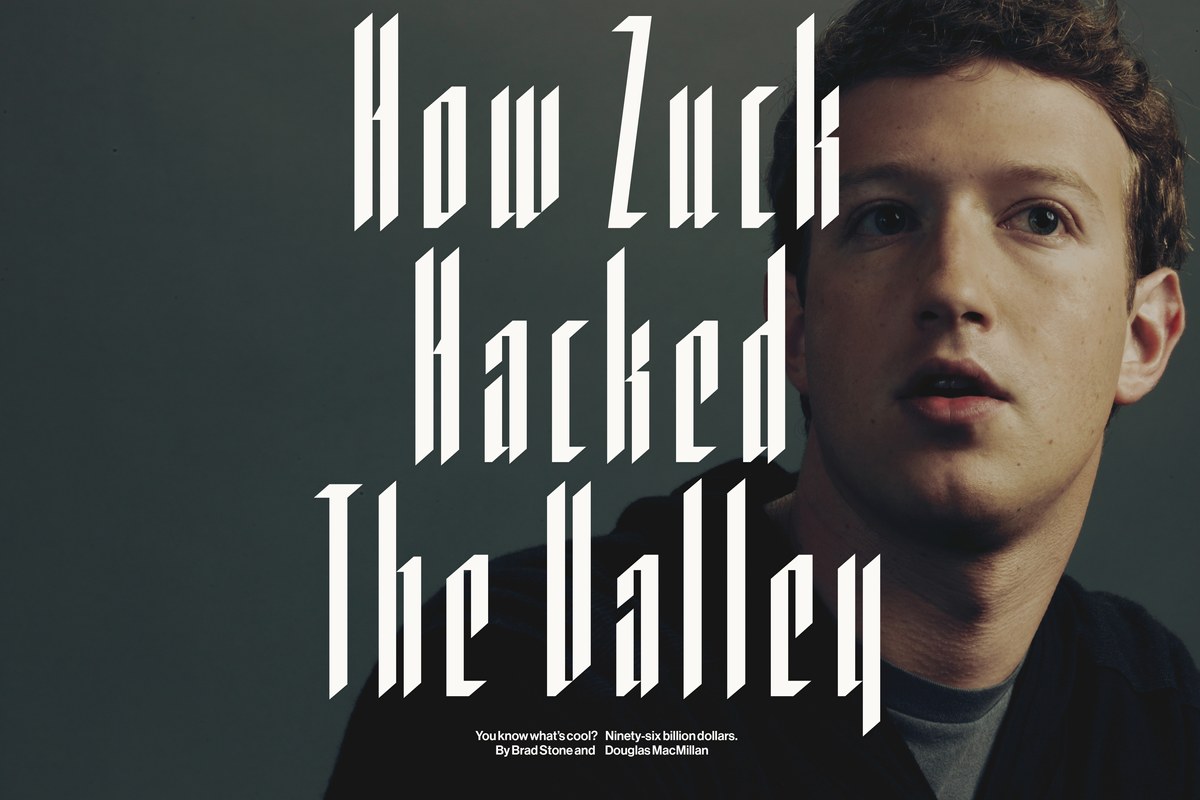
Druk
Special effects
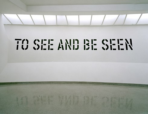
Lettering
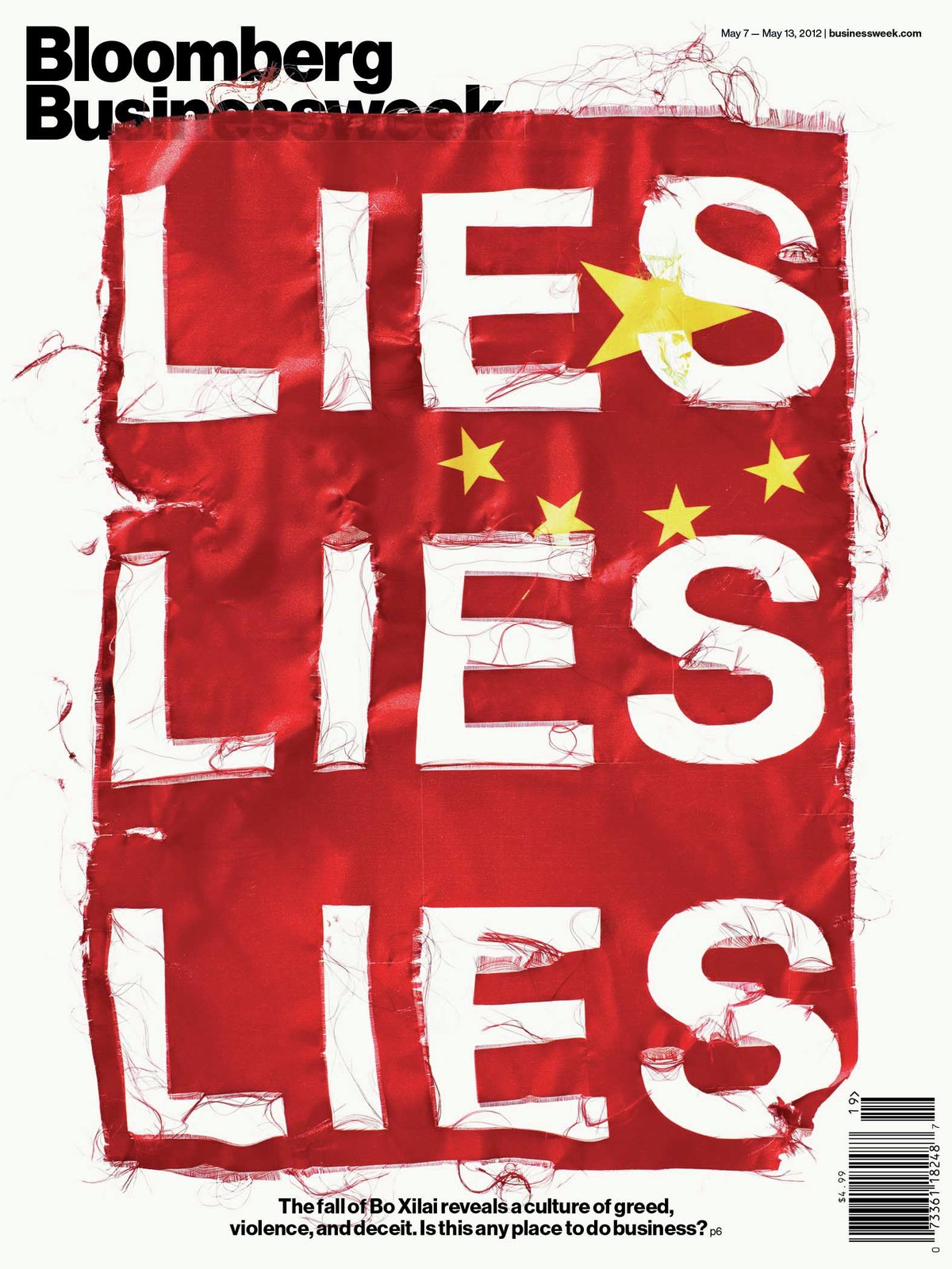
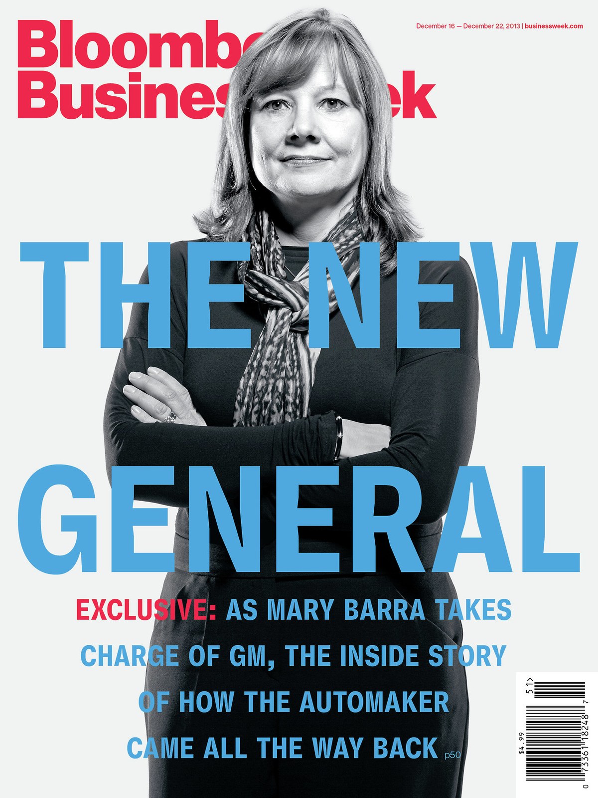
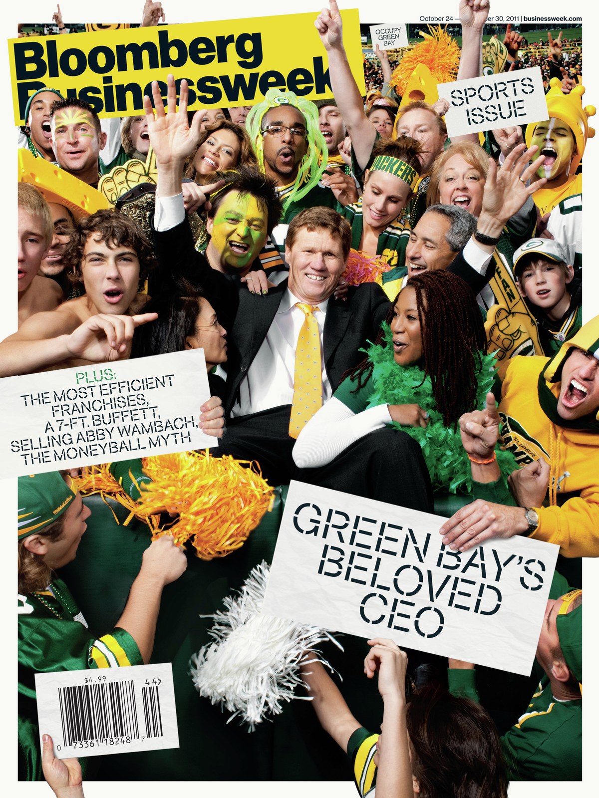
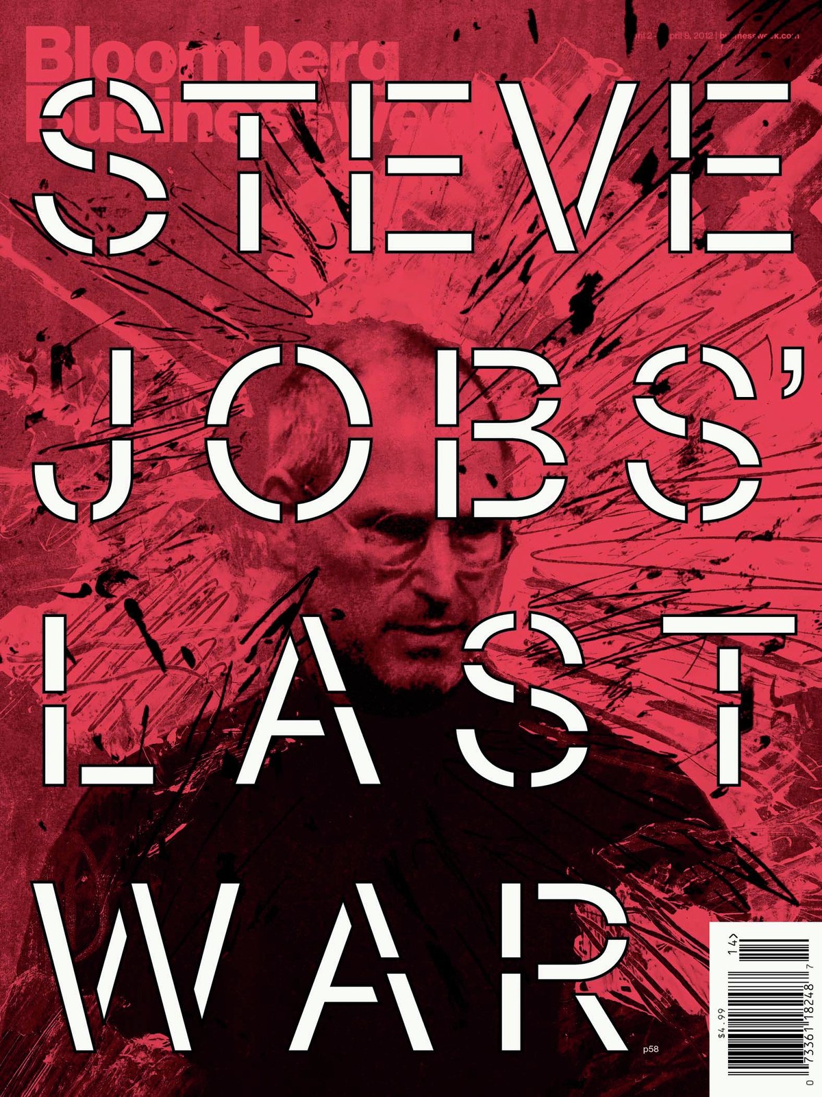
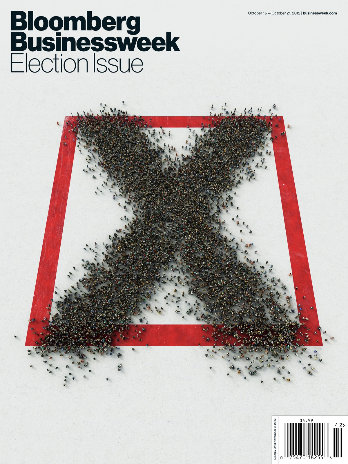
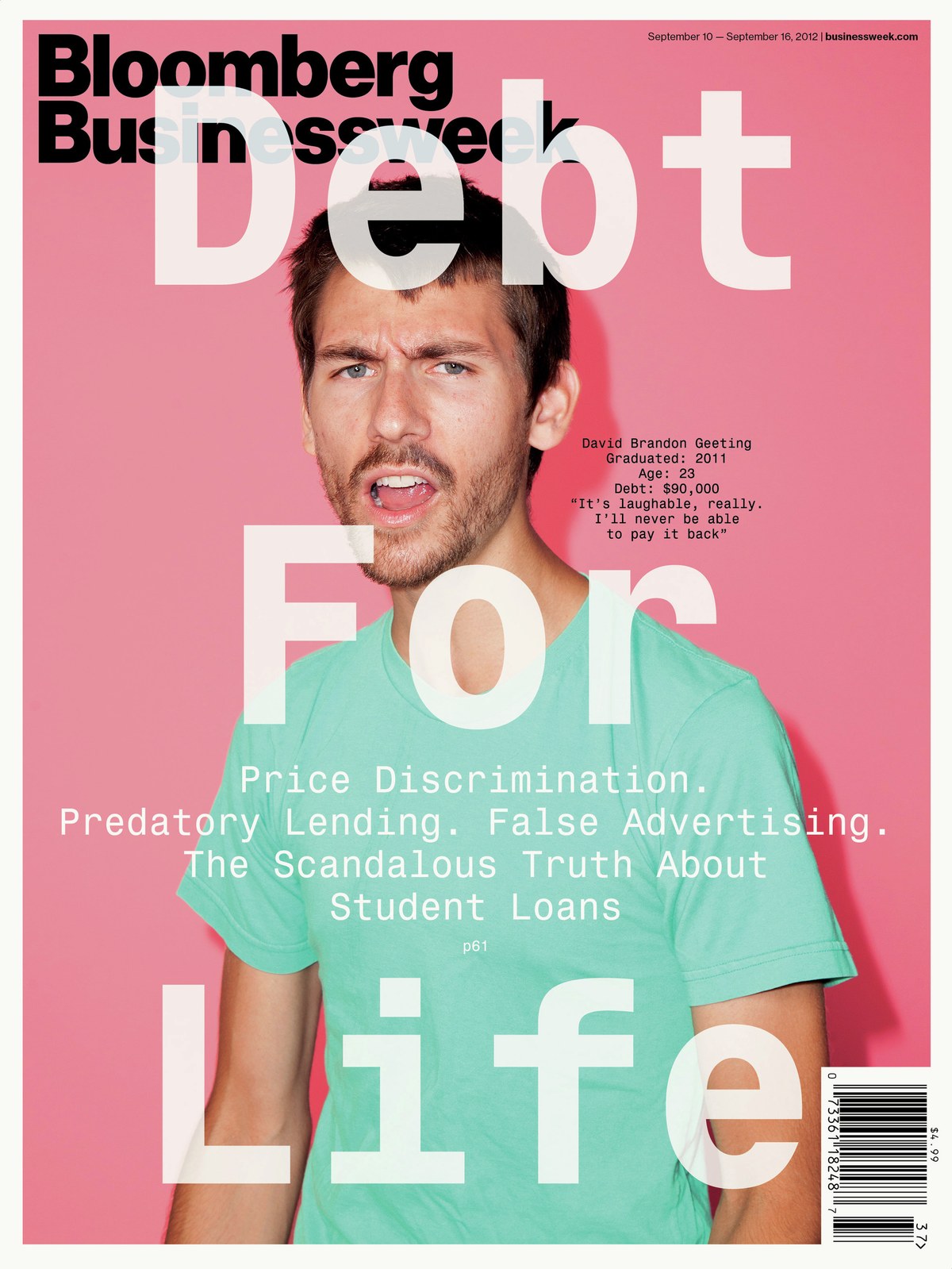
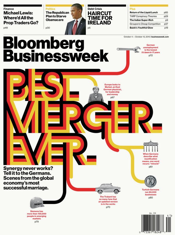
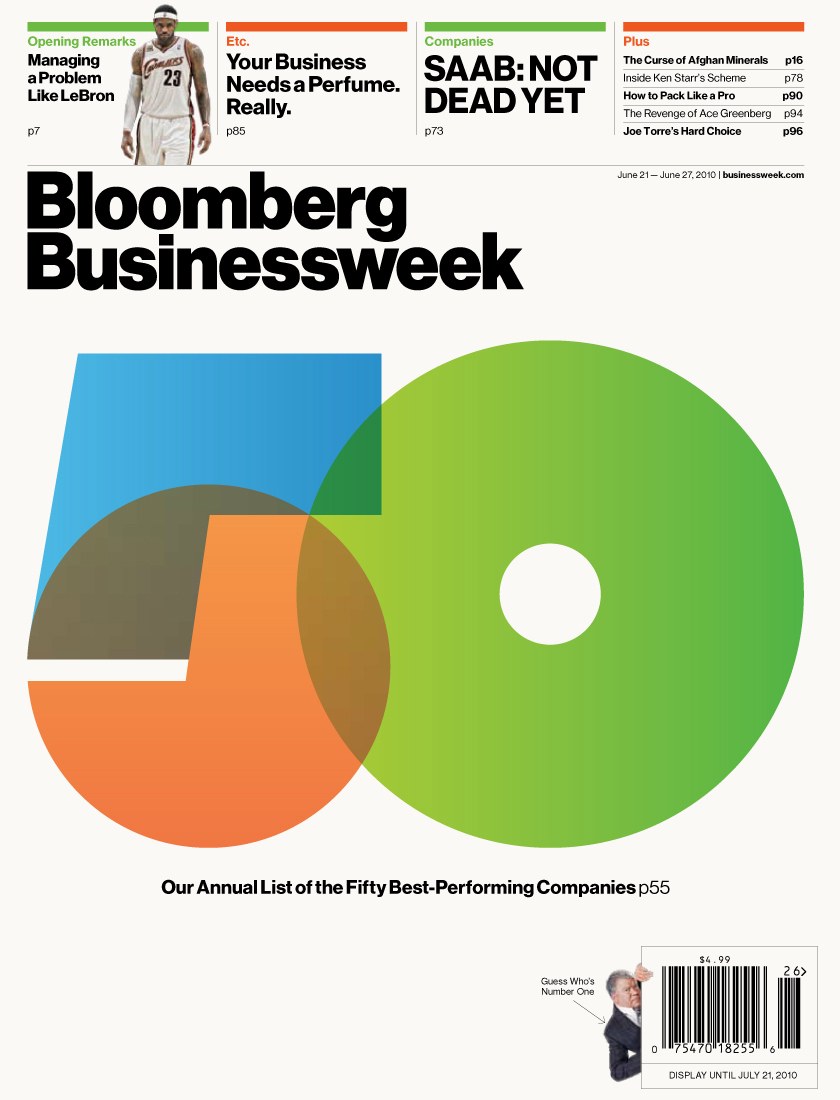
Schwartz and Hasebe created lettering for covers and spreads on a regular basis, sometimes riffing on Neue Haas Grotesk and Druk (and occasionally Publico), and sometimes going off in more fanciful directions, like the 3-stripe geometric lettering for a special report on 20 years of German reunification. While Druk was in development, cover lettering also helped to figure out the brief for the family—how narrow it needed to be and how heavy it could get.
After delivering the fonts, Schwartz was embarrassed but amused to learn that Weiner despised Helvetica.
