A pair of typefaces for Rapha
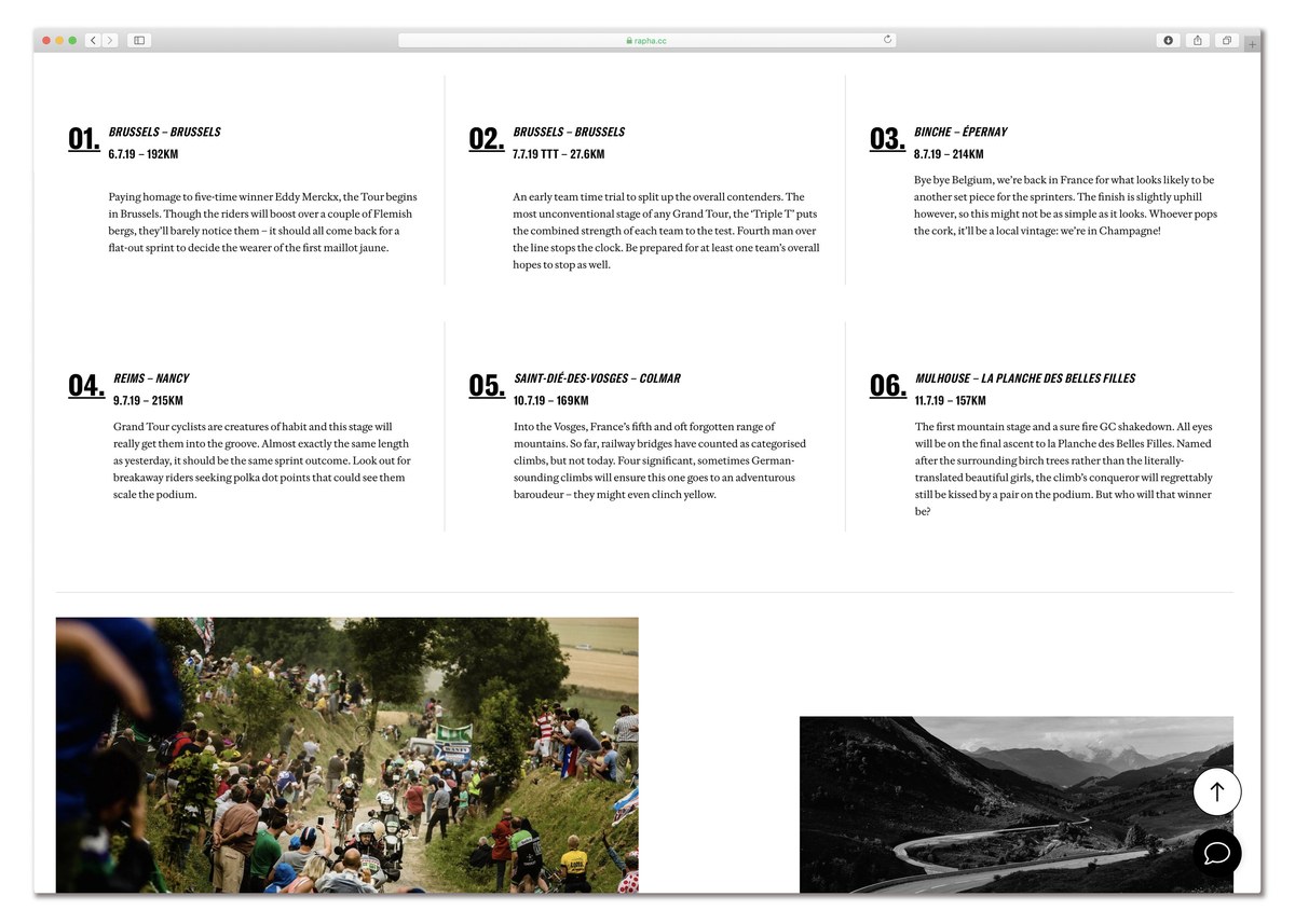
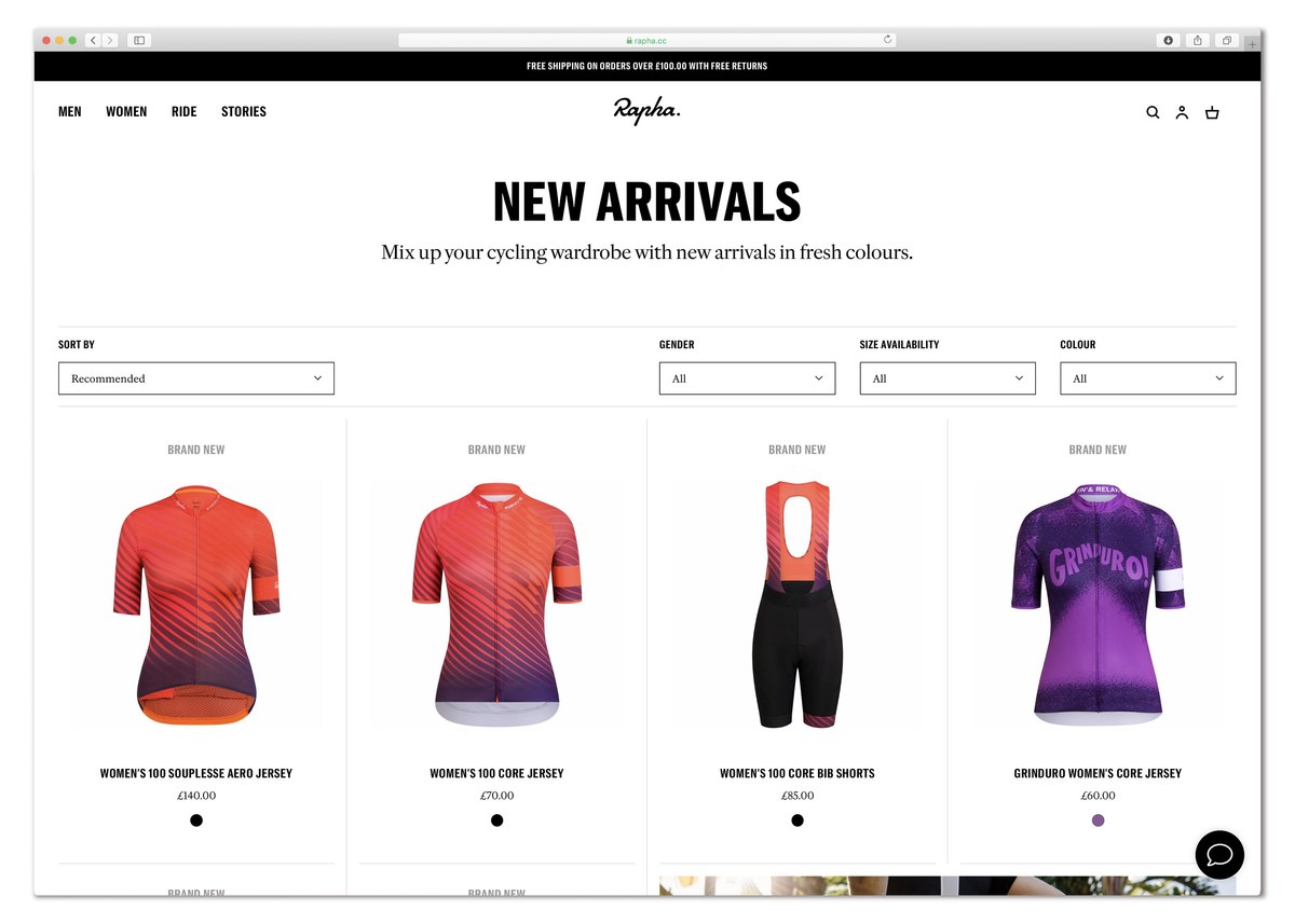
Since its founding in 2004, Rapha has been producing some of the finest cycling clothing in the world, both for amateurs and for pro teams such as Canyon SRAM and EF Education First. A huge part of Rapha’s success has been its attention to detail, not only in apparel, but also in its art direction, photography, and design. From its iconic logo through to its groundbreaking magazine Rouleur, Rapha has always stood out from its competitors and inspired many imitators. Part of this identity has always been a paired down typographical style of Trade Gothic and Adobe Caslon often used in almost literary style, often at odds with typical sports and cycling identities.
In 2017, Rapha’s Art Director, Jack Saunders, approached Commercial Type with a view to updating and expanding its typographical palette. What had served so well for so long, was beginning to show its limitations. Trade Gothic came in a limited number of weights and widths, and Adobe Caslon designed for text, was less suited to headline use, and its relatively small x-height, and long descenders made it less economical for reading matter.
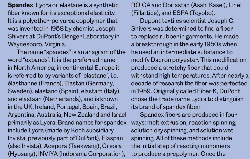
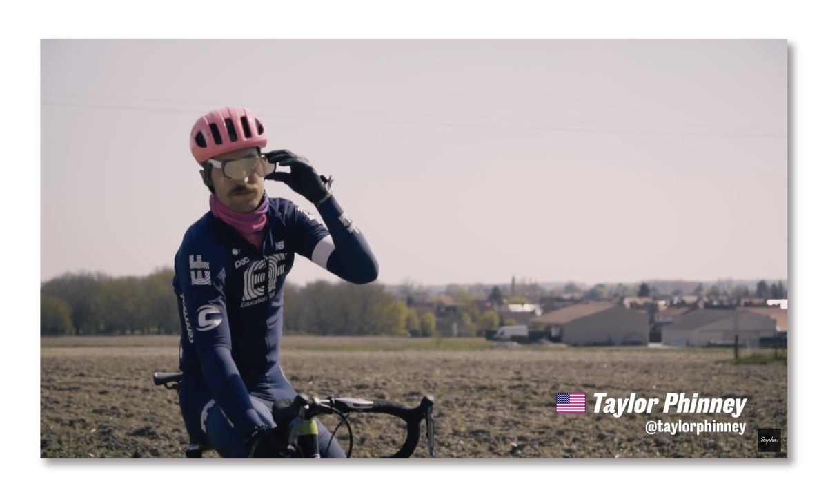
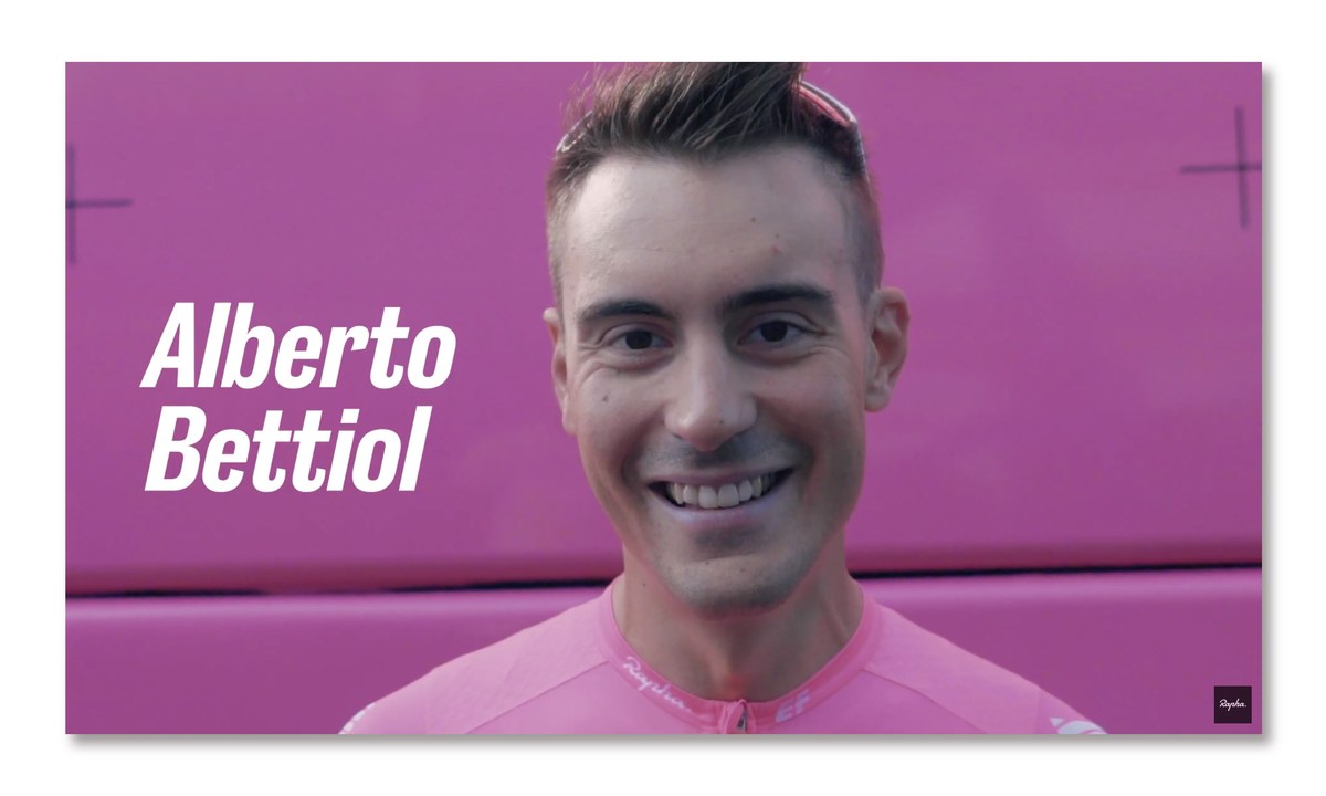
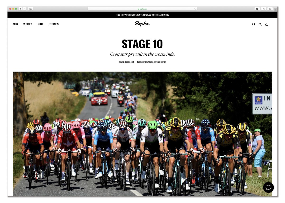
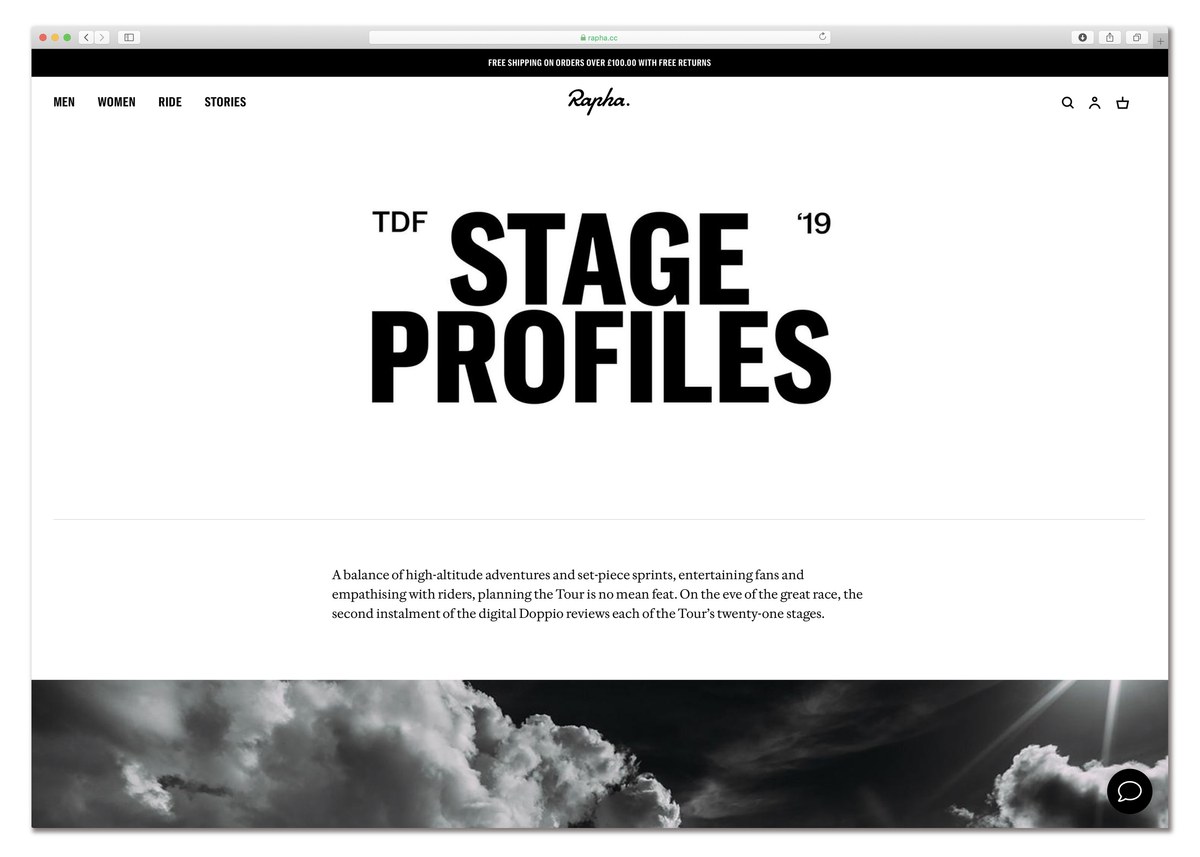
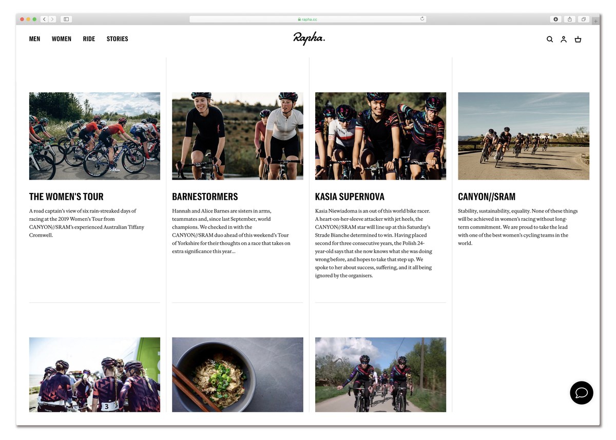
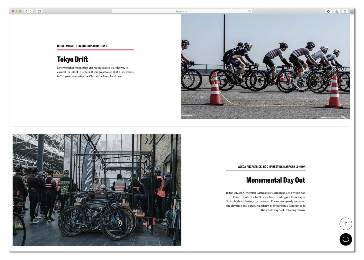
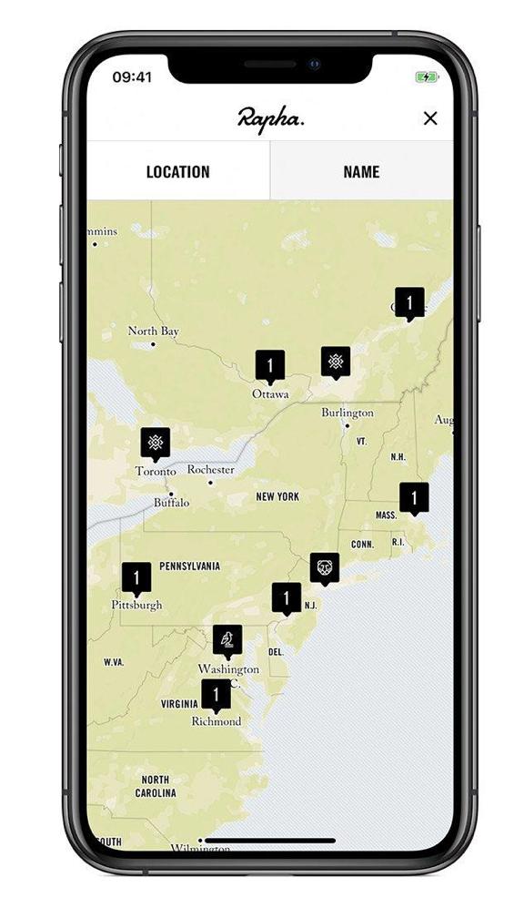
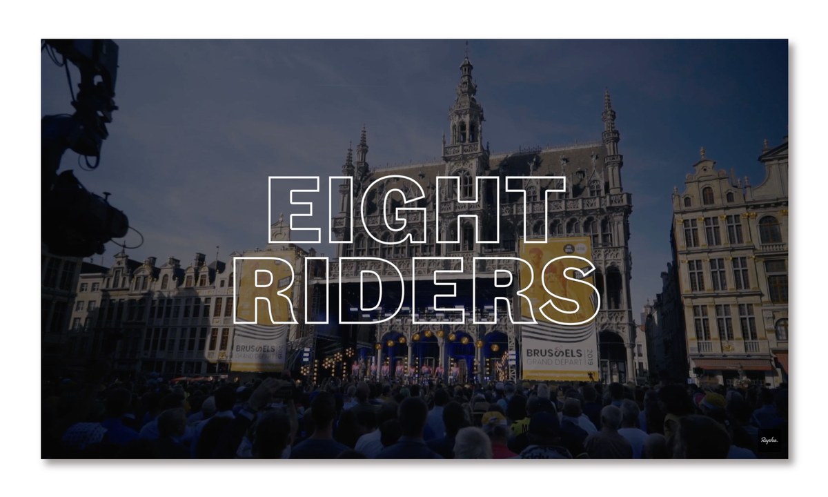
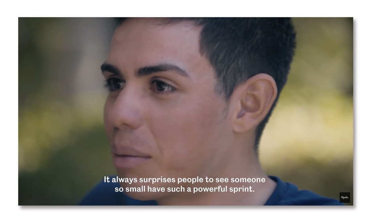
Working closely with Saunders and Rapha’s internal design team, Commercial Type partner (and long time cycling enthusiast) Paul Barnes and long time collaborator Dan Milne created a new range of faces, Rapha Sans and Rapha Serif. Designed for both headline and text use across a wide range of applications, the new faces unveiled in March 2019 were gradually rolled out across online, print, clothing, and merchandise.
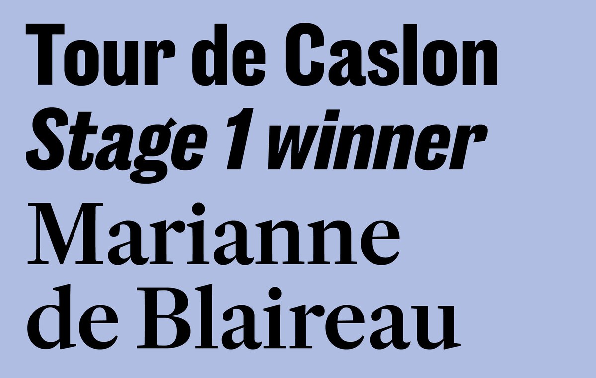
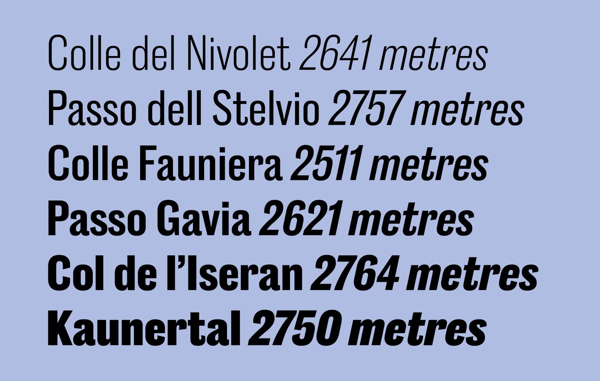
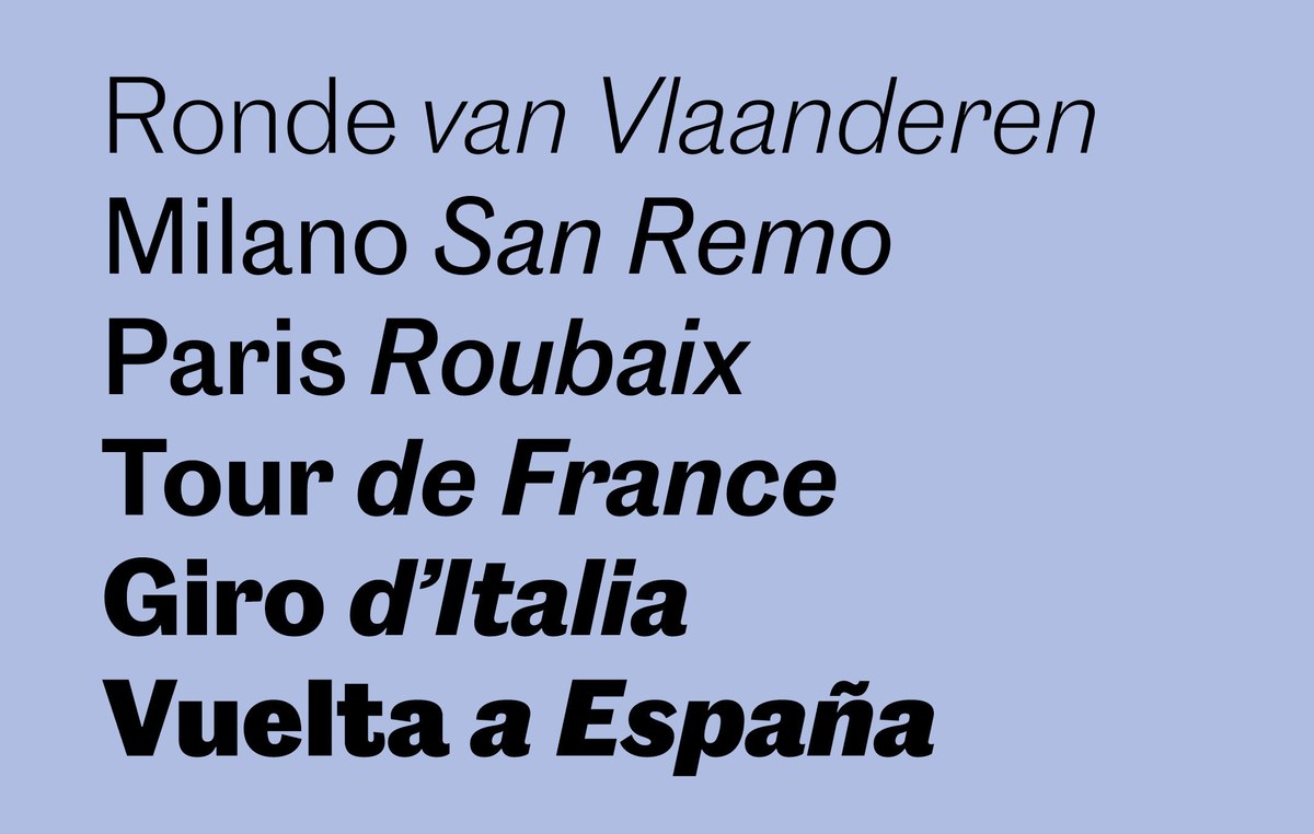
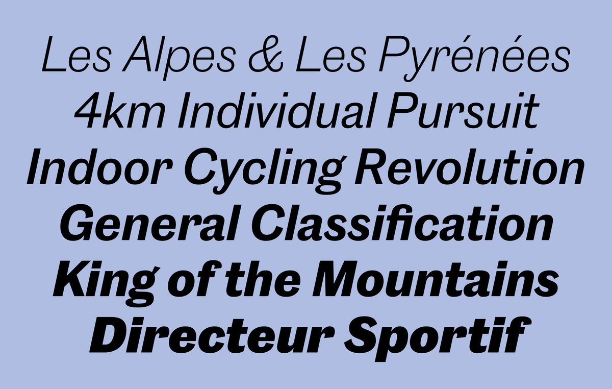
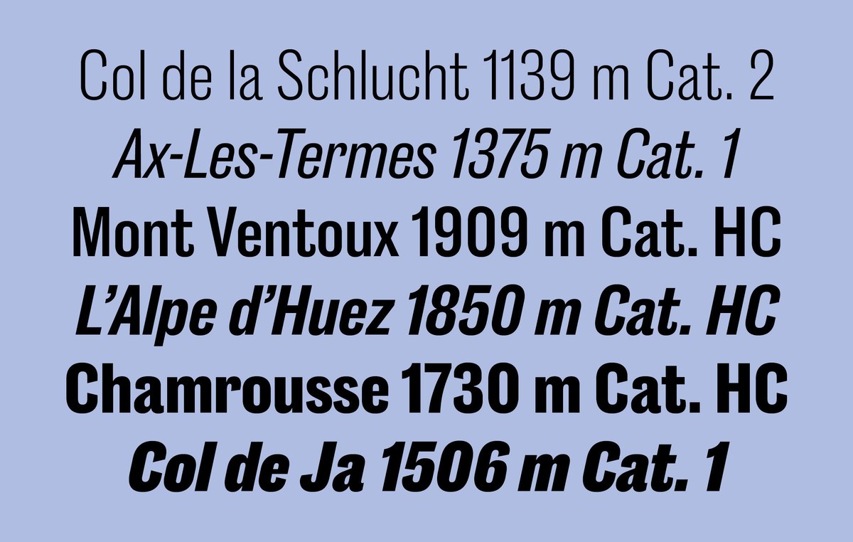
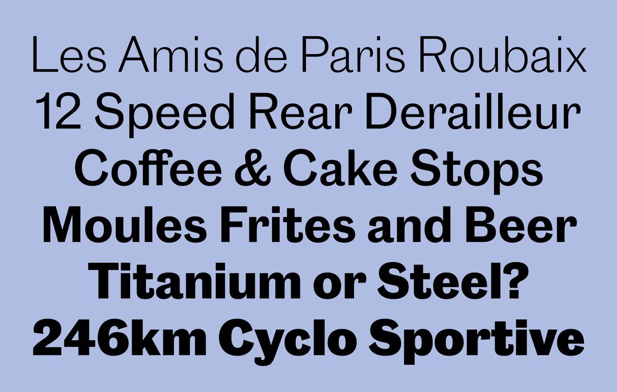
Rapha Sans comes in two widths in six weights, from Light to Extrabold, and is an adaption of one of the first releases from Commercial Classics, Caslon Doric, a compendium of the Caslon foundry sans serifs cut in the last third of the nineteenth century and the beginning of the twentieth century. The regular width is based on Caslon Doric No. 4, which first appeared in the 1870s and was the first regular width sans Caslon produced with a lower case. Rapha Sans Condensed is wider than Commercial Classics’ Caslon Doric Condensed, and has been specially refined for use as both a text and display face.
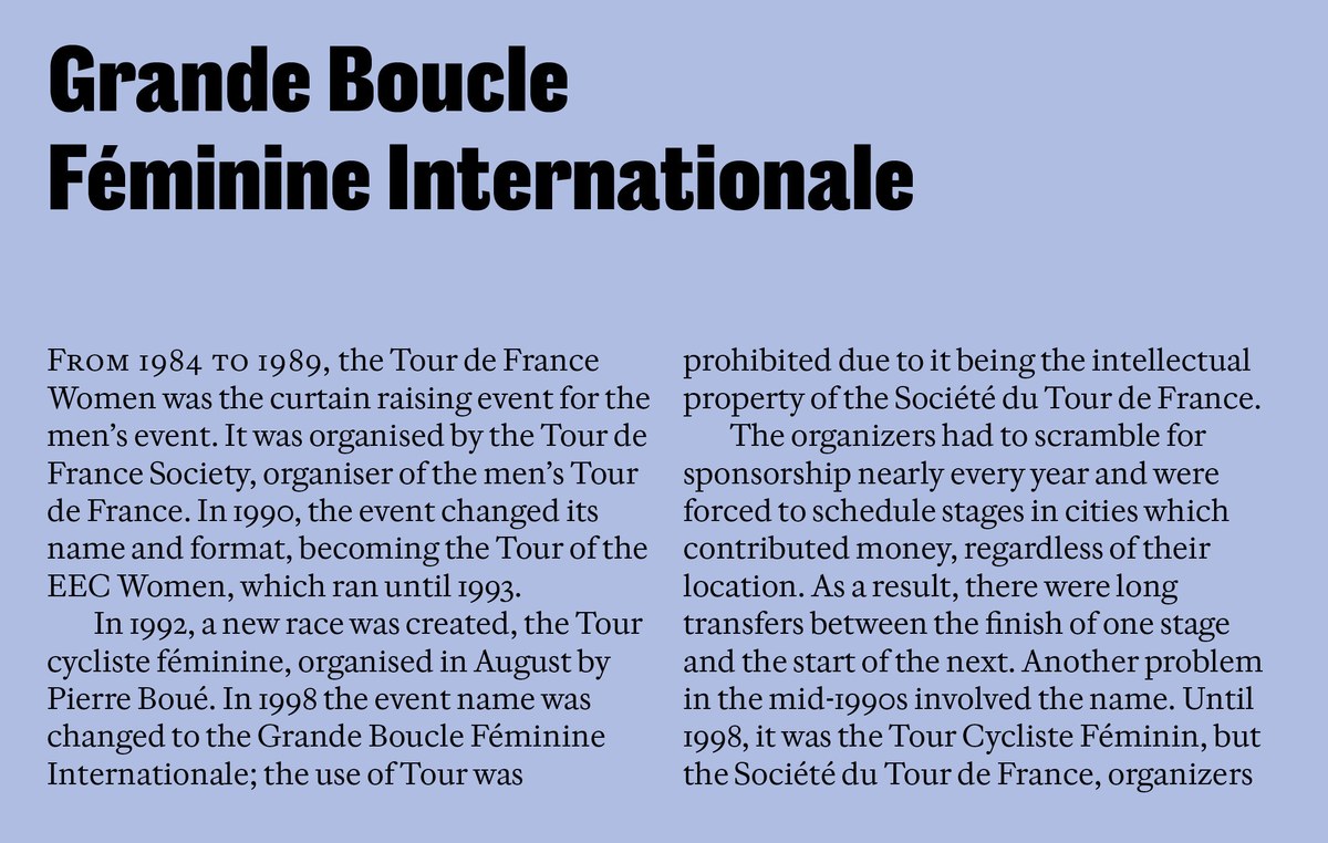
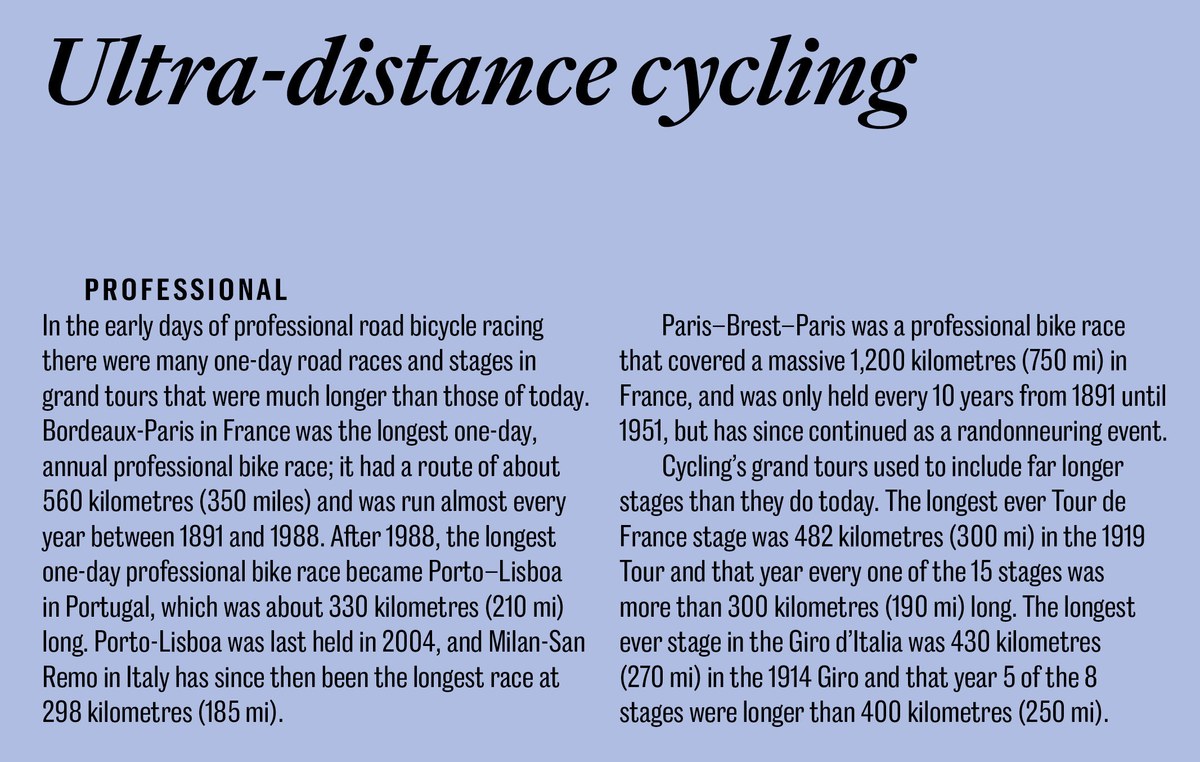
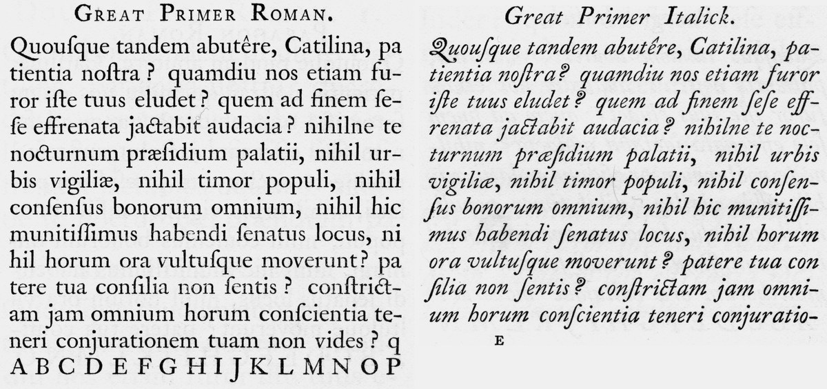
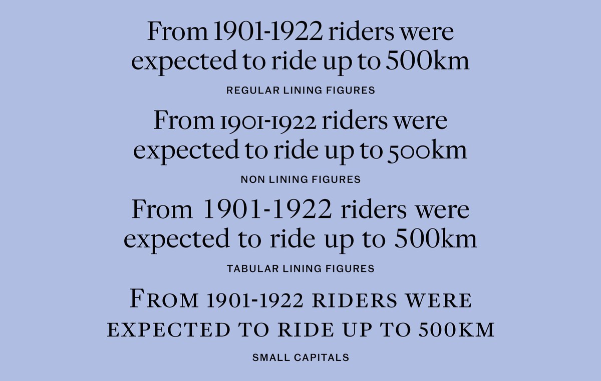
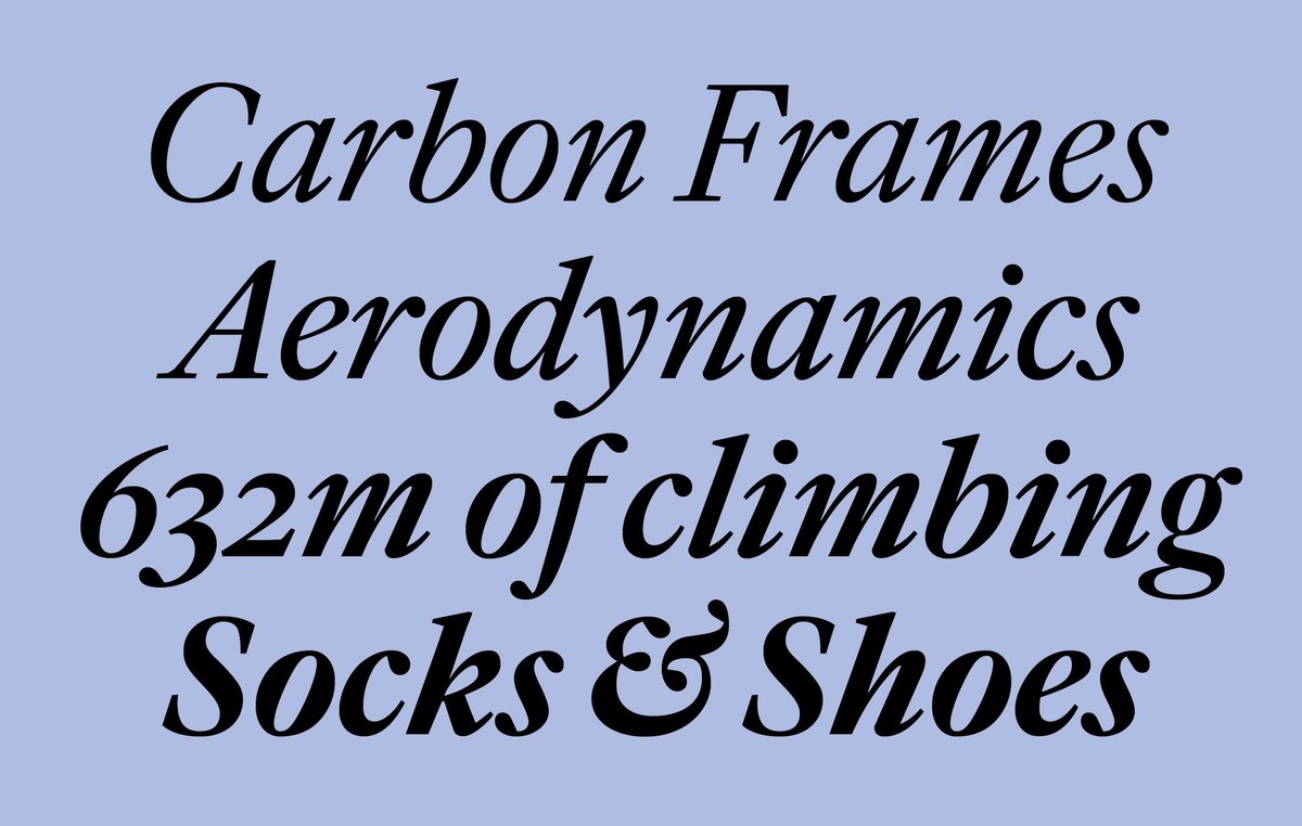
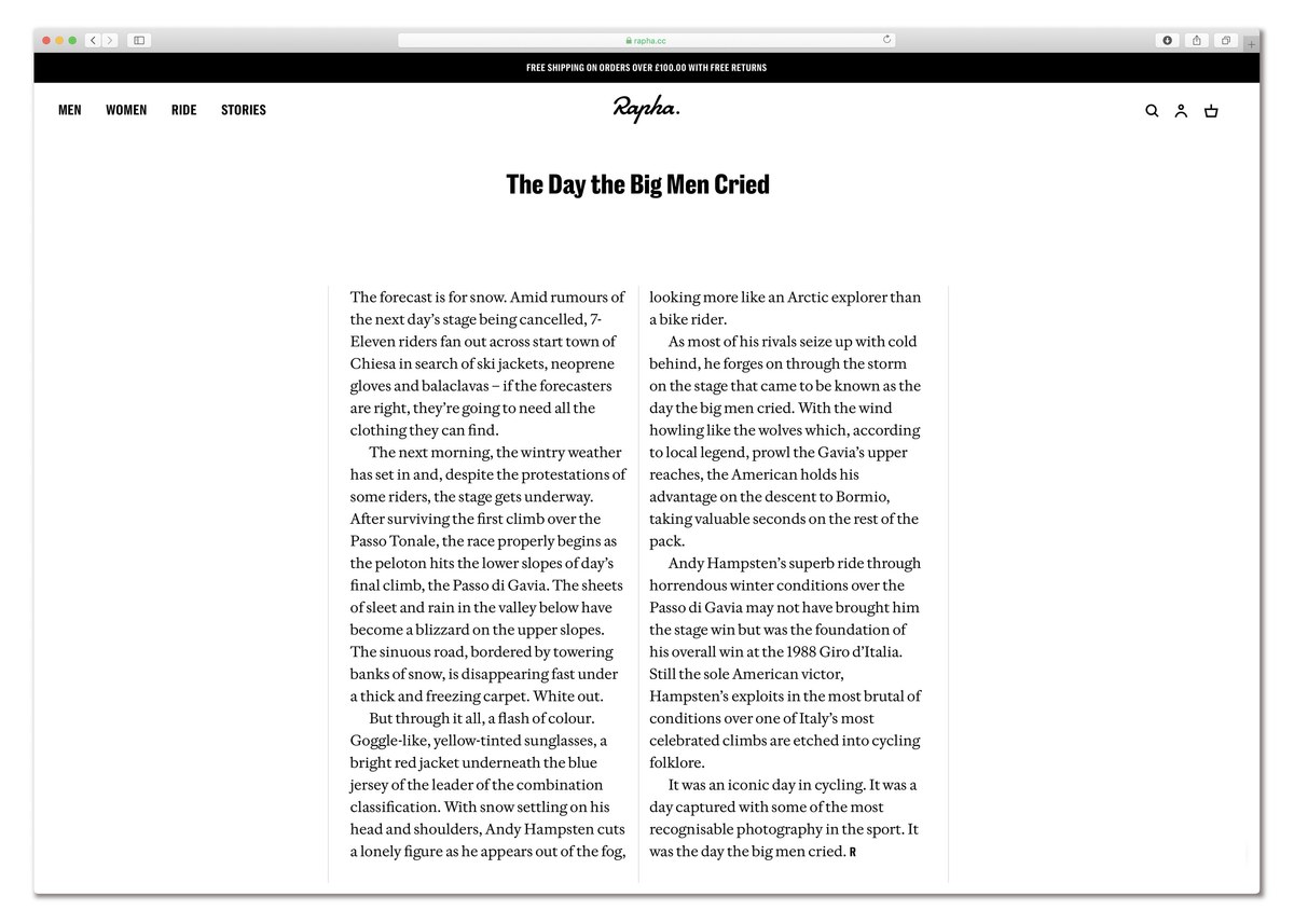
Rapha Serif is a new face with modern proportions but a rich heritage. Inspired by the work of the first William Caslon and in particular his Great Primer (cut in 1734), a face that owes much to the Dutch masters of the seventeenth century (the Netherlands is of course one of the hotbeds of cycling). Coming in four weights, it has two versions for text and headlines, and a larger than expected x-height with reduced descenders without feeling overtly economical. Its serif structure are simple with minimal angled tapering, and an overall sharpness, reflected in the sharp lines of ball terminals of the a c f g j r y 3 and 5. The italic has both the steepness and regularity of angle that is seen in some of Caslon’s work, making it characterful without being distracting. The sharpness of the roman can be seen in the minimal simple strokes in the lowercase, and the ball terminals. The headline develops the text variant with a greater contrast, slightly narrower proportions and tighter letterspacing. Rapha Serif comes with various numeral styles, several alternatives, and small capitals in roman. The family was later expanded and released as Frame.
The sans and serif, though over 100 years apart in origin, complement and contrast with each other and reflect the heritage and variety of the Caslon foundry through its three centuries of existence. They have allowed Rapha to maintain and developing its brand over an ever increasing number of applications in all mediums, whilst retaining the consistency with its previous fonts.
