New type for Rolling Stone
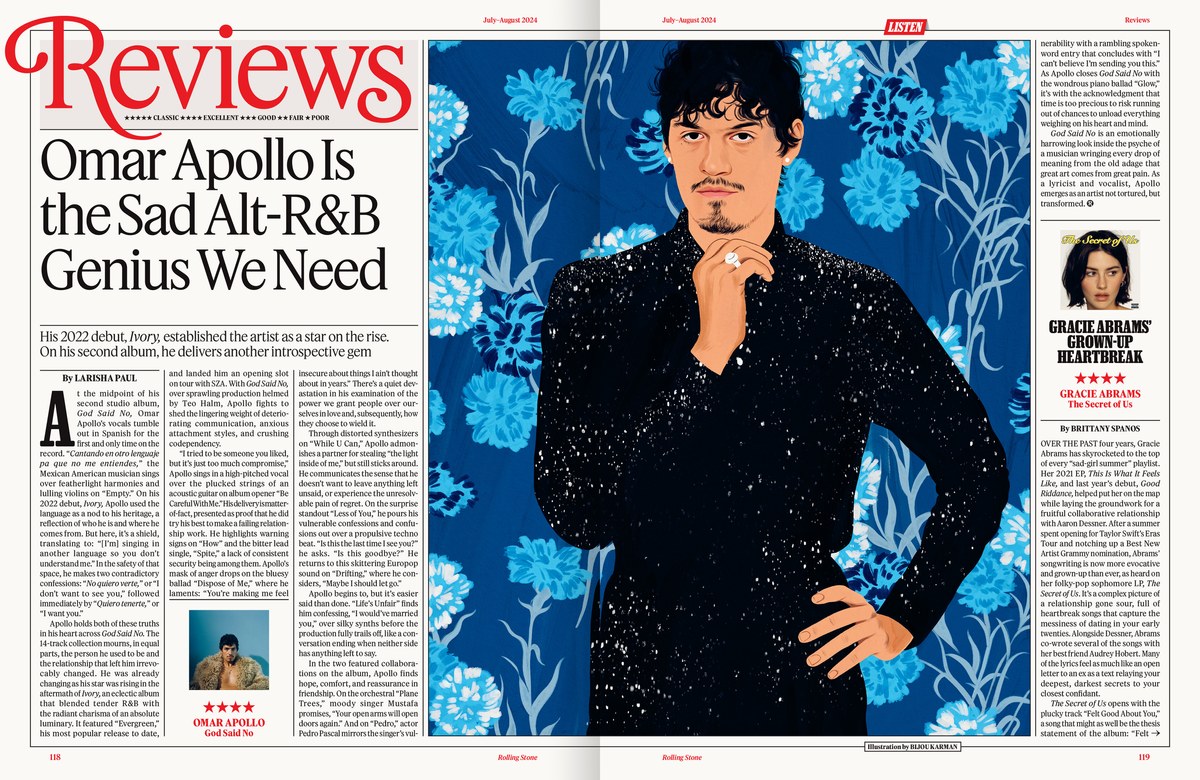
Spread from Rolling Stone issue 1389/1390, July–August 2024.
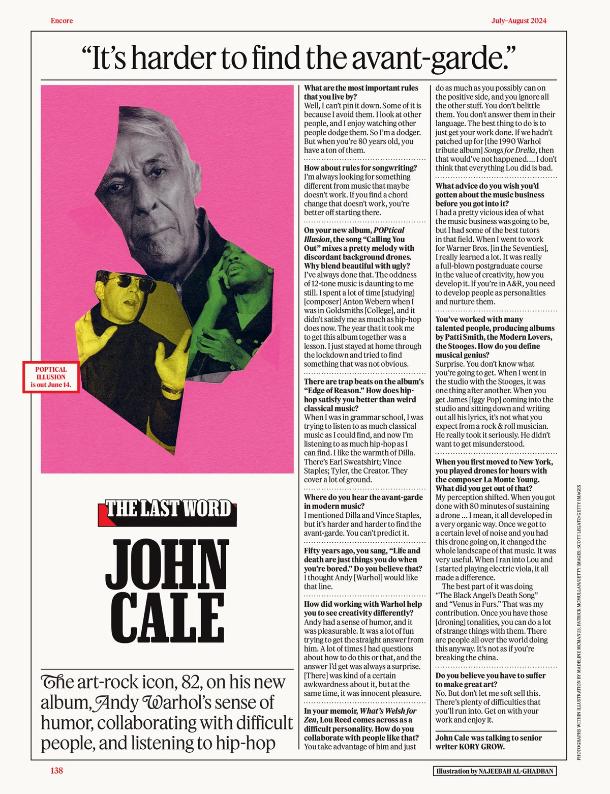
The final page from Rolling Stone issue 1389/1390, July–August 2024.

The cover of Rolling Stone issue 1389/1390, July–August 2024.
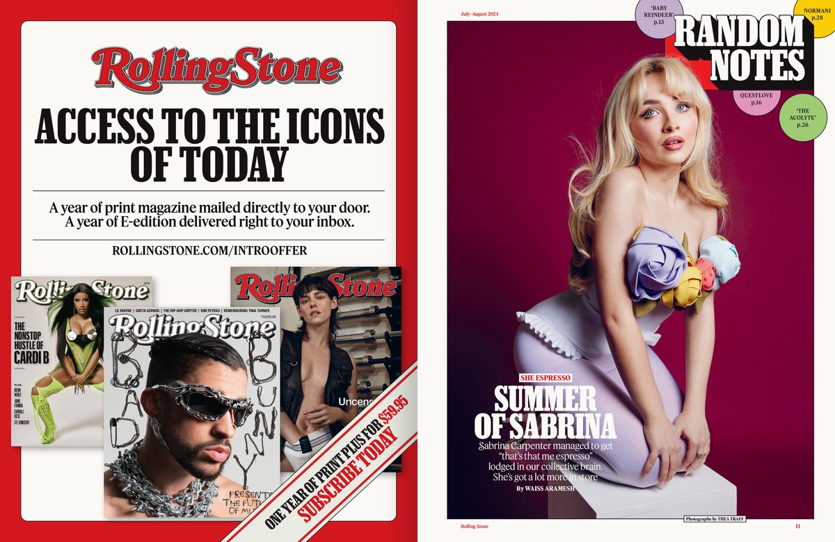
Spread from Rolling Stone issue 1389/1390, July–August 2024.
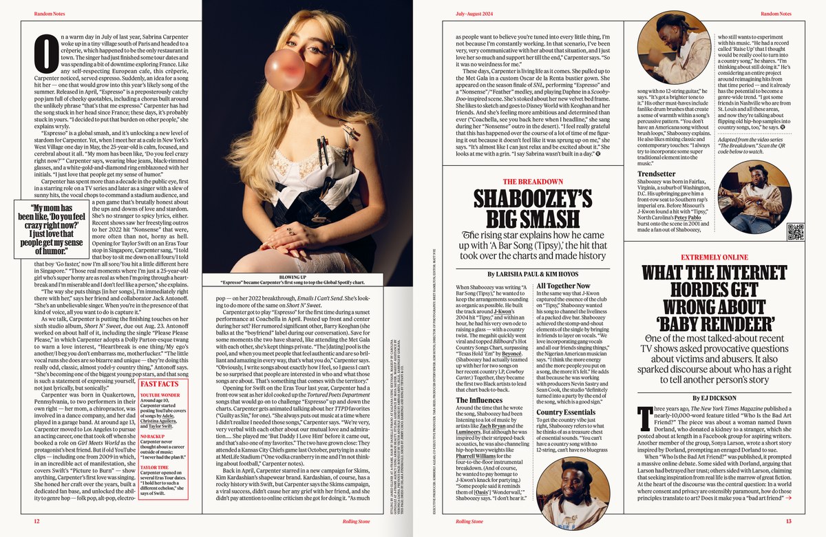
Spread from Rolling Stone issue 1389/1390, July–August 2024.
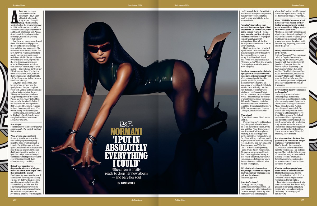
Spread from Rolling Stone issue 1389/1390, July–August 2024.
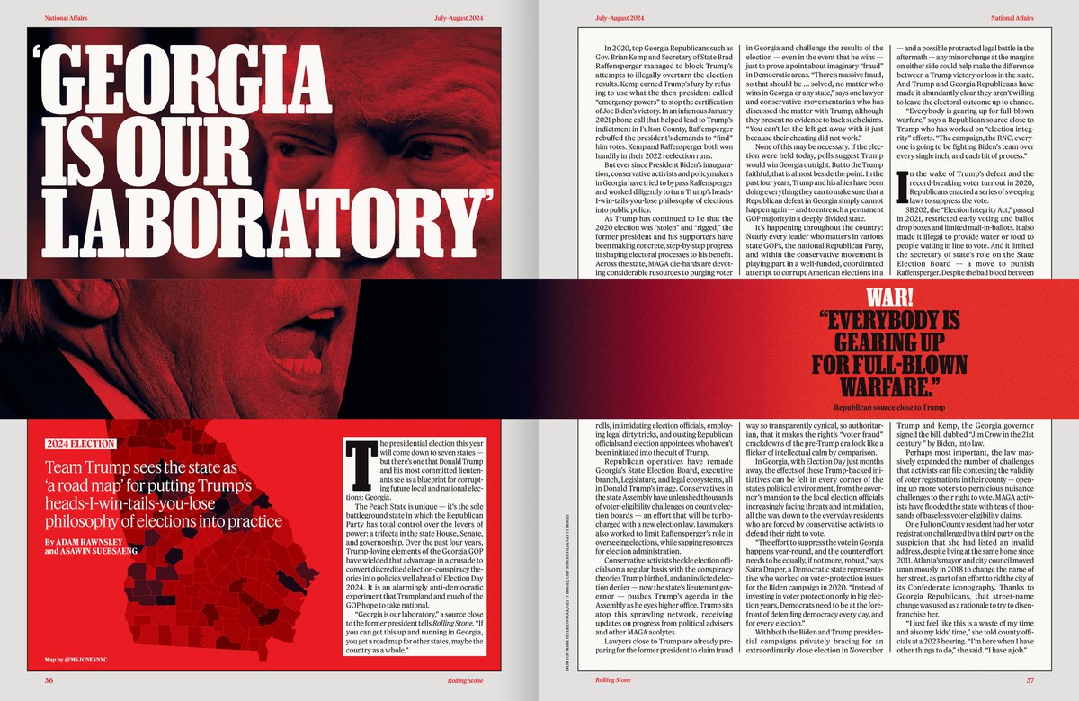
Spread from Rolling Stone issue 1389/1390, July–August 2024.
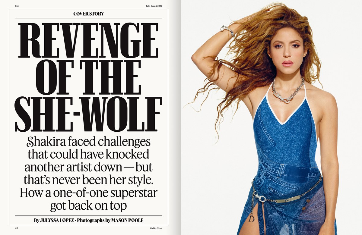
Spread from Rolling Stone issue 1389/1390, July–August 2024.
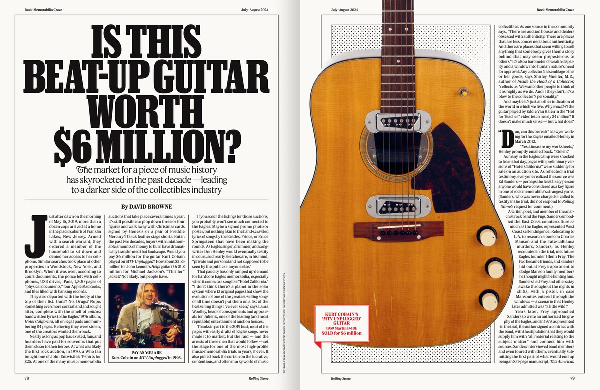
Spread from Rolling Stone issue 1389/1390, July–August 2024.
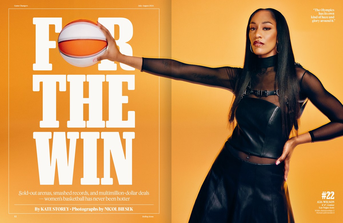
Spread from Rolling Stone issue 1389/1390, July–August 2024.
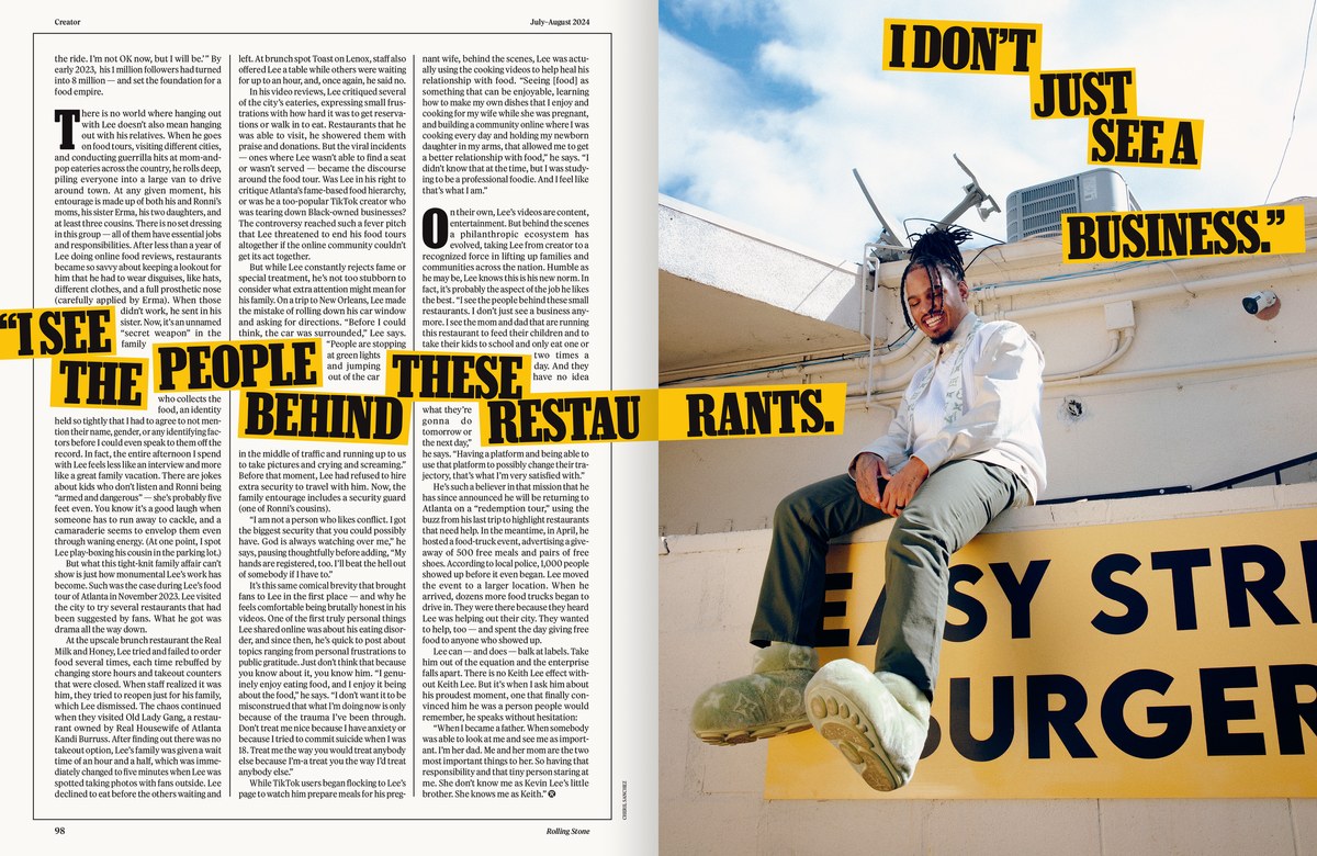
Spread from Rolling Stone issue 1389/1390, July–August 2024.

Spread from Rolling Stone issue 1389/1390, July–August 2024.
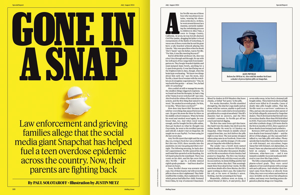
Spread from Rolling Stone issue 1389/1390, July–August 2024.

Spread from Rolling Stone issue 1389/1390, July–August 2024.

The final page from Rolling Stone issue 1389/1390, July–August 2024.

The cover of Rolling Stone issue 1389/1390, July–August 2024.

Spread from Rolling Stone issue 1389/1390, July–August 2024.
The summer double issue of Rolling Stone hit newsstands at the end of June, kicking off a new era for the magazine. Richard Turley of Food and Mark Leeds of c-ll-ct-v-ly, working with an internal team at Rolling Stone led by Creative Director Joe Hutchinson and CEO Gus Wenner, revisited every aspect of the design, pace, and structure of the publication, down to the trim size and paper stock. Turley and Leeds tapped Commercial Type to rethink the type palette, which ended up being a mix of custom and off-the-shelf families.
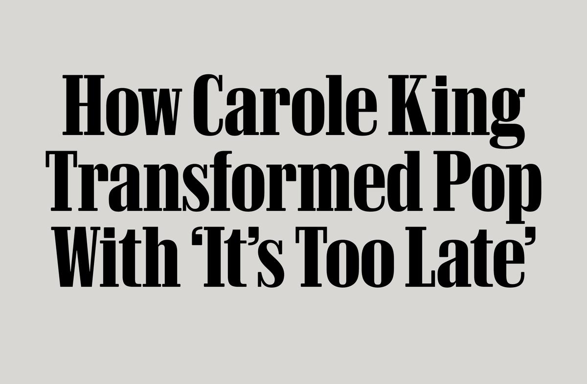
Rolling Stone Slab Bold Headline is used for features.

Rolling Stone Slab Headline is also drawn for tight leading in all caps.
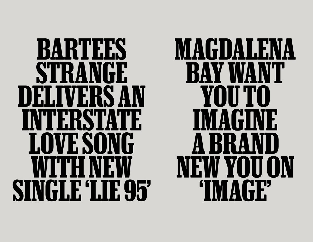
Most headlines in the front section are set in Rolling Stone Slab Bold in all caps.

Rolling Stone Slab Semibold and Semibold Italic.

Rolling Stone Slab Bold and Bold Italic.

Rolling Stone Slab Black and Black Italic.

Rolling Stone Slab Bold Headline is used for features.

Rolling Stone Slab Headline is also drawn for tight leading in all caps.

Most headlines in the front section are set in Rolling Stone Slab Bold in all caps.

Rolling Stone Slab Semibold and Semibold Italic.
Tim Ripper drew the main headline typeface, Rolling Stone Slab, which builds on his ongoing work on the condensed widths of Successor, his revival of nineteenth-century Egyptians from the British Isles. The new slab’s width and contrast take cues from the condensed slab serifs created by Dennis Ortiz-Lopez for Fred Woodward and Gail Anderson’s design of the magazine in the 1990s. Finding the right tone for the headline slab proved tricky. The magazine incorporates a singular mix of music and pop culture coverage—often but not uniformly light—juxtaposed with serious articles on politics and deeply reported journalism, interviews with cultural and political figures, and album reviews. This anti-formulaic formula has served the magazine well since the 1970s, even as its readership has moved online.
Subtle rounding on corners and especially serif endings tempered the blocky, monolithic quality typical of a bold condensed slab—but enough crisp corners remain to keep Rolling Stone Slab from looking doughy or overly casual. The italics fully embrace the typeface’s nineteenth-century roots, with tails and cursive detailing. The Woodward-Anderson era also helped inspire a higher-contrast display version for feature layouts, where it furnishes an elegant and sober tone.
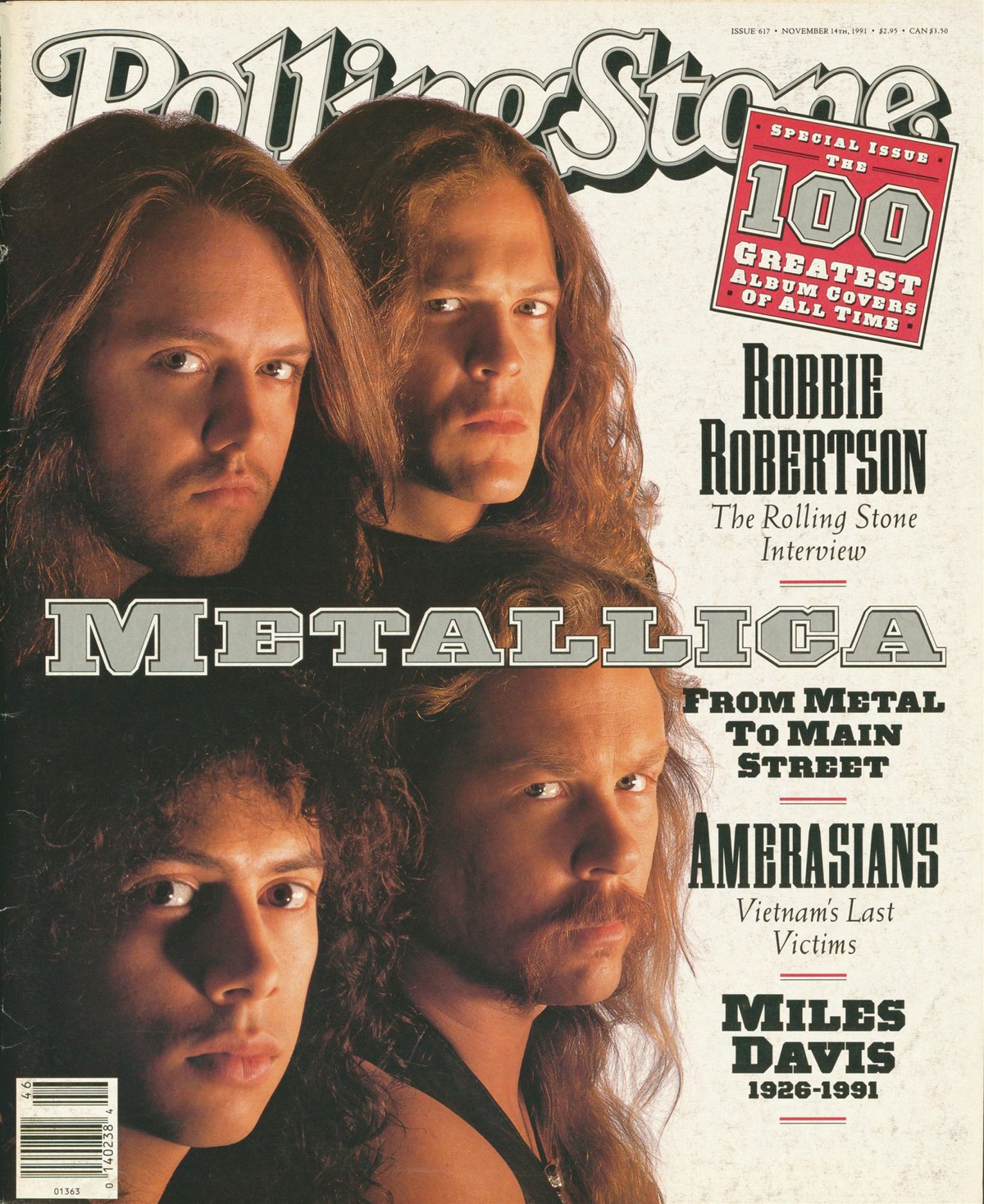
The cover of Rolling Stone from November 1991. Art Director Fred Woodward, Deputy Art Director Gail Anderson, coverlines set in various styles of Grecian by Dennis Ortiz-Lopez.
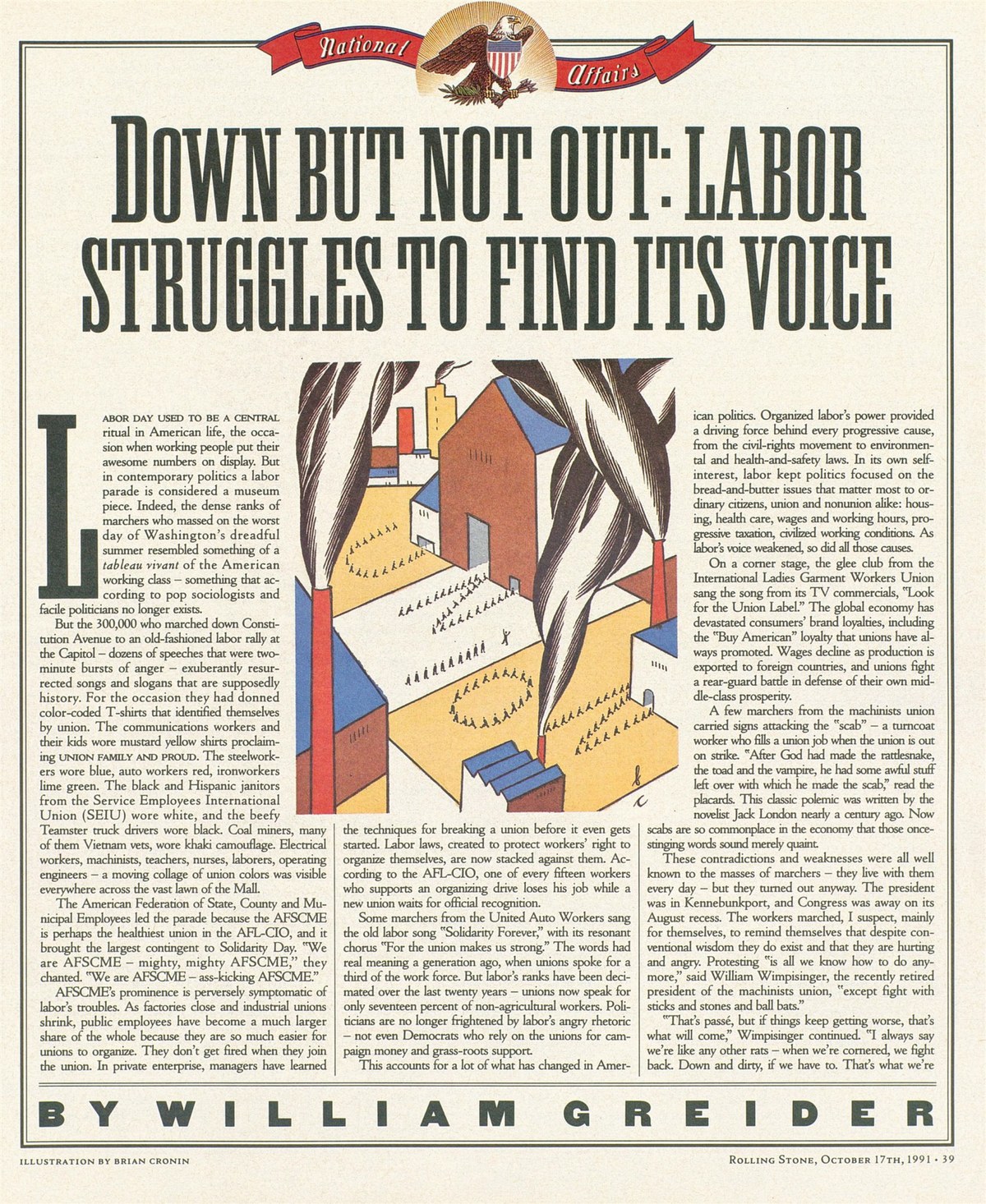
A page from Rolling Stone, November 1991. Headline set in Marla Bold by Dennis Ortiz-Lopez.
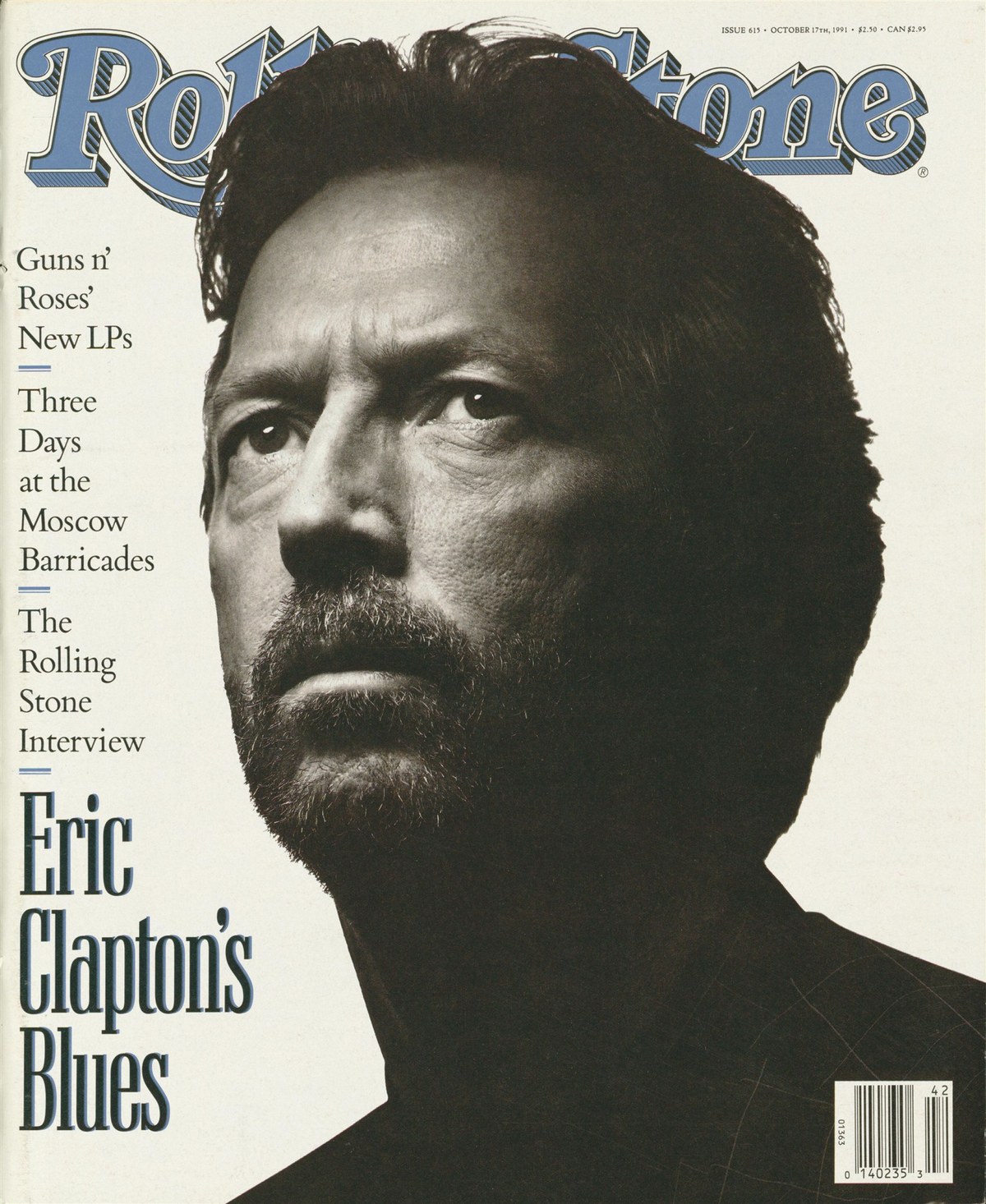
The cover of Rolling Stone from October 1991. Large coverline set in Candida Medium Condensed by Dennis Ortiz-Lopez, others in Bembo.

Swash caps are primarily used for artists’ names in the first issue since the redesign.
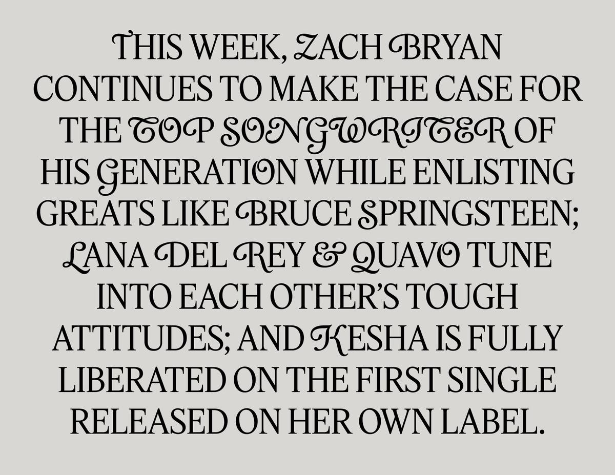
The swash caps leave room for experimentation as the redesign evolves.
Text and secondary headlines are in Feature Flat Text and Deck, with a set of swash capitals added to the Deck Regular by Julien Priez, a French calligrapher and type designer who joined the Commercial Type team in 2024. Turley asked us to try adding swashes to Feature after picking up a copy of Rolling Stone’s tenth-anniversary issue from October 1977. The cover was famous for its giant shaded X, commissioned from Jim Parkinson by then Art Director Roger Black. Turley liked how the Cloister Cursive coverlines played against the slab, and thought a set of swashes would add levity and texture to an otherwise deadly serious type palette. Rather than following the obvious path of simply adding swashes to the italic, Priez experimented with adding them to the upright as well, which had a surreal quality that Turley and Leeds preferred.
As tempting as it might have been to indulge in nostalgia for this project, we deliberately decided not to do so. That’s not to say that we didn’t have a lot to learn from the magazine’s history. Our guiding principle was to make the redesign “look like Rolling Stone,” without directly quoting the past. This informed Turley and Leeds’s approach as well. For example, the rules around the page allude to the Scotch borders used during Roger Black’s and Bea Feitler’s tenures as creative director and art director, respectively, in the 1970s. Now, as then, these rules help separate the editorial content from advertising, and create a frame that can be broken to striking effect. Any elements that were working—like Jesse Ragan’s recent update of Jim Parkinson’s design for the nameplate—were left alone.
Turley touched on the thinking behind the redesign in an interview with Arjun Basu on the Full Bleed podcast. One important objective was to “throw more words at it,” to return to Rolling Stone cofounder Jann Wenner’s ideas about prioritizing written content and making the magazine an immersive reading experience. “You look back at those Rolling Stone magazines—it was really dense. And so the job there was to find a new version of that type of density.” To that end, he added, “we upped the point size, we arranged the whole magazine around the body copy.” The team also elected to shift the paper stock back to a heavyweight newsprint, thus taking a publication known for continually reinventing itself back to its roots while transforming it into something utterly new. “I think the thing is people looking at it and thinking, God, it’s always looked like this,” Turley said.
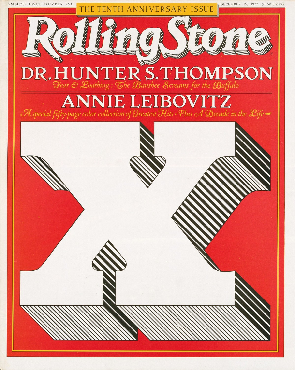
The cover of the tenth-anniversary issue of Rolling Stone, December 15, 1977. Cover designed by Bea Feitler, X lettering by Jim Parkinson, art direction by Roger Black.
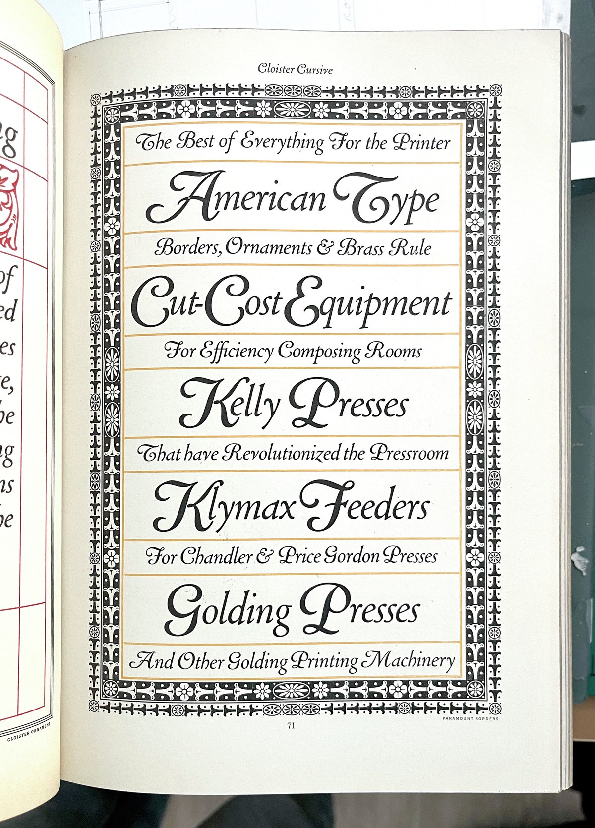
ATF Cloister Cursive, Morris Fuller Benton. First cast by American Type Founders ca. 1913.