Ahistoric reading: Designing Roboto Serif for Google Fonts
Most of the typefaces that come out of Commercial Type engage with history in one way or another. We like to use history as a starting point, but, Commercial Classics aside, the outcome is rarely a reproduction of the past. We hope what we design builds upon it and brings some of the old shapes and historical ideas somewhere new.
Roboto Serif was an unusual project for us because it isn’t really based on history at all. It was originally commissioned by Rob Giampetro for Google’s Material Design team. The main goal for Google was a new reading typeface that was native to the screen. It needed first and foremost to provide a comfortable reading experience. We thought that since this typeface would be screen-first, it would be interesting to approach the design of the typeface by working purely with what shows up as pixels on screen, sidestepping history for a more experimental, step-by-step approach to the design decisions.
First, some history
Georgia was designed by Matthew Carter for Microsoft in 1993 and introduced in 1996 as one of a new set of “Core fonts for the Web.” Georgia comes preinstalled on most computers, and anyone reading this essay has definitely seen it before. Its ubiquity has rendered it almost invisible, a true testament to its utility. What makes Georgia so interesting to me is that it was designed to bridge the gap between reading on paper to reading on screen, back when many people were resistant to the idea of reading anything but short bursts of text on screen, and long before everyone spent all day staring at their smartphones. You can still see this family in use today as the main text face for a number of popular websites. Up until around 2016, the New York Times website used Georgia for body copy, until they switched over to their custom cut of Imperial (designed by none other than Matthew Carter).
Georgia succeeded in bridging the gap between reading on paper to reading on screen by utilizing the hallmarks of newspaper typefaces both for legibility and for familiarity—its forms fit comfortably within the world of newspaper typefaces, so it has an air of believability. Georgia references hallmarks of a long lineage of newspaper typefaces, from Ionic No. 5 (adapted for Linotype machine setting in the early twentieth century, after many British foundries); Corona (part of Linotype’s “Legibility Group,” 1940); Egyptienne F (Adrian Frutiger for Linotype, 1956); Nimrod (Robin Nicholas for Monotype, 1979); to News Miller (Matthew Carter for Carter & Cone, 1999).
Three main characteristics provide the thread that runs through these typefaces to Georgia: a large x-height, low stroke contrast, and simplified and exaggerated details. These traits combine to subconciously communicate to a reader that they’re reading news, adding up to a particular tone and rhythm. Things like the more robust x-height, open apertures, and smaller ascenders and descenders make a typeface more readable at small sizes, on cheap paper—and also help make type more readable on screen. Carter leveraged these readily recognizable customs in newspaper and type history to help make the connection from print to the screen. Using the aesthetic of a newspaper text face would create the comfortable environment that people were already used to and make reading on screen feel more familiar. Creating new conventions would have risked alienating readers.
But after twenty-five years of people reading on screens, we can shed historical notions. What makes for a frictionless reading experience on screen now?
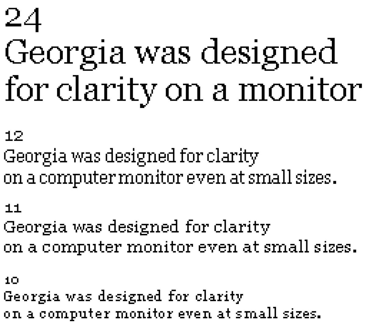
Matthew Carter manually drew bitmaps for each of a range of sizes in Georgia. Then the outlines were hinted —the shapes were painstakingly manipulated to match the bitmaps—by Tom Rickner, for optimal readability in black and white.
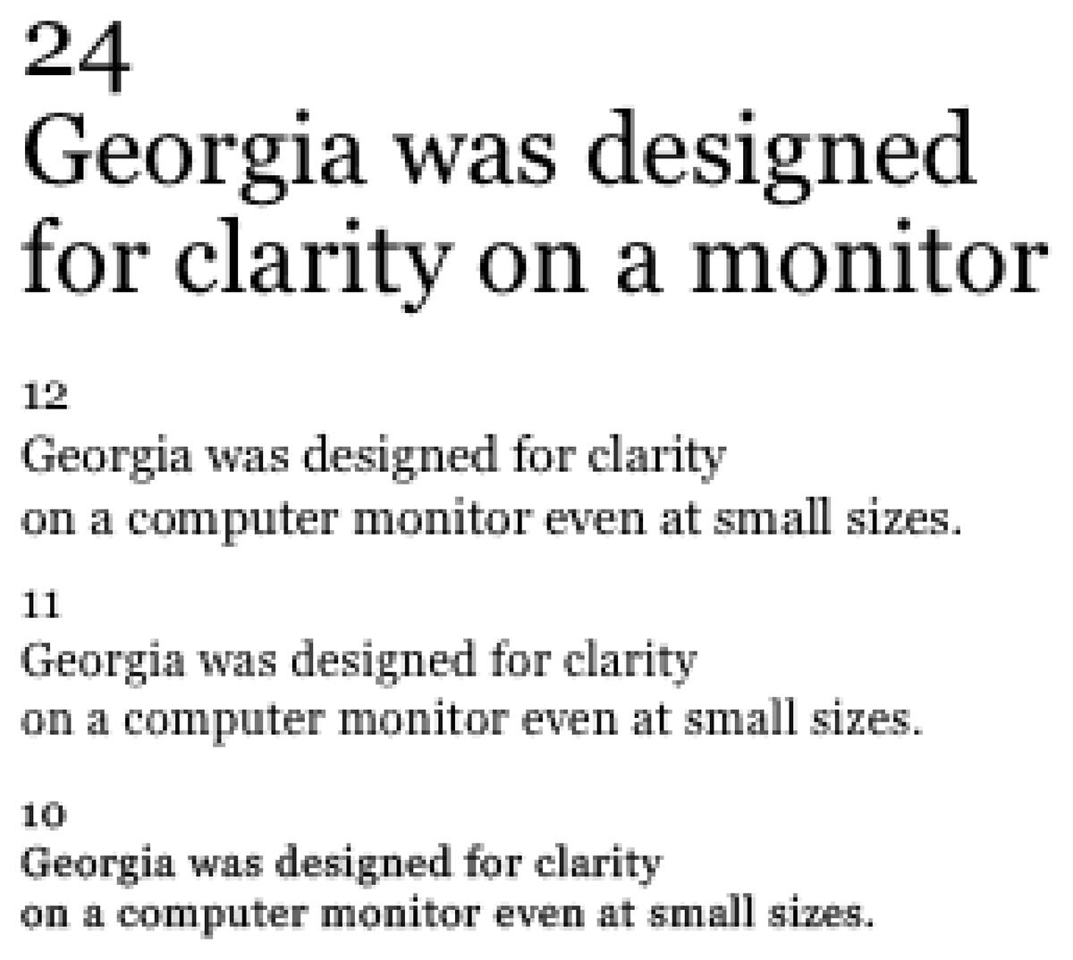
The same sizes rendered in grayscale without hinting are smoother and more faithful to the outlines, though readability suffers.

Today’s high resolution screens have made hinting far less critical.
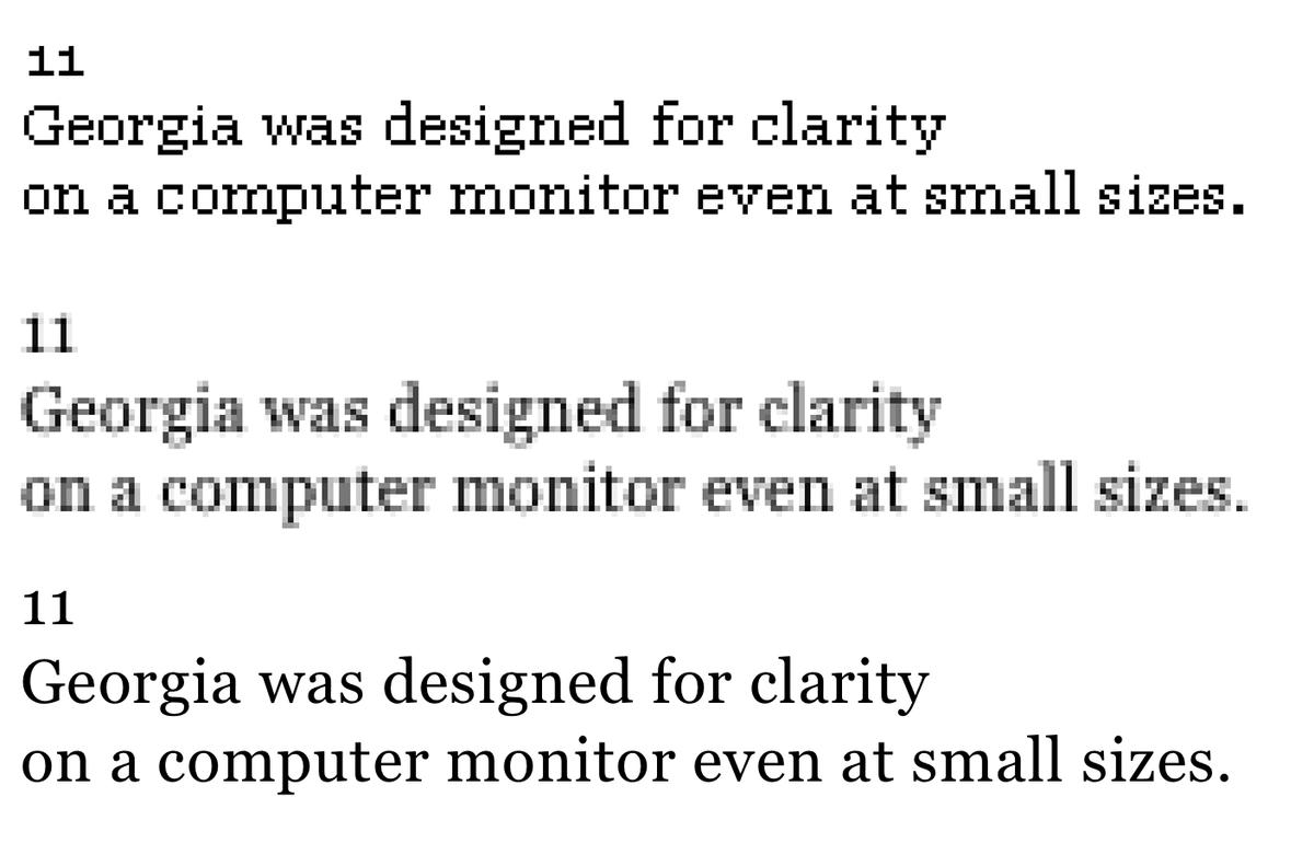
It’s remarkable how much the personality of the design comes through even in black and white bitmaps.
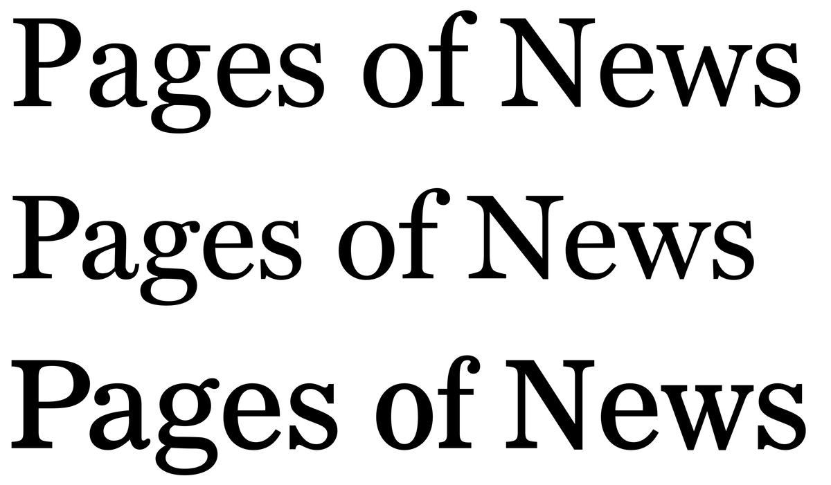
Georgia (top) can almost be thought of as Miller Text (middle), a Scotch roman, as seen through the lens of Corona (bottom), a news text face.
A selection of twentieth-century newspaper typefaces. From top: Ionic No. 5, Corona, Egyptienne F, Nimrod, and News Miller.
Terminal, contrast, proportions, and overall width are being explored here.
I decided to take a scientific approach: by separating out all of the different characteristics of what makes a serif typeface a serif typeface, I could isolate each element and explore different possibilities for it, and then test combinations of solutions to see what felt right and most comfortable on screen. People often think of experimental typefaces as being weird for weirdness’ sake, but I truly wanted to take an experimental approach, coming up with various theses and testing them.
I experimented with proportions on the macro level, with how more or less variation in the widths of individual letterforms altered the texture of text, with the vertical proportions, and with overall stroke contrast. On the micro level, I experimented with how the terminal shapes and the forms of the serifs altered the overall appearance and tone. By designing the process to break down a serif typeface to its elemental parts, I aimed to strip out unnecessary subtleties and distill the typeface down to deliberate shapes, asking at each stage: “Which of these versions works best on screen? What makes for a better reading experience for me?”
Rhythm
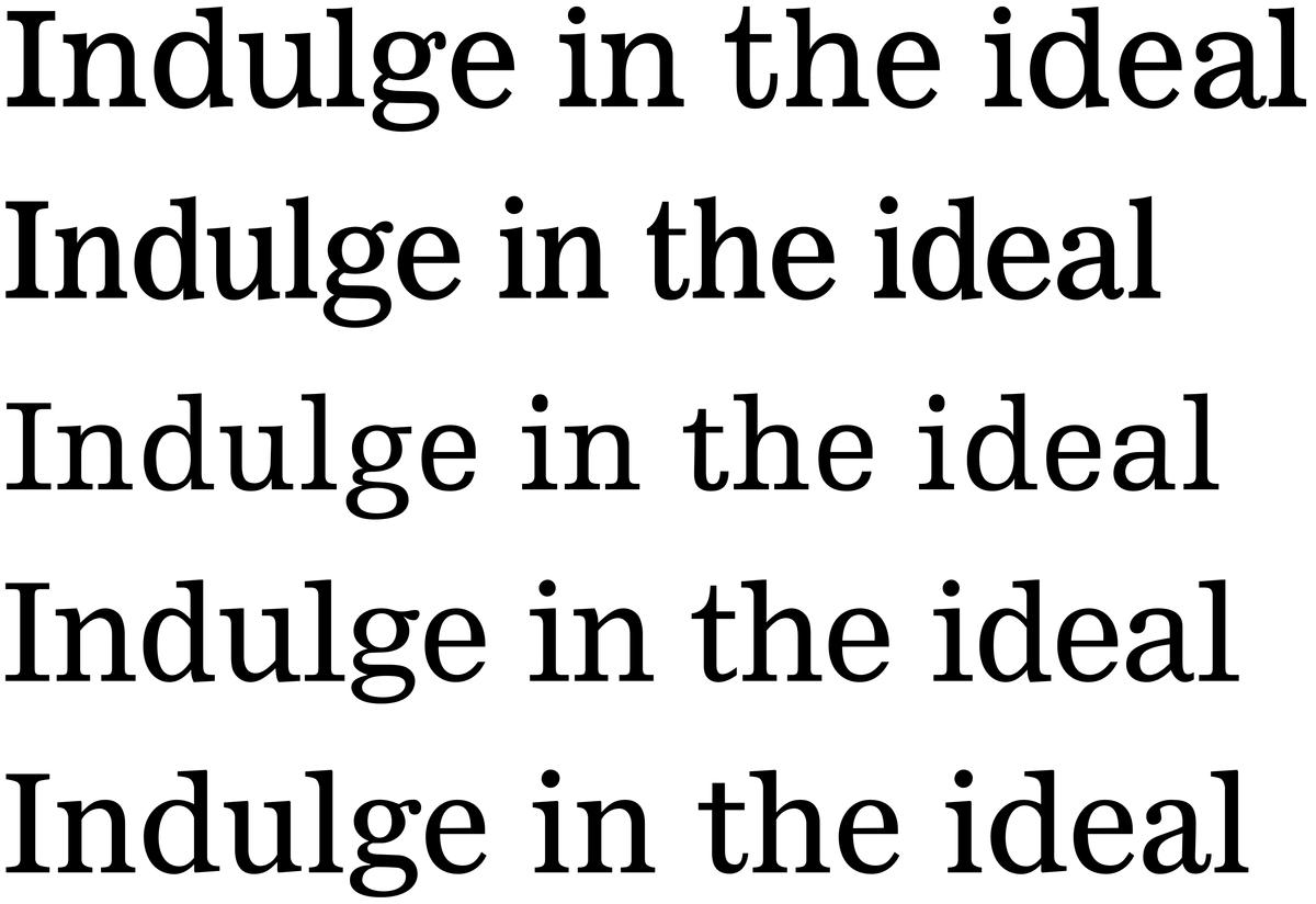
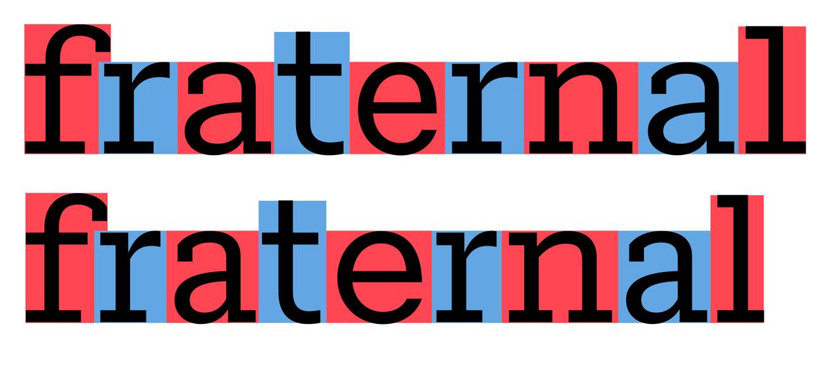
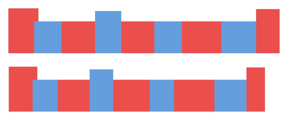
Rhythm is structurally important to how a typeface looks and feels. Early on I was testing a rhythm that was closer to newspaper typefaces, which are very regular. Variations in width were subtle, with rounds like e o c a bit more compact, so they don’t differ too much from flats like h n u; and narrow letters like a and s take up additional space for the sake of consistency. This was tested against a much more varied set of proportions, more similar to a typical book typeface: a f r s t are much narrower than flat-sided letters, which are narrower than the rounds; and m and w really stretch out to fill their space. I found the more regular proportions too monotonous for reading on screen—too cold and not conducive to reading—but the most varied proportions were a little too energetic. I ended up somewhere between the two but closer to the more varied rhythm, where it felt easier to read long blocks of text and not overly monotonous and fatiguing to the eye.
Vertical proportions
Vertical proportions were important in the process because the typeface needed to work seamlessly alongside Roboto Sans, Google’s default sans for interfaces, designed in 2011 and updated in 2014. From the beginning I made sure that the cap heights and x-heights matched visually, so that neither family jumps out when the two are mixed together in text. This ended up being the only shared trait between the two typefaces, aside from the name. Our clients at Google made clear at the outset that they did not expect or want Roboto Serif to be Roboto Sans with serifs tacked on. Instead, it needed to be a very considered companion to work well alongside the Sans, Mono, and Slab to add flexibility, depth, and sophistication to the family as a whole.

Roboto and Roboto Serif.

Serifs
The serifs were another example of being surprised by the result of the process. At first I was trying to reduce and simplify the serifs as much as possible: in many of the sketches they were just simple slabs. In the end, letting them have a little bit of bracketing made the typeface feel somehow more comfortable when reading long texts. The form was more traditional than I expected, but felt appropriately warm on screen while not being overly nostalgic about old books. To me it still looked contemporary.
The sharper interior serifs helped optimize the amount of white inside the letterforms, making the typeface feel crisper than it did with pure symmetrical bracketing. Having the outside bracketing be more pronounced and curved kept it from being overly digital and cold, seemingly because the gray pixels soften the overall tone.
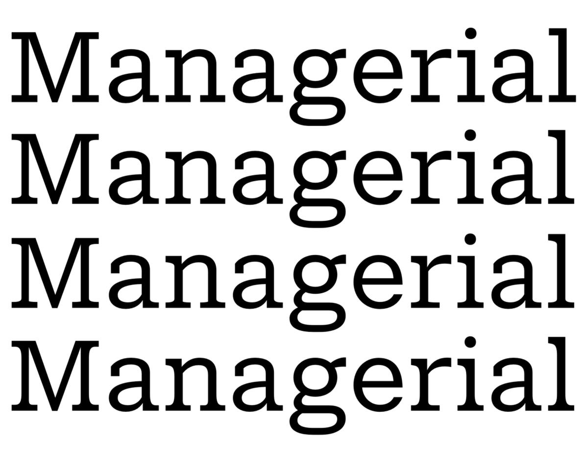
These were the main ideas I was testing and interpolating between to find something that felt comfortable but also legible on screen. The final version ended up somewhere between the third and fourth options.
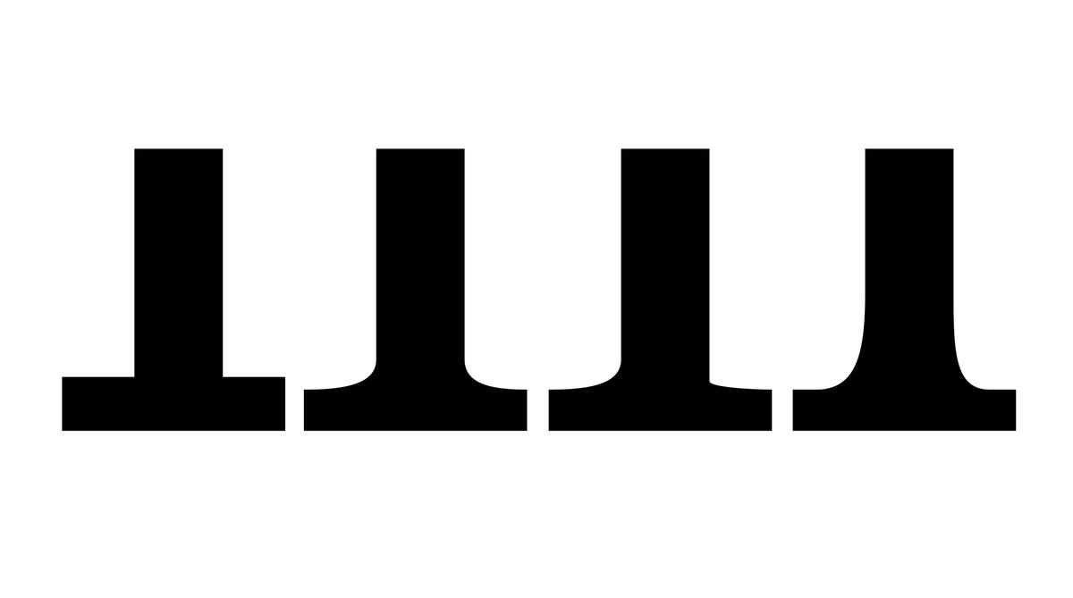
These serifs are all from the bottom left of the lowercase n.
Terminals
This was an early exploration into terminal shapes, and how they interacted with different rhythms of characters and different contrasts. Different options seemed to work best with different contrasts and character widths, but knowing how much territory the final family was going to cover, I understood that the terminal shape needed to work with different contrasts and weights and widths. The typeface needed something flexible but not noticeable. After a while I started to get into some existential thinking: “Do ball terminals really need to be balls?”
This goes back to stripping out any nuance that wasn’t necessary, and tempering the personality of the typeface. Something simple like having balls gave the typeface a more specific character, whereas this typeface needed to be atmosphere-agnostic. It should be comfortable when used for long-form journalism or a novel, or when reading an email, or even for interface elements, so it couldn’t carry a tone that felt too attached to any specific end use.
The square is native to the screen and is a simple shape to render, whereas curves are harder to render at smaller sizes. These terminals serve their purpose of making the texture of a block of text more even without doing any more than they need to do. Each letter simply exists. None of them grab the reader’s attention though their own quirkiness. It can work in all weights, widths and optical sizes, and grades, in a fluid way that is native to the screen.
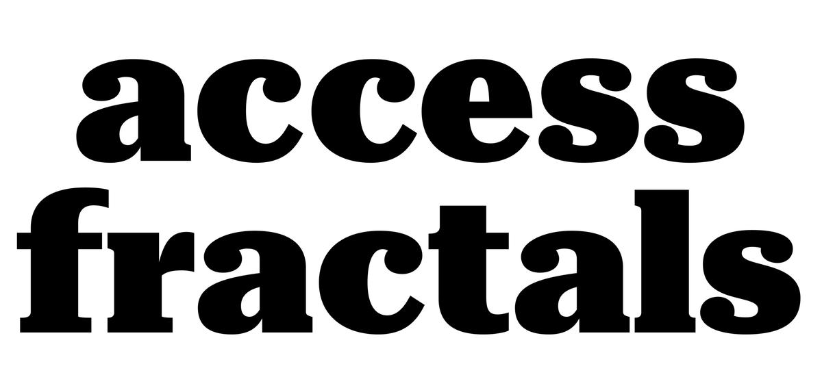
Ball terminals.
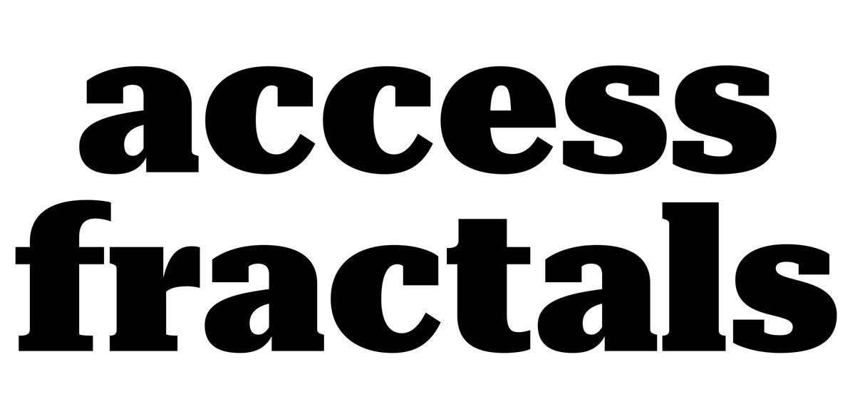
Rectangular terminals.
Proofing
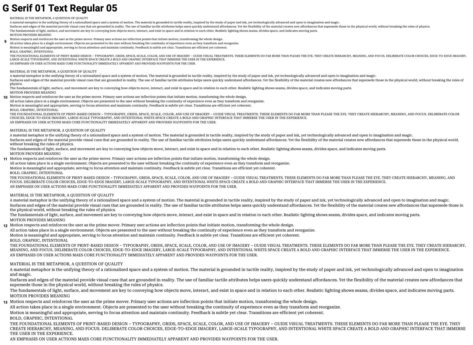
I proofed Roboto Serif using a web-proofing script that spit out a page that looked like this.
To help find those things that popped out, I proofed the typeface using a web-proofing script that would spit out a web page. So much of my day was spent looking at stuff like this for hours, trying to figure out what was working or not working. What was I noticing and what was I not noticing? One thing that helped me immensely was setting the typeface as the default serif in my browser. I caught more distractions and learned more about the typeface by doing this than I had on any previous project. I could see it in words that I probably wouldn’t come up with, in sentences that I would never think to write. I could see where its limits where and where it shone. Most of the time I forgot about it, and that was how I realized that it was accomplishing its job. It felt comfortable to read and I didn’t notice it. It felt at home in any kind of text I was reading it in.
Weights, widths, optical sizes, and grades
When we started the process of designing Roboto Serif, most of the existing variable fonts up to that point showcased the exuberant possibilities the technology offered for display type. Far fewer families demonstrated how variable fonts can assist with the minutiae of micro and macro typography. This family was designed to bring the fine-tuned nuance from print to the web, where the various options for weights and widths—and more importantly optical sizes and grades—are seldom available but can be very helpful. For example, when working with type on a colored background, instead of adding a stroke with CSS, you can adjust the grade so the typeface is more robust and easier to read. Optical scaling helps to make sure the typeface looks its best when set in a range of sizes, say for a web article or a news site. Headlines can be elegant without compromising the readability of smaller text, or vice versa. A micro size has been developed for captions and footnotes, though it also makes an appealing display face with a clunky, functional aesthetic.
The width axis allows for both stylistic and functional adjustments—a long headline can be narrowed to keep it from breaking onto additional lines. The display size has the largest range from wide to narrow, both to accommodate the expressive needs of display typography and because the higher contrast allows for more variation without counterforms closing up, while the text and micro sizes are limited to what is most legible at their intended sizes.
Roboto Serif widths.
Italic widths.
Roboto Serif’s optical sizes at their intended relative scale.
Display, Text, and Micro at the same point size, showing the differences between them.
Display is clean and elegant, with relatively delicate thin strokes.
Text is robust and straightforward.
Micro has a large x-height, additional thinning where strokes meet, and an overall clunkiness to keep counterforms from filling in and details from getting lost at the smallest sizes.
Grades are subtle variations in the weights of the thin strokes, to allow text to become more delicate or more robust as needed without affecting copyfit.
All three grades of Roboto Serif are superimposed here.
Languages
With weight, width, optical size, and grade axes, Roboto Serif supports a total of 485 languages, by Google’s count. After first appearing on Google Fonts in February 2022, the family was updated in 2023 to add support for languages that use the Cyrillic script and several languages in Africa. A project this large could not have been accomplished alone, and I am so thankful for the contributions of Hrvoje Živčić, Kara Gordon, Miguel Reyes, Christian Schwartz, Mark Record, Inga Plönnigs, Flavia Zimbardi, Rafał Buchner, Maria Doreuli, and Thomas Bouillet to the Latin; and Ilya Ruderman, Yury Ostromentsky, and Micha Strukov for drawing the Cyrillic.
Roboto Serif can be accessed on Google Fonts and is free for all. You can also play around with the minisite. We can’t wait to see what you make with it. We’ll conclude here with the Afterword from the printed specimen Google Fonts produced to introduce the family.
Google Fonts’ mission is to make web typography better for everyone. One of the ways we invest in this (and the typography community at large) is by commissioning outside typographers and studios to create new fonts.
For Roboto Serif, we were thrilled to collaborate with Commercial Type for the first time. This latest addition to the Roboto superfamily fills a need we saw in our existing library for a highly readable serif that pairs well with Roboto Sans. In order to create a true serif for Roboto, (not just a ‘serif-ized’ version of Roboto Sans), Commercial used the vertical proportions of Roboto Sans as a starting point—to make sure the two families could be mixed harmoniously in running text. The result is an elegant, functional typeface that complements Roboto Sans, but can stand on its own as a beautiful, modern face. Expanding Roboto with a serif allows for greater flexibility and variety… which means better functionality and tonality across many, vastly different products and brands.
Roboto Serif is offered as an open-source, variable font (the static files are available, too). Variable fonts are well known for saving font download bandwidth online, but that’s just one of their benefits. For example, designers can set Roboto Serif to automatically adjust optical sizingon browsers and other products like Sketch. We’ve invested heavily in variable font typefaces, as well as in tools for their production, testing, and use, and we’re excited to see what creative designers and developers do with this technology. What would you want on an axis?
We hope you enjoy getting comfortable with Roboto Serif! Let us know.
—The Google Fonts Team
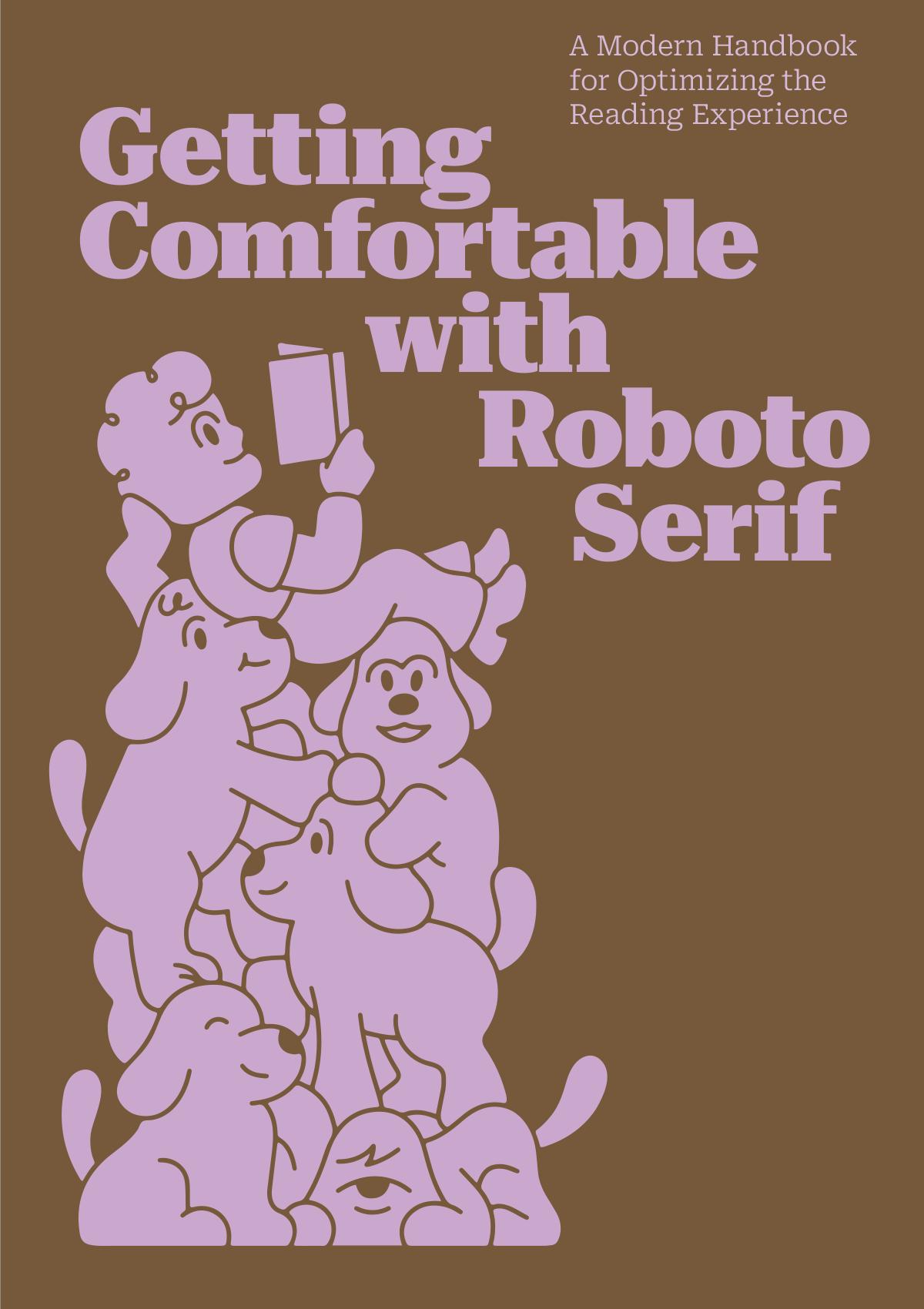
Cover of the printed specimen, designed by Studio Elana Schlenker with illustration by Kyle Platts.