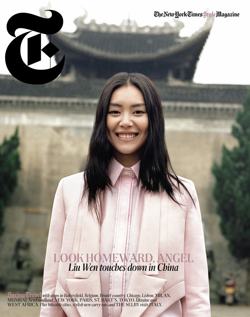
T: The New York Times Style Magazine
Beginning in 2007, Berton Hasebe and Christian Schwartz have created eight different custom typefaces – through several changes of editor and design director – that have each helped to define the moment in fashion for T: The New York Times Style Magazine.
2007: Giorgio
2008, creative director Janet Froelich, senior art director David Sebbah, art director Chris Martinez. Round alternates were introduced for Giorgio’s second year.
Spread from 2007. Creative director Janet Froelich, senior art director David Sebbah, art director Chris Martinez.
2008, creative director Janet Froelich, senior art director David Sebbah, art director Chris Martinez. Round alternates were introduced for Giorgio’s second year.
Spread from 2007. Creative director Janet Froelich, senior art director David Sebbah, art director Chris Martinez.
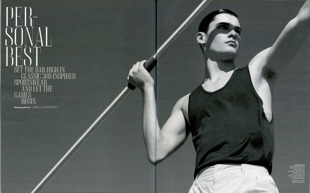
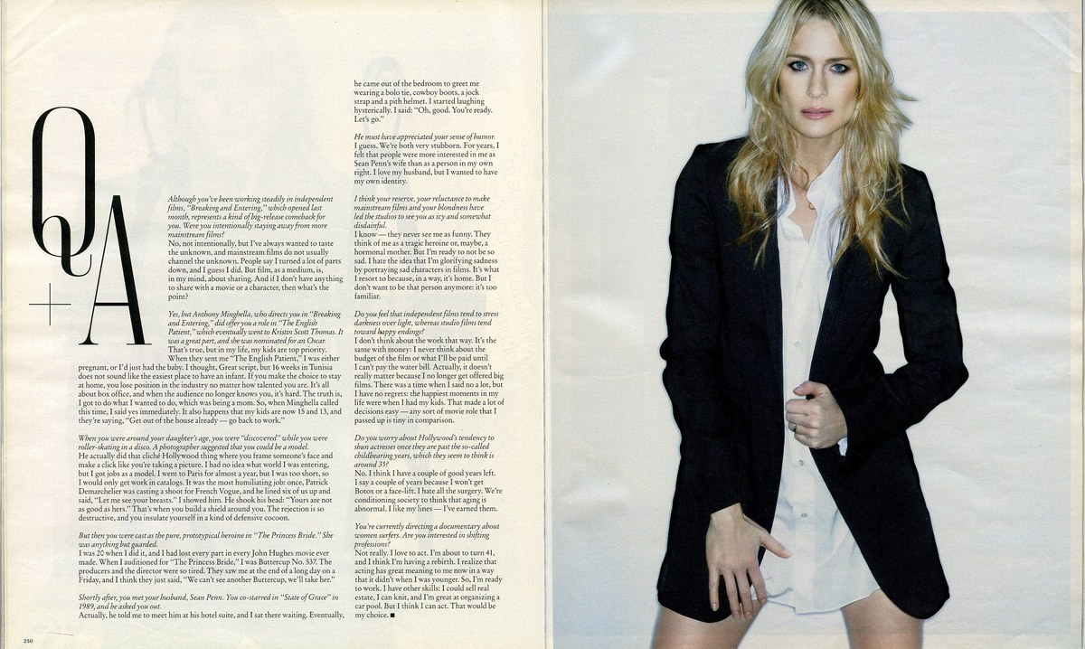
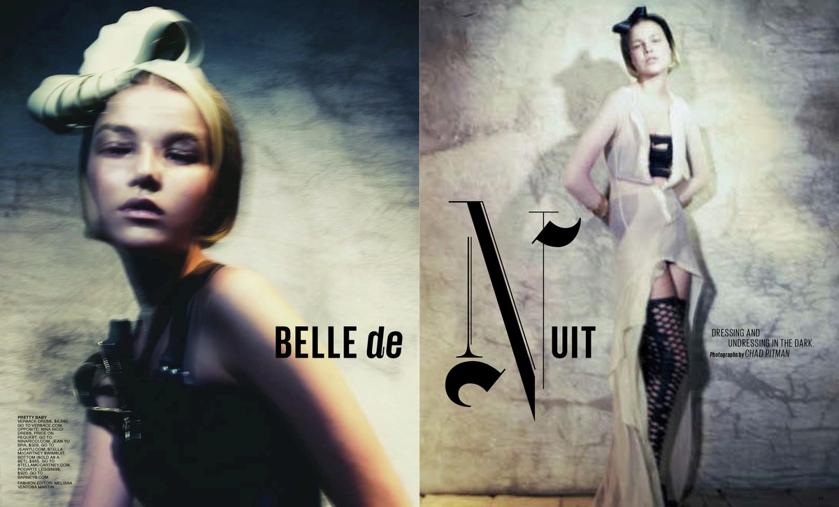
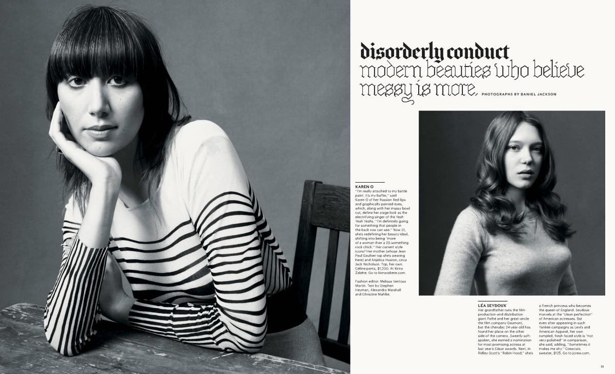
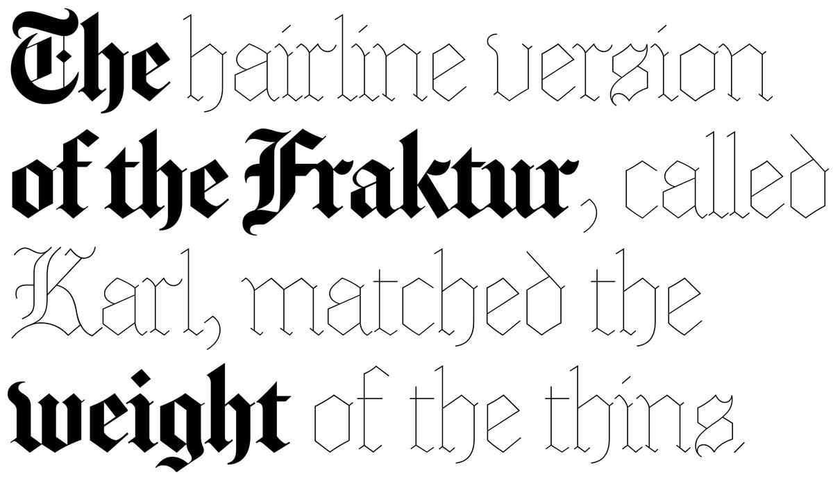
Giorgio was commissioned as a temporary addition to the type palette in T, specifically for headlines in the feature well, to respond to the current moment in fashion. The tall, slender proportions and eccentric detailing that was prevalent for spring/summer 2007 were not well served by the light weights of Stymie and the beautiful Fraktur, commissioned by T from Matthew Carter, who also drew the iconic single-letter nameplate.
Christian Schwartz worked closely with art director Chris Martinez, who provided a range of references but was most attached to Imre Reiner’s Corvinus, especially a strange interpretation by New York-based type designer and lettering artist Dennis Ortiz-Lopez called Corvinus Versailles. Since the typeface would just be used in short headlines – that was the initial intention, at least – Schwartz was encouraged to embrace eccentricity and make sure the typeface’s personality would come through no matter how short the headline was.
Giorgio was designed as a single weight in four optical sizes, pushing the boundaries of stroke contrast with the rotogravure process used to print the magazine, which gives rich, saturated color to images but is hard on type.
Giorgio was altered the following year with a set of circular alternates for C D G O and Q, inspired by a remix of the typeface done by Non-Format for the year-end holiday issue.
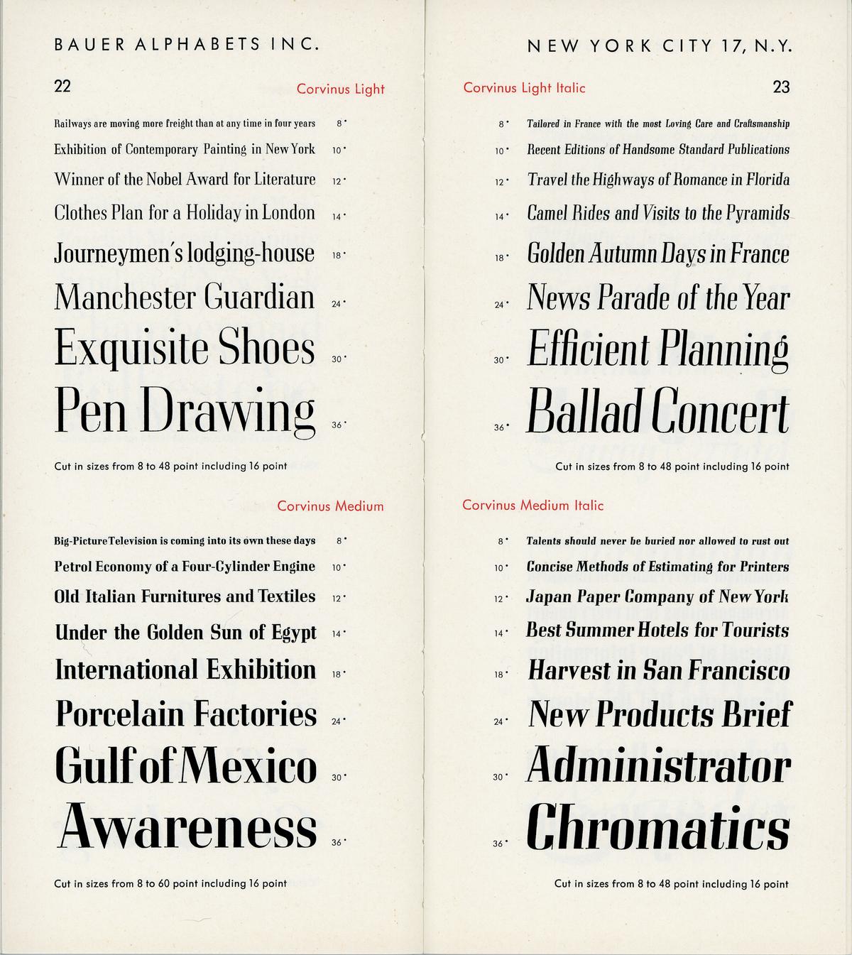
Corvinus by Imre Reiner, 1929–34.
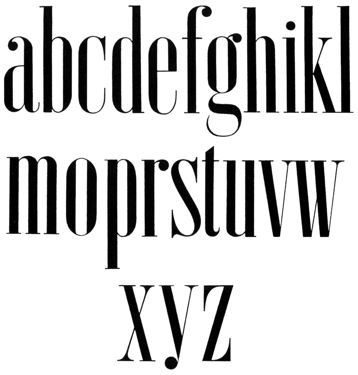
Alphabet from Hoffmann’s Schriftatlas, 1930
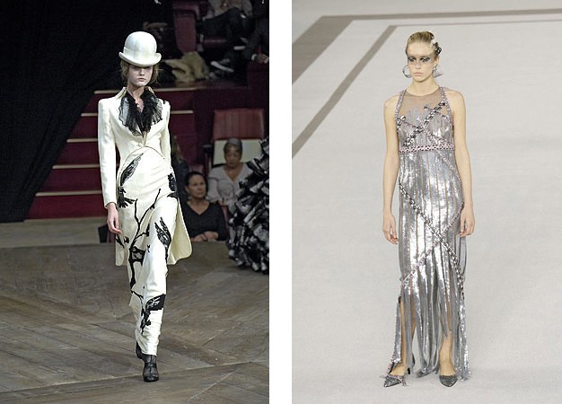
Left: Alexander McQueen; Right: Chanel couture. Both S/S 2007
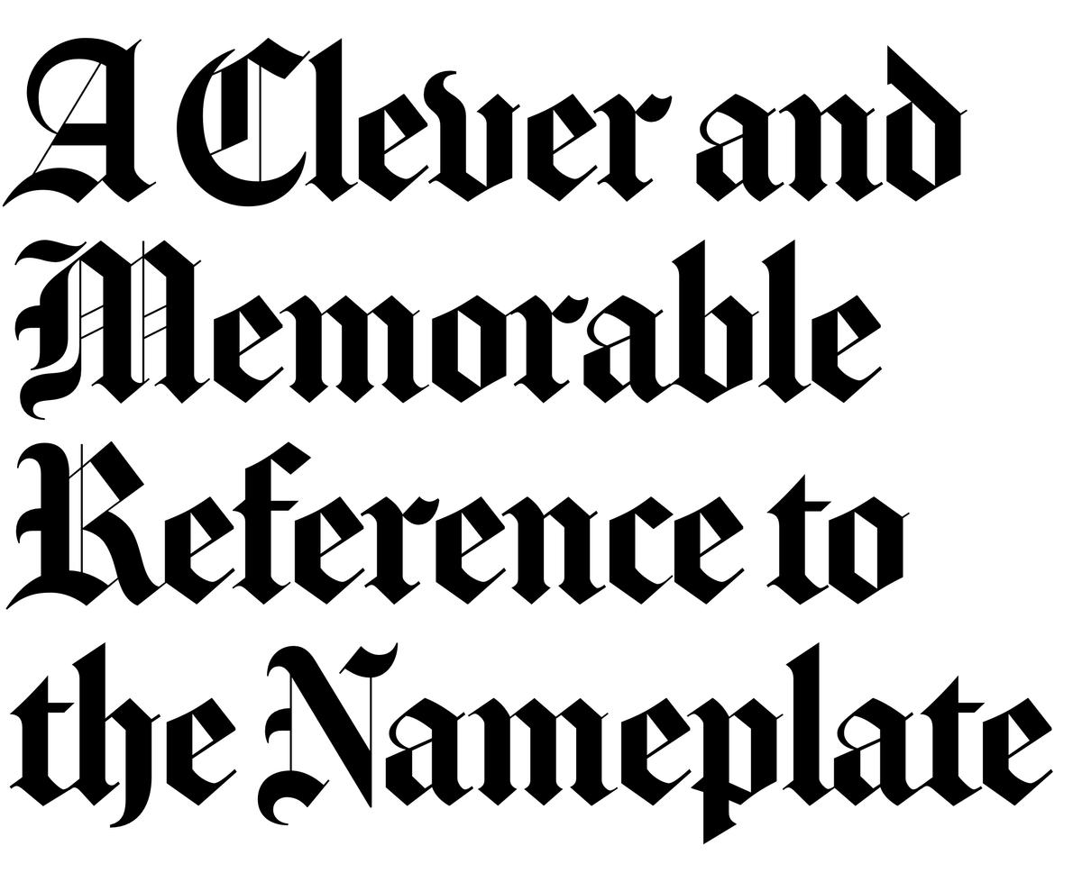
Matthew Carter’s NYT Fraktur, based on the New York Times nameplate, was commissioned for the launch of T in 2004.
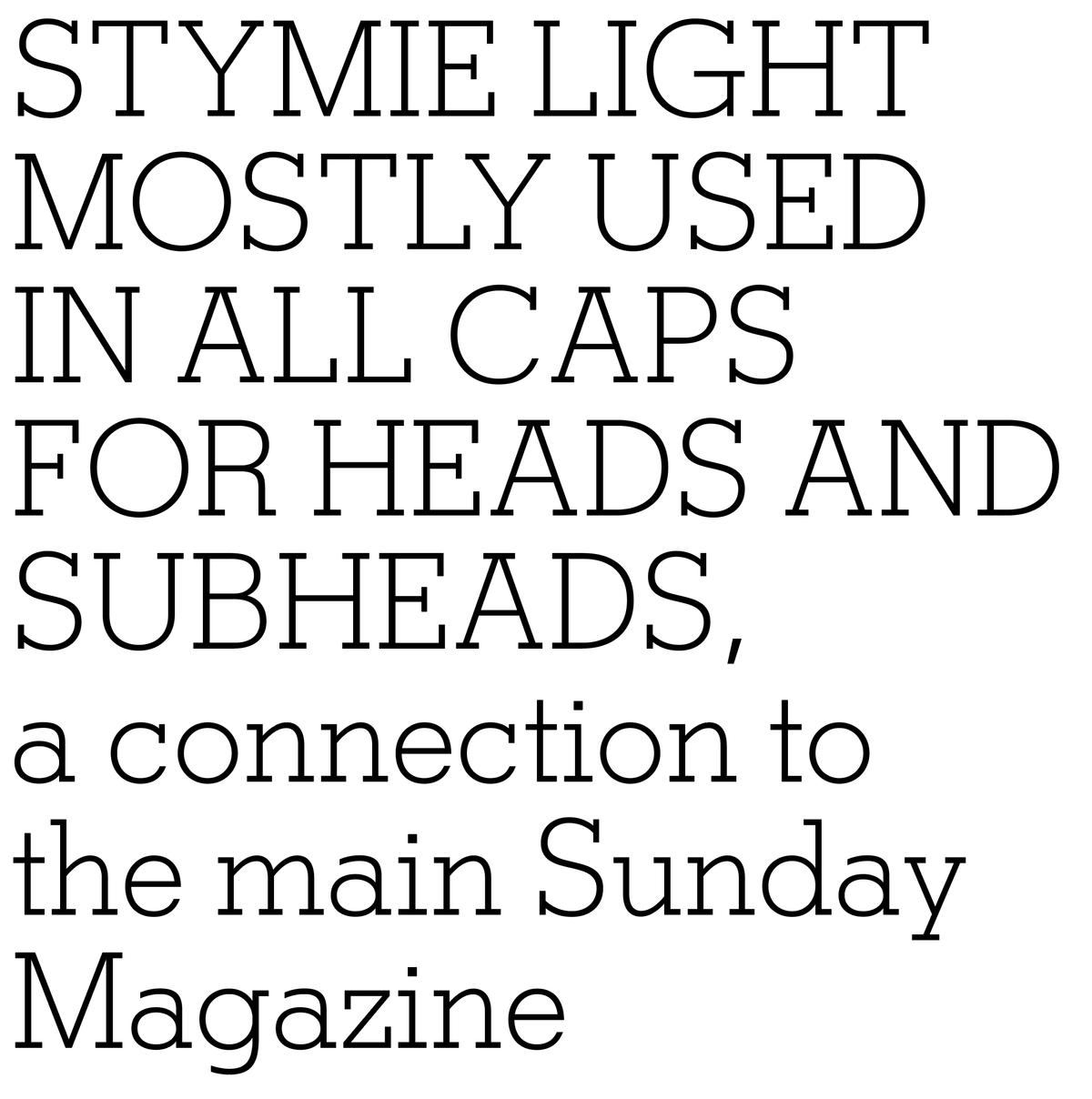
T also used a custom version of Stymie, also drawn by Carter, which it shared with the New York Times Sunday Magazine.

Each issue featured a Q+A, so Schwartz drew a dozen variations on the Q
Page from the Holiday issue at the end of 2007, with the headline lettered by Non-Format in their remix of Giorgio.
2009: Giorgio Sans
2009, senior art director David Sebbah, art director Chris Martinez.
2009, senior art director David Sebbah, art director Chris Martinez
2009, senior art director David Sebbah, art director Chris Martinez
2009, senior art director David Sebbah, art director Chris Martinez
2009, senior art director David Sebbah, art director Chris Martinez.
2009, senior art director David Sebbah, art director Chris Martinez
2009, senior art director David Sebbah, art director Chris Martinez
2009, senior art director David Sebbah, art director Chris Martinez
In 2009, Chris Martinez wanted to evolve Giorgio once more, using French enameled street signs as a reference. He liked how the stripped-back simplicity of the forms, without contrast or serifs, balanced with the distinctive structures of some of the letterforms, such as the R. He wanted Schwartz to see how Giorgio would adapt as a low-contrast sans, first as a Bold, then expanding out to a full range of weights. The Thin weight matches the hairlines in the Fraktur, allowing the two to work unexpectedly well as a pair. Alternate forms in the italic lowercase retain the tails from Giorgio, for occasional use.
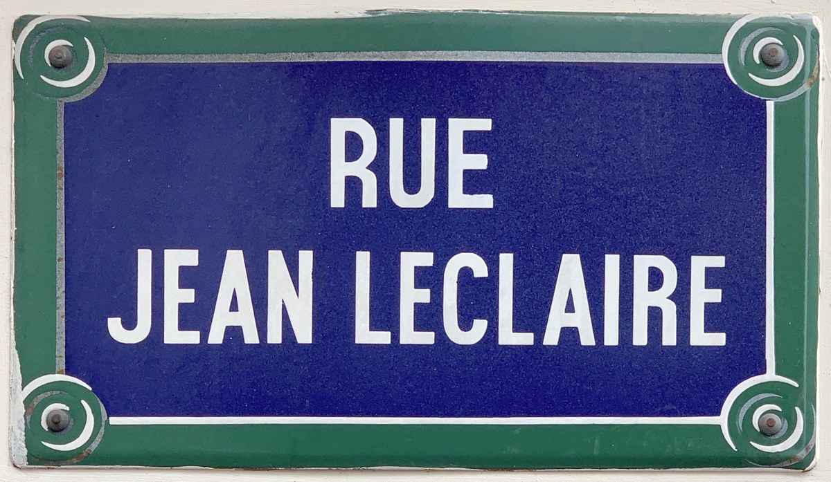
Enamel street sign from Paris, image from Wikimedia Commons.
2009: Karl
2010, creative director David Sebbah, senior art director Chris Martinez
2010, creative director David Sebbah, senior art director Chris Martinez
2010, creative director David Sebbah, senior art director Chris Martinez
2010, creative director David Sebbah, senior art director Chris Martinez
2010, creative director David Sebbah, senior art director Chris Martinez
2010, creative director David Sebbah, senior art director Chris Martinez
2010, creative director David Sebbah, senior art director Chris Martinez
2010, creative director David Sebbah, senior art director Chris Martinez
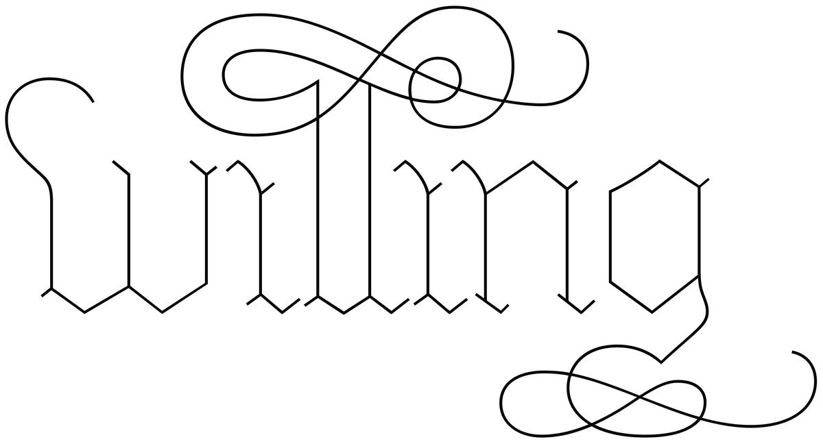
With their 5th Anniversary issue, T unveiled their first complete redesign since the magazine was founded. Senior art director Chris Martinez commissioned a truly unique new voice for their typographic palette: a hairline version of T's own Fraktur, which was designed for the magazine by Matthew Carter. Berton Hasebe drew on his experience working on Paul Barnes’s Marian to create Karl. Karl included an extensive set of swashes, attached to the ascenders and descenders, which Hasebe sketched with a ballpoint pen, then painstakingly digitized to retain their fluid spontaneity.
2010: Pialat
2010, creative director David Sebbah, senior art director Chris Martinez
2010, creative director David Sebbah, senior art director Chris Martinez
2010, creative director David Sebbah, senior art director Chris Martinez. For the first time, one of our custom display faces was used throughout the magazine, including the cover.
2010, creative director David Sebbah, senior art director Chris Martinez
2010, creative director David Sebbah, senior art director Chris Martinez
2011, creative director David Sebbah
2010, creative director David Sebbah, senior art director Chris Martinez
2010, creative director David Sebbah, senior art director Chris Martinez
2010, creative director David Sebbah, senior art director Chris Martinez. For the first time, one of our custom display faces was used throughout the magazine, including the cover.
2010, creative director David Sebbah, senior art director Chris Martinez
In 2010, founding editor Stefano Tonchi departed T for W, and Sally Stringer took over the top spot. She defined a new editorial direction for the magazine, more bohemian and – appropriate for the times after the 2008 economic crash – less focused on overt luxury. Divisions between sections of the magazine were no longer as hard, and Chris Martinez wanted to use one display typeface to tie the whole publication together.
Martinez was very taken with the lettering style of the titles for À nos amours, a 1983 film by French director Maurcie Pialat, and asked us to use these forms as the starting point for a new typeface. Berton Hasebe drew the face in two variations, one with conventional hairlines and an Open version, where the thin parts of the letters all appear to have worn away. After completing Pialat, we learned that the main title for A nos amours had been typeset in Raphael Boguslav’s Visa, but the production process had softened the corners so much that it was hard to recognize.
Pialat also has a spirited italic, loosely inspired by italics cut by Christofel van Dijck for the Elzevir family in the 1600s. The tension between the soft, worn endings and the crisp, jumpy forms felt appropriate for the spare visuals and increased white space.
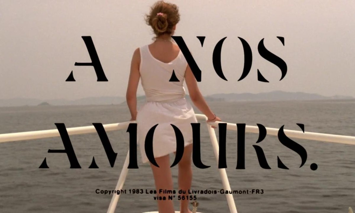
Main title to À nos amours, directed by Maurice Pialat.
L. Annæi Senecae Opera, quae exstant, printed 1649 by Daniel Elzevir using types cut by Christofel van Dijck
2013: Schnyder
Graphik Titling was drawn in four weights.
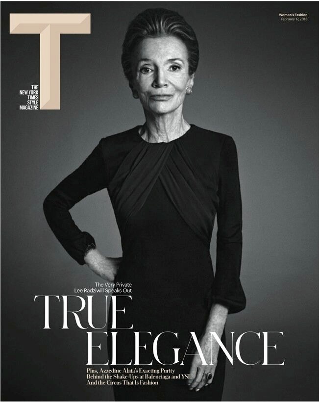
17 February 2013, creative director Patrick Li with Shawn Carney, Aurelie Pellissier, and Natalie Do.
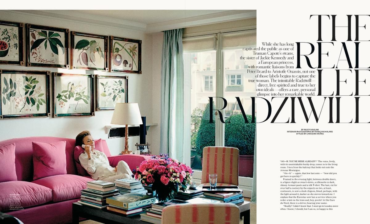
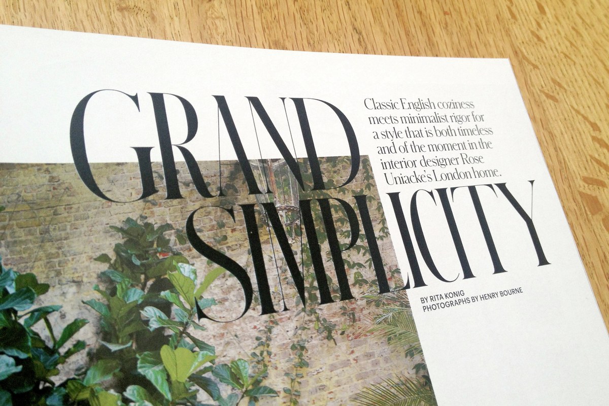
2013, creative director Patrick Li, art directors Shawn Carney and Aurelie Pellissier, designer Natalie Do
2013, creative director Patrick Li, art directors Shawn Carney and Aurelie Pellissier, designer Natalie Do. S and XL optical sizes are used here.
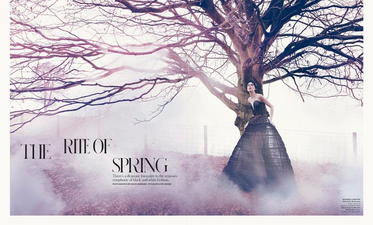
2013, creative director Patrick Li, art directors Shawn Carney and Aurelie Pellissier, designer Natalie Do
Graphik Titling was drawn in four weights.
17 February 2013, creative director Patrick Li with Shawn Carney, Aurelie Pellissier, and Natalie Do.
2013, creative director Patrick Li, art directors Shawn Carney and Aurelie Pellissier, designer Natalie Do
Sally Stringer’s tenure turned out to be relatively short-lived, and Deborah Needleman was named editor at the end of 2012, bringing Patrick Li in as creative director. After each designing headline faces for T over the years, Hasebe and Schwartz teamed up for the next one, because Patrick Li and his team of Shawn Carney, Aurelie Pellissier, and Natalie Do had an ambitious idea and a short timeframe.
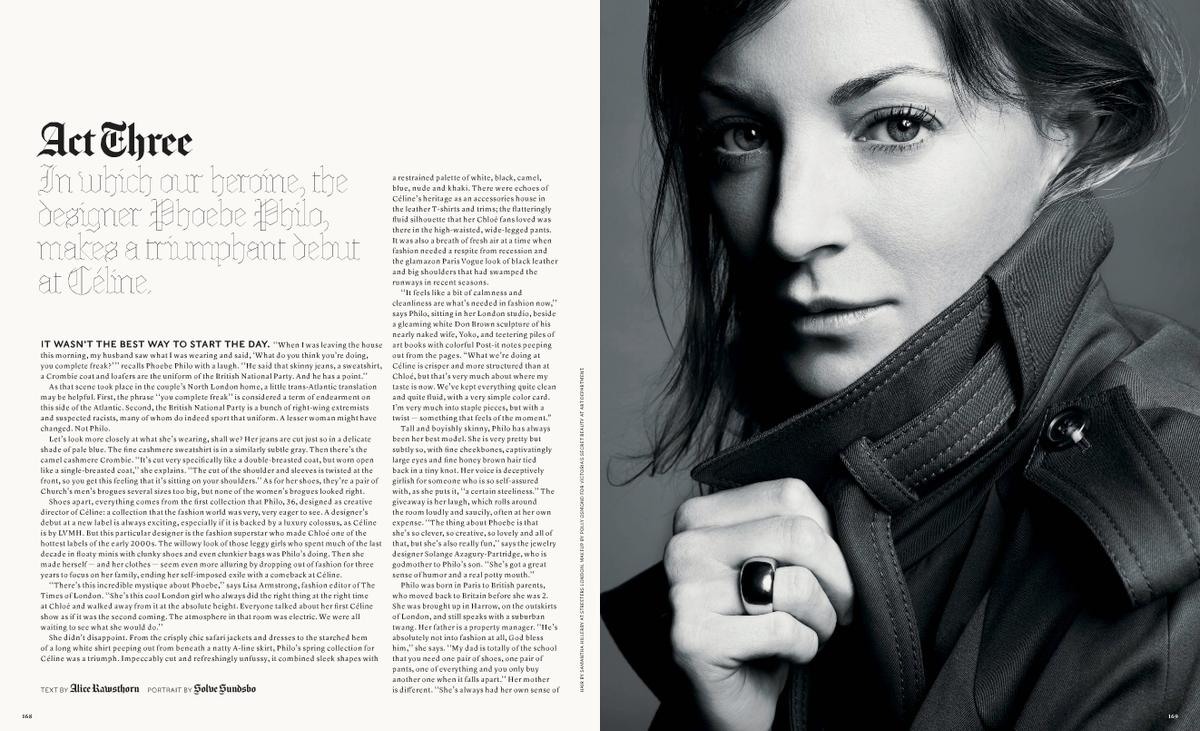
The initial jumping off point for the design was a piece of pointed pen lettering by Swiss painter Jean-Frederic Schnyder, which Li had recently acquired. The lettering was quite precise in its thick and thin strokes, but had organic and unusual structures for individual letters and great variations in character widths from line to line, for justification. Schnyder features two weights, a Light and a Bold, initally in three (later in four) widths. The stem weights in each weight are identical across the widths, an unusual feature that allows the widths to be mixed freely in headlines, even within single words. Certain characters were given a large number of alternates, allowing the headlines to feel even more like lettering rather than set type. The lowercase draws from German typefaces popular in the the early 1900s. Like Giorgio, this typeface tests the limits of gravure printing, and has four optical sizes to ensure that its thin strokes can be thin as possible at each size without falling apart.
Schnyder Wide was added a year later, expanding the family in some interesting new directions, on one hand bringing a new airiness to the headlines on the elegant, understated opening spreads for the cover story on Phoebe Philo; on the other hand, the Wide provides even more variety of widths for the designers to play with in the mixed-width headline treatments that are a signature of T's display typography, particularly with a handful of extremely wide alternate forms.
Li and his team also commissioned Graphik Titling, which applied the same mixed-width effect to Graphik, the secondary typeface in the layouts.
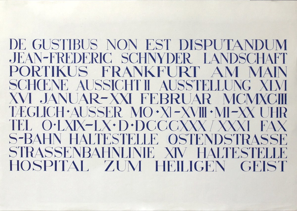
Lettering by Jean-Frederic Schnyder, 1993
2018: Kippenberger and Fact
2018
2018
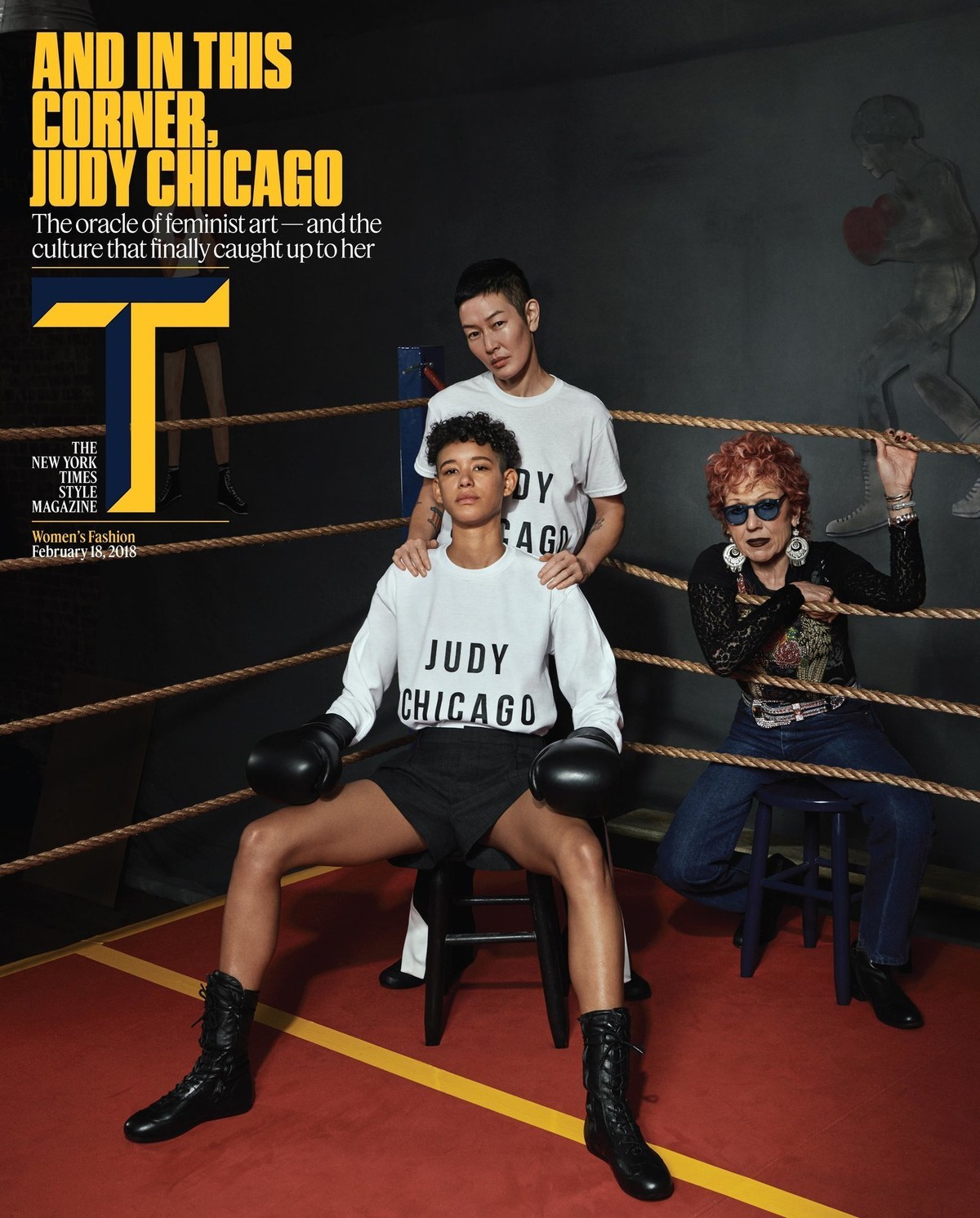
The redesign debuted with the Women’s Fashion issue on 18 February 2018
2018
2018
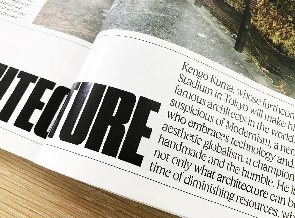
The 2018 incarnation of T is filled with dense, dark text
2018
2018
2018
2018
2018
The redesign debuted with the Women’s Fashion issue on 18 February 2018
2018
Hanya Yanagihara became editor in chief in 2017, leading creative director Patrick Li and his team to reimagine the look of the magazine from front to back, once again enlisting Hasebe and Schwartz to create custom typefaces for the redesign. The goal this time was to create a complete system of typefaces that would pull together references encompassing artist-published underground magazines from the late 20th century, the precisely gridded publication design of Karl Gerstner, and Herb Lubalin’s provocative typographic covers for fact magazine. T was becoming a denser and more text-oriented publication than it had been under previous editors. The image-forward approach was giving way to a magazine focused on words, so the new typefaces needed to be built for a text-heavy environment.
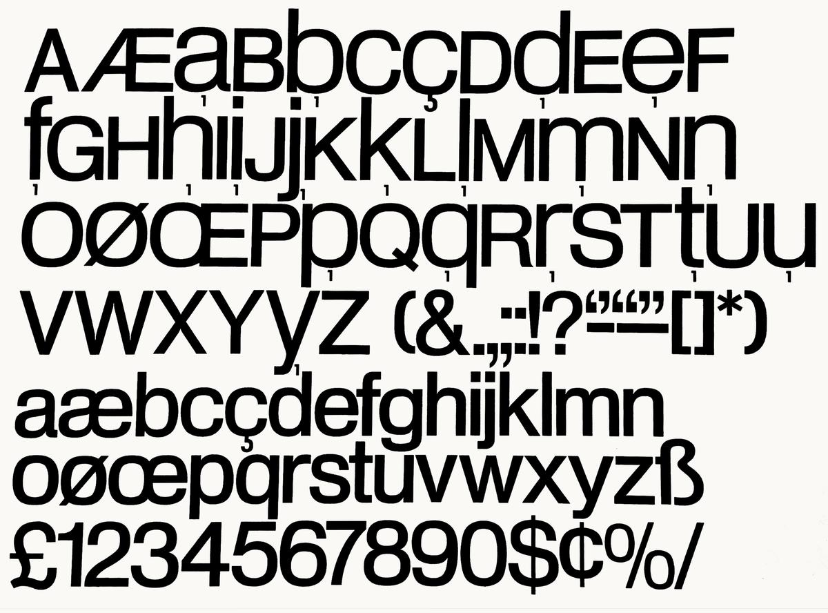
Kippenberger, designed by Berton Hasebe, is a sans serif family in three widths. Round bowls are blunted off in order to facilitate tightly stacked tracking and leading, and its squarish, inflated curves give the feeling of 1960s and 70s phototype and DIY dry transfer headlines without referencing any one typeface in particular. The normal and condensed widths are drawn for use at both small and large sizes, while the Poster width was drawn exclusively for bold, powerful feature openers and coverlines.
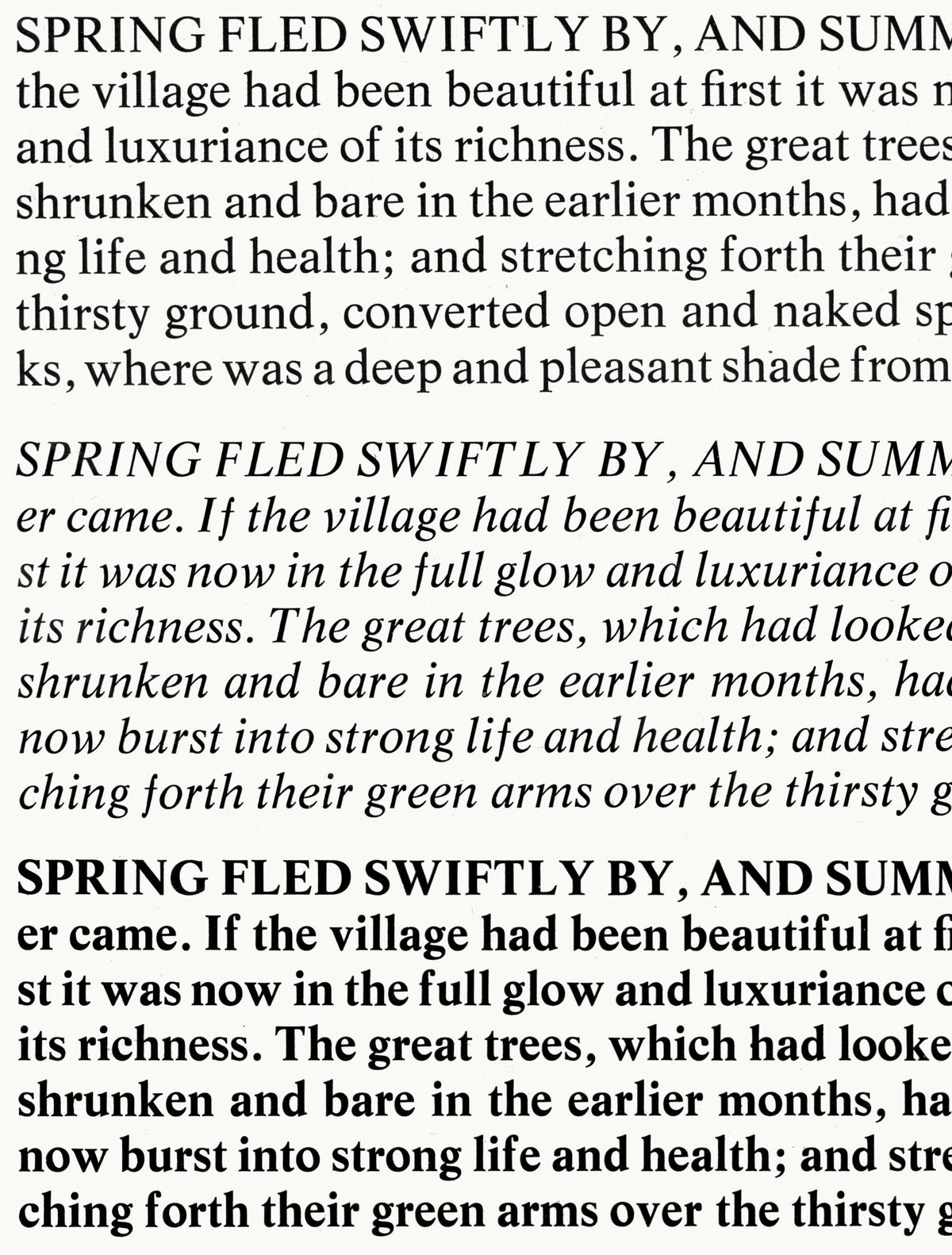
Fact, by Christian Schwartz and Hasebe, is a serif family in three optical sizes and two widths. Its clearest inspiration is Times New Roman and its many imitators, such as Simoncini’s Life, but its large x-height (to match Kippenberger), consistently angled contrast, and soft, drooping ball terminals give it a looser and more organic tone. The core weights have relatively low contrast but sharp, thin serifs to keep a convincing feel for a fashion magazine. The text variant is quite narrow, to maximize copyfit.
The two families are designed with matching vertical metrics and similar weight ranges, so they can be mixed freely. T’s digital editions were redesigned at the same time as the print magazine, and Kippenberger and Fact help to keep the personality consistent across all media. Fact was later expanded with help from Hrvoje Živčić and released as Feature, and Kippenberger was expanded with help from Tim Ripper and released as Review.
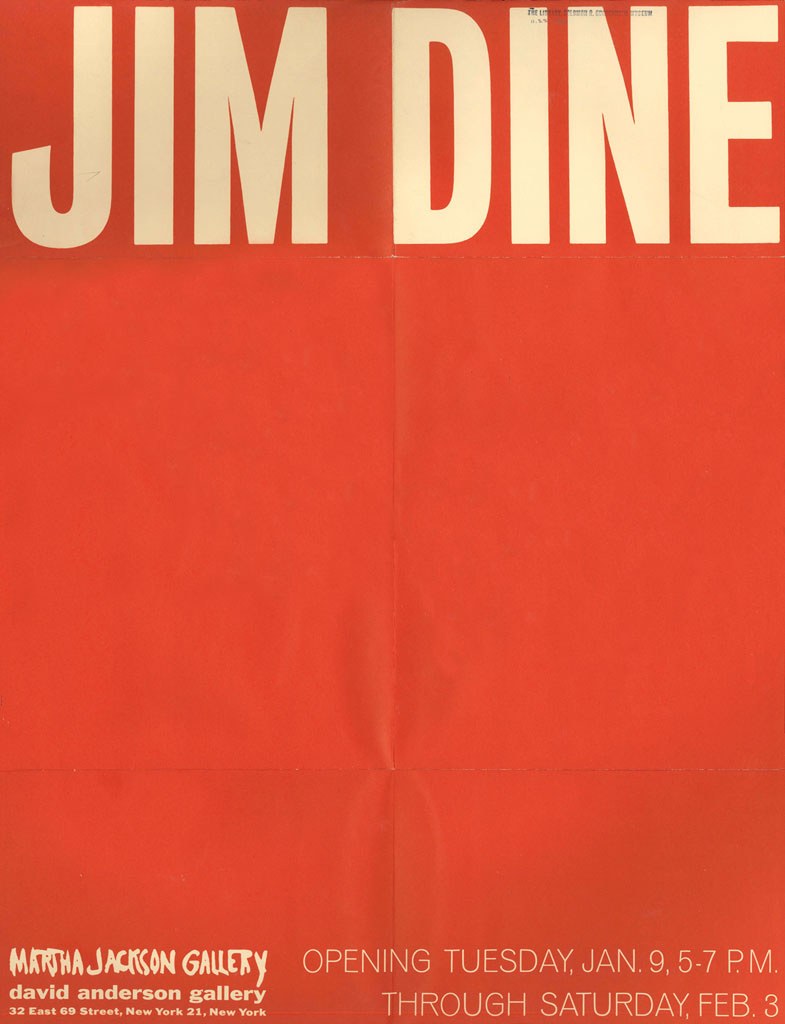
Poster for Jim Dine at Martha Jackson Gallery, 1966
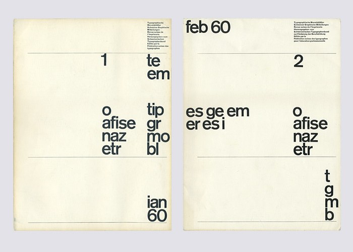
1960 cover for typographische monatsblätter by Yves Zimmermann using Akzidenz Grotesk
Headknocker Medium (clone of Heldustry), 1978. Shown in TypeMasters Inc. specimen, 1984
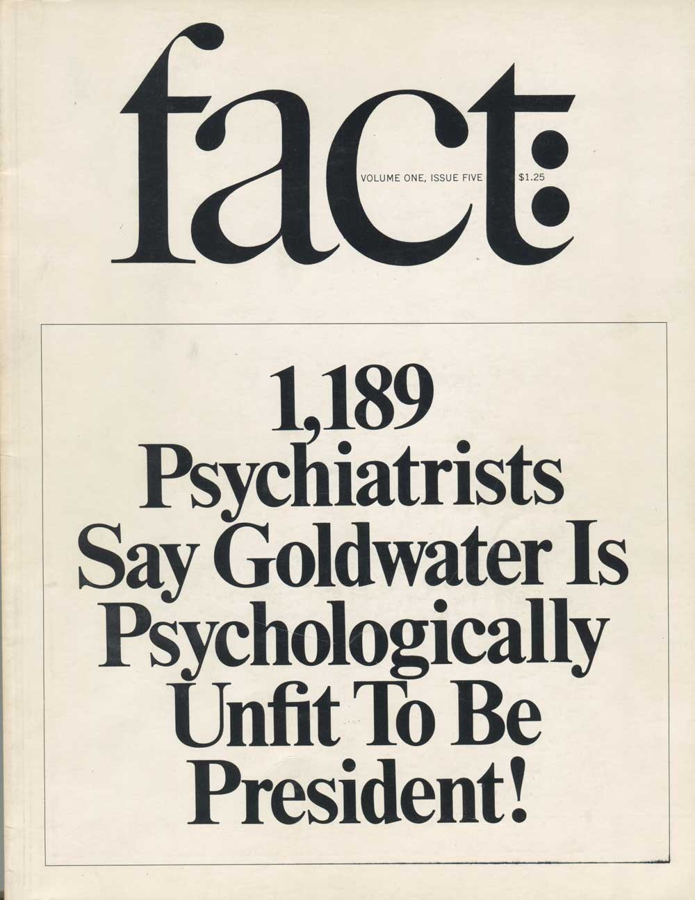
The use of Times New Roman on Herb Lubalin’s covers of fact was a big influence, especially on the tight-not-touching spacing.
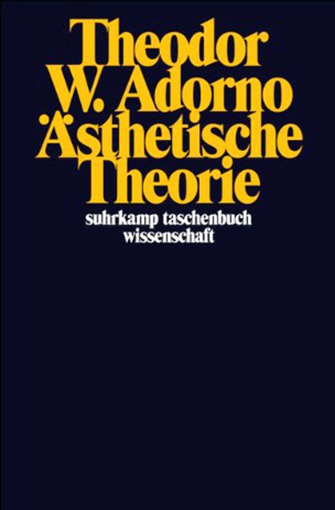
Another influence was Willy Fleckhaus’s use of Times Modern on covers for Suhrkamp-Verlag’s science paperback series in the 1970s.
Life, designed by W.A. Bilz and Francesco Simoncini, 1965