Everything new is new again
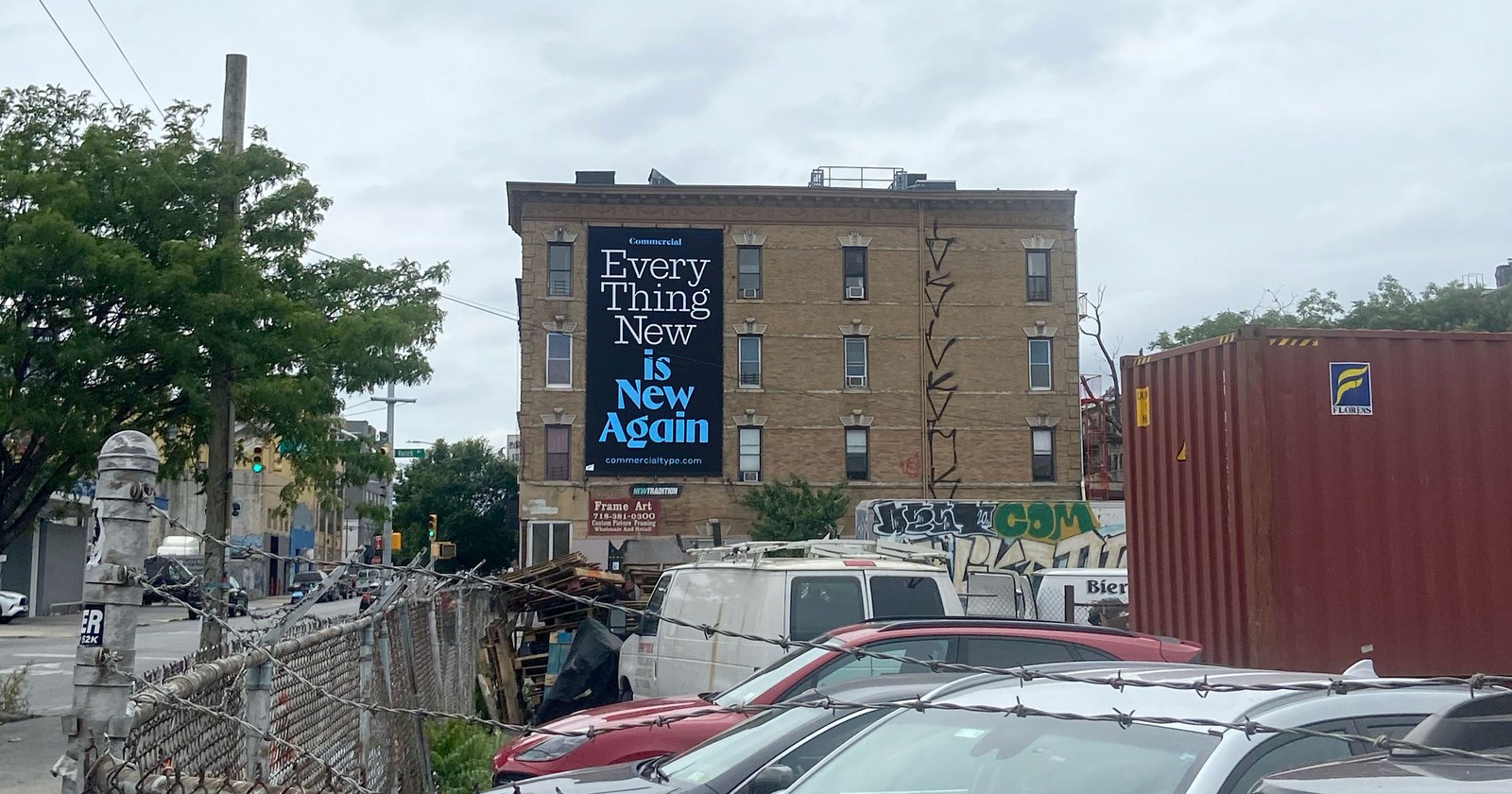
Billboard in Brooklyn (2023).
In collaboration with GrayBits and Studio Vance Wellenstein, we are proud to unveil a complete reimagining of our website. Perhaps the biggest change is that Commercial Type and Commercial Classics are now one library, under one roof—but everything from our license to the way we show OpenType features has been reconsidered.
Since starting the company in 2008, we’ve worked with the team at GrayBits, who developed a custom-tailored content management system for our foundry. As our audience has grown, GrayBits has helped us navigate how best to present our library to the public. Prior to our new website, GrayBits designed and developed the Commercial Type Vault, a more informal marketplace for unreleased and in-progress typefaces. Both sites are integrated into a shared CMS.
A couple of years ago, we engaged our friends at Champions Design to help us analyze our brand and assess our overall strategy. After spending fifteen years improvising our way from one idea to the next, it was helpful for us to pause and try to understand ourselves, to think about how our clients and customers see us, and to plan for the future. One important idea that came out of this exercise was the Vault, a venue where we can loosen up and be more casual and experimental—but our main objective was to lay the foundation for a new website. Our previous site had served us well, but our library had outgrown it—even when split between Commercial Type and Commercial Classics—and it was time for a fresh approach.
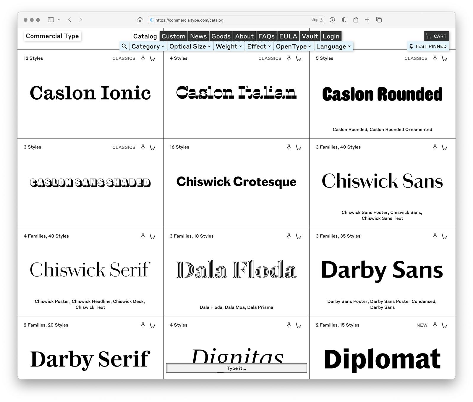
The Catalog page now gives a wider overview of families, with sorting and filtering tools at the top and a “test it” bar at the bottom that lets you quickly try your own text without leaving the page.
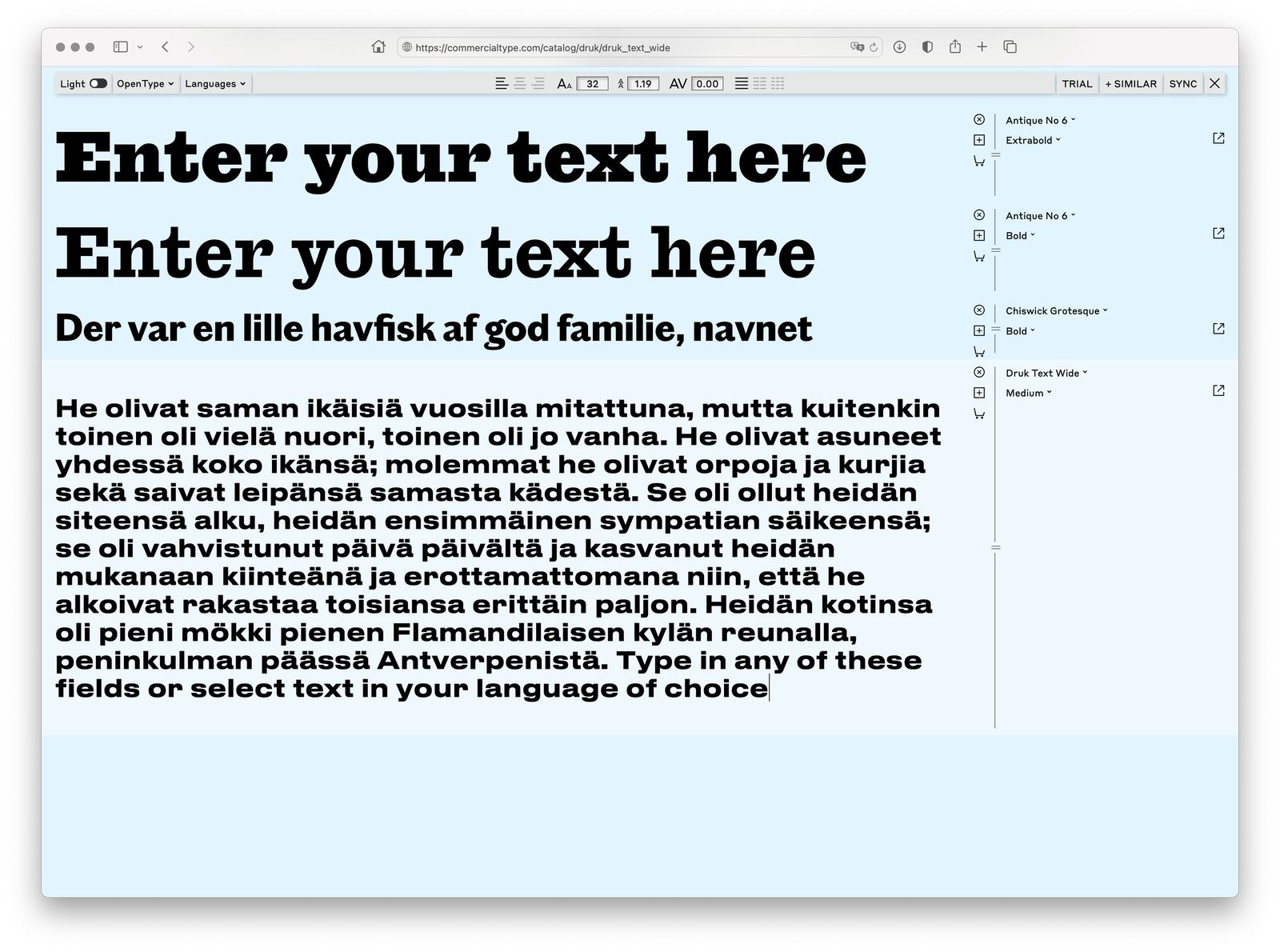
The new pin tester in action.
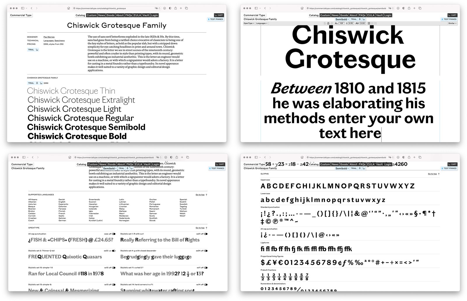
Collection pages now give a broader overview of a typeface, and style pages include a more comprehensive synopsis of info: language support, OpenType features, and character sets.
We have a substantial library: 176 families in 65 collections as of this writing. The team at GrayBits has helped us embrace the sheer size of our offering by building tools to help sort, filter, and browse, and by adding a tester at the bottom of the main catalog page so you can see your own text in any of our typefaces without having to click through. Another useful feature is a “pin tester,” which allows you to pin any typeface you see on the site for further testing and comparison. Additionally, individual style pages now have a more robust tester and comprehensive info on language support, OpenType features, and character sets.
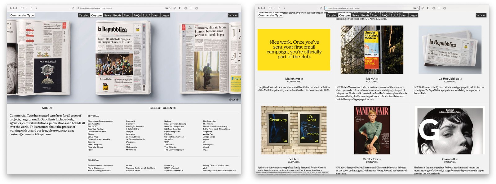
Information about many of our custom projects now exists in one place, including case studies on MoMA, Vanity Fair, the V&A Museum, and Chobani. For readers who want to learn more about the process and thinking behind our releases, we are also adding detailed essays about each family. This is a work in progress, but reading about Graphik, Druk, and Frame will give you a taste of what’s to come.
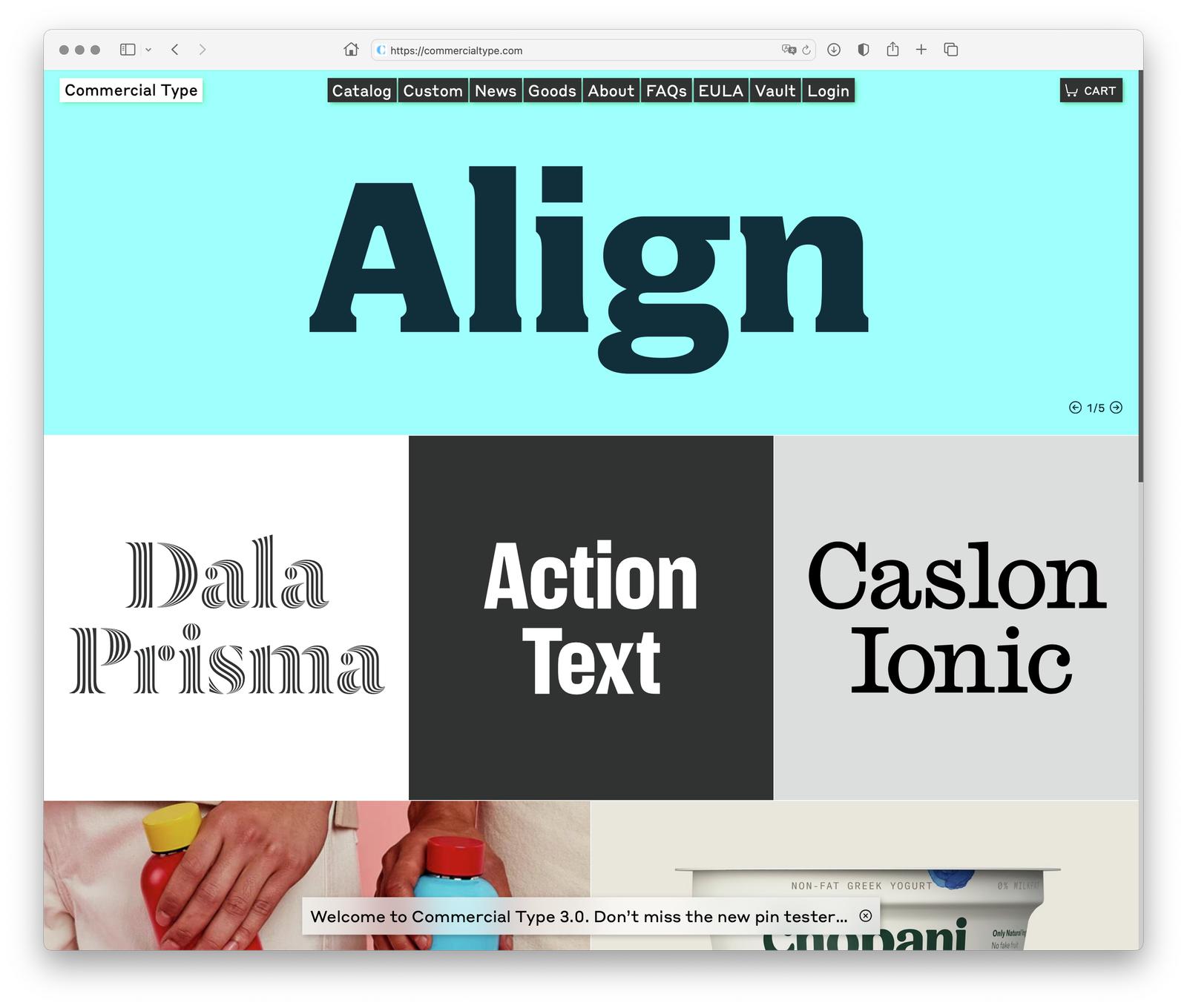
Our new homepage offers a more panoramic snapshot of what we’ve been up to.
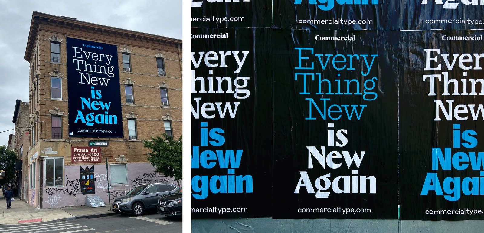
Billboards in Brooklyn and wheatpaste posters in New York and Philadelphia promote the new website.
GrayBits brought on Vance Wellenstein as creative director to reimagine our overall aesthetic. Graphik and Druk Wide have given way to Styrene and Frame Text, our homepage now gives a wider overview of what we’re up to, and a new tone-on-tone color palette replaces what a designer friend once described as “vomiting neon Post-it® notes.” Wellenstein also designed our launch campaign of billboards in Brooklyn and wheatpaste posters blanketing New York and Philadelphia, produced in collaboration with Dahsar.
We have heard your requests! We now have user accounts (attached to your email address), so you can access your order history even if you’ve lost your order numbers, and can easily redownload or upgrade past orders. We have also simplified our licensing. Desktop, web, and app usage are now covered by a single EULA, but can still be purchased à la carte, so you never pay for more than the license you need.
We’re really excited about our new site and hope you enjoy using it.