Druk: Only the extremes
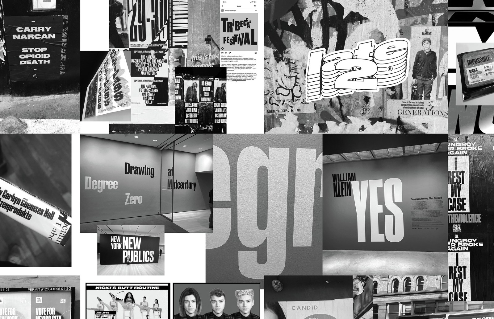
Some of our typefaces start as what we think of as “type design” ideas: explorations of a particular genre, or process-based ideas that come from a specific way of drawing. Lyon is a prime example of this, exploring the tension between contemporary digital type design tools and sixteenth-century shapes. Others start from “graphic design” ideas, taking an idea of how type might look in a layout and figuring out how to make the typeface that captures that feeling. Berton Hasebe’s Druk embodies this second kind of typeface. Though it has roots in nineteenth- and twentieth-century sans serifs, the references were more about typography than typefaces: Dutch artist and graphic designer Willem Sandberg’s work for the Stedelijk Museum in the 1960s, Barbara Kruger’s immersive typographic installations, the tight headline typography used by Willy Fleckhaus in Twen magazine, and DIY uses of Fred Lambert’s classic Compacta for Letraset.
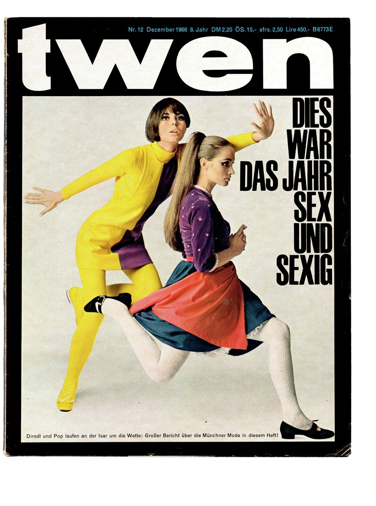
Cover of Twen designed by Willy Fleckhaus, 1966
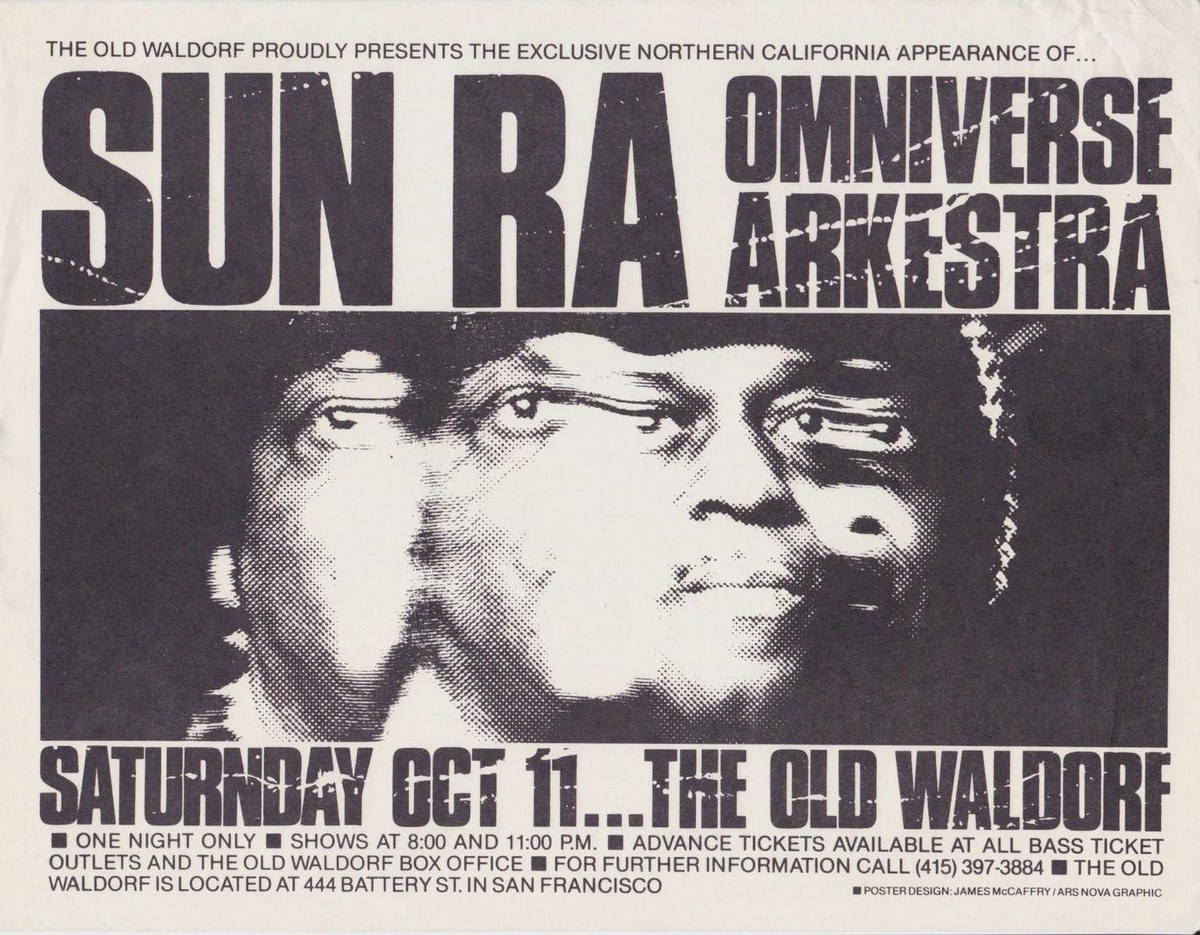
Gig flyer designed by James McCaffry using Compacta, 1980
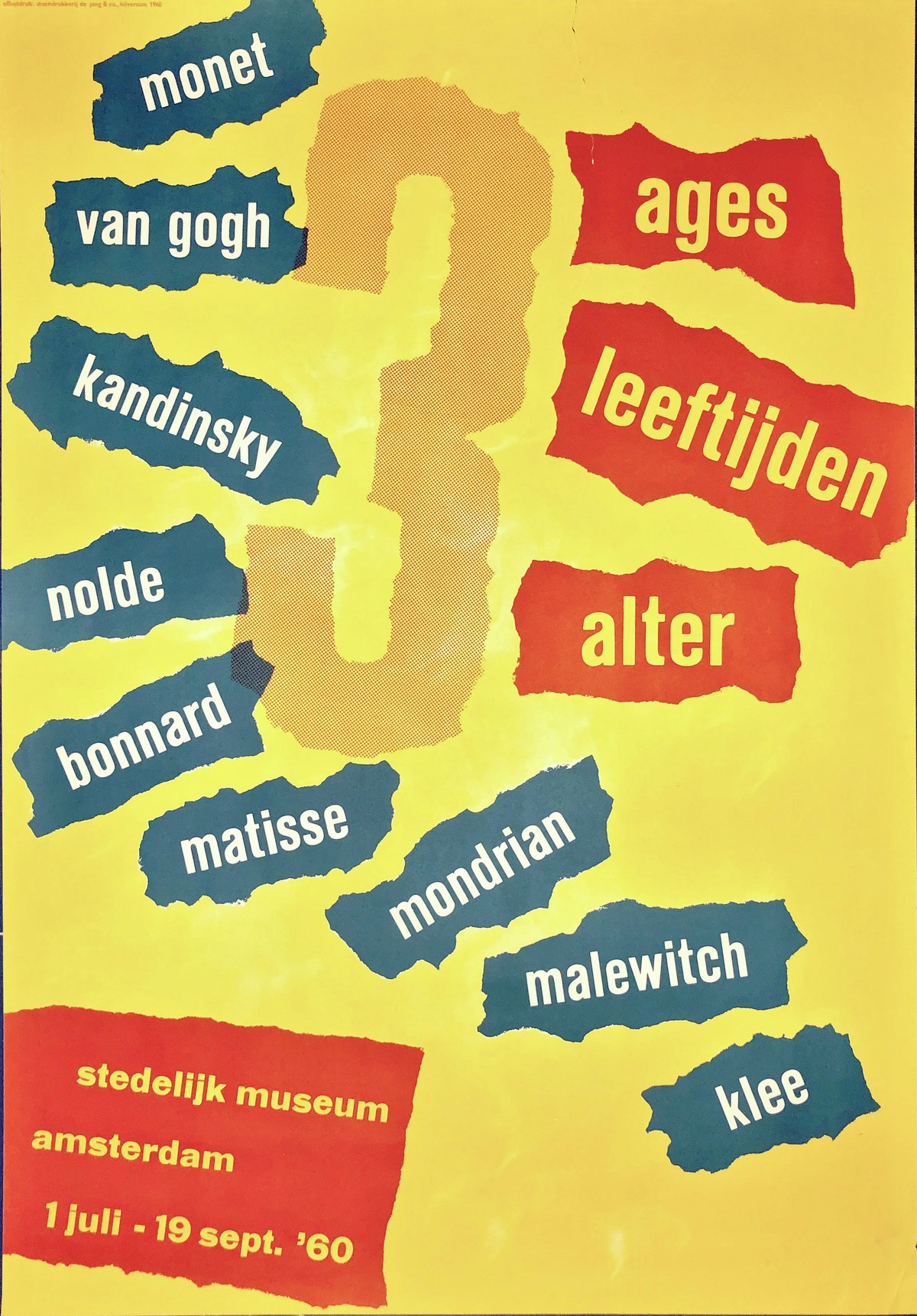
Exhibition poster by Willem Sandberg (1960).
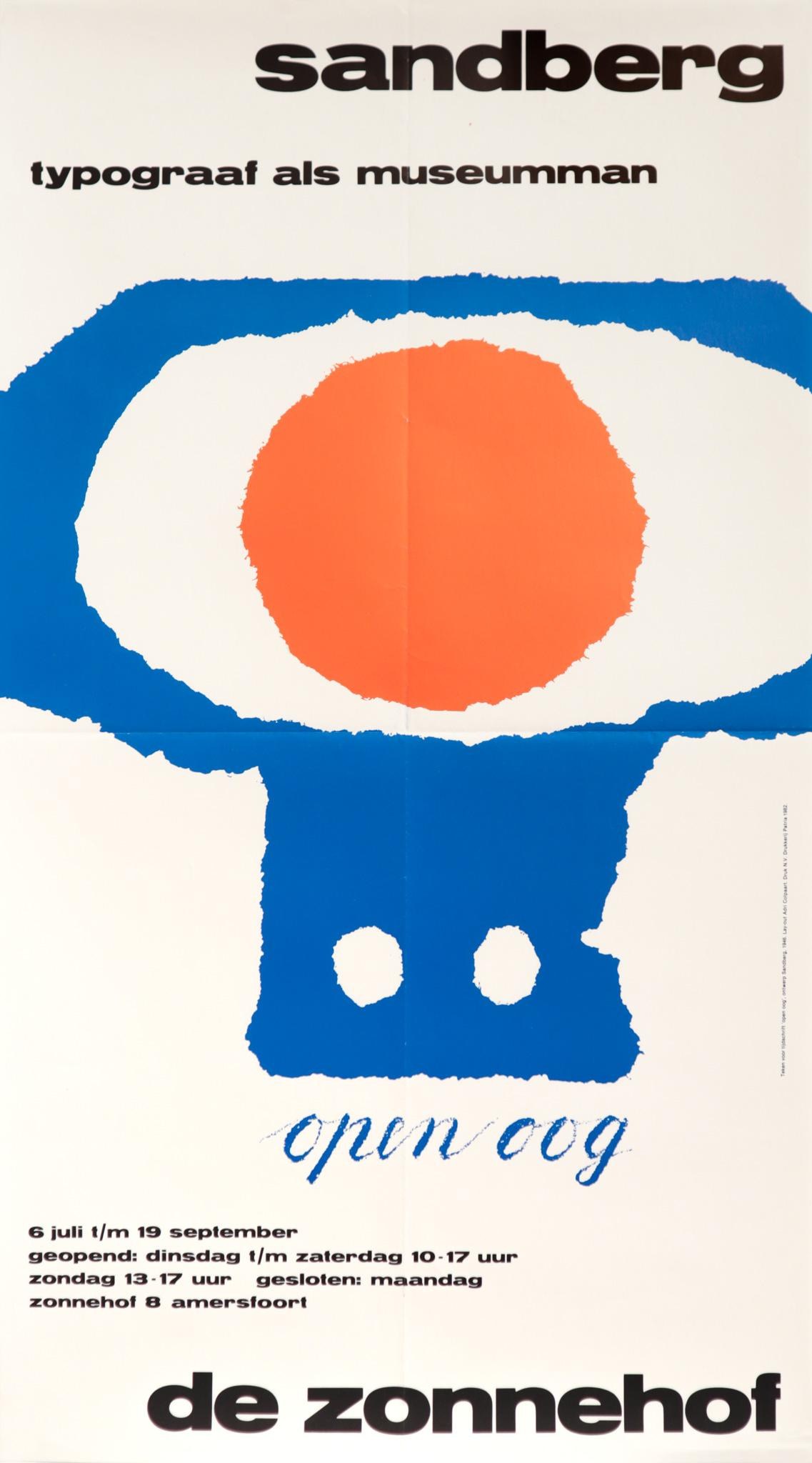
Exhibition poster by Willem Sandberg, 1982
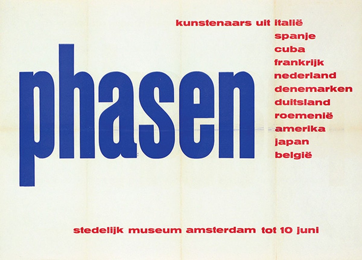
Exhibition poster by Willem Sandberg, 1957
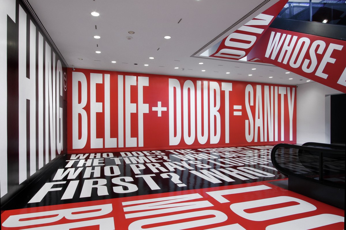
Site-specific installation by Barbara Kruger at the Hirschhorn Museum, Washington DC

Cover of Twen designed by Willy Fleckhaus, 1966

Gig flyer designed by James McCaffry using Compacta, 1980

Exhibition poster by Willem Sandberg (1960).

Exhibition poster by Willem Sandberg, 1982
The perfect vehicle for this idea came along in 2011. We had provided the type for Richard Turley’s redesign of Bloomberg Businessweek the year before, and provided lettering and modified versions of the typefaces as the needs arose. Turley and his team realized they needed a bold, condensed display typeface with a big presence on the page. Hasebe had drawn a set of condensed numerals for the initial redesign, intended to bring greater variation in scale to the dense front section. These had been loosely inspired by the Haas Typefoundry’s anonymous and slightly crude condensed sans serifs, Commercial-Grotesk and Enge Grotesk (“tight sans serif”). The first condensed sans serifs emerged in the 1830s in Britain, and the genre quickly spread across Europe. Some of the most interesting examples cropped up in Germany and Switzerland. Hasebe took the family from heavy to heavier, drawing a typeface that required little effort on the part of the designer to make an engaging layout.
Druk Wide—not really an expanded version of Druk, but rather a similar approach to the opposite kind of extreme proportion—followed a few years later. Like Druk, Druk Wide has its origins in the extremely heavy and wide grotesks offered by many European foundries during the early twentieth century. Variations on this design were known as Annonce Grotesk, and sold as the widest variants of Aurora and Venus, among others. Hasebe had been thinking about Annonce Grotesk during and after his time in the Netherlands studying at the Royal Academy of Art’s Type & Media program. Like Alexander Isley’s exuberant mixing of wide and narrow type in Spy magazine in the 1990s, Turley and his team freely mixed the narrowest widths of Druk with Druk Wide, making for a wild energy in the lifestyle section at the back of the magazine.
Sandberg used a small size of Annonce Grotesk for captions in many of his iconic catalogs for the Stedelijk Museum in the late 1950s and early 1960s. Many condensed sans serifs were available in text sizes during the era of hand-set metal type as well—wider and more open than the matching display sizes, but able to bring their particular aesthetic to page numbers, tables of contents, and even functional uses like train schedules. This inspired Druk Text, a display face for small sizes that has proven to be particularly useful on the web, where it can bring a strong personality to navigational elements.
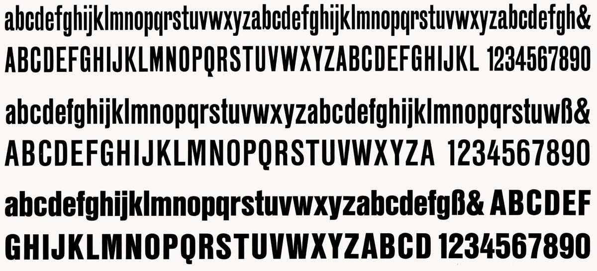
Enge Grotesk and Commercial-Grotesk from the Haas Typefoundry.
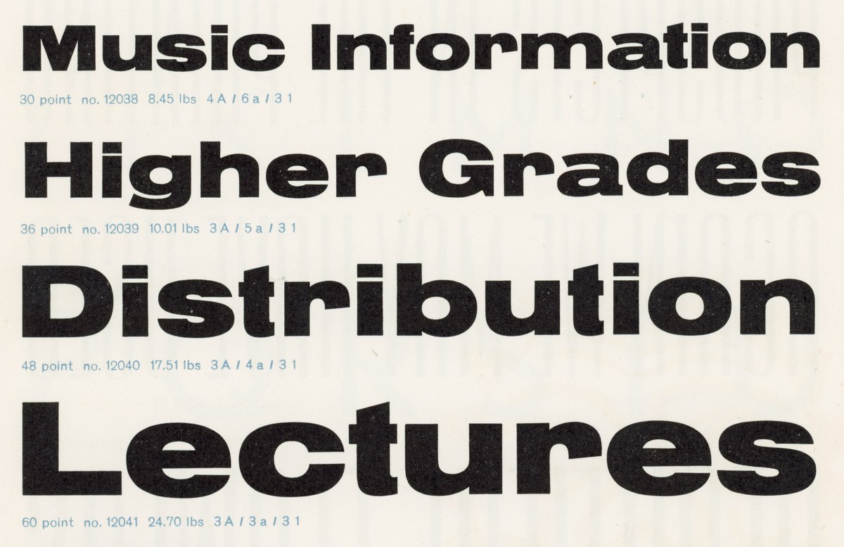
Annonce Grotesk, shown in 1960 Amsterdam Typefoundry specimen.
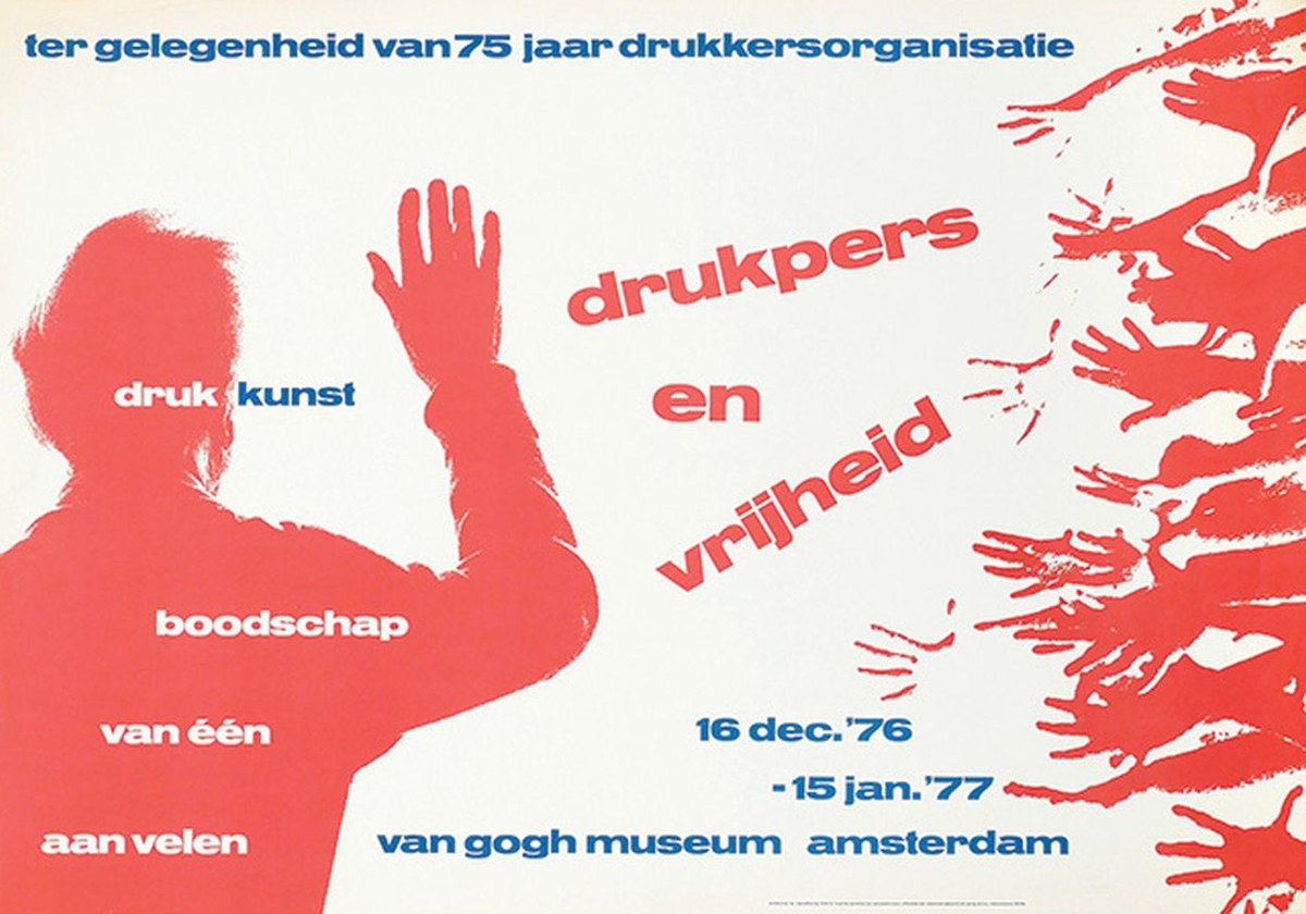
Poster by Willem Sandberg, 1976
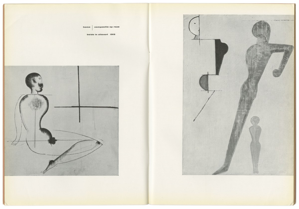
Catalog designed by Willem Sandberg for exhibition on Oskar Schlemmer, 1954, using small sizes of Annonce Grotesk.
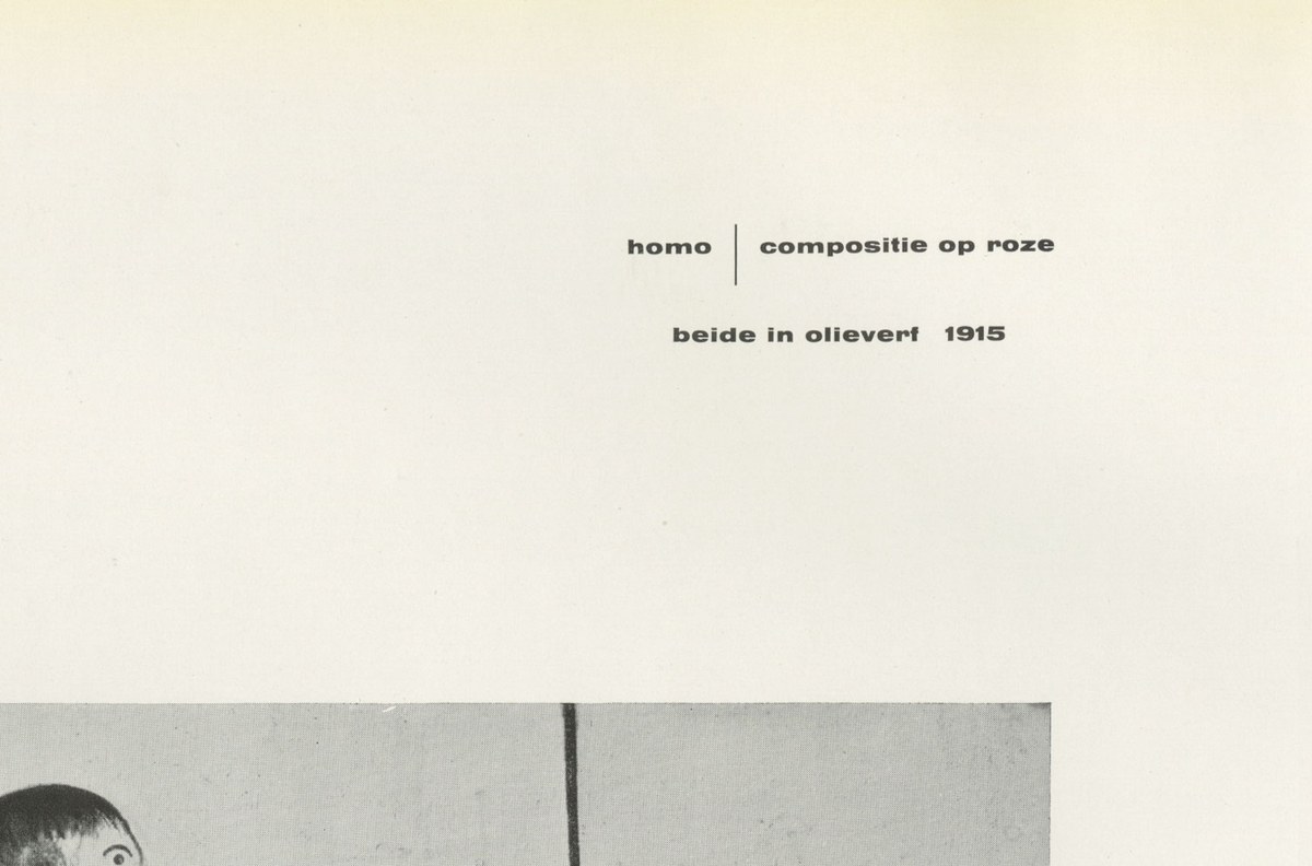
Detail of catalog designed by Willem Sandberg for exhibition on Oskar Schlemmer, 1954, using small sizes of Annonce Grotesk.
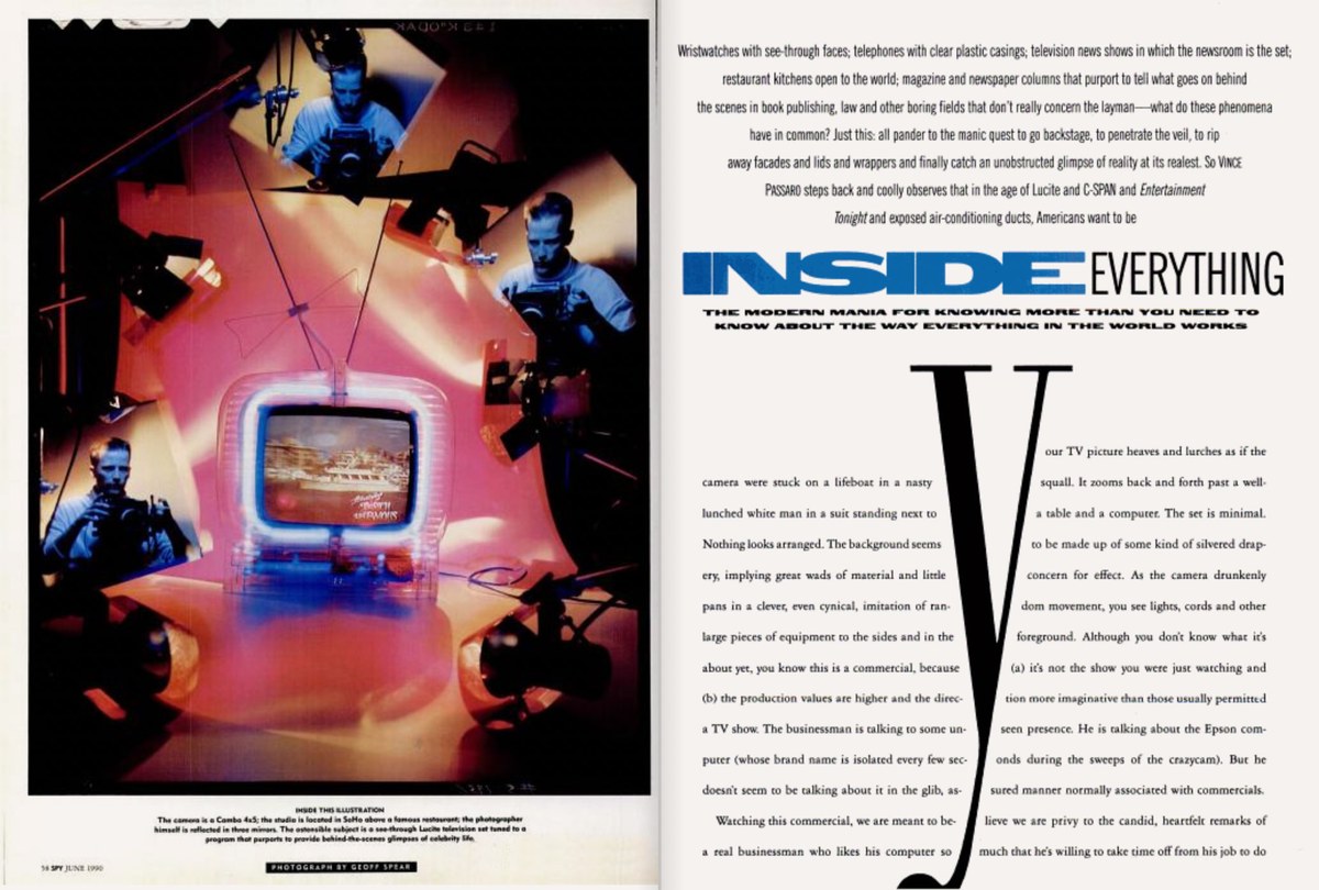
Spread from Spy Magazine, design director Alexander Isely, 1990
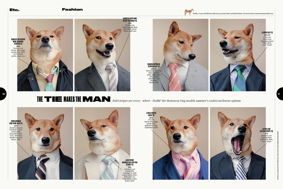
Spread from Etc section of Bloomberg Businessweek, showing how the widths of Druk were mixed in headlines, 2013
A limited range
Starting from Medium and going up to Super, Druk is uncompromisingly bold. “Though I sketched lighter weights and intermediate widths”, says Hasebe, “we quickly decided to set those aside. That allowed me to focus on what we liked about Druk – its boldness and impact – in the first place. I also think it was nice how our favorite styles were the only things people saw when Druk was released.” Druk was designed without a normal width or lighter-than-medium weights: Hasebe wanted to avoid shifting the focus of the typeface away from the most emphatic styles to accommodate more general-purpose usage. His thought was that almost any “normal” sans serif can fill in the middle—Graphik, Marr Sans, and Atlas Grotesk all work well in combination with Druk, along with sans serifs from a number of other foundries. However, we’re not so precious about the idea that we would refuse to add light weights for clients – you can find Druk Text Light and Druk Wide Light in the Vault, both commissioned – but we didn’t want to dilute the idea by releasing them as full fledged members of the family.
Druk Medium, Bold, Heavy, and Super.
All italics in Druk are at the same angle, regardless of the width, so the italics can be combined as freely as the uprights.
Flatness
Part of what makes Druk work so well is its flatness—not just the flat sides, but also flat tops and bottoms to the curves, so words stack cleanly. The overall effect is very graphic. “I wanted some crudeness in Druk’s finish, and these tiny bits of flatness prevented its curves from being too clean,” says Hasebe. The idea came after he had looked into the titling of the film Akira, with a particular interest in the sheared top of its R. He realized the reason for its sheared R was that Akira’s titling was taken directly from its manga covers, which typeset it in a cropped, banner format. Though very subtle in Druk, this treatment is a noticeable characteristic of Review.
Bloomberg Businessweek commissioned three narrower widths of the heaviest weight for a year-end issue in 2011. “Druk’s tight spacing was the core of its design,” recounts Hasebe. “It determined so much—even down to how narrow I made the XX Condensed. For example, while the counter of the XX Condensed H is only 11 upms, its spacing is 10. It was important to me that Druk's spacing was noticeably tighter than its counters in all of its widths.” Hasebe introduced a purposeful and subtle change to the texture of the typeface by preventing terminals and crossbars from lining up too often on the horizontal axis. This keeps an emphasis on the verticality of the letterforms and prevents words and headlines from becoming monotonous. In Druk Wide, the flatness is rotated 90°, with flat segments on the tops and bottoms of curved bowls to emphasize the elongated shapes, and short flat segments on the sides to keep them looking constructed.
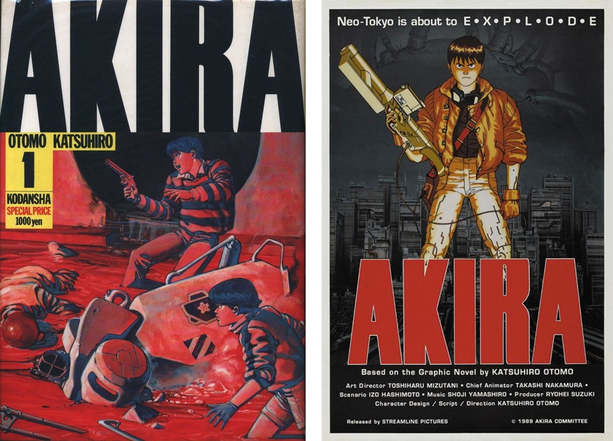
Left: Cover of English-language edition of Akira, with the title cropping off the top (1982).
Right: Poster for the 1988 animated film adaptation, showing the same distinctive shearing of the R.
Druk has flat segments on curves, for cleaner stacking of words.
Suddenly it was everywhere
Once a typeface is out in the world, all we can do is watch from the sidelines as it takes on a life of its own (or not, as the case may be). Our hope with each typeface we release is that it will find its audience. Even if it only resonates with a small number of designers, we’re happy to have inspired someone’s work. Druk is a highly specific and intentionally limited family commissioned by a business magazine, so we expected it to have a limited appeal. We were not prepared for how quickly it caught on and how ubiquitous it became. Both beloved and reviled, Druk is the only one of our typefaces we have seen memes about. “I can’t say why it got so popular,” says Hasebe, “but it wouldn’t have happened without Richard Turley and his team at Businessweek, as well as Christian and Paul pointing me towards Druk’s historical sources as a starting point. I’m lucky that I was part of that moment.”
Richard Turley and I have been texting photos of Druk in the wild (in both expected and hilariously unexpected contexts) back and forth for a few years, and we finally got around to making a zine about it in 2023. Timing is everything: Druk is an easy and fun typeface to use, but its popularity probably has more to do with happening to appear at the right time than anything else.