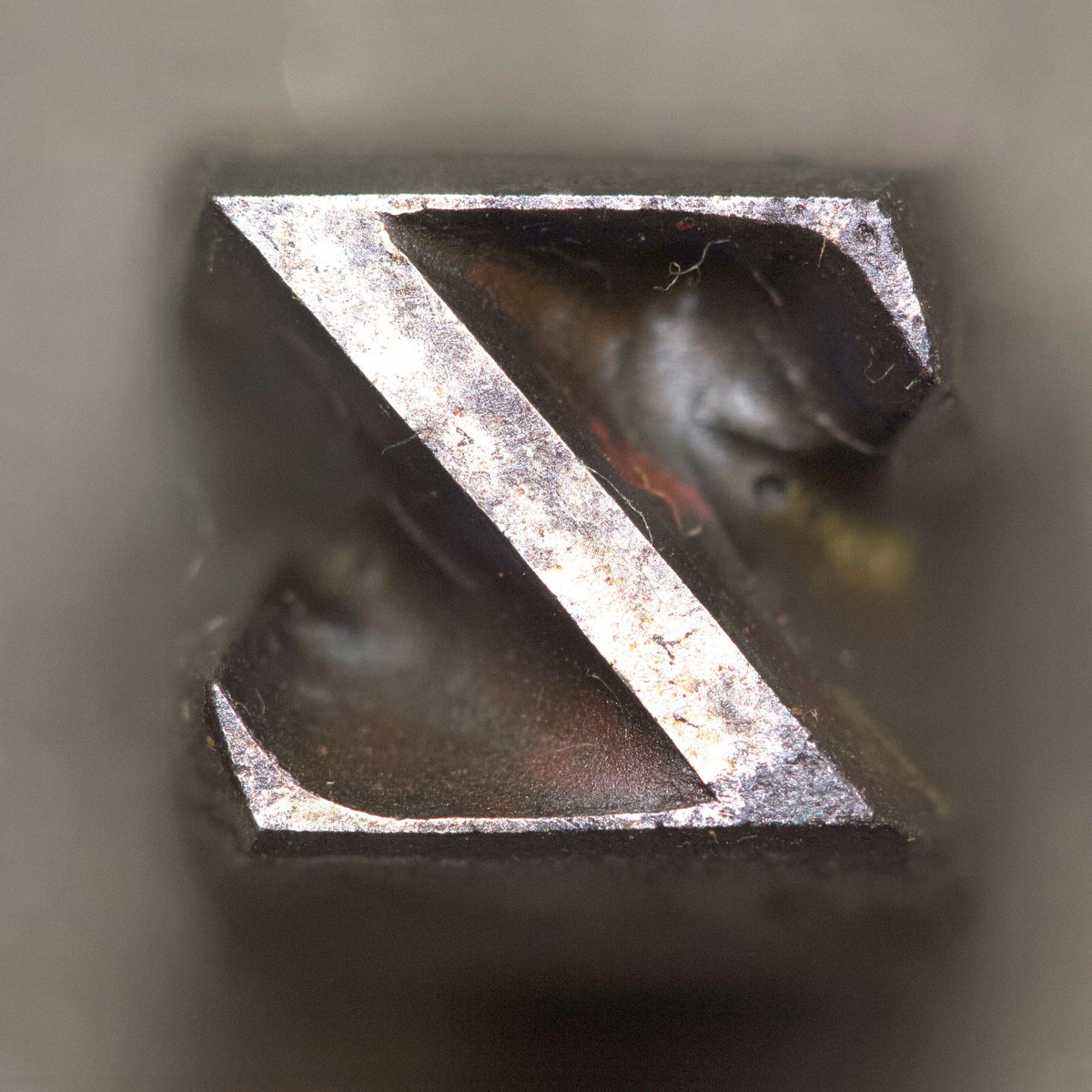
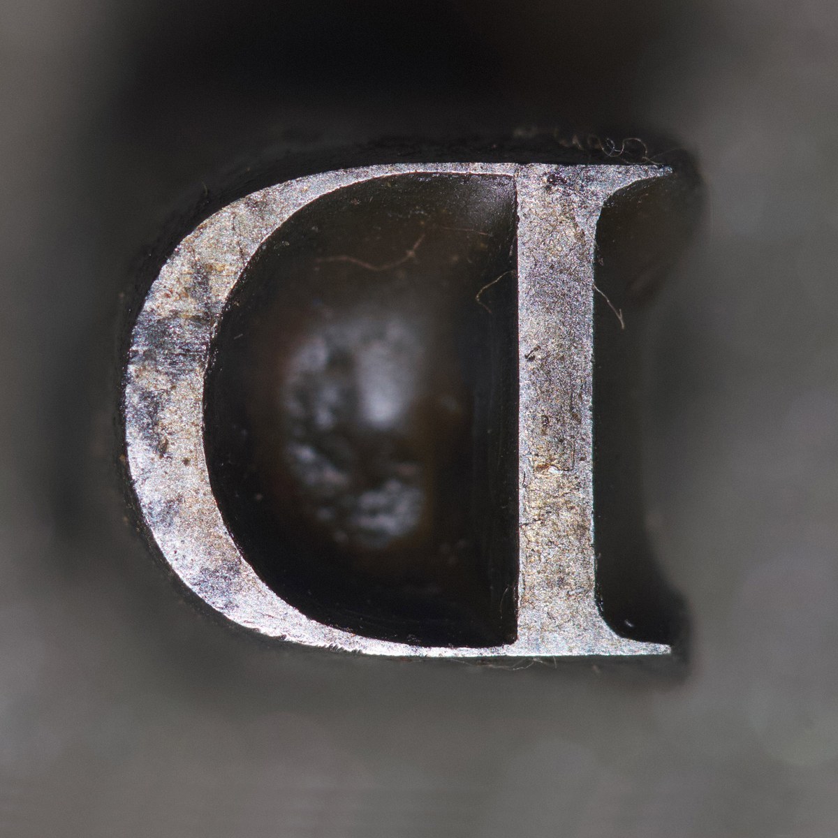
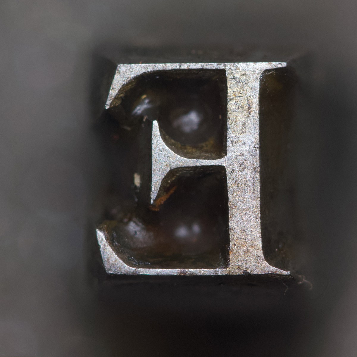
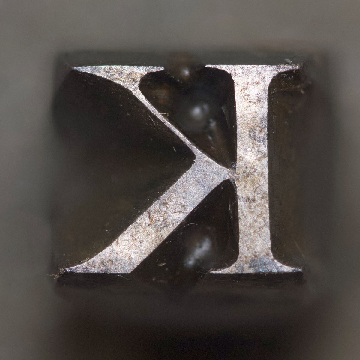
Double Dutch: Copies of copies
in the making of Frame
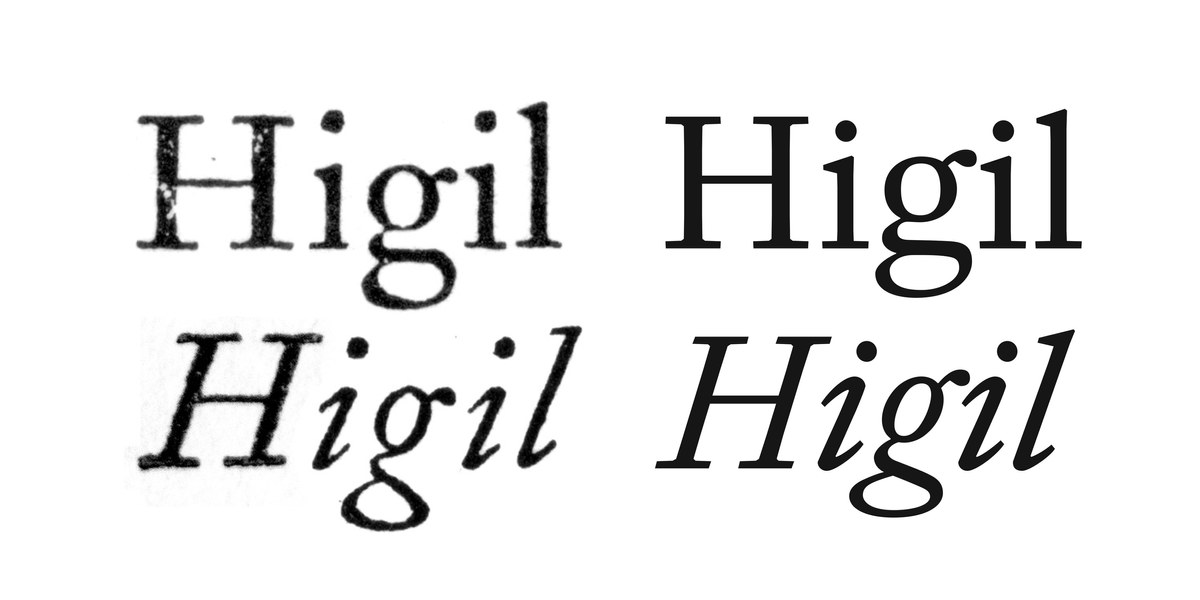
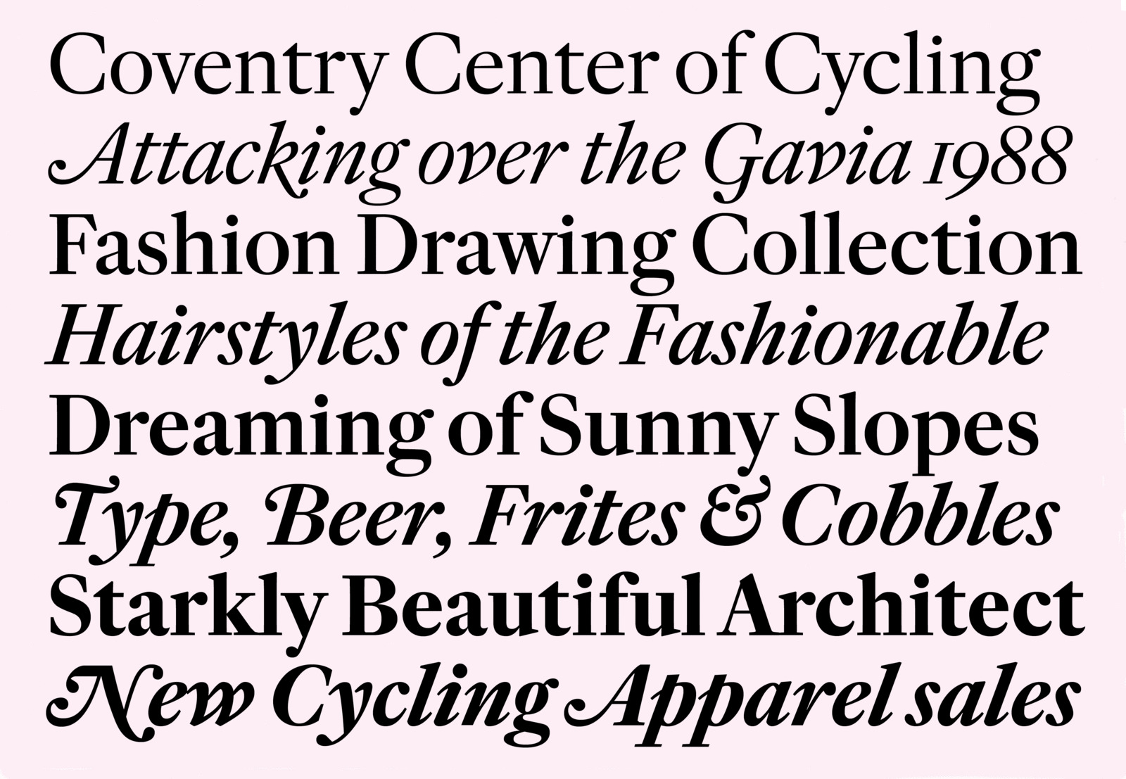
Frame comes in four weights with matching italics in text and headline variants. It takes the Caslon model and remakes it with modern proportions and a focus on sharpness.
Frame is a contemporary serif typeface with a large x-height and compact extenders. Its relatively low contrast makes it well suited for both screen and print applications. Created for the cycling clothing brand Rapha,1 it has its origins in the seriffed faces of William Caslon I but follows the vertical proportions of Caslon Doric, a sans serif cut roughly a hundred years after Caslon died in the last quarter of the eighteenth century. The path towards Frame is more nuanced and circuitous than it might appear at first blush, winding through history, sport, technology, and back to history again.
Beginnings
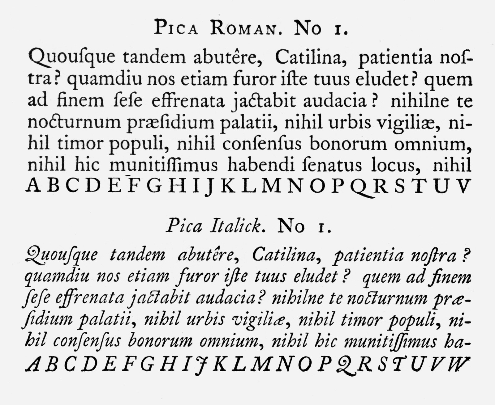
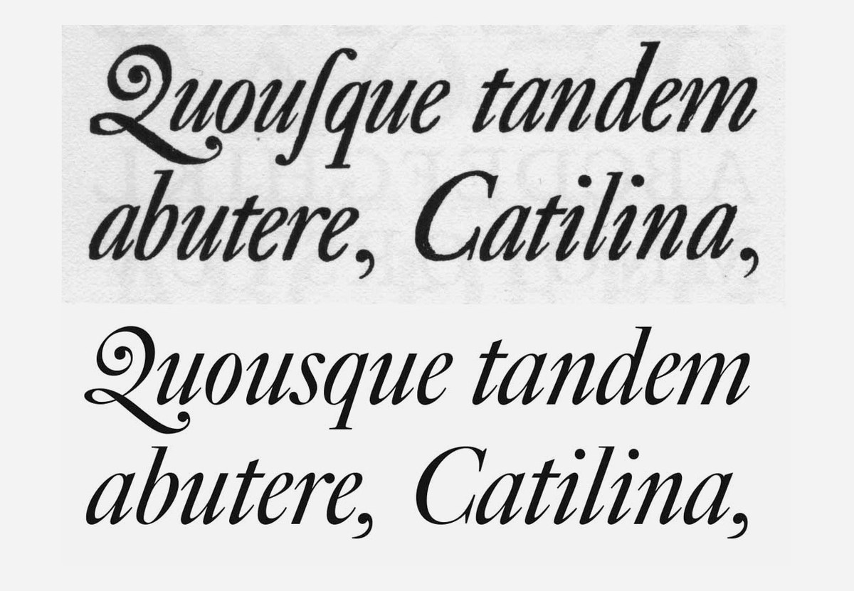
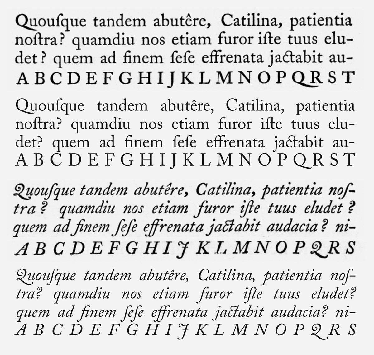
Pica Roman No. 1 and Pica Italick No. 1, cut by William Caslon before 1725, as shown in the facsimile of the Specimen of Printing Types by William Caslon (1766), Journal of the Printing Historical Society, No. 16, 1981/2.
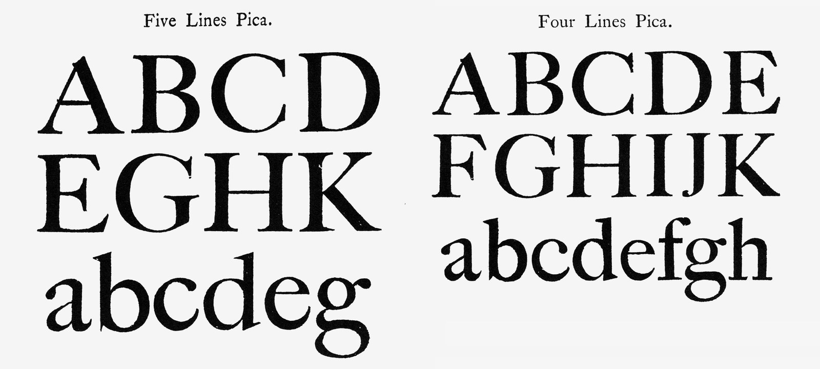
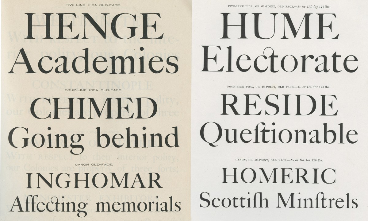
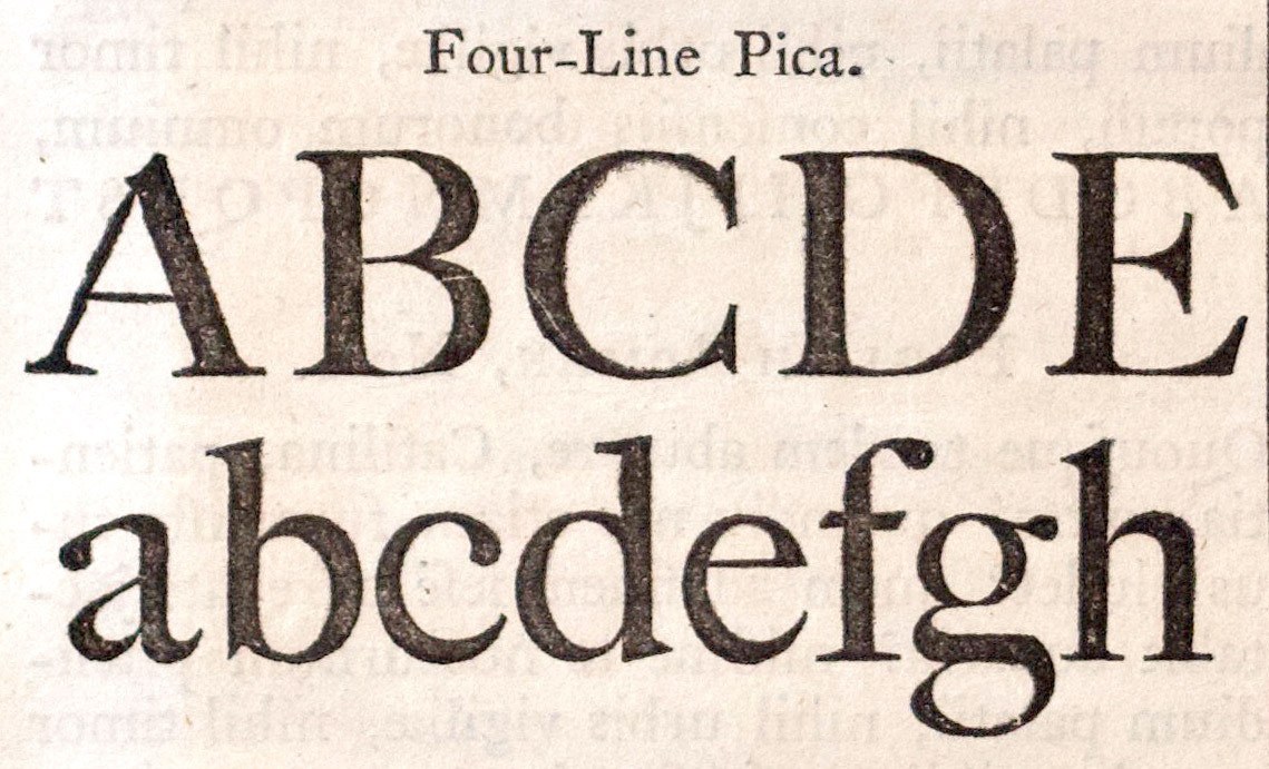
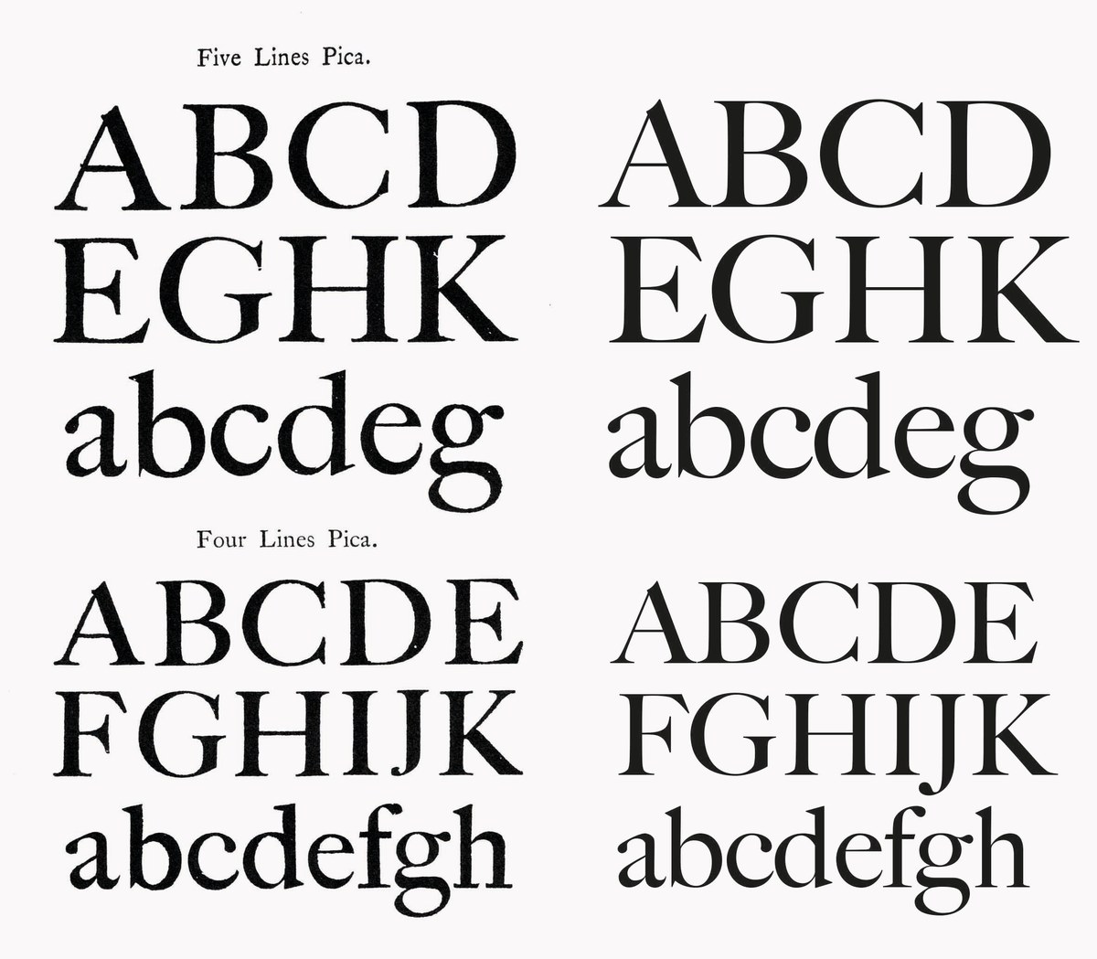
The magnificence of Caslon at large sizes, and the models for Matthew Carter’s Big Caslon. Five Line and Four Line Pica, cut by William Caslon (uppercase ca. 1734, lowercase ca.1763), as shown in the facsimile of the Specimen of Printing Types by William Caslon (1766), Journal of the Printing Historical Society, No. 16, 1981/2.
So why was Caslon so successful? What makes ‘Caslon’ to this day such an enduring style? And what exactly is the Caslon style?
Copies, copies, copies
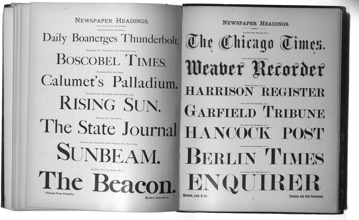
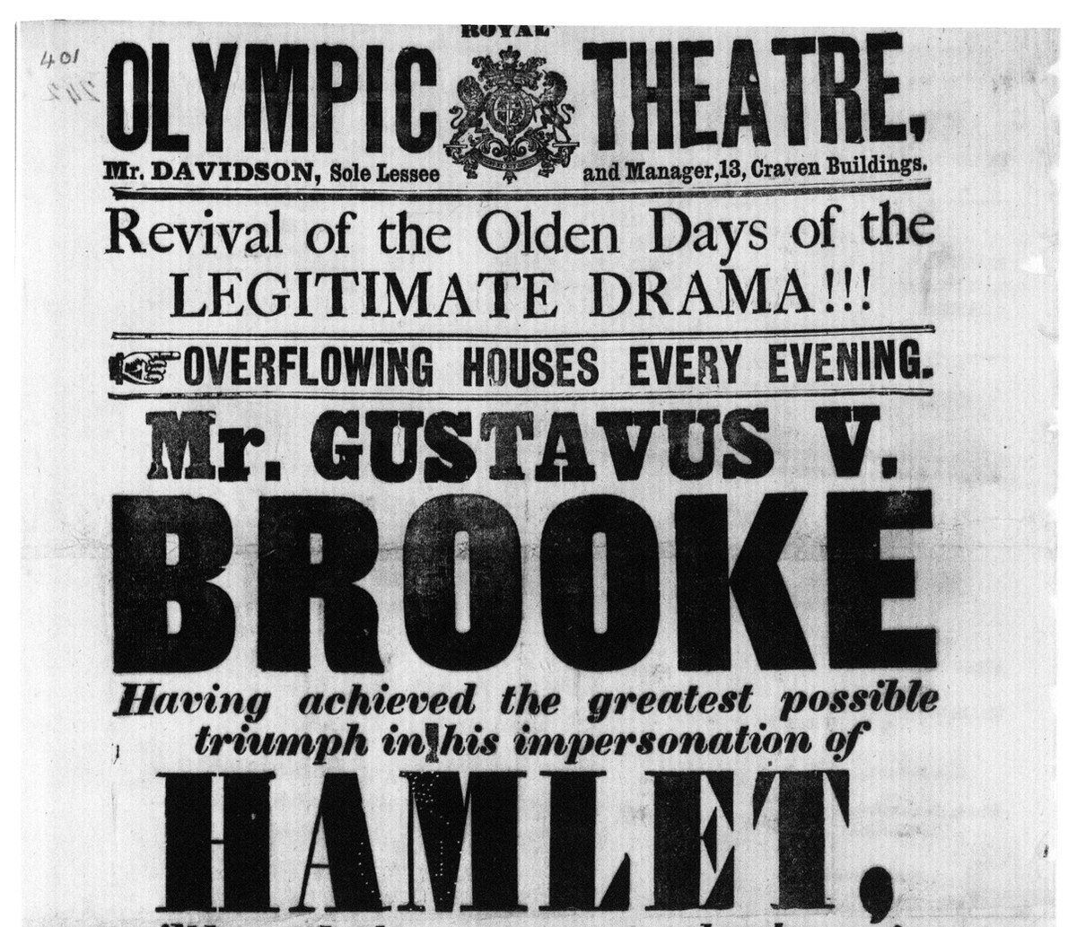
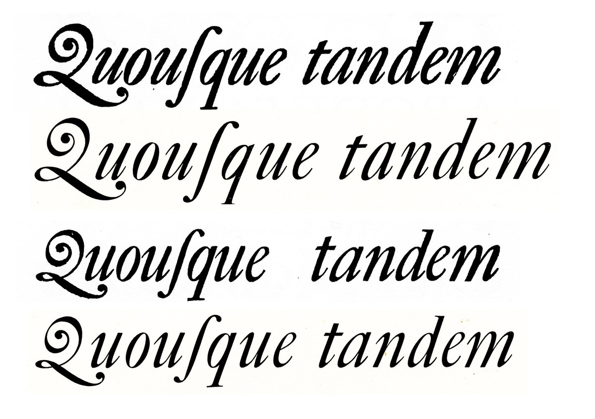
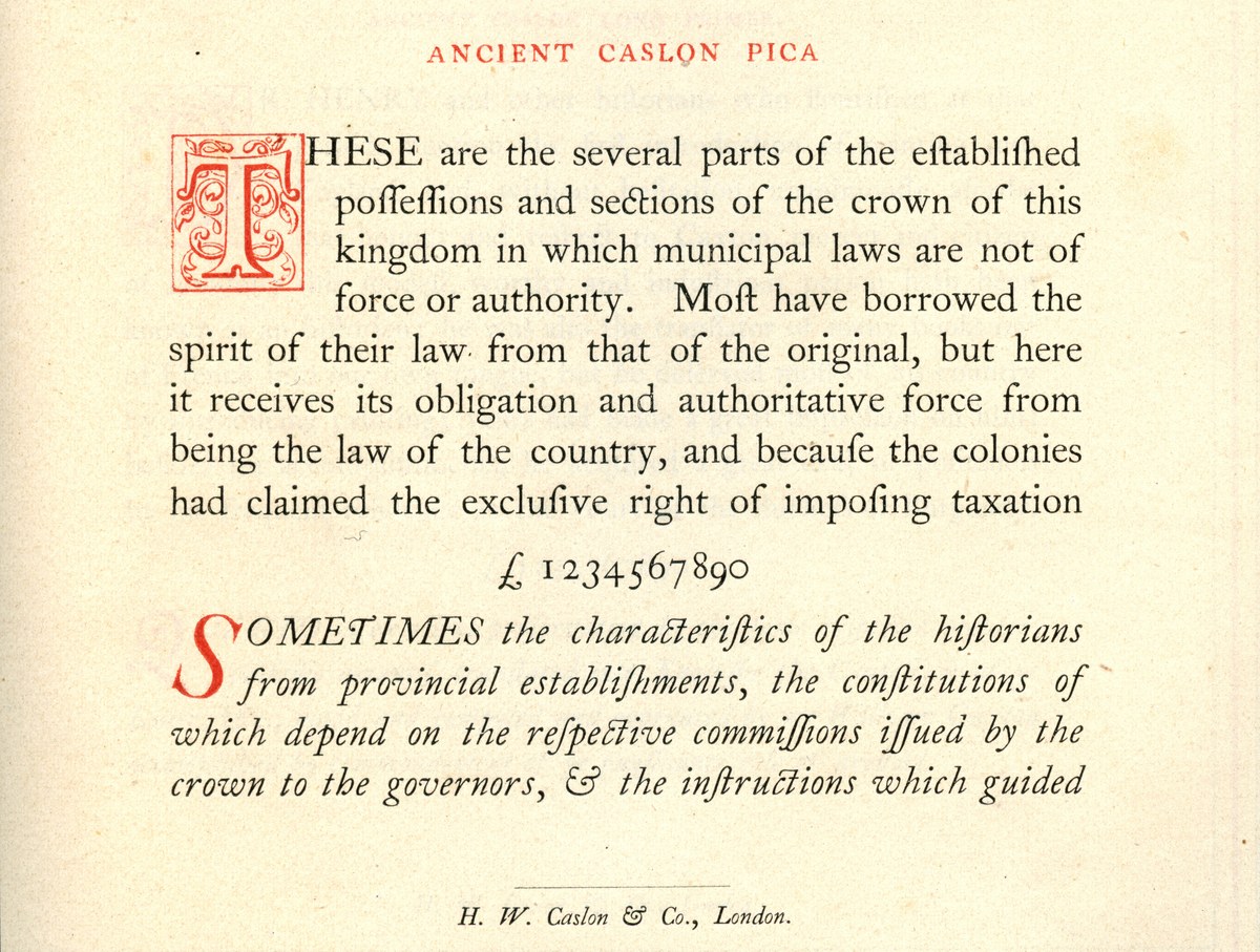
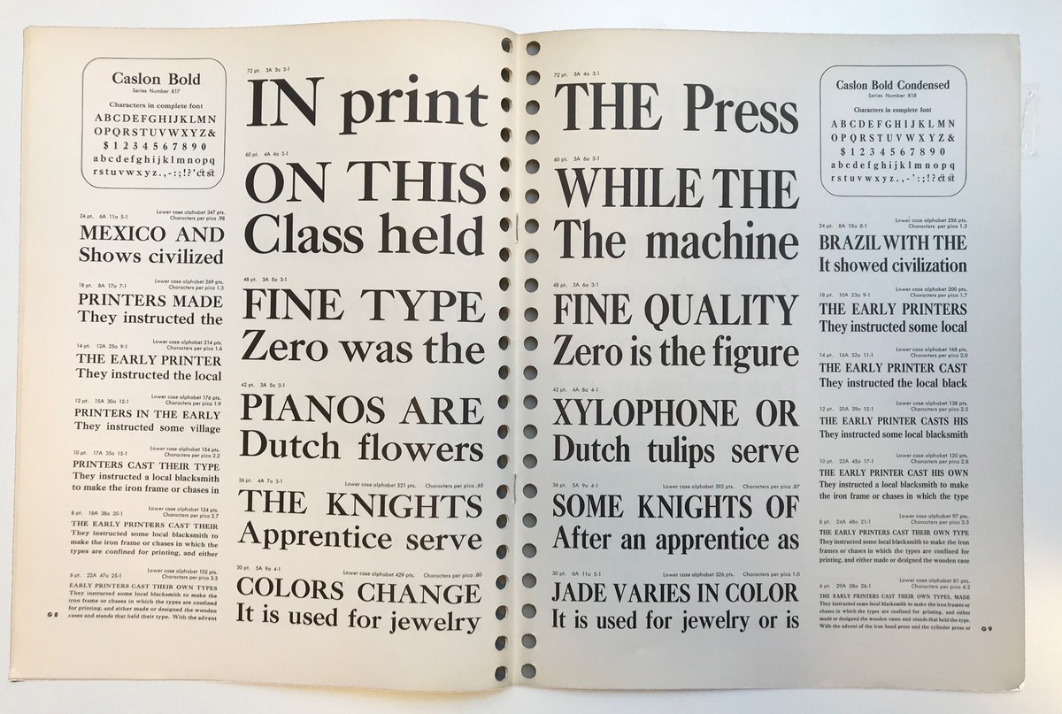
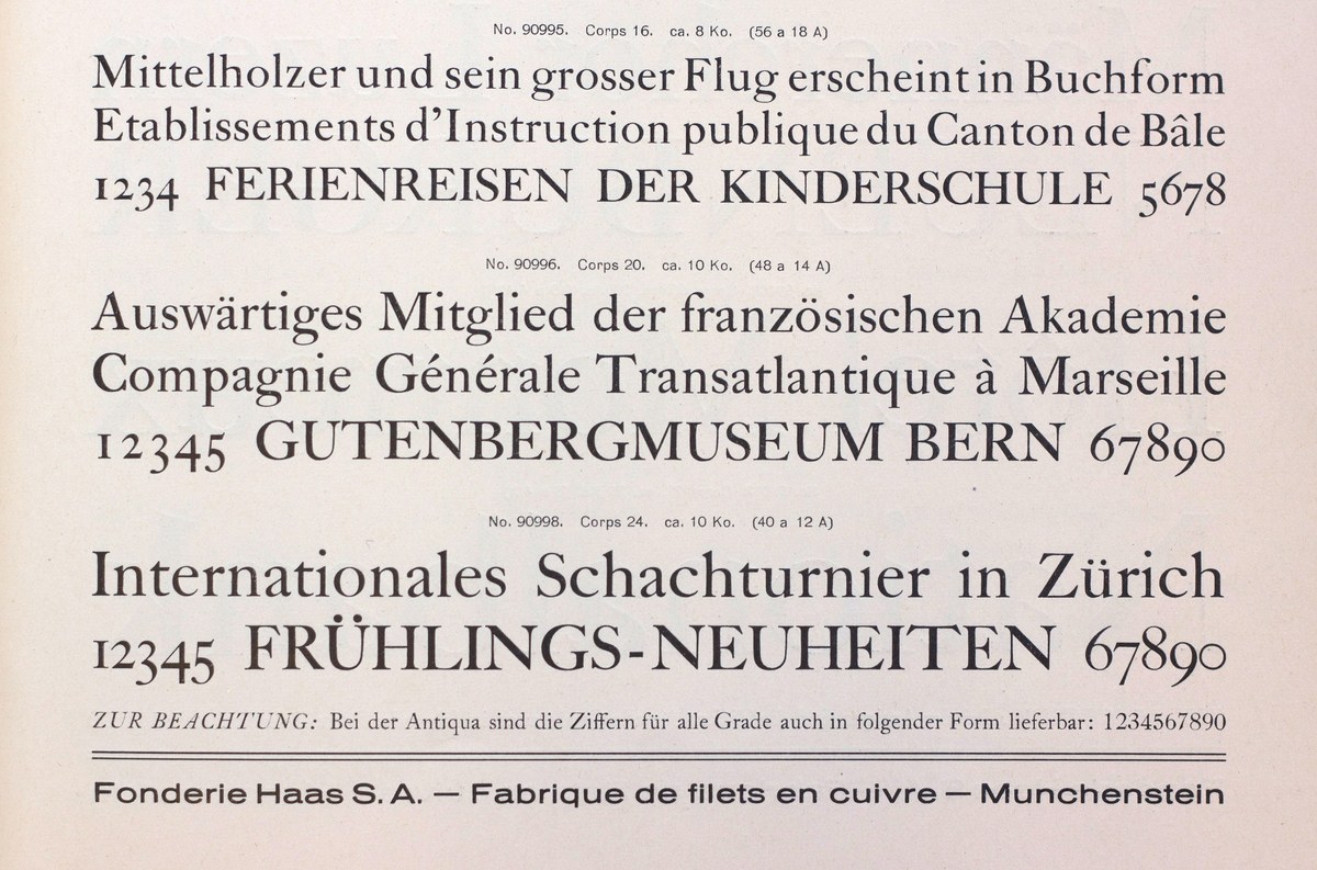
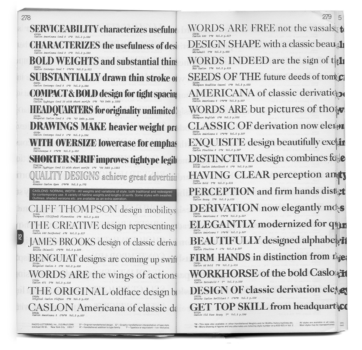
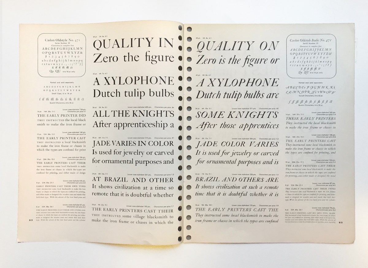
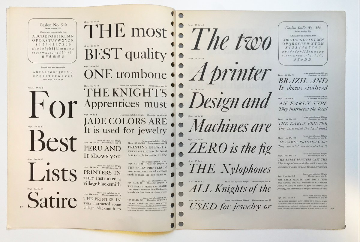
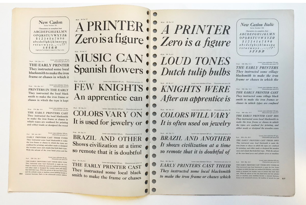
Throughout the twentieth century, the copy was copied again and again. And the copies of the copy were copied. And those in turn were copied. In 1915, Monotype issued a hot-metal version of Caslon so accurate that George Bernard Shaw didn’t notice the difference. And in the 1940s, Haas made a version: a Swiss Caslon. In America, the copies proliferated, often differentiated by numbers (471, 540, and so on). With the advent of photolettering, countless Caslons appeared; nearly a hundred named Caslons appear in Photo-Lettering, Inc.’s specimens. Some had only the barest hint of Caslon I – had the new designers ever even seen his work? This suggests that adding Caslon as a name was an imprimatur of quality and commercial success. But even though these typefaces shared the Caslon name, they didn’t share much of the original’s DNA. In the eye of the typical user of type, ‘Caslon’ represented a broad swath of styles, but had a hint of being made before one’s grandparents’ grandparents. Thus Caslon became reified as a style, much in the same way that people talk of styles of domestic architecture.
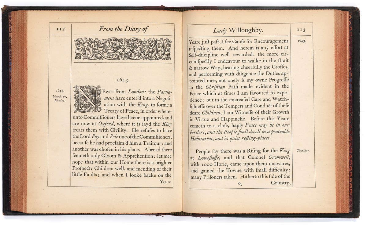
When the original foundry disappeared in 1937, the material from the eighteenth and nineteenth centuries was rescued by one of Caslon’s rivals, Stephenson Blake,18and so until the end of the metal type era, Caslon Old Face was still available. If a printer wanted to produce something intimating genuine heritage, they simply had to use Caslon, the great survivor.
Caslon reset in the digital age
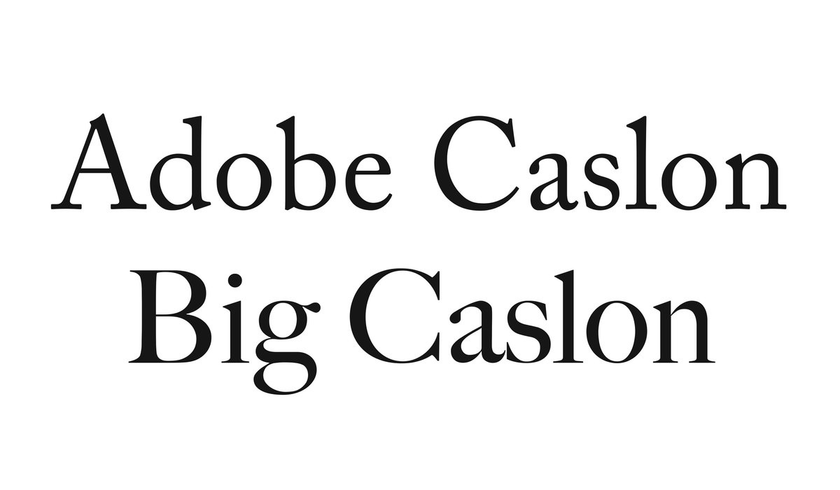
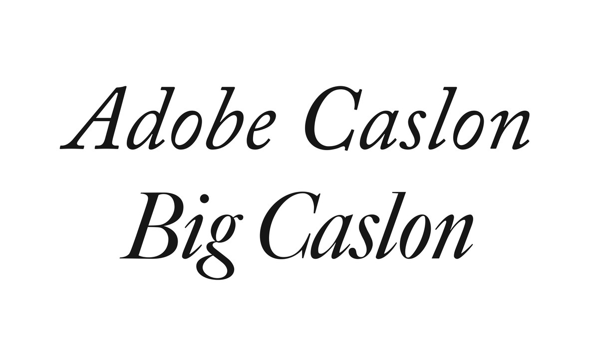
With every new technology – Monotype, Linotype, phototypesetting, digital setting – Caslon made the leap into the next era. As fashions changed, so Caslon changed in style. What would Caslon the Elder make of the Caslon incarnations from the seventies and eighties? With the dawn of desktop publishing, Adobe (like Monotype and Linotype before it) sought the credibility of making ‘serious’ type, both new designs and revivals that would draw on the scholarship and knowledge gained in the twentieth century. Adobe Caslon, designed by Carol Twombly in the late eighties, drew upon three primary sources: the 1738, 1786, and 1924 specimens, so both the original and the later modified types. Modelled on the smaller text sizes, Adobe Caslon’s robustness made it ideal for text setting, a trait that held it in good stead in the age of 300 dpi laser printers. In style, the Adobe version has the warmth and gentle elegance of its precursors while retaining many of the slight eccentricities of the originals. Cleverly marketed by Adobe with well-considered specimens like Adobe Garamond and Trajan, the new Caslon quickly became a hit. This is a copy of a copy of Dutch type (and, if you include the nineteenth century recut, a copy of a copy of a copy), transported into the digital age in the glowing sunshine of California.
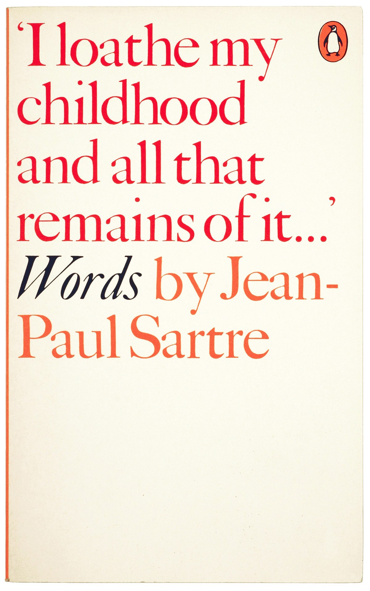
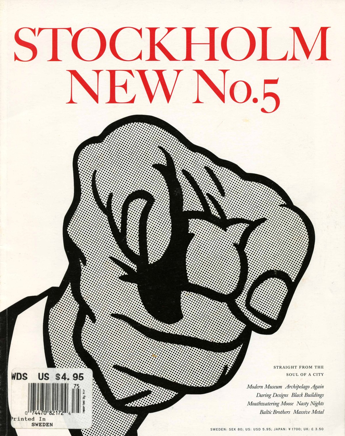
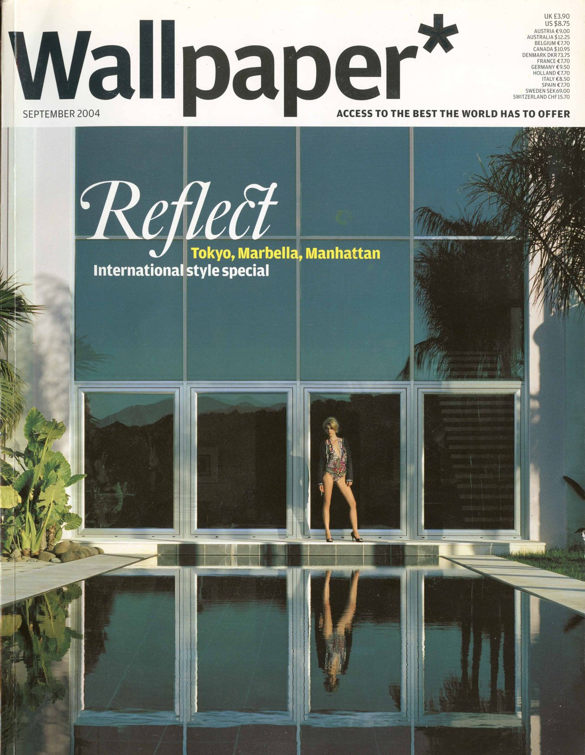
On the other side of the United States, Matthew Carter worked on a face called Chiswell (after the street where the Caslon foundry stood until the beginning of the twentieth century), which eventually became Big Caslon. Inspired by Derek Birdsall’s and Alan Kitching’s use of Caslon’s largest sizes, Big Caslon has a sharpness and dynamism that make it a perfect companion to the softness of Adobe Caslon. Like much of Carter’s work, it displays the genius of appearing to be an authentic recreation of the original while being completely appropriate for contemporary use. And like Adobe Caslon, Big Caslon became a near-instant success, appearing in unexpected places like Stockholm New and Wallpaper*. Later on, it was bundled with Apple’s MacOS operating system. Here we have an Englishman making a copy of a copy of Dutch type in Boston. Big Caslon and Adobe Caslon offer the designer an excellent snapshot of William Caslon I’s work. If no one got fired for using Caslon, probably no one got fired for using these two faces.
Despite the existence of these two excellent faces, new designs linked to Caslon continued to appear with great regularity across the globe. Each in turn remakes the copy in different places, each with different priorities. Some return to the original sources, some rely on copies of these, and some emerge from just a memory of Caslon. Some examples:
Founders Caslon by Justin Howes in England
Williams Caslon by William Berkson in the United States
King’s Caslon by Dalton Maag in England
William by Maria Doreuli and Typotheque in Russia and the Netherlands
Dover by Tiny Type Co. in Norway
English 1766 by A2 in England
Frame
Frame is a copy of a copy of Dutch types, made in London by a Midlander (just like Caslon). As a designer, I have always had an ambivalent relationship with Caslon. His types, which still resided in drawers when I was at university, were worn, with all the sparkle gone – fit if you wanted an antique feel, but seemingly from a time and place far away. In part, this was a prejudice against the way I often saw Caslon and its favoured status in private presses, which I then associated with a design conservatism. Gradually, over the course of my career, I have used digital revivals19and have grown to appreciate Caslon, but have never felt the need to revisit it: Big Caslon and Adobe Caslon seemed to say almost everything that needed to be said about Caslon’s style.
Much of Commercial Classics draws upon the work of later Caslons and the output of the foundry in the nineteenth century, in part because so much remains at St Bride Library, including the punches. Amongst them, some (often unaltered) are by the master himself, including his first roman from 1725 – but I must confess to a distinct lack of curiosity to see his work in the flesh. When I made Marian in 2010, Caslon did not appear; the face of Nikolas Kis represented the ‘Dutch’ style in Marian 1680, and I also turned to Caslon’s contemporaries Fleischmann (Marian 1740), Fournier (Marian 1742), and of course Baskerville (Marian 1757).
Cycling and type
Cycling and type design are natural allies. Both are highly repetitive activities, whether we’re talking about pedalling or spacing and kerning the same forms again and again. At the professional level, both require dedication and long hours to achieve good results. Often this excellence is pursued on an individual basis. The traditional heartlands of cycling – the Low Countries, France, and Italy – were also centres of printing and typography. Both have a close relationship to their history and legend; just as a type aficionado might know that Claude Garamond created the definitive form of the Renaissance roman, a cycling enthusiast will recall Eddy Merckx’s seventeenth-stage victory at the Tour de France in 1969. These historical moments become the cornerstones against which we measure other achievements.
Professional cycling has always had a close relationship with journalism, newspapers, and the wider media. The three major national stage races – the Tour de France (L’Auto, 1903), the Giro d’Italia (La Gazzetta dello Sport, 1909); and the Vuelta Espana (Informaciones, 1935) – were all initially set up by newspapers to boost circulation, and the press in turn promoted and documented these events.20 Many races like the classic Omloop Het Nieuwsblad (originally Omloop Het Volk) were started by newspapers, and others such as Paris-Roubaix relied on the support of newspapers. From the earliest days of the professional sport, letters and typography were everywhere – on the bikes themselves, on the riders’ jerseys, on the numbers on the backs, on the banners at the start and finish. And just as the clothes, hairstyles, and cars all date the scene, so does the typography.
As a design-led company, Rapha has always been conscious of the relationship between typography and cycling. In style, the company’s original logo and tracked-out Trade Gothic deliberately evoke a golden moment: 1950s France.21The name itself recalls both Saint Raphaël, a French aperitif, and the cyclist Raphaël Géminiani.22 But rather than a slavish copy, it’s just enough to give a warm recollection of a glorious past, whether real or fiction.
Updating the palette
For many years, Rapha had a simple typographic approach: a condensed sans, Trade Gothic, matched with a serif, which in recent years was Adobe Caslon. The company planned to relaunch its website in 2019, with a development of the existing palette rather than a wholesale change. Some elements worked; others less so. In the case of Adobe Caslon, though the face had a serious but warm aesthethic, in headlines it was uneconomical.23 A propensity to use italic was not based on an aesthetic choice, nor on its effectiveness as a tool for emphasis, but rather on the italic’s narrowness compared to the roman. The lack of economy derives from Adobe Caslon’s relatively small x-height and its generous ascenders and descenders. This led me to wonder if you could make a new Caslon that would work for text and headlines, but be more economical in setting. Are the relatively long ascenders and descenders in Adobe Caslon an intrinsic part of what a Caslon might be? Could a new design appear close enough to Caslon to most who would see it, but still differ significantly enough to make the process worthwhile?
Designing Frame
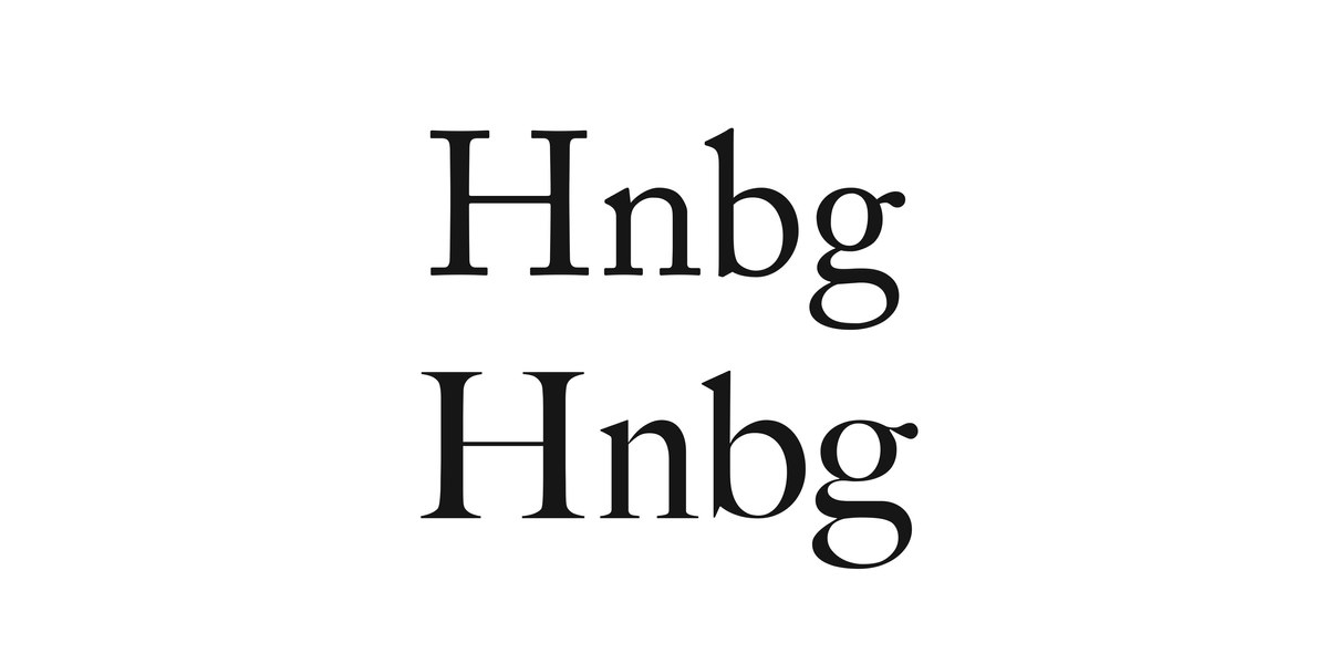
Several design decisions allowed me to find the freedom to make Frame. The first was where the typeface would appear – it would primarily be a digital face living online, and the softness inherent in Adobe Caslon, which suggests the effect of letterpress squash, would be unnecessary. In text, that softness would be virtually unnoticeable. Any sharpness I added would be subliminal, yet would give the type a more modern appearance in larger sizes. But the decisive moment came when Jack Saunders, the design director at Rapha, chose Caslon Doric to replace Trade Gothic. He then asked if the serif face could match the proportions of the Doric, in particular the cap and x-height. This made me think of Publico, a serif face Christian Schwartz and I made to match the proportions of the original Helvetica. In a sense I was making a truer ‘Dutch’ version of Caslon.24
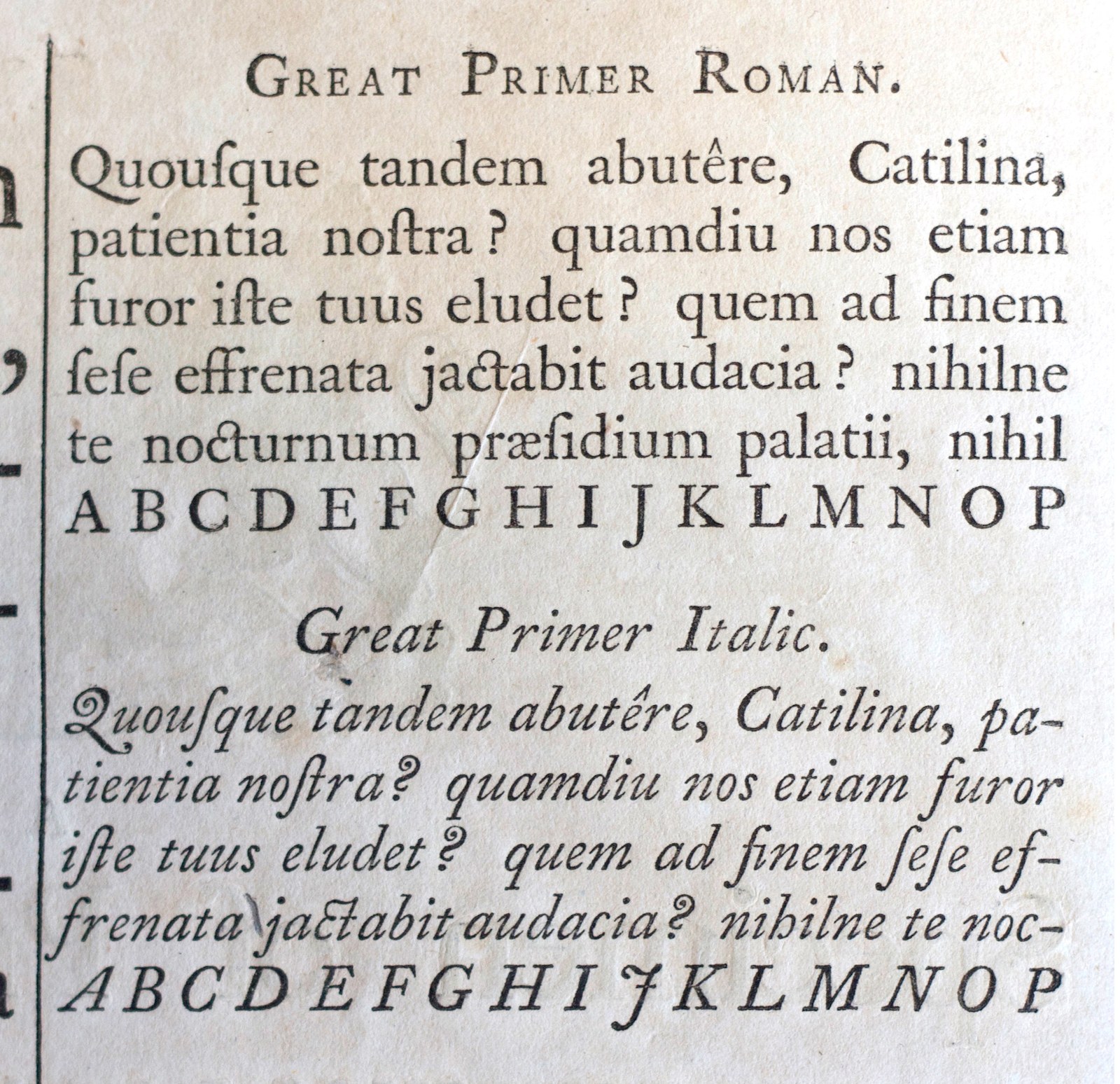
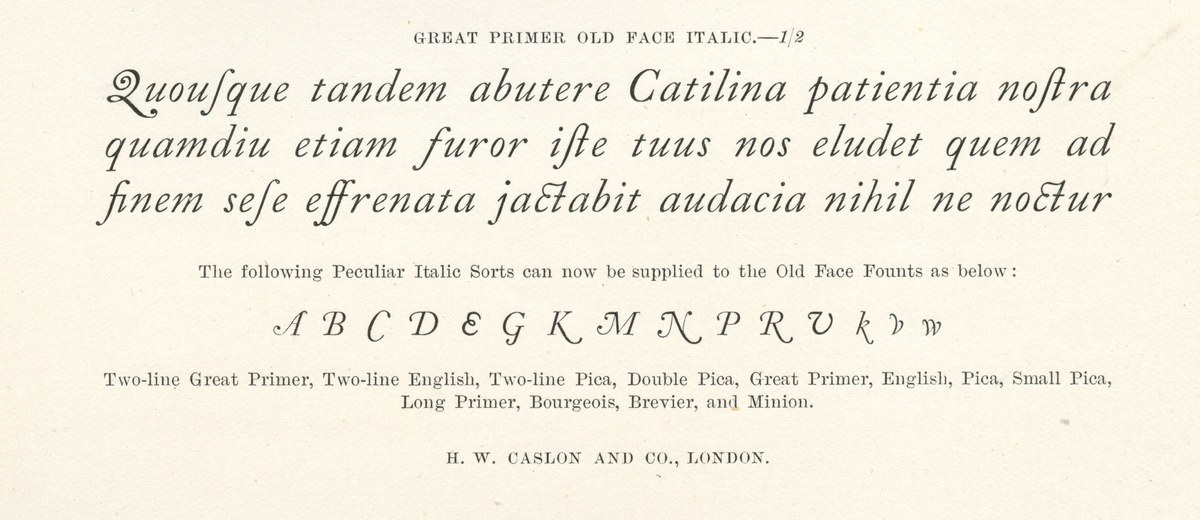
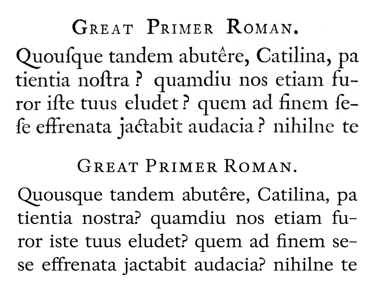
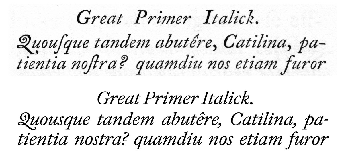
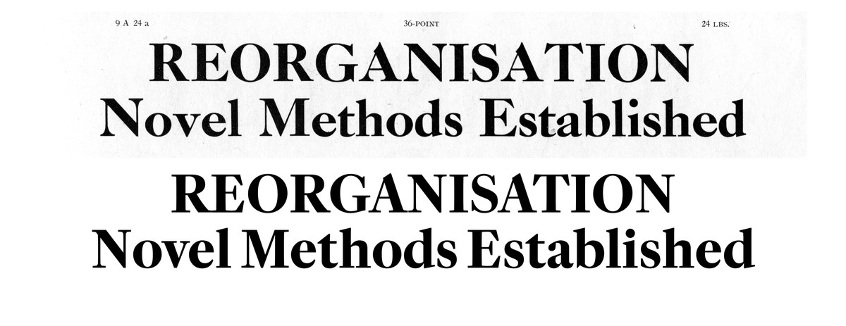
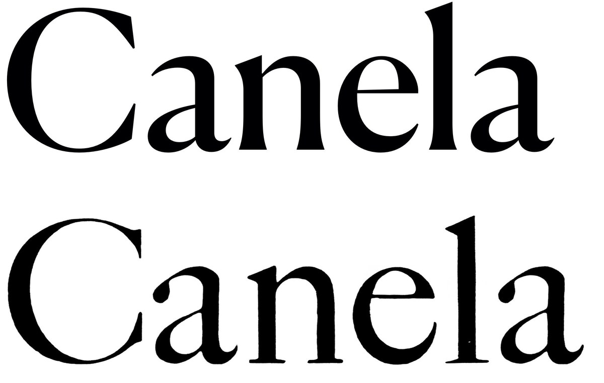
Great Primer (later 18pt), roman and italic. Cut by William Caslon I, Great Primer first appears in 1728 and is perhaps Caslon at his closest to the Dutch. It’s sharper in style than the models used for Adobe Caslon. As shown in A Specimen of Printing Types by William Caslon, Letter-Founder to his Majesty, 1785. St Bride Library.
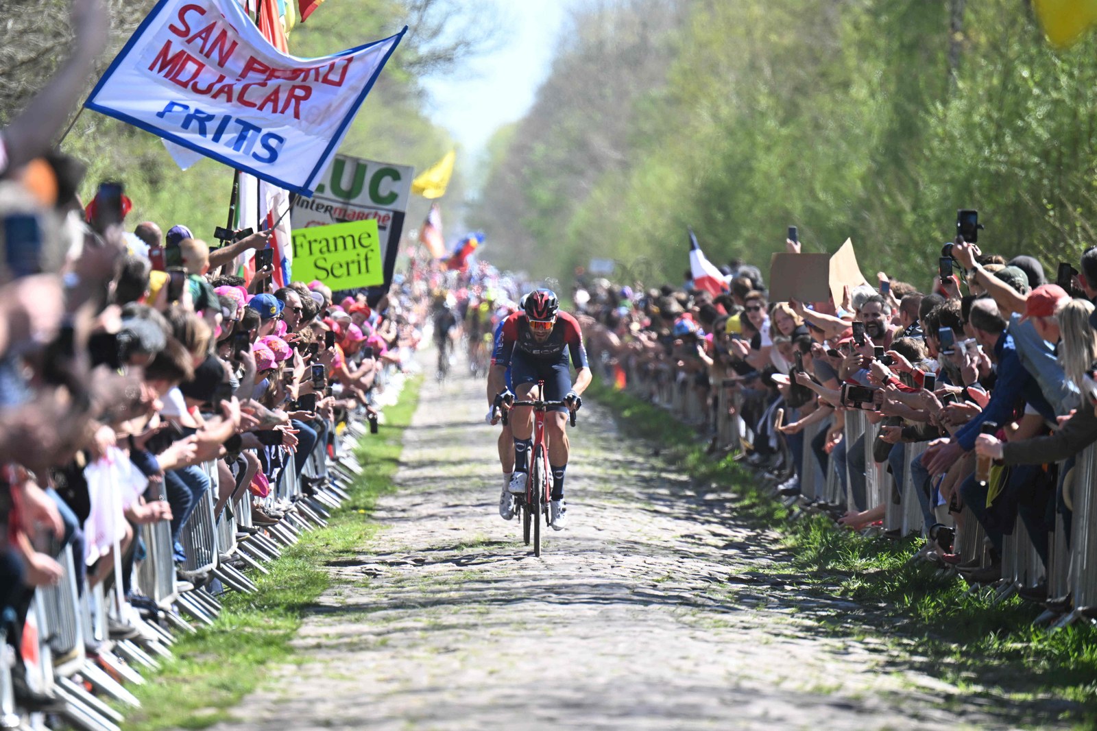
Returning to the specimen of 1766,25 I looked through the many sizes of Caslon, noting those that inspired Big Caslon, and those that inspired Adobe Caslon, principally the largest text sizes and the smaller display sizes. Several were the work of others – Moxon and William Caslon II, though over time historians have come to view them as part of the Caslon canon. One in particular caught my attention: the Great Primer, which was later cast at both 16 and 18 point. As one of the earliest William Caslon I faces cut in 1734, Great Primer seems to be the most Dutch of all the text faces, retaining the sharpness and grittiness that attracted me to the masters of the seventeenth century. Grittiness is a quality that is hardly regarded in professional cycling – the tradition of the strong, able to ride at the front into the headwind whatever the conditions. These attributes are especially valued in the low countries and in the classic races like Paris-Roubaix and the Tour of Flanders.
Simplification
If Frame diverges most noticeably from the original is in its proportions, in its details it aims for simplification. This is not only because at text sizes many details become lost, but also because I wanted to return a sharpness to the design. (A similar approach is followed in Darby Serif, a reductionist transitional.) In several of Caslon’s faces, the serif structure in the lowercase is almost a simple flat line with little or no tapering. So the serifs in Frame’s lowercase have a gentle straight flaring of the stroke, and the serif itself is a shallow, almost flat angle stroke, ending in an angled terminal. In the capitals, the stroke flares before meeting an angled corner and then a tapering stroke. The balls are rounded on the outside, but flat on the inside, subtly shifting between sweetness (roundness) and sharpness (angularity) – without the other, neither is fully appreciated. In the text design, the contrast is deliberately low (almost matching Adobe Caslon). Certain characters are drawn not from Caslon, but directly from the Dutch style: see the lack of top and bottom serifs on the C, G, and S, for example. By rescaling the proportions, the capitals that are quite prominent in Caslon and Adobe Caslon leave less of an impact on the overall colour of the page in Frame.
Angles and widths
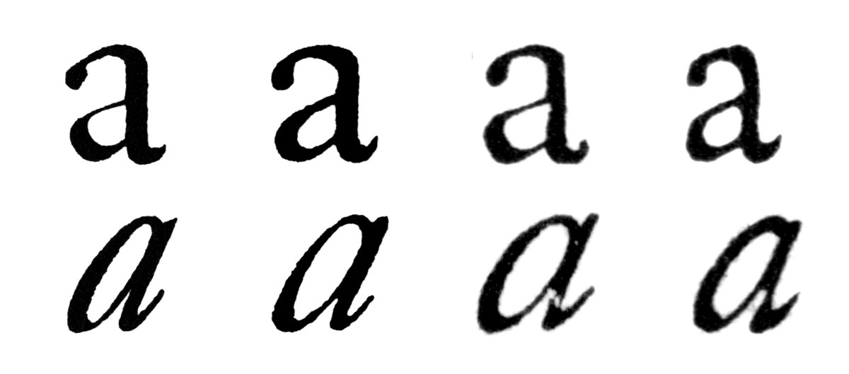
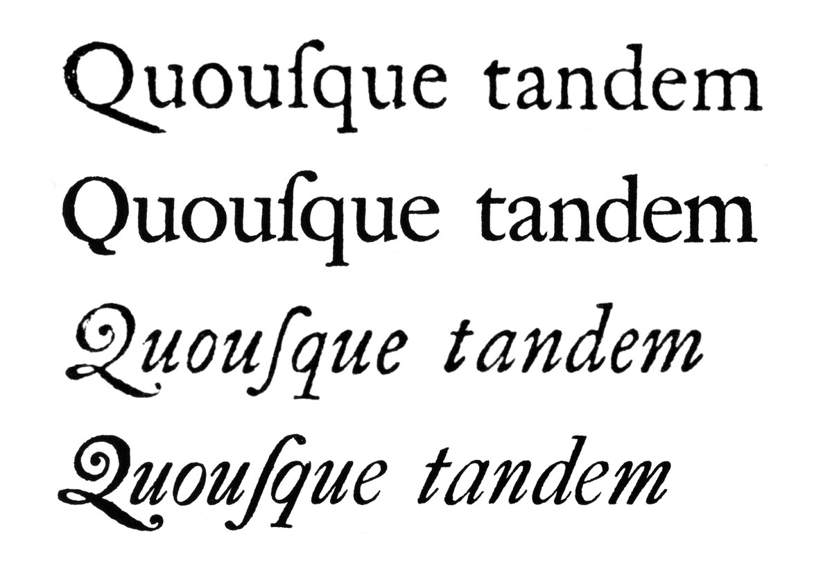
Caslon’s italics show a variety of styles; the largest sizes are narrow in width and have a shallow angle with tight spacing. The text sizes vary often in angle from steep (Great Primer) to something gentler (Pica), and in width they go from wide (Great Primer) to narrow (Pica, echoing Adobe Caslon). Caslon’s italics maintain a steadier rhythm than earlier models such as Granjon. They are less dramatic, with fewer changes in angle and width throughout the face; where Granjon’s italics seem to steal the show from the roman, Caslon’s assume a much more subservient role. Frame has the regularity of Caslon’s faces, with an angle and width between his smaller sizes and Great Primer.
As with the roman, the details of the italic are reductionist in style; the capitals follow exactly the same simple serif structure. In the lowercase, the upper and lower tails reach the main strokes in a sharp and obvious point, while on the exterior they have a subtle, barely noticeable point. The balls of the c, f, g, and r are round on the exterior, but have flat interiors that join the main stroke with a sharp point.
Some of the characters have been simplified: see the h with its lack of inward ball terminal, which maintains the rhythm of the n and m; and the v and w that are gently curved, rather than having rounded bowls with head stroke and ball.
The swash letters that appear in Caslon specimens from the latter nineteenth century, as well as in many modern Caslon revivals, are not original (bar the J and Q); they were added only in the nineteenth century. They have a different flavour from the corresponding eighteenth-century letters and lack the confidence and majesty of those made by Granjon in the sixteenth century. In Frame, the swashes are reserved to just a few letters – A, B, D, E, G, J, K, M, N, P, Q, and R – rather than to every capital letter and multiple lowercase forms, including terminal letters. In style they are informed by the drama of Granjon, but tempered by the calmer qualities of the lowercase.
Overall, the italic attempts to capture the spirit and energy of Caslon’s original, but with a measured quality and regularity needed for legibility. And although the roman addressed many of Rapha’s concerns about economy, the italic remains a popular choice for headlines, where its simple understated elegance draws readers’ attention without dazzling them.
Larger and bolder
In the age of Caslon, every size of type was cut individually. Most readers would hardly notice how the design changed between sizes. Adobe Caslon and Big Caslon are based on one punch cutter’s vision, but a side-by-side comparison shows that they are different in style. They diverge not only in their degree of contrast, but also in the width and proportion of the lettershapes and in spacing – yet both are accepted as one and the same: Caslon. Only when type stopped being cut by hand did it gain the greater consistency of design we expect today; even though manufacturers usually had separate designs for a range of sizes (Monotype typically had three designs, one for text, one for smaller headline use, and one for large headlines), they would to most eyes be homogenous. In the case of Frame, the headline variants are closer to the modern approach. The design is effectively the same as the text, with increased contrast and tighter spacing designed for use at a specific range of sizes. Though the headline version has greater sharpness, it is not of a dazzling style like a hairline Modern.
Today we understand that one typeface design can have many multiples – not just in size, but also in weight. For Caslon, this possibility had yet to be fully grasped and understood. Heavier serif letters existed, but they had yet to become what we would identify as truly bold. For a denser (and therefore heavier) form, the blackletter would offer weight, but the concept of bold variants of a regular weighted roman was yet to be discovered. Only in the nineteenth century did this come to fruition, not only within the dramatic bold and fat-face display faces of the early part of the century, but also with heavier text faces, such as the Ionic and Clarendon styles of the middle of the century. This in turn became truly codified once the concept of the family of type such as Cheltenham and Century Schoolbook became the standard, and printers became accustomed to bold variants of a style. So Frame had no eighteenth-century model to follow; rather it needed to imagine one. In this it had to retain the intentions of the regular weight while dealing with the challenges of gaining boldness. So as weight increases, the thicks and thins also gain, but not at the same rate, which would simply be like adding stroke uniformly (the so-called ‘dipping in chocolate’ effect). And as weight is gained, the x-height increases to avoid the letters becoming wider and wider. Thus the small number of weights: four reflects both the needs of the client and the suitability of the style to accommodate more, whilst remaining true to the original design. Any need for greater weight for Rapha could be accommodated by using Caslon Doric.
Frame continues the rich tradition in type of copying, or covering another designer’s work, which was more than likely already a copy of something else in the beginning. So we have multiple copies of copies made in different places, in different times, by different designers. With each copy hopefully something new appears, while retaining some quality of the original. What that quality is depends on the person making the copy. In the case of Frame, part of what makes it what it is is the proportions taken from Caslon Doric, which in turn makes it more ‘Dutch’. It appreciates its history, just as cycling as a sport respects past glories without being held ransom to what came before as technology continues to evolve. Frame simplifies the Caslon model, but preserves enough of it to still be part of the Caslon tradition.
Frame replaced Adobe Caslon as Rapha’s primary brand typeface.
Fournier coined the disparaging term ‘Dutch style’ to describe the development, beginning in the Low Countries in the sixteenth century, of narrower faces with increased x-height and reduced ascenders and descenders. The innovation allowed more words to a page and was purely financially driven.
An example might be the Fell Types given to the Oxford University Press in the latter part of the seventeenth century, a mix of types including faces by Garamond, Granjon, Hautlin, and Van Dijck.
Caslon was born in Cradley (then a parish of Halesowen) in the county of Worcestershire – a mere ten miles from Wolverley, where his great rival Baskerville was born. The Midlands was also one of the centres of cycling manufacturing in the nineteenth century, starting thirty miles east, in Coventry. A few manufacturers, such as Reynolds Technology and Brooks Saddles, are still in business today.
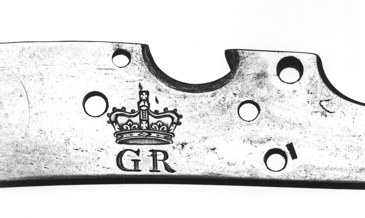
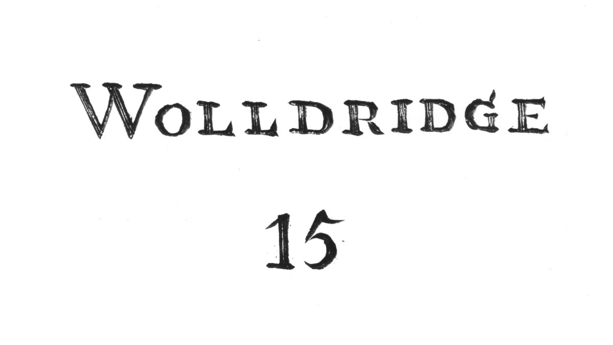
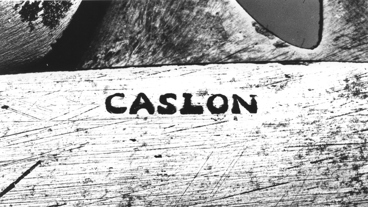
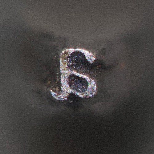
In its collections, the Royal Armouries Museum shows a flintlock muzzle-loading musketoon dated 1715, engraved with Caslon’s name. He had been employed as a lock engraver by the Board of Ordinance at the Tower of London.
James Mosley, ‘Caslon, William, the Elder (1692–1766), Typefounder,’ in Oxford Dictionary of National Biography (Oxford: Oxford University Press, 2004), https://doi.org/10.1093/ref:odnb/4857.
A roman and italic cut in the pica size; the punches are at St Bride Library, London. See James Mosley’s introduction to the facsimile of the Specimen of Printing Types by William Caslon, 1766, Journal of the Printing Historical Society, No. 16, 1981/2.
The proportions are similar to those of Van den Keere’s largest types.
Other examples might be Baskerville or, more recently, Gill Sans.
During the eighteenth century, Caslon was joined by the following:
Alexander Wilson, Glasgow, 1742
John Baskerville, Birmingham, 1752
Thomas Cottrell, whose foundry was in turn taken over by Robert Thorne and later William Thorowgood, and renamed the Fann Street Foundry, London, 1757
Joseph Jackson, the former foreman of the Caslon foundry, whose foundry was taken over by William Caslon III and then William Caslon IV, London, 1763
Joseph Fry, Bristol, 1764
Vincent Figgins, London, 1792
Caslon’s fame had spread across the Channel to the most celebrated of contemporary writers on type: Pierre-Simon Fournier le Jeune in his Manuel typographique. But despite lavishing praise on Baskerville, who would exert a profound influence on the continent, Fournier appears to have thought less highly of Caslon, writing elsewhere: ‘Only one thing hinders the advance of Printing in England – the bad taste of [Caslon’s] types, especially the italics, which are absolutely absurd’. See Harry Carter, trans., Fournier on Typefounding (London: Soncino Press, 1930). Set in Monotype Caslon.
Caslon was not alone in showing ‘ancient’ fonts in the second half of the nineteenth century; Figgins and Marr began showing their own faces from the eighteenth century.
See, for example, Épreuves des caractères de la Fonderie Caslon (Paris: Fonderie Caslon, 1920). Digitised version from the Bibliothèques spécialisées et patrimoniales de la ville de Paris.
James Mosley dates this to 1856 and the Boston Type Foundry; see Mosley, ‘Recasting Caslon Old Face’, 4 January, 2009. The 1860 specimen shows several sizes, as well as many other designs from Britain.
See for example A Specimen of Isaiah Thomas’s Printing Types (Worcester, MA: 1785). The title page proclaims: ‘Chiefly manufactured by that great artist, William Caslon, Esq; of London’.
As typographic adviser to Wallpaper*, I encouraged Tony Chambers (then the creative director) to use Big Caslon and its as-yet-unreleased italic companion. And later Big Caslon became the prime identity of Schirmer Mosel, a literary publisher in Munich.
And, of course, images of professional cyclists stuffing newspapers down their jerseys for insulation as they crest a mountain pass also come to mind.
‘The Original Rapha’, The Inner Ring, 16 May, 2012, https://inrng.com/2012/05/original-rapha-history.
Of course, additional economy comes from having full control over your own custom font, as opposed to having to wrangle licensing issues.
‘Dutch type’ still refers to types made in the Netherlands. Some of the most celebrated are the serif typefaces of Gerard Unger, in particular Hollander, Swift, and Gulliver. These are contemporary Dutch variants of the Dutch style, but in the twentieth century the increased x-height and shortened extenders became more pronounced; to English speakers today, the phrase ‘Dutch style’ refers to a style of even greater economy that reflects the development of specific newspaper faces in the nineteenth and twentieth centuries. One can only imagine what Fournier would have thought.
See the facsimile of the Specimen of Printing Types by William Caslon, 1766, Journal of the Printing Historical Society, No. 16, 1981/2.
