Chiswick Sans Collection
Designer
Technical
Pricing
$650, styles from
$50
One-time fee for perpetual use
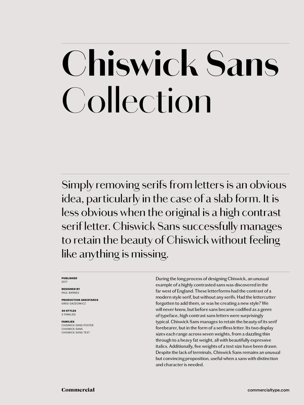
Simply removing serifs from letters is an obvious idea, particularly in the case of a slab form. It is less obvious when the original is a high contrast serif letter. During the long process of designing Chiswick, an unusual example of a highly contrasted sans was discovered in the far west of England. These letterforms had the contrast of a modern style serif, but without any serifs. Had the lettercutter forgotten to add them, or was he creating a new style? We will never know, but before sans became codified as a genre of typeface, high contrast sans letters were surprisingly typical. Chiswick Sans successfully manages to retain the beauty of Chiswick without feeling like anything is missing.
Read moreChiswick Sans Poster Family


Chiswick Sans Family
Go to top


Chiswick Sans Text Family
Go to top


Supported Languages
Go to topAfrikaans
Albanian
Asturian
Basque
Bosnian
Breton
Catalan
Cebuano
Cornish
Corsican
Croatian
Czech
Danish
English
Esperanto
Estonian
Faroese
Faroese
Filipino
Finnish
Flemish
French
Frisian
Friulian
Gaelic
Galician
German
Greenlandic
Guarani
Haitian
Hawaiian
Hiligaynon
Hungarian
Icelandic
Igbo
Indonesian
Irish
Italian
Kurdish (Latin)
Latin
Latvian
Lithuanian
Livonian
Luxembourgish
Malagasy
Malay
Maltese
Maori
Moldavian
Nederlands
Norwegian
Occitan
Polish
Portuguese
Provencal
Romanian
Romansch
Saami
Samoan
Scots
Scottish
Slovak
Slovenian
Spanish
Swahili
Swedish
Tagalog
Turkish
Walloon
Welsh
Wolof