Graphik gets six new widths
Type designer Christian Schwartz has an enduring interest in the expressive possibilities found in plain typefaces. This stems from his early exposure to Modernist graphic design, particularly posters, from the mid-twentieth century. In addition to the powerful imagery, he naturally loves the typography, which is often bold, direct, and surprisingly plain.
While much of twentieth century design was dominated by three iconic sans serifs from Europe: Helvetica, Univers, and Futura, Schwartz was drawn to the “B-list” of sans serifs, such as Plak, Folio, and Neuzeit Grotesk, which provided an initial inspiration for Graphik. “I wanted a typeface without the baggage of Univers and Helvetica; something that could be used in similar ways without only evoking Modernism.”
Graphik was designed to be a blank slate; a “vanilla-flavored” typeface that is perfectly suited for whatever style of expression is needed. This purposeful, elegant plainness has allowed Graphik to move effortlessly between being central to the design or playing a supporting role in many successful editorial projects, as well as corporate branding, video and broadcast design, websites, apps, and user interfaces.
Originally released in 2009, Graphik has since become a modern classic. From the beginning, Schwartz had a vision to build Graphik into a large, multi-width typeface system with a rational approach to the grid of widths and weights. Ten years later, and with assistance from Croatian designer Hrvoje Živčić, his plan is finally a reality.

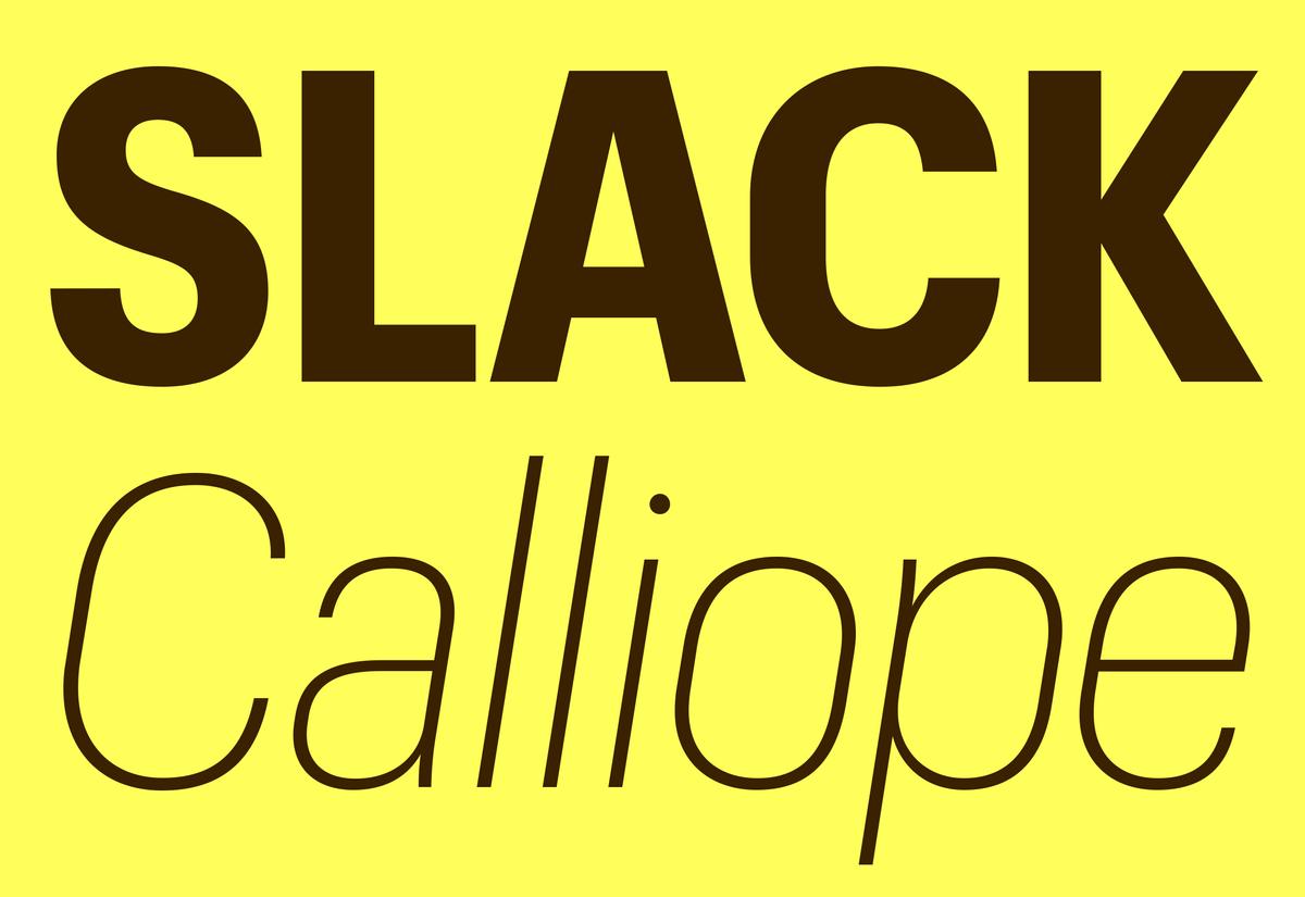
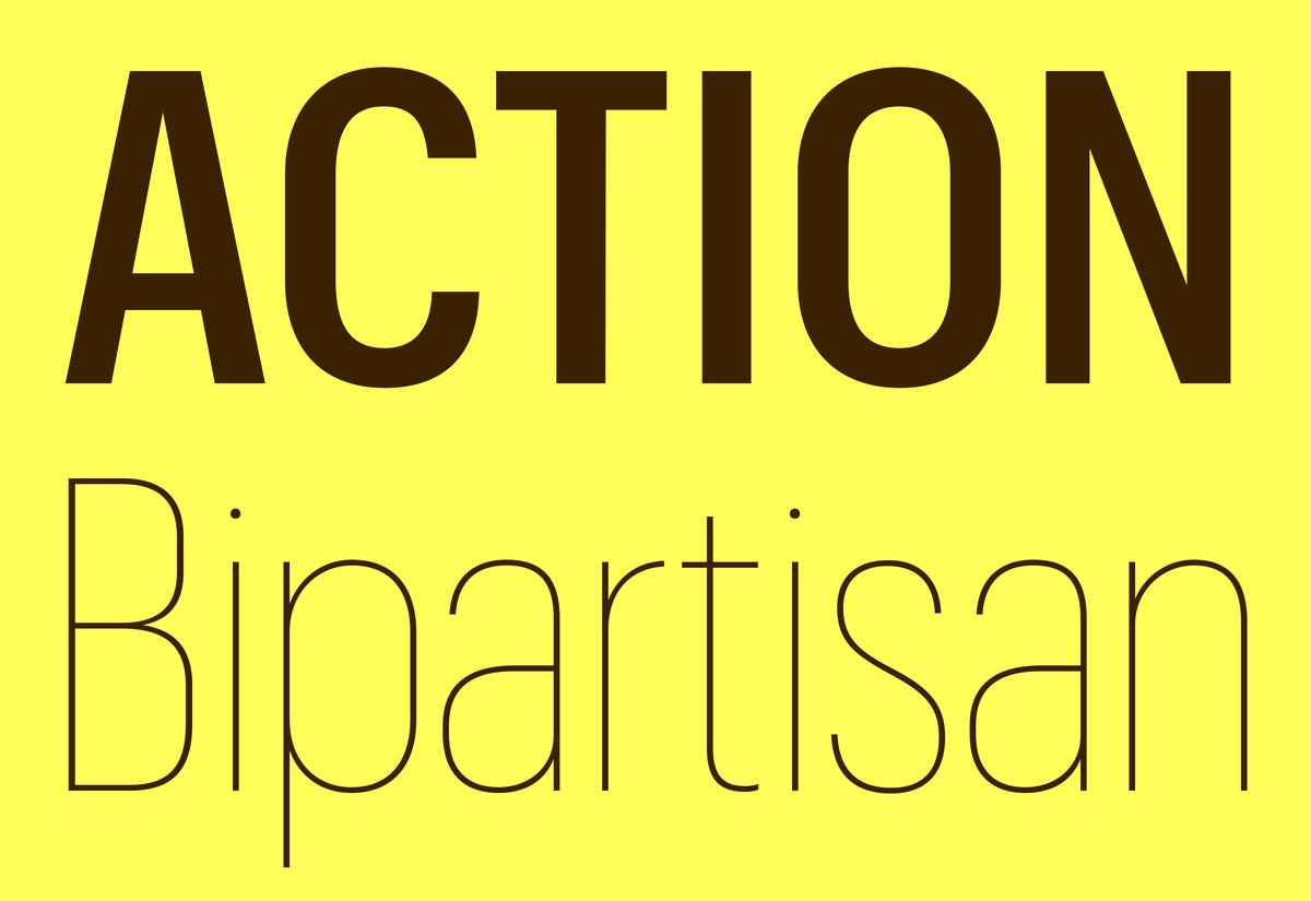
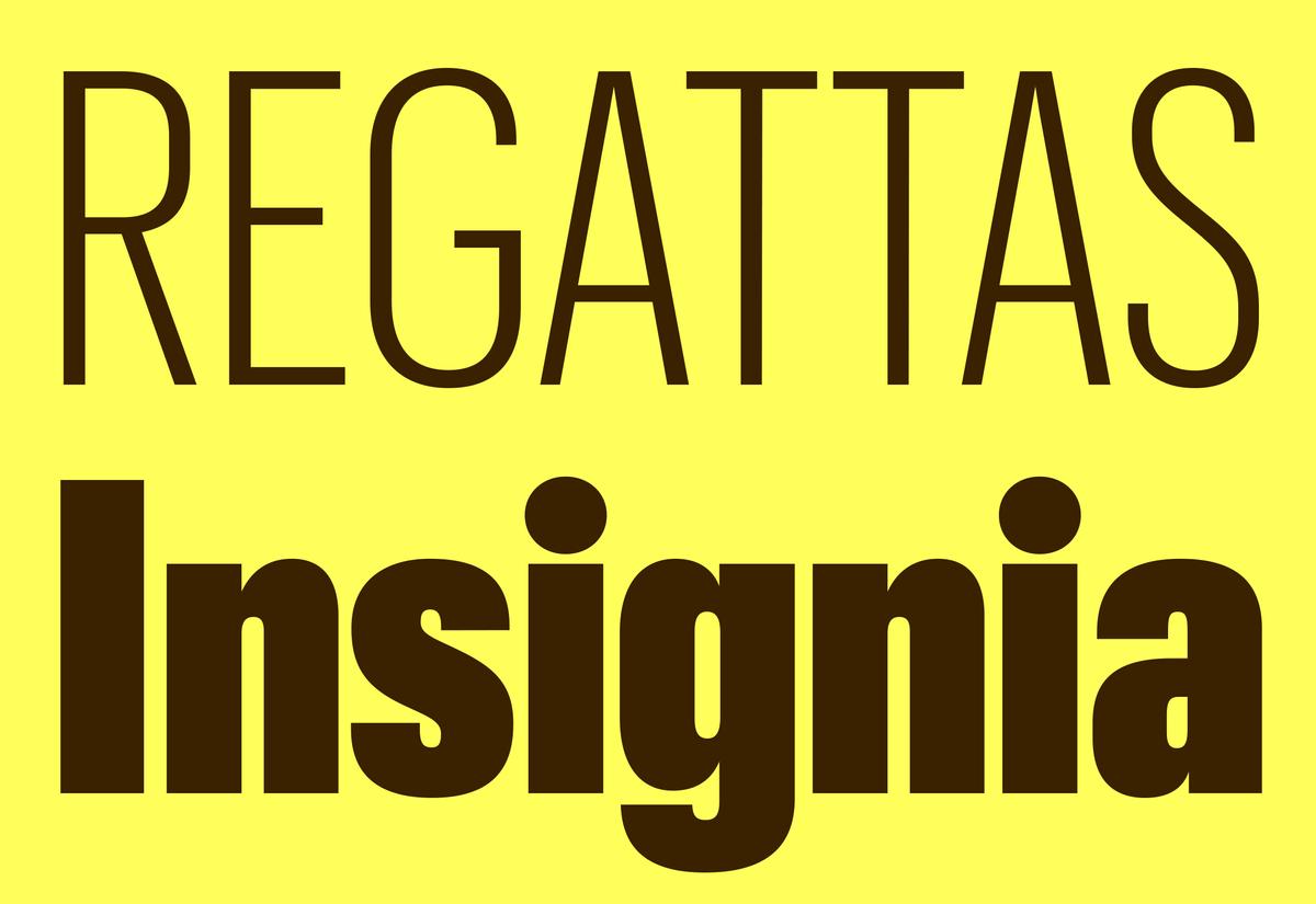
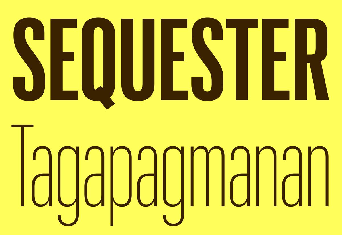
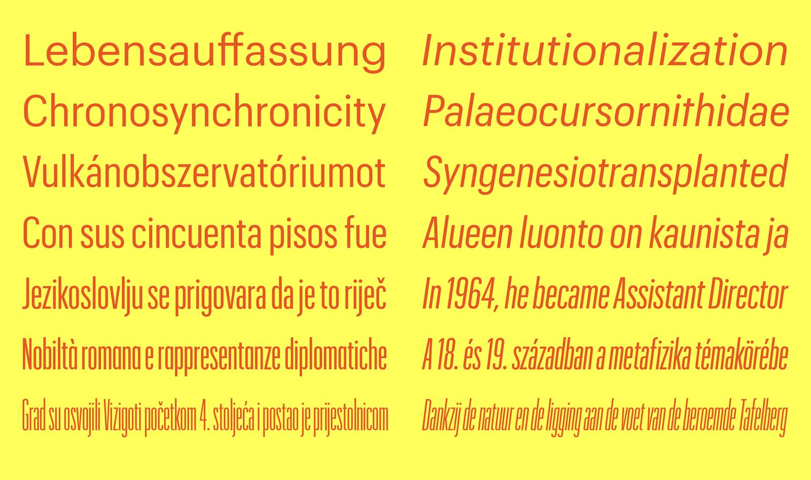
From Regular to XXXX Condensed
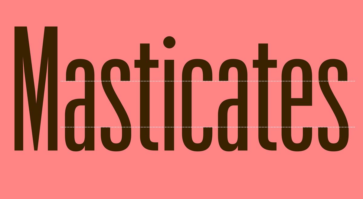
The original plan for Graphik included only regular, condensed, and extra condensed widths but that quickly changed. “At Commercial Type, we often push each other to take things too far, just to see what it will look like.” Schwartz was working on what he thought was the narrowest width of Graphik when fellow designer Abi Huynh challenged him to go further. “The XX Condensed was starting to work and then Abi said ‘Don’t you think this could be twice as narrow?’ and it actually worked!”
“Often, going beyond the logical conclusion of an idea and finding out what happens is where things get interesting. ‘What if this went further? Has this gone too far yet? Why don’t we take it too far and find out?’ The XXXX Condensed is a good example of that.”
The new widths of Graphik span from Compact to XXXX Condensed. To create such a large typographic system is no small task, but to build a system that doesn’t simply add styles for the sake of being a “super family” takes an assured precision. Much effort went into making sure the gaps between the widths and weights are meaningful, so the choice between them would not be ambiguous in use. Schwartz attempted to reduce the family as much as he could; the six new families proved to be the minimum he found useful.
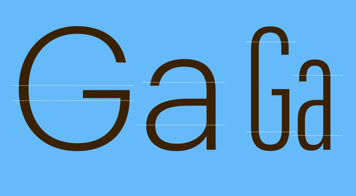
Keeping Warmth and Openness
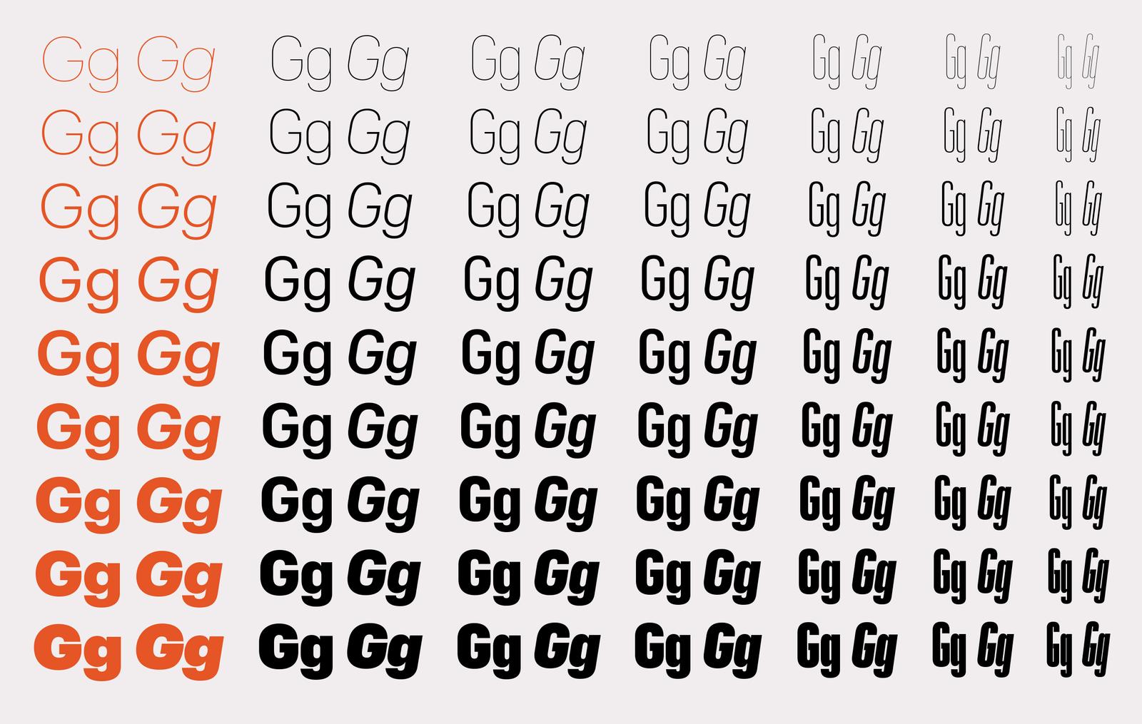
In designing the condensed widths, Schwartz maintained the warmth and friendliness of Graphik by retaining the curved upper and lower sections of the characters, while elongating the straight sides. These consistent curves helps harmonize the system throughout the widths of Graphik as the characters become more condensed.
Typically, a straight-sided sans serif will fill as much of the available space as possible, closing the forms in on themselves for a dense texture. In contrast, Graphik’s condensed widths feature open terminals that avoid coming together to fill up all of the white space in a character. This results in an openness in the text and a lively texture, rather than becoming a relentless series of verticals with the effect of looking like a barcode.

Editorial Usage
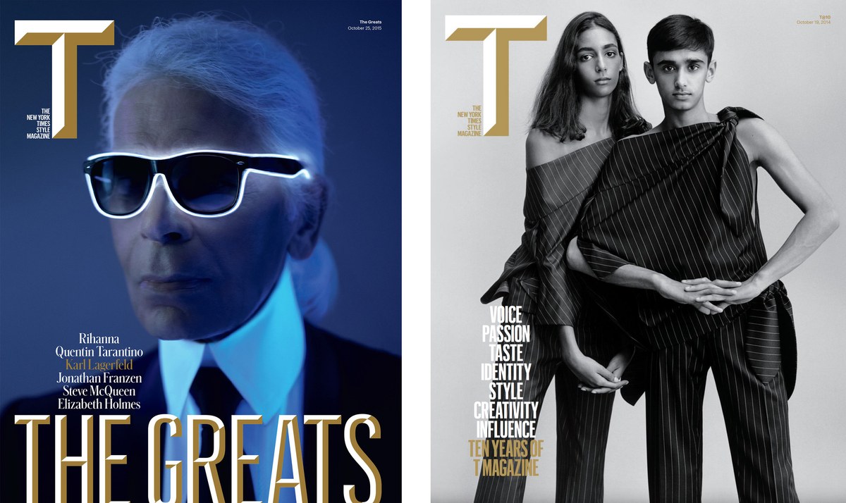
After three years of periodically working on the expansion of Graphik, Condé Nast’s cooking and dining magazine Bon Appétit and iconic men’s magazine Esquire contacted Schwartz with similar needs: a condensed, straight-sided sans in multiple widths that could be used to set big headlines. “When they both came asking almost the same, specific question, we said: 'Oh boy, you have no idea! We’ve been working on something for years,’” says Schwartz.
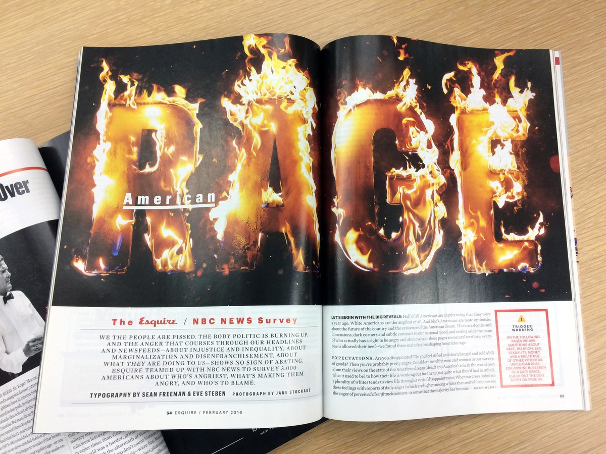
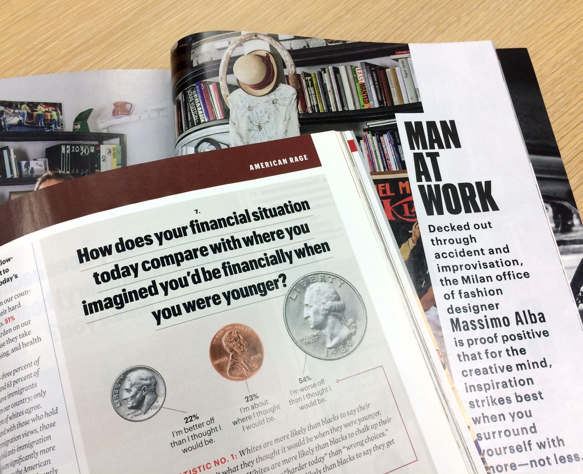
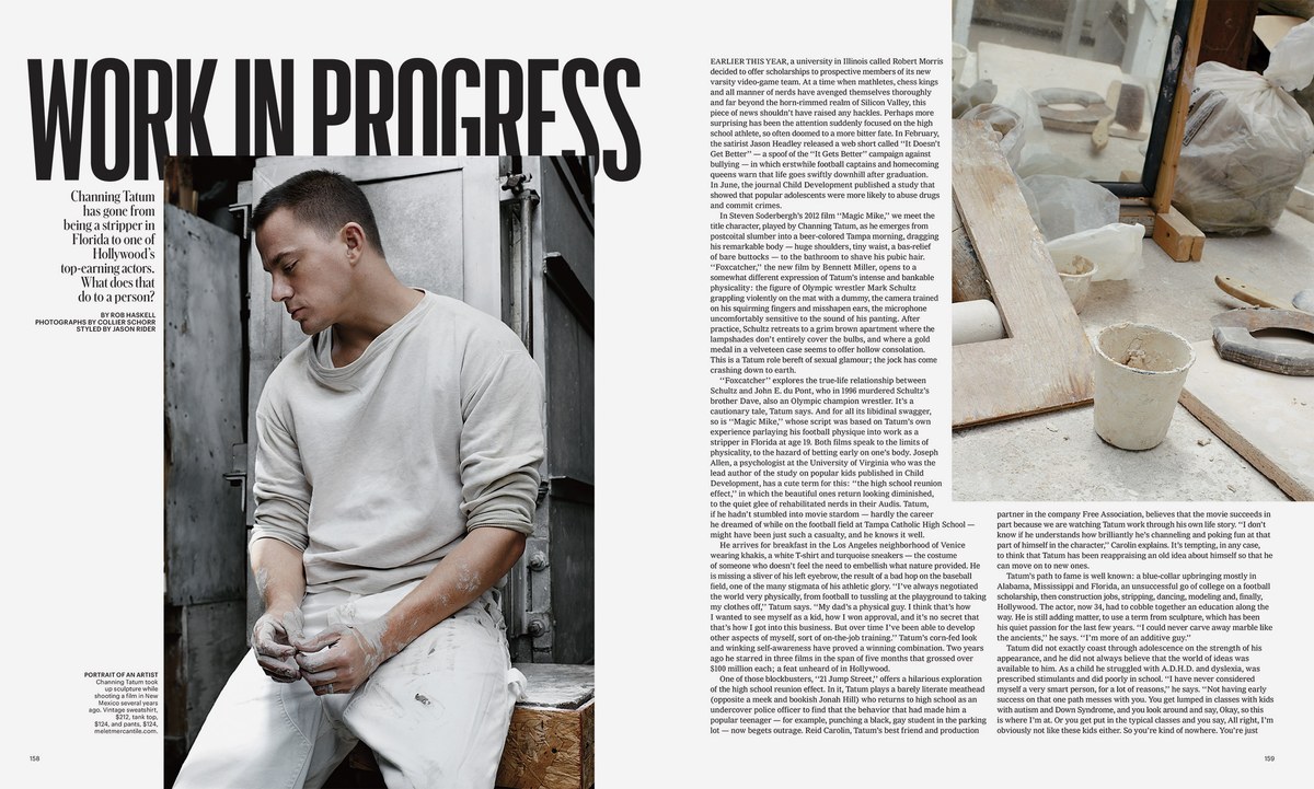
Under creative director David Curcurito, the art department at Esquire pushed Graphik to the limit by using and abusing the type by photocopying, D.I.Y. stenciling, tracing quickly with a felt-tip marker, and even setting 3-D letterforms on fire. They tended to use the heavier weights in the range to create powerful, punchy headlines. “We’ve been surprised how well Graphik takes that abuse, maintains its integrity, and lends itself to those treatments” says Schwartz.
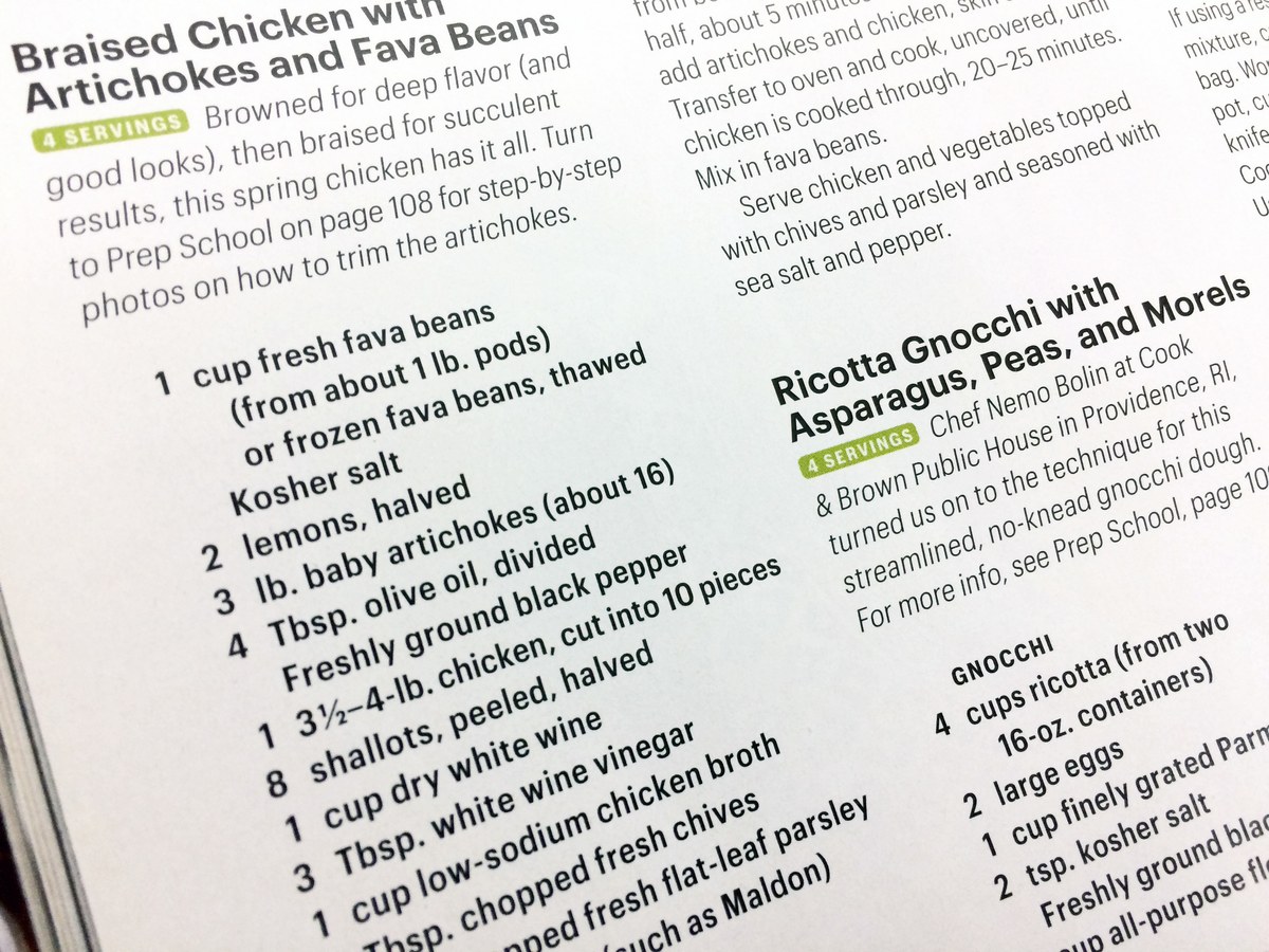
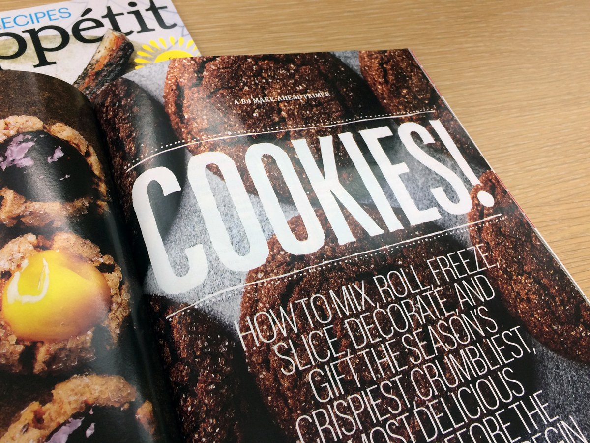
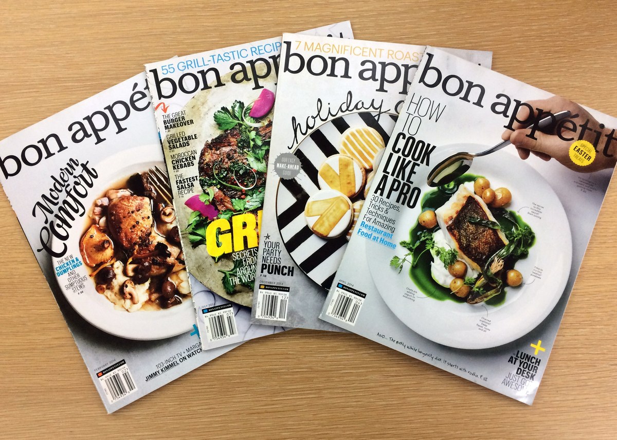
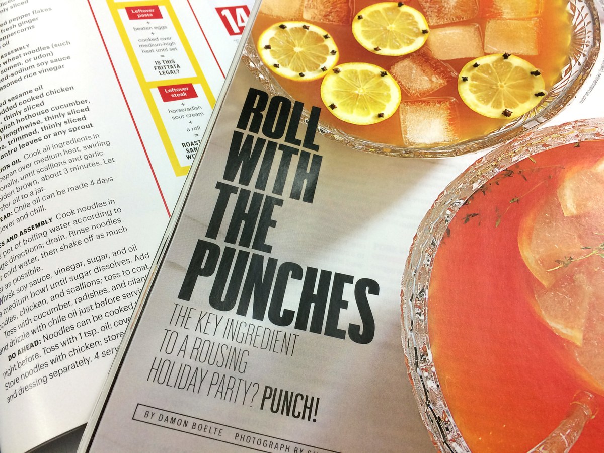
In contrast, Alex Grossman and his team at Bon Appétit utilized Graphik’s narrower widths and lighter weights to bring style and sophistication to their layouts—especially with the intricate design challenge of recipes and ingredient lists.
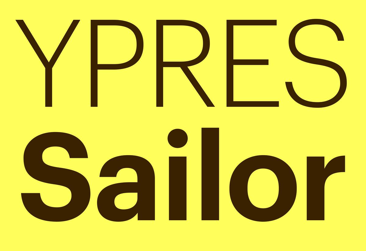
When design and architecture magazine Wallpaper* refreshed their look under creative director Meirion Pritchard, Graphik helped refocus attention on their images rather than flamboyant type treatments. The regular width wasn't efficient enough in text, so Schwartz designed Graphik Compact; which creates a balance between regular and condensed and doesn't appear overtly condensed in headlines.
Recommended Uses for Widths
With access to all of the widths and weights, Graphik creates opportunities for expression within a constrained environment but stays within a system that looks consistent. This allows designers to choose the tone and style of the content by choosing the width. The wider widths are comfortable playing a secondary role to the information, whereas the narrower widths allow for large sizes and an emphatic, even abstract voice.
Compact is all about efficiency in fitting copy. Use for both headlines and text without looking like the letterforms have been condensed or compacted.
Condensed is the all-purpose editorial, online, corporate design, wayfinding, and app typeface. It can also be used for text with some additional tracking.
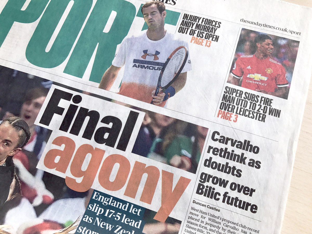
X Condensed is effective for newspapers and can be used at a wide range of sizes. Great for headlines and in apps.
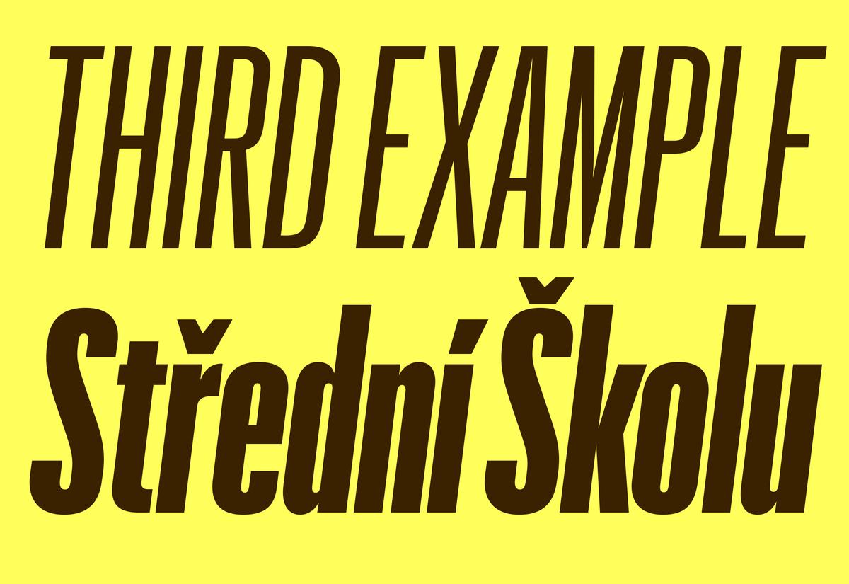
XX Condensed works for the biggest headlines in a newspaper and is expressive, but still eminently readable. It can also be used for general graphic design use such as book covers, signage, and magazine layouts.
XXX Condensed is best for “screamers” (an old British term for big, tabloid headlines) and feature spreads in magazines. It is all about big, expressive display type.
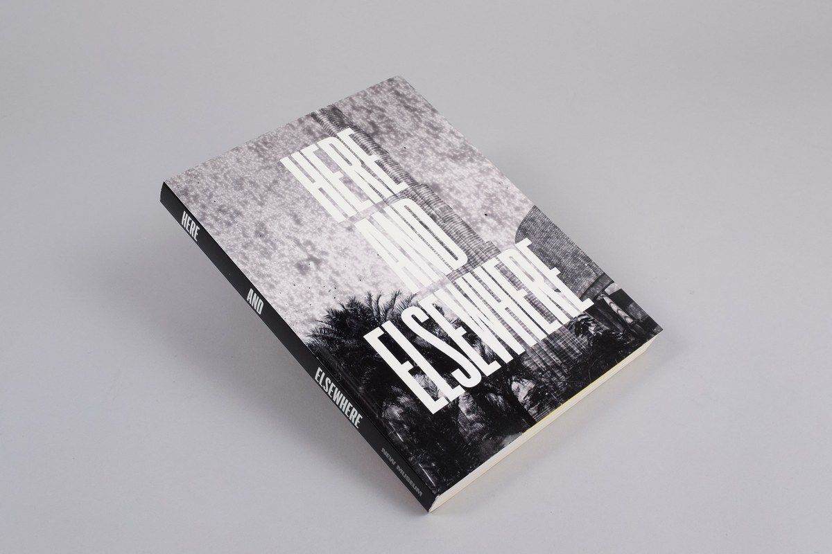
XXXX Condensed allows letterforms to be at the edge of readability. Perfect for posters, album covers, and places where the text takes on an abstract pattern and graphic visual form.
Text: Doug Wilson