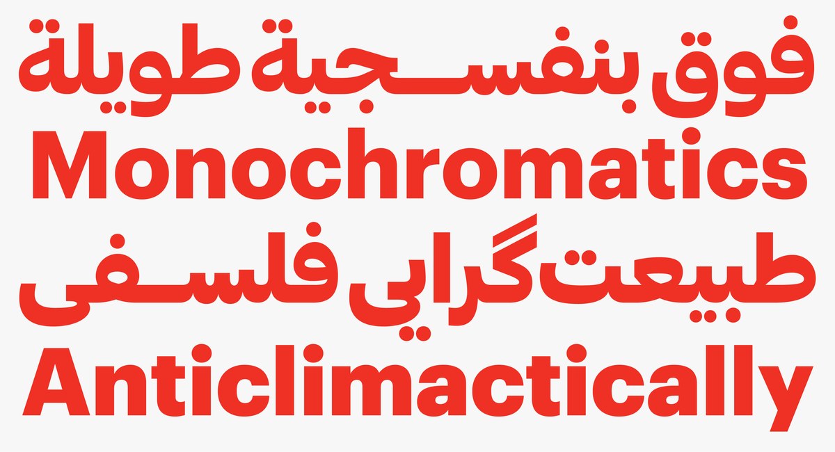
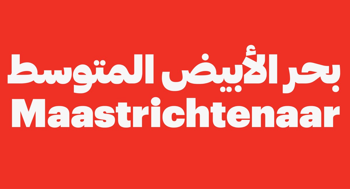
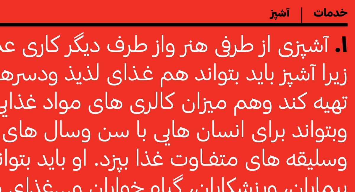
Graphik Arabic
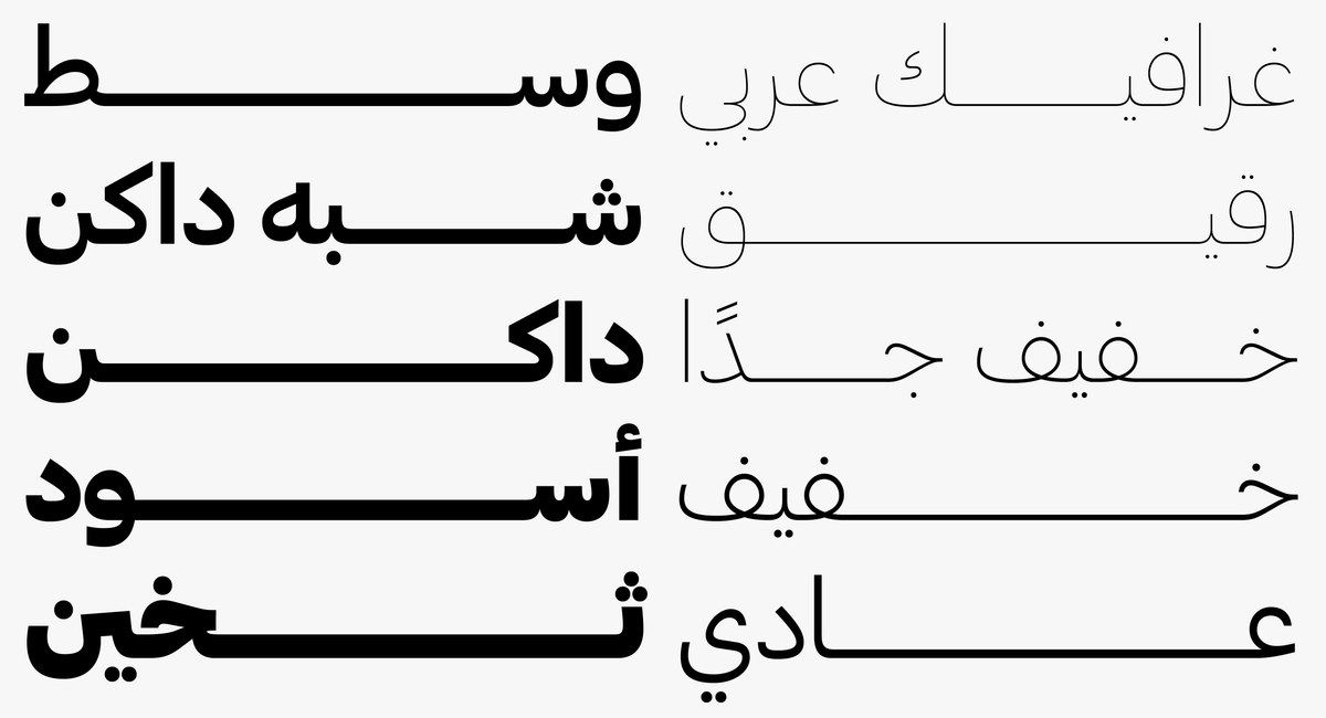
Graphik, designed by Christian Schwartz, was inspired by expressive graphic design done with very plain type. It was a reinterpretation of the lesser known mid century typefaces without the baggage of the more familiar ones like Univers, Helvetica or futura. From Thin to Super, the nine Latin weights span a range of uses from display to text.
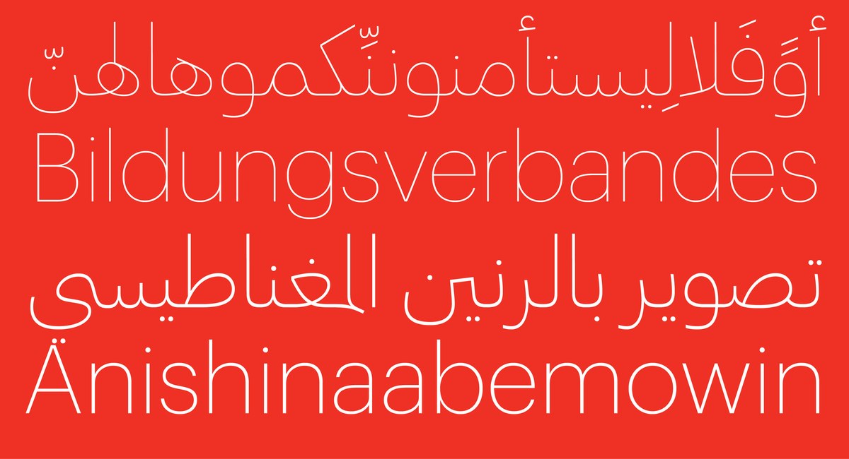
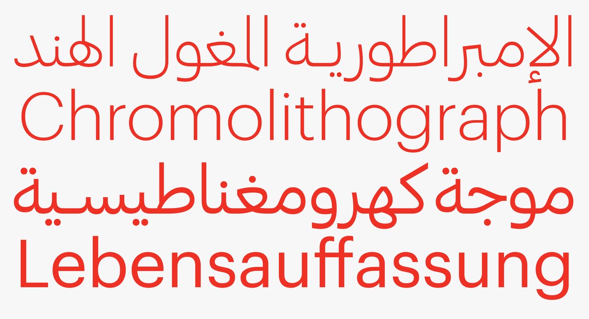
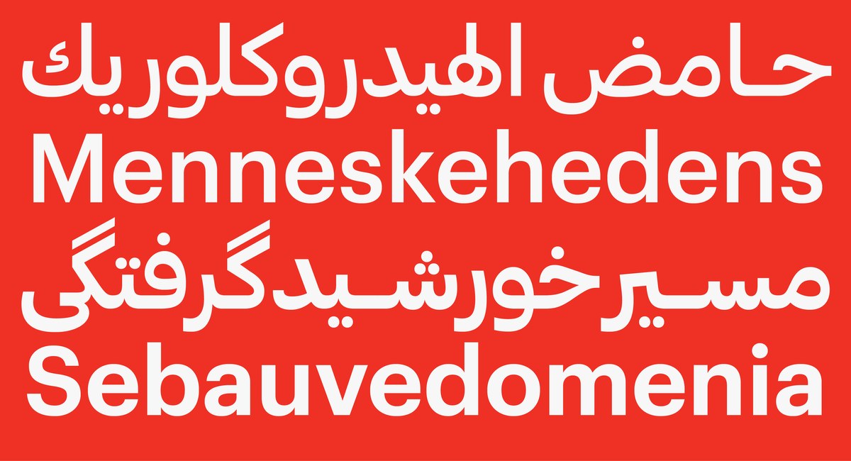
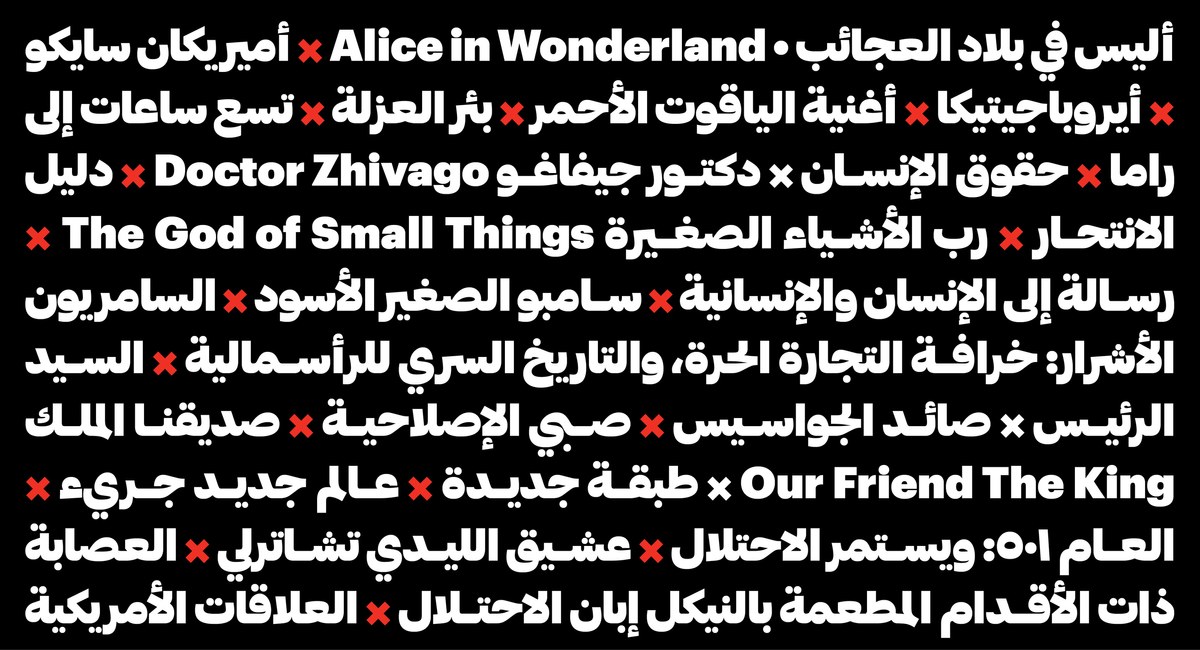
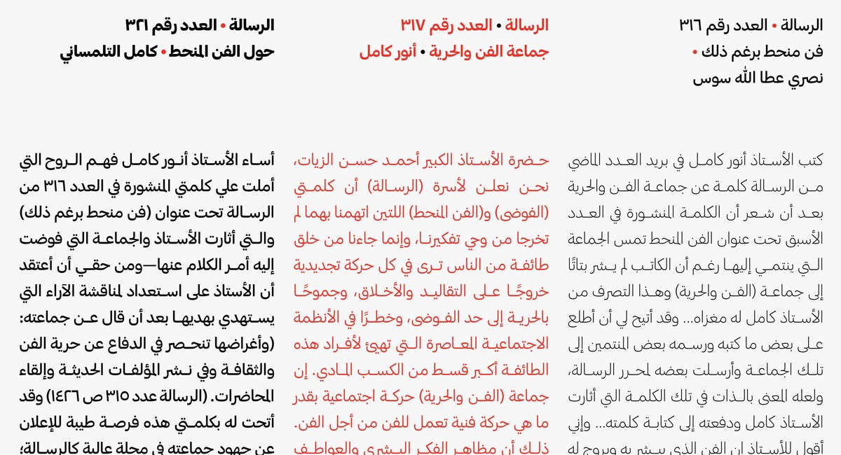
Graphik has now been expanded by Lebanese type designers Waël Morcos and Khajag Apelian to support Arabic, Persian, and Urdu. In adding Graphik Arabic, the objective was to achieve two main goals. First, to balance the visual quality and texture of the Latin; second, to operate in both contexts: display and running text. This meant basing the design on a fluid construction and adopting a stroke contrast where the baseline is thicker than the verticals—a characteristic considered to be the standard for Arabic running text.
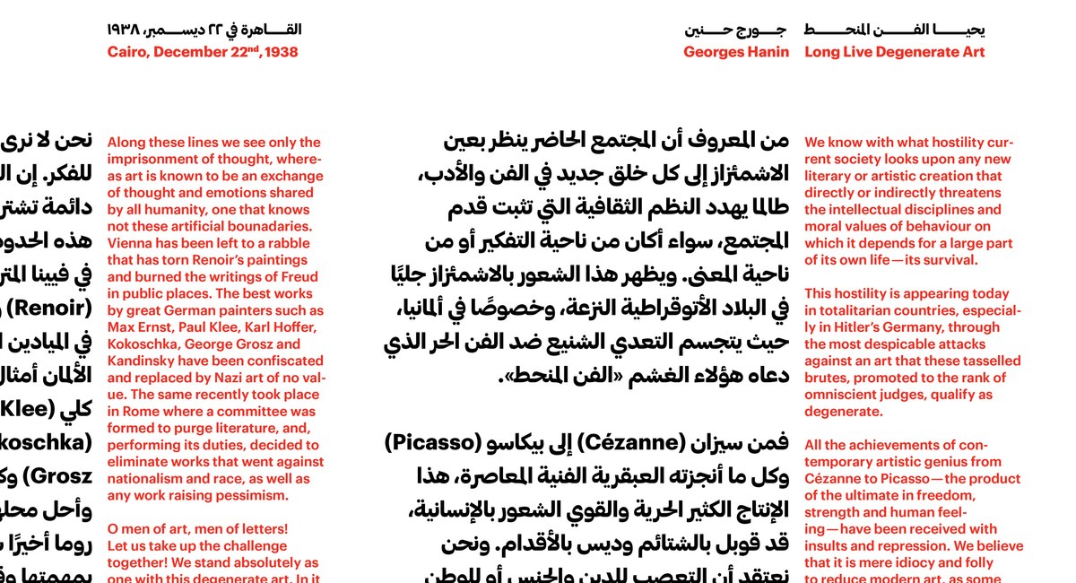
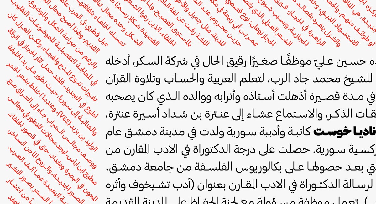
Other design decisions echoed the detailing of the Latin typeface and shaped the design of the Arabic. The start and ending of the stroke is geometric and unadorned drawn with closed apertures and open endings. Letters with looping counters have a vertical axis allowing the typeface to stand straight. The baseline mixes straight lines and curves that become thinner at connection points—a contrast increase necessary to resolve multiple stroke overlaps. The diacritic dots remained circular to match this distinctive feature of the Latin face.
To complete the glyph set, the designers added the ligatures, or fused letterforms, necessary to respect the grammar of the script but omitted cascading letter combinations that proved to be incompatible with the simplicity of a plain grotesk.
When Graphik Arabic was complete, Schwartz reworked the Latin character set to better harmonize with the Arabic, reducing the difference in weight between uppercase and lowercase and reducing the size of the numerals to make them fit more seamlessly into Arabic text.
In the Latin, Greek, and Cyrillic alphabets, Graphik neatly straddles the line between the round bowls of a geometric sans, and the structures and proportions of a European grotesk. Similarly, Graphik Arabic combines the simplified strokes of a grotesque with the structure and proportion of a fluid script. The Arabic aims to be a meaningful departure from calligraphic detailing and presents a utilitarian workhorse with a plain style.
