Last year kept us busy. Some of the work we can’t talk about yet (stay tuned), but a lot of it we can. Here’s a highlight reel.
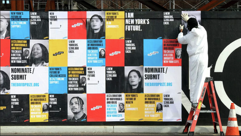
Type is the foundational element of graphic design, and the cornerstone of a brand. One of the most exciting things to happen around here last year was the launch of a branding studio within our type design studio. Commercial Type Design Studio, headed by industrial designer-turned-branding adept Dino Sanchez, builds identities from the typefaces out. At Creative Boom, Abbey Bamford wrote about our new type-driven joint, highlighting our passion for work that might strike others as unglamorous: “‘There’s a whole universe of companies that desperately need design but don’t think of themselves as design-forward,’” Dino told Bamford. This can encompass anything from supply chain companies to foundations to nonprofits. (Given our long and productive entanglement with magazines and other cultural-sector work, though, it probably goes without saying that we like glamour, too.)
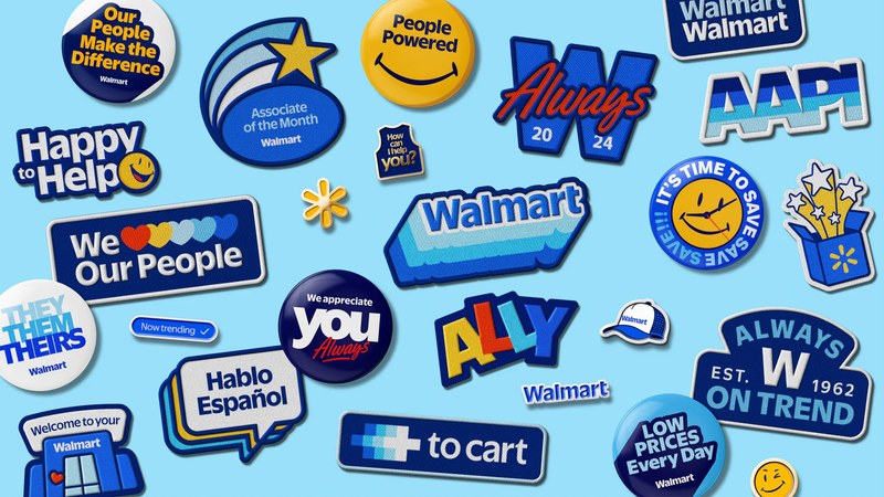
In January Walmart unveiled a subtle but dynamic new identity by Jones Knowles Ritchie, who tapped us to draw a proprietary typeface, Everyday Sans. Christian Schwartz, assisted by Thomas Bouillet, designed this open, readable family in five weights; Miguel Reyes also drew a casual script face, Always, that appears on patches and other collateral.
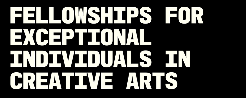
Thomas joined up with Matt Wiley’s group and Jonny Sikov at Pentagram to create a new identity for the John Simon Guggenheim Memorial Foundation, which offers fellowships to “exceptional individuals” in any field of knowledge. The foundation’s logotype is set in an all-caps custom Graphik Mono, which Thomas developed into a full alphabet so it could be used throughout the identity. Fun fact: The decision to go mono was sparked by the realization that GUGGENHEIM, FOUNDATION, and FELLOWSHIP all have ten letters. The bold graphic look feels of the moment, and liberates the Guggenheim Fellowship from fusty foundation tropes.

Richard Turley and FOOD’s rebrand for Air marks the first-ever use of Christian’s forthcoming Control Compressed, in its low-contrast variant. Miguel’s Control Cursive also makes an appearance, and he drew the ethereal, tubular logo as well. There’s some irony between the tight type and Air’s credo that “creative people need space to breathe”—that’s part of the fun. Check out the brand guidelines.
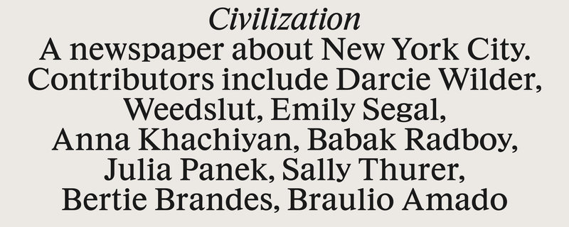
Since launching in 2018, Richard Turley and Lucas Mascatello’s cult newspaper Civilization had been using the macOS system version of Times. For Issue 7, released in September, Thomas drew a revival of a 4¼pt Times New Roman—working name: Civ—including cuts with slightly longer extenders. The paper’s designers have been using it at every imaginable size.
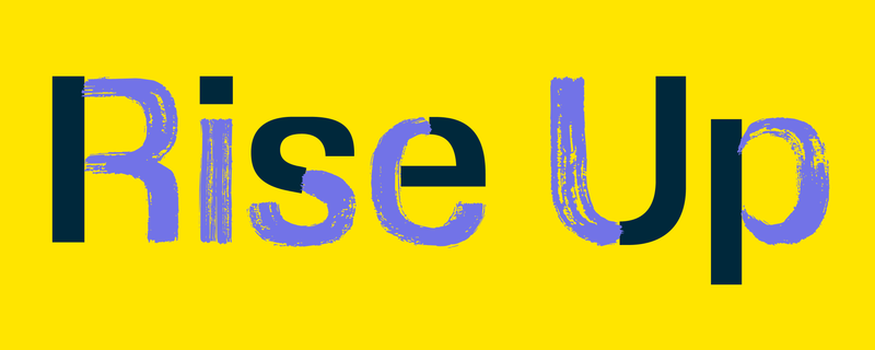
Sun Day is a new global day of action conceived by Denis Hayes (who inaugurated the first Earth Day in 1970) and environmentalist Bill McKibben. COLLINS developed a flexible identity, logo, and design system for this participatory new movement, enlisting Tim Ripper to work on a custom version of Review to create a “living typeface” in three variants: Brush, Print, and Outline.
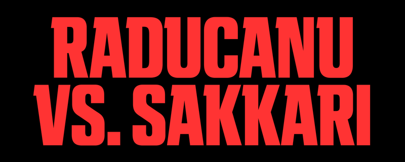
More Tim, more Review: A team led by design director Rami Moghadam, in collaboration with Dixon Baxi, rebranded ESPN in 2025 across all platforms, with a special focus on the ESPN+ streaming platform. Tim adapted Review into a semi-slab with lower contrast and a lot of forward momentum to give the face more of a muscular voice.
Miguel designed a custom script face for Lumens that adds a lighthearted (no pun intended) note to the elegant new identity developed by Decade.
Christian took Miguel’s Control Cursive and drew a custom version of it for Kiên Mai and Chợ Chời Creative’s new identity for Boulevard Vietnam, splitting the strokes into colors.
In September, London-based international art magazine Apollo unveiled a redesign by our friend Mark Porter (the legendary creative director who commissioned Christian and Paul to design new type for the Guardian in the early aughts). Mark brought Julien Priez in to create a stately custom display face based on the magazine’s original nameplate, drawn by Paul about twenty years ago.
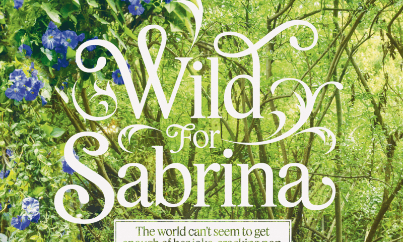
For the print edition of Angie Martoccio’s July/August Rolling Stone cover story on Sabrina Carpenter, creative director Joe Hutchinson and c-ll-ct-v-ly asked Julien and Christian to produce storybook-themed lettering to accompany lush, sumptuous photographs by David LaChapelle, shooting his twenty-first cover for the magazine.
Christian had fun doing the lettering for New York’s special “Yesteryear” issue, which paid tribute to Broadway. With one eye on the art deco-ish type of the original 1975 poster for A Chorus Line and the other on his studio display—tight deadline, and no time to dig through the library and trace the type’s origins—Christian worked up a full inline alphabet to use throughout the issue, along with a secondary solid version. Only after the issue hit newsstands, when he had a moment to breathe, did Christian realize that the new alphabet in fact owed more to his memory of Michael Chave’s 1969 Marvin than to Roy Sprong’s 1970 Pinto, which is what was used for the Chorus Line poster. Tom Alberty and the team at New York also used Graphik Dot to evoke old-school lightbulb signs.
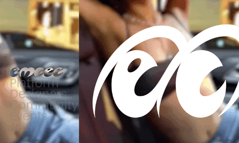
Social shopping platform emcee uses Greg Gazdowicz’s Focal Maxi as its primary typeface. But Greg also, with Echo Wu of FOOD, drew the 👀 logo. And from there, he developed an utterly deranged, spiky-soft display face. You can catch glimpses of it on emcee’s Instagram profile.
Greg and Christian worked with creative director Anna Thurfjell to develop a new logo system and nameplate for Aftonbladet, Sweden’s most widely read daily paper, which has used a blocky slab in its nameplate for almost its entire century-long history. The space between Georg Trump’s City and Schadow offered a rich area of interpretation in terms of contrast, width, and squareness. After redesigning the primary logo and creating a second logo for the publication’s most significant sibling brand, Sportbladet, Greg and Christian expanded the nameplate to a full alphabet in solid and shaded variants so the in-house team could create new logotypes on the fly.
For Toronto Life, a monthly magazine covering a range of topics related to its eponymous city, Christian and Greg went through a couple of rounds of proposed nameplates—but it was Julien who took the design over the finish line. During early discussions, design director Colleen Nicholson mentioned that Toronto Life had used Farnham for almost twenty years and still considered it an integral part of its DNA. She later noted that the ideal nameplate would be “Farnham, but not Farnham,” and that it would look more drawn than typeset. At that point we knew we had to get Julien involved. He quickly did a round of sketches, and then sent the client two versions of the logotype: one a more traditional cursive italic, the other a sloped roman. They chose the sloped roman, and that was that. The new mark has been introduced across the brand with the single-line version on the magazine’s cover, the stacked version on the website, and the TL icon on social media.
The first time Christian redrew the Vanity Fair nameplate was in 2012, for then creative director Chris Dixon and a very hands-on Graydon Carter. The brief was fairly loose: To replace the geometric sans logotype in use since the early aughts, Christian had free rein to experiment with weight, contrast, and contours—as long as it remained a sans serif. For kicks, Christian also threw in a version using VF Didot, the massive Didot-esque family in seven optical sizes that he and Paul had just completed for the magazine. Carter immediately chose that one, and it debuted on the October 2013 cover. Dixon asked Christian to draw a sturdier, more down-to-earth version in 2018. Now, under design director Justin Patrick Long, global editorial director Mark Guiducci, and new creative director Jen Pastore, Christian has reworked the nameplate again. This time he has returned to a geometric sans in a nod not only to the nameplate from the early 2000s, but to Vanity Fair’s longer heritage. He drew the 2025 version in a different proportion and weight, and fine-tuned the A, V, and N to work better on screens. New York institution Casa Magazines approves.
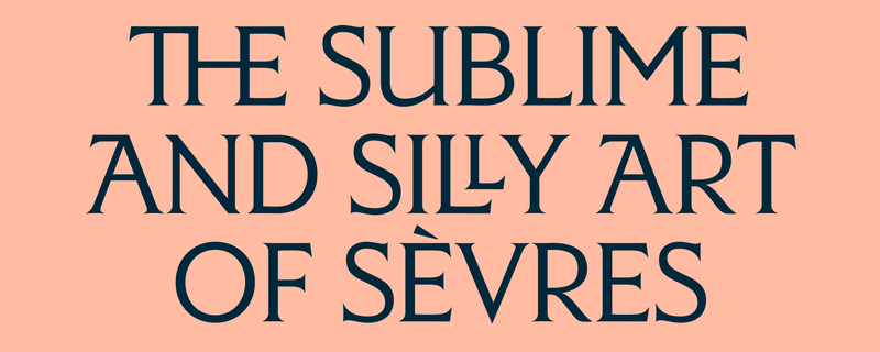
Independent publishing house Scribe was founded in Australia in 1976 and now has offices in Melbourne, London, and New York. Paul Barnes worked with friend of the house David Pearson to update the company’s logotype, using Orleans as a starting point. David and Paul wanted to retain a bit of the personality of the original logo, which used a redrawn version of Victor Hammer’s American Uncial. Orleans, with its roots in calligraphic sans serifs and handmade, broad-nib letterform traditions such as blackletter, seemed like a logical choice to connect Scribe’s rustic, original logo with a crisper, more contemporary mark.
Have you seen The Observer lately? It’s the world’s oldest Sunday paper, dating from the end of the eighteenth century, and Paul and Greg are all over it. But it’s more than just a Sunday paper these days: It recently launched its first digital subscription, and is now a daily digital publication in addition to being a physical, multisection weekly newspaper. The Observer uses Caslon Ionic as its primary typeface, with Caslon Doric in a supporting role for elements like labels, dropdown menus, and datelines. Paul updated the nameplate using Caslon Ionic; custom type will appear in 2026. The Observer testifies to the quiet power of a restrained type palette. c-ll-ct-v-ly has been documenting new issues.
Delusse is Sandrine Nugue’s third release with Commercial Type (following Orientation and Moulin), and her first published text serif. Named for Marguerite Delusse, a gifted late-eighteenth-century engraver who used the name Marguerite Vendôme professionally, Delusse engages in dialogue with one of the most iconic French typefaces of the twentieth century: Vendôme, nominally designed by the artist François Ganeau and released by the Fonderie Olive in 1950. Although you could be forgiven for thinking you were looking at Vendôme upon first seeing Delusse, the latter doesn’t revive or even pay tribute to the former. Delusse works through Vendôme and emerges on the other side as something thoroughly original—particularly evident in the bananas, reverse-contrast italic, where Nugue really lets loose.
Christian’s display agate Amplitude, first released by Font Bureau in 2003, popped up in the Vault in May, updated and now including italics (!), with assistance from Ben Tuttle. Amplitude is a classic for a reason: It was one of the first typefaces to explore the possibility that small can be big—that a face made to be set at ~5½pt cannot simply be blown up for stylistic effect, but can be deliberately designed to work well set large. It was hugely influential for Shiva’s Delegate.
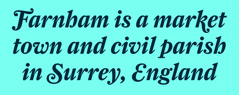
Another classic landed in the Vault last year: Christian’s Farnham, originally published by Font Bureau in 2004, has been remastered with help from Bea Korsh. Farnham is Christian’s reflection on the transitional romans of Johann Michael Fleischmann, a German-Dutch punchcutter employed by the Enschedé Foundry in the mid- to late eighteenth century. For Typographica’s “Favorite Typefaces of 2004,” art director Tom Dolan encouraged readers to think of Farnham as “Fleischmann drawn with a really, really sharp pencil.”
Designed by Paul Barnes and Greg Gazdowicz, Caslon Ionic is nothing if not crisp. So Greg, long fascinated both by various states of softness in type and by the rich tension between soft and sharp, decided to remix it. Caslon Ionic Rounded, now in the Vault, plays with its precursor’s most salient traits, smoothing and fraying and blurring its corners, serifs, and terminals. It also draws on the lettering found on London pubs, and on Caslon’s weird 1888 Atlas.
Greg Gazdowicz’s Focal seems to have struck a nerve. Appearing everywhere from Elastic Magazine to La Repubblica to Domus to Jesse Reed’s Second Hand, this meditation on the soft, warm qualities type acquired from phototypesetting production processes in the seventies quickly gained traction after its release in 2024. Greg developed Focal’s edgy counterpart, Focal Maxi, for a client project with Richard Turley and FOOD. The client, social commerce platform emcee, needed a workhorse sans that could perform well at all sizes for its app and website. Greg started exploring ways he could make Focal more functional for interfaces, while also making it a little brasher. He looked to Frutiger’s underappreciated Vectora and Victor Caruso’s Futura Maxi for clues to how to proceed, incorporating another significant seventies trope to turn Focal Maxi’s attitude and functionality up to eleven: the giant x-height. Focal Maxi moved from the Vault to the main library in June; Pentagram’s Jonny Sikov chose it as the primary typeface for Derrick Gee’s Solid Air.
We got help translating some of our ideas into the Cyrillic script last year from longtime collaborator Ilya Ruderman of CSTM Fonts. Released in 2009, Christian’s “emphatically vanilla” Graphik remains our most popular typeface; Ilya designed the Cyrillic version in 2015. In 2017, with assistance from Hrvoje Živčić, Christian published Graphik Condensed, an all-purpose condensed sans with a particular knack for interfaces. Ilya managed to retain Graphik Condensed’s warmth and consistent curves in the Cyrillic version. Next, he took on Feature, the pretty, Times-ish serif originally designed for T: The New York Times Style Magazine by Christian with Berton Hasebe (and expanded for commercial release by Hrvoje Živčić). Ilya drew Cyrillic versions of all three optical sizes—Text, Deck, and Display—that preserve Feature’s unique mood: dense and dark, pretty and robust, with a high x-height, exaggerated stress angle, and droopy organic terminals on some glyphs. We should all buy fonts.
Eugenio climbed out of the Vault this year. The collection—Eugenio Serif, Eugenio Sans, and Eugenia—originally designed for La Repubblica, Italy’s popular daily paper, mobilizes what might at first glance seem like a strange cross-pollination: Bodoni × Vignelli. Francesco Franchi’s mantra for the paper’s 2017 redesign was “looking to the past to go into the future.” This gave us a key to unlock a modest type palette for La Repubblica, which launched in 1976 using Bodoni and Times New Roman.
Thomas’s spiny, sharp Jargon, a flared headline face in six weights, grew out of a single bold condensed style of Tandem, his 2020 degree project at Type and Media in The Hague. The upright styles show the influence of Dutch newspaper types; the italics borrow from François Ganeau’s sloped romans for Vendôme. Jargon’s honed terminals and steep x-height make it perfect for book and magazine covers, and for headlines on the web.
The Nicola collection grew out of Miguel’s early research for Canela, when he came across Tommy Thompson’s classic 1946 How to Render Roman Letter Forms. Thompson used Caslon to demonstrate how to hand-render typefaces with a soft, square-nibbed pencil. Miguel returned to the idea years later as a new way to reread the types cut by Jenson in Venice in the late fifteenth century. Nicola’s straightforward shapes produce a steady texture for running text, and its striking calligraphic qualities make it a sound choice even for larger sizes. Miguel wanted to make a proper display cut, though, so he revisited the design, expanding the original modest text family from eight to twelve styles: An almost monolinear Thin proceeds to a formidable Black. The family features tighter spacing for greater economy, without looking overly condensed. Its contrast goes against the usual logic of a display face by decreasing rather than increasing, making Nicola Display even more slablike.
Drawn by Paul with help from Luke Charsley and Tim Ripper, Royal Gothic also moved up from the Vault last year. A boxy sans serif that first appeared as a single bold style in Britain around 1880 has been completely rethought and reworked as a seven-weight family with italics for today’s complex typographic needs. Arguably the most exciting aspect of Royal Gothic’s renewal is the expansion of the weight range, from a gossamer thin to a very fat fat. Paul was especially interested in the usefulness of the lighter weights, which have a fairly dense, even color that makes them exceptionally legible and readable in running text. Fraser Muggeridge studio used Royal Gothic Light to great effect in a 2023 monograph on artist Sarah Lucas for Tate—complementing it with heavier weights throughout for heads, subheads, running text, captions, and page numbers.
Not to get too syrupy in a public forum, but we love the type community. It has given a lot to us, and we try to give back as much as we can. We’re thrilled to support Typographics again this year. We continue to be a supporter of Lisa Huang’s ambitious and essential Words of Type, and we’ve chipped in to help publish Alphabettes Soup, forthcoming from Bikini Books. Early in the year, Thomas traveled to Bangkok to speak at BITS 11. In October, we were chuffed to offer our support to Typography Theory Practice, a one-day conference at Leeds School of Arts; the talks are now online.
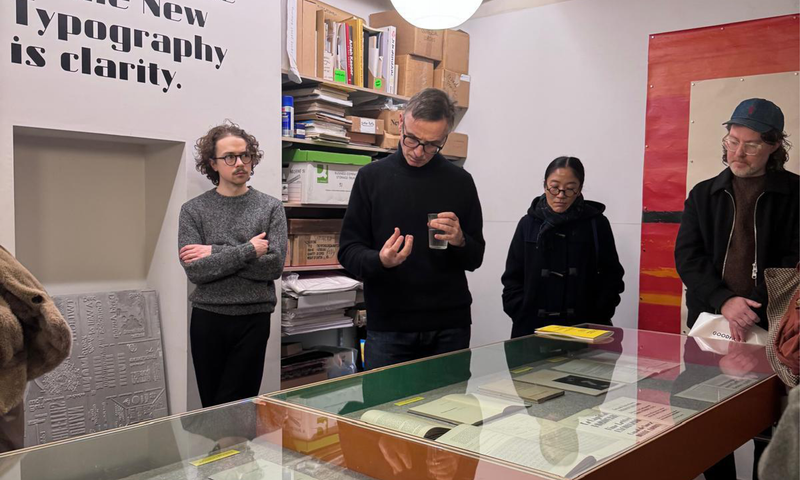
The year ended on a high note: In early December, Paul teamed up with Fraser Muggeridge to curate the exhibition Jan Tschichold Shaping Typography 1925 2025 in London. Revisiting key works like Elementare Typographie, Die Neue Typographie, and Typographische Gestaltung, the exhibition presents Tschichold as a—if not the—central driver of the modern movement in typography. Also featured were Tschichold’s typefaces from this period—Transito, Zeus, Saskia, and Ramses—and experimental alphabets like Noch eine neue Schrift. Paul and Fraser compiled a concise catalog documenting the items from the show, with an introductory text by Chris Burke, as well as several key texts by Tschichold from this period. And Dafi Kühne typeset and (re)printed Tschichold’s 1937 Konstruktivisten poster in Berthold’s Akzidenz-Grotesk.
We always get a kick out of seeing our type in the world, and we love getting emails and DMs from you sharing uses with us. Please keep them coming. Julien, Sandrine, and Greg have been good about contributing to Fonts In Use, and even Paul has gotten in on the action. One of the biggest thrills for us last year was seeing Feature in use in the identity redesign for St. John the Divine by Selman and Brand Federation, alongside the cathedral’s own custom blackletter face, Divine, and a custom wordmark by Fred Shallcrass of Frere-Jones Type. Another highlight was FOOD’s use of our custom (connected!) Caslon Ionic—originally drawn for Richard Turley at Interview—for Rosalía’s LUX.
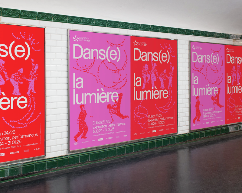
Other uses cropped up, too: Atelier Pierre Pierre used Control for the identity for Dans(e) la lumiére. Matt Avery of Monograph chose Atelier Carvalho Bernau’s Atlas Grotesk and Atlas Typewriter, as well as Christian’s Graphik Condensed, for Colby Chamberlain’s Fluxus Administration. Polymode used Focal for the cover of Collective States. Correspondence used Atelier Carvalho Bernau’s Atlas for the exhibition catalog for Larissa Fassler’s Building Worlds. Sophie Cure used Terza on the cover of Les aimants. Foil seems appropriate for Chiswick. Internazionale continues to use Atelier Carvalho Bernau’s Lyon, as well as Lyon Hed and a custom Lyon stencil (Kai Bernau with Robin Mientjes). Paul’s Caslon French Antique appears on the reissue of Alexander Baron’s 1963 novel The Lowlife. Elizabeth Carey Smith used Control for Drew Warshaw’s campaign. Spine Studio used Julien Priez’s Place to stunning effect, folding in the blackletter caps from its Extra styles, for the Anden Krop exhibition and its accompanying catalog. Malmsten Hellberg used Focal for the exhibition Aalto Aino Alvar. Fraser Muggeridge studio chose Nicola to promote the new Tourist album. Andrea Trabucco-Campos and his group at Pentagram used Review (combined with TNR and custom letterforms) for the Williamstown Theatre Festival identity. Polytechnic used Align for a CUHK School of Architecture poster. And at the very end of the year, Miguel’s extrafine weight of Canela appeared in The Cut’s cover story on artist Rama Duwaji, New York City’s First Lady. Did we miss anything? Probably, but these were a few of our favorites.
Spam has an anxious attachment style, growing ever more insistent with our avoidant clicking away. Intrigued, Dino Sanchez stopped ignoring these forlorn, unwanted messages and started harvesting them, finally giving them the attention they so desperately crave by turning them into a type specimen. Imagine Being Able to Invest in New Typefaces Right Away! stars Greg Gazdowicz’s Focal and Focal Maxi. We handed the specimens out at magCulture Live in London, but we’ll slip them into the shop as soon as we get around to photographing them.
Double Acts in Pop is both an ode to collaboration and an artifact of collaboration, with an original essay surveying some of pop music’s most iconic duos by Los Angeles-based writer Molly Lambert. We started shipping the books in early 2025, and you can still get a copy from the shop. Chris Wu of Wkshps furnished the specimen’s riotous design.
For Typographics 2025, we updated our Concise specimen, a handy synopsis of the entire Commercial Type library. The updated version includes recent families like Place and Delusse, and reviews our licensing policies. Frequent collaborator Studio Vance Wellenstein is responsible for the elegant design. We’ll be back in June with more good stuff. See you there?
Thanks for reading, friends. Fingers crossed.
 |
 |
 |
