Eugenio, three related families for La Repubblica in Rome
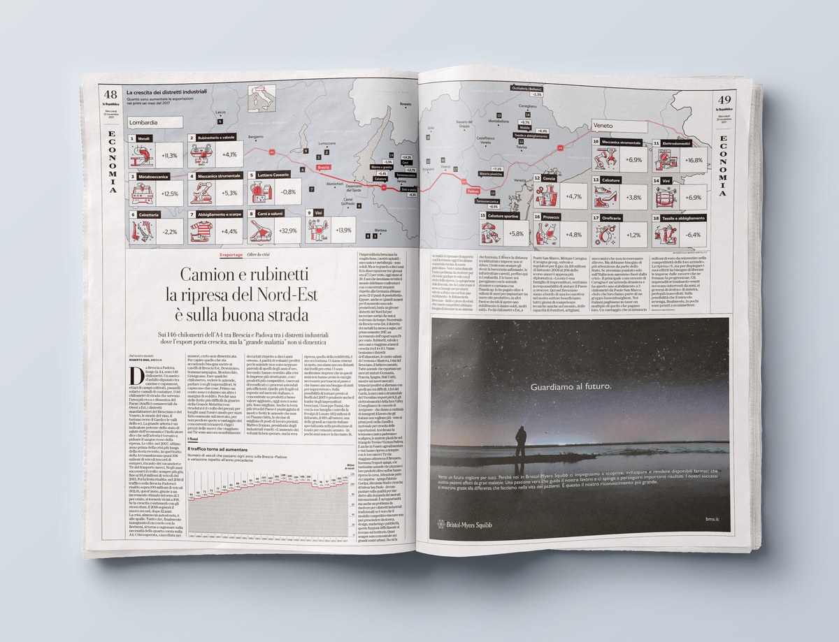
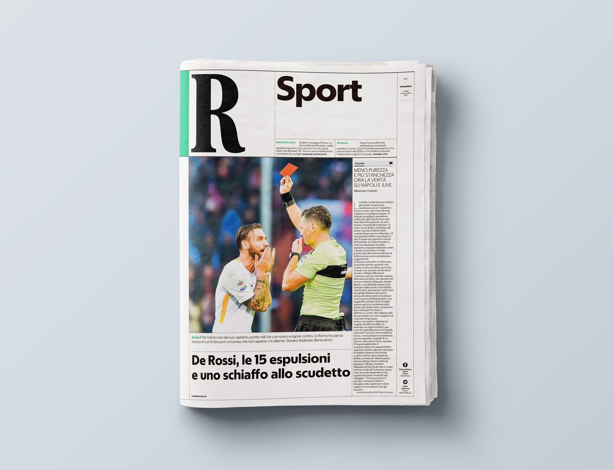
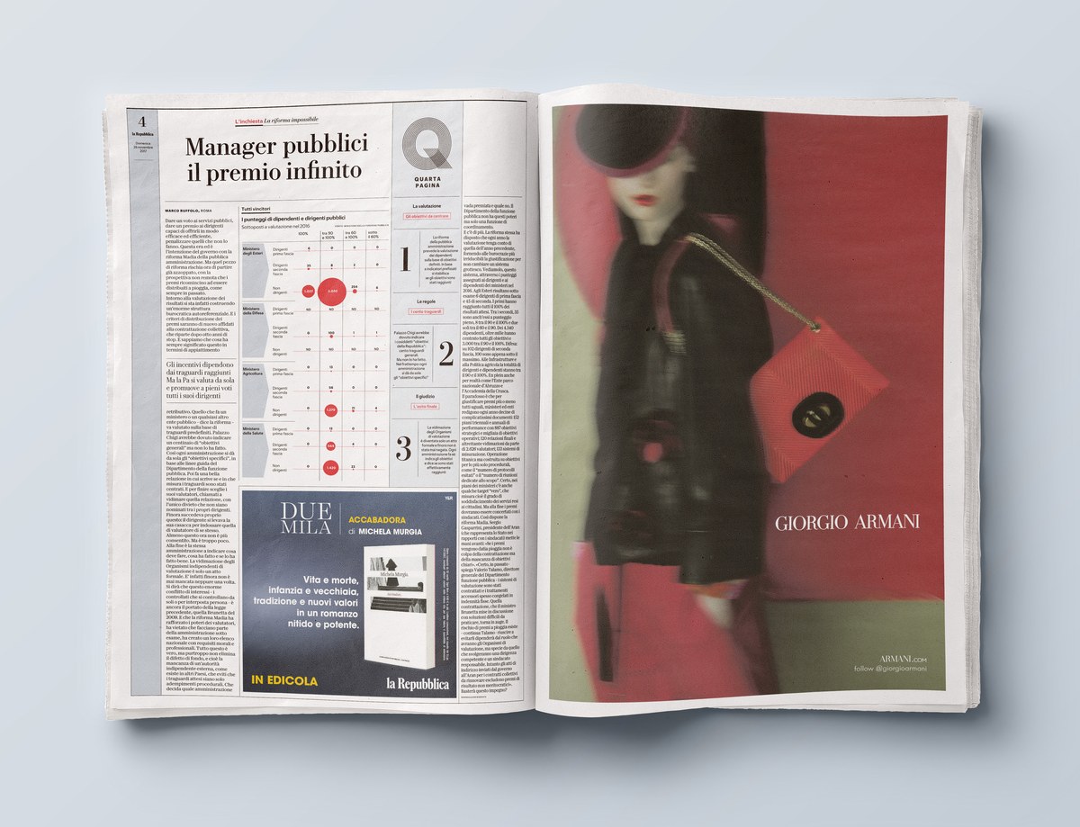
The team of designers at Commercial Type recently worked to create a new typographic palette for the redesign of La Repubblica, a popular national daily newspaper in Rome, Italy.
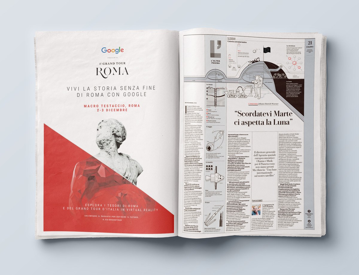
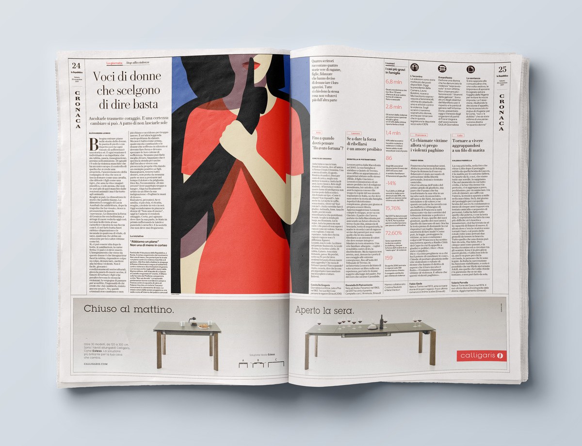
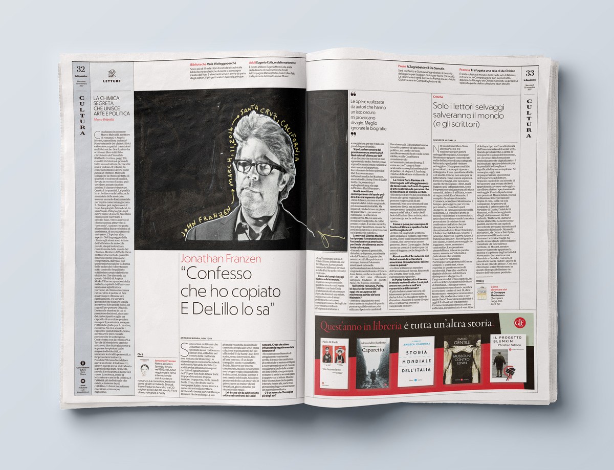
The project was developed by managing editor Francesco Franchi, a contemporary icon of publication design thanks to his years at IL, a monthly magazine published in Milan, and Angelo Rinaldi, art director of La Repubblica since 1996. Designers Manuel Bortoletti and Giovanni Cavalleri helped with the design while portraits and spot illustrations throughout were drawn by Marta Signori.
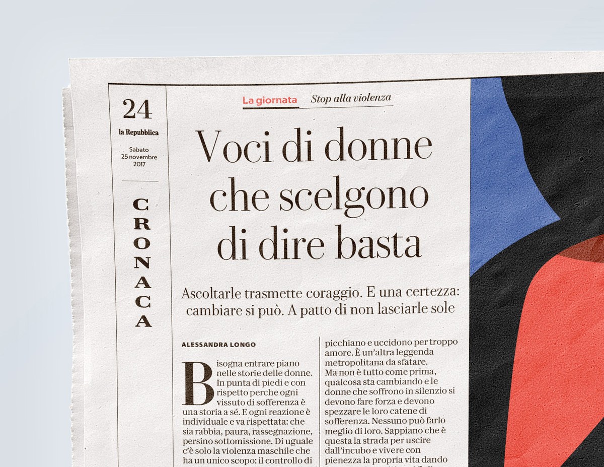
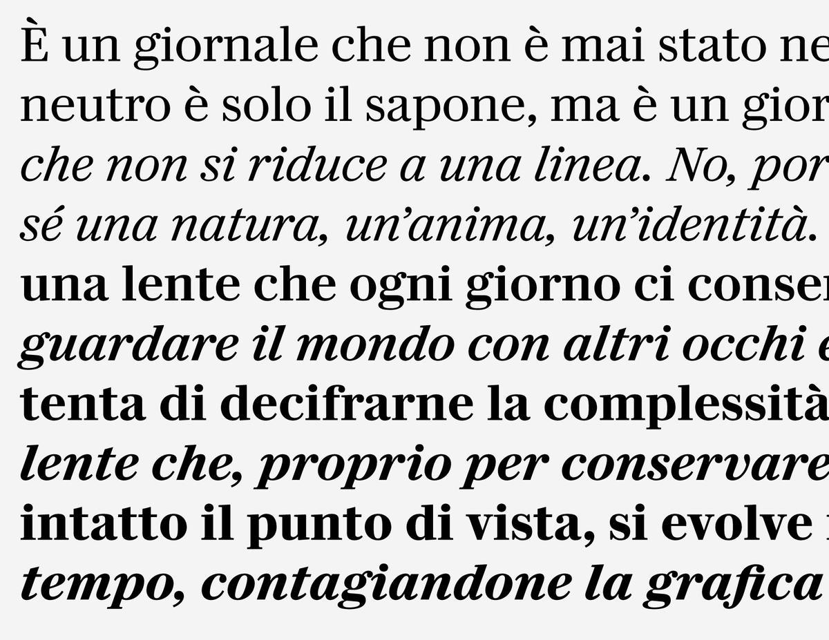
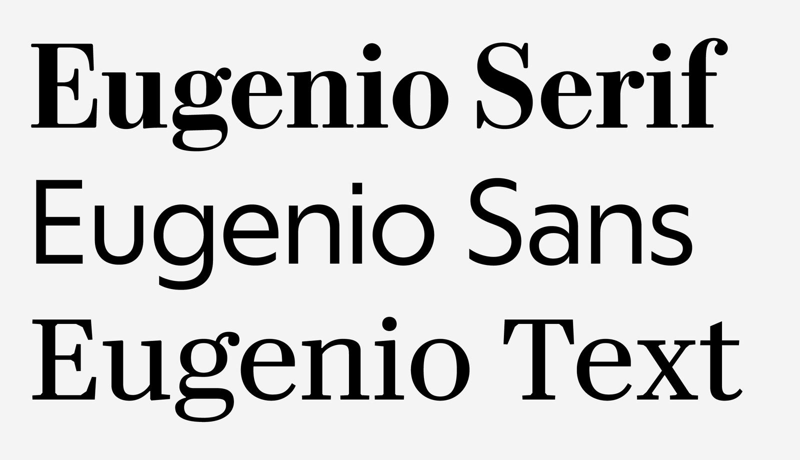
The team’s redesign of the newspaper focuses on clarity, modernity, and “looking to the past to go into the future.” Combining three complete typefaces under the unifying theme of being uniquely Italian and refreshingly stylish; the Eugenio family consists of Eugenio Serif, Eugenio Sans, and Eugenio Text.
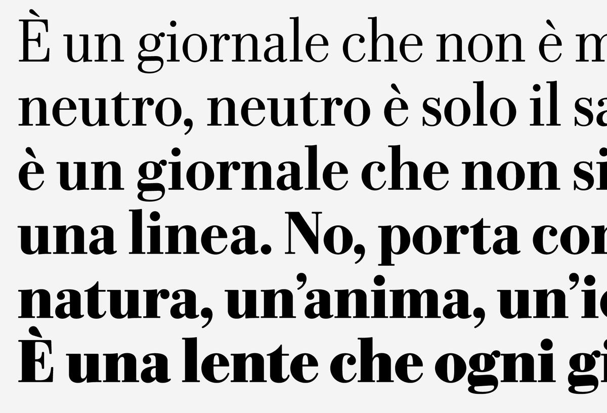
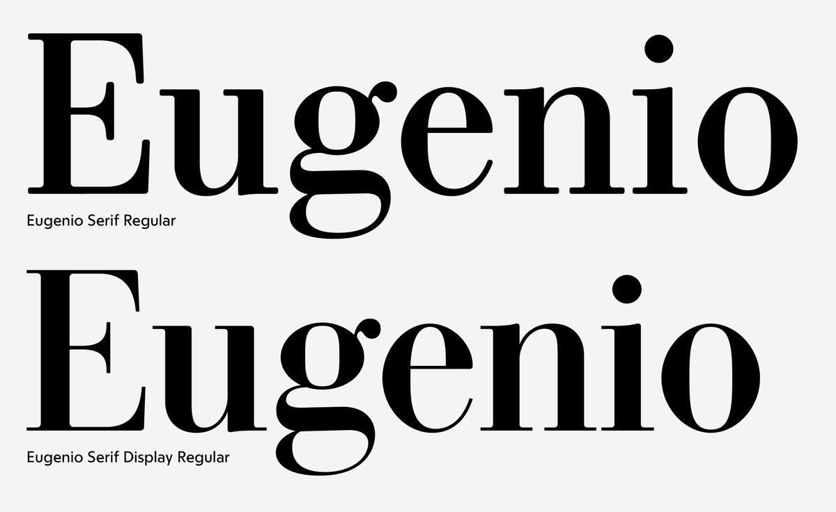
Eugenio Serif
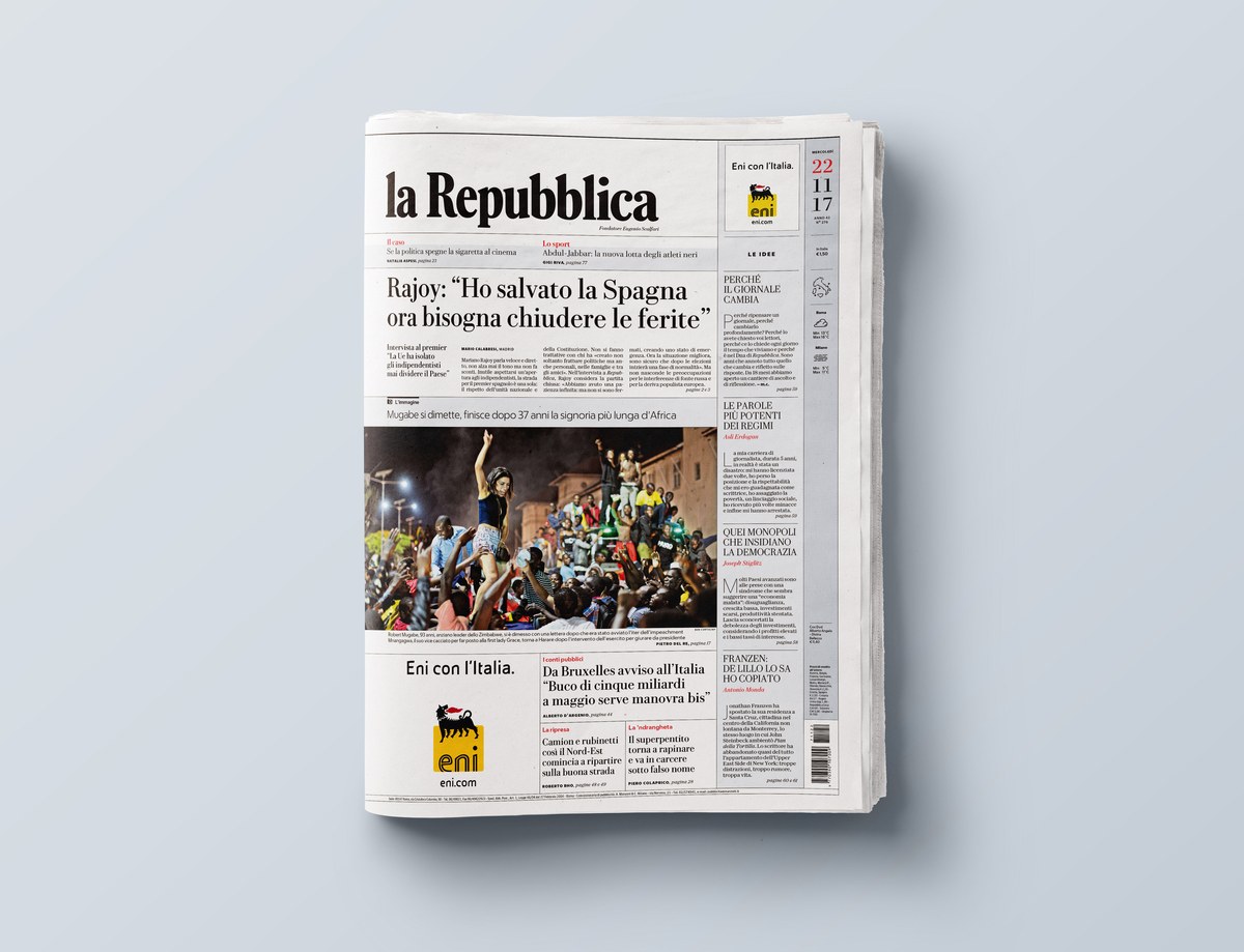
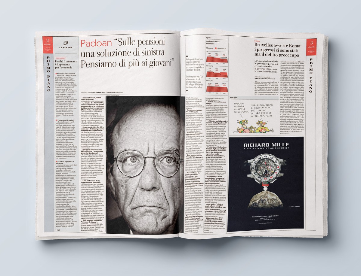
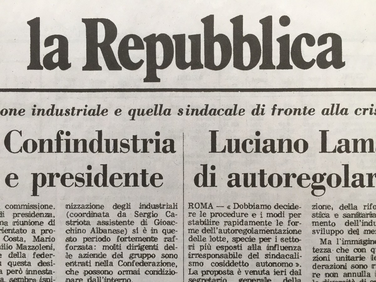
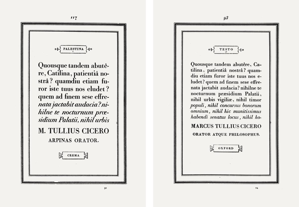
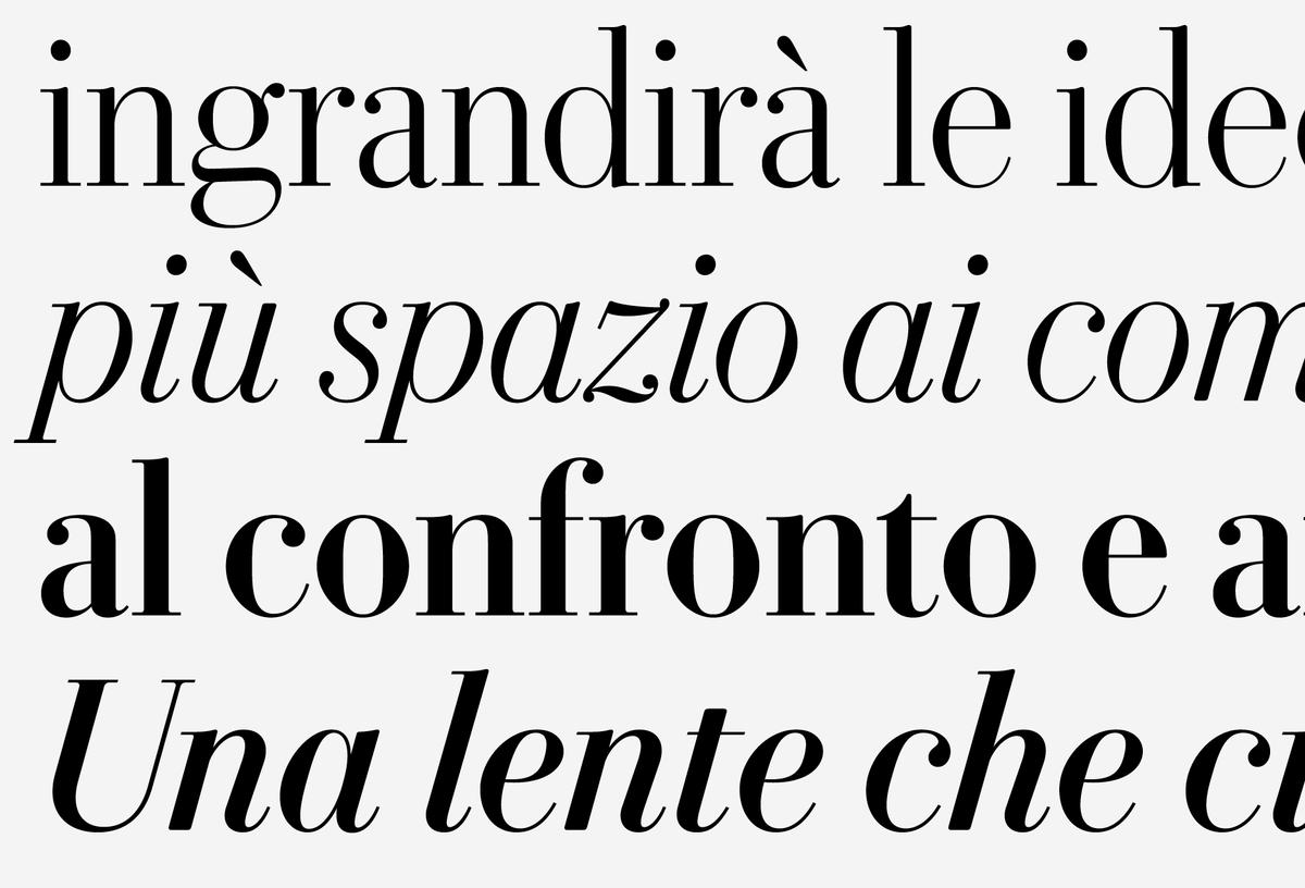
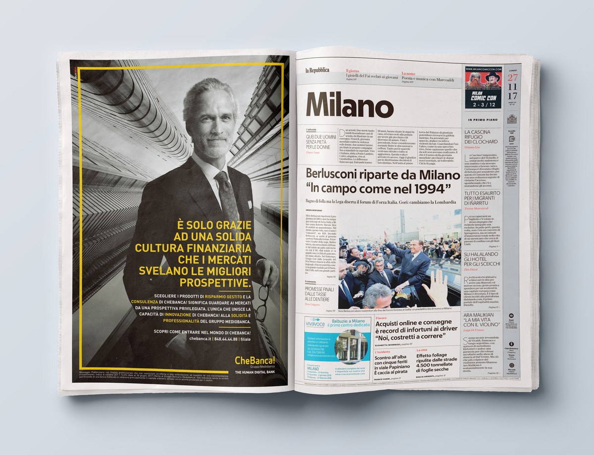
The primary voice of La Repubblica is Eugenio Serif, which is used for headlines throughout the newspaper. Designer Miguel Reyes (assisted by Hrvoje Živčić and Christian Schwartz) took inspiration from the history of the newspaper itself: When launched in 1976, La Repubblica used Bodoni and Times New Roman as its primary typefaces. The designers chose to reference this in designing a contemporary version of Bodoni for the newspaper.
Looking specifically at the smaller 16pt and 24pt specimens from a facsimile of Giambattista Bodoni’s definitive 1818 Manuale Typographico, Reyes noticed a certain “warmth” and “softness” which is not usually associated with Bodoni. Most contemporary revivals focus on the sharp contrast of the display sizes, but Reyes crafted Eugenio Serif with a subtle softness that feels warm and utilitarian and lends an air of trustworthiness to the text.
Eugenio Sans
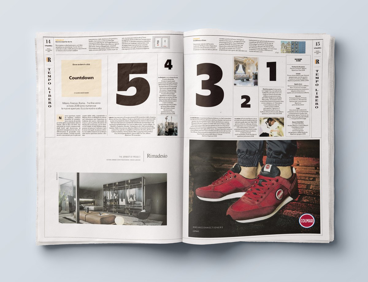
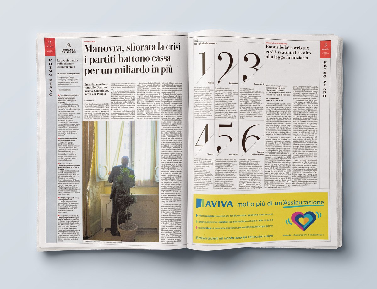
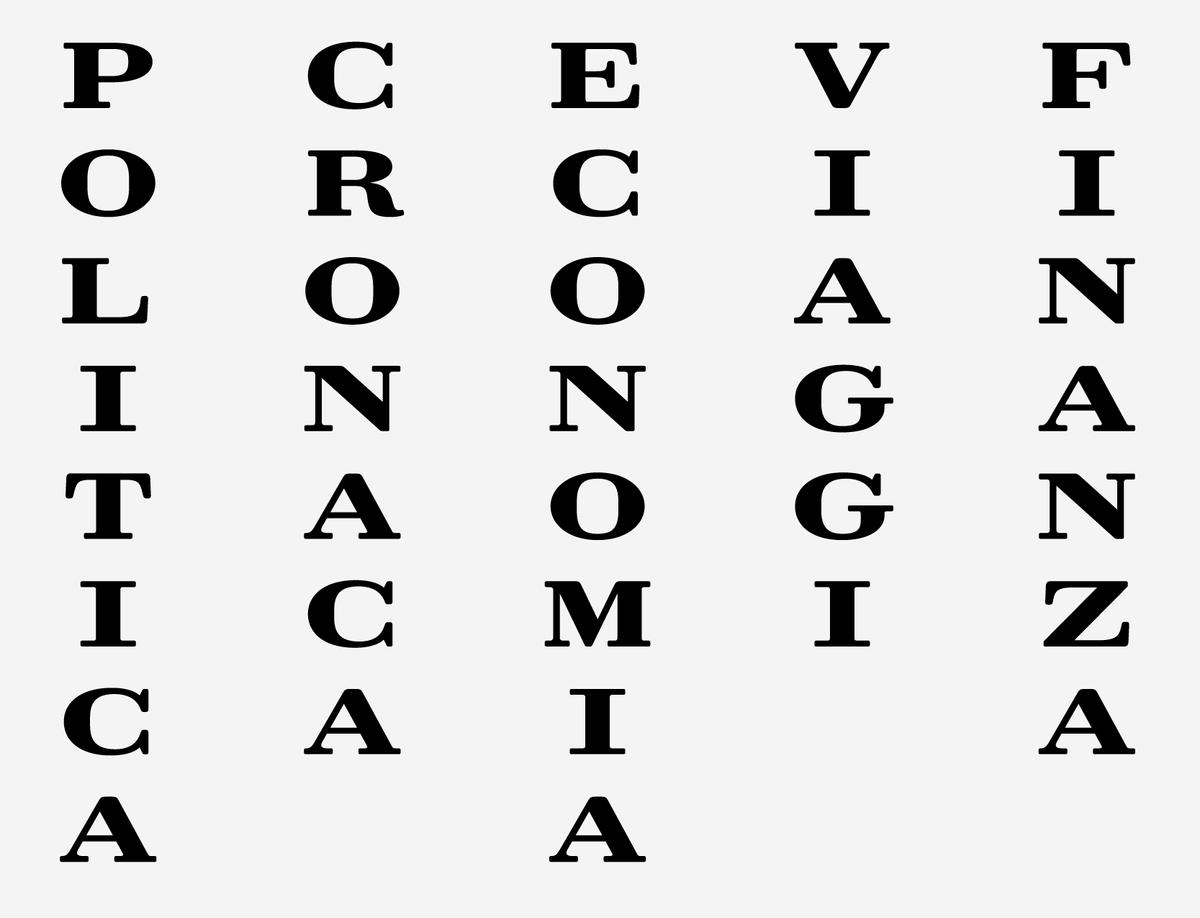
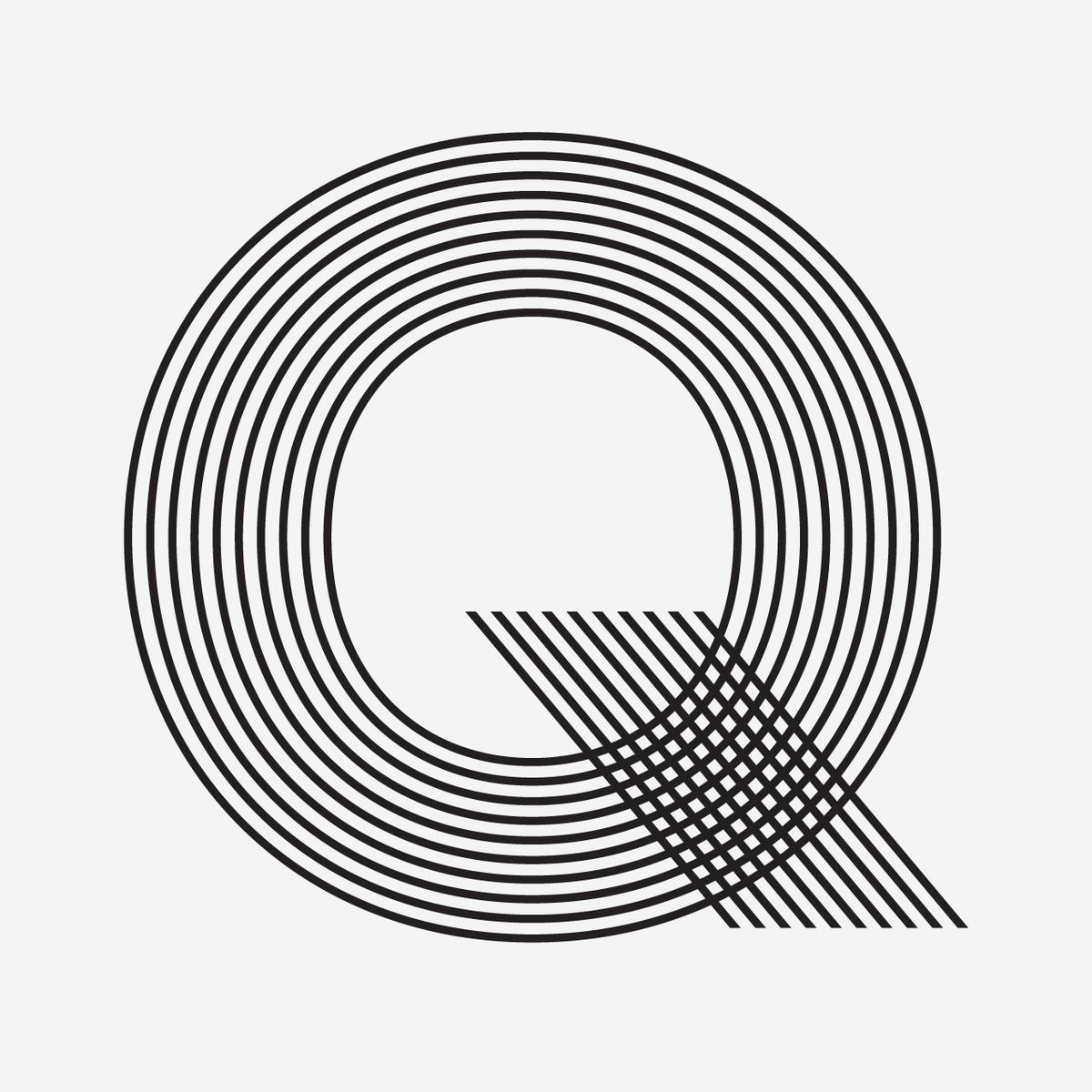
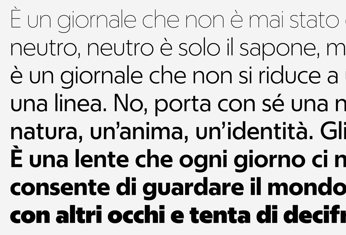
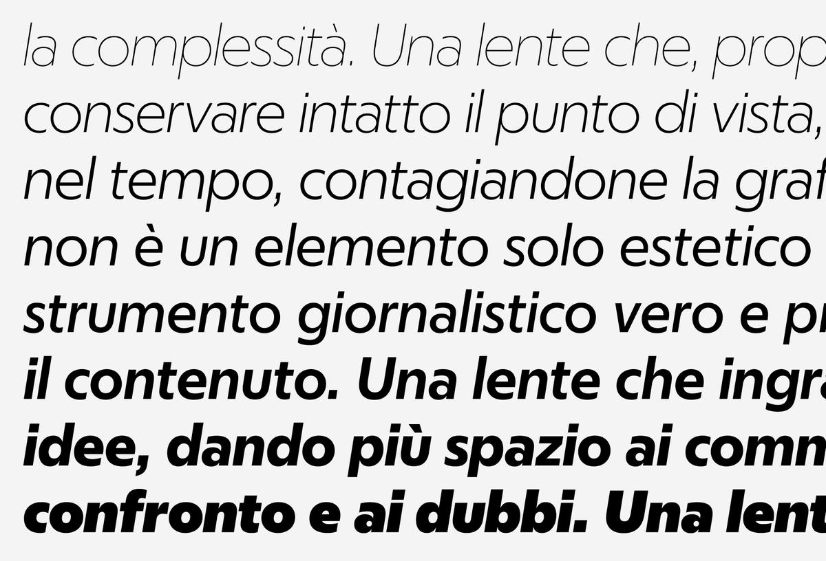
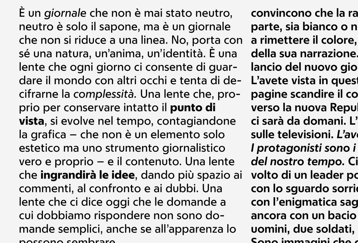
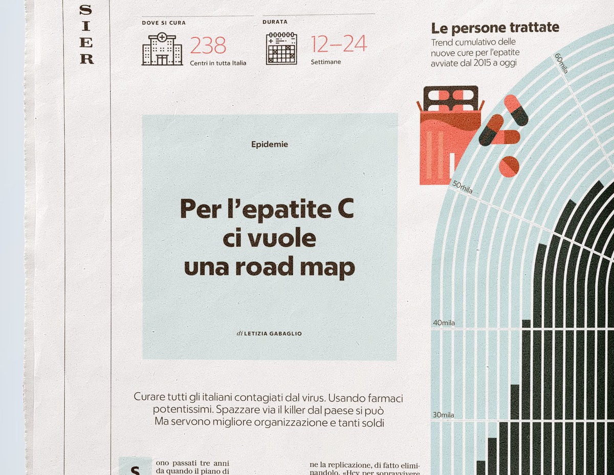
To compliment Eugenio Serif, designer Greg Gazdowicz created a sans that is both stylish and pragmatic as needed. Dismissing other sans serif models, he and Franchi settled on a geometric sans serif partially inspired by the classic combination of Bodoni and Futura which was popularized by renowned designer Massimo Vignelli. Eugenio Sans is showcased in the newspaper at many sizes: from big drop caps to small captions, sidebars, and info graphics. It is also the primary headline typeface for the Sport and other feature sections (reserving Eugenio Serif for signaling news).
Though the geometric sans genre is remarkably crowded, Gazdowicz found that by focusing on the technical constraints of newsprint and complementing Eugenio Serif, he wound up with a fresh design in the process. The terminals end at flat verticals, making for open apertures and clean spaces between letters which avoids feeling retro or old. The overarching bluntness contrasts with Eugenio Serif and keeps away from the sharpness of Futura.
Eugenio Text
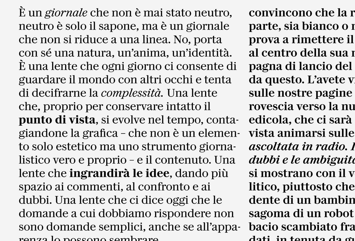
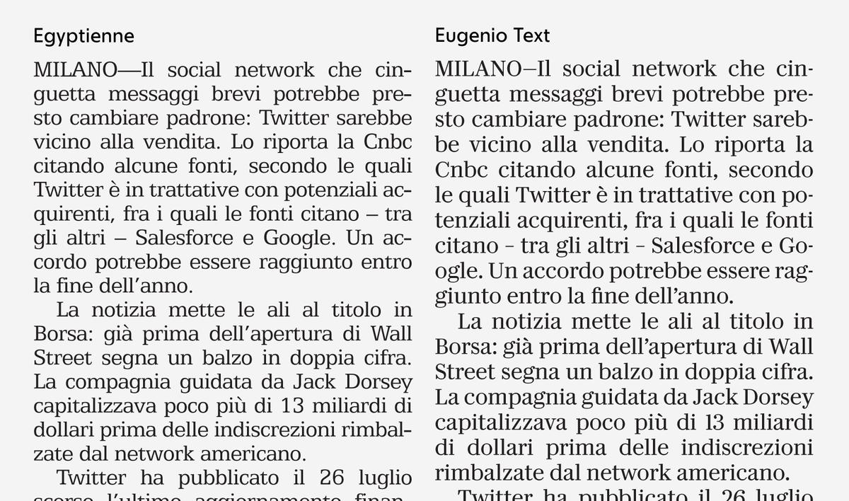
Designed by Paul Barnes (with help from Dan Milne), Eugenio Text is the new text typeface for La Repubblica. It is based on transitional typefaces from the late 18th century with roots in Scotland, also incorporating flavors of Baskerville and Bodoni in order to harmonize well with Eugenio Serif.
In a nod to aging readers, and to accommodate the constraints of small screens, La Repubblica feels considerably larger than their previous text typeface, at roughly the same point size, with hardly any effect on copyfit. Its straightforward structures and crisp detailing reads well on both newsprint and screen. Where Eugenio Serif is soft, Eugenio Text is faceted, counteracting the softness typical of newsprint, and boxy counterforms give a feeling of openness.
Nameplate
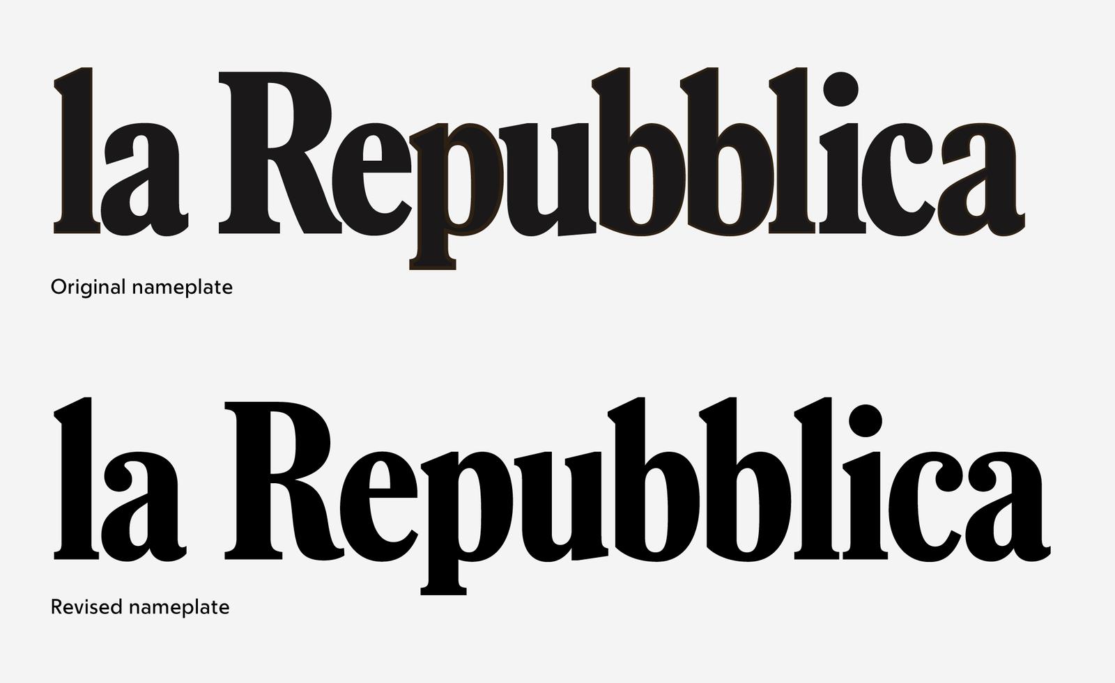
One final touch for La Repubblica was the logotype, or nameplate, which hadn’t changed since the newspaper was founded in 1976. Redrawn by Christian Schwartz, the refreshed logotype brings in higher contrast and some Bodoni-esque details to modernize the nameplate and tie in with the full newspaper redesign.
Altogether, the three Eugenio families combine to create a fresh and energetic typographic palette to serve both the designers and readers of La Repubblica throughout Italy. Though new typefaces are not yet in use on their existing website, the mobile-first reimagining of their site, Rep, puts them to extensive use. Since the launch, the redesign has been quite positively received. By looking to the newspaper’s past, Franchi and his team has created a new look for the future of La Repubblica.
