Commercial Classics poster campaign in London

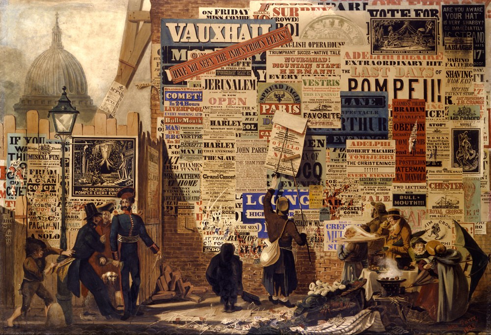
The Poster Man, John Orlando Parry, 1835
Arthur Dunhill Collection
Perhaps the finest example depicting display typography in the first half of the nineteenth century is The Poster Man by John Orlando Parry. Painted as a wedding gift in 1835, it pictures a street scene of theatrical playbills (and some street crime) in London near St Paul’s Cathedral. Though it is fictional (the copy is an elaborate message to his betrothed), it is easy enough to imagine that many of the letters are fonts from the leading British foundries. Many of the bold faces in the Classics library, such as Thorowgood Grotesque, Thorowgood Egyptian, and Original Sans, would not seem out of place in this painting. The purely typographical approach of most of the posters was often borne of the necessity of speed of production, but has an immediacy that still resonates and has inspired us over the years to use this medium to promote typefaces on the streets.

Our first foray into advertising in public spaces marked the release of Dala Prisma in 2014, using a borrowed quote from Kanye West: “We don’t know what to want.” They appeared on the streets of London and New York. The following year saw another series designed by Project Projects promoting Canela, Algebra, Druk, and Le Jeune posted in various subway stations in New York.
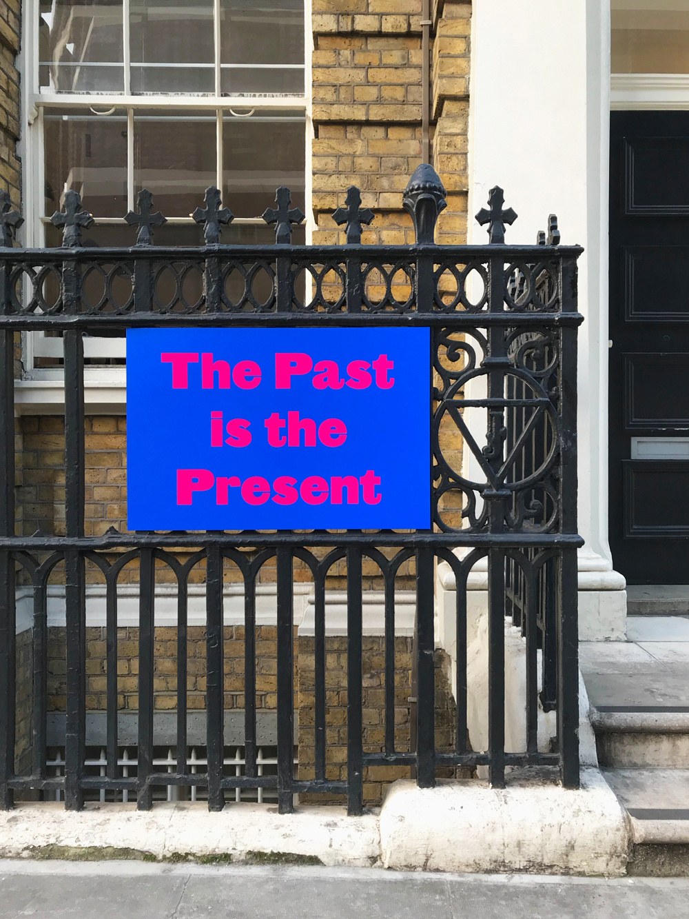
To commemorate the launch of Commercial Classics in April 2019, a silk screen edition, ‘The Past is the Present’ was posted around Clerkenwell in London. Set in Original Sans, the first sans serif from the Figgins foundry, it seemed entirely appropriate that one of the locations we chose was the last site of the foundry on Ray Street.
Our latest campaign appeared around London at the end of 2020 to celebrate both the holiday season and the Commercial Classics library. Working with our long-term collaborators, Fraser Muggeridge studio, multiple designs were created ranging from 4-sheet to the large landscape 48-sheet format.
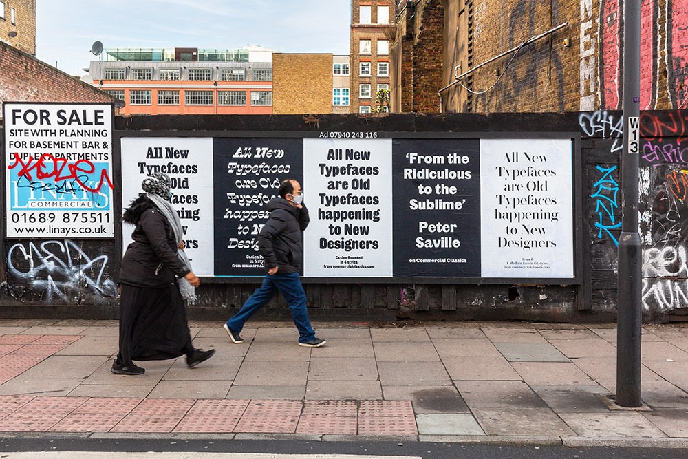
‘From the Ridiculous to the Sublime’
Peter Saville, the famed British designer, has been one of the many influences on our practice both visually and methodically. In 2014 he designed a print for one of our lectures, set in Marian 1812. When we sent him the Classics specimen he exclaimed that that the venture went ‘From the Ridiculous to the Sublime.’ This seemed to encapsulate the diversity of the collection; from the seemingly ridiculous Caslon Italian to elegantly sublime Brunel. Such a memorable quote seemed ideal copy for three designs of the campaign; Caslon Italian Shaded, Isambard and Original Sans

‘All New Typefaces are Old Typefaces happening to New Designers’
Another set of posters shows Antique No. 6, Blanchard, Brunel, Caslon Italian, Caslon Ionic, Caslon Rounded, and Thorowgood Grotesque. The copy is a play on “All new news is old news happening to new people,” which is commonly credited to British journalist and humourist, Malcolm Muggeridge—Fraser Muggeridge’s grandfather. It references how many designers react to seeing something old that they haven’t seen before, that to modern eyes appears new, even when it isn’t.
Two of the designs exhibit Caslon Rounded Ornamented, drawn by Tim Ripper, and are simple celebrations of the holiday season. The smaller example in colour uses the multiple layers of the face with the larger black and white version takes advantage of its scale to fully show the gorgeous internal ornamentation.

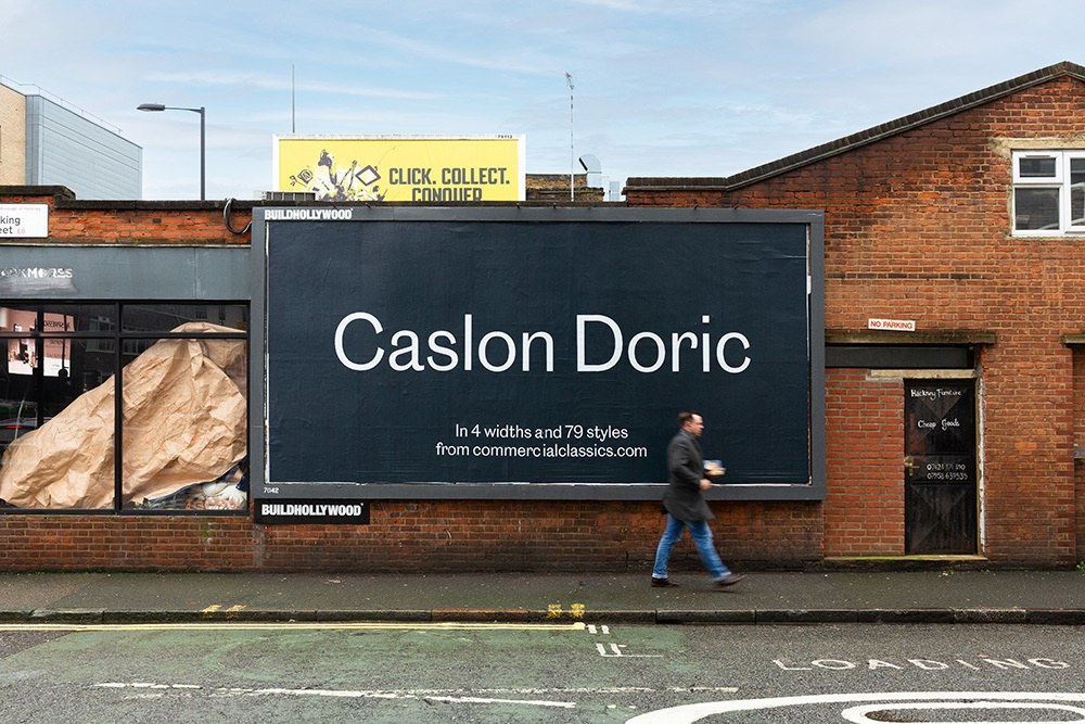
The other large examples celebrate individual designs: Caslon Doric, Original Sans, and Thorowgood Dimensional. The mid-size design shows Thorowgood Grotesque, which as the copy records, was the first ever face to be called Grotesque.