Review gets wide(r)

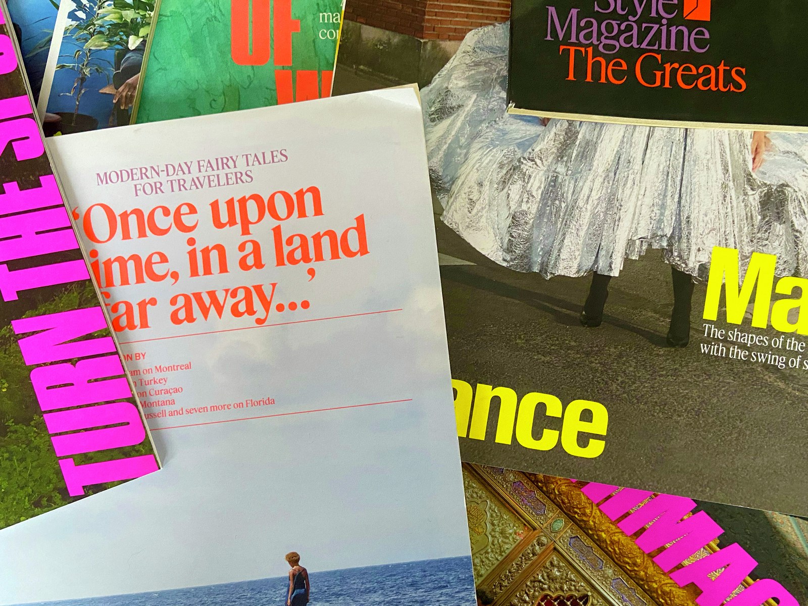
Berton Hasebe’s Review, alongside Feature by Christian Schwartz and Hasebe, in use on the cover of T: The New York Times Style Magazine. Creative direction by Patrick Li.
Review, the blunt, imposing typeface designed by Berton Hasebe for T: The New York Times Style Magazine, now has a wide variant drawn by Tim Ripper.
Creative director Patrick Li kicked off a memorable series of covers with his 2018 redesign of T: The New York Times Style Magazine. Hidden inside the newspaper like treasure and free of the demands of newsstand traffic, the magazine has always had wide latitude to experiment.
Many elements collude to create a notable cover design, of course, but the importance of the type selection can’t be overstated. In the case of T, a blunt, outrageous sans (Review) costars with a delicate, head-turning serif (Feature)—though it’s really Review that steals the show. If Feature is a gritty flower pushing through a crack in concrete, then Review is the concrete. Its surprising, foreshortened, almost brutalist forms benefit from a sober ballast, a counterpart that feels familiar.
Drawn by Berton Hasebe under the name Kippenberger for the relaunch of T, Review originally came in three progressively narrower widths: the regular-width Review, Review Condensed, and the skyline Review Poster. With help from Tim Ripper, Hasebe expanded the family into a full range of weights, from Thin to Black, for release under its new name with Commercial Type in 2020. A wide variant was originally on Li’s wish list for the redesign; we loved the idea, but reality had other plans.
Then-new editor in chief Hanya Yanagihara envisaged a magazine bursting with words. Its previous incarnation—supported by Hasebe and Christian Schwartz’s elastic Schnyder—had been airy and light, focused more on images than on text. But Yanagihara wanted the newly imagined T to have a “sense of urgency.” Style writing, she told the Guardian, “should be done with finesse, but also with as much authority and background as you would have reporting a piece about the NSA, or the Trump White House.” These priorities, accompanied by the material constraints of time and budget, inclined Review toward narrowness rather than width. We back-burnered our aspirations for a broader version, but we didn’t forget them.
Fast-forward a few years. Ripper, so instrumental in filling out Review for retail release, stepped in to complete our vision for the family. Review Wide preserves all of the original family’s audacious spirit, galvanized by an exhilarating moment in social and design history: the late sixties and early seventies. It was a restive period that produced Karl Gerstner’s groundbreaking grid systems; homespun zines hurriedly assembled by artists and outsiders using paste-up strips of phototype and Xerox machines; and Herb Lubalin’s in-your-face designs for Fact, one of the all-time great cover-design concepts.
As a whole, Review revisits Folio Extra Bold, a boxy outlier of Folio released by Bauer in 1957; Fred Lambert’s beloved Compacta, the first original typeface design for Letraset, published in 1963; and Phil Martin’s Heldustry from 1978. Review Wide in particular takes cues from another star of self-published zines and DIY typesetting—Aldo Novarese’s Eurostile—and offers a provocative counterpoint to the narrower Condensed and Poster widths.
Review’s overshoots were intentionally sliced off and its exterior curves blunted, generating a dynamic tension with its round counters. The lack of overshoots and compact descenders encourage tight setting both horizontally and vertically, producing forceful walls of text that evoke ribbons of embossing tape without descending into nineties grunge or nostalgia. The general-purpose Review and Review Condensed can be used effectively big and small, from signage and headlines down to captions, labels, and microcopy. For Review Poster and Review Wide, though, think huge.
Review Wide Heavy, drawn by Tim Ripper.
We always like pushing things to extremes, often beyond the point where they feel comfortable. How narrow can it go and still be legible (and readable)? How wide can it go before it breaks? Although not as extreme as Druk or Caslon Doric—its proportions, after all, are based on old CRT screens, giving it a certain old-school familiarity—Review Wide pushes Review’s dense, stackable brio even further. The family comes in seven weights with matching italics, and features alts like round dots and punctuation to soften the squareness.