Control by Christian Schwartz and Miguel Reyes

Dutch typographer, type designer, and teacher Gerrit Noordzij famously said that typography is “writing with prefabricated letters”—fixed shapes in fixed space, combining in any order. An earlier lettering master and teacher, Zürich-based Walter Käch (whose students included Adrian Frutiger), served as the core inspiration for Control. In 1949, Käch published an influential lettering manual titled Schriften Lettering Ecritures; Christian Schwartz first saw it at a conference in 2013 and was intrigued by the sans serifs (called “block letters” by Käch) that appeared in it.
The manual was all about flexibility: everything was a suggestion, not a directive, and Käch dispensed advice for dealing with all sorts of circumstances. His block letters look awkward in places to eyes accustomed to Helvetica, Univers, and the rest of the ubiquitous sans serifs they helped to usher in, a window into alternate evolutionary paths for conventions of contrast and proportions.
In 2017, T commissioned Christian and Berton Hasebe to draw a serif and sans pairing for the magazine. Taking the idea of the lettering manual literally, Christian sketched a sans serif loosely modeled on Käch’s block letters, but with variations on how open the apertures should be in letters like C, S, a, and e, and different amounts of stroke contrast. The magazine went in a different direction, but Christian returned to the sketches every so often, convinced that potential for an interesting typeface was waiting in there somewhere.
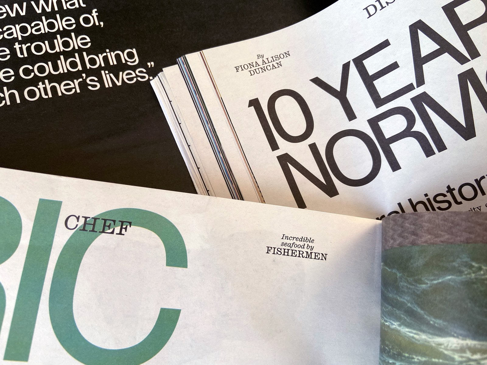
The desire for a clean slate at Interview, with a renewed focus on photography and a shift away from a year’s worth of baroque headline treatments using the inspired pairing of Candy Darling and Proxy, provided the catalyst for figuring out what Control should be. Christian spent a day in the archives with Richard Turley, the magazine’s editorial and design director. As inspiring as Tibor Kalman’s issues and Fabien Baron’s first tenure were, Richard and Christian found what they were looking for in the 1970s newsprint era, which used Tight Not Touching (TNT) spacing for big Helvetica and Futura headlines that were then enlarged to fit across an entire spread. It was straightforward, even simplistic—but irresistible. “It appealed to my graphic designer lizard brain,” Christian said. “There’s no concept, it’s not clever, I just love the way it looks.”

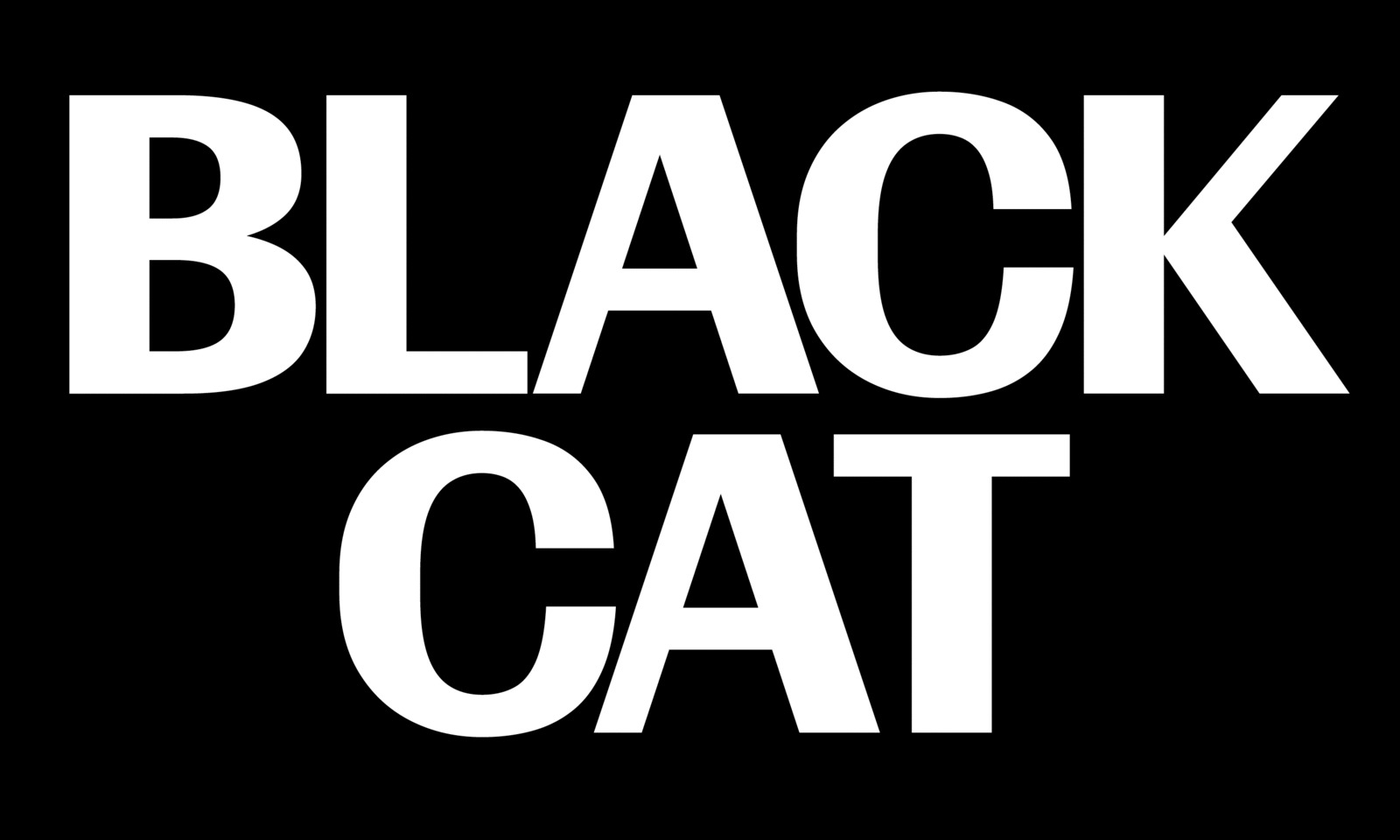
Control’s TNT styles go against everything Christian had ever learned about the correct way to space and kern type, but look entirely convincing in Interview and on the cover of our own most recent specimen. Emboldened by the so-wrong-it’s-right attitude of the spacing, Christian collaborated with Miguel Reyes on a lateral approach to the italic, touching on Susan Kare’s bitmap fonts for the original Macintosh and Van Dijk, a Letraset alphabet that came out in 1982. It’s common for a serif italic to differ dramatically in proportions and texture from its matching upright, so Christian and Miguel applied this same principle to a sans. Interview’s editor in chief grew less enamored of the Cursive italic over time, so Christian added a more expected oblique as a second option.

After spending some time in the Vault while Hrvoje Živčić was drawing the light end of the weight spectrum, Control is now complete and ready for whatever you can think to do with it. Like Greg Gazdowicz’s Align, Control is fully realized only in the variable version: the axes apply the idea of the lettering manual literally, allowing users to adjust the letterforms to different situations. Christian found the way the apertures, contrast, and tracking each alter the typeface’s personality to be both useful and fun. More faithful renditions of Walter Käch’s work are available, whereas Control uses these alphabets as the starting point for a delirious trip through the past seventy years of sans serifs, touching on tropes at all taste levels. It can be a workhorse, comfortable for extended reading at text sizes; or a lettering tool that empowers designers to fine-tune to their hearts’ content.