Terza, a text typeface in three modes
The process of designing Roboto Serif for Google prompted Greg Gazdowicz to revisit a long-standing fascination: an awareness that our relationship to digital text, far from being steady, linear, or fixed, is subject to different tempos and rhythms. He wondered if the various ways we read and interact with text might be a useful framework for structuring a type family, with three distinct modes of interaction imposing unique demands on three subfamilies. Such questions were more specific and circumscribed than the original client commission, so Gazdowicz decided to drill down on and repurpose them, channeling them into a project of his own: the tripartite Terza, a typeface for every stage of a text’s life cycle.
What primarily intrigued Gazdowicz about productivity environments like Google Docs was that they provide people with a playground for roughing out new material and publishing it, all in the same space. This unfinishedness, this intermediate quality, piqued his interest: users of such apps experience not just the polished finish, but all of the messy tensions and contradictions that go into making something. Could a typeface do that, too?
New typefaces are usually created with a specific context in mind. For example, T: The New York Times Style Magazine, wanted an impactful typeface that could be tightly stacked, so Berton Hasebe designed Review. A French university needed a wayfinding typeface for student housing; the result was Sandrine Nugue’s Orientation. But Gazdowicz designed the Terza collection with the mind in mind. He wanted to plumb the different tempos and rhythms that come into play when people interact with text.1
In this early draft of Roboto Serif, the exaggerated serif lengths on i and l in the Author variant (top), along with narrower capitals and simplified forms for g and s, can be seen here in comparison to Reader (bottom).
The differences in texture between Author and Reader modes can be seen here. Author (top) has wider spacing, while Reader (bottom), has tighter spacing and more conventional serifs on a, f, and s.
Gazdowicz designed the Terza collection with the mind in mind. He wanted to plumb the different tempos and rhythms that come into play when people interact with digital text.
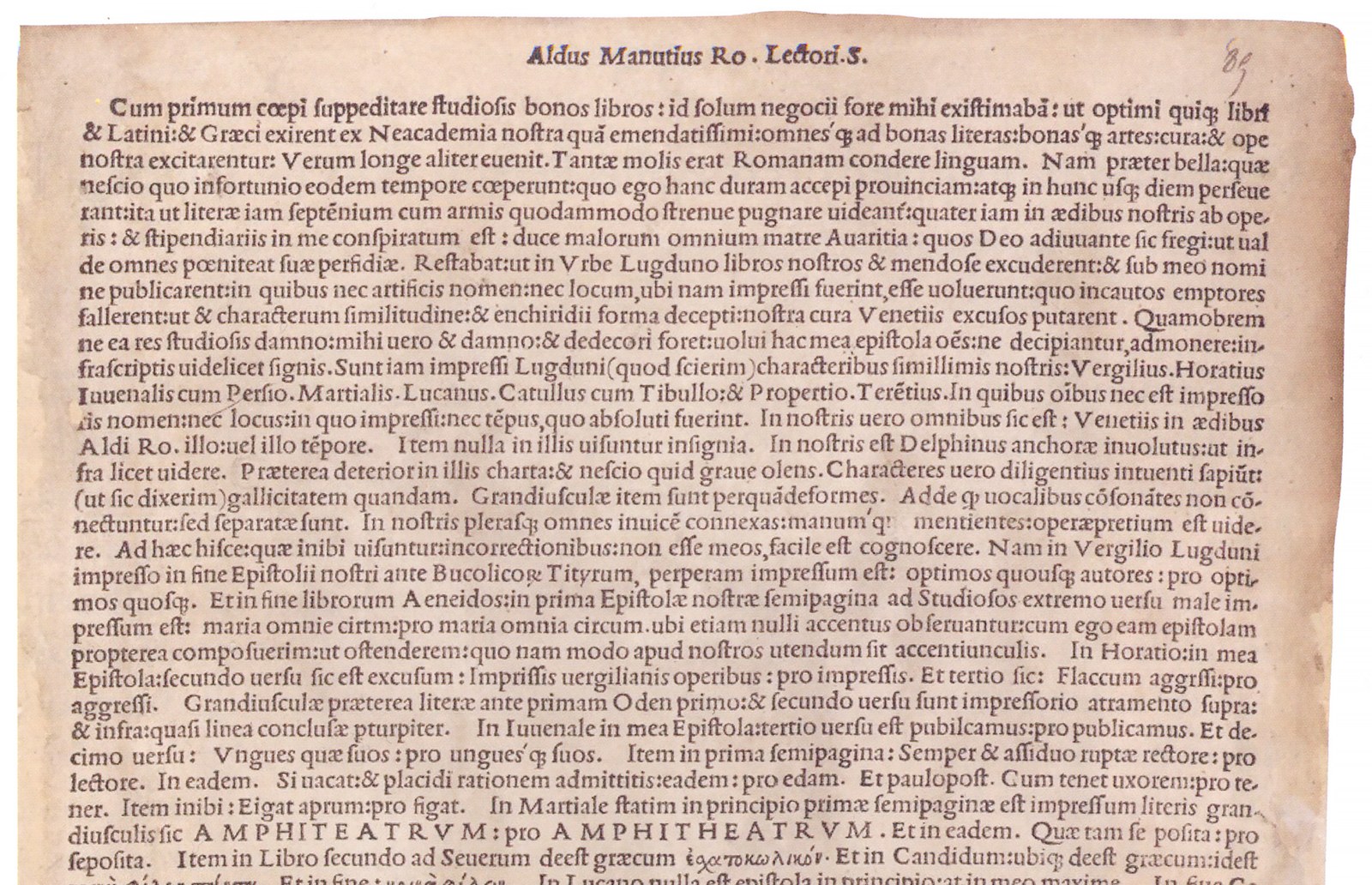
Aldus Manutius printed Monitum in 1503. This broadside detailed the ways in which counterfeits of Aldus’s publications differed from the genuine article. Original in the Bibliothèque Nationale de France, reprinted in a publication accompanying the exhibition Aldus Manutius: A Legacy More Lasting Than Bronze at the Grolier Club in New York, 2015.
Gazdowicz’s first solo project with Commercial Type, Robinson, engaged in dialogue with the twentieth-century history of book cover design and calligraphic typefaces. Terza, by starting with the Aldine punches cut by Griffo, at first glance seems to emerge from history as well. But its approach to history is more indirect. If Terza Reader embodies historical fiction, Terza Author and Terza Editor could be considered fan fiction: What might an Aldine type morph into in the context of contemporary productivity apps? The Reader variant, which draws on the rich lineage of book types, serves as the collection’s starting point, from which the other variants, Author and Editor, depart fairly dramatically. Gazdowicz designed Reader first, then Editor, and finally interpolated between them, adding in a longer serif axis because he knew that would be a defining feature of the Author family.
Terza Reader has its roots in a brief for a serif designed for comfortable reading on screens, but the experience of reading is far from monolithic. Immersive reading has a brisk tempo. We tend to read “chunkily”—rather than focusing on individual letters, our minds abstract letters and clump them together to form words and blocks of words; our goal is to absorb information. Gazdowicz found himself turning to the late artist Mirtha Dermisache’s work, which strips written language down to impulses, shapes, and textures, to frame Terza Reader’s development. More obviously, he also drew on Aldine types, which have relatively low contrast, an oblique stress, and shapes informed by cursive handwriting and the broad-nibbed pen. These types, continuously in use in books set in the Latin script since the Renaissance, have proven themselves a successful technology for immersive reading.
Writing is a different and more active kind of reading. When we write, we actually read and write at the same time. For most of us, the tempo of writing is much slower than that of immersive reading. There are stops and starts. Loops. Blanks. Beginnings-again. We no longer lean back to take in word shapes and absorb information; we lean forward, more deliberate, to make sure we’re writing the right thing. We focus on a text’s infrastructure—things like syntax, punctuation, and spelling. Gazdowicz designed Terza Author to cultivate this thoughtfulness by deliberately slowing the tempo, signaling to users that they are in a different space—a space of reflection. This mode of manipulating text is an effect of digital technology, which allows us to push type around as never before: we compose emails, we make lists, we write novels in the cloud. And so Author mode, the most experimental cut of the Terza collection, departs from classical Aldine proportions to become wider and airier. Gazdowicz exaggerated some aspects of the variant to help clarify the delineation between weights; and he introduced traits like longer, ropier serifs to help emphasize each glyph. This not only opens up more space and time for writers to think, but also gives the Author subfamily an unvarnished feeling, a sense that the text is still very much in process.
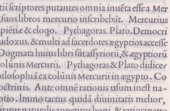
Close-up of a page from De mysteriis Aegyptiorum, Chaldaeorum, Assyriorum by Iamblichus et al., printed by Aldus Manutius in 1497
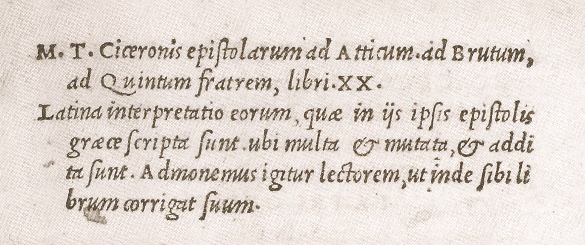
The italic in Epistolarum ad Atticum by Cicero, printed by Aldus Manutius and Andrea Torresani, 1513
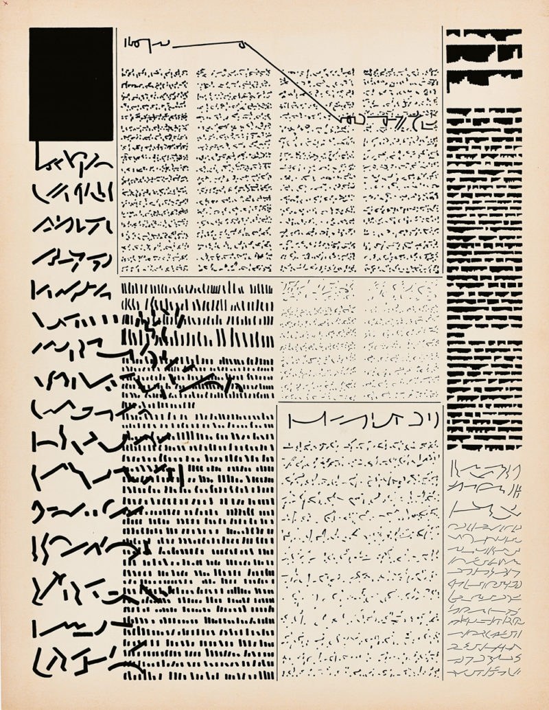
Mirtha Dermisache, DIARIO NOº 1 AÑO 1, 1972
Terza Editor departs even more from classical Aldine proportions and veers toward another tradition: so-called typewriter typefaces. These monospaced faces have a mechanical quality that has come to connote roughness, raw data, and code. When you edit, you’re reading, but you’re also writing to make notes on someone else’s (or your own) text. There’s something meta about editing—writing about writing. It usually occurs in short bursts and isn’t meant to be read in long stretches. Terza Editor has a distinctly different texture from Reader and Author and a very steady, almost incantatory, rhythm. It is the “slowest” of the three families because every glyph occupies the same amount of horizontal space.
The overall disposition of the three subfamilies provides marked contrast when they are viewed side by side, particularly in the italics. But because the variants emerge from the same source, they effectively cross-reference one another and allow designers to create complex typographic hierarchies with them, as shown in Terza’s dedicated minisite. For this project, Commercial Type asked author Jess Zimmerman to write an original essay, a rough draft of which is set in Terza Author. The draft is accompanied by margin notes in Terza Editor between Zimmerman and editor Caren Litherland. “Static Screen,” the finished piece, is set in crisp, dark Terza Reader, which facilitates the loss of self in the text. The site acts as a proof of concept—a laboratory demonstration, really—for using the triple-duty typeface.
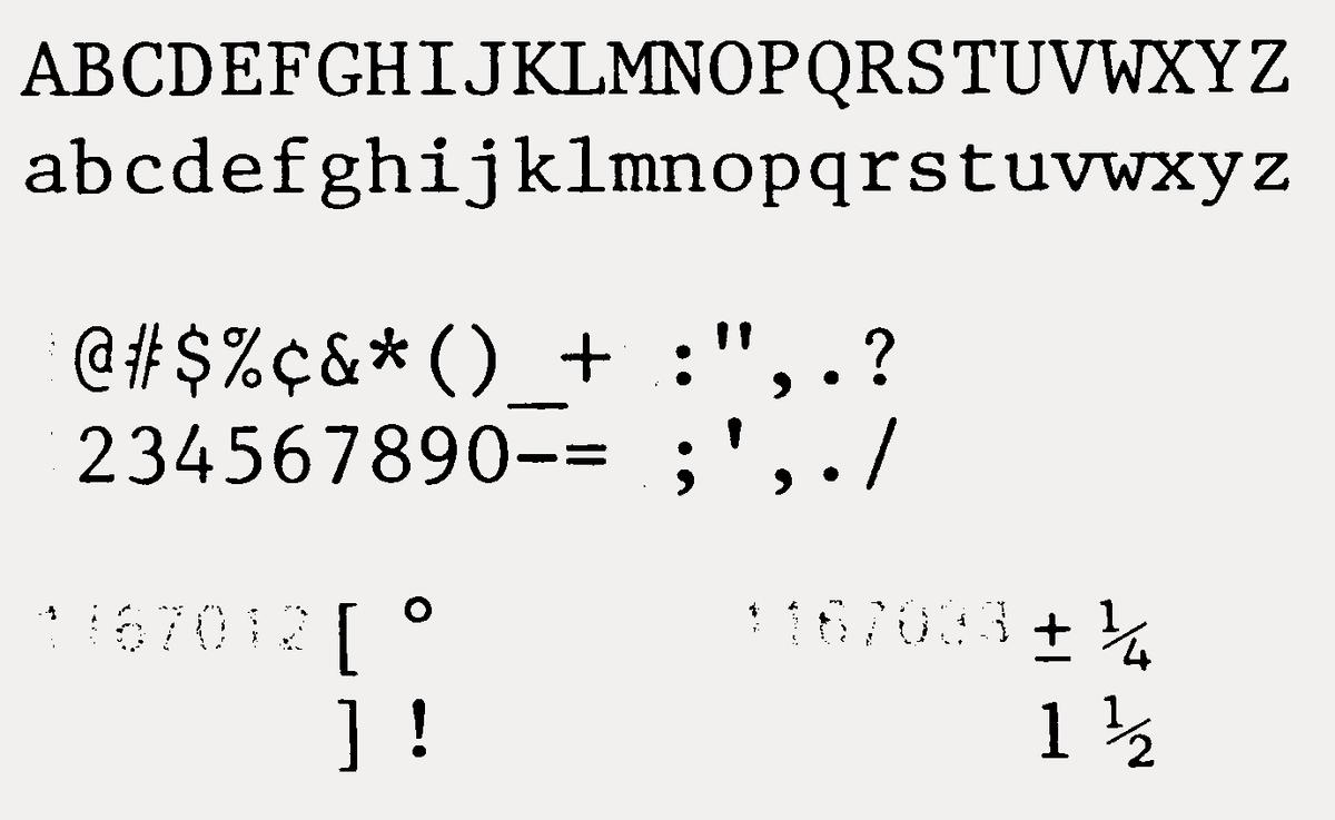
Prestige Elite, designed for the IBM Selectric, credited to Clayton Smith, 1953
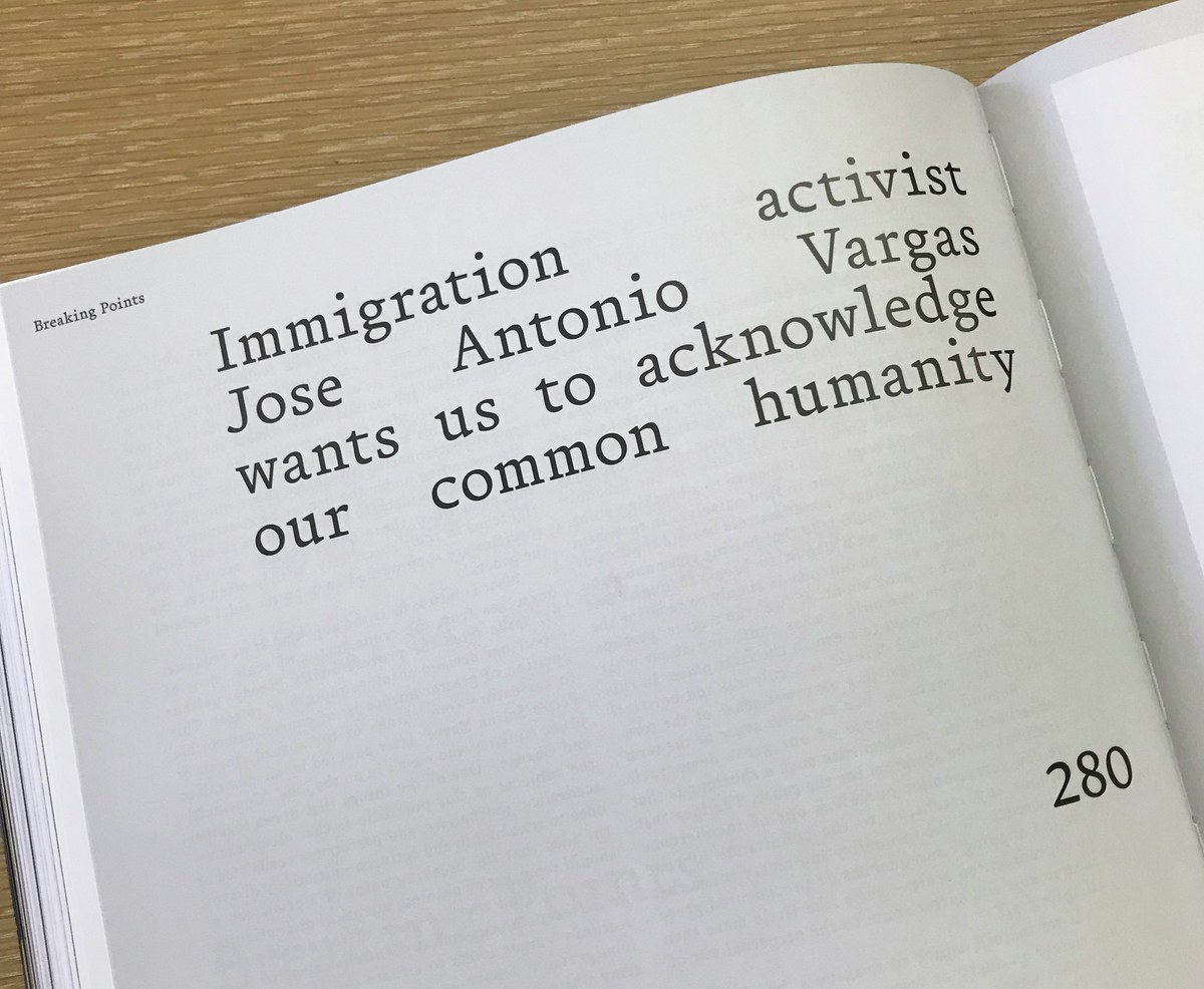
Terza Author was used for both text and display in a series of interviews in Document Journal 13, Fall/Winter 2018.
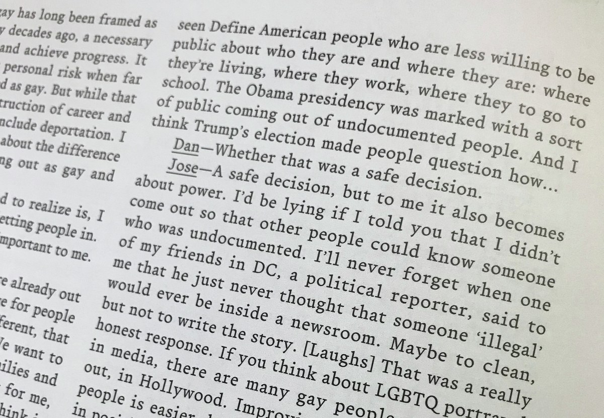
Terza Author was used for both text and display in a series of interviews in Document Journal 13, Fall/Winter 2018.
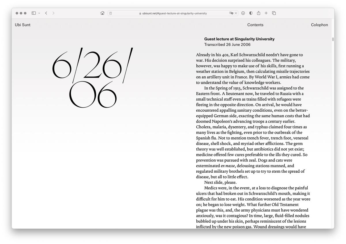
James Goggin designed ubisunt.net, the digital incarnation of Blaise Agüera y Arcas’s novella Ubi Sunt, using Terza Reader and Editor, Atlas Grotesk and Typewriter, and Lineto’s Heymland.
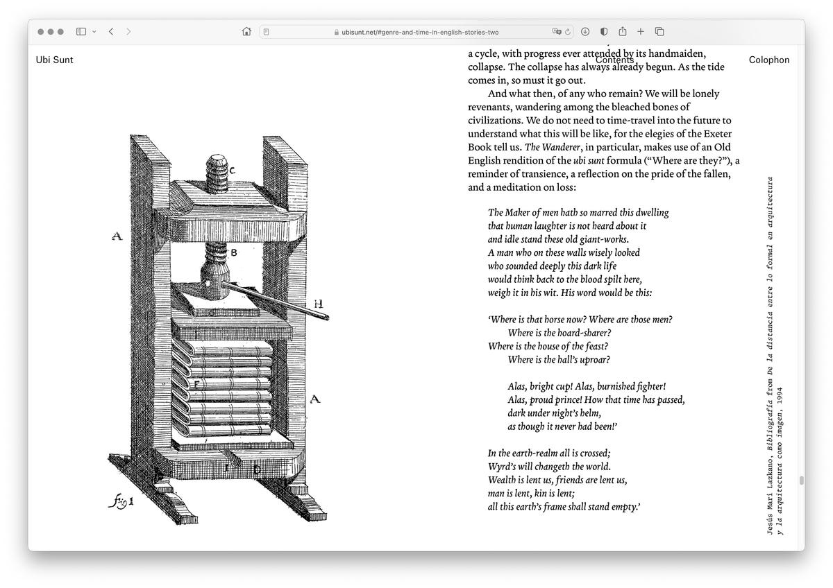
James Goggin designed ubisunt.net, the digital incarnation of Blaise Agüera y Arcas’s novella Ubi Sunt, using Terza Reader and Editor, Atlas Grotesk and Typewriter, and Lineto’s Heymland.
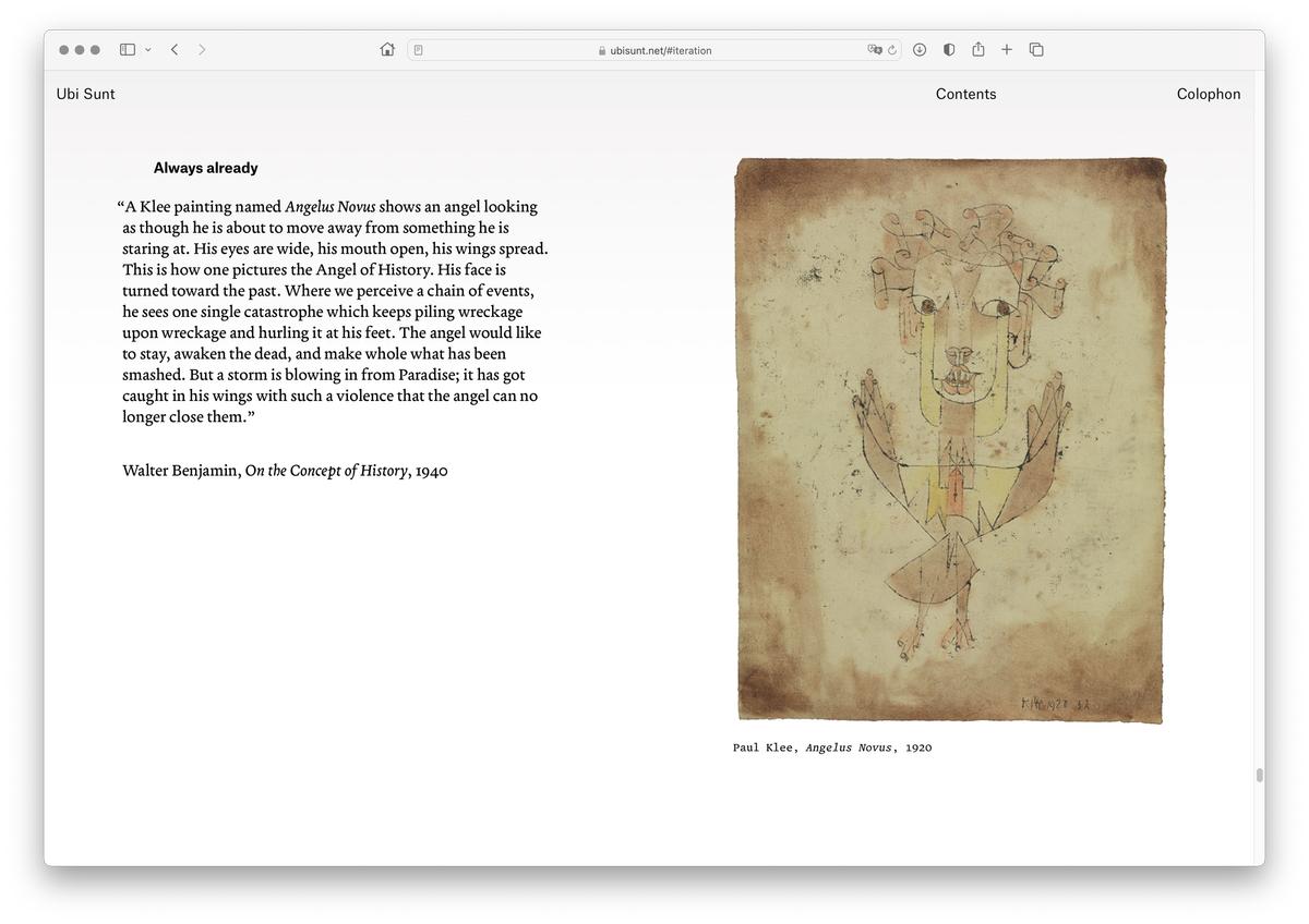
James Goggin designed ubisunt.net, the digital incarnation of Blaise Agüera y Arcas’s novella Ubi Sunt, using Terza Reader and Editor, Atlas Grotesk and Typewriter, and Lineto’s Heymland.

Terza Author was used for both text and display in a series of interviews in Document Journal 13, Fall/Winter 2018.

Terza Author was used for both text and display in a series of interviews in Document Journal 13, Fall/Winter 2018.

James Goggin designed ubisunt.net, the digital incarnation of Blaise Agüera y Arcas’s novella Ubi Sunt, using Terza Reader and Editor, Atlas Grotesk and Typewriter, and Lineto’s Heymland.

James Goggin designed ubisunt.net, the digital incarnation of Blaise Agüera y Arcas’s novella Ubi Sunt, using Terza Reader and Editor, Atlas Grotesk and Typewriter, and Lineto’s Heymland.
Things don’t always go according to plan, though. James Goggin of Practise set the main text of Blaise Agüera y Arcas’s beautiful speculative novella Ubi Sunt in Terza Reader as nature and Gazdowicz intended, but opted to use the Editor variant for image captions. And creative director Nick Vogelson has used the Author subfamily in print editions of Document Journal to indicate a change in terrain rather than a shift in speed or interactive mode. The Brooklyn Rail has used Terza Reader for running text, but has also used Editor as a display face on the cover of a special issue of the magazine, as well as for body text in a one-off booklet of essays. Terza is not rigidly prescriptive; its three variants are suggestions, not rules. “What’s great about being a type designer,” says Gazdowicz, “is that you spend lots of time thinking about and agonizing over how to make a typeface succinct and make it make sense. And then no one uses it the way you intended.”
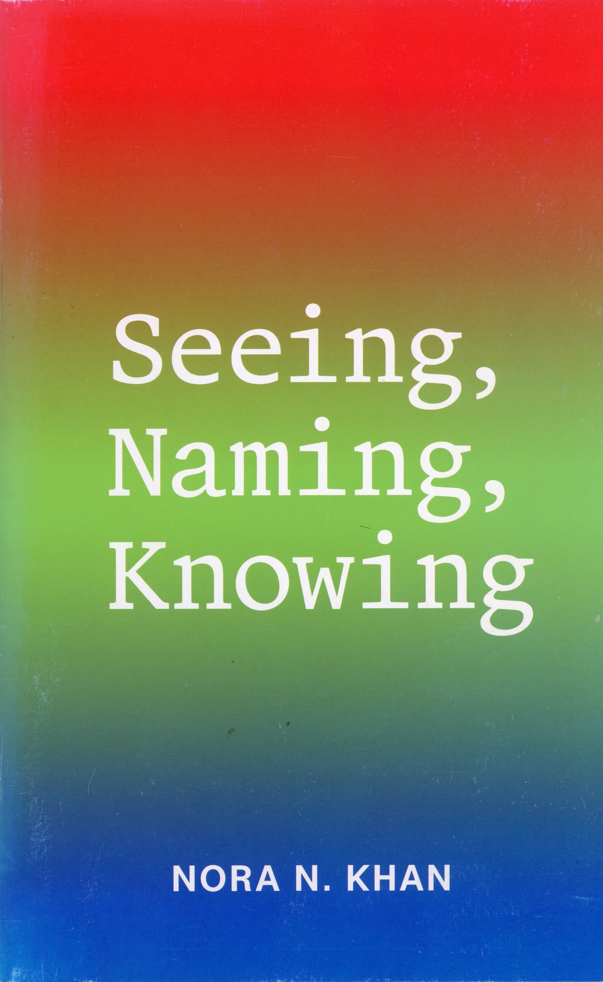
The cover of “Seeing, Naming, Knowing” by Nora N. Khan, designed by Mike Tully and published by the Brooklyn Rail, March 2019
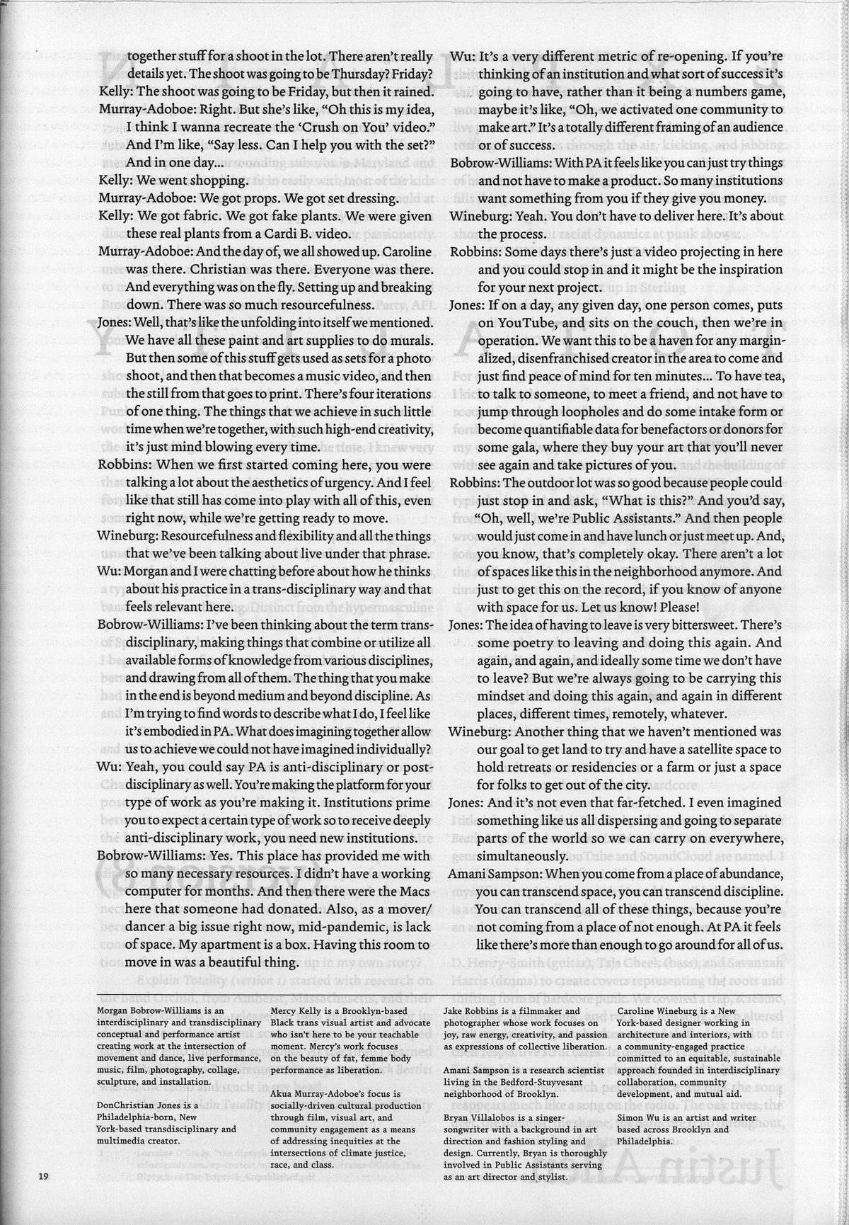
A page from Movement Journal 55, September 2021, designed by Yotam Hadar. Terza Reader is used for the main text; Author is used for footnotes and other supporting material.
Think of “tempo” as how quickly a reader gets from point A to point B, and “rhythm” as the characteristics of a typeface that influence that tempo.