Making beautiful things still matters. This is what we’ve been up to lately.
Here at Commercial Type, we’ve been keeping on keeping on. One of us moved back to New York, one of us moved away from New York, and a new designer joined the team. “Producing beauty still matters,” our friends at Atelier Carvalho Bernau remind us, and we have taken those words to heart. We’re proud of what we’ve accomplished so far this year.
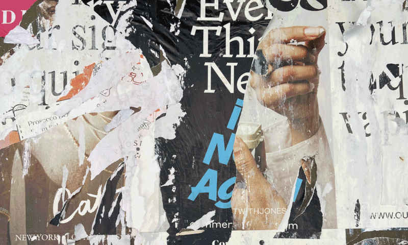
Punch, drawn by Paul Barnes with Tim Ripper, arrived in the Vault back in January. The rounded headline face, which resuscitates and expands Miller & Richard’s News Bill Italic and dreams up a new matching roman, debuted in Fraser Muggeridge studio’s catalog for Yayoi Kusama’s 2023 exhibition You, Me and the Balloons at Factory International in Manchester, England. Designer Elaine Lopez made Punch look completely contemporary with the lava-lamp motion graphics she created for Parsons.
In March we released Ionic Modern, a typeface doubling as an interactive survey of the two sources it references: the supremely functional Ionic style introduced by Caslon, and the lithe Modern display style that evolved during the latter half of the nineteenth century. As they were developing the family, it occurred to Paul Barnes and Greg Gazdowicz that they could harness variable-font technology to connect the dots between the robust Ionic and graceful Victorian Modern’s shared skeleton, articulated around the axes of contrast and weight.
Also released in March, Focal is Greg Gazdowicz’s ode not to a particular typeface, but to a moment: a window of time during the seventies when phototypesetting took hold in publishing, and type lost some of its sharpness. There was a warmth to this interlude between metal and digital typesetting that captivated Greg. He imagined a typeface that existed in an uncanny valley of something familiar being printed, overprinted, xeroxed, faxed—a weathered memo that nevertheless remained readable. Steeping himself in the technological history of the period, and questioning the unwritten dogma that has built up around sans serifs, Greg came up with an original family that feels a bit more European than American—a familiar but forgotten grotesk.

We’d say it’s so wrong it’s right, except it’s never right: Control has no “correct” version. Christian Schwartz drew Control as a playful homage to Walter Käch’s 1949 lettering manual Schriften Lettering Écritures, a non-prescriptive guide full of example alphabets that included a set of sans serif forms Käch called “block letters.” Created in and for the medium of variable fonts, Control invites designers to tinker with axes for weight, contrast, aperture, and tracking, and to choose between an oblique and a cursive as a companion style. The family can play it straight as a tasteful mid-century grotesk, or can turn into a densely crowded seventies headline face. Miguel Reyes drew the outré cursive, loosely based on Van Dijk, published by Letraset in 1982.
We love custom work because it gives us an opportunity to dig into thorny, context-specific puzzles. Earlier this year, Christian Schwartz and Greg Gazdowicz developed a logotype for American luxury leather goods purveyor Mark Cross, founded in Boston in 1845. Gentle flaring on stroke endings and terminals prevents the wordmark from looking overly cold and mechanical. Christian drew the secondary typeface, a flared, subtly expanded sans serif.
Restless Rolling Stone has continually tweaked its appearance over the decades while somehow always managing to look like itself: iconic, instantly recognizable, and a little ungovernable. We had the honor of teaming up with Richard Turley of Food and Mark Leeds of c-ll-ct-v-ly on the latest redesign, which hit newsstands in June. Our job was to overhaul the type palette. Tim Ripper drew the main headline face, Rolling Stone Slab, an offshoot of his ongoing work on Successor and continuing exploration of nineteenth-century Egyptians from the British Isles. The custom slab comes with a gorgeous, lush italic and a higher-contrast display variant for feature layouts. Text, subheads, and decks are set in Feature Flat Text and Deck—with a notable twist. French calligrapher and type designer Julien Priez designed a set of swash capitals for the Feature Deck Regular cut. Instead of taking the obvious path of adding swashes only to the italic, Julien had the curious idea of adding them to the roman, too, injecting energy and fun into the somewhat reserved Feature Flat.
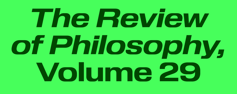
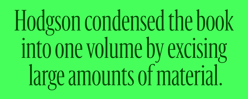
In a persistent bid to make our typefaces more useful, usable, and accessible, we’ve added to a few of our families this year. Review, designed by Berton Hasebe, originally came in three progressively narrower widths: the regular-width Review, Review Condensed, and the very narrow Review Poster. Tim Ripper helped Berton expand the family into a full range of weights, from Thin to Black, for release at Commercial Type in 2020. Recently Tim stepped up again to cross a wide version of Review off our wish list. With proportions based on old squarish CRT displays to give it a certain vintage familiarity, Review Wide pushes Review’s blunt, stackable audaciousness even further. The family comes in seven weights with matching italics, and includes alts like round dots and punctuation to soften the squareness.

Graphik, one of our most popular families, now has three Indic companions: Graphik Bangla, Graphik Devanagari, and Graphik Tamil. Shiva Nallaperumal of November acted as creative director for all three extensions, with mastering and technical assistance from Universal Thirst. All three scripts can be used for both text and display, and each conveys Graphik’s simple plainspokenness in its own way.
Arya Purohit brought Graphik’s “vanilla” qualities to the Bangla script, retaining the typical ball terminals alongside clean, simple stroke endings. Graphik Bangla fuses classic and modern genres to achieve Graphik Latin’s warmth, while weight distribution and optical correction work to create a smooth texture and optimal readability.
Hitesh (Rocky) Malaviya translated Graphik’s blend of geometric forms and fluid warmth into the Devanagari script, finding intuitive ways to simplify the forms—especially stroke endings and “knots”—without forcing the shapes to appear overly synthetic. Graphik Devanagari is Rocky’s attempt to create the “perfect” default monolinear Devanagari typeface.
Rocky also designed Graphik Tamil, which presented a unique challenge because Tamil’s letterforms vary so much in horizontal width and are markedly less dense than Latin. Like Graphik Devanagari, Graphik Tamil was an exercise in weight distribution and optical correction. The team also designed a Tamil-specific space unit that reverts to the original when used with the Latin glyph set.
Sanomat was designed by Paul Barnes with Berton Hasebe for Sami Valtere’s 2013 redesign of Finland’s newspaper of record Helsingin Sanomat. When HS’s current creative team came back to us in 2023 to see if we could come up with a weight or two of a condensed version for use in the paper’s monthly magazine Kuukausiliite, we decided to see just how narrow we could go. We came up with two new families—Sanomat Condensed and Sanomat X Condensed—plus a variable font to let designers play with all of the widths in between. As Sanomat contracts, the x-height gets taller and the serifs get shorter, though they take on depth to gain a smidge of compensatory weight. The flared terminals likewise gain depth to remain prominent. Tighter setting becomes possible with the reduction in serif length, which produces a satisfying density while preserving the elegance of the regular width.
For us, being part of the type community means sharing work and sharing knowledge. This can take the form of putting up billboards or making specimens or giving talks or teaching or being recognized by peers. We do what we can.
Paul Barnes and Peter Saville go way back. Friends and collaborators since the nineties, they’ve teamed up on identities for the City of Manchester, Givenchy, Gay Dad, New Order, Joy Division, and Electronic. They teamed up again in the spring at St Bride for a freewheeling two-part conversation called “Always Now: Typography and Semiotics.”
At the end of April, we were delighted to see a couple of families from the Commercial Type library pick up prestigious TDC Certificate of Excellence awards. Wael Morcos and Khajag Apelian’s Canela Arabic, an exuberant companion to Miguel Reyes’s Canela, supports Arabic, Persian, Urdu, and Kurdish. The six-weight typeface draws on classical Naskh and Thuluth proportions to produce a modern design perfect for headlines and short bursts of text. Canela Arabic is slated for release later this year. And Sandrine Nugue’s curvy, groovy, asymmetrical flared Moulin moved from the Vault to our main library at the end of 2023. It not only won a Certificate of Excellence; it was also selected as a Judge’s Choice. Moulin has already popped up in several real-world settings, including the LA-based luxe clothing brand Rue Sophie.
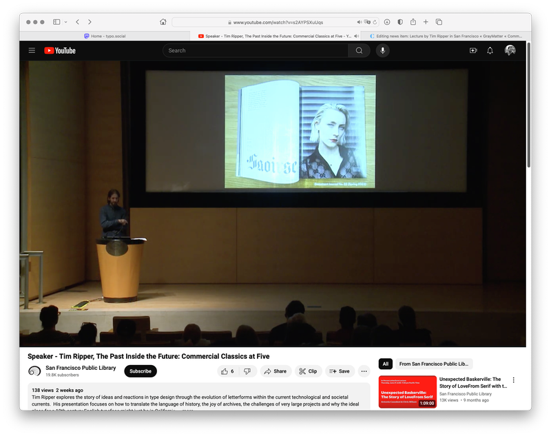
In July, recent California transplant Tim Ripper gave a talk called “The Past Inside the Future: Commercial Classics at Five” at the San Francisco Public Library. Presented by Letterform Archive and Type West in conjunction with SFPL (and accompanied by a fantastic poster designed by Benjamin Shaykin for attendees), the talk summed up the ethos and first five years of Commercial Classics, a subsidiary label operating under the broader Commercial Type umbrella. The project, which so far has focused on type “hits” from nineteenth-century Britain, seeks to liberate these groundbreaking designs from their narrow historical constraints so they can find a place within a new context. This approach, more about reinterpretation than strict revival, necessarily engages anachronism and speculative fiction. And California, land of fresh possibilities and seemingly limitless futures, may very well be an ideal home for such excavations.
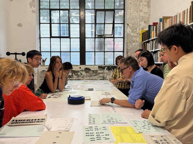
Friend of the house and frequent collaborator Fraser Muggeridge founded the Typography Summer School, an intensive program and “think tank” for recent graduates and design professionals in London and New York. Paul Barnes has spoken and taught there since the program’s earliest days in 2010, and that’s where he found himself again in early August. Rumor has it that he might be back next year, too.
Thanks for reading! Get ready for more new type in the fall…
 |
 |
 |