The first decade of typefaces by Miguel Reyes


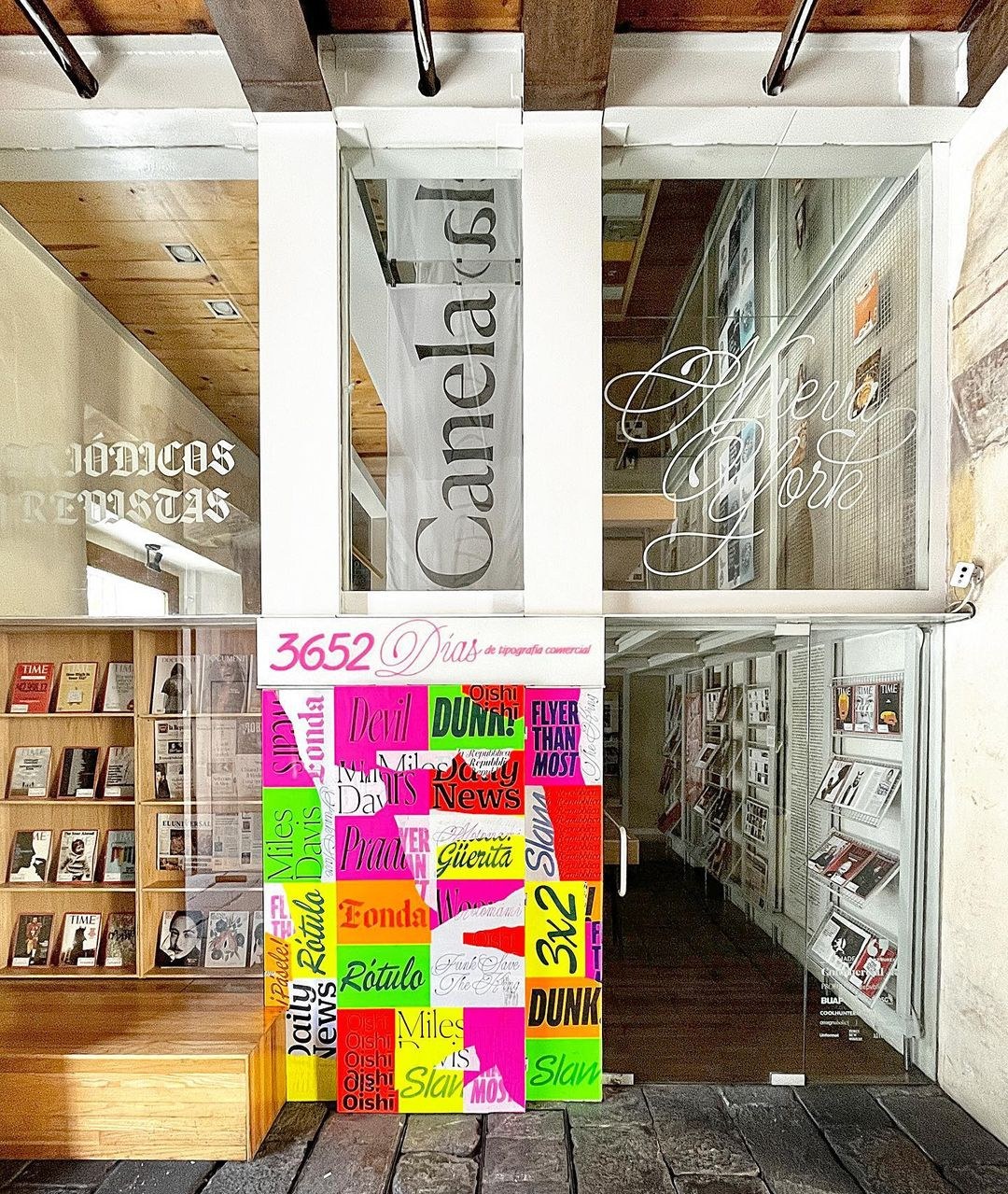
An exhibition celebrating ten years of Miguel Reyes’s work as a type designer opens tonight in Puebla City as part of the ninth edition of the Tipografía México conference. A version of this text, written by Christian Schwartz, was prepared as an intro for the show.
A few years ago at the studio, Miguel or I came across a seemingly well-intentioned post online that referred to Canela as his Mexican Caslon. We had a good laugh about this with our colleagues and moved on, but the phrase “Mexican Caslon” has stuck with me, and every so often I find myself thinking again about why, exactly, we found this so funny. This reductive description felt wildly incongruous with how much difficulty we had writing about Canela in marketing materials when we released it. It’s a typeface that particularly defies easy categorization: it’s not a serif, but its flared endings and tapered terminals make it hard to describe as a sans serif. It has roots in display types cut by William Caslon—it shares the contrast, proportions, and some of the underlying shapes, and early iterations of the design explicitly revived Caslon Oldstyle—but it’s definitely not a faithful recreation of a historical typeface. It was drawn in New York by a designer from Mexico who was inspired by English types after studying type design in the Netherlands. It does not directly engage with Mexican aesthetics, but the design is intangibly influenced by the visual culture Miguel grew up in. It is more than the sum of its parts, but also not at all what I would imagine if the parts were described to me. It is a singular typeface created by a singular type designer. It happened to come out in the right place at the right time to strike a nerve with people who use type, rapidly becoming one of the signature typefaces in our library.
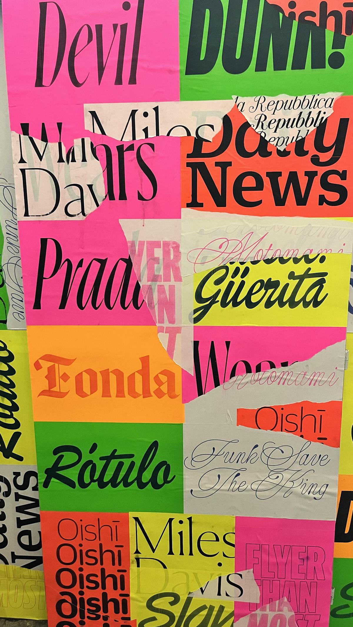
This is not to say that Miguel shies away from exploring Mexican influences; Canela Blackletter, for example, considers the tradition of hand-painted blackletters on fondas. But his body of work can’t be reduced to where he grew up. Miguel’s best typefaces have a particular quality that is hard to distill into words; you just know it when you see it. Unexpected shapes sometimes flirt with chaos, as with the different italics for Ayer, or the off-the-wall swash capitals in Candy Darling—but when the parts come together they feel inevitable.
Like a sample transformed in a song, Miguel’s influences are recognizable but often beside the point, with particular use cases often more important than the typefaces referenced. Analog X Condensed touches on Futura Condensed—specifically its powerful voice in Nike’s 1990s ad campaigns. Lovesong joyfully embraces Brush Script, a perennial icon of bad taste, paying special homage to the manipulated versions of the typeface found on vinyl signage and vehicle graphics. Canela contains elements of Caslon, but that is incidental to it being beautiful on the page, the screen, or the package. Even when tasked with a more literal interpretation of a historical typeface, like Eugenio Serif, commissioned by the Italian daily newspaper La Repubblica with the brief of making a new revival of Bodoni, Miguel manages to find an oblique way into the assignment. Modern interpretations of Bodoni are typically crisp and precise, but Eugenio Serif is soft and warm, while retaining the elegance that typifies Bodoni’s work. Eugenia preserves some of Bodoni’s lesser-known decorative types, existing in yet another ambiguous space between script and italic.

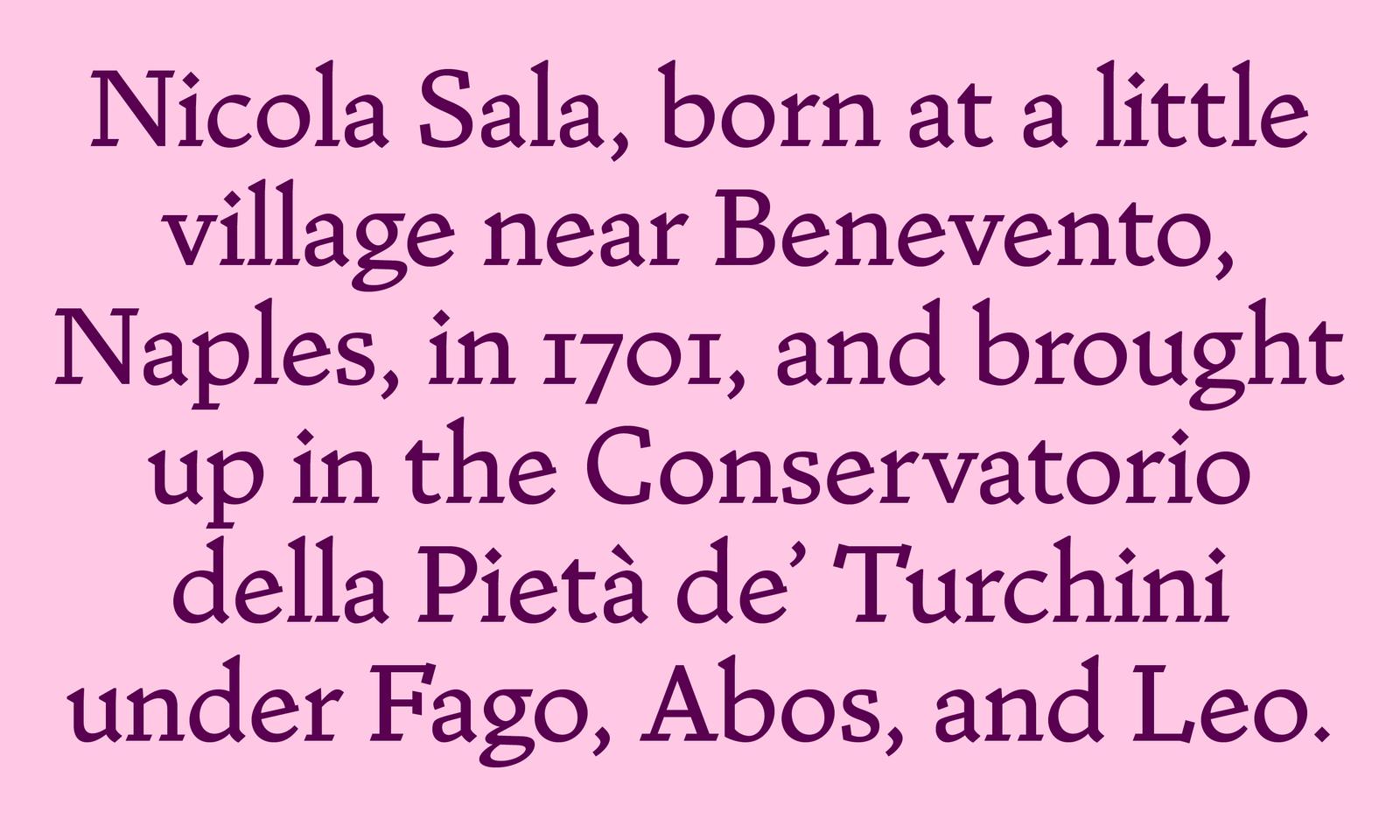
Today we introduce Nicola, Miguel’s latest typeface, a typical blend of influences and tools. Before digital typesetting let designers set their own type, “comping” – hand-rendering headlines in various typefaces for copyfit and client approval – was an important skill. During his initial research for Canela, Miguel came across Tommy Thompson’s renditions of Caslon, written quickly with a broad-tipped pencil, in his classic 1946 manual How to Render Roman Letter Forms. The tension between the rough, informal quality of the rendering and the classical letterforms depicted informed an early sketch of Canela that didn’t quite work: the angled serifs felt mannered and the simplified terminals felt chunky and unsophisticated. Still interested in the idea some years later, he applied it to the typefaces cut by Nicolas Jenson in Venice in the late fifteenth century, finding a more natural result when combining the informal technique with a calligraphic source. Elegant and brash, Nicola is a robust, low-contrast typeface whose simplified details verge on making it a slab serif.
Miguel’s first decade of type design shows an incredible range of ideas. That these ideas are best expressed as typefaces, and are hard to describe in words, probably explains why our collaboration has been so fruitful. Typeface design is an intellectual pursuit, and many debates can be had about theories of reading; but for me, at its core it’s really about how black and white shapes interact to make someone feel a certain way while they read a piece of text. Miguel’s work shows an innate feeling for this, and I can’t wait to see what he draws next.