Sanomat News
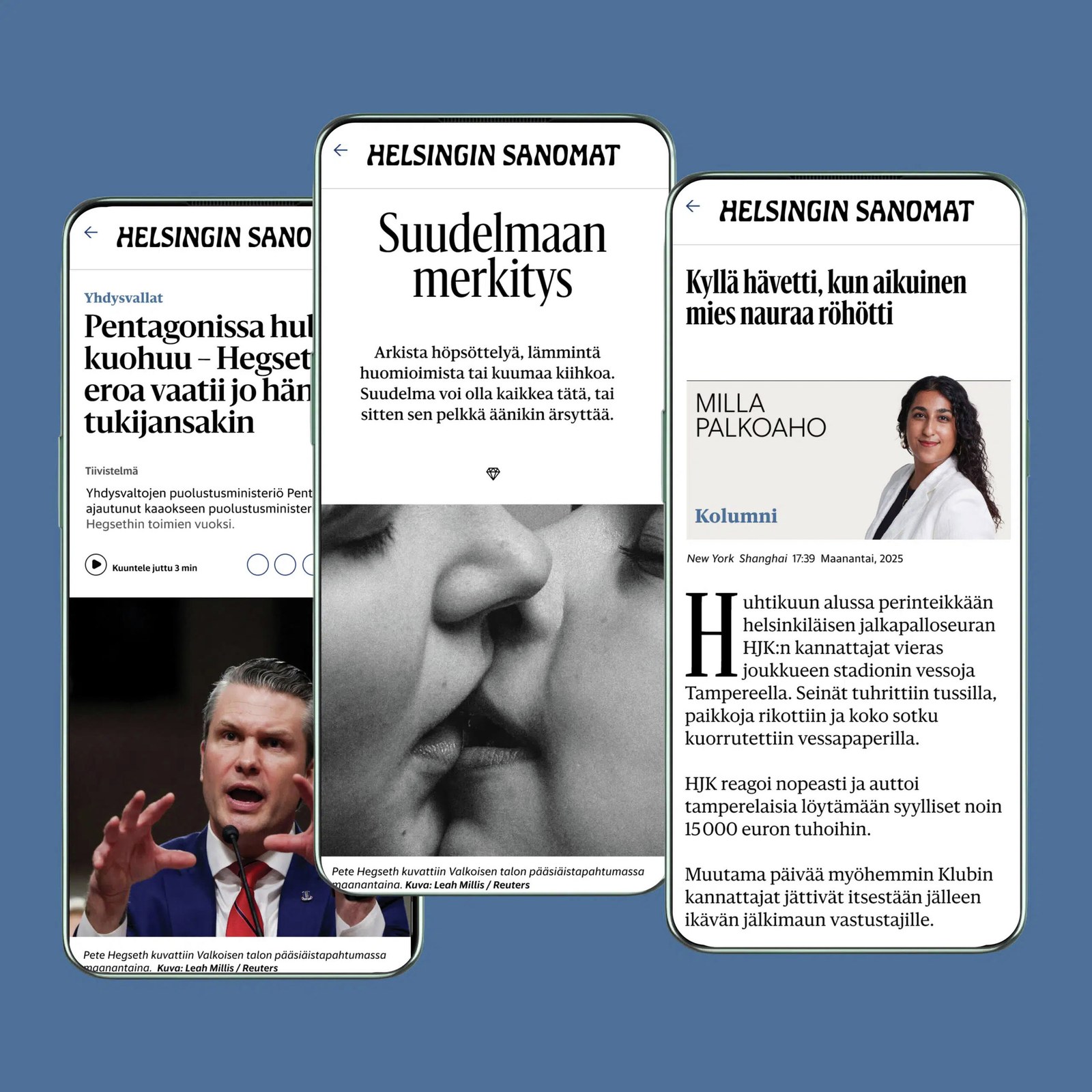
Throughout the spring 2026 season, Helsingin Sanomat (familiarly known as Hesari), Finland’s newspaper of record, will roll out a digital redesign led by Anna Thurfjell Studio. The goal of the redesign is to cinch Hesari’s status as a leading news brand by improving readability on screens, clearly differentiating article types, and improving visual hierarchy. A cornerstone of the updated approach is Sanomat News, a variable version of Sanomat designed by Paul Barnes.
Paul originally designed the gently flared display serif in 2013 with help from Berton Hasebe as part of Hesari’s shift from a broadsheet to a tabloid format. Commercial Type furnished all of the type for that redesign, which was led by Sami Valtere: In addition to Sanomat, which gave the publication its primary voice and personality, Christian Schwartz and Vincent Chan designed Helsingin (published in 2015 as Sanomat Sans) for sans display settings and Helsingin Text (released as Sanomat Sans Text) for captions, sidebars, infographics, maps, and tabular data. Running text used a custom grade of Publico.
Sanomat News—larger, softer, airier—now replaces Publico for continuous text, creating a more consistent look for the news service as a whole and fostering readability at small sizes on screens. The advantages of the variable format are speed and granularity: A single file containing all styles requires just one call to the server, and details can be seamlessly adjusted so that the face looks good at any size—robust and low-contrast in paragraphs, tighter and more graceful in headlines. Sanomat News has also been optimized for night mode, which means that letters won’t appear too heavy when reversed out of a dark background.
Its soft, lyrical forms make Sanomat somewhat unusual for a newspaper face. But practical motives underlie its organic shapes: Sanomat’s subtly flared terminals gesture at the publication’s curvy nameplate and give the face a majestic, almost inscriptional quality, forging a connection between the old Hesari and the new one. Also, flaring the ends of a, c, f, g, j, r, and y, which tend to stand out in Finnish, makes them less obtrusive. And trimmed serifs on diagonal characters like v and y allay the visual echoing that results from the Finnish-language convention of repeating letters to represent long sounds.
Sanomat’s ad hoc peculiarities—an inscriptional elegance, grace throughout the weight range, and a curious approach to serifs—make it an ideal fit for Finland’s most popular news outlet. But these same traits also let the family travel easily into other realms elsewhere, like fashion and beauty.
Helsingen Sanomat published an interview with Paul and Anna about the redesign; Anna translated the article into English. For more context, read Christian Schwartz’s essay on Sanomat.