Sanomat’s soft elegance
Helsingin Sanomat is Finland’s major daily newspaper, with a circulation of well over 300,000. A broadsheet since its founding in 1905, the paper made the switch to tabloid format in January 2013, and we provided all of the type for the new design. Drawn by Paul Barnes with assistance from Berton Hasebe, the headline typeface Sanomat played a key role in maintaining the impression of a serious, quality newspaper in the smaller tabloid format, traditionally associated with sensationalist journalism.
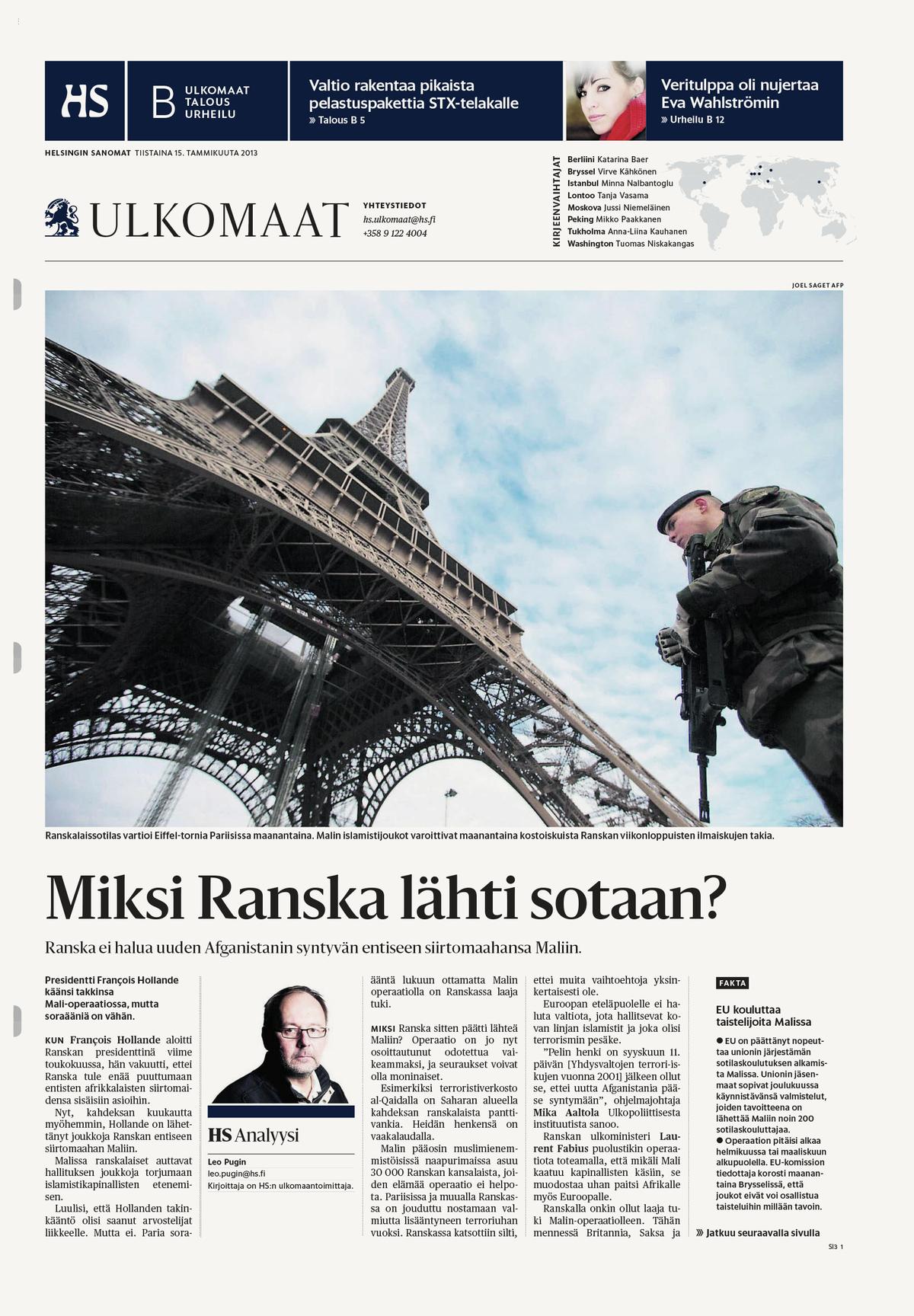
The front page of the paper’s World News section.
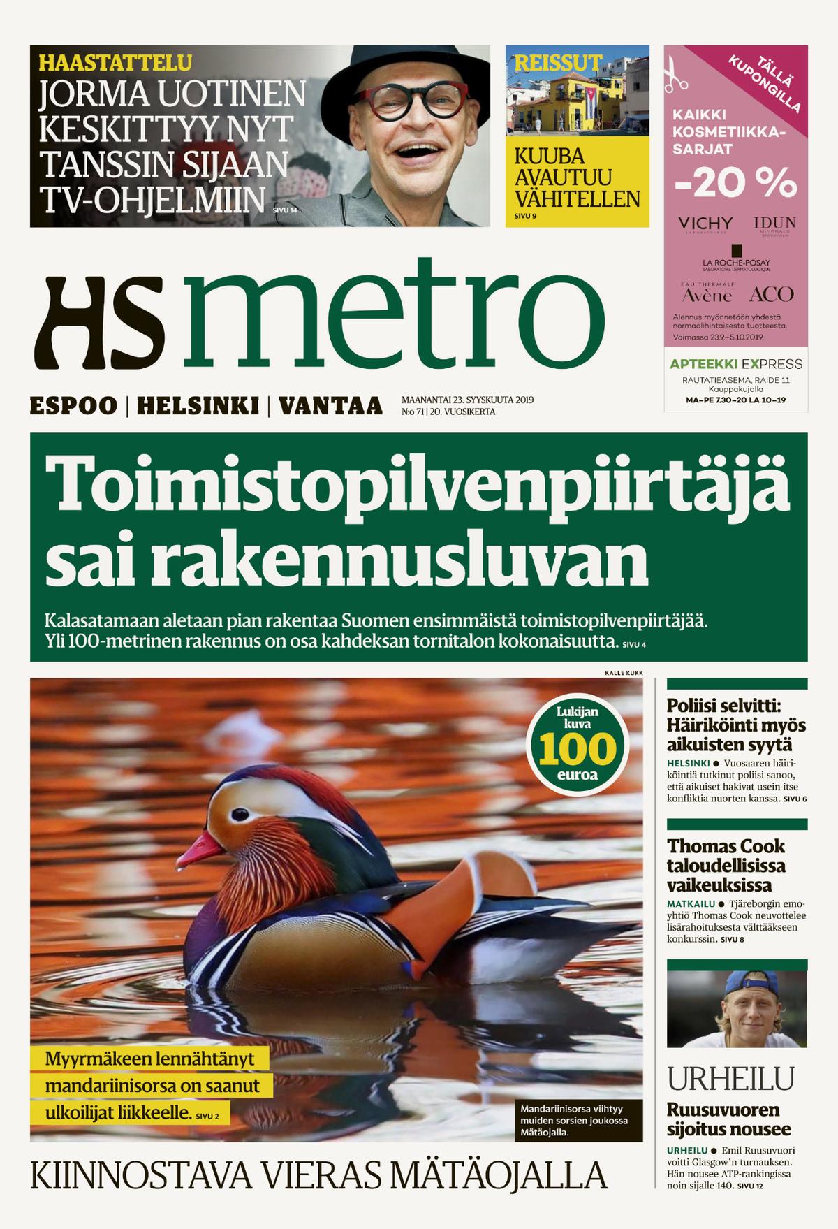
Sanomat Slab, designed by Paul Barnes and Miguel Reyes, appeared in HS Metro from 2016 until the free daily was discontinued in 2020, and also brands Helsingin Sanomat’s radio and TV content.

Because Helsingin Sanomat runs a full-page ad on the cover, the first spread becomes the paper’s de facto front page.
The front page of the paper’s World News section.
Sanomat Slab, designed by Paul Barnes and Miguel Reyes, appeared in HS Metro from 2016 until the free daily was discontinued in 2020, and also brands Helsingin Sanomat’s radio and TV content.
Because Helsingin Sanomat runs a full-page ad on the cover, the first spread becomes the paper’s de facto front page.
The front page of the paper’s World News section.
The redesign was carried out internally, headed up by group creative director Sami Valtere along with art directors Hannu Pulkkinen and Ari Kinnari, and built on a strong grid of square elements. We designed Sanomat to play against the grid, with organic forms that warm up the coldness and precision of the underlying page structure. It’s common to evoke refinement in a typeface by using sharpness and high contrast: pointed serifs and terminals connote elegance, while softness and organic curves impart a warm and casual feeling. Sanomat manages to come off as elegant even though its details – such as the terminals on letters like a, f, g, j, k, r, and y; and the flaring that replaces the serifs of horizontal strokes in capital letters like E, F, L, and T – are soft.
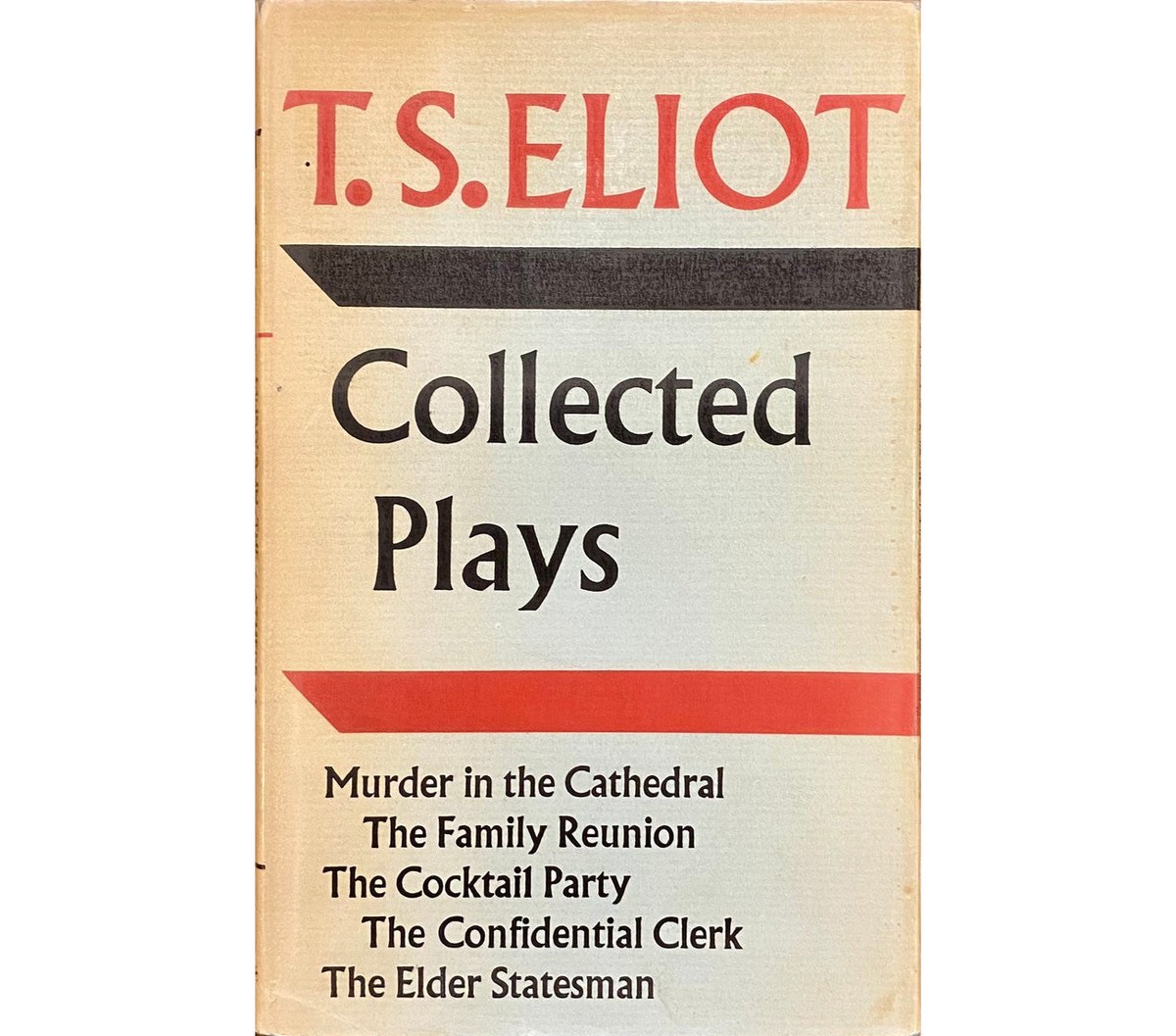
This unusual treatment shows the influence of inscriptionally inspired typefaces like Berthold Wolpe’s iconic Albertus, Hermann Zapf’s divisive Optima, or Joachim Romann’s little-known Romann Schrift. In part this is functional: the Finnish language has many repeating letterforms, such as ää, and the softening reduces visual noise. Additionally, the serifs are quite short, particularly on the diagonal characters, because of the preponderance of vv and yy pairs in Finnish. The word for “goodness,” hyvyys, is an example of the strings of diagonal letterforms the typeface needed to accommodate.
Albertus as used by its designer Berthold Wolpe (1962).
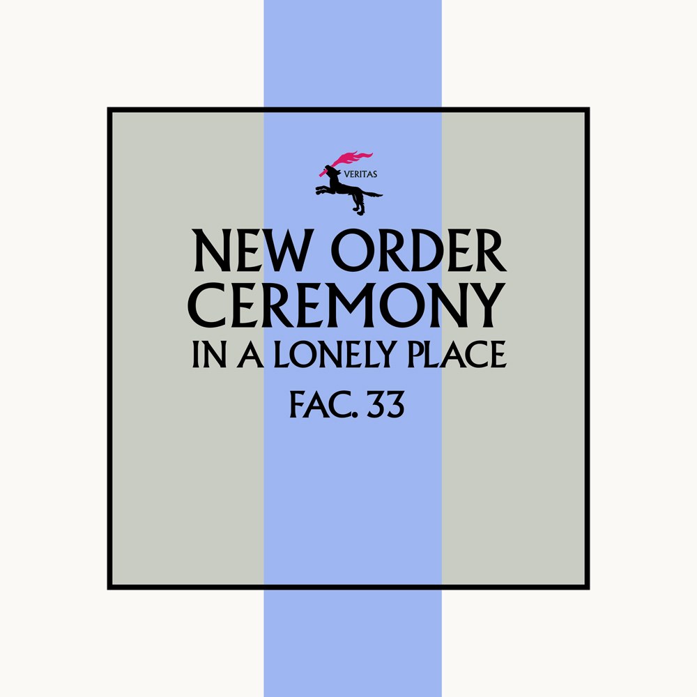
Albertus used by Peter Saville on the cover of a New Order single (1981).
Optima, sample from 1958, reproduced in Buchdrukschriften im 20.Jahrhundert (1995).

Joachim Romann’s unsung Romann Schrift from 1942, reproduced in Buchdrukschriften im 20.Jahrhundert (1995).

Sanomat and Sanomat Sans were drawn to accompany each other without being built on the same skeleton or basic proportions.
Sanomat’s gentle curves and humanist sentiment echo Finnish twentieth-century architecture and design. Barnes was inspired by an eclectic group of Finnish designers and illustrators including Alvar Aalto, Eliel Saarinen, Maija Isola, and Tove Jansson. Perhaps this affinity for the warm and unembellished forms of Finnish modernism explains why Sanomat has found a place in corporate branding and the marketing of furniture and housewares. Its elegance has also made it a good fit for beauty and wellness products, and for several seasons of promotions for the Brooklyn Academy of Music.
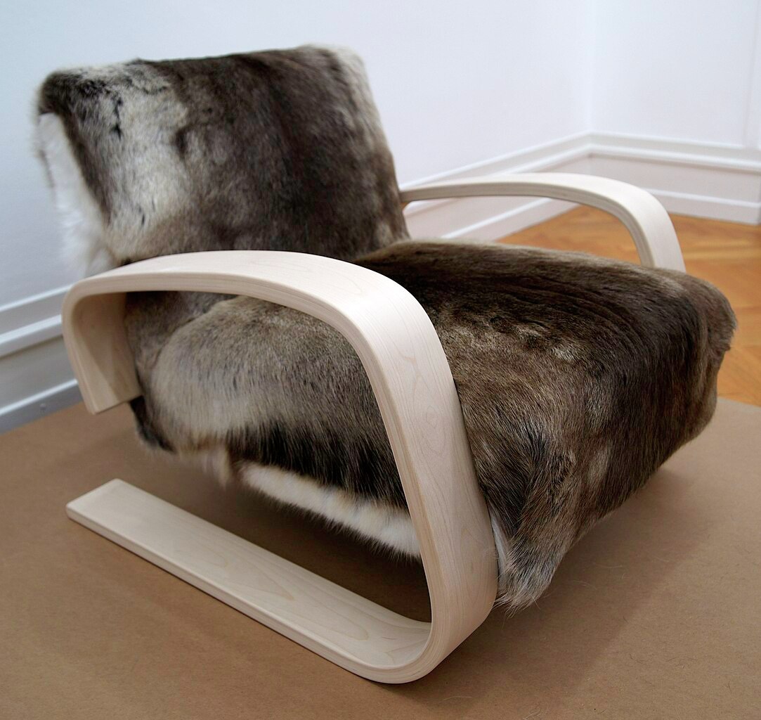
Alvar Aalto’s Armchair 404, designed 1935–36. Photo from Wikipedia user Sandstein (Creative Commons).
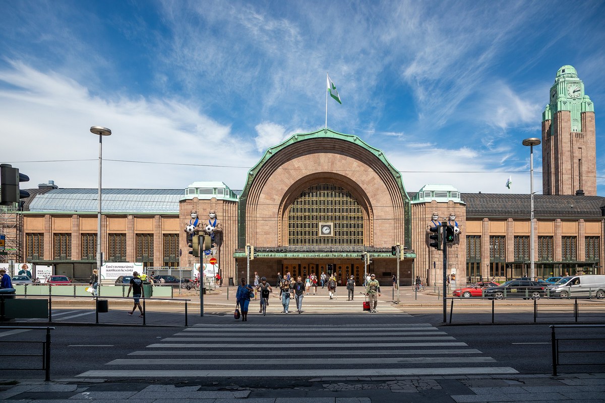
Helsinki Central Station, designed in 1909 by Eliel Saarinen. Photo from Wikipedia user Aaaatu (Creative Commons).
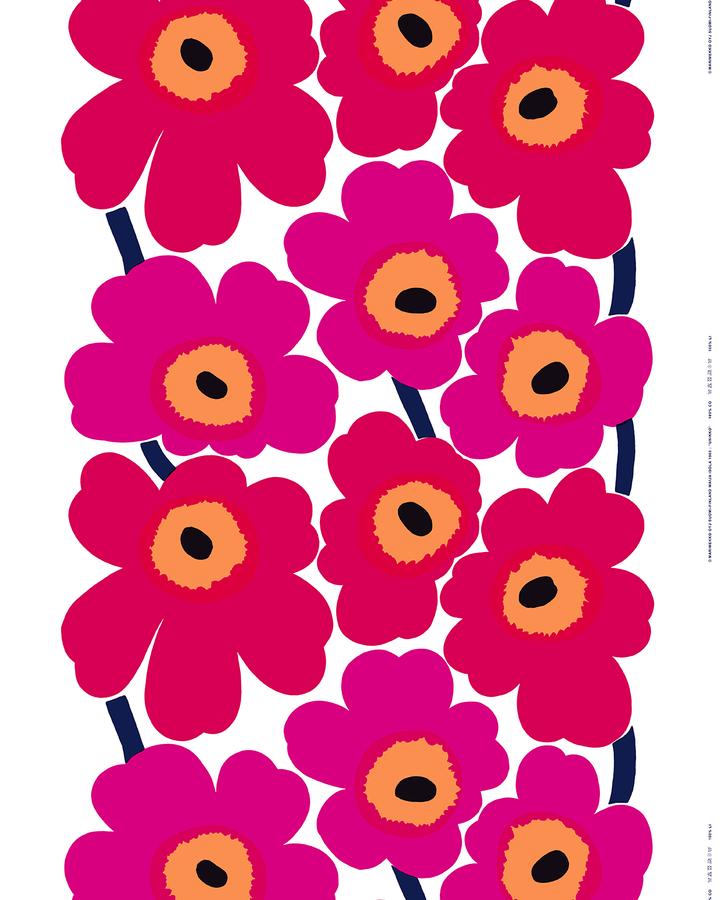
Unikko (poppy) pattern by Maija Isola for Marimekko, 1964. Image from marimekko.com.

An early draft for narrower widths in the Light weight attempted to find the narrowest proportion the forms could withstand.

The K and the crossbar of the E proved particularly tricky.

Sanomat Condensed Bold, Light Italic, and Light.

Sanomat Bold, Light Italic, and Light.

Sanomat X Condensed Bold, Light Italic, and Light.
Sanomat Condensed Bold, Light Italic, and Light.
Sanomat Bold, Light Italic, and Light.
Sanomat X Condensed Bold, Light Italic, and Light.
Sanomat Condensed Bold, Light Italic, and Light.