Rolling Stone refreshed

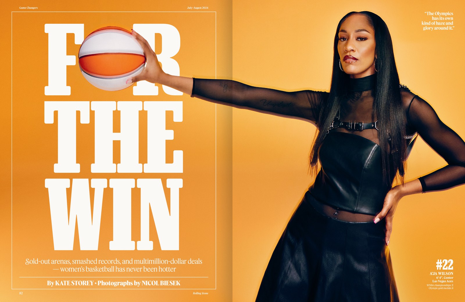
Spread from Rolling Stone issue 1389/1390, July–August 2024.
Christian Schwartz remembers how elated he was to see one of his typefaces used on the cover of Rolling Stone for the first time. It was in 1998, during the illustrious Fred Woodward–Gail Anderson era; Robusto and Bold cuts of Fritz, an homage to Oz Cooper, were used to set coverlines over a full-bleed image of Katie Holmes. So when Richard Turley of Food and Mark Leeds of c-ll-ct-v-ly called on Commercial Type earlier this year to rethink the magazine’s type palette for the redesign they were working on, Christian didn’t hesitate to say yes.

Tim Ripper drew the main headline face, Rolling Stone Slab, which builds on his continuing work on the condensed weights of Successor, an exploration of nineteenth-century Egyptians from the British Isles. The new slab’s contrast and width allude to the condensed slab serifs created by Dennis Ortiz-Lopez during Woodward and Anderson’s run in the 1990s. Bold, condensed slabs can sometimes come on a bit strong, creating dense, dark, blocky walls of text; Tim mitigated this density by subtly rounding corners and serif endings. The overall text image nevertheless remains extremely crisp, with forms that seem almost to interlock. Complete with tails and cursive detailing, the italics unabashedly celebrate the typeface’s nineteenth-century roots, and also nod to the period from 1981 to 2018, when Rolling Stone was dominated by Jim Parkinson’s second, sinuous wordmark. The Woodward–Anderson era also helped inspire a higher-contrast display version for feature layouts, where it gives headlines a serious, refined cast.

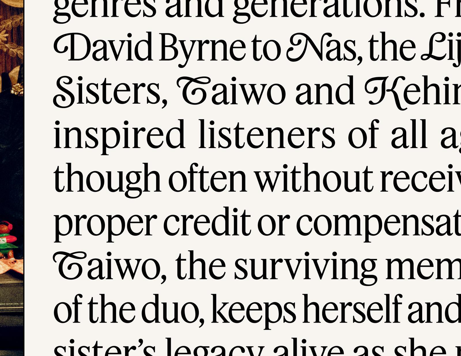
Text, subheads, and decks appear in Feature Flat Text and Deck. Julien Priez, a French calligrapher and type designer who recently joined the Commercial Type team, created a set of swash capitals for the Feature Deck Regular cut. Turley asked us if we could add swashes to Feature after picking up a copy of Rolling Stone’s tenth-anniversary issue with its Cloister Cursive coverlines. Instead of taking the obvious path of simply adding swashes to the italic, Julien hit on the idea of adding them to the roman, too. Turley and Leeds loved the result. The swashes add whimsy and inflection to an otherwise sober type palette.

It would have been easy to slip into nostalgia for this project, but we didn’t want to go that route. Nostalgia engages only superficially with history, trafficking in tropes of an idealized past. Our mantra for this redesign, by contrast, was to “make it look like Rolling Stone” without directly sampling bygone issues. This involved thoroughly immersing ourselves in the archives and deeply understanding how a magazine famous for reinventing itself behaves. “‘We took inspiration from past eras of the magazine and yet the design feels totally fresh and modern,’” said in-house Creative Director Joe Hutchinson. “‘I have redesigned Rolling Stone at least four times now and this is my absolute favorite.’”
Read Christian Schwartz’s essay about the Rolling Stone redesign.