Algebra Display by Susana Carvalho and Kai Bernau
Designers Susana Carvalho and Kai Bernau of Atelier Carvalho Bernau have expanded their Algebra family with a sharp and elegant display companion. A single weight of Algebra Display was drawn for the US edition of Esquire in 2013, adding a gracefully aggressive tone to large headlines and initials. Carvalho and Bernau refined and expanded the family to a full set of weights with assistance from Barbara Bigosińska and Katerina Kochkina.
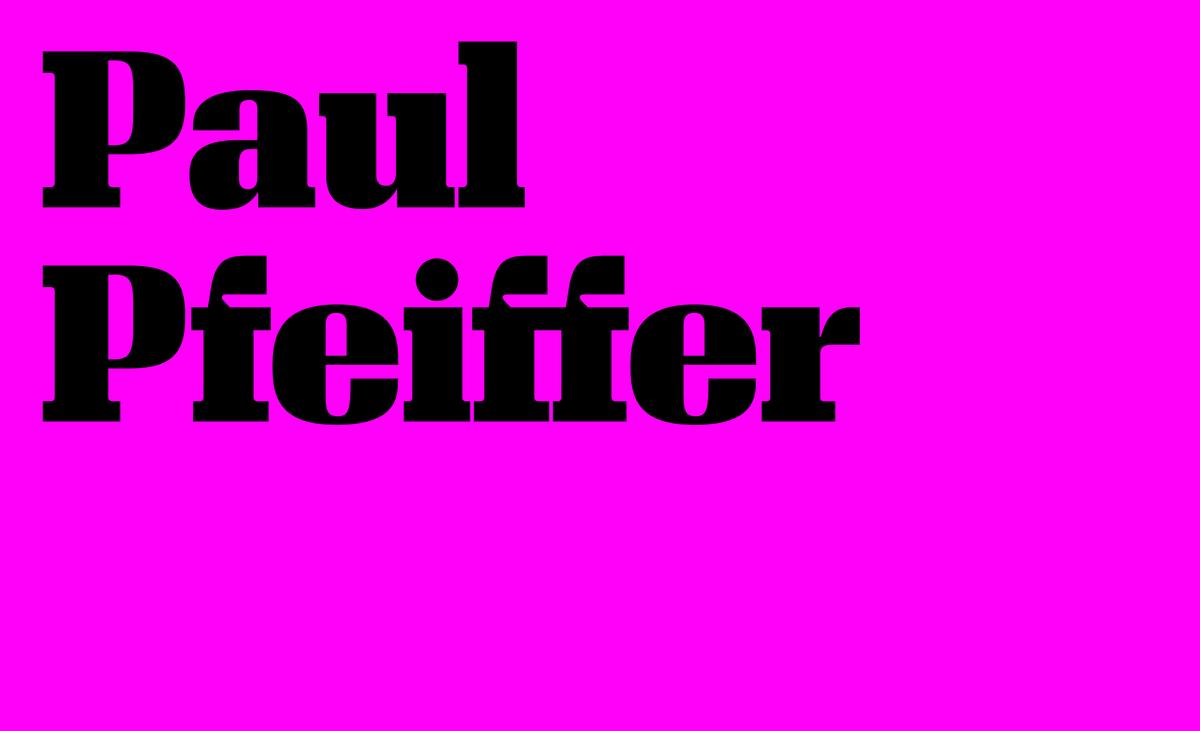
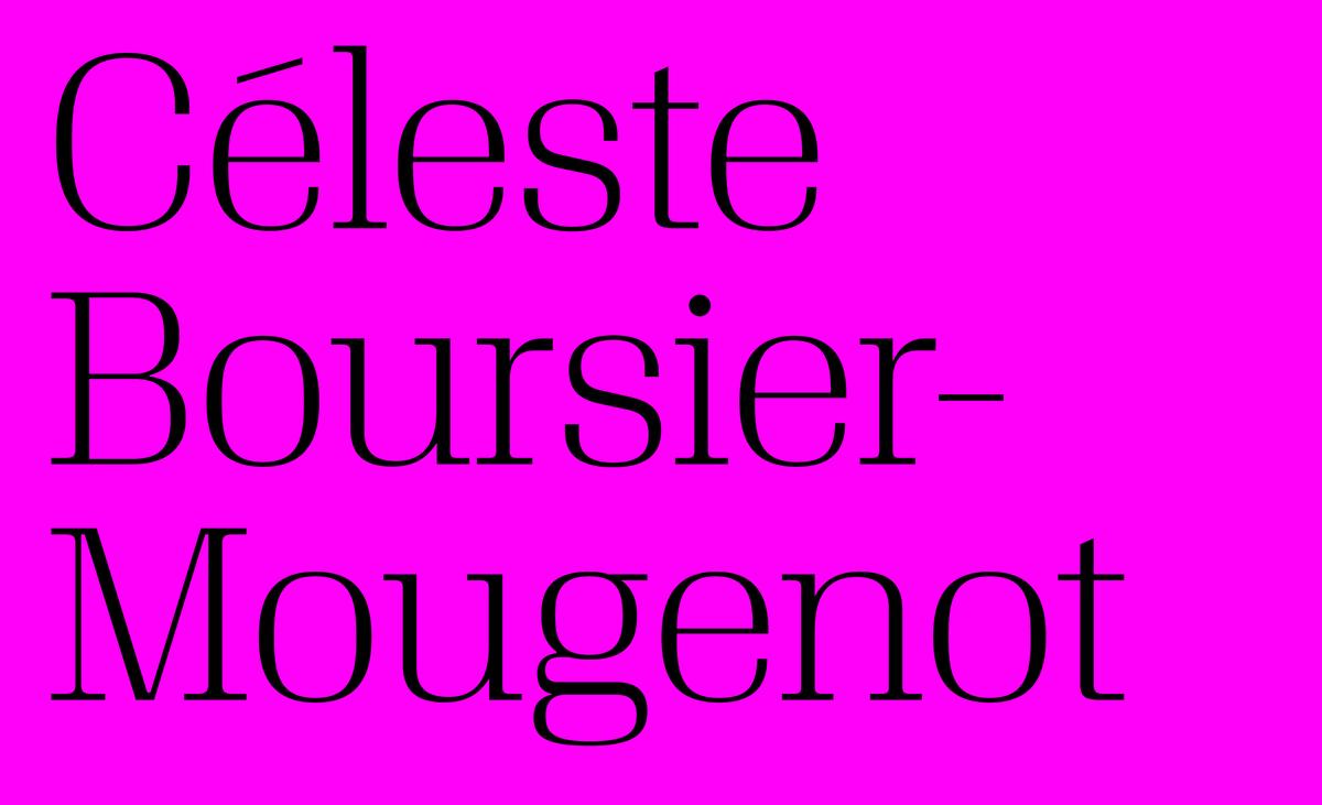
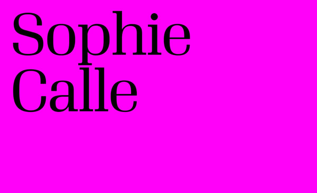
Like its all-purpose sibling Algebra, Algebra Display was inspired by the construction and proportions of Grotesks. Its details are influenced by many of the superelliptical serif families that helped define the aesthetic of the mid 20th century, particularly in central Europe. While many of these typefaces were staid in character, Algebra Display has an assertive personality and a contemporary air of brutalism: terminals and serifs abruptly sheared off; solid, massive posture; rational structure; graphical texture; and consistency prioritized over humaneness.
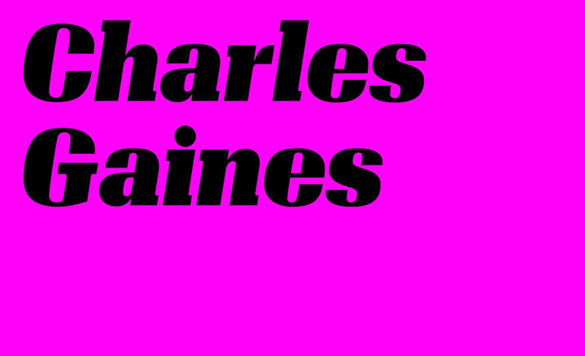
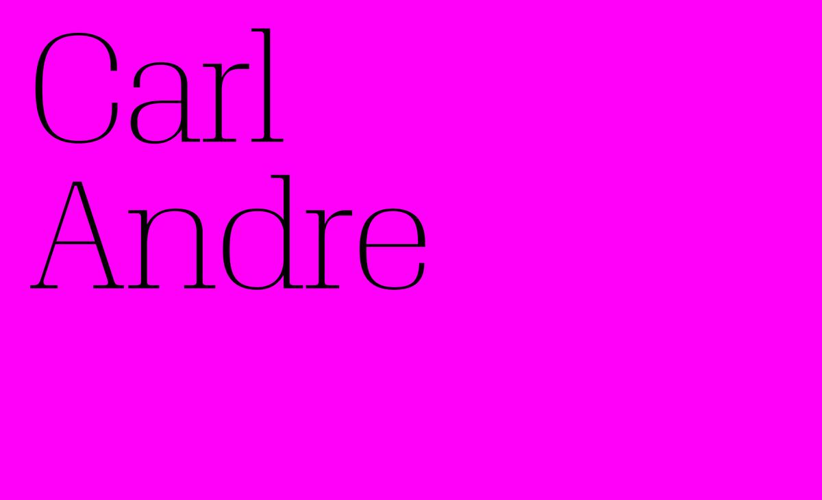
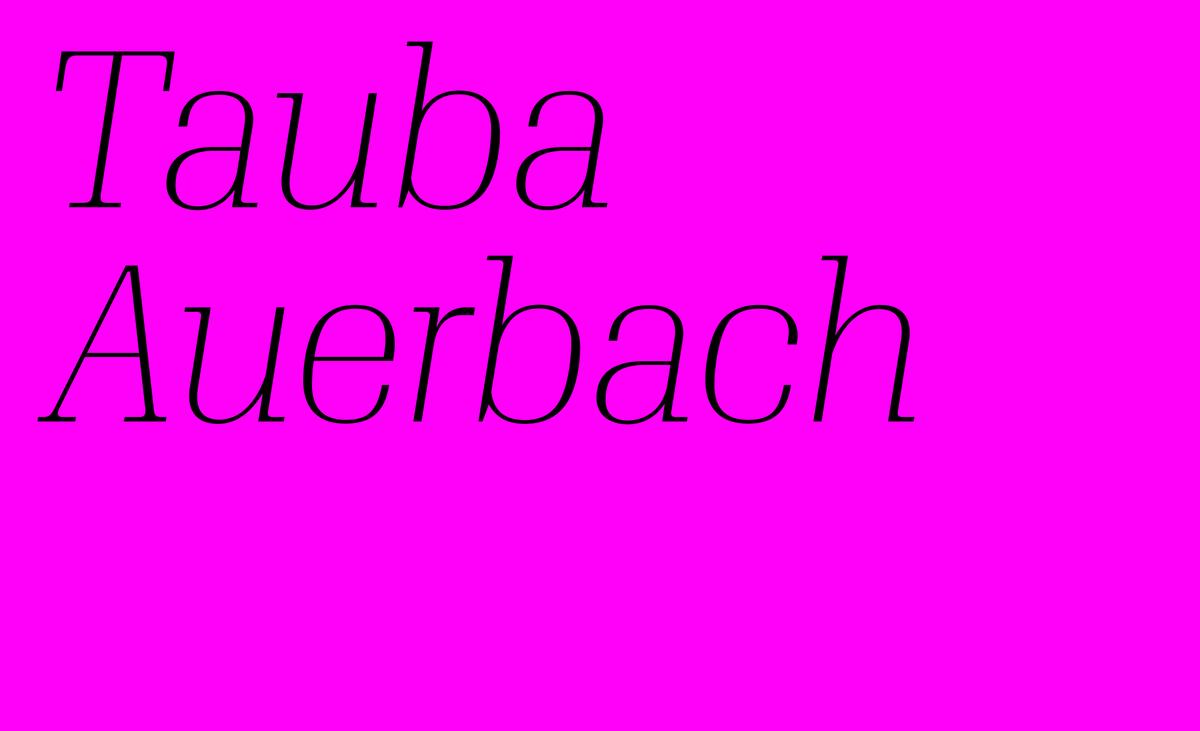
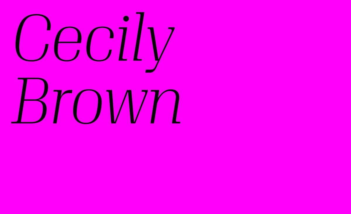
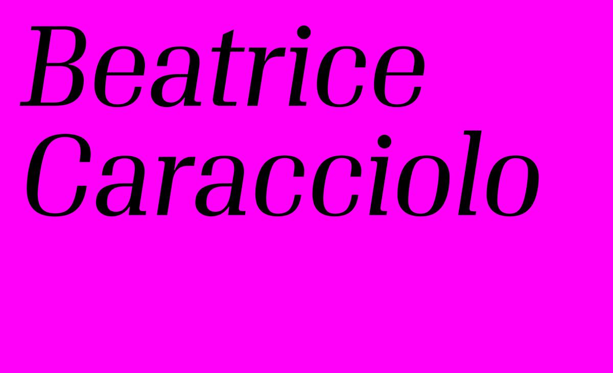
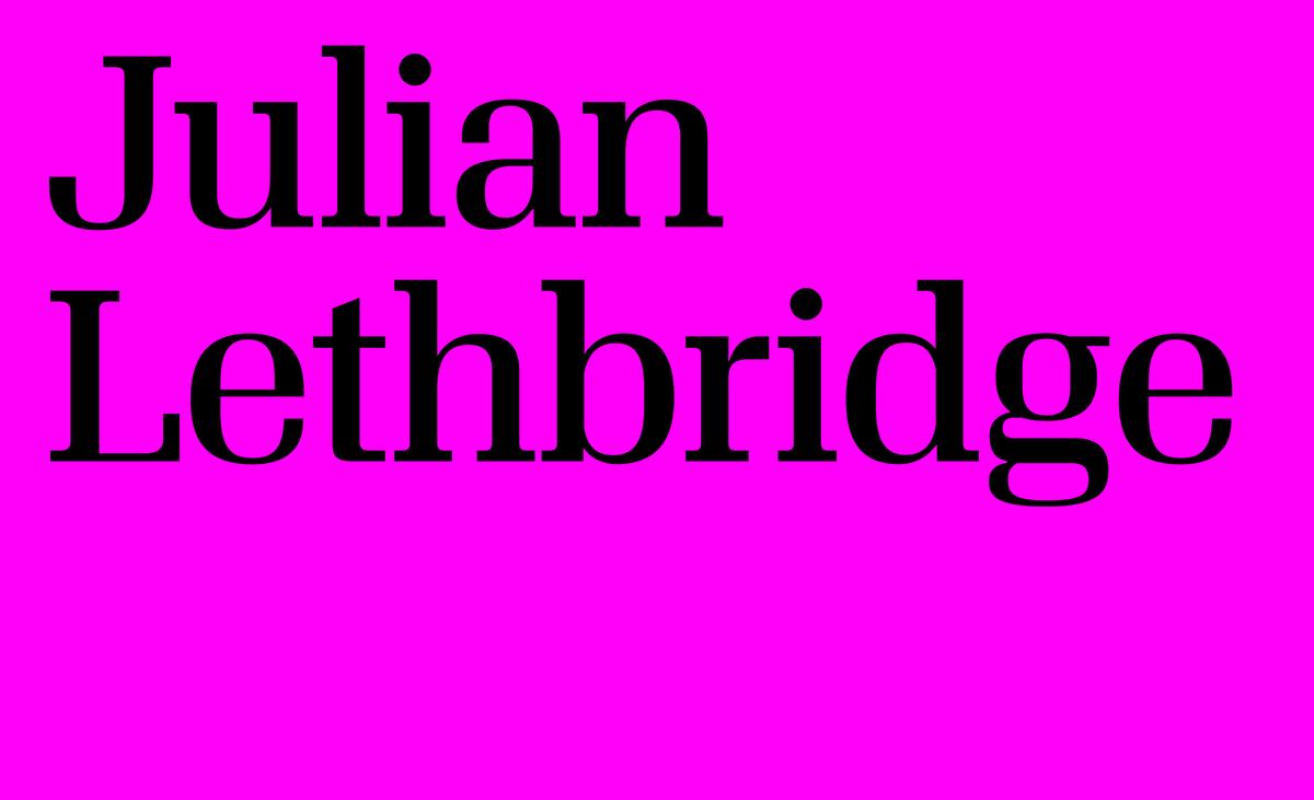
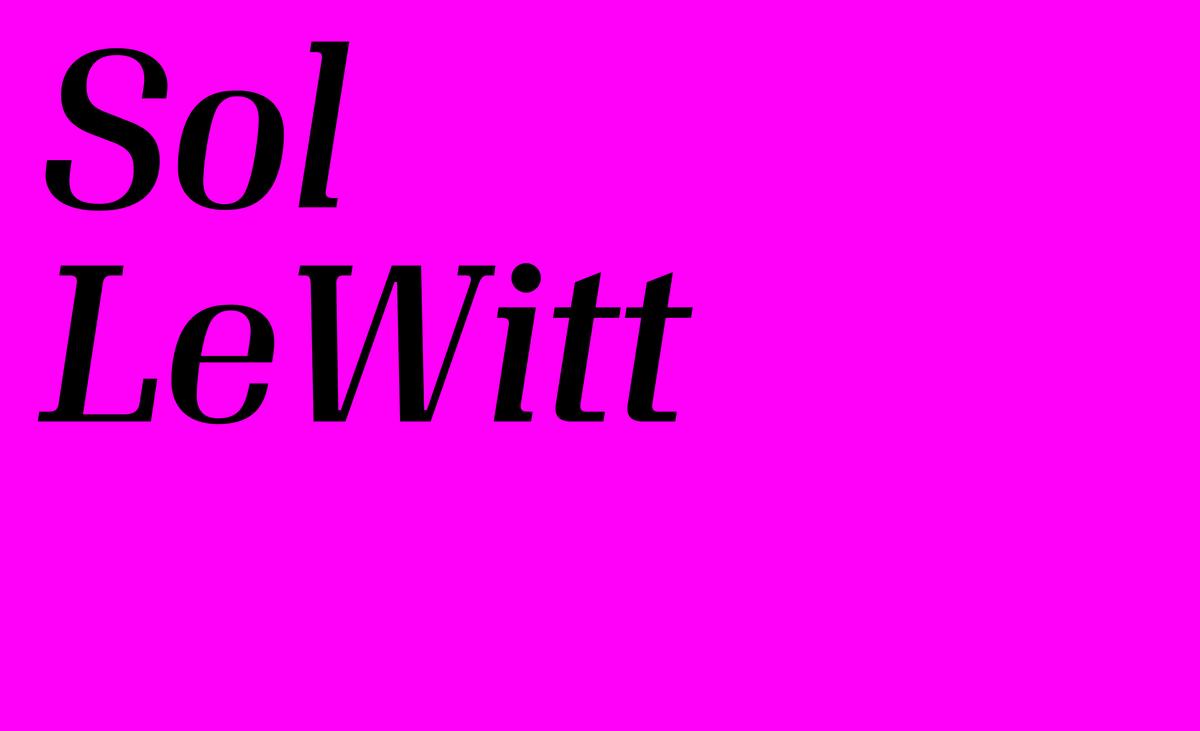
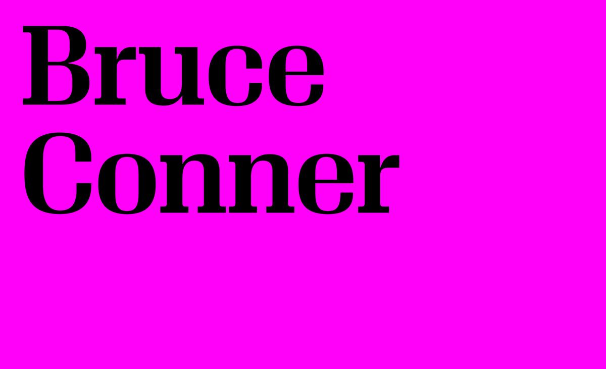

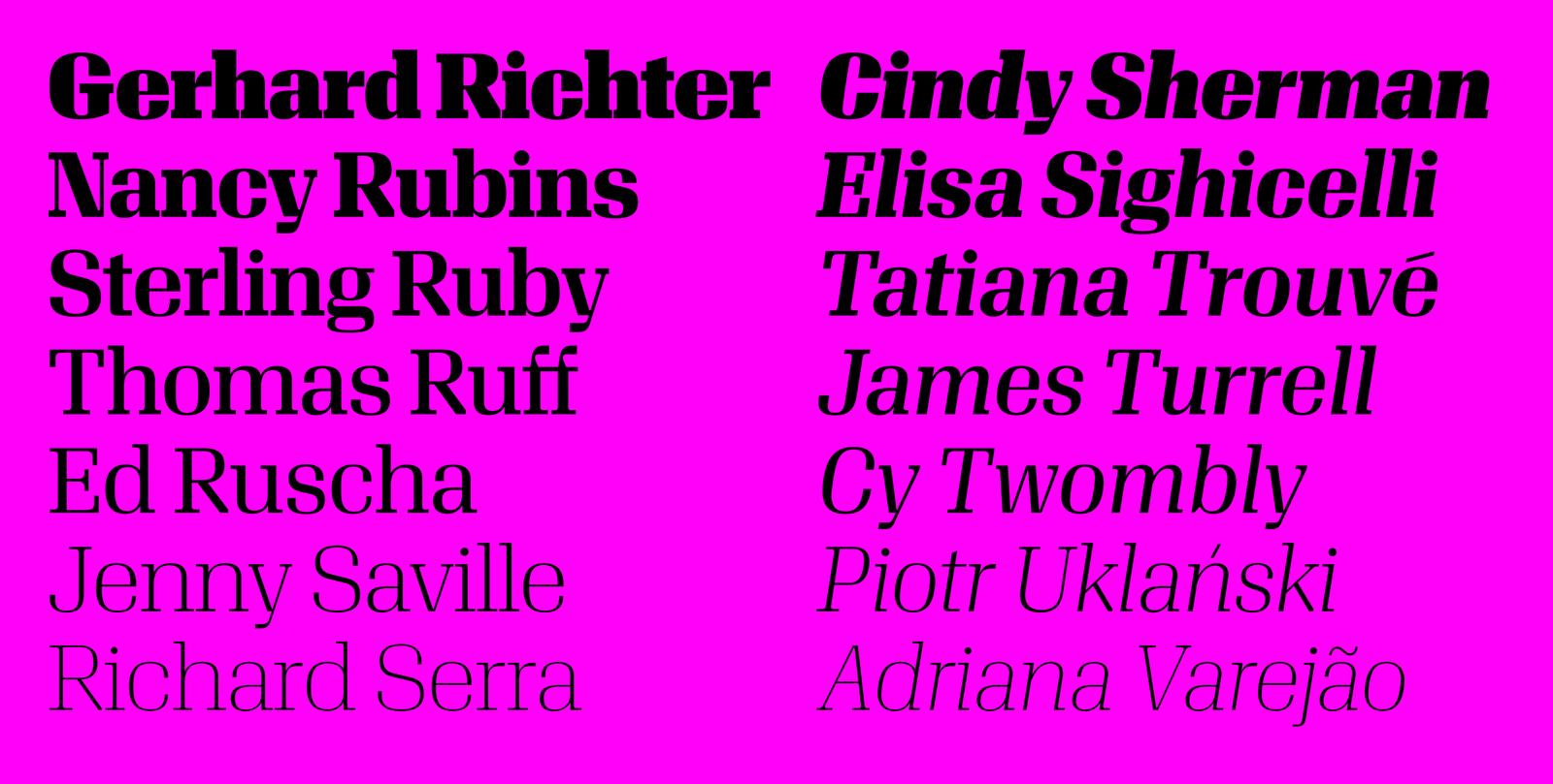
Algebra Display covers many tones across its range of seven weights: icily pretty in the light weights, bracingly strange in the heaviest weights, and sophisticated in between, with a refreshing simplicity in the italics.
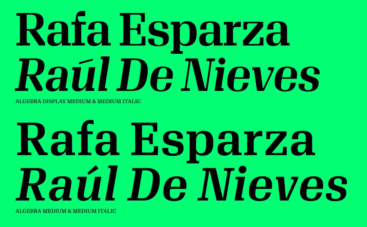
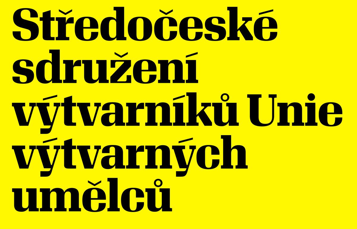
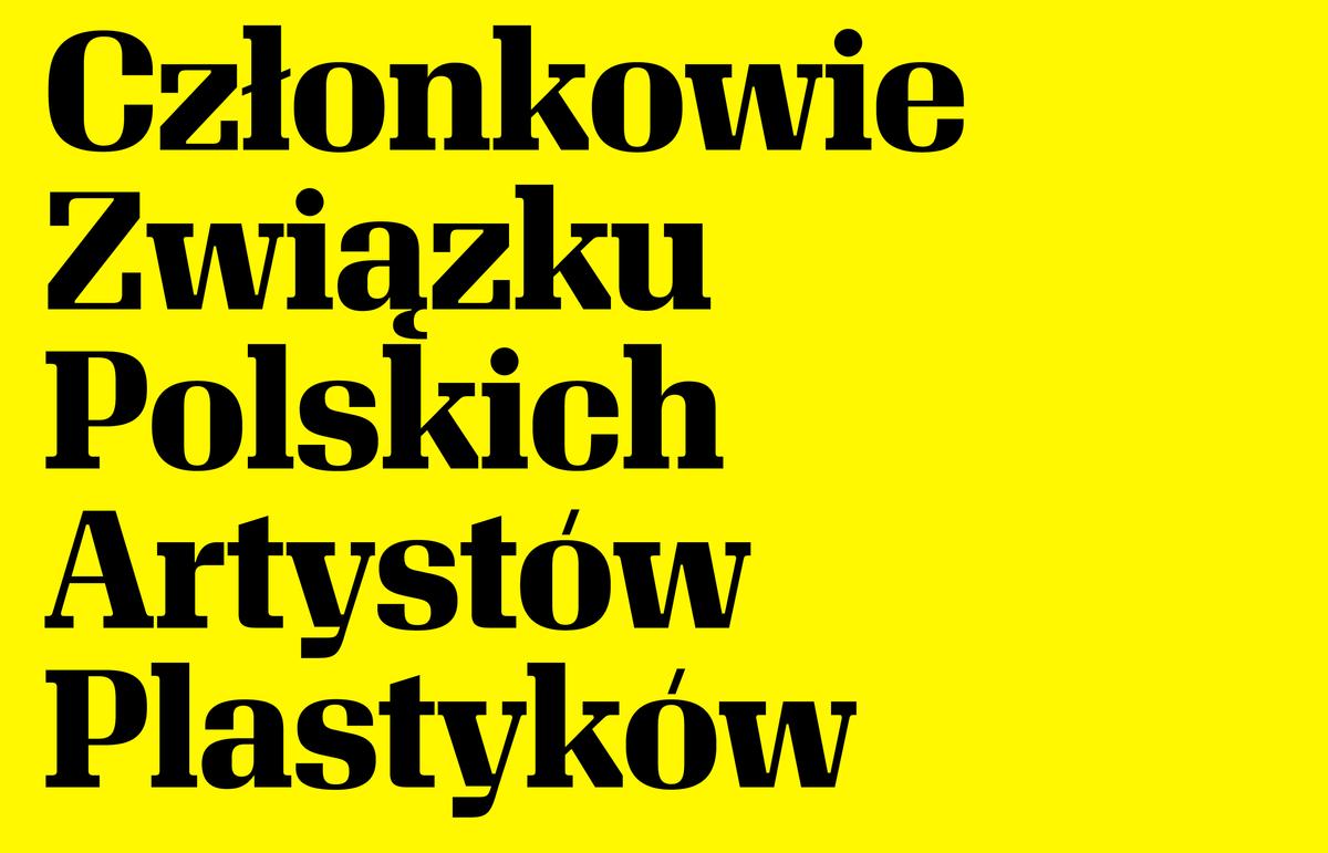
Compared to Algebra, Algebra Display is both higher and lower in contrast: the serifs gain weight, while the thin strokes are thinner, giving an unexpectedly active texture compared to a typical low-contrast slab serif. The serif bracketing is tight, giving subtle elegance without introducing softness. Accents and punctuation are thin, adding texture and keeping focus on the letterforms. Algebra Display and Algebra are an excellent match, with the active and kinetic quality of the display playing well against the smooth and even texture of text.
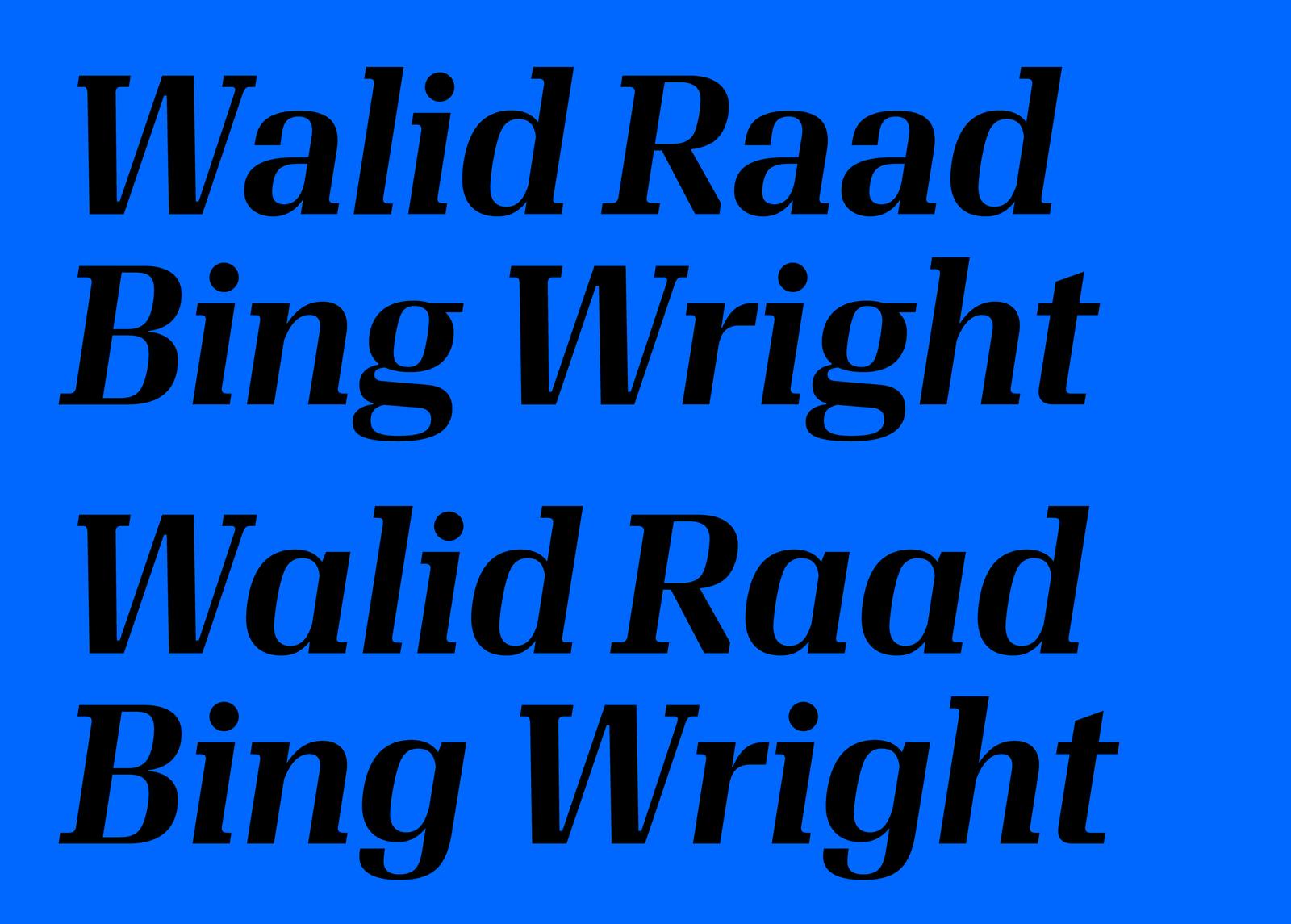
Where Algebra has many lowercase alternates in its italics, Algebra Display only has alternate forms for a and g.
Algebra Display is available for desktop, web, and app use, and all styles have been manually hinted for optimal rendering on screen in Windows.
Related fonts
