Focal by Greg Gazdowicz

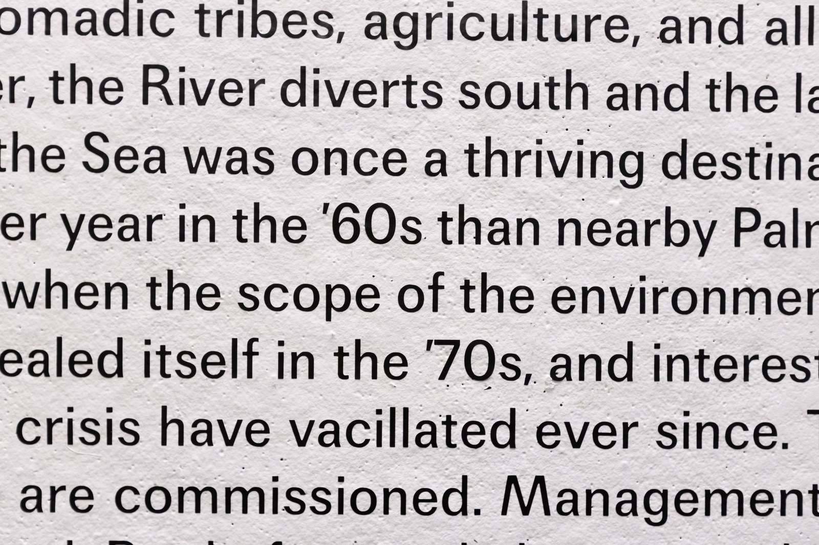
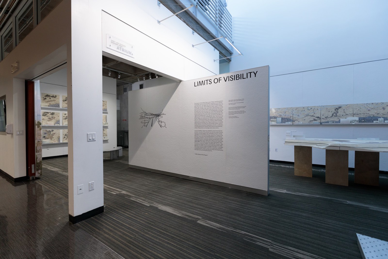
Focal cut in vinyl and applied as wall text for Gillian Shaffer Lutsko’s Limits of Visibility exhibition at USC Architecture. Exhibition design by Willie Ip. Image: Pavel Poboruev.
Focal is an unusual sort of revival. Instead of resuscitating a specific typeface or genre, Greg Gazdowicz has chosen to revisit a period of softness: the particular iteration of phototypesetting practiced in the 1970s, which warped type in unpredictable ways and gave printed text a muted, lived-in feeling. Greg wondered if he could bring this soft, organic quality to type on both paper and screen.
Phototypesetting replaced hot-metal typesetting, which characterized itself by its fidelity. Because lead sorts were cast from matrices and then printed directly onto paper, a precise approximation of the original design was (for the most part) preserved. But although it was lighter, cheaper, and quicker than metal typesetting, phototypesetting was also more abstracted and complicated, with a greater number of steps and thus more opportunities for “failure” or deviation from the intended design that ink traps could only go so far to forestall. Photographing letterforms at high speed tended to warp junctions and round corners. Type lost sharpness as it scaled up.
But there was a warmth to this brief interregnum between metal and digital typesetting that interested Greg. He began forming an idea of a typeface that existed in an uncanny valley of something familiar being printed, overprinted, xeroxed, and copied again and again, taking on a certain patina while remaining readable. So he started exploring how Franklin Gothic and other designs in its orbit like Trade Gothic and News Gothic appeared on seventies Varityper machines, complete with the large x-height, gentle contrast, slightly angled terminals, and tight spacing that became popular during that period.
Greg soon realized that he didn’t simply want to make a survey of American gothics seen through a Varityper lens; that would be letting genre get in the way of effect. What he really wanted was to capture a vanished era of softness. He changed course and began to question the tacit conventions that have grown up around sans serifs. The deliberately low(ish) x-height, for example, is out of sync with the post-ITC enlarged counterforms that have defined the past two decades of type design. Other idiosyncrasies like the wide-stance M, the spurless G, and the curvy leg of the R distance Focal from the more constructed sans serifs in the Commercial Type library like Atlas Grotesk and Graphik.

An early version of Focal on the wall at USC Architecture.
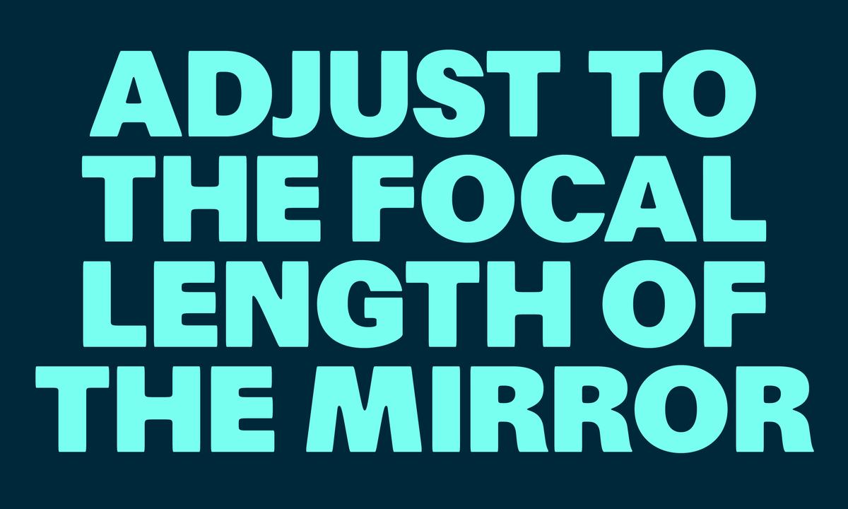
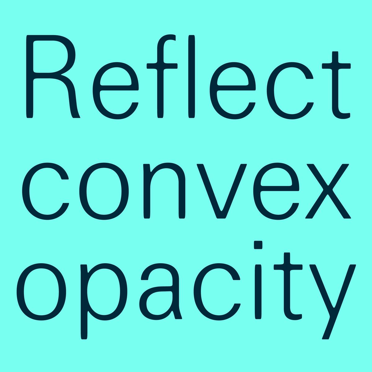
In Focal, every corner is rounded—but not all corners are rounded alike. Inner corners have a relatively consistent radius; outer corners are vertically elongated, echoing the stretching that often occurred during the photographic process. This softness makes Focal seem slightly awry, slightly off-register, giving it an out-of-scale quality at display sizes and a homey, broken-in feeling in running text.
By immersing himself in the visual and technological history of the period, thinking about the general relationship of softness and roundedness to letterforms, and challenging the unwritten rules that have accumulated around sans serifs, Greg has produced a fresh design that feels perhaps more European than American—a familiar but forgotten grotesk. Consider pairing it with a serif that is as sharp and refined as Focal is mellow: Feature Display Condensed, for instance, which also references seventies typesetting; or Ionic Modern, which attempts to capture the spirit of both the crisp, sturdy Ionics that emerged in the first half of the nineteenth century and the very high-contrast Moderns of the Victorian era.


