Focal, a sans serif in the uncanny valley of softness
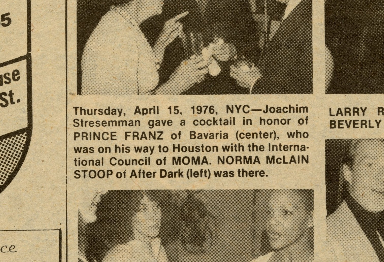
This page from Interview magazine in 1976, typeset in Helvetica, is a good example of the particular kind of softness seen in the typesetting of the era.
Type is in many ways a fashion business. Taste is cyclical: x-heights rise and fall like hemlines; preferences for spacing expand and contract like people’s penchant for wide-leg over skinny jeans. Type designers mine the past for ideas while—ideally—finding something fresh and relevant to say. With Focal, Greg Gazdowicz has created an unusual kind of revival. Rather than bringing back a particular typeface or genre, Focal attempts to capture the particular quality of a lost era of print production: the 1970s, when the hot-metal era gave way to phototypesetting, and type as a whole lost some of its sharpness.
Importantly, this softness was neither mechanical nor entirely consistent, making it entirely different from the rounded typefaces that first emerged in the middle of the nineteenth century, typified by Caslon Rounded and other typefaces we’ve revived for Commercial Classics; or later typefaces that made allowances for roundness in their very structure, like VAG Rounded and Frankfurter.
Focal started out as a somewhat faithful rendition of the way Franklin Gothic and its loosely related cousins (Trade Gothic, News Gothic, et al.) appeared on the Varityper, with the expected large x-height, tight spacing, gentle stroke contrast, and slightly angled terminals. “I had an idea of a typeface existing in an uncanny valley of something familiar being printed, overprinted, or xeroxed and copied over a few times until it starts to become something more organic and warm,” Gazdowicz wrote in some early notes for this essay. He soon realized that conflating medium and genre was getting in the way of this concept. “The more I worked on the idea in the direction of American gothics, the more I started realizing I didn’t want to just make a survey of American gothics seen through a Varityper lens; I wanted to encapsulate an era of softness,” he wrote. “So I had to find a new model for the concept to mesh with.”
Gazdowicz realized that what he was responding to was the particular quality of phototypesetting, and how each step of the production process in the photo era introduced a slight softness in the type forms. For offset printing, the master type drawings were shot onto film masters, which were then duplicated for distribution. From the dupes, galleys were typeset on photo paper and pasted up in camera-ready mechanicals, from which negatives were made. Those were then imposed and used to expose printing plates—after which, finally, the type was printed. The softness could be compensated for through ink traps, but never fully avoided.
Because Gazdowicz has spent so much time reading crisp, precise letterforms on screen, the warm imperfections of phototype on paper deeply appealed to him, and he was curious to see if he could bring this subtle organic quality to type on screen as well as on paper. In a private talk at a New York design studio in February 2024, Gazdowicz said: “The feeling I wanted for this typeface couldn’t be achieved by just simply applying a unified rounding effect and calling it a day.” Every corner is rounded in Focal, but not all corners are rounded equally: inner corners have a more consistent radius, while the outer corners are vertically elongated, better capturing what happened in the photographic process.
Without evoking a specific typeface, Focal imparts a feeling of a familiar but forgotten grotesk, perhaps more European than American. Its relatively small x-height is out of step with the large post-ITC counterforms that have defined the past two decades of type design, both for fashionable and functional reasons, making it stand out among recent sans serifs. Its structural quirks, such as the splayed M, spurless G, and the gently curved leg of the R, push it away from the more rational and systematic sans serifs in our library like Graphik and Atlas Grotesk. One point of inspiration was Gert Wunderlich’s Maxima, designed in the 1960s and first produced by the East German foundry VEB Typoart in metal in 1970, before being adapted for phototypsetting and early digital typesetting. Gazdowicz also looked at Adrian Frutiger’s Univers, Bauer & Baum’s Folio, and Karlgeorg Hoefer’s Permanent, mainly to see how different designers had handled the heaviest weights with their relatively small x-heights.
Focal achieves this impression of something familiar yet slightly off, a sans serif from decades ago whose name is on the tip of your tongue, in part by sidestepping the unspoken conventions that seem to have appeared around sans serifs. In his notes on the project, Gazdowicz wrote: “Despite the lower x-height being from an older era, I feel like it brings some freshness right now by going against what has become pretty common.”
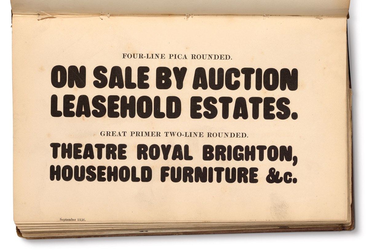
Caslon Rounded in Specimen of Printing Types by Henry Caslon (1842).

Like Caslon Rounded, Caslon Doric Condensed Round, drawn by Paul Barnes and Thomas Bouillet, has fully rounded endings.

Punch, by Paul Barnes with Tim Ripper, applies an effect similar to a slab serif, at least in the lower case.

Duplicate Sans Round, by Christian Schwartz and Miguel Reyes, attempts to look “rounder than round” by adding ball terminals in addition to the fully circular stroke endings.

Stag Sans Round, by Christian Schwartz and Ross Mills, has flat stroke endings with rounded corners.

Blanchard, by Paul Barnes with Tim Ripper, has even smaller radii on its corners, but all of its corners are rounded nonetheless.
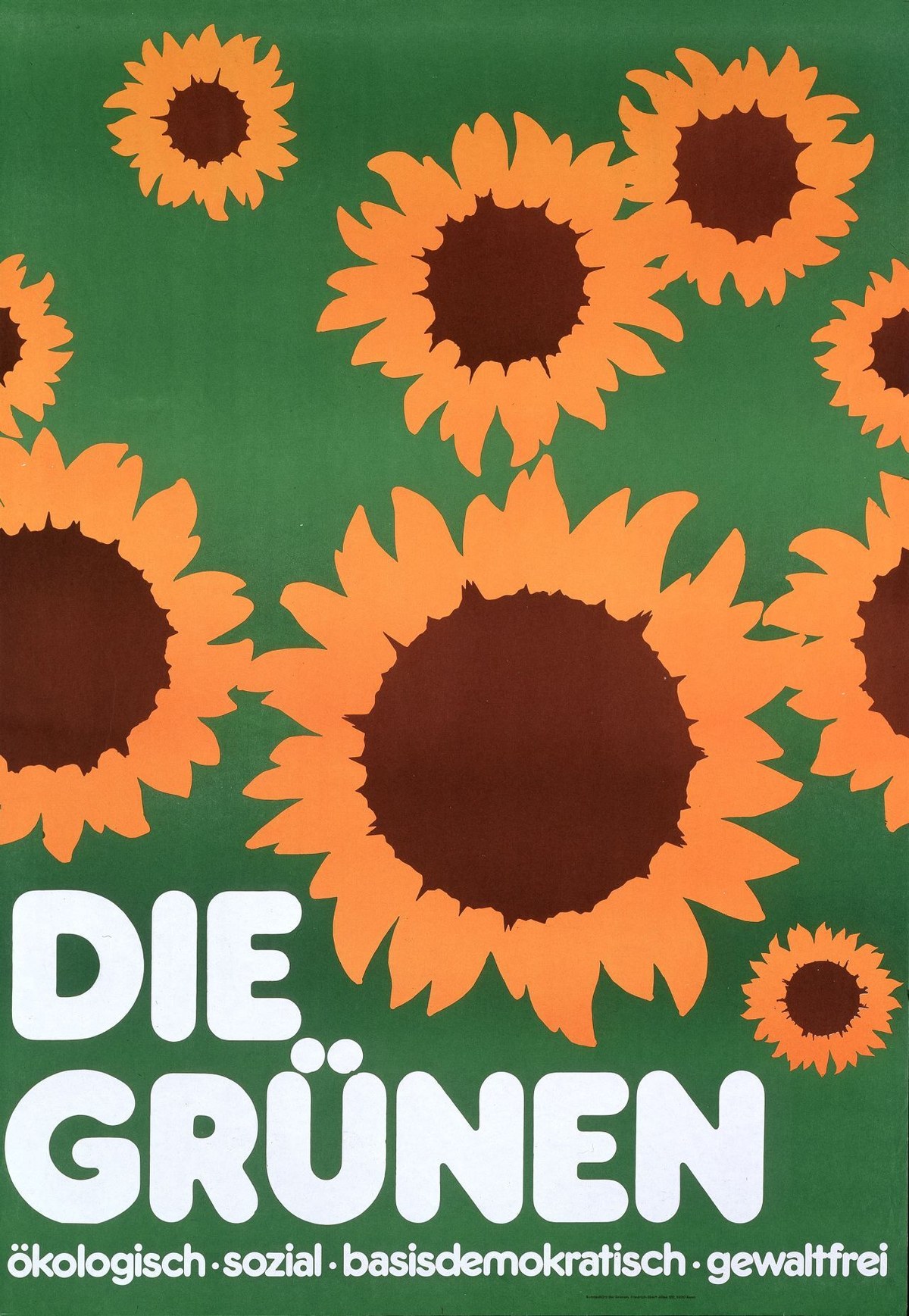
Frankfurter, designed by Bob Newman at the Letraset Studio in 1970 and used in this 1983 poster for the German Green Party designed by Grafik Werkstatt Bielefeld, is a great example of a typeface designed with rounding in mind from the outset, rather than round endings being applied after the fact.
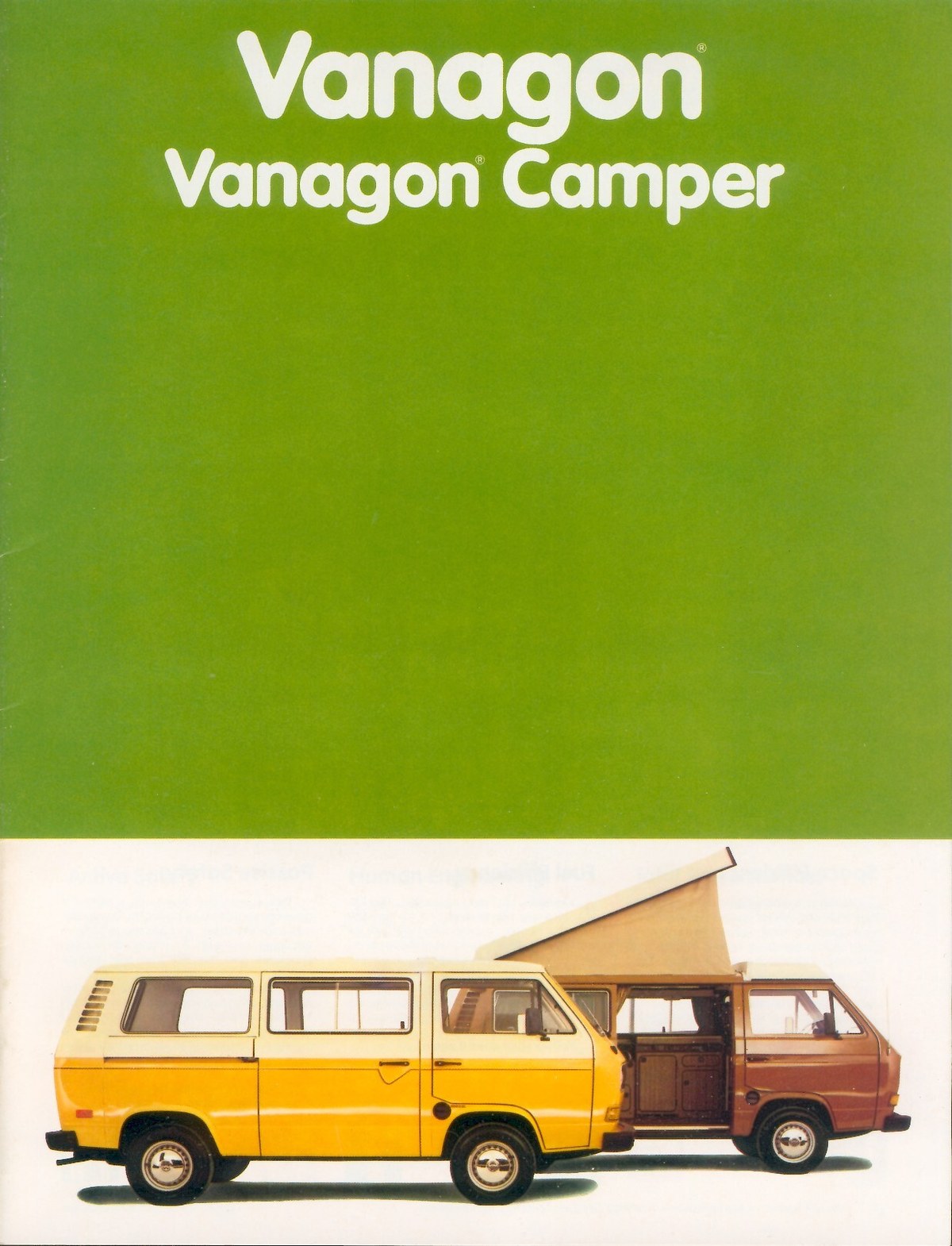
VAG Rounded, a typeface developed at ad agency GGK Düsseldorf and introduced as Volkswagen’s worldwide brand typeface in 1978, was also drawn with roundness as an integral part of the design.

Though originally developed for an auto company, VAG Rounded has over time become associated with early learning, as typified by this poster from Sesame Workshop.
Elsner & Flake’s digital version of Maxima in use in the spring 2024 issue of LOEWE, Loewe’s house publication, with art direction and design by Thomas Petit (BRX 41).
Folio Fett, designed by Konrad Friedrich Bauer and Walter Baum for the Bauer Type Foundry (1957).
An early version of Focal applied as wall text. Exhibition design by Willie Ip.
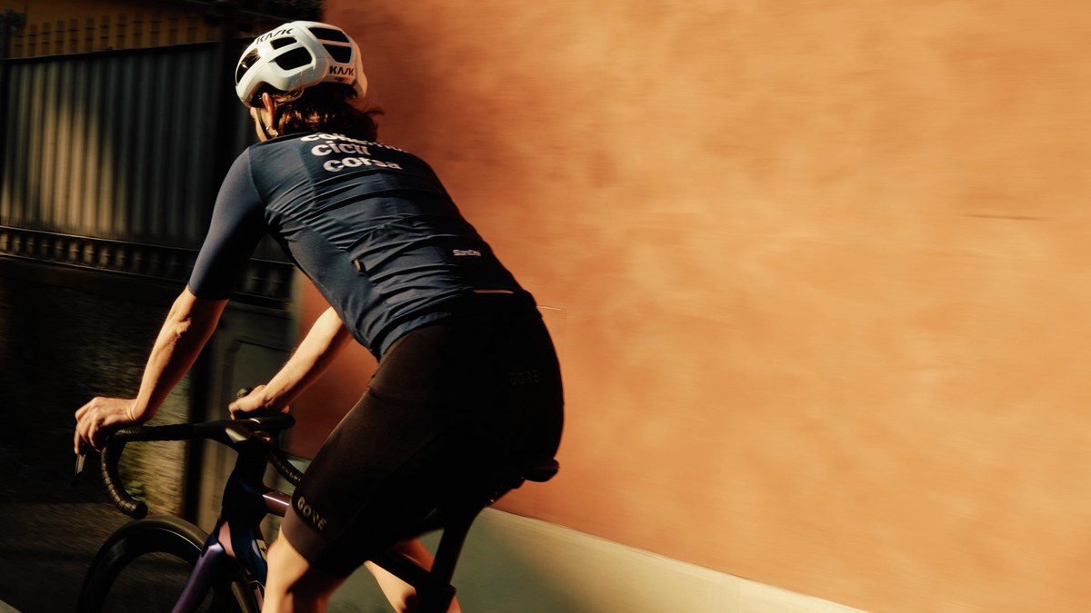
Francesco Franchi chose Focal as the primary typeface for the Italian cycling collective Collettivo Cicli Corsa.
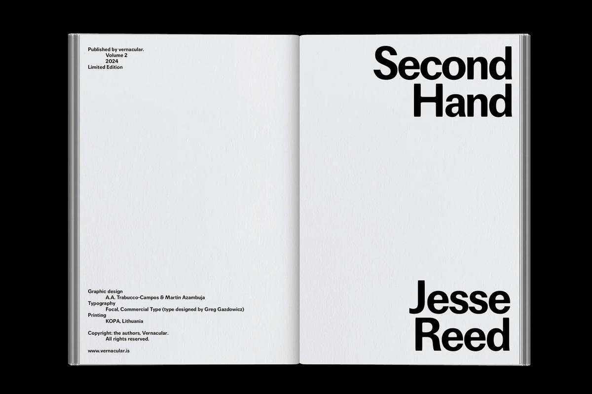
Andrea Trabucco-Campos and Martin Azambuja put Focal to use in their design of Jesse Reed’s book Second Hand.
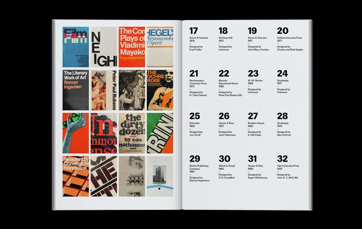
A spread from Jesse Reed’s Second Hand.
Focal looks good big: Chloe Scheffe chose it for titles and other large text blocks in Elastic Magazine.
Focal set big in Elastic Magazine.
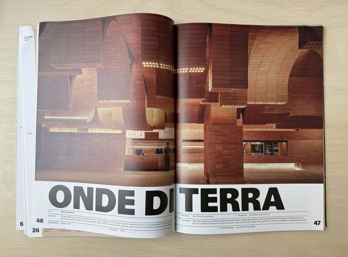
Focal in Domus.
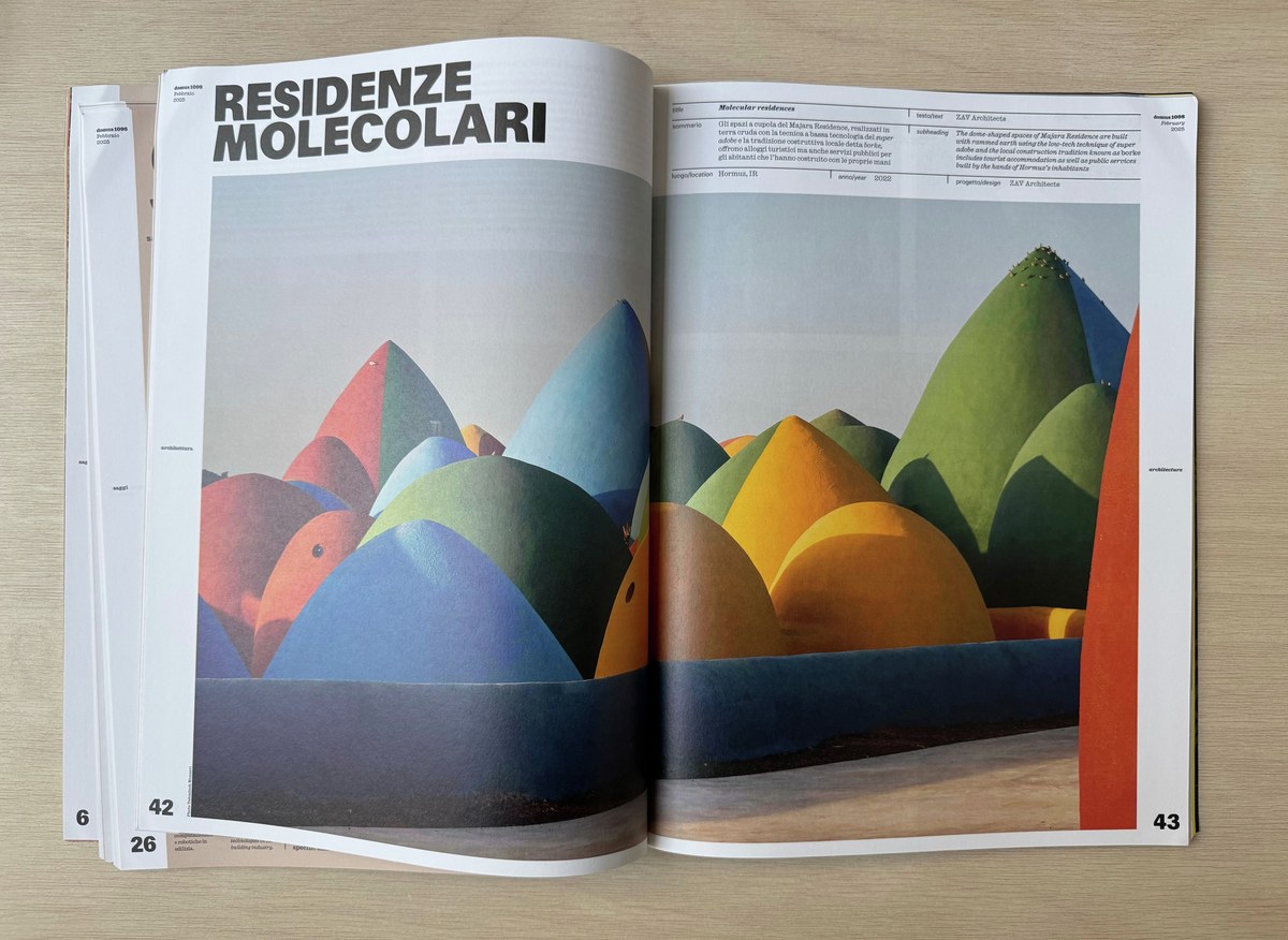
Focal in Domus.
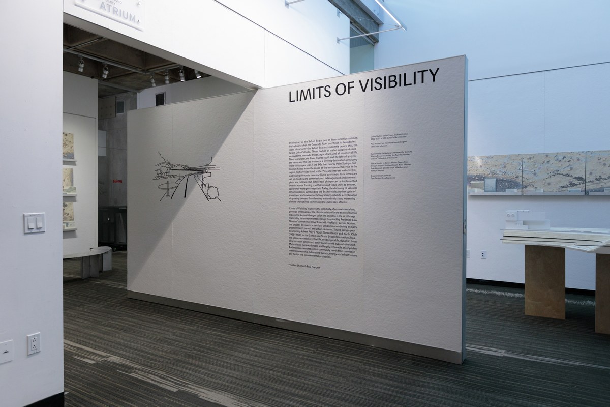
An early version of Focal used in the exhibition graphics for “Limits of Visibility” at the USC School of Architecture. Exhibition design by Willie Ip. Photos: Pavel Poboruev.
An early version of Focal applied as wall text. Exhibition design by Willie Ip.
Francesco Franchi chose Focal as the primary typeface for the Italian cycling collective Collettivo Cicli Corsa.
Andrea Trabucco-Campos and Martin Azambuja put Focal to use in their design of Jesse Reed’s book Second Hand.
A spread from Jesse Reed’s Second Hand.
Fairly early on, Focal found an audience. Influential journalist-turned-creative director Francesco Franchi put it to work in La Repubblica and Domus; and Andrea Trabucco-Campos and Martin Azambuja decided that it was a perfect fit for their design of Jesse Reed’s book Second Hand. At a certain point, Gazdowicz also noticed that people were setting Focal quite large: Willy Ip used it for wall text for an architecture exhibition at the University of Southern California; Chloe Scheffe chose it for titles and other big text in Elastic Magazine. And that works: Focal’s soft corners and other structural idiosyncrasies give it a strange, out-of-scale quality at display sizes.
Nevertheless, Gazdowicz found himself wanting to create a nervier complement to Focal. A client project for lifestyle platform Emcee with Richard Turley of FOOD offered an opportunity to test the waters. Emcee needed a workhorse sans that would perform well at a range of sizes for its website and app; Gazdowicz initially proposed Focal, precisely because of its “small can be big” properties, but it was too polite: it felt small and timid in the image-heavy interface and wasn’t assertive enough for a wheat-paste campaign.
Gazdowicz started thinking about ways he could make Focal more functional for interface elements, while also giving it a bit of an attitude. It occurred to us that Frutiger’s Vectora might offer useful lessons in this regard, as would Futura Maxi, the family Victor Caruso designed for PLINC in 1960 to adapt Paul Renner’s Futura for changing tastes. I had long admired Frutiger’s final typeface, an early-nineties meditation on American gothics drawn for classified ads in newspapers; in fact, I drew a custom thin weight of it for O, The Oprah Magazine when I was at Font Bureau. In a way this brought us back full circle to Focal, which began as a study of Franklin Gothic, Trade Gothic, and News Gothic before swerving into more conceptual territory.

Focal Maxi was originally designed for the social shopping platform Emcee.
Jonny Sikov chose Focal Maxi as the primary typeface for Derrick Gee’s Solid Air.
Whereas in Focal Gazdowicz had celebrated the low x-height of pre-ITC typefaces like Maxima, he now pumped it back up to the vertiginous x-height of Vectora and Futura Maxi to enhance readability at smaller sizes and to make the face a little more pushy. The crossbars of t and f align with the x-height, resolving Vectora’s problem of slight unevenness without sacrificing readability. Gazdowicz also pruned the extenders (though, again taking a cue from Vectora, he nudged the ascenders just a hair above cap height) to allow for tighter setting. Along with the high x-height, Focal Maxi’s flat horizontal terminals add to the impression of fullness. The client liked it, and so did we. We released Focal Maxi in the summer of 2025.
Think of the Focal collection not so much as a text cut versus a display cut, but as complementary partners operating at slightly different frequencies—one very much in your face, the other less so—that can be used in a range of sizes, for different purposes. Despite sampling bits and bobs ranging from various American gothics to Wunderlich to Frutiger, Renner, and Caruso, the collection taken together is less a revival than an exploration of a historical accident: an ephemeral period in print history when technological limitations, paper, and type converged to produce an unpredictable softness and warmth on newsprint. Gazdowicz has used up-to-the-minute tools to harness phototype’s “flaws” in an effort to create beautiful accidents on purpose, and to provide some relief from the crisp digital perfection that permeates our everyday.
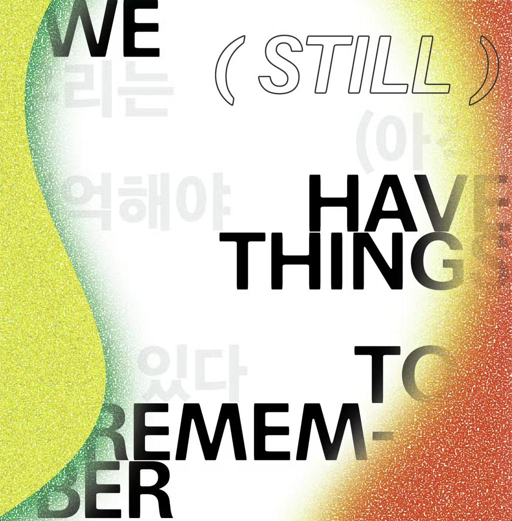
Focal used to promote the 15th Gwangju Biennale.