Control and flexibility
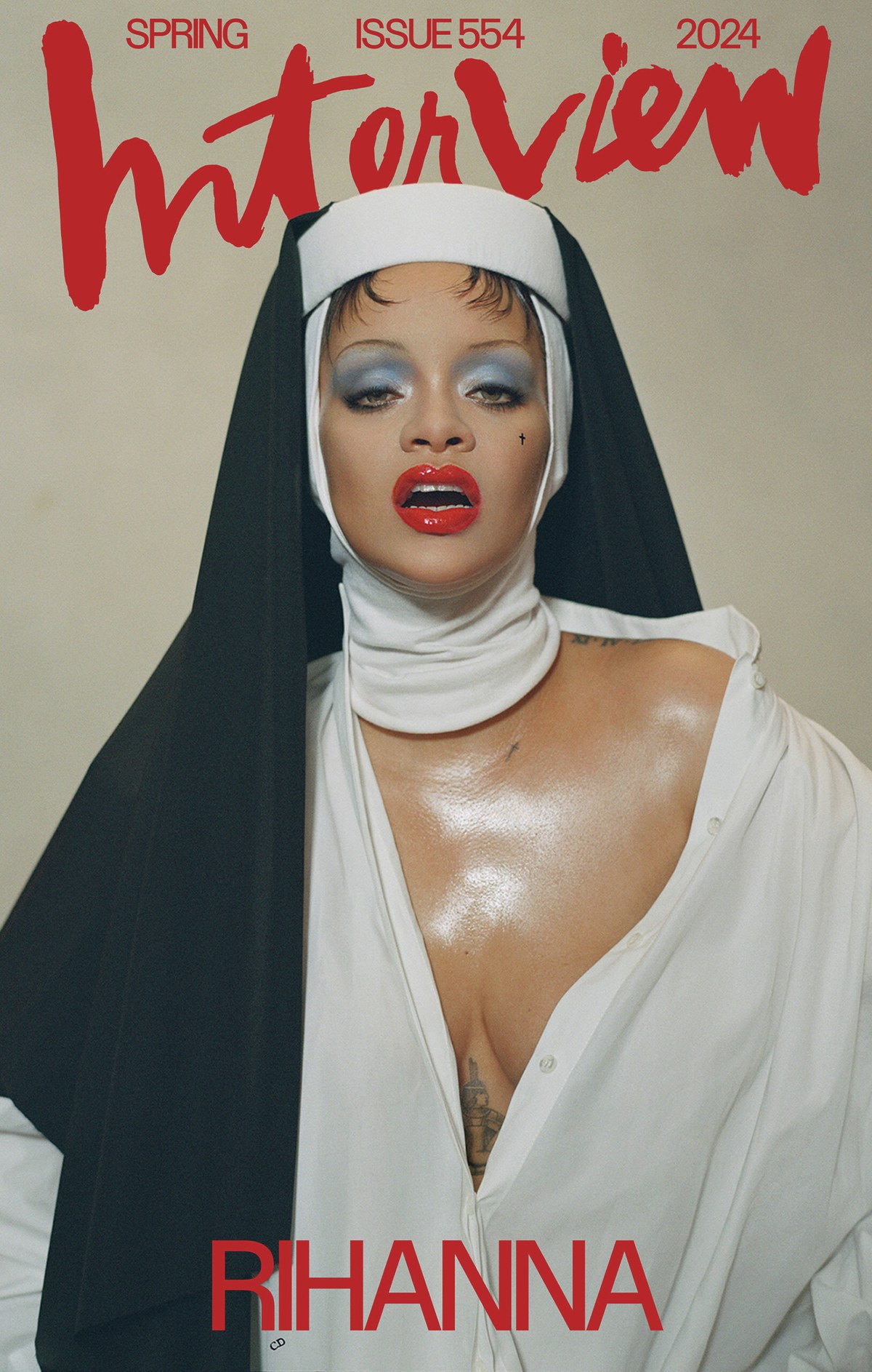
Interview cover, April 2024. Editorial and design director Richard Turley, art director Kurt Woerpel, designer Jack Vhay. Photograph by Nadia Lee Cohen.

Interview cover, September 2023. Editorial and design director Richard Turley, art director Kurt Woerpel, designer Jack Vhay. Photograph by Brianna Capozzi.
Control is an irreverent interpretation of Walter Käch’s sans serif lettering examples with no “correct” version. Use the variable font to adjust weight, contrast, apertures, and tracking as you see fit, and choose between an oblique and a cursive as a companion style. The family can express itself as a tastefully legible mid-century grotesk, or it can morph into a tightly spaced headline face straight out of the 1970s. This makes Control the first typeface I’ve drawn that felt like it needed to be a variable font to fully express the idea behind it.
Schriften Lettering Ecritures
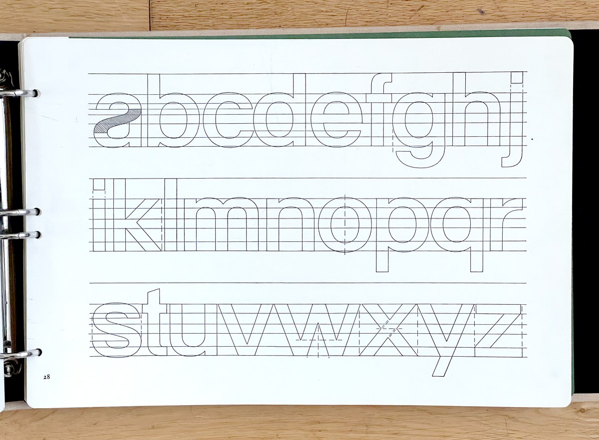
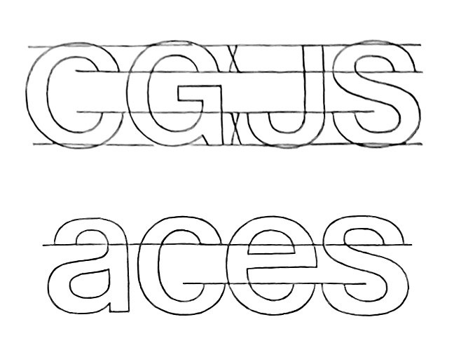
Construction of lowercase “block letters” as shown in Schriften Lettering Ecritures by Walter Käch, published in 1949 by Verlag Otto Walter AG Olten.
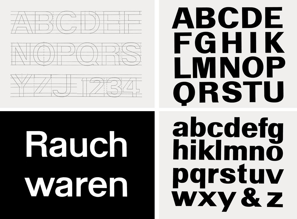
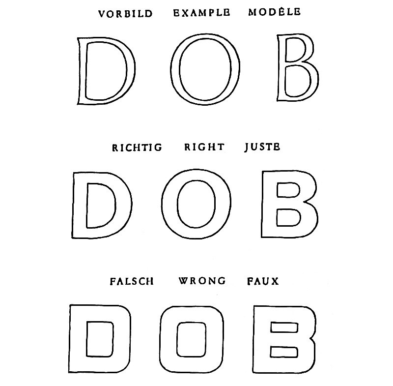
Additional excerpts from Schriften Lettering Ecritures by Walter Käch, published in 1949 by Verlag Otto Walter AG Olten, showing what he referred to as “block letters.” Clockwise from upper left: construction of normal weight upper case, bold upper case, bold lower case, and an example phrase showing recommended spacing.
At the ATypi conference in Amsterdam in 2013, I attended a lecture by Peter Bain, then a professor at Mississippi State University, about an influential lettering manual from 1949 with the trilingual title Schriften Lettering Ecritures, written and illustrated by Swiss designer and teacher Walter Käch. Clear advice on construction, contrast, proportions, and spacing are supplemented with example alphabets. Starting with Roman capitals, Käch moves briskly through Rustica, Batarde, and Fraktur up to then-contemporary styles, including a set of sans serifs (“block letters”, in Käch’s terminology) that bear a striking resemblance to a proto-Univers, nearly a decade before his student Adrian Frutiger designed this iconic grotesk family.
One thing that struck me was how much leeway this manual left for the graphic artist, letterer, or sign painter who would follow Käch’s examples. This was not like the later Lettera, where the alphabets were meant to be photostatted and pasted up into headlines; this was a jumping-off point. The letterforms were not set in stone.
I came back to Käch’s block letters in 2017 when Berton Hasebe and I were working on a pair of commissions for T: The New York Times Style Magazine. I sketched a loose interpretation of the light and bold weights, then experimented with closing the apertures, with angling them more like Akzidenz Grotesk, and with higher and lower contrast in the heavier weights. Our clients wanted to go in a different direction, selecting what would later become Review, so I put the drafts aside, revisiting them every so often to see if I could figure out what I wanted from the typeface before coming back to the project in earnest in 2022 for a refresh of Interview magazine. I spent a day in Interview’s archive with the magazine’s design director, Richard Turley; thinking about how the 1970s era of Tight Not Touching (TNT) Helvetica headlines enlarged to fit the full width of the spread helped crystallize for me what Control could do best.
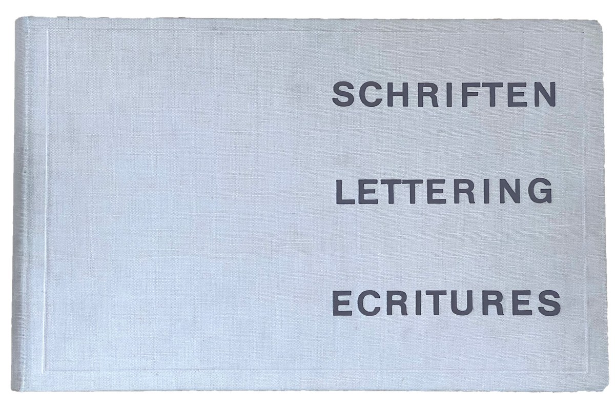
Cover of the Schriften Lettering Ecritures binder, written and illustrated by Walter Käch, published in 1949 by Verlag Otto Walter AG Olten.
In addition to the large showings of alphabets, Schriften Lettering Ecritures included recommendations for spacing, proportions, and alignments of terminals, as shown here.
In addition to the large showings of alphabets, Schriften Lettering Ecritures included recommendations for spacing, proportions, and alignments of terminals, as shown here.
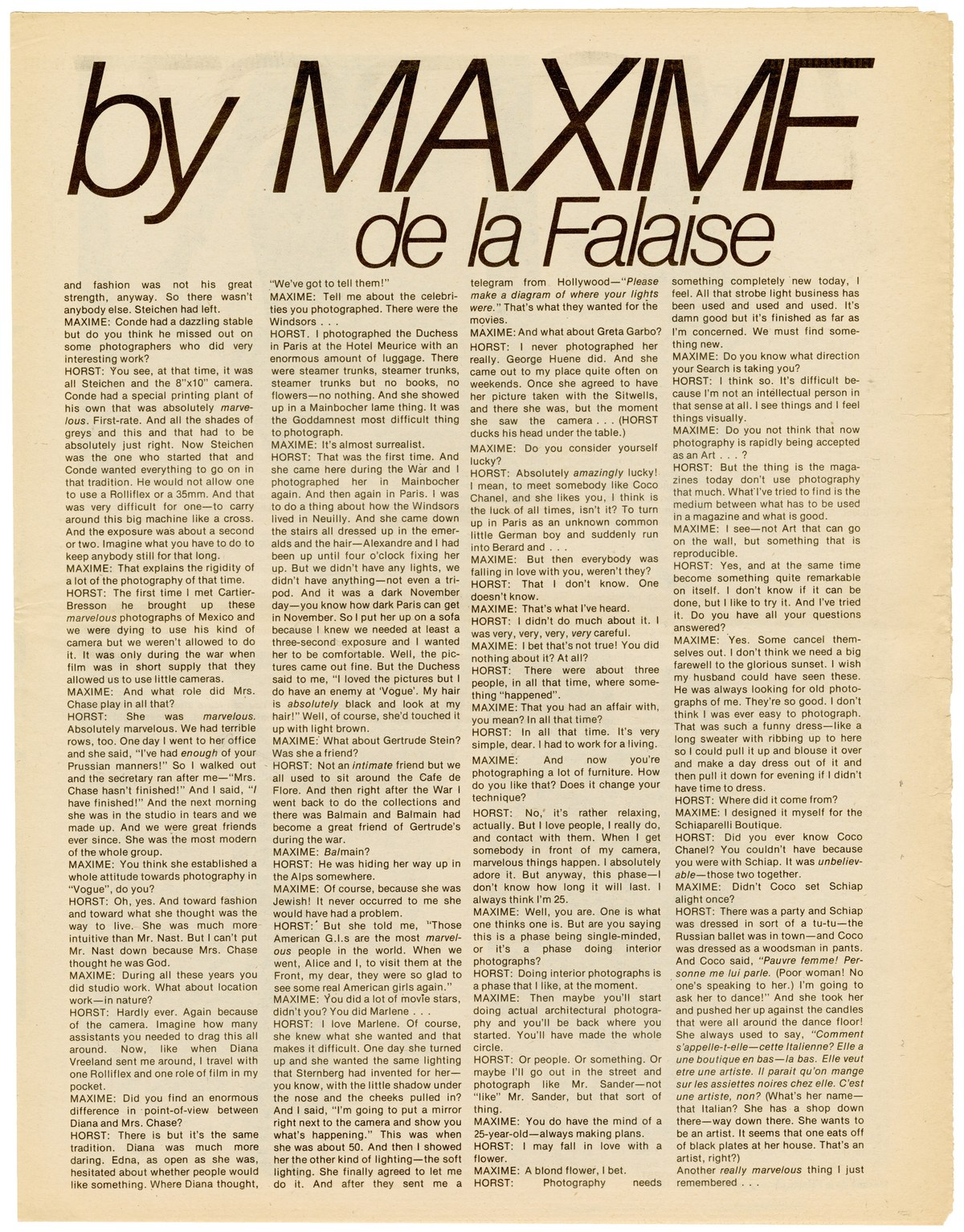
Page from Interview, mid-1970s.
Sketch by Christian Schwartz for T, September 2017.
Sketches by Berton Hasebe and Christian Schwartz for T, September 2017.
Cursive, Oblique, Italic
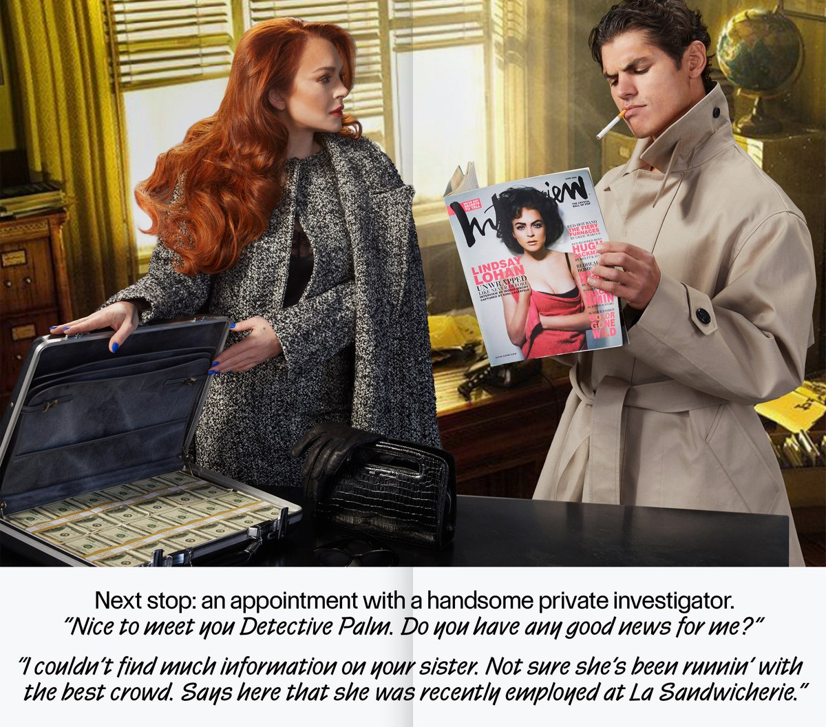
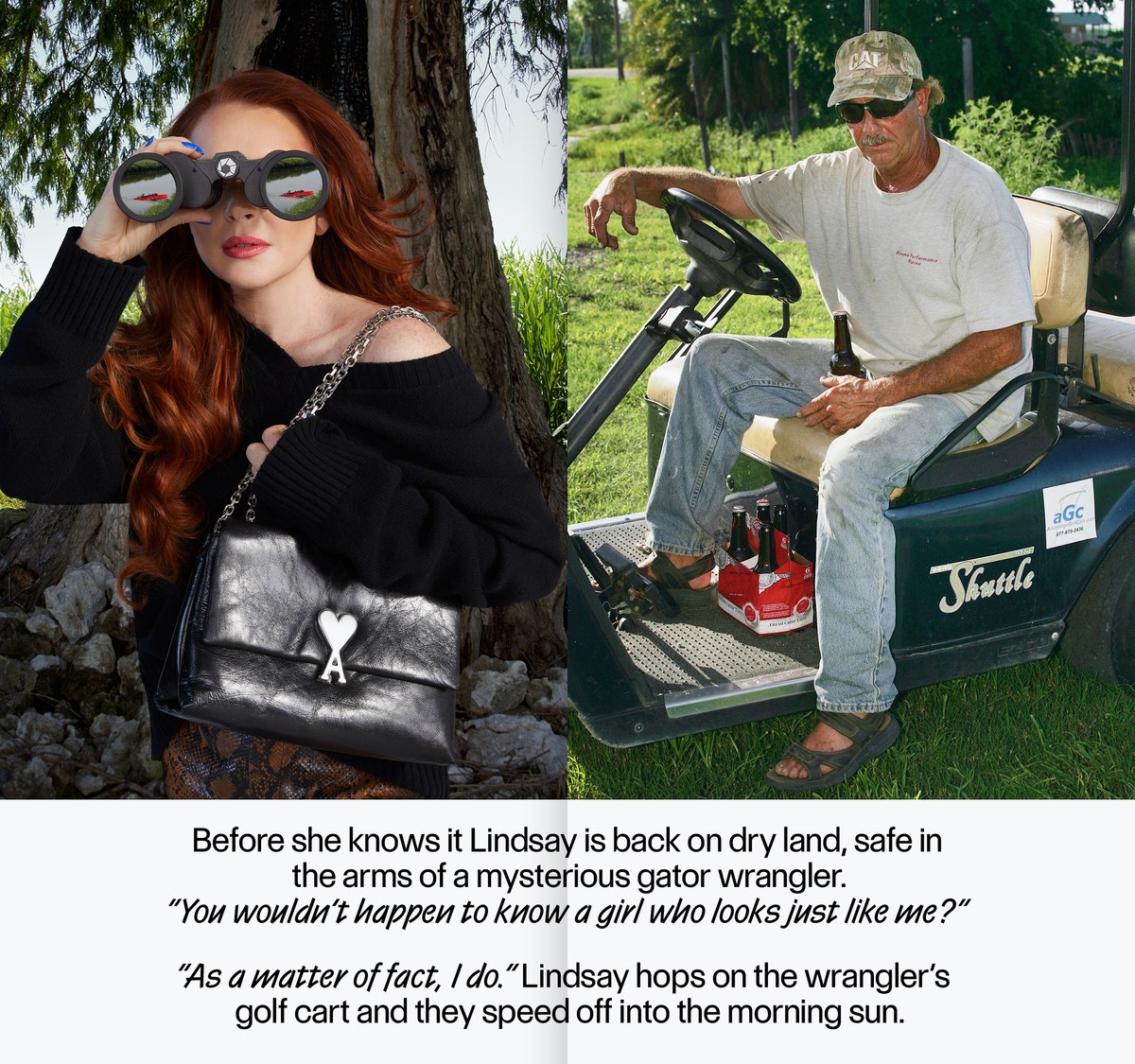
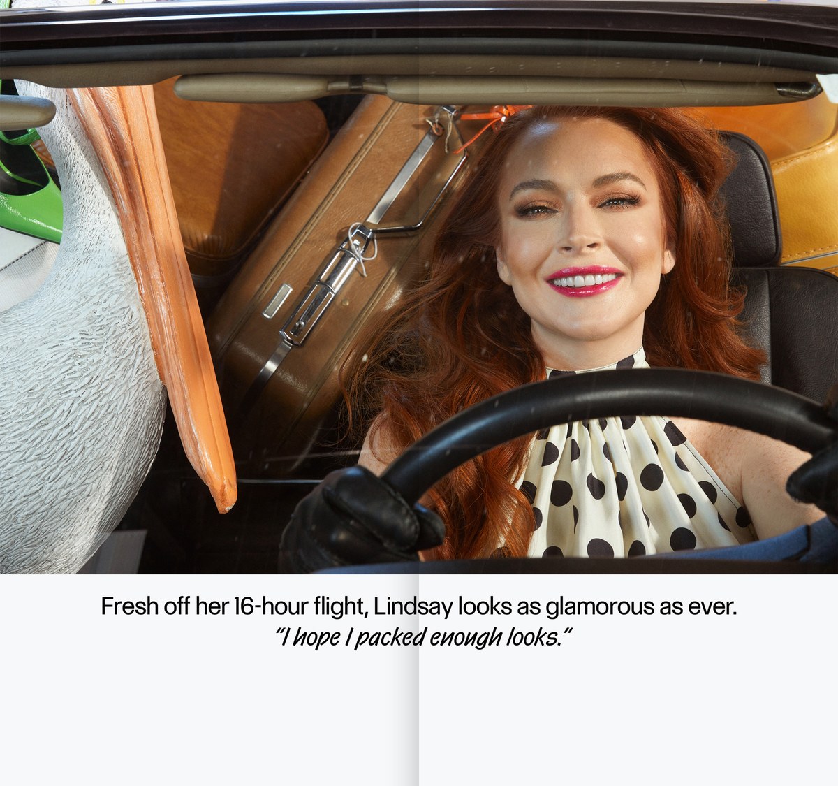
Spreads from MIAMI, photography by Roe Ethridge, produced by Interview and AMI for Art Basel Miami, November 2022.
Spreads from MIAMI, photography by Roe Ethridge, produced by Interview and AMI for Art Basel Miami, November 2022.
Spreads from MIAMI, photography by Roe Ethridge, produced by Interview and AMI for Art Basel Miami, November 2022.
Spreads from MIAMI, photography by Roe Ethridge, produced by Interview and AMI for Art Basel Miami, November 2022.
Spreads from MIAMI, photography by Roe Ethridge, produced by Interview and AMI for Art Basel Miami, November 2022.
Spreads from MIAMI, photography by Roe Ethridge, produced by Interview and AMI for Art Basel Miami, November 2022.
Spreads from MIAMI, photography by Roe Ethridge, produced by Interview and AMI for Art Basel Miami, November 2022.
Interview encompasses a wide range of tones in its content, and Control needed to be able to keep up. An article is just as likely to begin with “I was so impressed by the breadth of literary influences in your new novel. When did you start reading Henry James?” as “To start off, what’s your favorite brand of poppers?” With this in mind, I wanted the italic to add something extra to the type palette. I recalled using Los Angeles as an italic for Geneva on the original Macintosh, because I found the Mac’s artificial slant too jarring.
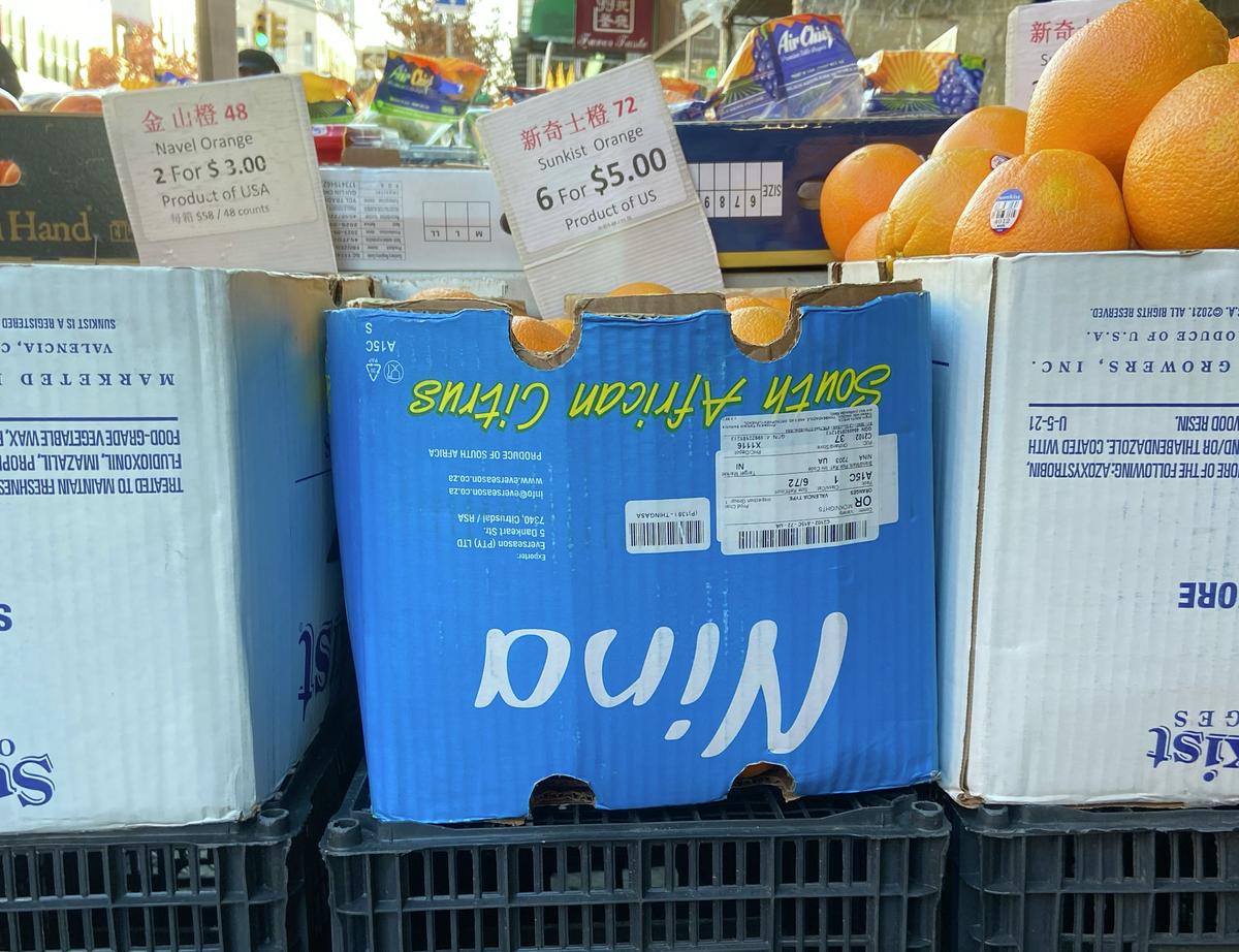
The 1982 Letraset alphabet Van Dijk also popped into my head. Angular and monoline, with a narrow lower case and a wide upper case, Van Dijk made frequent appearances in strip-mall hair salons and kids’ magazines in the ’80s and ’90s. Nowadays, I’m reminded of it every winter thanks to its popularity with produce companies, particularly citrus wholesalers. It seemed like it could be an interesting model for an italic companion—if the weight, contrast, and vertical proportions match, why not have a cursive instead of an oblique? Miguel Reyes drew a test, and within a few weeks the upright and cursive appeared together in a special publication Interview produced for Art Basel Miami.
After a couple of issues, Interview editor in chief Mel Ottenberg had had enough of Control Cursive, and I drew a more conventional sloped roman italic as well. We then worked with Hrvoje Živčić to extend the weight range with Thin and Light weights.
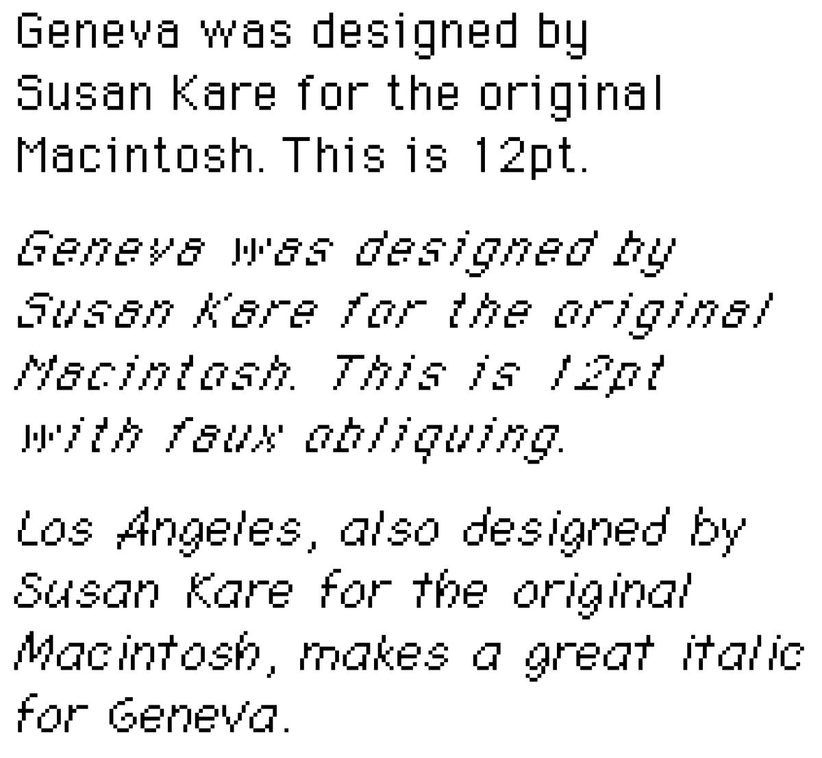
Bitmap fonts by Susan Kare for the Macintosh, ca. 1983.
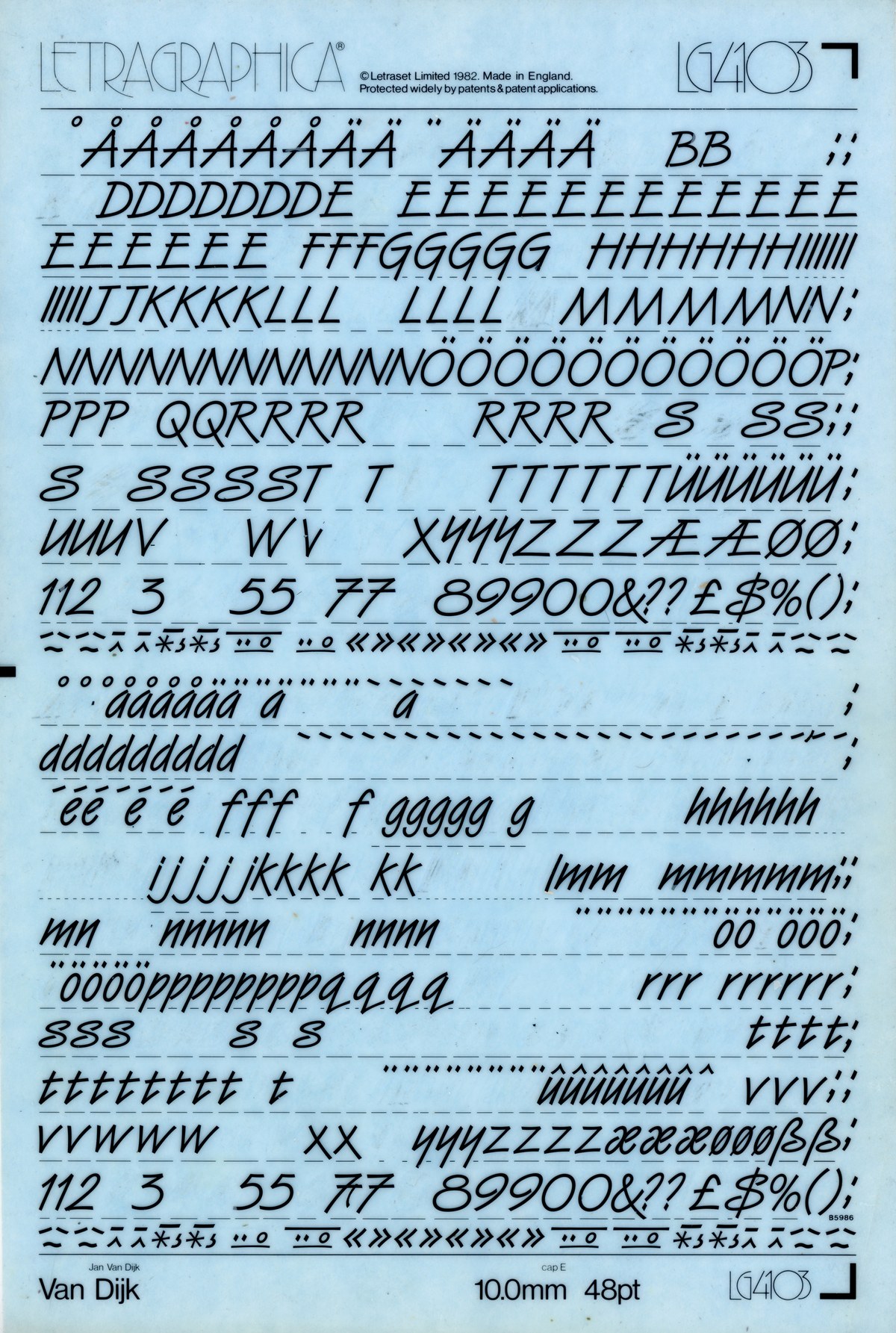
Partially used Letraset sheet of 48pt Van Dijk.
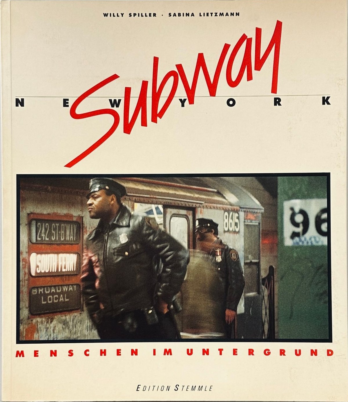
Cover of New York Subway by photographer Willy Spiller and Sabina Lietzmann (1984). Cover in Van Dijk with a heavily modified S, paired with Futura.
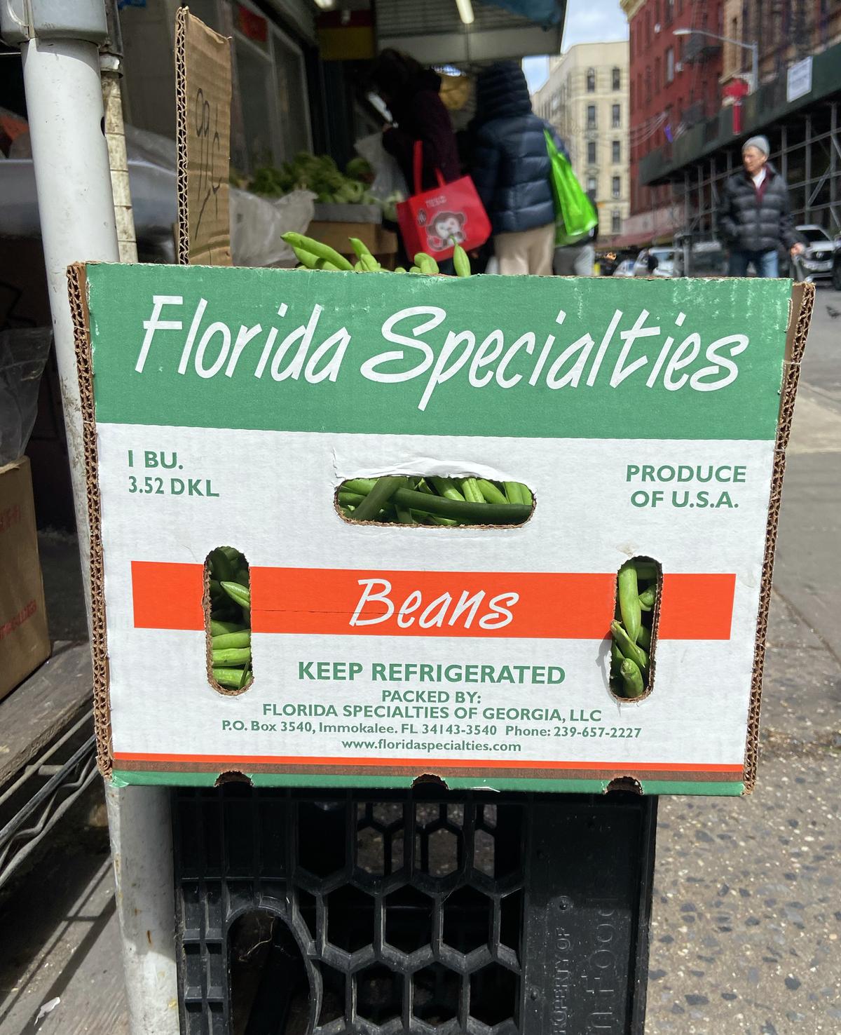
Beans on Grand Street (2024), typeset in Van Dijk with Gill Sans.
Oranges on Grand Street (2023), typeset in Van Dijk with logotype in Biffo.
Van Dijk on a book cover at a used bookstore in Portugal, paired with Futura and ITC Avant Garde.
Variable fonts
I’ve had a hard time getting enthused about variable fonts. Interpolation has been an integral part of typeface design since the CAD-assisted beginning of the digital era in the 1970s, when URW’s Ikarus system helped Matthew Carter extrapolate the heaviest weight of Galliard. Back in the ’90s, we witnessed two attempts to put these tools in the hands of type users—Adobe’s Multiple Masters and Apple’s TrueType GX—both of which failed to catch on, largely due to lackluster implementation for end users. A few projects showed the technology’s promise: an identity for a German mobile provider designed by MetaDesign in Berlin, and the first few years of Wired magazine under creative directors John Plunkett and Barbara Kuhr. Both used the flexible widths of Myriad to interesting effect. When variable fonts were introduced in 2016, they benefited from having more tech companies behind them, but the same fundamental issues arose: Will design tools unlock what these fonts can do? and will users care? The answer to both, so far, seems to be a qualified “kind of.”
Another challenge is the disconnect between what works well as in-between frames for animation and what works well as a static font in a layout. It’s possible to build variable fonts that seamlessly transition between surprising extremes—the first draft of Paul Barnes’s Spiller for the V&A identity cycled beautifully through sans, antique, Latin, and bracketed serif forms, for example. It was impressive in motion, but as static forms the in-betweens felt weirdly ambiguous and uncertain. The result was unconvincing enough that the idea was only used for an animated logo.
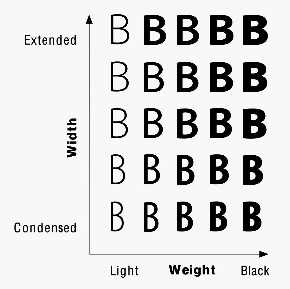
Weight and width axes can be useful, but the majority of users seem happy with the predefined styles carefully predetermined by a typeface’s designer. I struggled to find a compelling idea for a typeface that had to be variable, where the idea would be incomplete without the opportunity for adjustment, and where all of the in-betweens would be as useful, or even more useful, than the poles. Such typefaces do exist: like Greg Gazdowicz’s Align, Control is fully realized only in the variable version. The axes apply the idea of the lettering manual literally, allowing users to tailor the letterforms to each situation. The way the apertures, contrast, and tracking each alter the typeface’s personality seemed both useful and fun. In an ideal world, Control would have no predefined instances at all, encouraging users to consider each decision.
Anyone looking for a faithful digital rendition of Käch’s sans serif lettering examples should look to Dinamo’s Walter Alte and Neue instead. Walter Alte in particular captures the charm of the alphabets shown in Schriften Lettering Ecritures, with all their quirks. Control uses these alphabets as the origin point of a delirious trip through the past seventy years of sans serifs, touching on a range of tropes at all taste levels. It can be used as a straightforward workhorse typeface—the standard spacing is comfortable for extended reading at text sizes—or as a lettering tool that allows a high degree of fine-tuning. A handful of alternate forms, including conventional replacements for the abstracted commas and quotes, change the tone; and short versions of the ascenders and descenders facilitate tight leading to match the tight tracking.
Extrapolated drafts of Galliard Ultra Italic and experimental Thin Italic, Matthew Carter and the Linotype Drawing Office (1978). From “Galliard: A Modern Revival of the Types of Robert Granjon” in Visible Language XIX 1, Winter 1985.
Designspace for Myriad by Carol Twombly and Robert Slimbach, 1992. Chart in Designing Multiple Master Typefaces, published 1995–1997 by Adobe Systems.
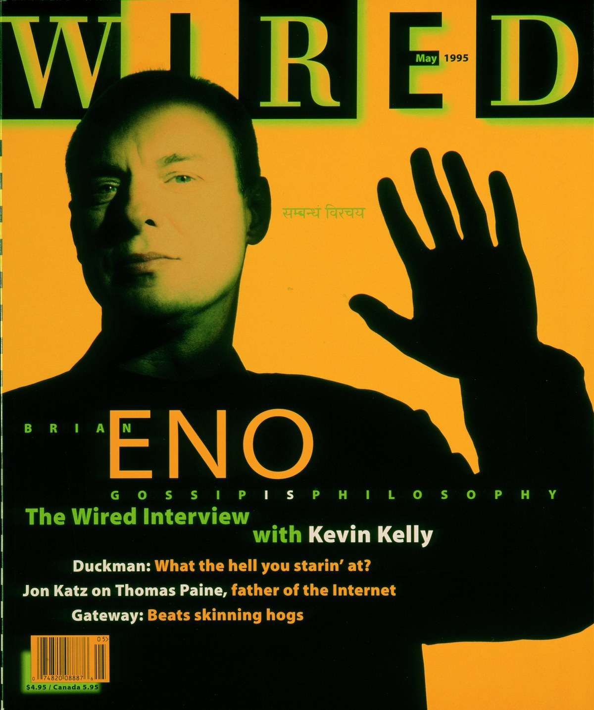
Wired 3.05, May 1995, cover designed by Plunkett + Kuhr using Myriad.

Control’s aperture axis takes the terminals from closed to open. The third from the bottom is closest to Käch’s recommendation.

The contrast axis sets Control apart from grotesks like Graphik and Focal, and starts to apply once the weight is heavier than Regular (400). The top is closest to Käch’s recommendation.

The tracking axis transforms polite, readable text into 1970s-style Tight Not Touching (TNT) headlines. The dots on i and j move down to harmonize with the tightness, along with the accents.

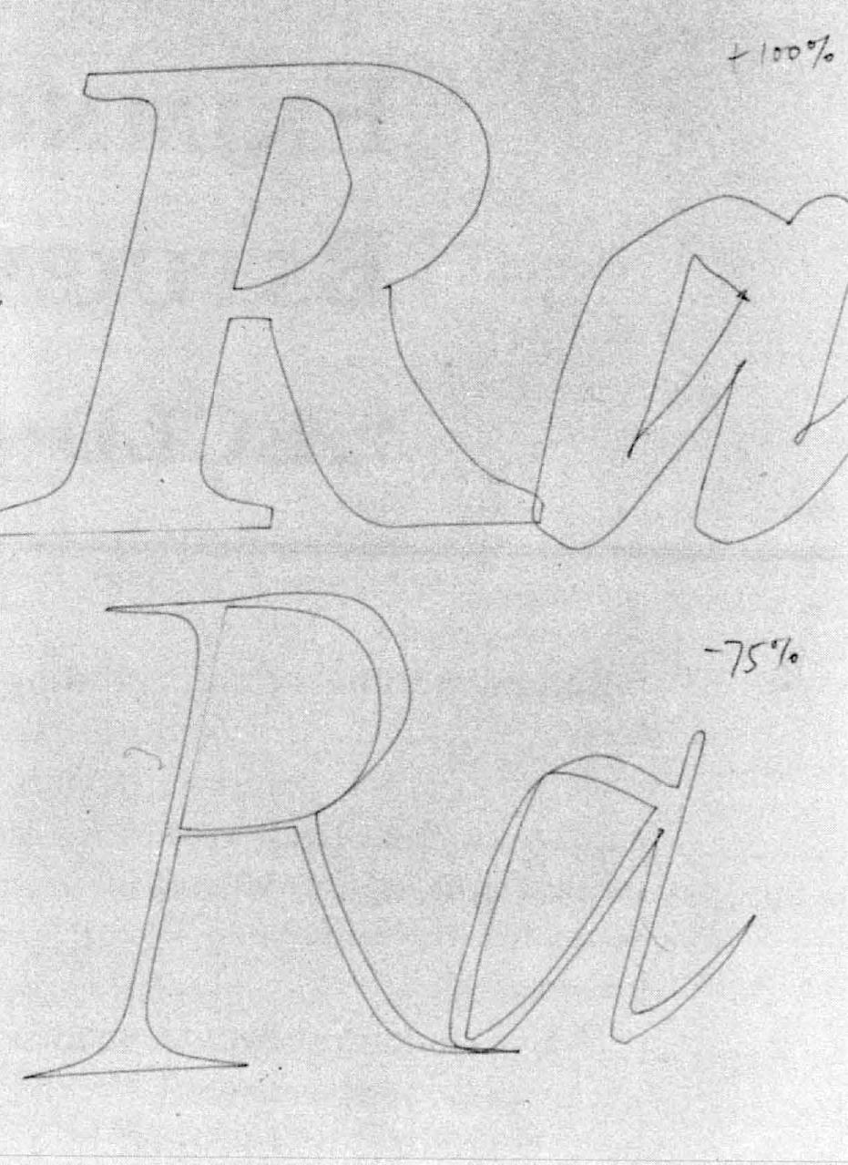
In the spirit of Control being based on a lettering manual, a number of alternates are included for R, a, and a few other letterforms.