Chiswick: A vernacular letter
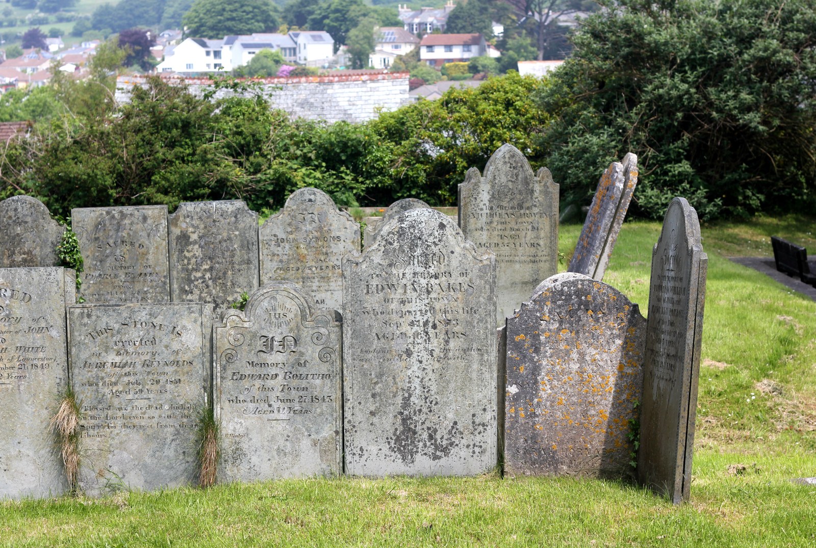
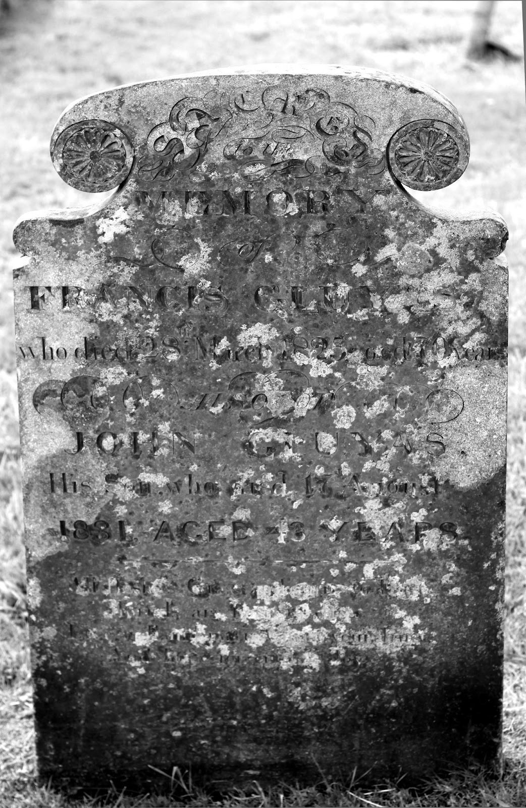
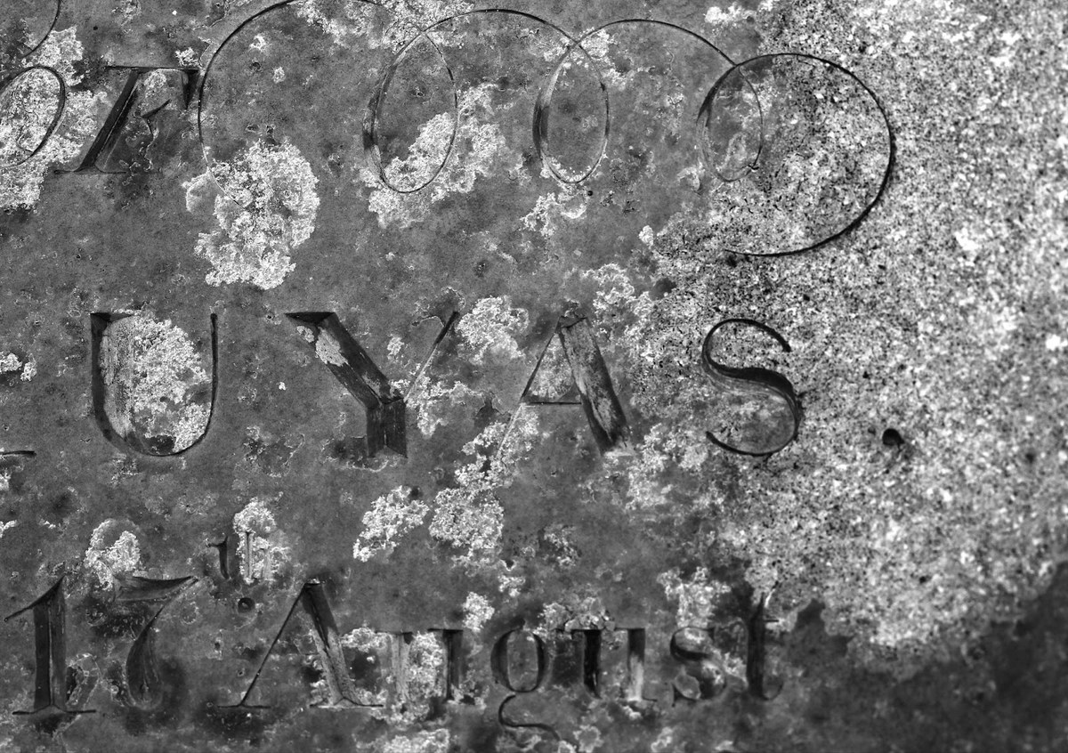
A graveyard in Cornwall shows examples of lettering derived not only from the vernacular style, but also from printing, both in its letterforms and in the various arrangements and degrees of contrast. Saint Mary’s Church, Callington.
The Chiswick collection derives not from a single model or design, but rather from a genre and an idea. Its three families – Chiswick, Chiswick Sans, and Chiswick Grotesque – celebrate the lettering that emerged in the British Isles in the eighteenth century and remained in common use into the twentieth. The collection imagines this form not only as how it might be, but also as what it could be. Its shapes have been fixed into a typeface, though not a typeface that was typical of the time.

Chiswick is an interpretation of a vernacular letterform that appeared in the British Isles in the eighteenth century and remained in use into the twentieth.

From a serif form, we developed a high-contrast sans and a low-contrast grotesque. Even at its most elegant, this is a form that would have been created by tradespeople who made letters.

Railway lettering from Wales, 1862 (National Railway Museum, York).
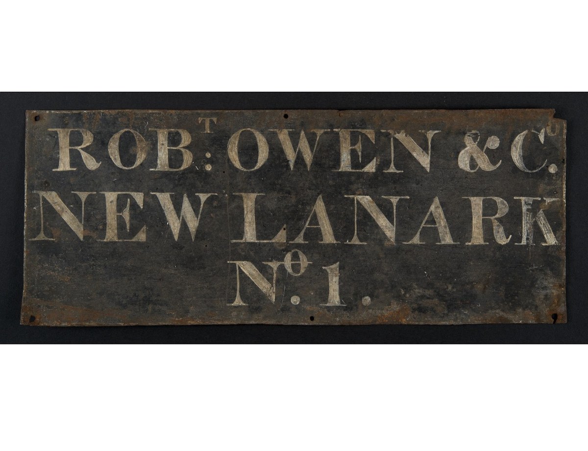
Painted sign from New Lanark, Scotland, courtesy of the University of Glasgow Library.
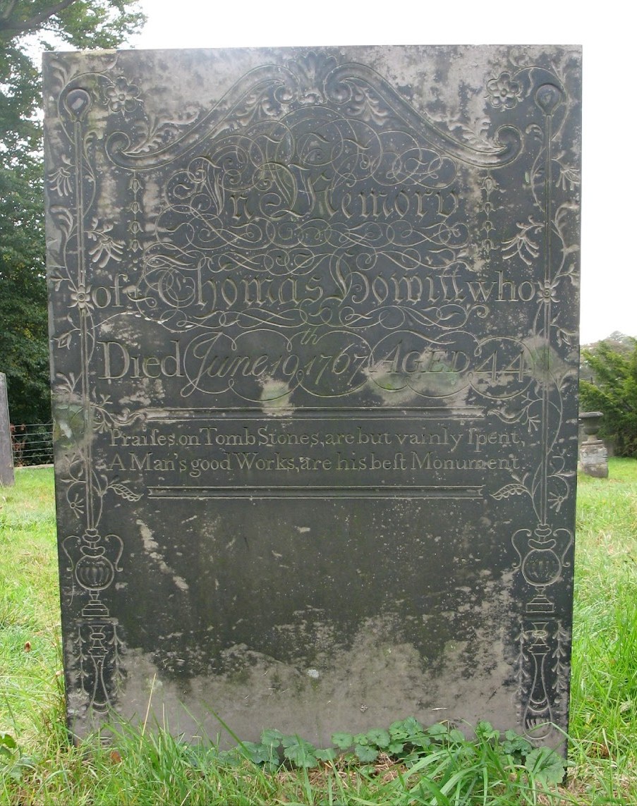
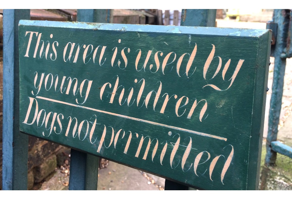
Vernacular lettering ranges from the carved to the cast to the painted. It can still be seen today on headstones, like this one in Derbyshire (Hucknall).

Lettering on a headstone in Cornwall (St Mawgan in Meneage Churchyard).
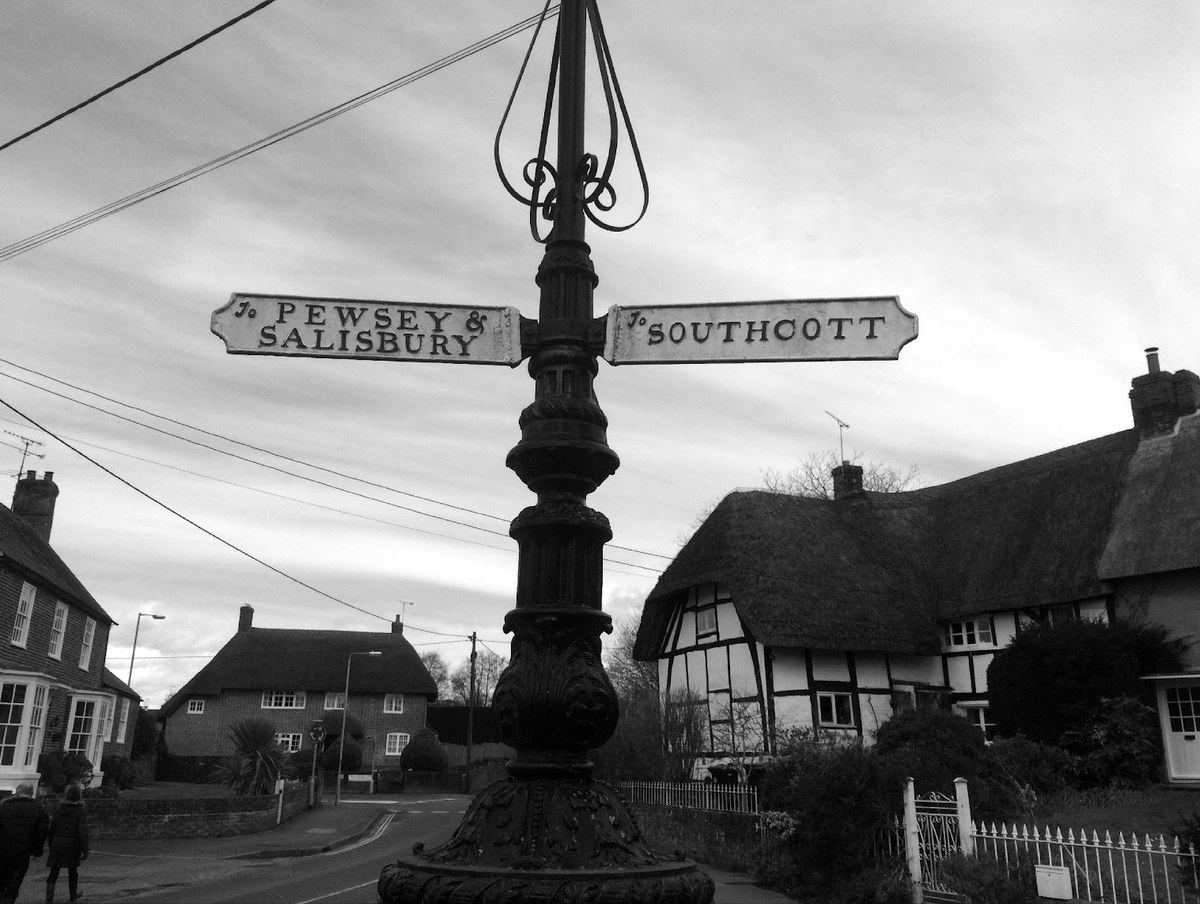
Cast signs in Wiltshire.
Hand-painted lettering in Clerkenwell, London.
Railway lettering from Wales, 1862 (National Railway Museum, York).
Painted sign from New Lanark, Scotland, courtesy of the University of Glasgow Library.
Vernacular lettering ranges from the carved to the cast to the painted. It can still be seen today on headstones, like this one in Derbyshire (Hucknall).
Lettering on a headstone in Cornwall (St Mawgan in Meneage Churchyard).
Chiswick exists as a counterpoint to Brunel, a modern face which matches the pervading typographic style of the late eighteenth and early nineteenth centuries. Its nod to the vernacular of the time acts as a foil to Brunel’s gesture towards the era’s formal typefounding; Chiswick’s pastoral disposition offsets Brunel’s more metropolitan style. One is defined by the metal body; the other enjoys the freedom of the bodiless handmade letter.
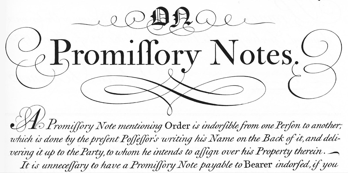
The writing manual The Universal Penman (1733–1741), engraved by George Bickham, was a compendium of the work of twenty-five writing masters. Famed for its examples of the roundhand script, it also documents more formal styles of lettering, which often have the qualities of type without being restricted by type’s physical confines. This style of letter shares many qualities with Caslon’s work, but the angle of the italic form is steeper.
Chiswick could be described as a British vernacular that evolved in the semi-isolation of an island, though parallels exist in letters found outside its shores. The family draws influence from a wide range of sources: letters found on gravestones and in writing manuals, engraved letters, drawn letters, carved letters, letters on buildings, and letters cast in metal. Before letters were created by mechanised processes, these ubiquitous forms were made by highly skilled workers. Created with love and artistry, the letters often transcended professional requirements.

Top: Chiswick Serif. Bottom: Brunel. Chiswick started cropping up in the eighteenth century; Brunel appeared at the end of that century and into the next.

Top: Chiswick Serif. Bottom: Brunel. Though more formal than calligraphy, Chiswick is less formal in style than Brunel, and fully explores not being tied to a physical body, whereas Brunel is constrained by that.
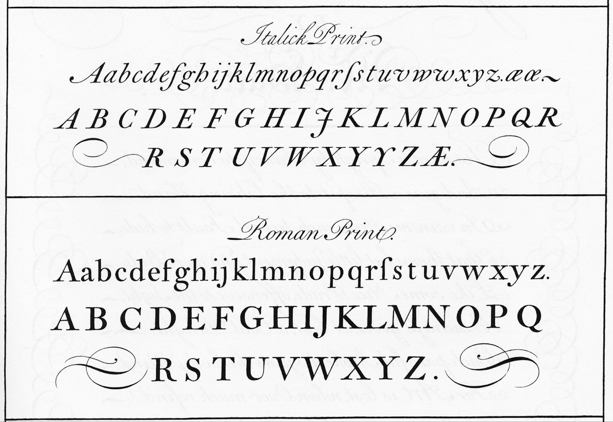
The writing manual The Universal Penman (1733–1741), engraved by George Bickham, was a compendium of the work of twenty-five writing masters.
Famed for its examples of the roundhand script, The Universal Penman also documents more formal styles of lettering, which often have the qualities of type without being restricted by type’s physical confines.
This style of letter shares many qualities with Caslon’s work, but the angle of the italic form is steeper.
Origins
But why make a typeface from letters? And why from this period? In 2009 Commercial Type was approached by Wolff Olins to make a typeface for the National Trust (or, to give its full title, the National Trust for Places of Historic Interest or Natural Beauty), a heritage organisation that covers England, Wales, and Northern Ireland (Scotland is covered by a separate organisation). Its huge portfolio of land and range of more than 350 properties spans from the Bronze Age chalk white horses through the twentieth century and the childhood homes of Lennon and McCartney.
We mooted lots of ideas, both historical and modern, as to what a typeface representing the activity of the National Trust should look like. The project allowed for an exploration of what might constitute a ‘British’ letterform.
At this stage, an existing typeface was considered too literal an interpretation. The typefaces of Baskerville and Caslon (despite the latter’s clear Dutch roots), a modern like Brunel, and more recently Gill could all be considered British, but we rejected them for various reasons.
We began an exploration of the sans form, greatly influenced by James Mosley’s pioneering essay ‘The Nymph and the Grot’ (originally published in Typographica, New Series 12, December 1965) and the (re) birth of the style in the eighteenth century. Mosley’s essay gets its title from the inscription in a grotto at Stourhead, a National Trust property. Early experiments with a literal interpretation proved unsuccessful, so we turned our attention to other examples in Mosley’s essay for inspiration, such as William Caslon IV’s first sans typeface. Ultimately these experiments were also rejected; for one thing, we felt that stylistically they were perhaps too utilitarian and not elegant enough.
This led to an examination of the vernacular style of lettering common to the period of many of the Trust’s properties from the eighteenth and nineteenth centuries, a style strongly associated with the institution of the country house and corresponding perceptions of style and elegance.
The country house occupies an important place in the British psyche; it represents the rural idyll, the pastoral arcadia. We sought a form that would fit not only with the architecture of the classical revival of William Kent or the garden design of Capability Brown, but also with the agricultural paintings of, say, George Stubbs or the world of John Constable. Or with the portraiture of a Gainsborough or a Reynolds. That such art often distorts reality is part of the illusion (and part of our ambit). It pushed us to move further afield from too-literal interpretations and into atmospheres – like the novels of Jane Austen and the social world of Bath. But despite the seductive qualities of a serif face that had ideas of beauty at its core, it quickly became obvious to us that the form fell short of the “universal” image the organisation wanted to project.

British typefaces through the ages. From top to bottom: the transitional form pioneered by Baskerville, here shown in form by Alexander Wilson & Sons, c. 1770; Matthew Carter’s Big Caslon, based on the large sizes of William Caslon I’s work (1720–1750); Brunel (late eighteenth and early nineteenth centuries); and Gill Sans by Eric Gill, 1928.

Exploration of the sans form. From top to bottom: type derived from the inscription at Stourhead; from William Caslon’s IV Egyptian; and two styles that add degrees of contrast to the form.

The beginnings of Chiswick, a typeface based on the vernacular style with a strong emphasis on elegance.

National Trust Sans comes in two variants: a lower-contrast version for general use and a higher-contrast version for display.

National Trust Sans comes in two variants: a lower-contrast version for general use and a higher-contrast version for display.

Early sketches of styles that would eventually lead to National Trust Sans, showing the influences not only of the English contrasted sans, but also of Wolpe’s Albertus and Zapf’s Optima.

National Trust Sans comes in two variants: a lower-contrast version for general use and a higher-contrast version for display.
National Trust Sans comes in two variants: a lower-contrast version for general use and a higher-contrast version for display.
National Trust Sans comes in two variants: a lower-contrast version for general use and a higher-contrast version for display.
Early sketches of styles that would eventually lead to National Trust Sans, showing the influences not only of the English contrasted sans, but also of Wolpe’s Albertus and Zapf’s Optima.
National Trust Sans comes in two variants: a lower-contrast version for general use and a higher-contrast version for display.
We finally settled on a contrasted sans serif for the National Trust – a twenty-first-century design that touches upon different traditions. While National Trust Sans is a letterform of its time, its skeletal structure (except for its vertical proportions) is that of the transitionals of Baskerville, Moore, and Wilson. Its relatively high contrast recalls the elegance of a serif letter, but also the contrasted sans found in lettering and later in typefaces of the nineteenth and twentieth centuries.
In Chiswick, the handmade letter cross-pollinates with type. Taking the vernacular seriffed letter of the eighteenth and nineteenth centuries and making it into type follows a path forged by John Baskerville. Baskerville’s life – his journey from writing master to industrialist to printer and typefounder – has been well chronicled. The sole extant example of his letter-cutting which is signed (it is believed to have been cut around 1730) is one of the key objects in the history of the letter in Britain of its time. It shows where Baskerville came from (the ‘Writing Master’ moniker places him firmly within the realm of the world of Bickham’s The Universal Penman) and where he was going with his (ad)venture into printing.
But we mustn’t consider this example unusual in itself; by this point, lettering had reached a high level in much of Britain. What was unusual was when lettering made its way into the closed world of printed types at a time when Caslon’s types were dominant. In his preface to the 1758 edition of Milton’s Paradise Lost, Baskerville wrote: “I formed to my self Ideas of greater accuracy than had yet appeared, and have endeavoured to produce a Sett of Types according to what I conceived to be their true proportion.”
Baskerville was simultaneously an outsider (provincial and not of the trade of printing and typefounding) and an insider (a master of letters). The lines ‘Cut in any of the Hands’ and ‘WRITING MASTER’ would to many observers simply be copies of his type style. In Commercial Type’s London studio, we have replicas made in 1980 from the original in the Library of Birmingham.
But such close imitation was never the aim of Chiswick. Rather, the goal was to capture the spirit of the vernacular and to serve as a counterpoint to Brunel, which comes from the world of the book, of the broadside, of the fixed-letter image of printing. Brunel is specific to a period of less than thirty years at the end of the eighteenth century and the dawn of the nineteenth. Chiswick, by contrast, embodies the written letter, the drawn letter, the carved letter – the world outside of printing. It spans much of the eighteenth century, nineteenth century, and beyond, extending almost up to our own era. It touches on the imagination and spirit of a time. Brunel is smooth and aims for perfection; Chiswick revels in inconsistencies, eccentricity, and eclecticism. Brunel descends from few sources, Chiswick from many.
Type becomes vernacular again: National Trust Sans painted by hand at Hardwick Hall, Derbyshire.
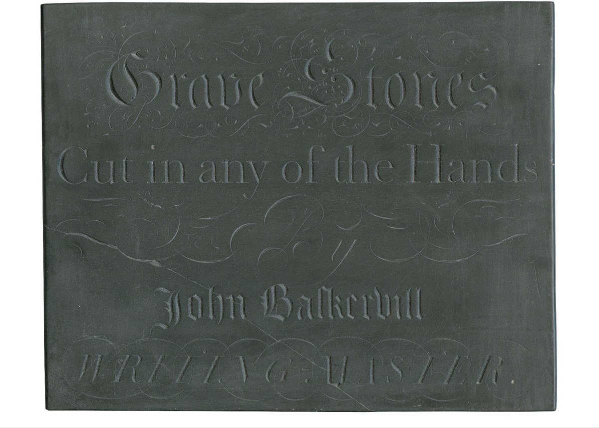
The only example believed to have survived of John Baskerville’s stone carved letterform, which in the roman and italic styles shows a remarkable closeness in style to the typefaces he had cut by John Handy.

From the beginning of John Baskerville’s venture into printing: the introduction to Paradise Lost, 1758. St Bride Library.

As Baskerville formalised his style of lettering in type, one can see in the italic a more upright style. Was this a visual choice, or one caused by the constraints of metal type? Details from A specimen, by John Baskerville of Birmingham, 1757. Images courtesy of St Bride Library. See also Beinecke Rare Book and Manuscript Library.
Recording the vernacular
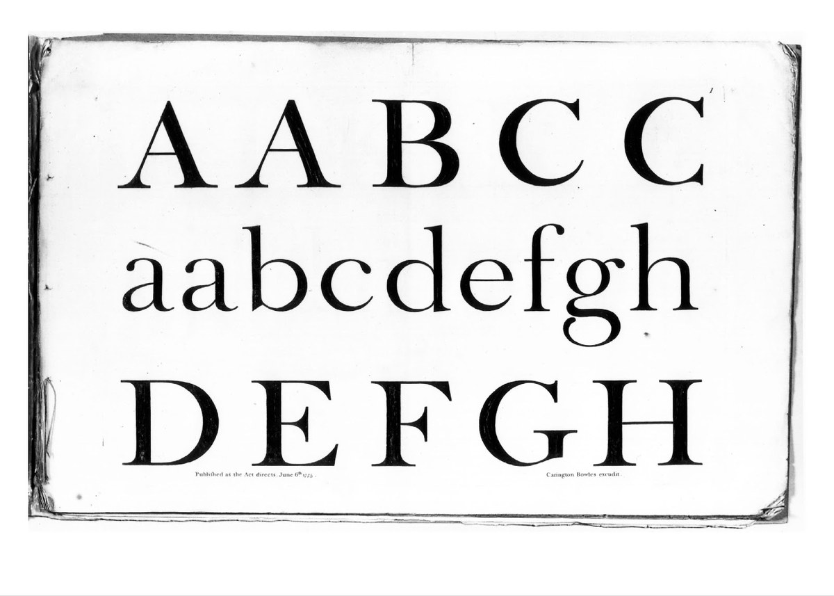
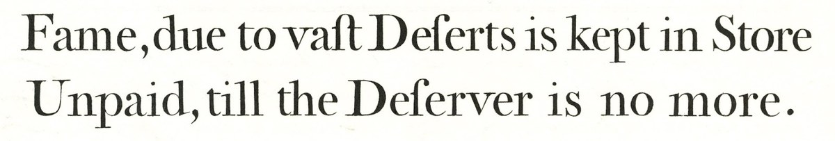
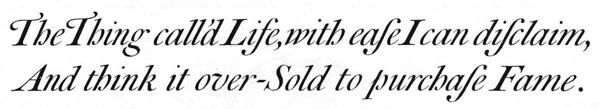
A more formal vernacular letter as shown in Bowles’s Roman and Italic Print Alphabets by Carington Bowles, 1775. Published in Motif, courtesy of James Mosley.
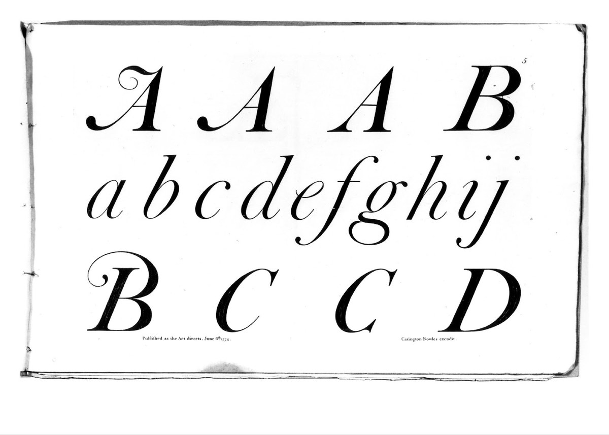
A more formal vernacular letter as shown in Bowles’s Roman and Italic Print Alphabets by Carington Bowles, 1775. Published in Motif, courtesy of James Mosley.
A vernacular form of letter was still being made at the time of Mosley’s ‘The English Vernacular’. This image shows L. Monk of the firm George Brown lettering in the 1960s. Photograph by James Mosley, used here with permission.
A more formal vernacular letter as shown in Bowles’s Roman and Italic Print Alphabets by Carington Bowles, 1775. Published in Motif, courtesy of James Mosley.
A more formal vernacular letter as shown in Bowles’s Roman and Italic Print Alphabets by Carington Bowles, 1775. Published in Motif, courtesy of James Mosley.
A vernacular form of letter was still being made at the time of Mosley’s ‘The English Vernacular’. This image shows L. Monk of the firm George Brown lettering in the 1960s. Photograph by James Mosley, used here with permission.
A more formal vernacular letter as shown in Bowles’s Roman and Italic Print Alphabets by Carington Bowles, 1775. Published in Motif, courtesy of James Mosley.
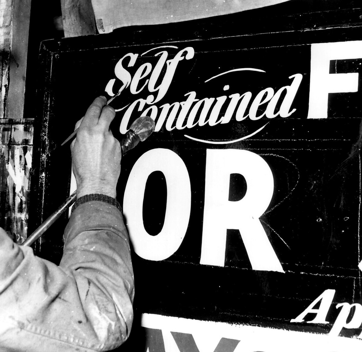
In 1963, James Mosley published ‘The English Vernacular’ (Motif, 11, 1963–4). The essay appeared when it was still possible to find forms of lettering actively being practised that would not have looked out of place two centuries earlier. One could still touch the past, but it was clear that it was on the verge of dying out. The mechanisation of letterform production, whether via typewriter, mechanically cut gravestone, or prefabricated letters for shopfronts, accelerated the process and removed the need for the hand.
Where lettering still existed, a second threat had come in the shape of the Trajan model, which had been adopted as a government standard, and had become the accepted form for letter-cutting. As letterpress died out, the old typefaces remained in small numbers (it is hard to imagine the names Baskerville and Caslon disappearing), but the variety dwindled. ‘The English Vernacular’, like Mosley’s later essay ‘The Nymph and the Grot’, shows how widely distributed the official letterform had become. Mosley noted that originally he thought it would take him two months to find examples of the vernacular; in the end it took two years. Later, the designer Alan Bartram published a series of books that chronicled letters where they could be found – on street signs, on architecture, on storefronts, on gravestones – culminating in The English Lettering Tradition (1986), which categorises and illustrates the diversity of form.
Mosley noted that originally he thought it would take him two months to find examples of the vernacular; in the end it took two years. Later, the designer Alan Bartram published a series of books that chronicled letters where they could be found – on street signs, on architecture, on storefronts, on gravestones – culminating in The English Lettering Tradition (1986), which categorises and illustrates the diversity of form.
Use of the word vernacular is telling; the vernacular is literally the form of the people. These letterforms would be practised by the vast majority of the population, and would be readily accepted and appreciated by virtually everyone. Mosley argued that the British (his use of the term English is not untypical; ‘English’ was often shorthand for ‘British’) had developed a letter style that could be consistently used across many forms, whether Egyptian, Sans, Clarendon, or seriffed roman; whether formal or informal. Those who made letters would instinctively understand the skeletal form of the letter, and then imagine it and reimagine it depending on usage.
Mosley’s hope was that his essay could play the role the copybooks of the past had played, and that people who looked at the examples it included would build something new upon these foundations. One such example, from 1775, was Carington Bowles’s Roman and Italic Print Alphabets. Its subtitle is illuminating: ‘Designed chiefly for | The Use of Painters, Engravers, Carvers, Grave-Stone Cutters, Masons, Plumbers, | and other Artificers; | likewise | very useful for Merchants and Tradesmens Clerk’. Such was the breadth of influence and readership in the eighteenth century; in the twentieth, the examples were aimed at the graphic designer, typographer, and printer.
While type designers certainly would have taken notice of Mosley’s essay, to have actually made typefaces from these examples in the sixties would have been an arcane curiosity (and a costly experiment). Against the backdrop of modernism’s dominance, the ideas of the English vernacular would seem parochial. Matthew Carter’s Snell Roundhand from 1966 might be considered an example of the essay’s influence, but, despite the model’s date of 1712, Carter’s chief aim was technical: producing a script typeface that conformed to the constraints of Linofilm, the state-of-the-art typesetting system of its day. More recently, two typefaces – Surveyor by Tobias Frere-Jones (2002) and a revival of Bowles’s letters by John Morgan Studio for Tate Britain (2013–15) – show the influence of Mosley’s essay and the vernacular style.
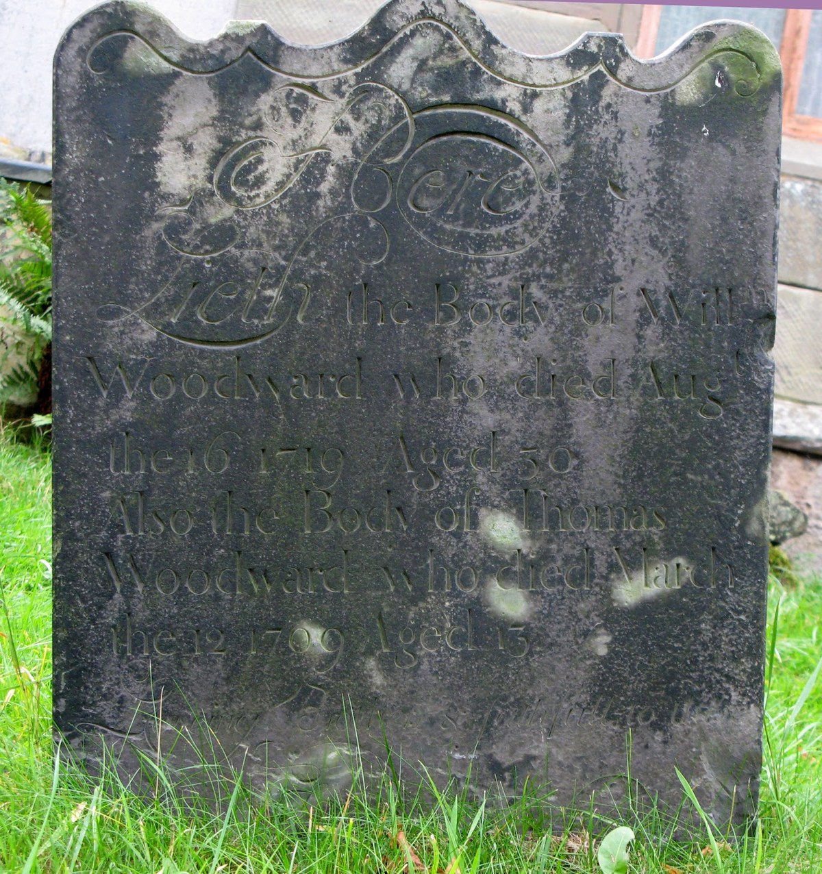
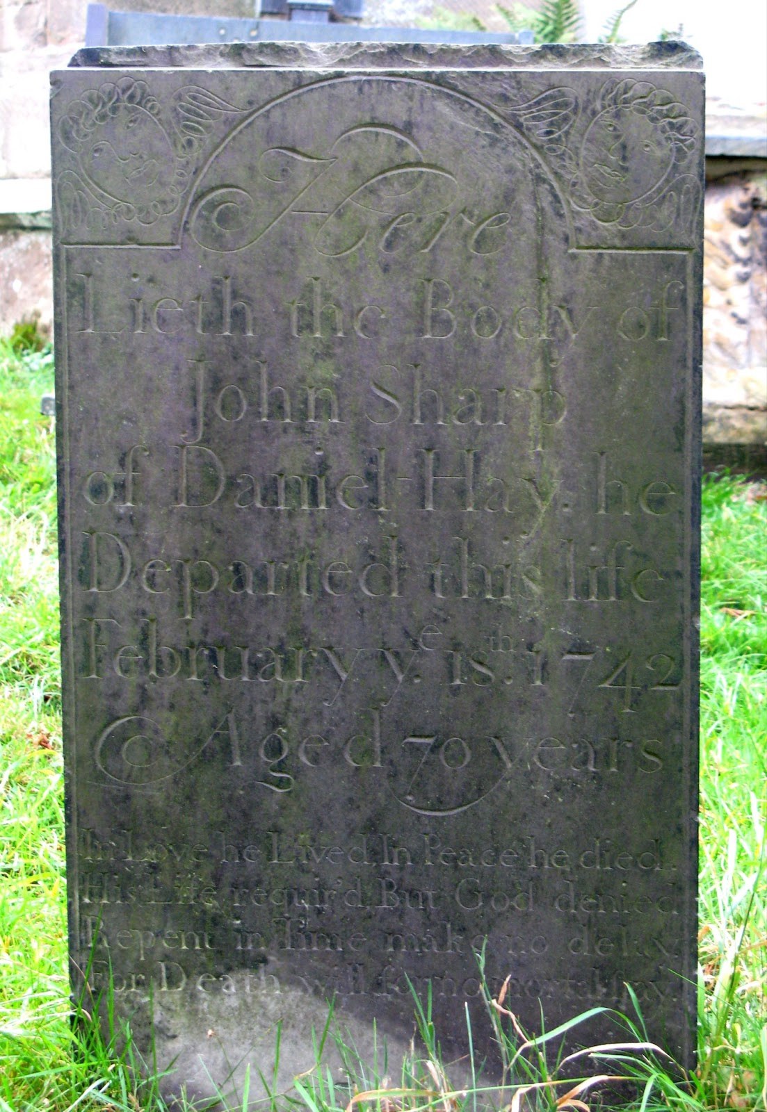
The richness of the vernacular form in the East Midlands appears on gravestones at the church of St Giles, Calke Abbey, Derbyshire. A mature and well-cut form of the vernacular style of serif letter is already present in the earliest example from 1719 (shown here). By the following century the style had developed and changed, but was still rooted in tradition.

The richness of the vernacular form in the East Midlands appears on gravestones at the church of St Giles, Calke Abbey, Derbyshire. A mature and well-cut form of the vernacular style of serif letter is already present in the earliest example from 1719. By the following century the style had developed and changed, but was still rooted in tradition.
The richness of the vernacular form in the East Midlands appears on gravestones at the church of St Giles, Calke Abbey, Derbyshire. A mature and well-cut form of the vernacular style of serif letter is already present in the earliest example from 1719. By the following century the style had developed and changed, but was still rooted in tradition.
The richness of the vernacular form in the East Midlands appears on gravestones at the church of St Giles, Calke Abbey, Derbyshire. A mature and well-cut form of the vernacular style of serif letter is already present in the earliest example from 1719. By the following century the style had developed and changed, but was still rooted in tradition.
The richness of the vernacular form in the East Midlands appears on gravestones at the church of St Giles, Calke Abbey, Derbyshire. A mature and well-cut form of the vernacular style of serif letter is already present in the earliest example from 1719. By the following century the style had developed and changed, but was still rooted in tradition.
The richness of the vernacular form in the East Midlands appears on gravestones at the church of St Giles, Calke Abbey, Derbyshire. A mature and well-cut form of the vernacular style of serif letter is already present in the earliest example from 1719. By the following century the style had developed and changed, but was still rooted in tradition.
Drawing on the vernacular
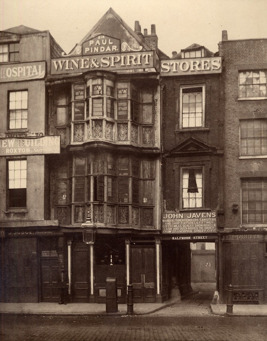
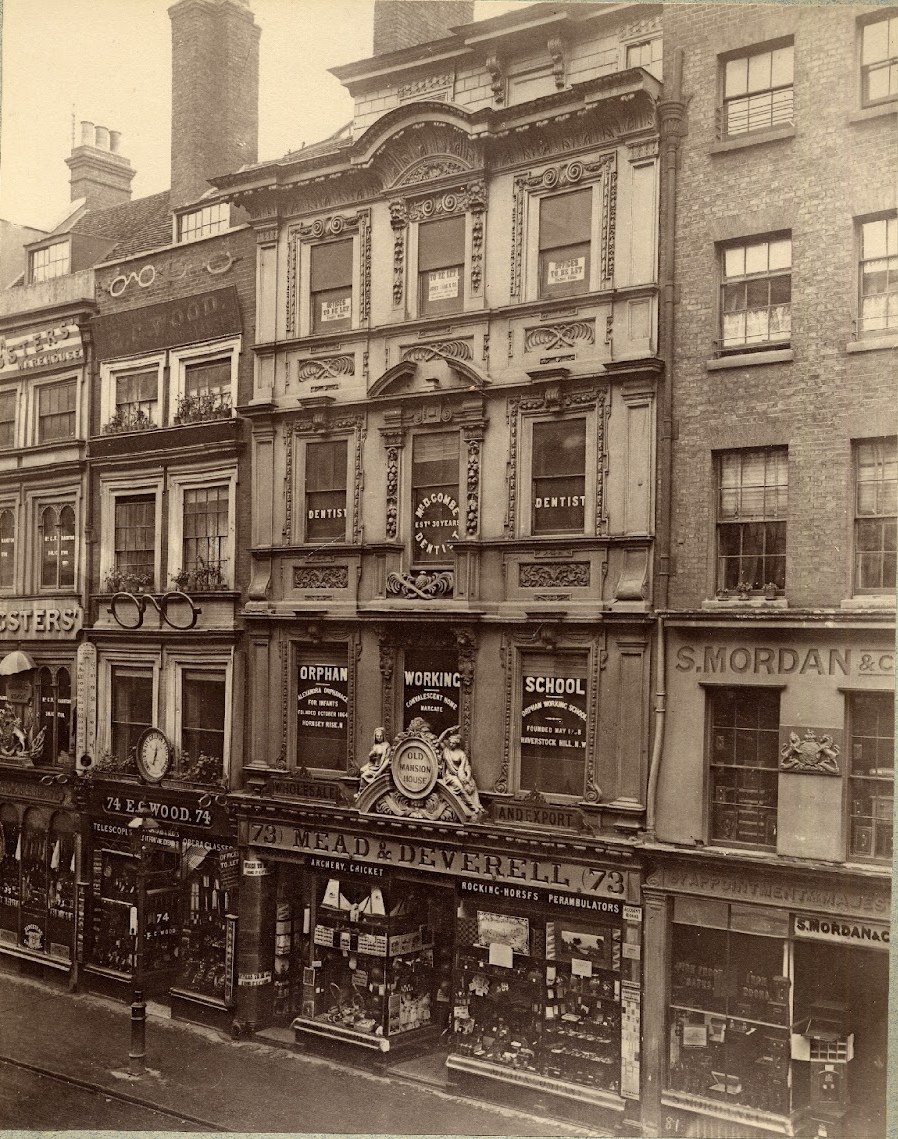
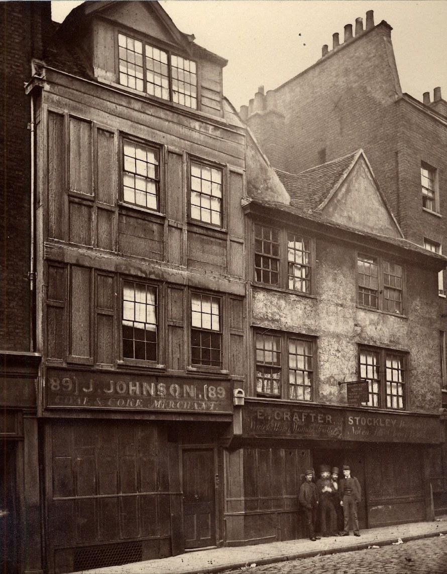
A view into another world: photographs from the collection of the Society for Photographing Relics of Old London, taken by Alfred and John Bool and Henry Dixon & Son. 1875–1886, courtesy of the Bishopsgate Institute.
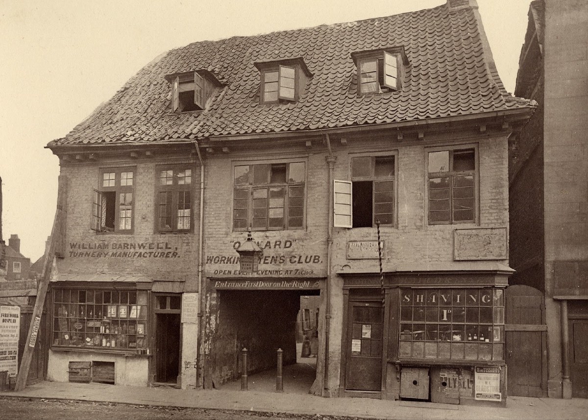
A view into another world: photographs from the collection of the Society for Photographing Relics of Old London, taken by Alfred and John Bool and Henry Dixon & Son. 1875–1886, courtesy of the Bishopsgate Institute.

A view into another world: photographs from the collection of the Society for Photographing Relics of Old London, taken by Alfred and John Bool and Henry Dixon & Son. 1875–1886, courtesy of the Bishopsgate Institute.
A view into another world: photographs from the collection of the Society for Photographing Relics of Old London, taken by Alfred and John Bool and Henry Dixon & Son. 1875–1886, courtesy of the Bishopsgate Institute.
A view into another world: photographs from the collection of the Society for Photographing Relics of Old London, taken by Alfred and John Bool and Henry Dixon & Son. 1875–1886, courtesy of the Bishopsgate Institute.
A view into another world: photographs from the collection of the Society for Photographing Relics of Old London, taken by Alfred and John Bool and Henry Dixon & Son. 1875–1886, courtesy of the Bishopsgate Institute.
A view into another world: photographs from the collection of the Society for Photographing Relics of Old London, taken by Alfred and John Bool and Henry Dixon & Son. 1875–1886, courtesy of the Bishopsgate Institute.
A view into another world: photographs from the collection of the Society for Photographing Relics of Old London, taken by Alfred and John Bool and Henry Dixon & Son. 1875–1886, courtesy of the Bishopsgate Institute.
Gravestones are probably the richest and most common source of lettering from the high point of the vernacular. If cut on a resistant material (slate, for example) and placed away from the ravages of climatic forces, they will survive across the centuries almost perfectly intact. The large diversity in form offers a designer much to ponder; within one small settlement, the same style of letter could have many variations, even when cut by the same individual. But from county to county, the variations can be greater and greater. Bartram noted particularly rich veins of lettering in the East Midlands. Distance from large urban centres slowed the progress of adoption of the letterform. The extremities of Britain, such as the county of Cornwall in the southwest (where slate was common) show that forms survived longer than they would have in London.
But gravestones are only one source for Chiswick; another is photographs of street scenes. Often created to document the landscape, whether urban or rural, such images accidentally record the richness and diversity of letterforms. In the late nineteenth century, Alfred and John Bool and Henry Dixon documented many buildings that were under threat of demolition for the Society for Photographing Relics of Old London.1 Many examples show lettering, confirming how prevalent the vernacular form was. Today we can still find traces of the vernacular, often in the form of ghost signs, that give a hint of what used to be there long after the original businesses have disappeared.
The terminology and categories we traditionally associate with printing type are less useful and applicable in the case of type derived from lettering. While common classification practice associates Baskerville with the transitional form, and the modern as a later form pioneered by Bodoni in Italy and the Didots in France, closer inspection of the Baskerville slate examples suggests that what we might consider the modern form appears earlier in lettering. If we define ‘modern’ as vertical orientation, strong contrast between thick and thin, and unbracketed serifs, then a case can be made that the modern form is what appears in the Baskerville slate, and in countless other examples. What we find in lettering is that the precision we apply to typefaces often fails to deal with the reality in the field. Chiswick is therefore modern in style, following this terminology: vertical stress, high contrast between thick and thin strokes, and serifs that are fairly flat, though gently angled as if cut by a stone cutter. Yet the terminals have a softness and a roundness, without the crisply defined ball we would expect in a modern, and could therefore be described as more transitional in style.
It is in the individual nature of letters that we can discern the hand. Each serif and stroke vary from letter to letter – not enough to disturb the reader and the rhythm of the form, but enough to add a subtle variety.
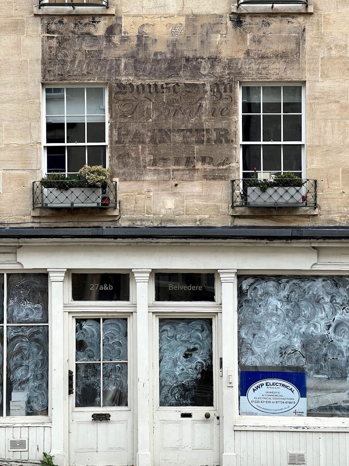
Ghost sign in the city of Bath. Hints can be seen of Tuscan, blackletter, roundhand, slab, and italic.
Chiswick has many of the characteristics of the Modern, but also hints of the transitional form – suggesting that the terminology we associate with printing types is less precise when dealing with type derived from lettering.
Details within letters vary slightly, deliberately avoiding the perfection of everything exactly matching. Illustration by Paul Barnes.
Details within letters vary slightly, deliberately avoiding the perfection of everything exactly matching. Illustration by Paul Barnes.

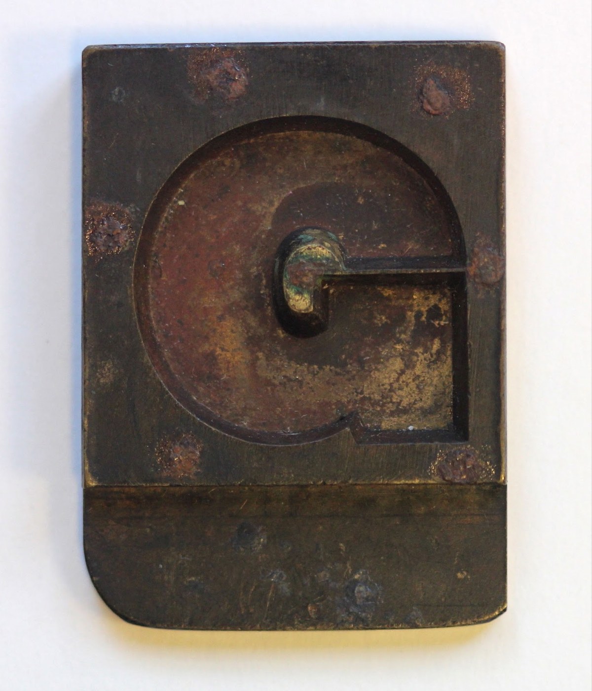
Individual letters are atypical of the style in printing type. Note the long tail of the y, the unusual g, and the tails on the K, k, and R.

As we continue to look, we see letters that break away from the confines of the metal body. The lower case y is an obvious example; its long curving tail extends in a way that any typefounder or printer would have blanched at, for it would have easily broken off when in a type case. Others show how small eccentricities offer a differing view of how letters should be; the lowercase g shows the open bottom bowl so typical of the vernacular, yet the bottom bowl’s juncture with the upper bowl is unusually far to the right and the lower bowl extends unusually far to the left. K and k don’t end in a flat serif, but in an upward tail. The tail of the R also sweeps up, but not to the degree of a modern. These are all small tics, but, repeated throughout a piece of text, they give Chiswick a distinctive style.

In the italic, Chiswick becomes its most expressive when freed from the limitations of a square body.

The strokes of certain lowercase characters have tapered rather than flat ends.
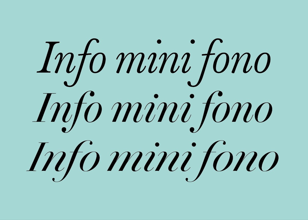
Differing angles in italics. From top to bottom: Baskerville; Brunel; and the steep, almost scriptlike angle of Chiswick.
In the italic, Chiswick becomes its most expressive when freed from the limitations of a square body.
The strokes of certain lowercase characters have tapered rather than flat ends.
Differing angles in italics. From top to bottom: Baskerville; Brunel; and the steep, almost scriptlike angle of Chiswick.
In the italic, Chiswick becomes its most expressive when freed from the limitations of a square body.
It’s in the italic that Chiswick truly begins to deviate from the familiar. Its angle is greater than that of Baskerville or Brunel.2 In this sense it approaches a roundhand script form, or the sorts of letters Bowles illustrated, which would be difficult to attempt in metal type (at least in square bodies). In digital type no such limits exist, and the ability to kern all combinations of letters allows for the kind of control and flexibility that lettering has always had over metal type. The relatively steep angle produces a wider-than-expected lower case.
The hooked strokes found at the tops of ascending characters replace the typical serif structure (though they can be swapped out via stylistic sets for more traditional serifs or serifless terminals). And the g’s exuberance defies the logic of the typefounder; note its lower bowl with its broad sweeps and unusual weight stresses. The bottom of strokes on the h, k, m, n, and r, as well as the top of the strokes on the a and u, are all gently arched.

The R can take multiple forms – some more expressive, others more typographic.

Different forms of R in the italic.

Ligatures can improve certain letter combinations. A letterer for example might have made a gy ligature, where the ear of the g rises above the y.
The R can take multiple forms – some more expressive, others more typographic.
Different forms of R in the italic.
Ligatures can improve certain letter combinations. A letterer for example might have made a gy ligature, where the ear of the g rises above the y.
The R can take multiple forms – some more expressive, others more typographic.
Capturing the spirit and breadth of the lettering and letter cutters that inspired Chiswick requires many alternate, ligature, and swash forms. The nature of some of the letters means that, when combined, they can clash. Sometimes this isn’t disruptive, but occasionally a substitute improves the combination: in a gy ligature, for example, the ear of the g rises to avoid collision with y. In other examples, an alternate form offers the designer the kind of choice a letterer might have made: an R with a tail, an R without a tail, an R with a longer tail, and so on.

The g offers alternatives: it can go from a plainer, closed lower bowl to a more expressive variation, where the lower bowl turns into an open, lengthy, swashlike curve.

In the italic, the g can be expressed as two bowls or as a more scriptlike single bowl, which can be open or closed as a tail.
Or consider the g, which has six variants, some quite subtle – such as thickening the strokes, or ending the lowercase bowl with a ball – but others less subtle: a closed lower bowl, or, most distinctive, a separated lower bowl that extends far beyond its body, with a high protruding ear. Each suggests a different approach to the same letter, but because all come from the same vernacular, the effect is harmonious rather than disturbing.

Hooked ends to strokes can be replaced with the more typical flat-stroke terminals, or with simple flat endings.
The italics’ range of alternates include basic characters: the default n, for example, has conventional in- and outstrokes, but there is also an n with a straight serif on its upper left stroke. The ascending characters, like h, have similar alts: a hooked top serif, a more conventional top serif, or no top serif at all.

The joy of swash italic capital letters: Chiswick has a wide variety of alternatives, from the subtle ball at the top of the C through to the fullness of Q.

The word ‘of’ appears many times in the examples we found, both in copybooks and of course on gravestones.
This creates subtle variety, but other characters are more flamboyant: a differently angled A, for example, or swashed variants that span from the early eighteenth century through the nineteenth.

Variations in the numeral 2 can be subtle (see the serif at the bottom of the lower right stroke); or more obvious, as in the final form shown here, where the bottom stroke is a bow tail.

Chiswick’s innumerable 2s.

Numerals can be expressed in multiple ways: as the standard form, where they are midway between the upper and lower case, and where the 6 and 9 ascend slightly; as a form that lines to the capitals; as a non-lining arrangement; and finally as numerals that align with the height of the small capital (which are standard in both roman and italic).
Variations in the numeral 2 can be subtle (see the serif at the bottom of the lower right stroke); or more obvious, as in the final form shown here, where the bottom stroke is a bow tail.
Chiswick’s innumerable 2s.
Numerals can be expressed in multiple ways: as the standard form, where they are midway between the upper and lower case, and where the 6 and 9 ascend slightly; as a form that lines to the capitals; as a non-lining arrangement; and finally as numerals that align with the height of the small capital (which are standard in both roman and italic).
Variations in the numeral 2 can be subtle (see the serif at the bottom of the lower right stroke); or more obvious, as in the final form shown here, where the bottom stroke is a bow tail.
Numerals provide another playground for variation. One of the prime sources for this is graveyards, but another is the clock face. Virtually every church once had a tower clock, and the façades of many public buildings also featured clocks. One of the most valued items of a household would be a clock passed down from generation to generation; a grandfather clock might represent figures in myriad ways. Would a single lettering artist or carver have produced all of these in a lifetime? Possibly.
Axes

Chiswick Serif’s italic range, from Extralight to Bold.

Because the style relies so much on the variation between thick and thin strokes, different optical sizes are necessary. They range from Poster (top) for the largest sizes, where the contrast is the greatest and the spacing the tightest; to Headline; to Deck; and finally to Text (bottom) for the smallest sizes, where the contrast is reduced and the letter spacing is more open.

Chiswick Serif has a simple range of weights from Extralight to Bold. Unlike the typographic equivalent, it has no black weight, yet alone a fat weight – these seemed neither to fit with the style, nor to be satisfactory in style.
Chiswick Serif’s italic range, from Extralight to Bold.
Because the style relies so much on the variation between thick and thin strokes, different optical sizes are necessary. They range from Poster (top) for the largest sizes, where the contrast is the greatest and the spacing the tightest; to Headline; to Deck; and finally to Text (bottom) for the smallest sizes, where the contrast is reduced and the letter spacing is more open.
Chiswick Serif has a simple range of weights from Extralight to Bold. Unlike the typographic equivalent, it has no black weight, yet alone a fat weight – these seemed neither to fit with the style, nor to be satisfactory in style.
Chiswick Serif’s italic range, from Extralight to Bold.
In the case of Latin typefaces, weight is a typical axis of variation. Brunel, for example, ranges from Roman to Black. Isambard, its cousin, extends to the most extreme weight of the nineteenth century: the so-called fat face. Chiswick is a less robust design; a very heavy weight would seem to stretch the form too far and simply imitate Brunel. Chiswick’s terminals, less defined and ball-like than Brunel’s and Isambard’s, are unsuited to the heaviest weights the way Brunel is. So instead Chiswick reaches a bold weight, comparable to Brunel’s Semibold. The lightest weight of Chiswick, Extralight, may be less historically accurate, but it works aesthetically. My original thesis – that the vernacular provides a guide to how letters ‘should’ be – allowed me to draw letters that fit within parameters that have never existed before, but that appeal to present-day tastes.
Another common variation is the optical axis. Chiswick Serif fits into the broad category of the Modern and relies on contrast between thick and thin strokes, so at each size it is used, the contrast should be noticeable. Thus Chiswick Serif extends from a Poster cut for headline and large sizes down to a size suitable for body text or even smaller sizes. Though a form like Chiswick might not have existed as a printed style at small sizes, Chiswick Serif Text reflects how the letters would have been used in engraving, or how the form would have appeared on, say, a pocket-watch face, a coin, or a medal.
Chiswick Sans
An example of a high-contrast sans, St Wendrona, Wendron, Cornwall (1831). The form is unexpected and delightful. No parallels exist in typefounding.
A bold and extended form from the 1840s. St John the Baptist, Pendeen.
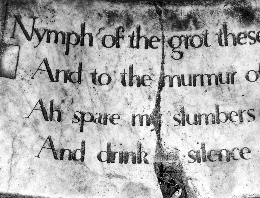
Inscription from Stourhead, Wiltshire (1848), as shown in ‘The Nymph and the Grot’ by James Mosley. One presumes that this was the original, but it has since been recut several times.
This shop sign in Edinburgh shows two weights of a contrasted sans form. The firm has been operating since 1928, which suggests that the form remained in use into the twentieth century, though it seems closer to a nineteenth-century form.
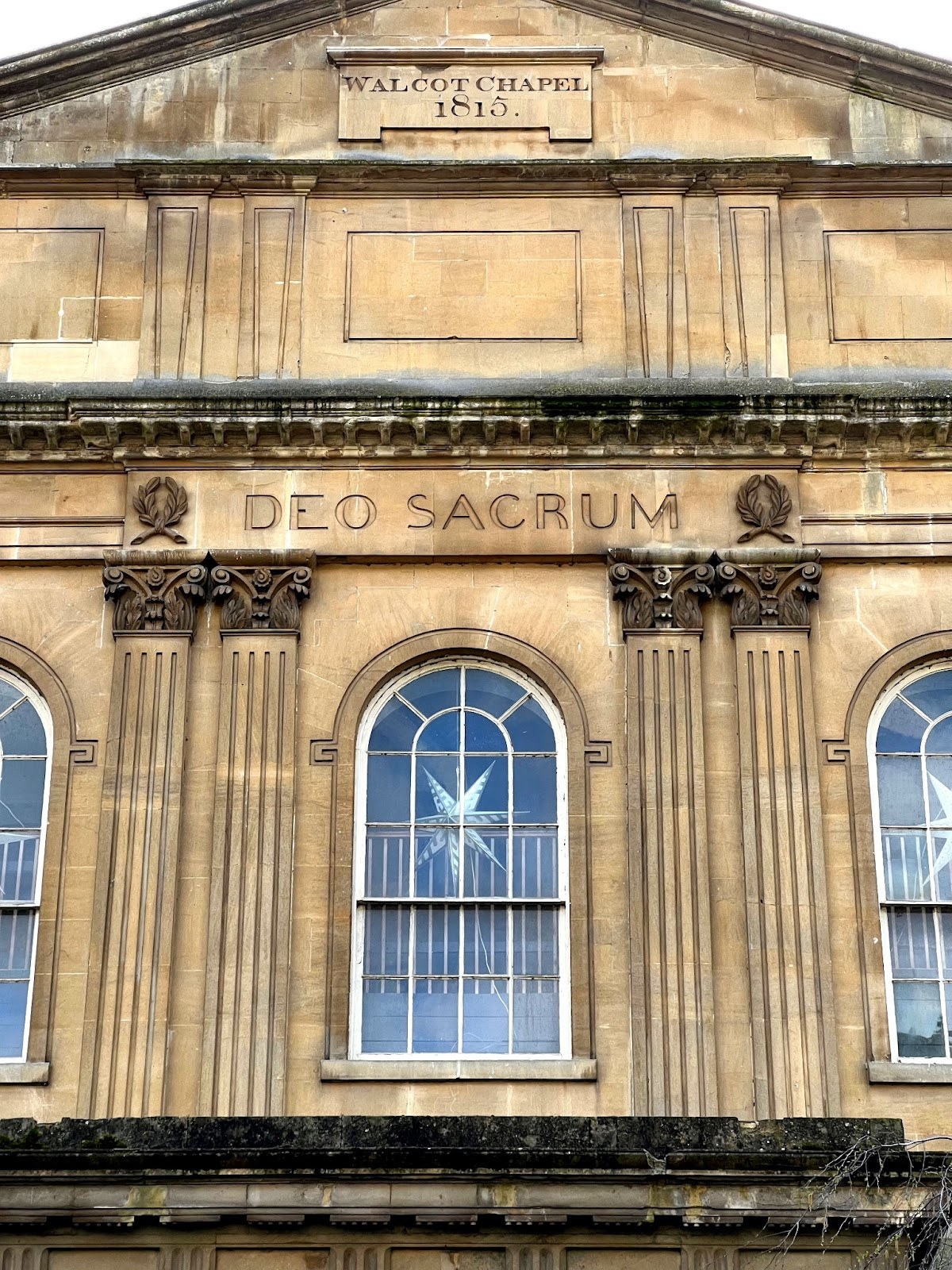
Inscription on Walcot Chapel, Bath. The date of the lower inscription is unclear; contemporary drawings do not show it, but it appears before the end of the nineteenth century.
An example of a high-contrast sans, St Wendrona, Wendron, Cornwall (1831). The form is unexpected and delightful. No parallels exist in typefounding.
An example of a high-contrast sans, St Wendrona, Wendron, Cornwall (1831). The form is unexpected and delightful. No parallels exist in typefounding.
An example of a high-contrast sans, St Wendrona, Wendron, Cornwall (1831). The form is unexpected and delightful. No parallels exist in typefounding.
A bold and extended form from the 1840s. St John the Baptist, Pendeen.
Inscription from Stourhead, Wiltshire (1848), as shown in ‘The Nymph and the Grot’ by James Mosley. One presumes that this was the original, but it has since been recut several times.
This shop sign in Edinburgh shows two weights of a contrasted sans form. The firm has been operating since 1928, which suggests that the form remained in use into the twentieth century, though it seems closer to a nineteenth-century form.
The inscription at the heart of Mosley’s ‘The Nymph and the Grot’ was cut in 1748 at Stourhead, Wiltshire.3 As a form, it is hard to place and categorise; it is a contrasted sans with the odd remaining serif. Was it a serif letter whose serifs were cut off, or a sans with the odd serif added? This contrasted form of sans serif seems to have enjoyed some popularity: it can be found on inscriptions on buildings, vases, medals, and gravestones – and eventually in a typeface made by Figgins in the 1880s, which we revived as County.
One can still see the form in Cornwall, where it appears to have been fairly prevalent. A particularly striking example shows a beautiful, highly contrasted sans inscribed on a gravestone. Probably cut in 1831, the stone features many styles: blackletter, roman, script, shaded, and a regular sans serif, making a high-contrast sans unexpected. It would be easy to miss if one didn’t look closely. Like the inscription in Stourhead, it begs the question: Is this a serifless serif or a high-contrast sans? And what possessed the letter cutter to make this choice? Did he cut the initial forms with the intention of cutting the serifs at a later date, and then forget? Or did he simply like the results? The width of certain letters like N, Y, and J suggests that he did not intend to add serifs later and that the choice was deliberate. That other examples of this high-contrast sans have not turned up in the area implies that the experiment was not repeated, or at least that other examples are less extreme.

A contrasted sans in the form of type: County, drawn by Paul Barnes with Tim Ripper.

County Open, drawn by Paul Barnes with Tim Ripper.
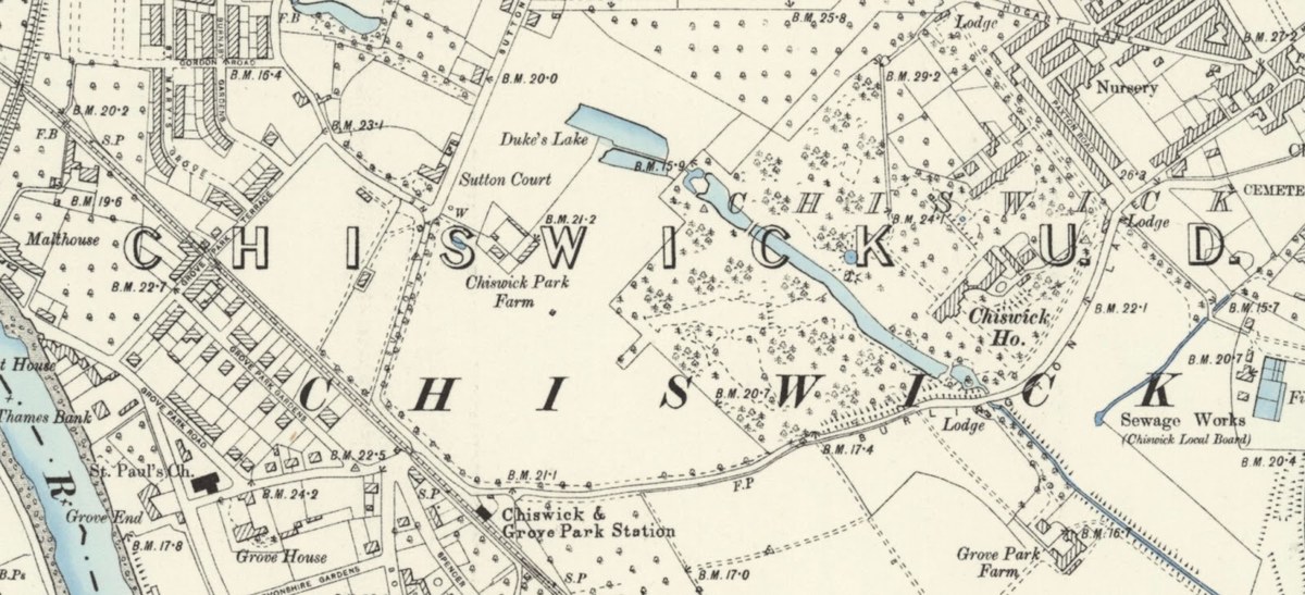
County is based on a Figgins design that was used by the Ordnance Survey on maps. Shown here on a six-inch map of Chiswick, 1894.
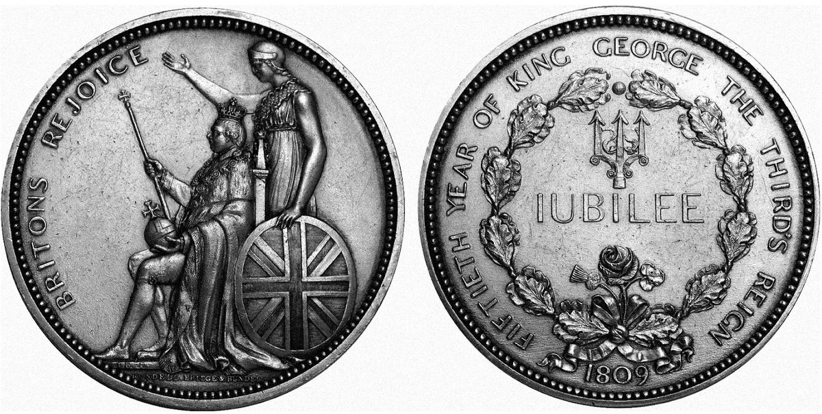
The assurance with which this beautiful, elegant sans has been handled suggests that the form was well understood at this point. Medal commemorating the Golden Jubilee of the Reign of George III, designed by J. Barber for Rundell, Bridge & Rundell, 1809.
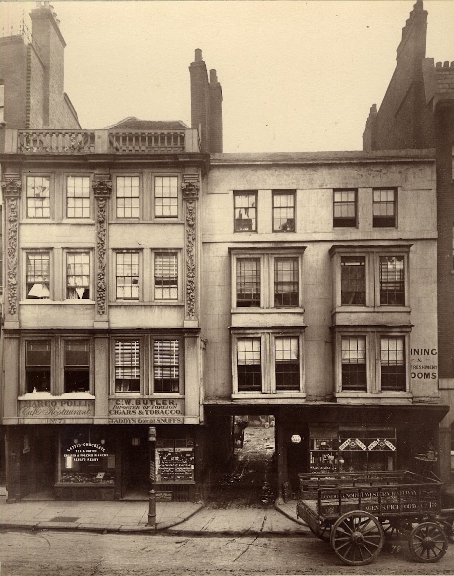
Photographs from the collection of the Society for Photographing Relics of Old London, taken by Alfred and John Bool and Henry Dixon & Son, 1875–1886. Courtesy of the Bishopsgate Institute.
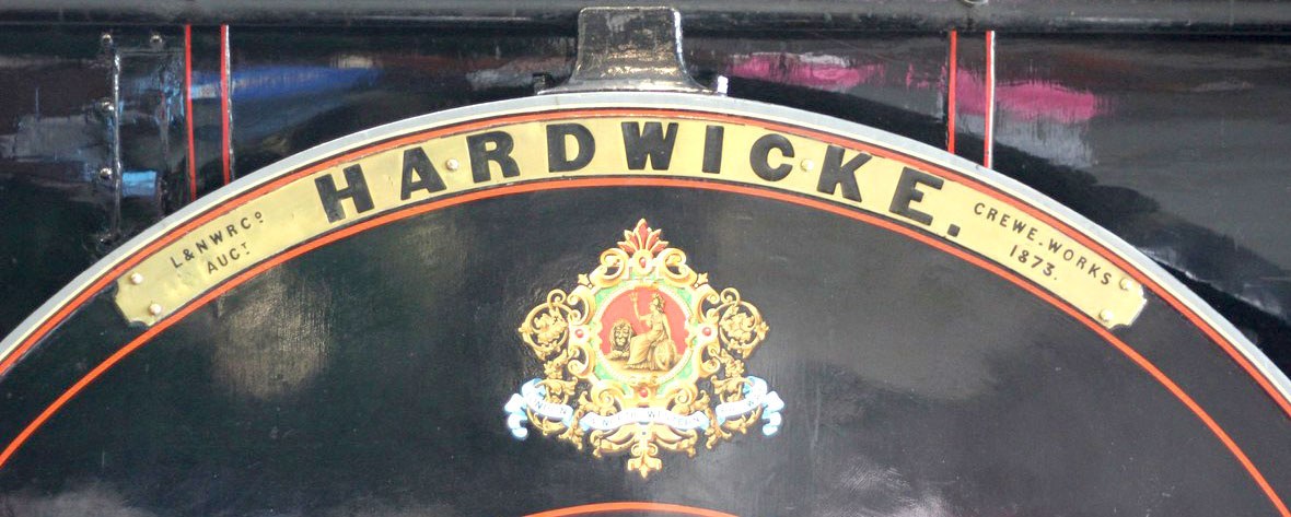
A sans perfectly suited to the industrial: the nameplate for Hardwicke built at Crewe (1892) and preserved at the National Railway Museum.
The sans applied in multiple methods: painted, extruded, indented.
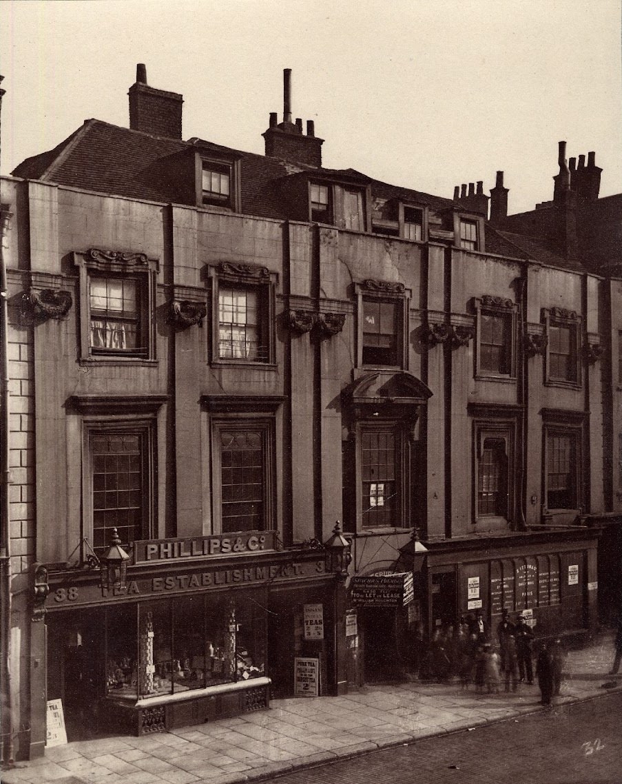
In the case of Phillips & Co., is it painted or is it dimensional?
Photographs from the collection of the Society for Photographing Relics of Old London, taken by Alfred and John Bool and Henry Dixon & Son, 1875–1886. Courtesy of the Bishopsgate Institute.
A sans perfectly suited to the industrial: the nameplate for Hardwicke built at Crewe (1892) and preserved at the National Railway Museum.
The sans applied in multiple methods: painted, extruded, indented.
In the case of Phillips & Co., is it painted or is it dimensional?
Chiswick Sans follows a similar path. It’s a serif without serifs. The skeletal structure and contrast are the same, but the detailing is different with the serifs removed. Though the form was a rarity during the height of the English vernacular, Chiswick Sans seems perfectly believable.

Chiswick Sans offers the elegance of Chiswick Serif in a simplified form.

In the roman, the simplification of the form results from the removal of serifs and terminals, and is relatively straightforward.

In the italic, the change is more invasive, involving a shallower angle and even greater simplification, while retaining character.
But whereas the task of making the roman seems logical, making the companion italic sans was more complicated. What happens with the strokes that mark the beginning and ending of a lowercase letter, which seem more integral to the letterform? Though they have been removed, a small curve remains, offering a hint about where the excised strokes once were. In the c, f, g, j, k, r, s, v, w, and x, simple thin strokes replace the former ball terminals. The angle of character is reduced by eight degrees, and some characters (g, v, w) are simplified, but in essence the core remains untouched.

Chiswick Sans italic weights. The weight range for the sans is expanded from five to seven – from a delicate Thin to a more emphatic Fat.

Chiswick Sans comes in three optical sizes: Chiswick Sans Poster (matching the contrast of the Poster serif cut), Chiswick Sans, and Chiswick Sans Text.

Chiswick Sans roman weights. The weight range for the sans is expanded from five to seven – from a delicate Thin to a more emphatic Fat.
Chiswick Sans italic weights. The weight range for the sans is expanded from five to seven – from a delicate Thin to a more emphatic Fat.
Chiswick Sans comes in three optical sizes: Chiswick Sans Poster (matching the contrast of the Poster serif cut), Chiswick Sans, and Chiswick Sans Text.
Chiswick Sans roman weights. The weight range for the sans is expanded from five to seven – from a delicate Thin to a more emphatic Fat.
Chiswick Sans italic weights. The weight range for the sans is expanded from five to seven – from a delicate Thin to a more emphatic Fat.
While Chiswick Serif offers numerous characters and possibilities, Chiswick Sans offers fewer. This is due in part to the sheer fatigue of making a large family, but also to the nature of sans serifs and their pared-down aesthetic, which requires a more sober approach. The weight range is broader: from Thin, which is almost a monoline hairline, to heavy Fat. Given the face’s contrast, the issue of optical scaling still applies, but the number of families is simplified to Chiswick Sans Poster (matching Chiswick Serif Poster), Chiswick Sans (matching Chiswick Serif Deck) and a Chiswick Sans Text, which is less contrasted than the serif version, but more contrasted than a typical sans serif face.
Chiswick Grotesque

Chiswick Grotesque expands the range to eight weights, with an even heavier Fat than Chiswick Sans.

Chiswick Grotesque expands the range to eight weights, with an even heavier Fat than Chiswick Sans.

Top: Original Sans Three, based on Figgins’s Two Line Great Primer Sans-Serif. Bottom: Chiswick Grotesque. The two are similar, but Chiswick is more informal.
Chiswick Grotesque expands the range to eight weights, with an even heavier Fat than Chiswick Sans.
Chiswick Grotesque expands the range to eight weights, with an even heavier Fat than Chiswick Sans.
Top: Original Sans Three, based on Figgins’s Two Line Great Primer Sans-Serif. Bottom: Chiswick Grotesque. The two are similar, but Chiswick is more informal.
Chiswick Grotesque expands the range to eight weights, with an even heavier Fat than Chiswick Sans.
High contrast is one reason we consider a serif face like Chiswick elegant, and it imbues Chiswick Sans with a similar elegance. This refinement makes them somewhat delicate, though, and they need a degree of care in use. Chiswick Grotesque takes a different approach. It is the vernacular rendered in the age of the machine; the skeletal structure remains, but this is a hastily created form made with speed, not finesse. These forms also recall how the sans letter had infiltrated the printed world, first with Caslon IV’s archetypical Egyptian of 1816, with its almost geometric forms; and then with Figgins’s sans faces of 1828. The surviving matrices show a perfectly circular O and Q; and despite the heavy weight and the issues of pure geometry, the type shows amazing spirit.
Chiswick Grotesque lives in the space between lettering and type. It borrows from examples like Figgins, but also from the spirit we see in Henry Dixon’s photographs. It’s a basic sans serif form which retains the spirit of lettering and is less considered and refined than the rest of the family. This can be seen in the O form, for example: as it increases in weight, its simple geometry becomes more obvious. It’s not a form that has been overanalysed; it’s a form that is rudimentary, even crude. The structure is the same as Chiswick’s, but the outcome is quite different.

The first sans serif type, William Caslon IV’s Two Lines English Egyptian as shown in Blake, Garnett & Co., Specimen of Printing Types, c. 1819. In form it touches on the geometric – it’s easy to imagine a connection with Edward Johnston’s Underground type nearly a hundred years later. Courtesy of St Bride Library.
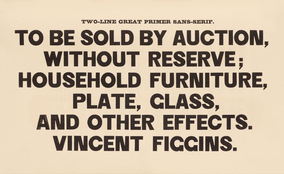
The second appearances of the sans serif in type form were issued by Vincent Figgins and appear in his 1828 specimen. Again, geometry was a model – but also a delightful naivety prevails. Two Line Great Primer Sans-Serif (Figgins introduced the name), Vincent Figgins Specimen of Printing Types, 1833. St Bride Library.
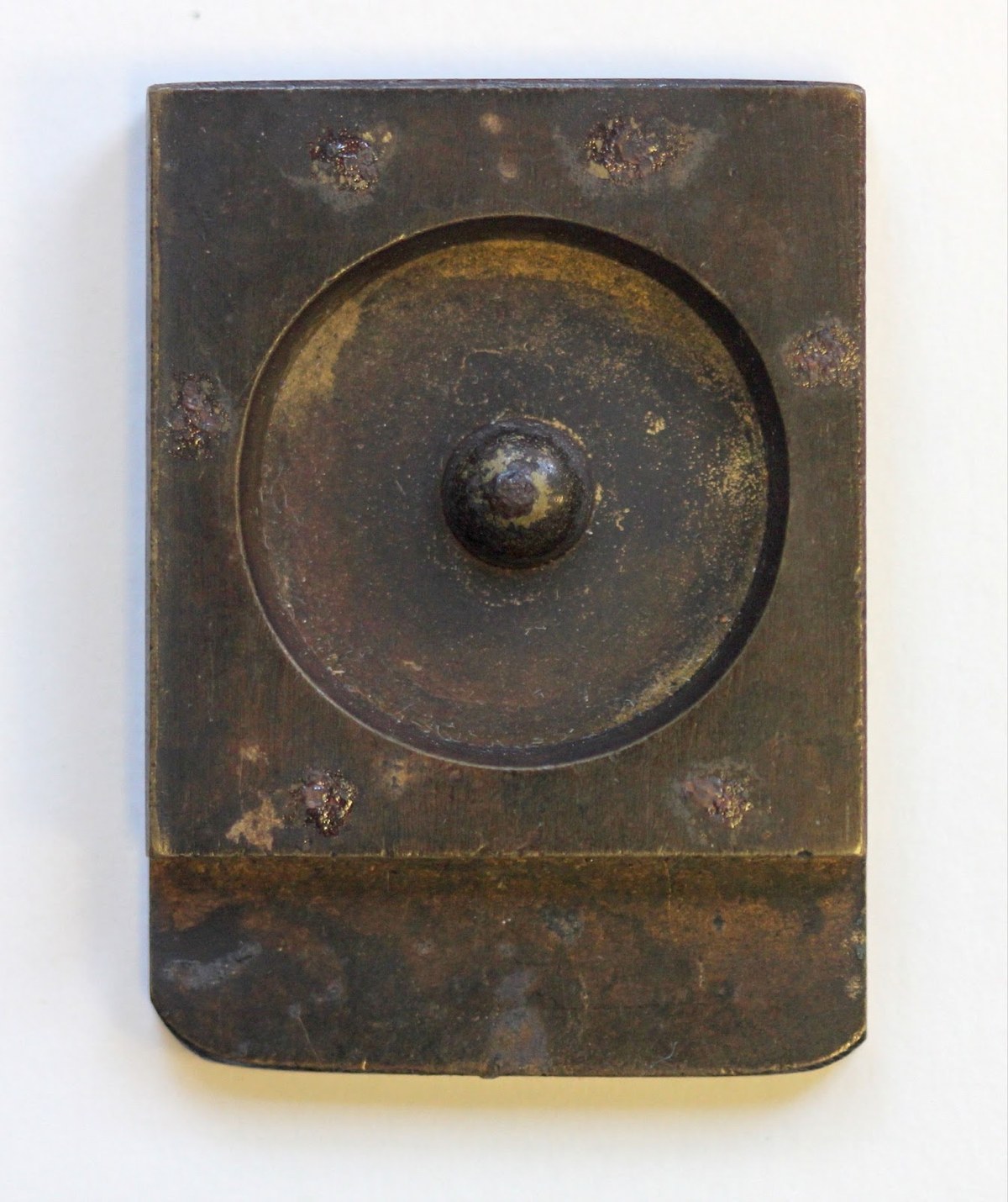
The matrices of Vincent Figgins’s Five Line Pica Sans-Serif clearly show the geometry of the style. Cut around 1828–1830. St Bride Library.
The matrices of Vincent Figgins’s Five Line Pica Sans-Serif clearly show the geometry of the style. Cut around 1828–1830. St Bride Library.

In the roman the geometric is obvious in the capital O; the italic returns to a more cursive form.

Chiswick Grotesque retains much of Chiswick Sans’ form, but has the appearance of being toned down.

Chiswick Grotesque retains much of Chiswick Sans’ form, but has the appearance of being toned down, particularly in the italic.
The less common forms of the K remain; the open g remains, but its elegance is harder to see. If we associate Chiswick with the rural idyll, then Chiswick Grotesque belongs to the metropolitan sprawl, to the busy streets of London, or to industrial warehouses and the mid-nineteenth-century railway boom. Even today, these letters can be seen all over London, often ghostly reminders of a bygone era, of long-forgotten heroes on statue plinths, of the former occupants of a building, of a brewery long closed, of an old pub no longer selling beer.
Chiswick can never hope to fully capture the full range of the vernacular letter. It would be easy enough to imagine a slab version, an Italian variant, or even a script which would almost be a copperplate – but all typeface families have to be limited if they are ever to be finished. In a serif and sans, the extremes of the style can be covered, from the pastoral elegance where Chiswick’s roots begin through to the industrial style of Chiswick Grotesque. Though rooted in history, Chiswick is a timeless design that remains useful today.
All 120 images can be seen on the RA’s website; and, as they were issued originally, on the Yale Center for British Art’s website.
Baskerville’s capitals are around 17 degrees, and the lower case around 18 degrees; in the slate example Baskerville’s capitals are around 23 degrees. Chiswick’s capitals are 23 degrees, and the lower case 27 degrees. Brunel has capitals around 18 degrees, with a lower case around 21. Baskerville’s reduction of the angle of his type from his lettering on slate was probably affected by the transfer to metal.
Mosley dates it as 1748: the time of construction of the grotto it was contained in. Don’t go looking for it today, though. At some point in the 1960s the original inscription was removed, and recut in a form unlike the original. This was then recut again to reflect the original recut inscription by James Sutton. In 2016 it was recut yet again by Iain Cotton.