Shape-shifting Align
Letters are intimate things. We use and misuse them, push and pull them; we stretch them and squoosh them; we make them work against all odds; we cram them into spaces. Rooted in the material world, Align is an exploration of flatness as a concept and as a modus operandi—a variable text face that molts its blunt, bracketed serifs as it swells to take up space. Heavy weights tend to play up a typeface’s features; Align’s heavier weights exaggerate its fundamental flatness by absorbing the serifs as the family gets heavier. “The face gets so bold and heavy that the serifs just drop off completely,” said designer Greg Gazdowicz, “though it’s still technically a serif.”
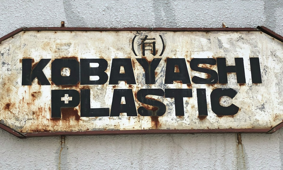
Gazdowicz enjoys unraveling conventions and observing how letters perform in the physical world. Camera in hand, he traipsed through various cities—New York, Los Angeles, Tokyo, Honolulu, Philly—and began noticing patterns in the everyday usage of letters. People seemed to go to great lengths to stuff letters into rectangles, with intriguing results. “I mostly saw things that were stretched and cropped,” said Gazdowicz, “but also things that were made by tape being laid out for a cap height and a baseline, then being painted on top of, and then having the tape removed.” Letters aren’t precious; they can be experimented with and pushed to extremes while remaining legible and readable. Gazdowicz started drawing.
An early step was trimming the overshoots: “I was interested in cutting off the overshoots of the round characters to see if it would affect the texture of a text typeface while also making it feel very graphic,” said Gazdowicz. The stringency of Align’s outer flatness is offset by an inner softness; the sheared bowls are counterbalanced by rounded corners and generously bracketed serifs. While designing the family, Gazdowicz set Align with tight leading to reinforce the solidity of the wordshapes. “Using it like this made me want to push on with the design,” he noted. This tight stackability coupled with Align’s overall flatness (particularly on the horizontal axis) produces a dense, dark, readable thicket in passages of text.
Align started to click for Gazdowicz when he stopped thinking of it as a superfamily consisting of a separate serif and sans. “The heaviest weight I was experimenting with wasn’t intended as the sans part of the family; it was just the black weight,” said Gazdowicz. “The starting point wasn’t the serif part; it was just the regular weight. I realized that the black weight had to take on more characteristics of the serif. It needed to fully be the serif with the serifs leveled out.” By making a few structural changes to bring the black weight more in line with the regular weight, Gazdowicz saw that Align was actually one family with a continuous weight range, rather than separate but related serif and sans families. “The serifs are still there in the outlines—they’re just flush with the stems,” he said.
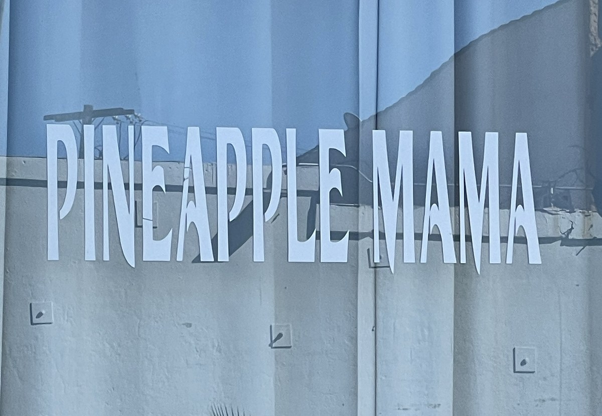
Gazdowicz remembered a sign he saw in LA for a place called PINEAPPLE MAMA. “The vinyl letters were stretched and squeezed and then cropped so much that the process destroyed the serifs that were there before,” he recalled. “This led me down the path of exaggerating the weight so that it felt as if the weight was inflating to fit the space.” He started interpolating between the regular and black weights and found he liked how the in-betweens looked: “Each weight in between the two felt meaningful in how much they were losing or gaining serifs.”

Enamel sign in Tokyo, 2018. Image: Greg Gazdowicz.

Hand-painted sign in Tabasco, Mexico, posted by @letterformsofearth on Instagram, 2019.

Hand-painted sign in Hawaii, 2022. Image: Greg Gazdowicz.

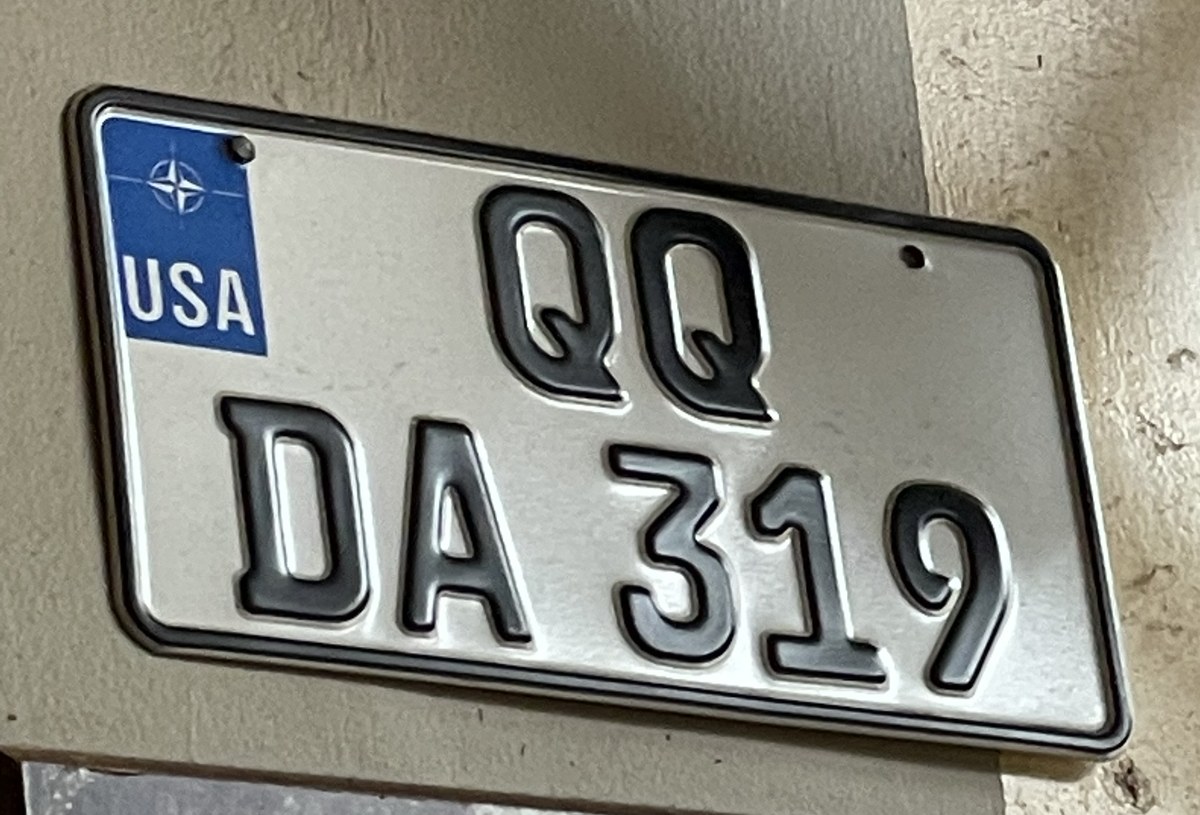
The Q on this license plate directly inspired the form in Align. Image: Greg Gazdowicz.

Vinyl lettering, Los Angeles, 2019. Image: Greg Gazdowicz.
Align’s sheared overshoots give it a distinctly crisp texture.
The lopped-off tops and bottoms of Align’s curves make it eminently stackable.
The italic stymied him at first, though. Stanley Morison famously argued that cursive italics were too disruptive in running text and proposed that a modest slope was all that was necessary to differentiate italic from roman. He of course later backed away from such rigid dogma, and couldn’t have foreseen the advent of desktop publishing, which allowed users to create “italics” that were in fact mechanically slanted (and warped) romans. But this is how most people tend to interact with letters: they want to emphasize certain words or differentiate them in some way from the main text; they press a button labeled I and they produce what they think of as “italics.” If a true italic or oblique is installed, then all is well; if not, then the result is faux, and most users either will be none the wiser, or won’t care. The message remains legible, and life hurries on.
Initially Gazdowicz made the Black italic a mechanically sloped roman, more typical of a sans. That didn’t interpolate well with the regular weight, however, and also struck him as stale. He then tried drawing a full cursive italic for Align, but that didn’t jibe with the family’s pragmatic, workaday thesis. “It felt too gimmicky to have a fully fledged cursivey italic,” he said. “It looked good but didn’t quite sit right with the family as a whole.” The fully cursive black italic, especially, did not work well in text: “It felt forced and unnatural,” said Gazdowicz, “like a shirt tailored for a person with a completely different body type.”
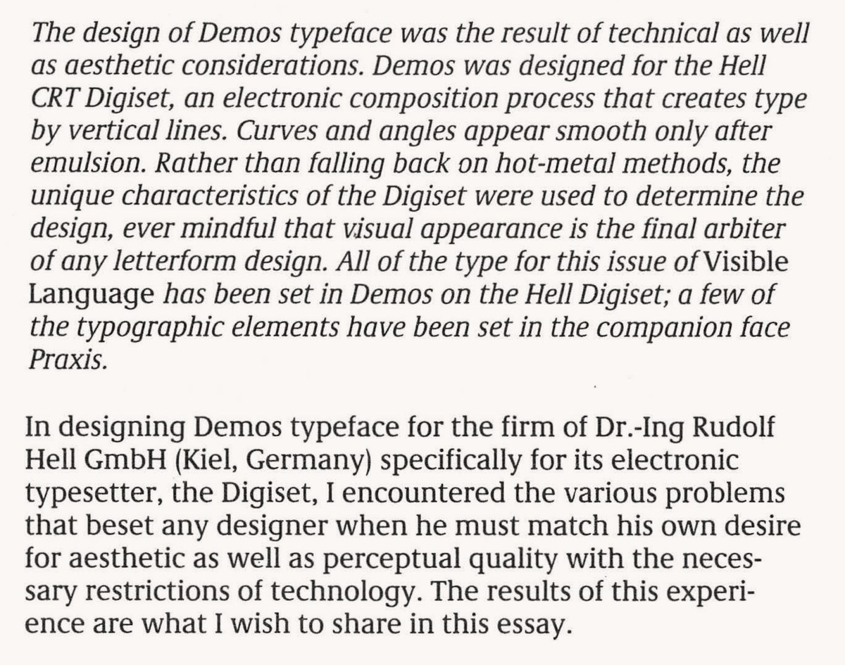
He turned to a couple of early digital typefaces by Gerard Unger, Demos and Praxis, which also explore flatness as a means of facilitating digital stretching and squeezing, albeit less explicitly than Align. Demos was particularly instructive because its italic consists of a mix of sloped roman and true italic forms. “It felt appropriate for Align to approach the italics in a similar way, since the heaviest weight would really benefit from some of the characters being sloped forms,” said Gazdowicz. Align’s italic, which might be characterized as a modified sloped roman, reinforces the family’s status as a boundary-pushing, transmogrifying hybrid: oblique forms typical of a sans serif mingle with more traditionally cursive glyphs like a, e, g, and k; and the serifed feet on the vertical strokes in h, m, and n stand firmly on the baseline.
Gazdowicz envisioned Align as a tight, linear family: it consists of five static weights with matching italics, from Regular to Black, but also comes as a variable font so that users can precisely control the face’s heaviness and progressive sloughing of serifs. “I didn’t want to make another super-huge family with tons of weights and styles,” said Gazdowicz, fresh from designing the sweeping Roboto Serif for Google and releasing the complex, three-part Terza collection at Commercial Type.
Align is strange in almost every way. Informed by the rushed, pragmatic “misuse” of letters in urban signage, it’s a text face destined for more contemplative environments. It can’t be pinned down to a specific time or style or genre; instead it blurs and bends genre altogether. It’s a serif whose italic behaves more like a sans oblique; it’s a sans that behaves like a serif, whose serifs linger like phantom limbs as the face gets heavier. It’s free from obvious influence (though if you squint at the roman cut of Align Black, you might see a glimmer of Berthold Block). It’s perhaps a distant relative of Melior and Eurostile in the sense that it also has squareness built into it; and its letterforms, like theirs, try to fit and fill their own box. But it’s really on its own planet. It’s weird how weird Align doesn’t look as a family—it’s a logical set of characteristics that yields a curious but convincing result.

Demos by Gerard Unger. See Unger, The Design of a Typeface, Visible Language 13, no. 2 (1979), PDF.
An early draft of Align Regular Italic and Black Italic, showing the different structures used in each.
Top: Regular Italic with more cursive forms for a k w v e and y.
Bottom: Regular italic with sloped roman forms.
Top: Black Italic with more cursive forms for a k w v e g and y.
Bottom: Black italic with oblique forms.
Gazdowicz’s eventual solution was a compromise that used a handful of subtle cursive forms consistently across the whole weight spectrum.