The Schenk that keeps on giving
Scrolling through Instagram one day, Hrvoje Živčić stopped short. At first he wasn’t quite sure what he was looking at. A beautiful photograph by Fraser Muggeridge shows a poster-sized piece of black chipboard filled with a simple phrase lettered in bright green gouache: schenk ein buch, give a book. You can see Fraser reflected in the gloss of the poster as he takes the photo with his phone, and, if you squint, you can make out Paul Barnes in the background. They are visiting Haettenschweiler from A to Z, an exhibition mounted by the Museum für Gestaltung Zürich in 2022. The piece in question is a promotional poster for Swiss bookseller SBVV, perhaps designed around 1960 (though that’s not clear) by Walter Haettenschweiler, and it served as a catalyst for Schenk, Hrvoje’s striking new display family.
Captivated by the unvarnished power of Haettenschweiler’s modular(ish) lowercase letterforms, Hrvoje set out to learn more about them. They were probably first sketched around 1954, when Haettenschweiler was still a student at the School of Applied Arts in Zurich—and they owed a debt to Pierre Gauchat, who had done similar lettering for a poster designed for SBVV the year before. When graphic artist and photographer Armin Haab saw Haettenschweiler’s lettering, he asked him to further develop the alphabet for a new source book he was editing with Alex Stocker: the influential Lettera. (After Stocker’s death, Haettenschweiler went on to coedit volumes two through four of Lettera, for which he drew numerous alphabets.)
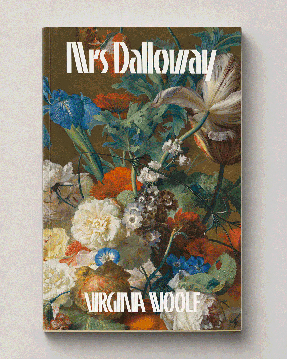
The resulting alphabet, now with an upper case and called simply Grotesk, appeared in the inaugural issue of Lettera; by the third edition of the issue, its name had been updated to Lettera-Grotesk. It consists of a combinatory mix of straight lines, diagonals, and arches, with lopped-off tops and bottoms. These caps are made for stacking. Banco’s presence makes itself felt here—it was surely part of the atmosphere, having been released by the Fonderie Olive just a few years earlier—though Excoffon’s design is characteristically propulsive, whereas Haettenschweiler’s is comparatively stately, almost meditative in its regularity. Schenk is even more rationalized: an important decision Hrvoje made early on was to force (most) diagonals to have the same angle. This makes the counterspaces quite narrow and geometric, giving the family a dramatic, graphic stance. Building on this idea, Hrvoje made a flipped version of all of the capitals with diagonals (A, M, V, W), giving them the opportunity to lock together à la ITC Avant Garde Gothic. He opted to keep the spacing tight, knowingly sacrificing some legibility and readability in order to push the graphic expression of the forms even further.
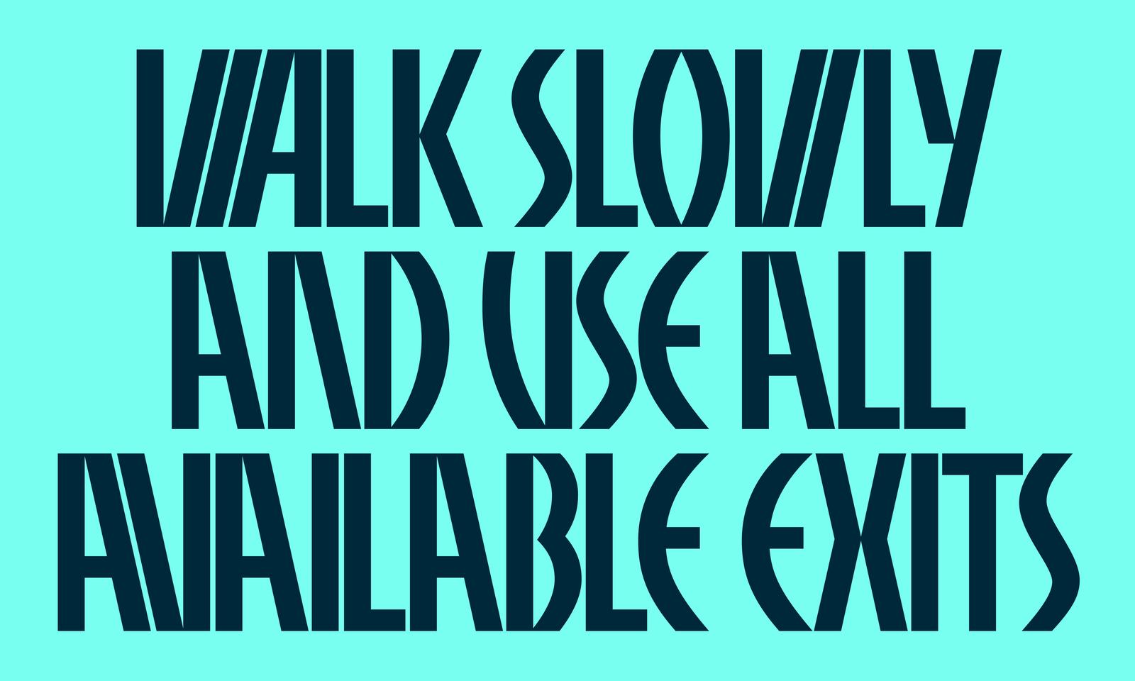
Hrvoje gave nearly all of the diagonals the same angle, and made flipped versions of all of the caps with diagonals so that they could click together like magnets.
Another important design decision involved focusing primarily on the partial alphabet visible in Fraser’s photo, largely ignoring the capitals shown in Lettera. “I was impressed by how simple the forms were and how the repeated shapes managed to fit into different letters with only slight adjustments,” Hrvoje wrote in some internal notes on the project. He began by digitally drawing the limited constellation of letters as faithfully as possible—not because he ever intended Schenk to be a purely imitative revival of Haettenschweiler’s work, but because he wanted to experience how the design operated. Concentrating on this restricted set of shapes encouraged Hrvoje to arrive at his own conclusions about how Schenk should develop, leading him to change some of the forms seen in the original design. Though hand-drawn in gouache and thus extremely tactile and almost calligraphic, the schenck ein buch lettering always had, for Hrvoje, something constructed and geometric at its core.
From a lucky glimpse of a partial lowercase alphabet drawn by hand in the 1950s, a fully fledged family made for contemporary use has unfolded. “The source is literally just that: a source, a seed,” Hrvoje wrote in his notes. “I often get surprised by how many decisions and small details you still need to figure out,” he continued. “Some of these choices are bigger and more visible, like the weight range, while others are much more subtle—something you don’t necessarily see at first, but feel.”
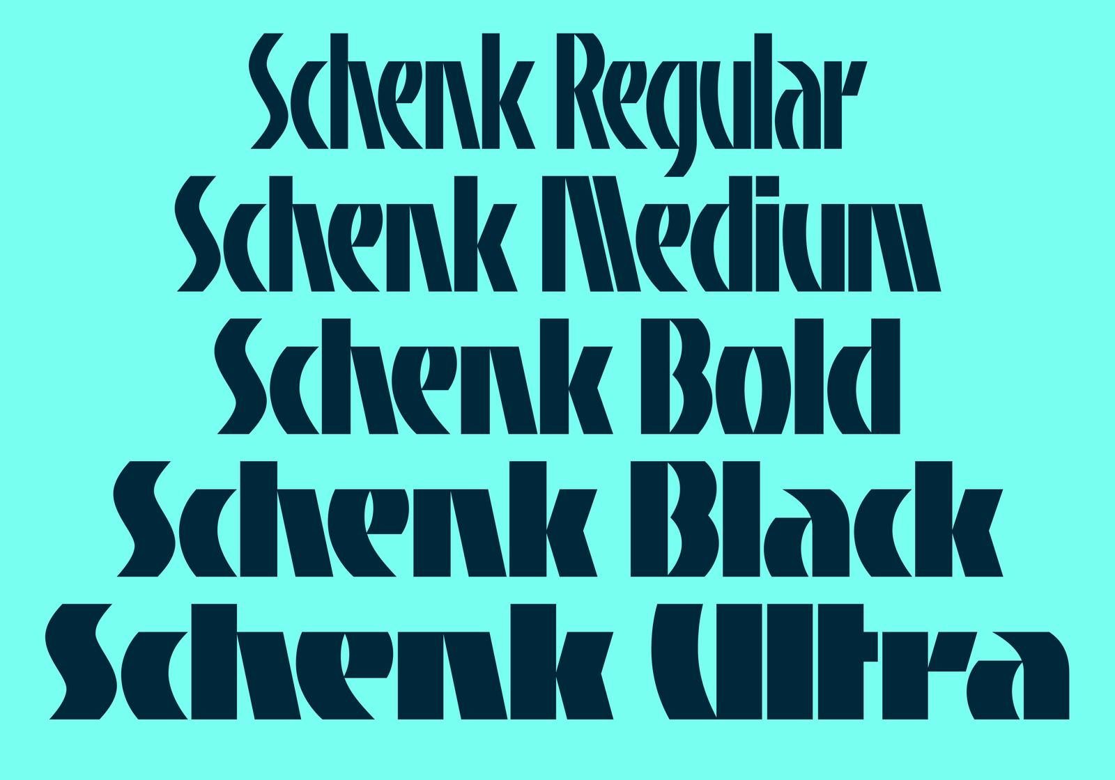
Five weights. Nothing too light. No italics.