Royal Gothic’s staying power
Paul Barnes first noticed Royal Gothic when he was a student at what was then called Lanchester Polytechnic (now Coventry University) in the West Midlands. Spying it in a case of metal type, it reminded him of the now-defunct Midland Bank, whose famous “griffin” logo, set in Bauer’s Folio Extra Bold, had been designed by Peter Pickard in 1965.
What made him intuitively associate the two designs was their boxy shapes. Within the apparently simple sans serif form teem multiple styles: rounded, geometric, grotesque, humanist, flared, contrasted—and within these appears a squarer style that maximizes impact and coverage.

Midland Bank Limited, logotype by Peter Pickard, 1965
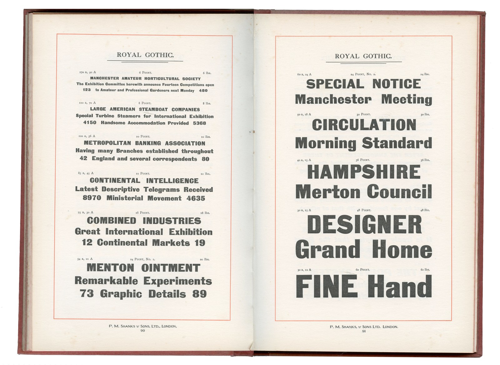
A heavy, squarish sans emerged in Germany in the 1870s, and then in Britain around 1880 in a specimen from the Patent Type Foundry in London, under the curious name of Royal Gothic—curious because “Gothic” was nomenclature more typical of the United States than of Blighty, which suggests the possibility that the font may have originally come from the US. Something was in the air: Zeitungs-Grotesque, the German design, gained popularity throughout Europe and appeared under various names, and piracy was also rampant. This ultrabold, authorless jobbing sans has no original but rather a constellation of “originals.”
Though clearly in a lineage with earlier British grotesques, Royal Gothic experiments with novel traits like a single-storey g; a flat-bottomed t, j, and y; a flat-topped f; a hooked r; and, inexplicably, a 4 with a swoopy left stroke and an open, stencil-like top. This is a big deal: The squarish sans is one of the great innovations of the late nineteenth century, paving the way for iconic twentieth-century designs like Eurostile and (as Paul instinctively sensed that day in Coventry) Folio Extra Bold. Contemporary designers often turn to squarish sans serifs to invoke tech or luxury; the squareness supports tight setting and creates a sense of density and fullness. As this new form began to emerge, though, it had a somewhat blunter objective: to reduce the amount of space between letters so as to appear darker on the page. More ink, more attention.
The metal sorts Paul glimpsed in the drawer as a student had a gritty, industrial appearance that appealed to him and stuck with him over the years. Although Royal Gothic experienced some initial success and remained continuously in production well into the twentieth century, eventually adding more sizes and a somewhat incongruous italic (probably made by the Keystone Type Foundry in Philadelphia under the name Charter Oak), it slipped into obscurity as digital typesetting took over. In the early aughts, Paul began work on his interpretation of the typeface, eager not only to adapt it to modern-day technology so it would be available to today’s designers, but also to help Royal Gothic realize its full potential. He felt the need, for example, to draw a new italic to better match the roman: a sloped form at a fairly modest eleven degrees.
Spread from Happy Gas (Tate, 2023), designed by Fraser Muggeridge
But arguably the most exciting aspect of Paul’s renewal of Royal Gothic is the expansion of the weight range, from a delicate thin to a corpulent fat. The fat weight keeps spacing tight for display, and the x-height markedly increases. The design’s squareness is most evident in the b, d, p, and q, and the counters almost completely flatten. The lighter weights strike a balance—and a tension—between the somewhat squashed appearance of the forms’ exterior and the flatness on their interior. Paul was especially fascinated by the utility of the lighter weights: Spacing is looser and contrast is reduced to create an even color, making Royal Gothic’s lighter weights eminently legible and readable in running text.
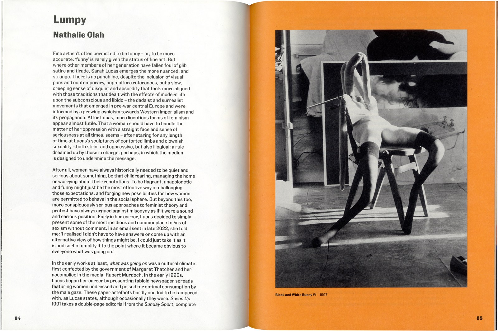
Fraser Muggeridge studio used Royal Gothic Light to wondrous effect for running text in a 2023 monograph on artist Sarah Lucas, complementing it with heavier weights throughout for heads, subheads, running text, captions, and page numbers. Happy Gas bears witness to this groundbreaking nineteenth-century design’s contemporary relevance—and its endurance.
Read Paul Barnes’s essay on Royal Gothic’s design and development.