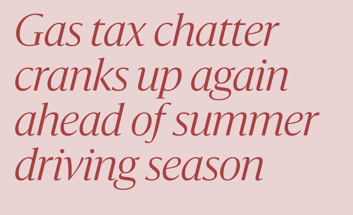
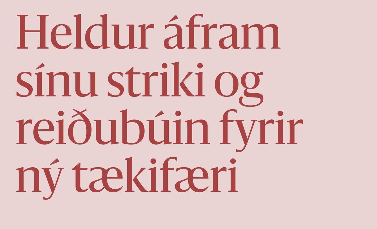
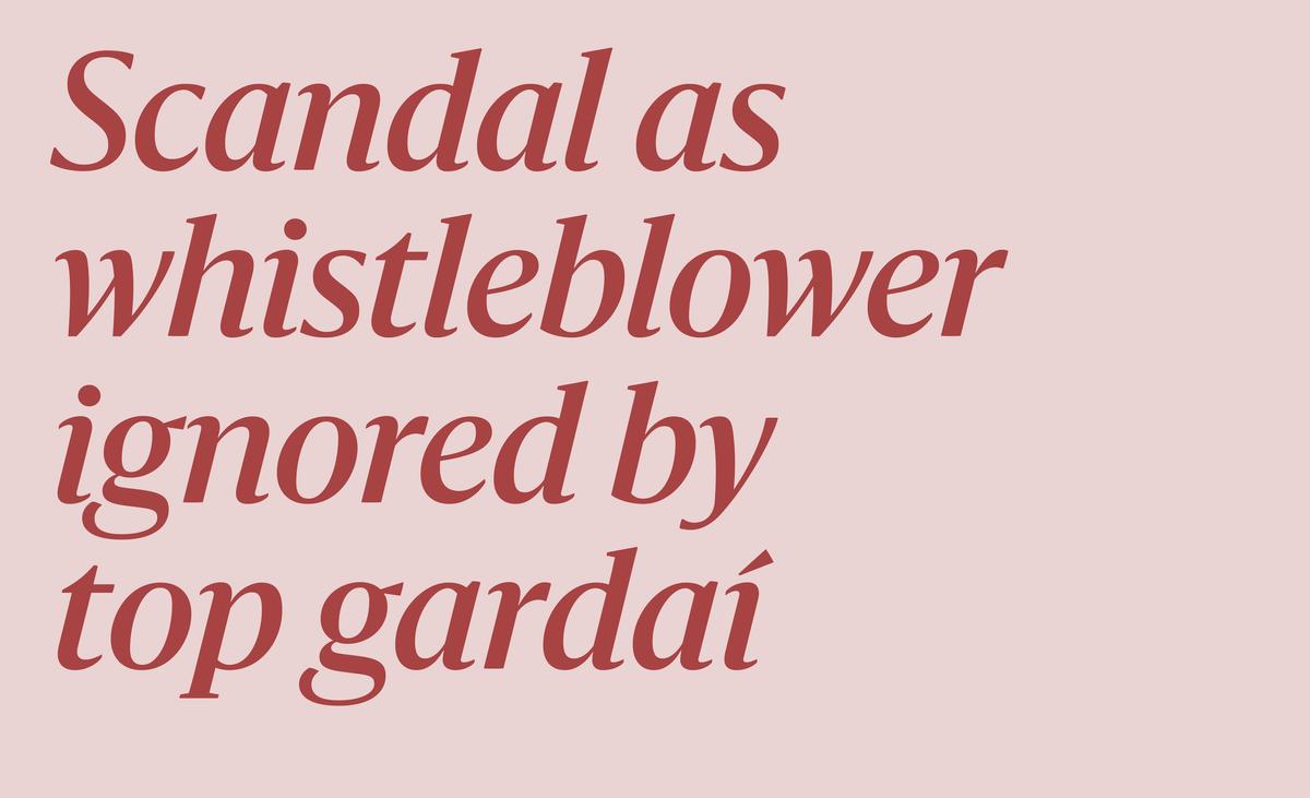
Sanomat by Paul Barnes
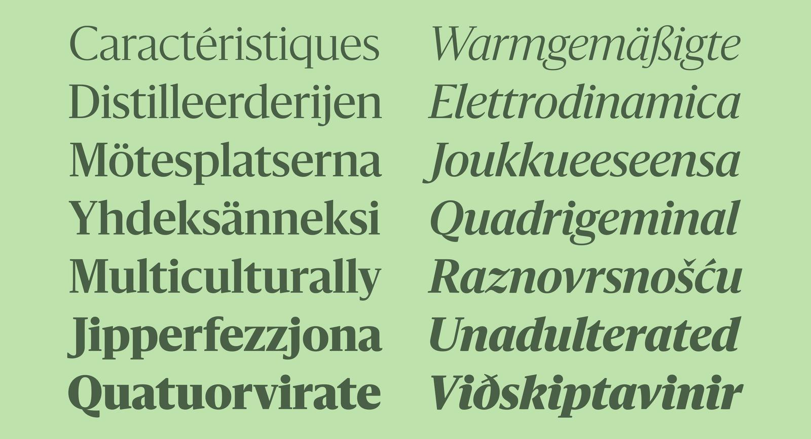
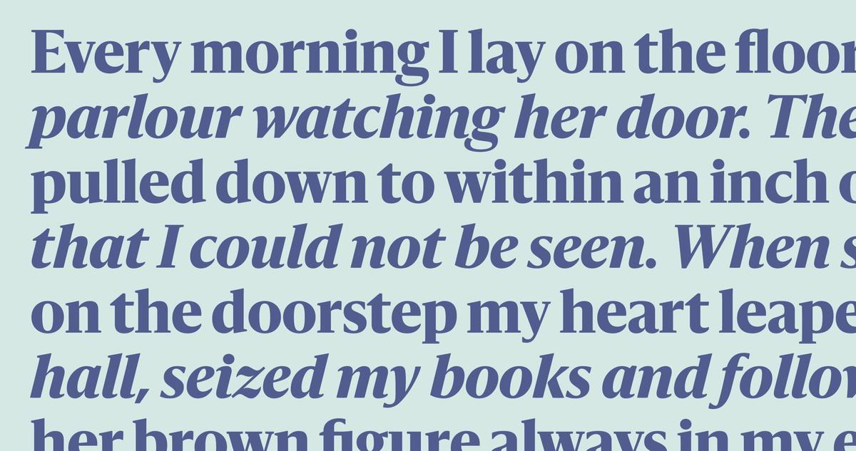
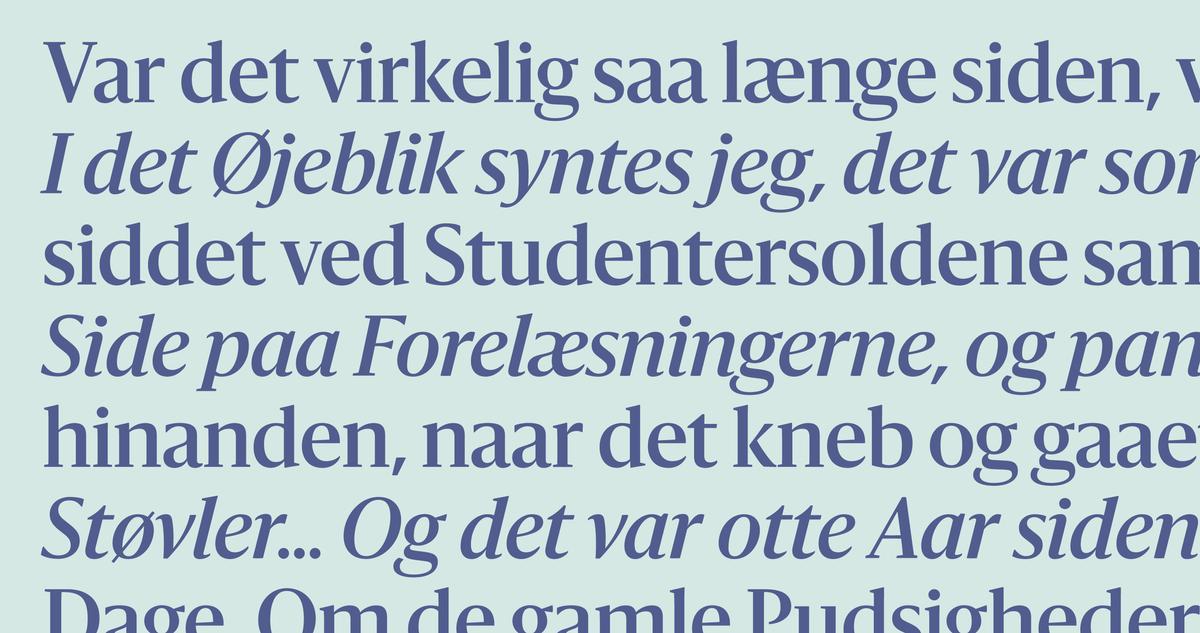
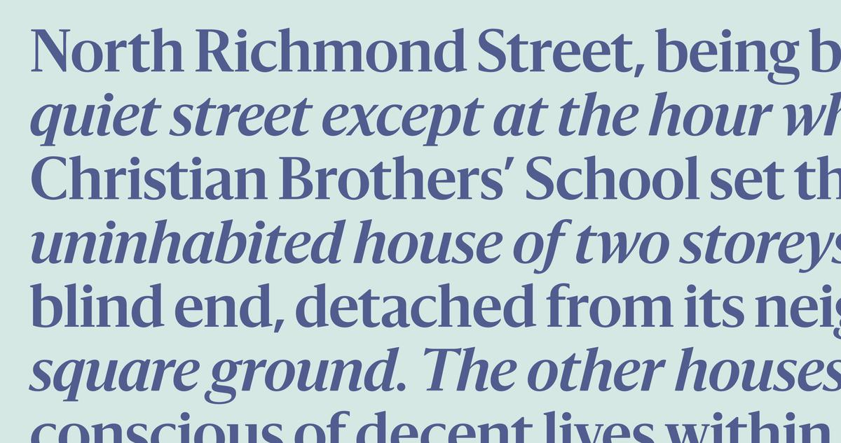
Sanomat is a new serif display family designed by Paul Barnes. Both serious and elegant, with an inviting warmth, it was originally commissioned by Sami Valtere in 2013 for his acclaimed redesign of Helsingin Sanomat, Finland’s most widely read and respected national newspaper. Its proportions are narrow, with shallow ascenders and descenders to allow for the tight leading typical of the news environment, short and simple serifs to allow for tight spacing, with a large x-height to keep legibility even in smaller headlines in the newspaper’s mobile apps. With its wide range of weights, from a graceful Light through to a boisterous Black, it is designed to express the many tones of voice needed by modern news media: a serious and respectable feeling for news headlines, a measured tone for the editorial pages, expressive personality for the style and arts pages, a literate elegance in the monthly magazine, and heightened drama on the sports pages.
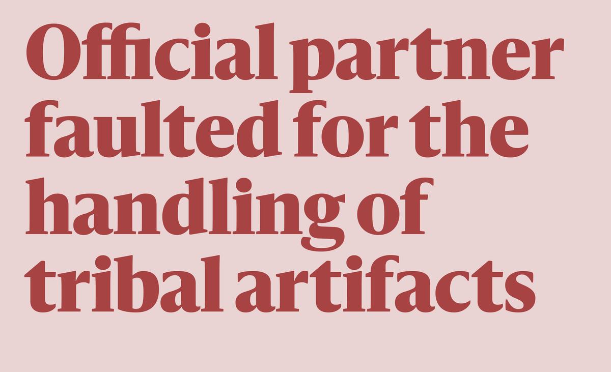
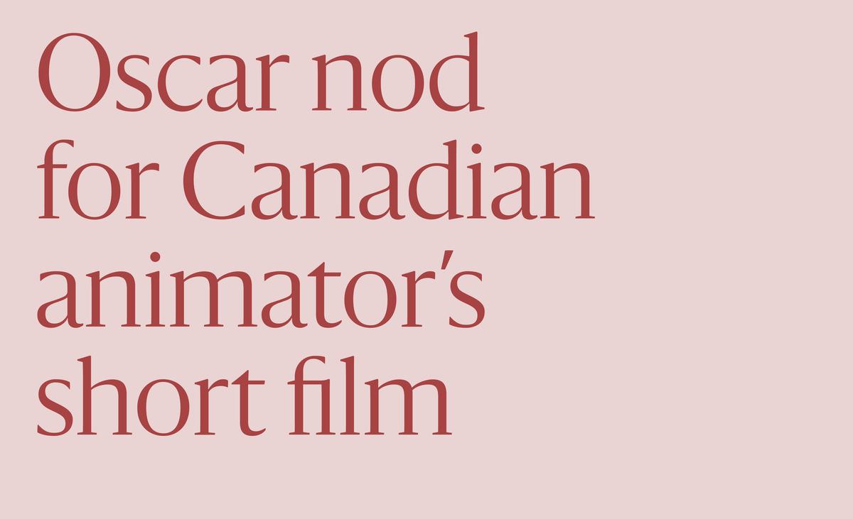
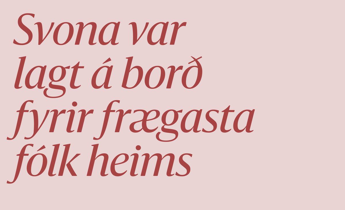


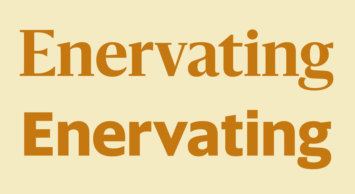
It is common to evoke elegance in a typeface by using sharpness and high contrast: pointed serifs and terminals typically denote elegance, while softness and organic curves denote a warm and casual feeling. Sanomat manages to feel elegant even though its details are soft, such as the terminals on letters such as a f g j k r and y, and the flaring in place of serifs of horizontal strokes in many capital letters, such as the E F L and T. This unusual treatment shows the influence of inscriptionally inspired typefaces such as Berthold Wolpe’s iconic Albertus, Hermann Zapf’s divisive Optima or Hermann Romann’s little known Romann Antiqua. In part this is functional: the Finnish language has many repeating letterforms, such as ää, and the softening reduces visual noise. It also brought a measure of warmth and humanity to the precisely gridded layouts of Helsingin Sanomat. The gentle curves and humanist sentiment echo Finnish twentieth century architecture and design. Barnes was inspired by an eclectic group of Finnish designers and illustrators including Alvar Aalto, Eliel Saarinen, Maija Isola, and Tove Jansson.
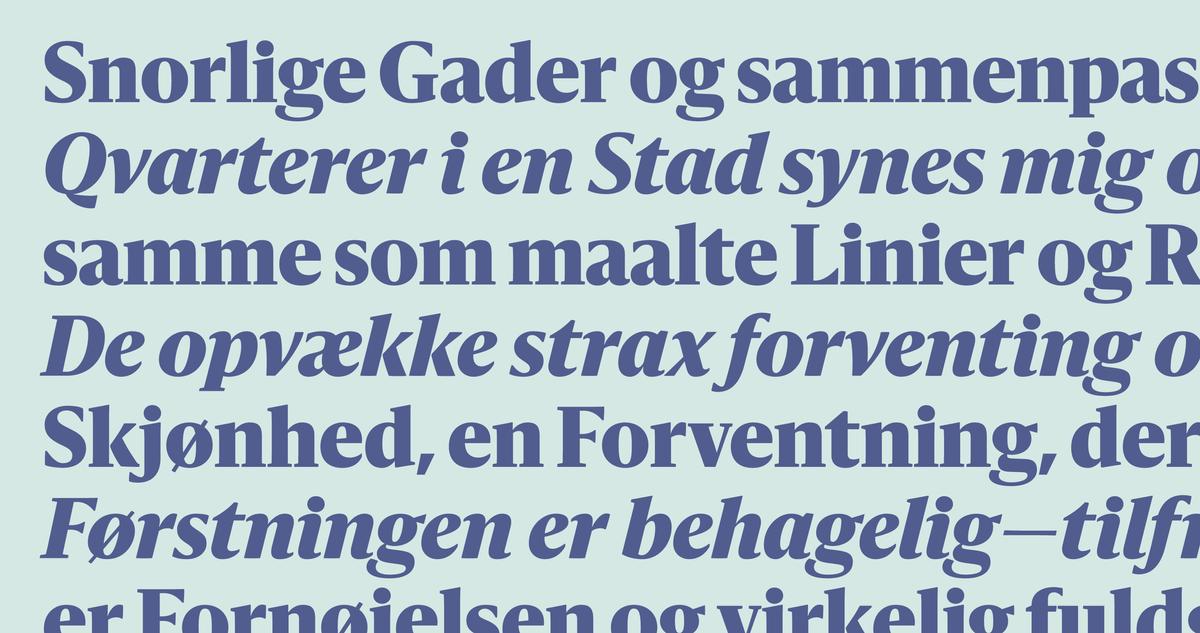
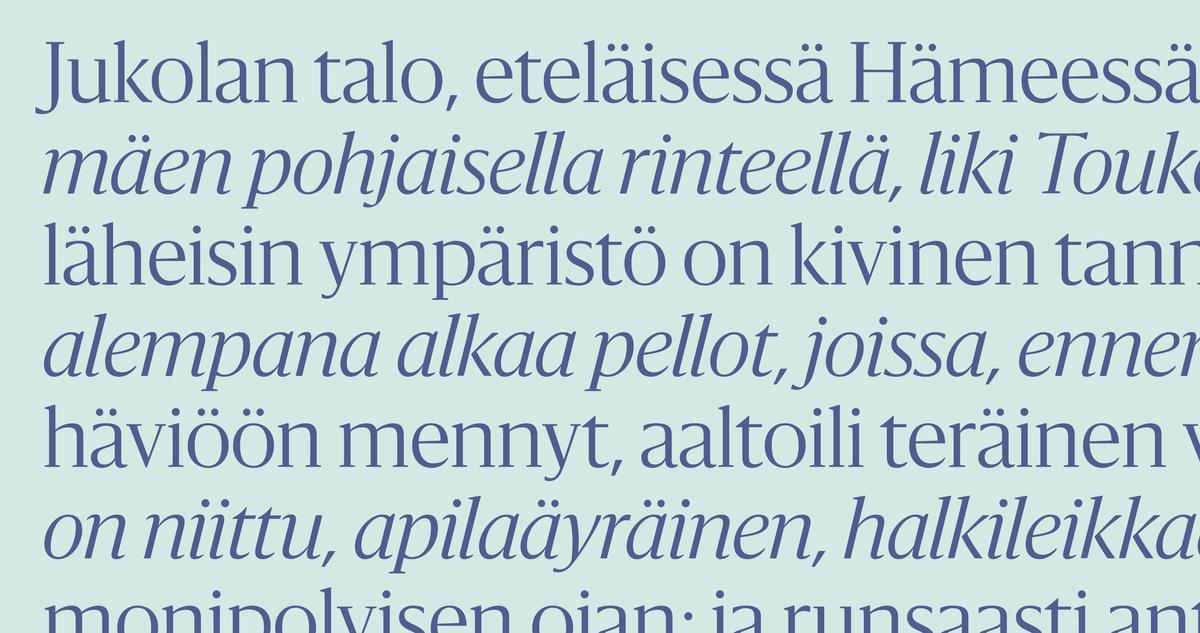
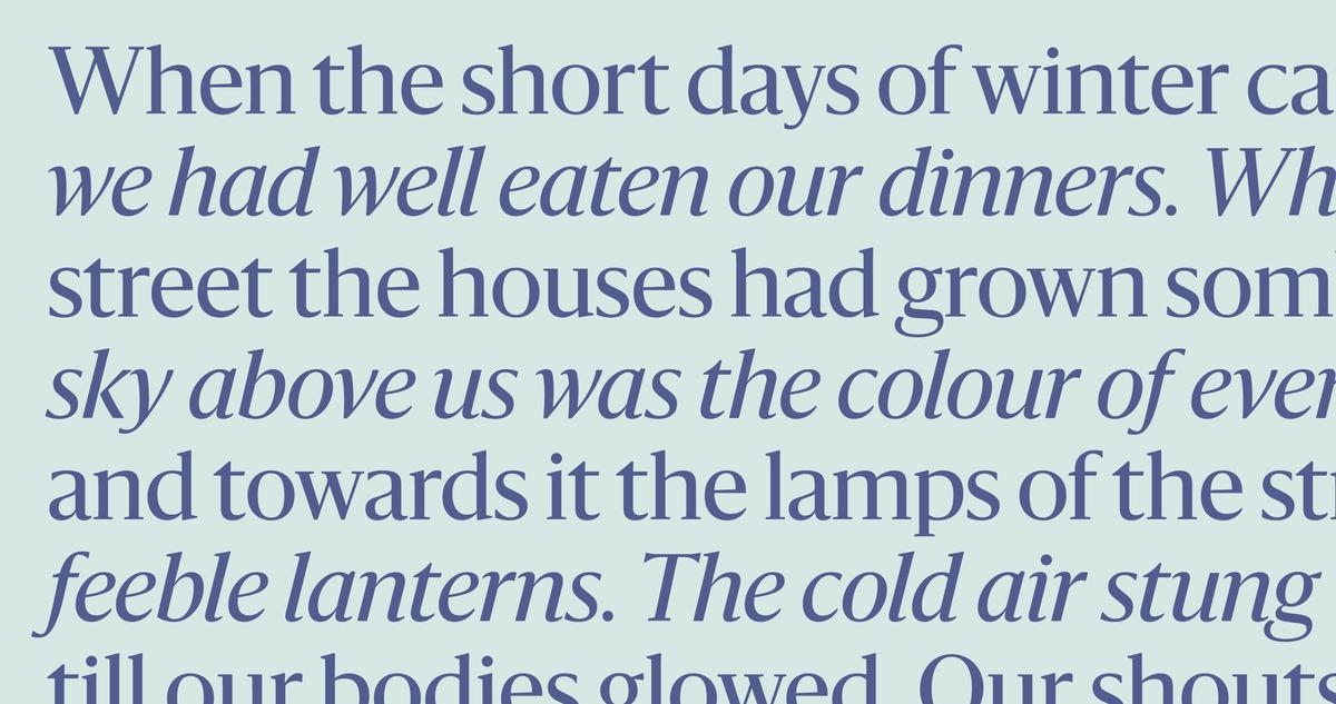
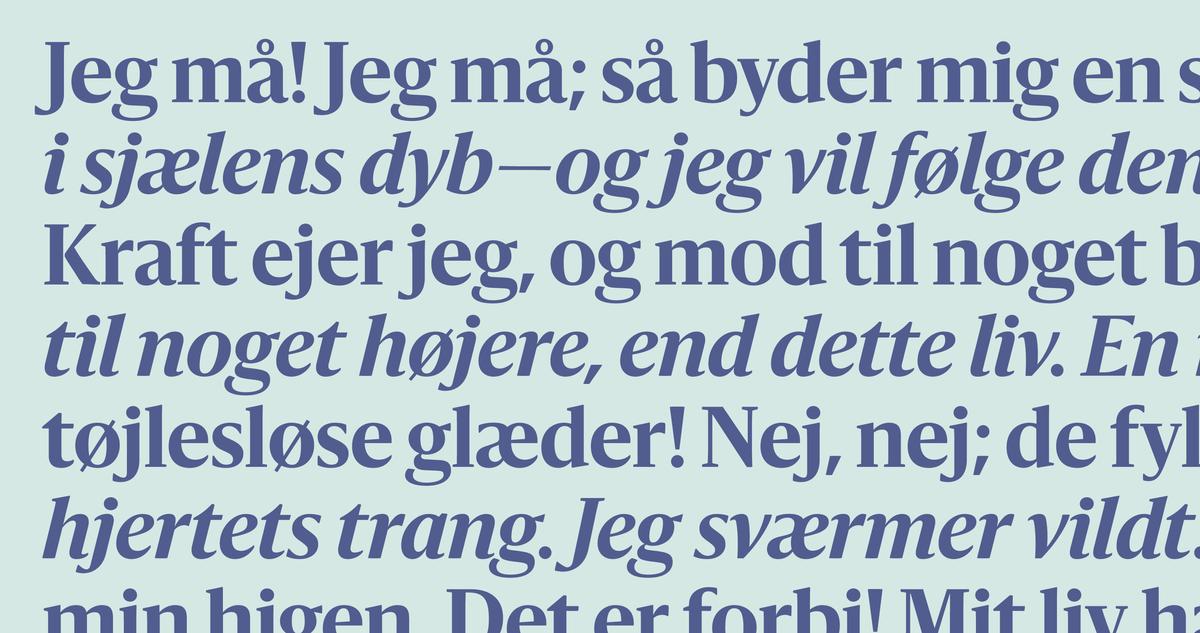
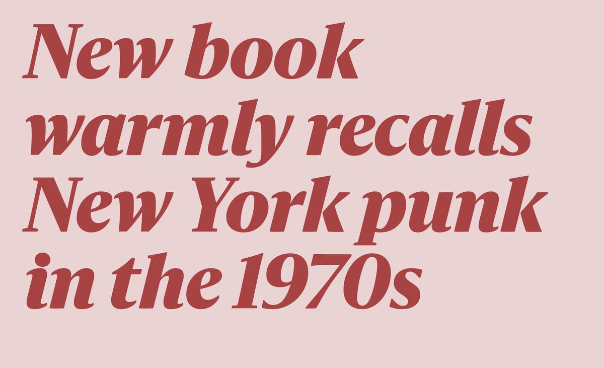
The roman’s gentle demeanour is matched by a simple italic, where incoming and outgoing strokes are short and to the point. A gentle angle of slant makes the italic legible and easy on the eye, allowing it to stand on its own while also working well as a companion for the roman.
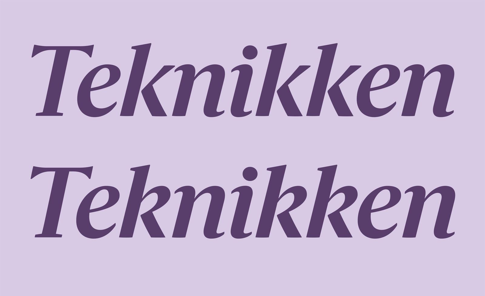
A looped cursive k in the italic is the sole alternate, for a softer feeling.
Sanomat was designed to work together with Commercial Type’s Publico Text and Sanomat Sans. Though Sanomat is not a seriffed version of Sanomat Sans, the two families complement each other and share some structures, such as the lower case g. Sanomat Sans has a quiet and unobtrusive character that balances the more assertive personality of Sanomat. Though distinctive, Sanomat pairs effectively with a number of text faces and sans serifs from our library, including Darby Sans, Lyon, Caponi, and the Guardian collection. Though Sanomat was originally drawn for editorial design, its distinctive personality adapts easily to other environments. For example, its elegance feels appropriate to fashion and beauty, and its warmth can breathe life into otherwise sterile layouts on screen.