Orleans by Paul Barnes
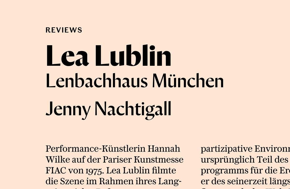
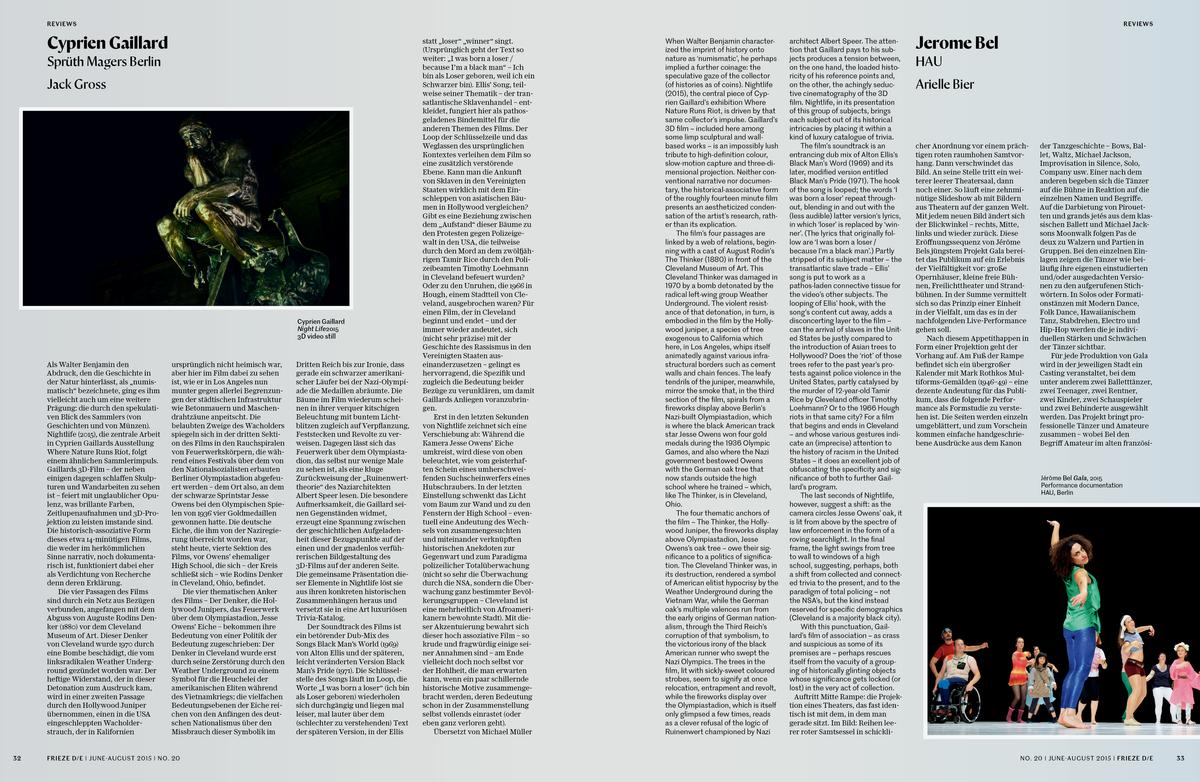
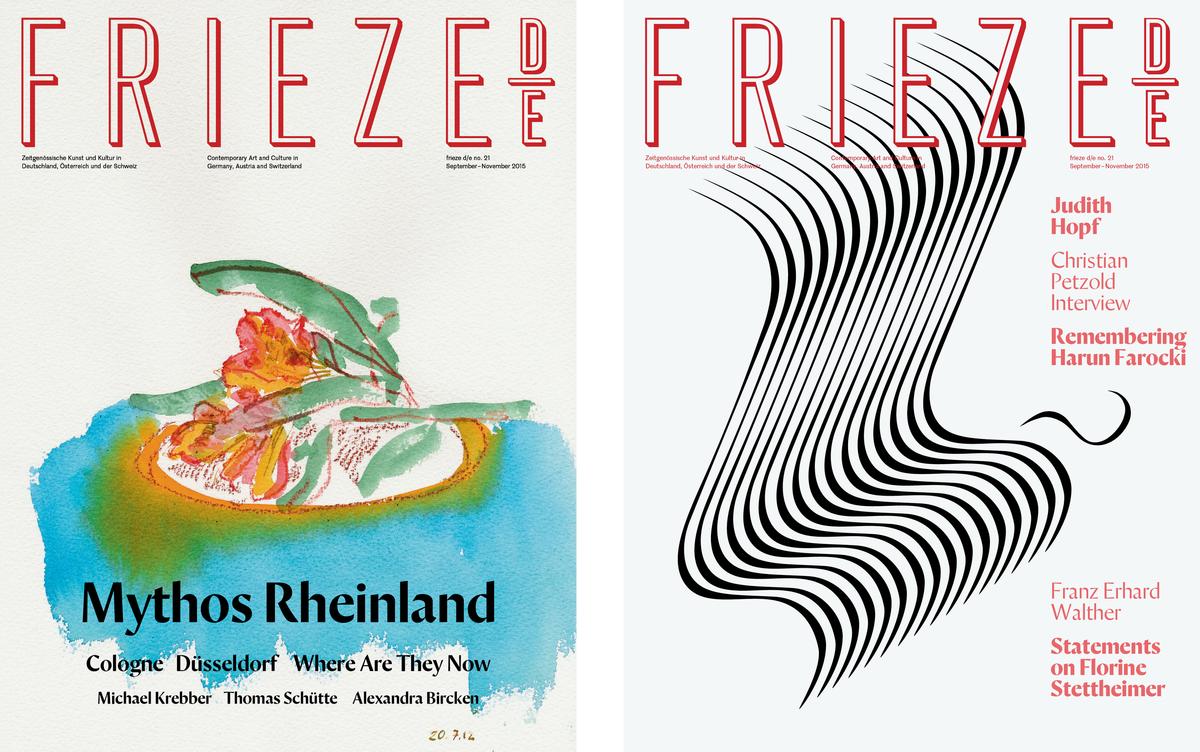
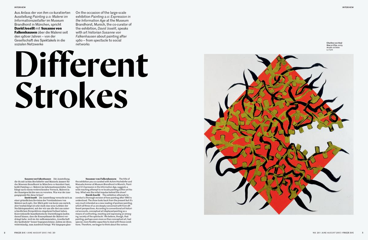
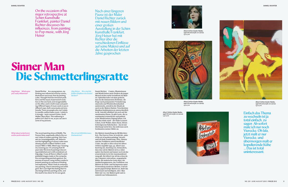
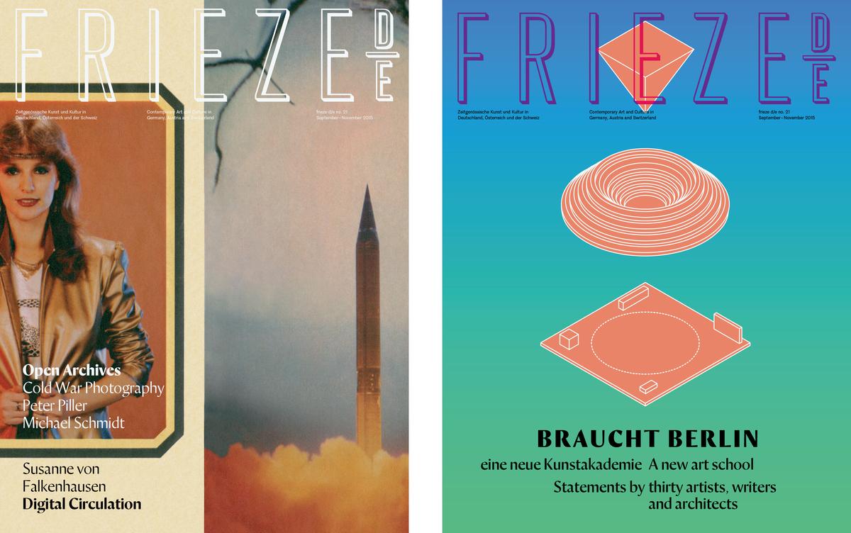
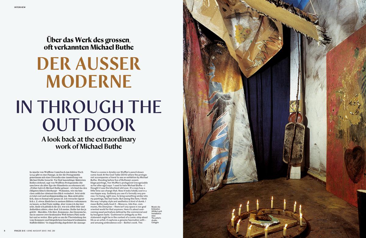
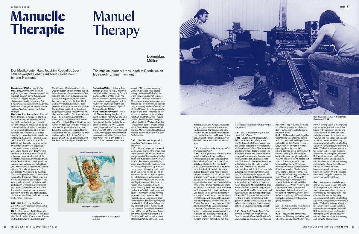
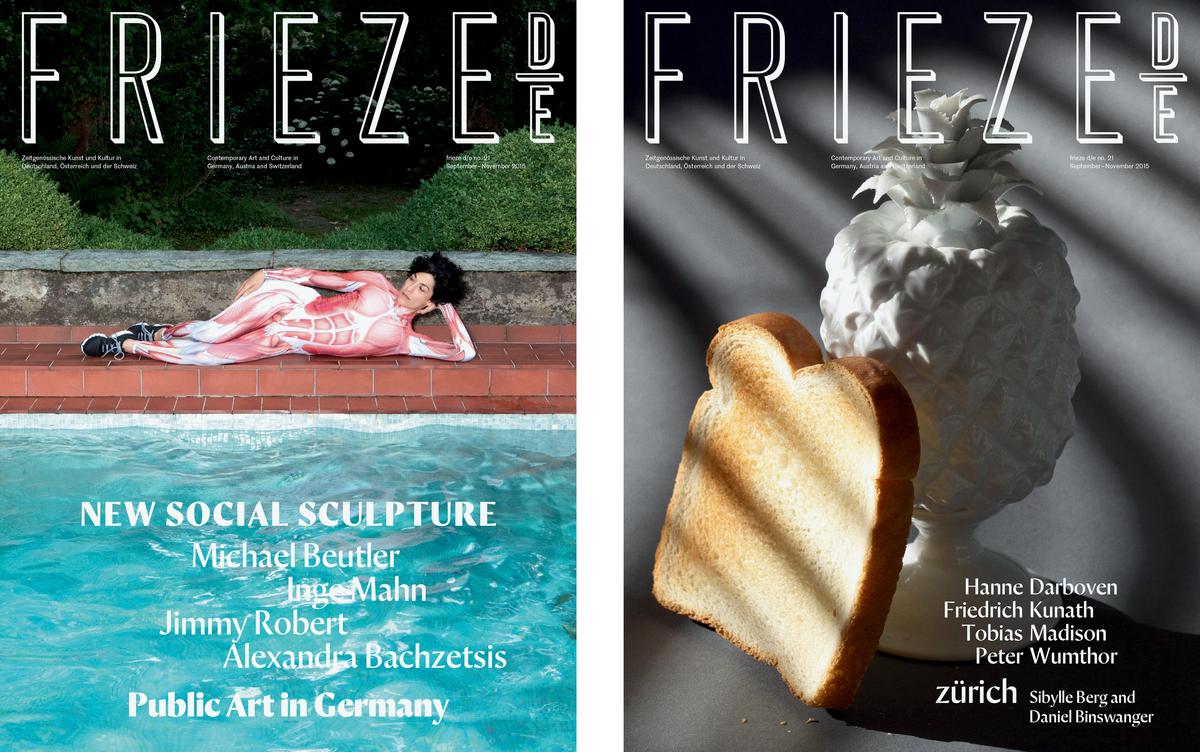
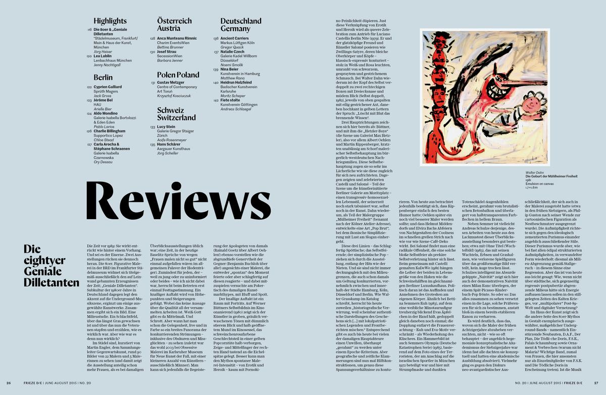
Designed in 2016 by Paul Barnes, Orleans is a distinct modern headline face that combines multiple influences seamlessly into new forms. Originally drawn for the redesign of the German edition of frieze, Orleans follows in the footsteps of Barnes’ Dala Floda (2005) and Dala Moa (2016), typefaces also made for headline use in the magazine. Several weights were drawn over the course of three months, but the magazine sadly closed before the redesign was implemented. The typeface, however, remained and was gradually refined and developed with the help of Tim Ripper into seven weights with accompanying italics. After debuting in the Commercial Type Vault, Orleans has now moved to our primary library.
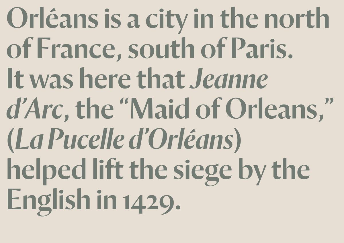
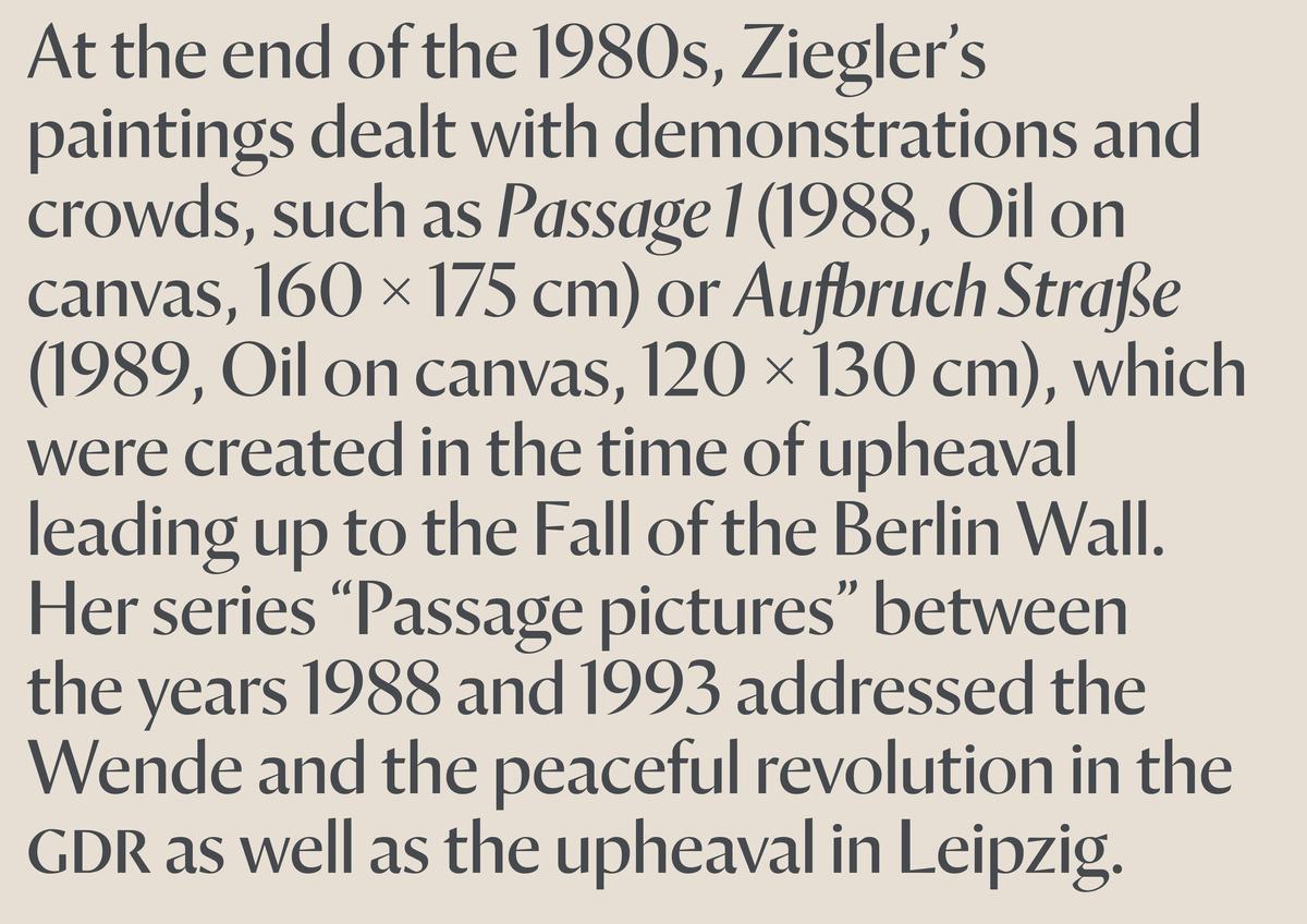
Orleans explores the handmade traditions in letterforms created with broad nibs, such as blackletter, but also draws upon the rich tradition of calligraphic sans. German calligrapher and type designer Rudolph Koch’s work was particularly influential, seen in descendants Stahl, drawn by Hans Kühne for Klingspor in 1939, and Lydian, designed by an American student of Koch’s, Warren Chappell, in 1938. The skeleton of the letters follow a classical model, like Dala Floda, but is a sans form, like Dala Moa. Where its predecessors are stencil forms, however, Orleans’ strokes join together. Traces of the pen can be found in the angled terminals and letters such as the n, where the juncture between the two strokes is thin, but thickens where the pen would complete the right stroke. As in Dala Moa, the terminals of C and E, as well as c, f, and j are rendered as wedges that come from a sharp turn, creating surprising angular counterforms. This, in addition to the overall proportions of the typeface, gives the classical model an updated and modern sensibility.
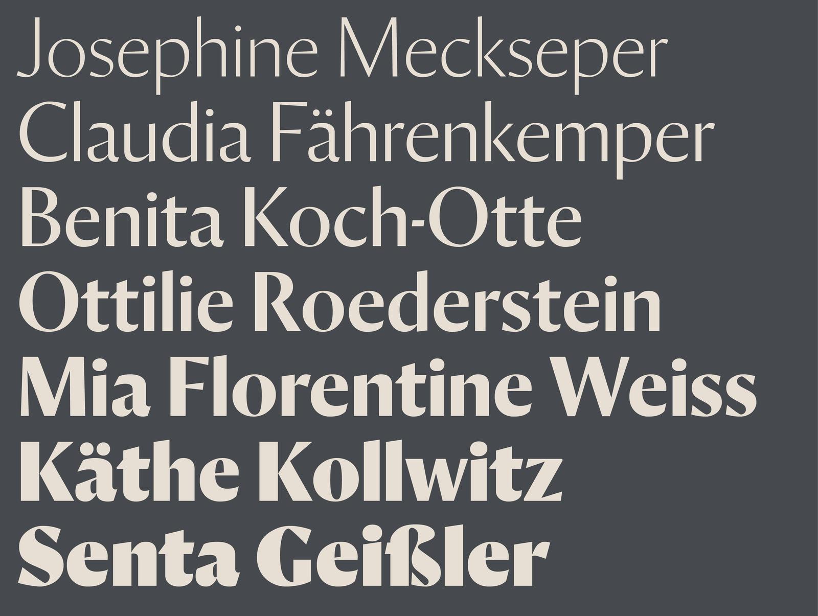
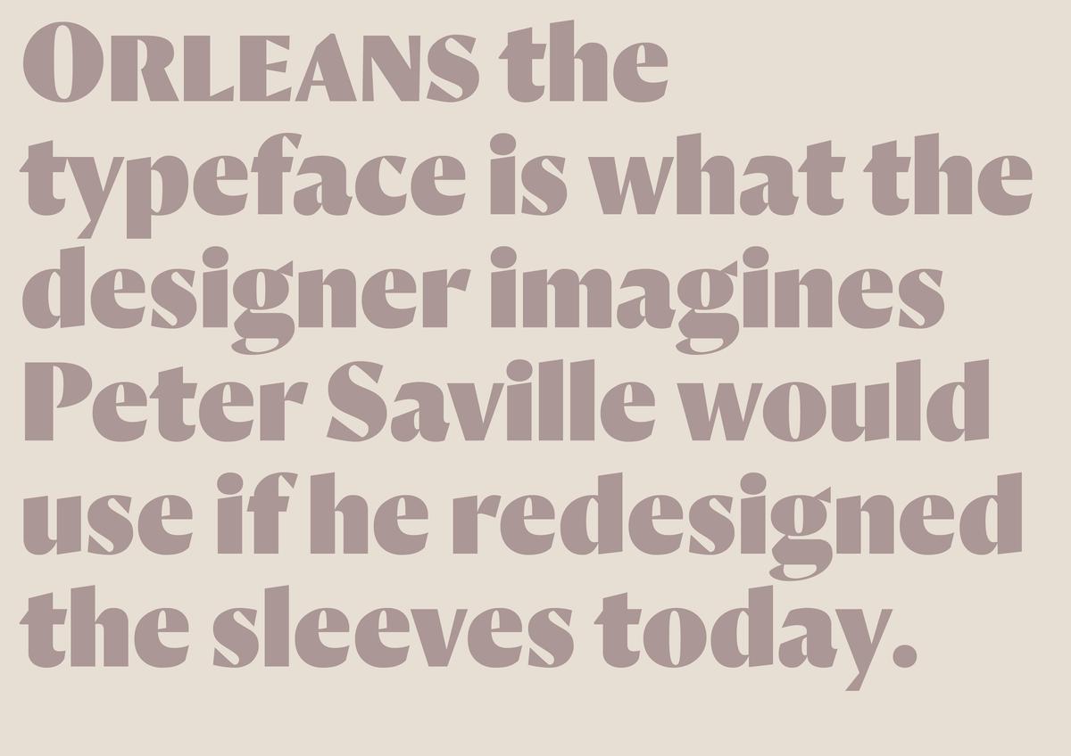
Across its seven weights, Orleans is a crisp and refined face that evokes a full spectrum of emotions, from strong and assertive to graceful and elegant. The heavier weights of Orleans were inspired by the emphatic and elemental quality of German poster faces, such as Louis Oppenheimer’s Fanfare (first released in 1922 by Berthold). The sharpness in the junctures are most noticeable in these weights, and the angularity is severe. In the heaviest weight, the high x-height of the lowercase and its tight spacing make it ideal for magazine headlines. As the family expands toward lighter weights, the texture softens as the forms become more classical and lithe, becoming delicate at the lightest thin weight without becoming too precious or fragile. At this end of the spectrum, Orleans recalls Granjon and Garamond in a sans serif form, with a smaller x-height, tall ascenders, and deep descenders. Stately inscriptional capital forms benefit from wider spacing.
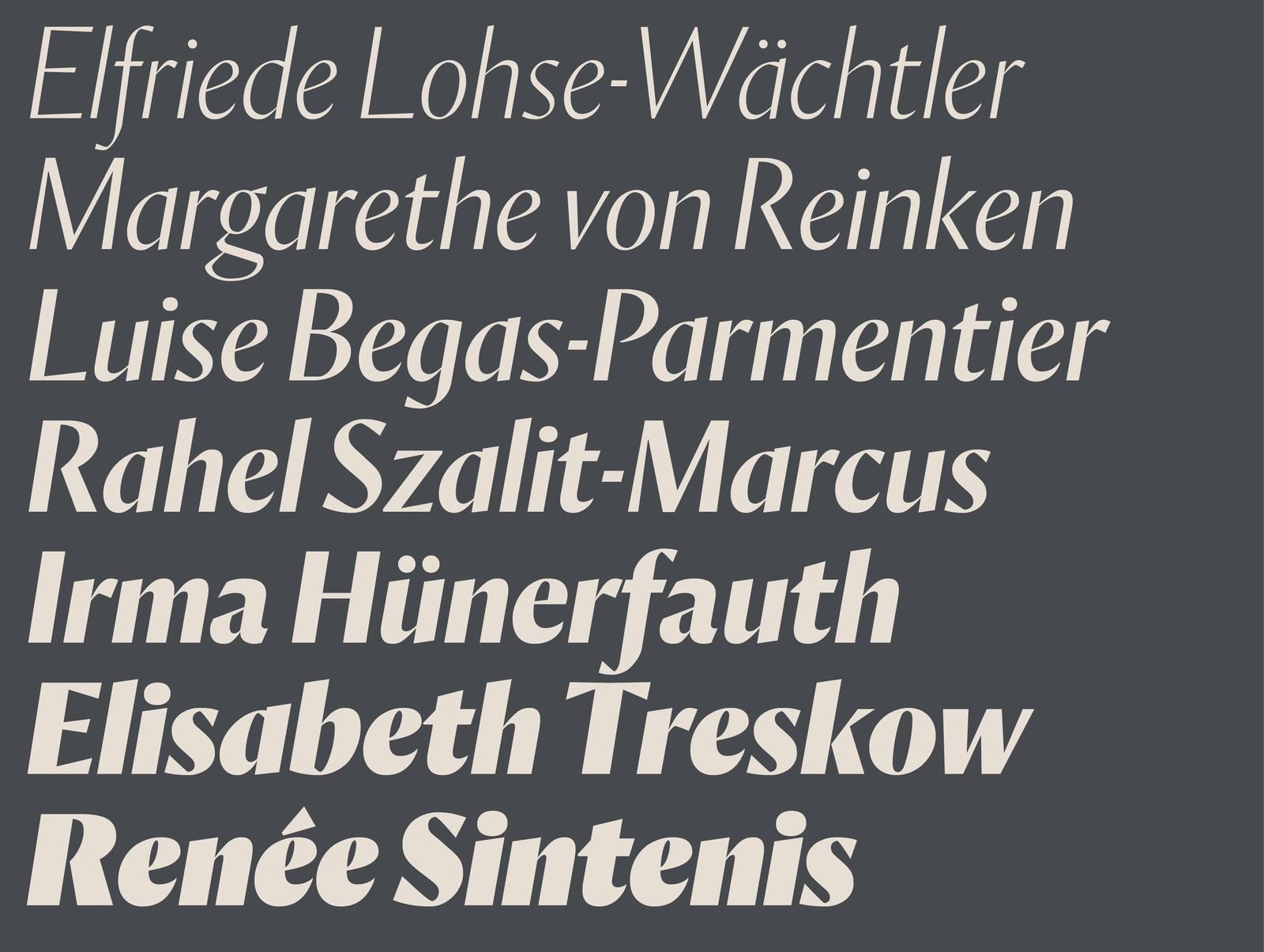
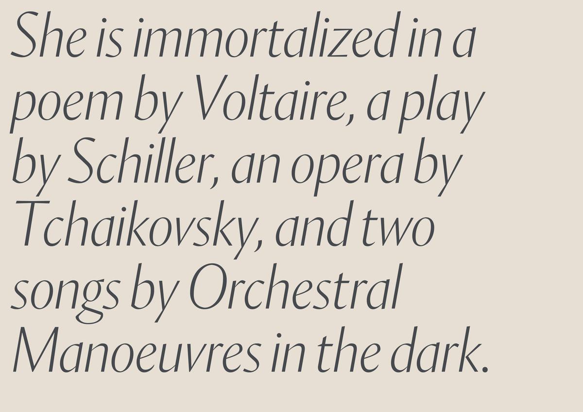
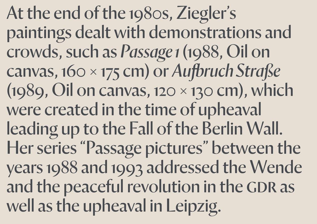
The companion italic is narrow, upright, and steady in angle. As in the roman, it ranges from a dense, forceful, and tightly-spaced fat style to a balletic, chancery-like thin. The heavier weights’ rhythm and emphasis are similar to a blackletter, while the lighter weights recall seriffed letters, as well as the italic of Dala Moa. The italic comes with a small set of alternate forms, including a double-storey a and a single-storey g. It can complement the roman, but also stands on its own as an independent headline face.
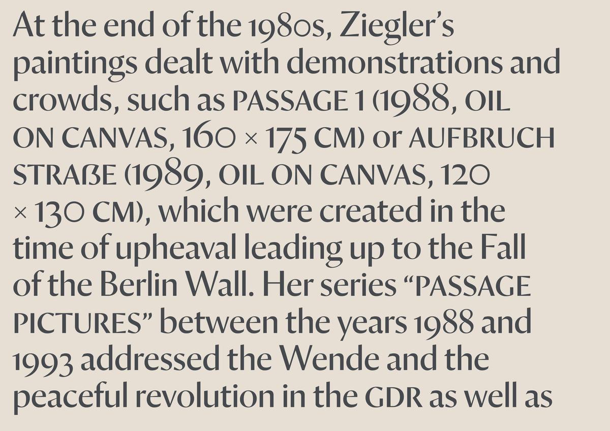
Despite being drawn for display, Orleans’ character set is closer to a book face, with small capitals and multiple numeral forms. Coupled with its wide range in weight, this makes Orleans unexpectedly versatile: able to shout emphatically and also speak with refined luxury. Orleans can operate not only in large editorial contexts, but its middle weights are well-suited for typical display sizes on the web and its crisp and exacting lines give it potential to be blown up to monumental sizes in museums or to be foil-stamped on beauty packaging. Straddling the line between novelty and familiarity, Orleans offers designers a rich and dynamic palette.
