Chiswick by Paul Barnes
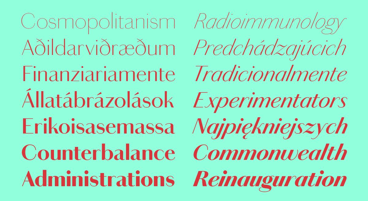
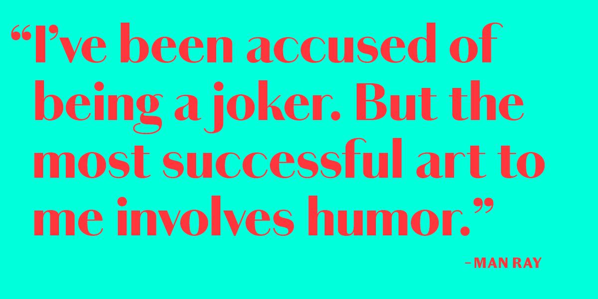
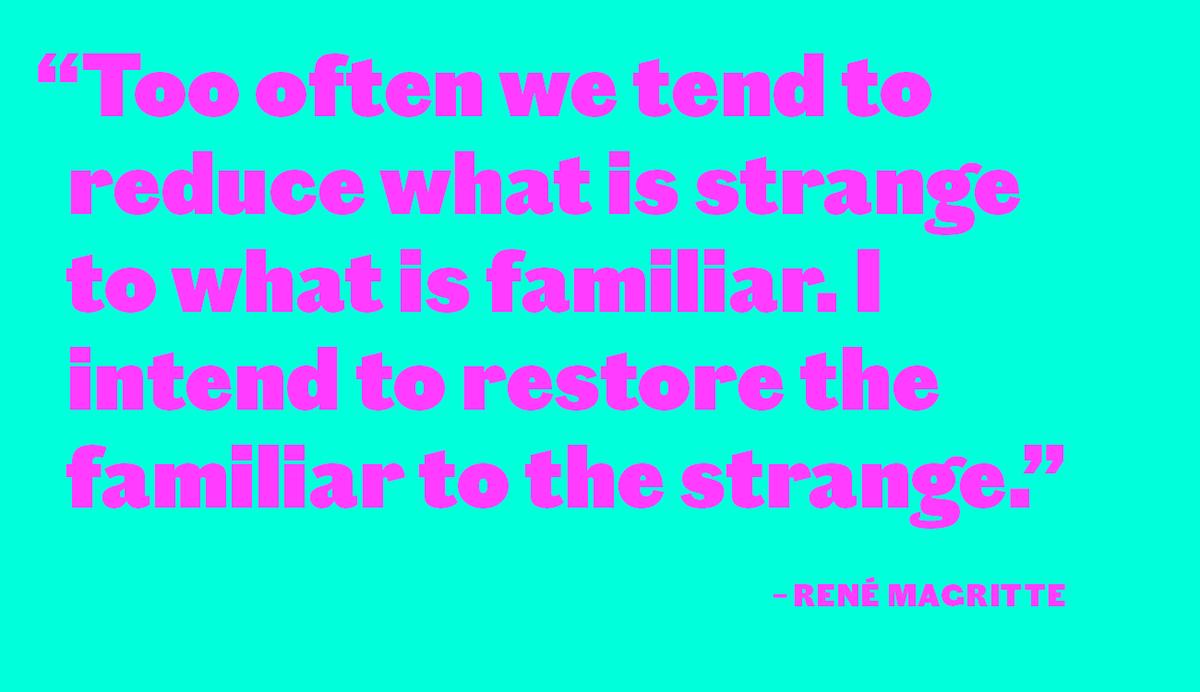
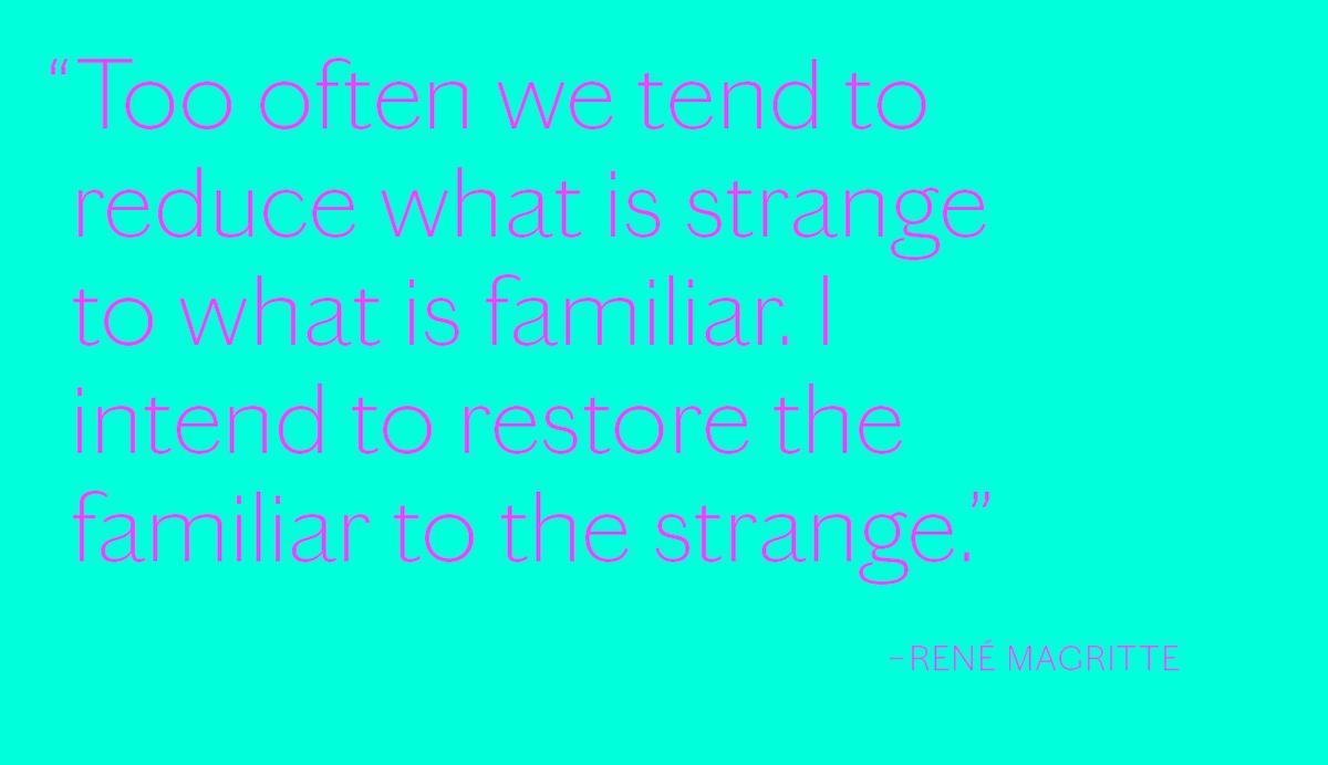
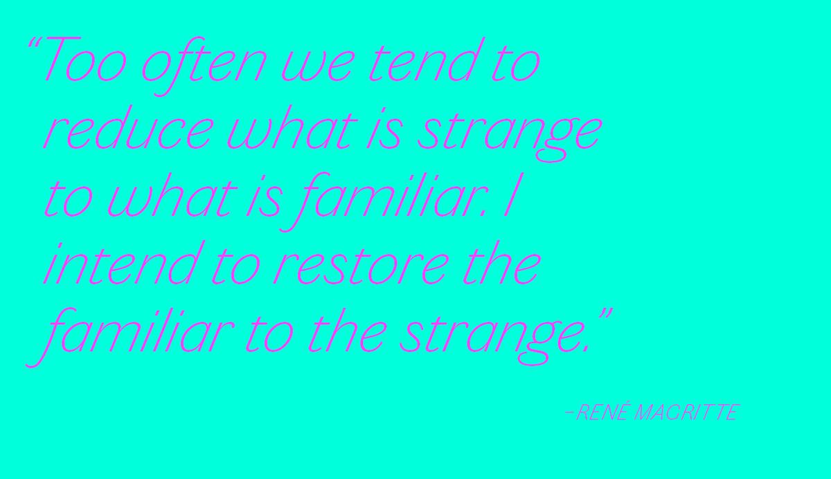
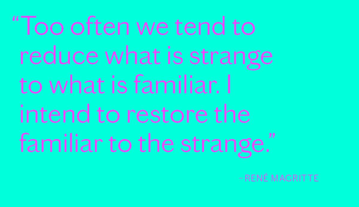
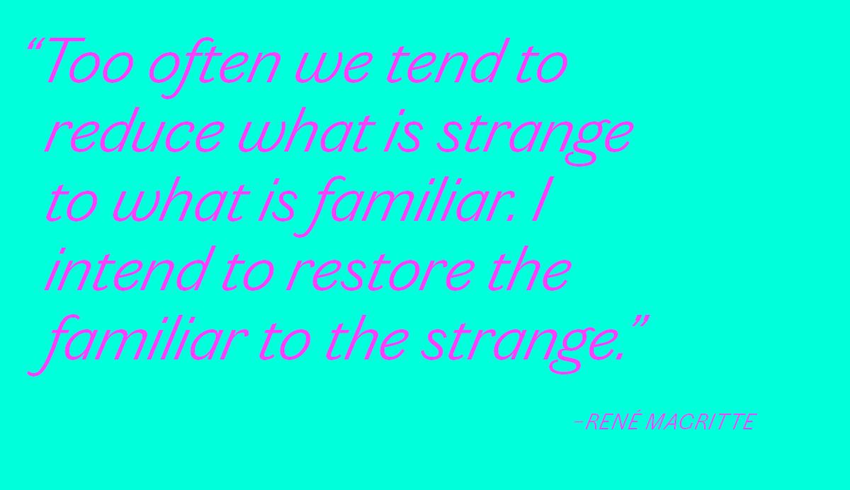
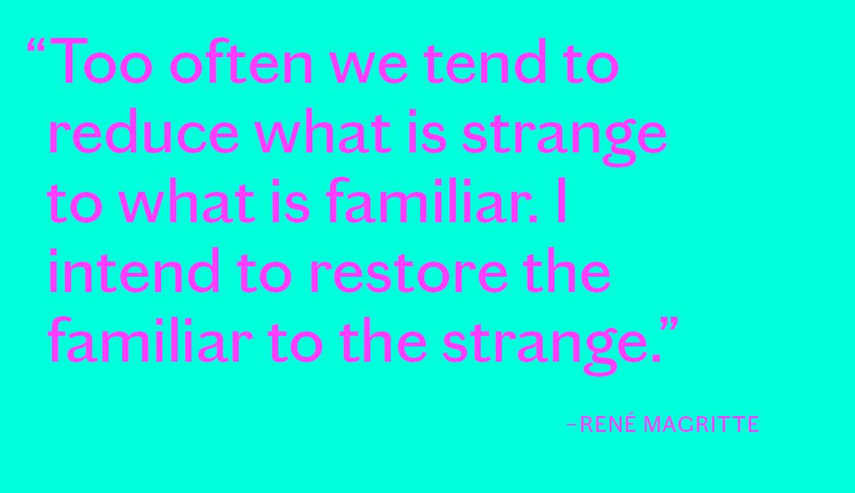
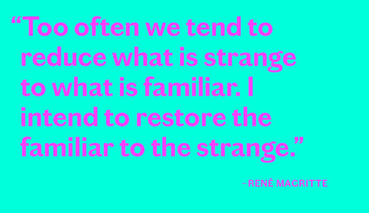
Chiswick is a collection of eight interrelated families in three sets – serif, sans, and grotesque – inspired by the vernacular style of lettering found in the British Isles from the 18th century onward. With a common skeletal structure, they range from the warm beauty of Chiswick to the industrial Chiswick Grotesque.
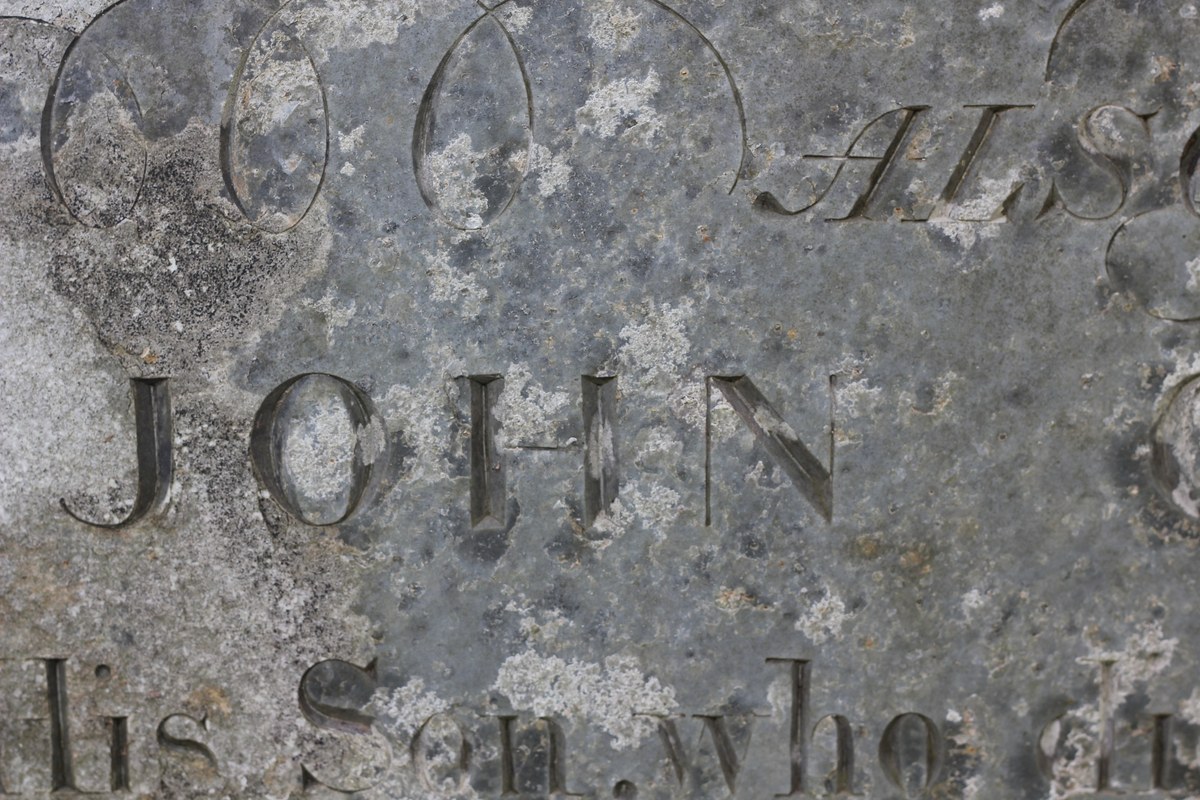
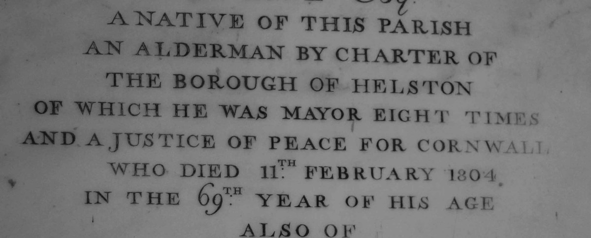
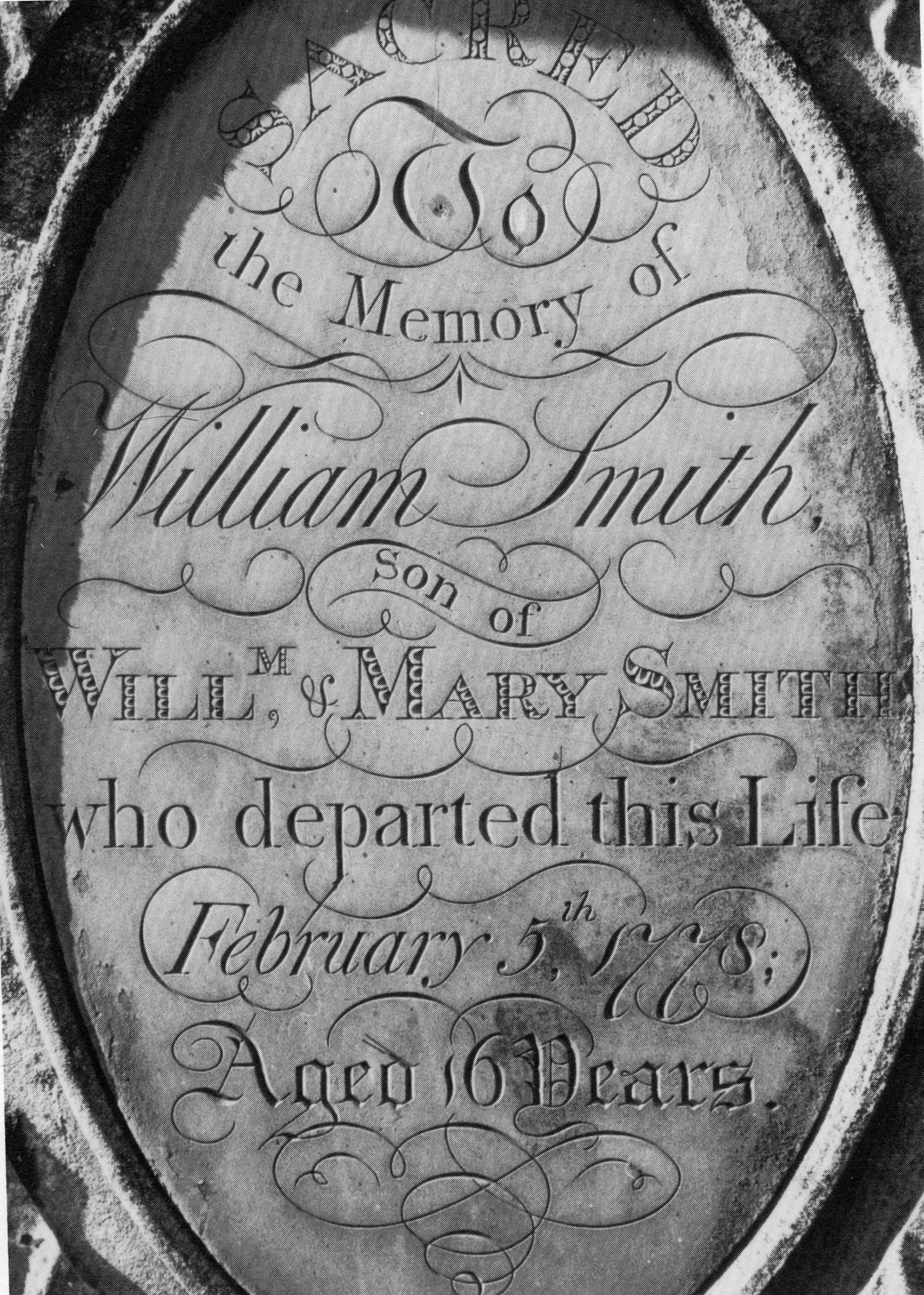
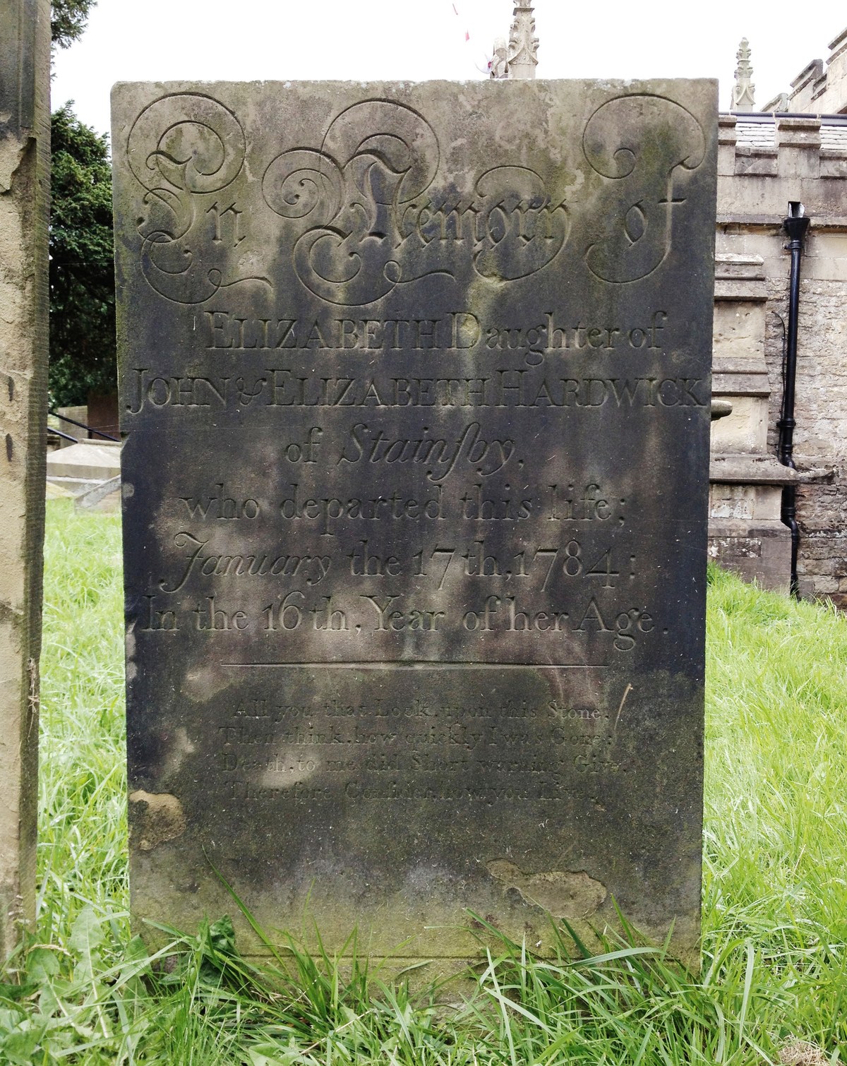
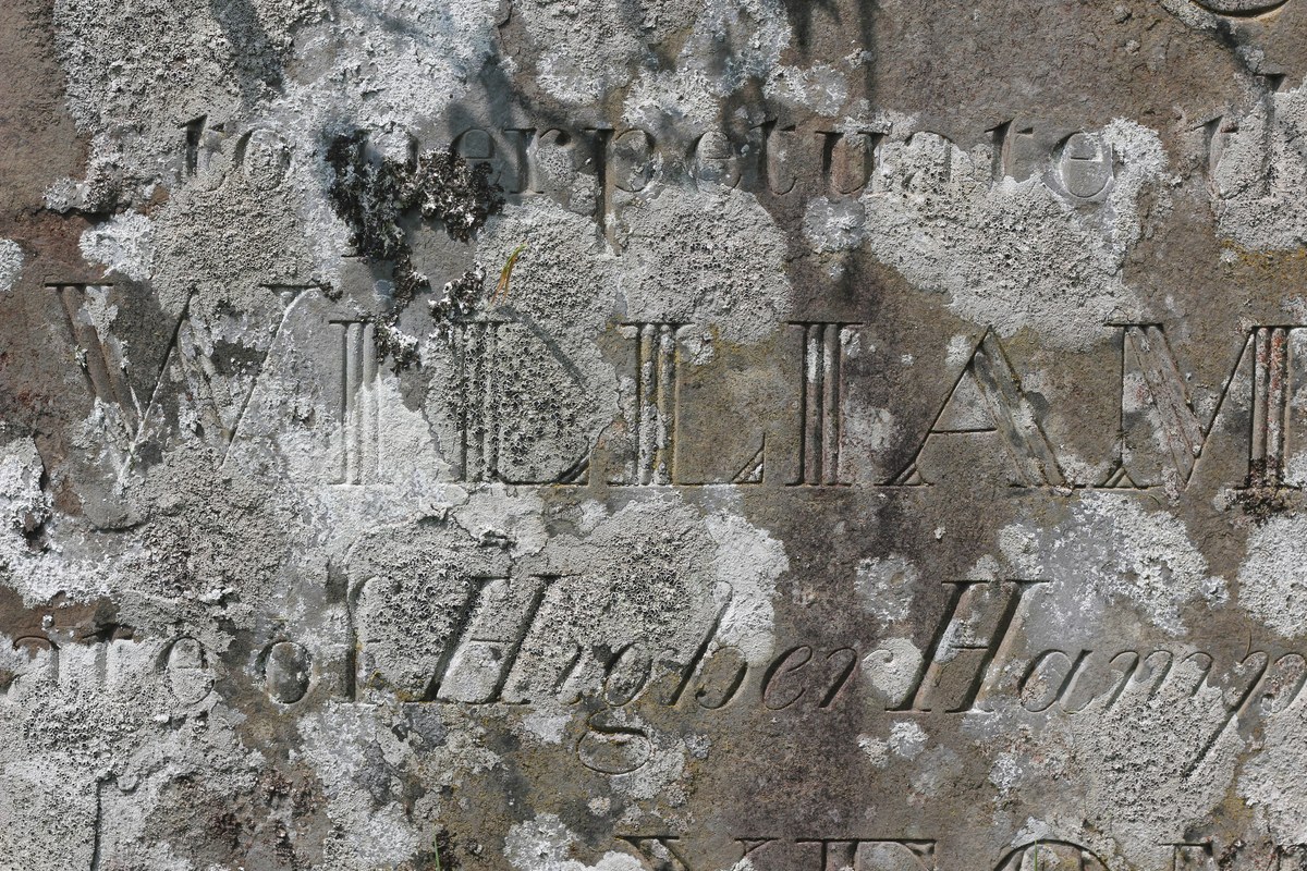
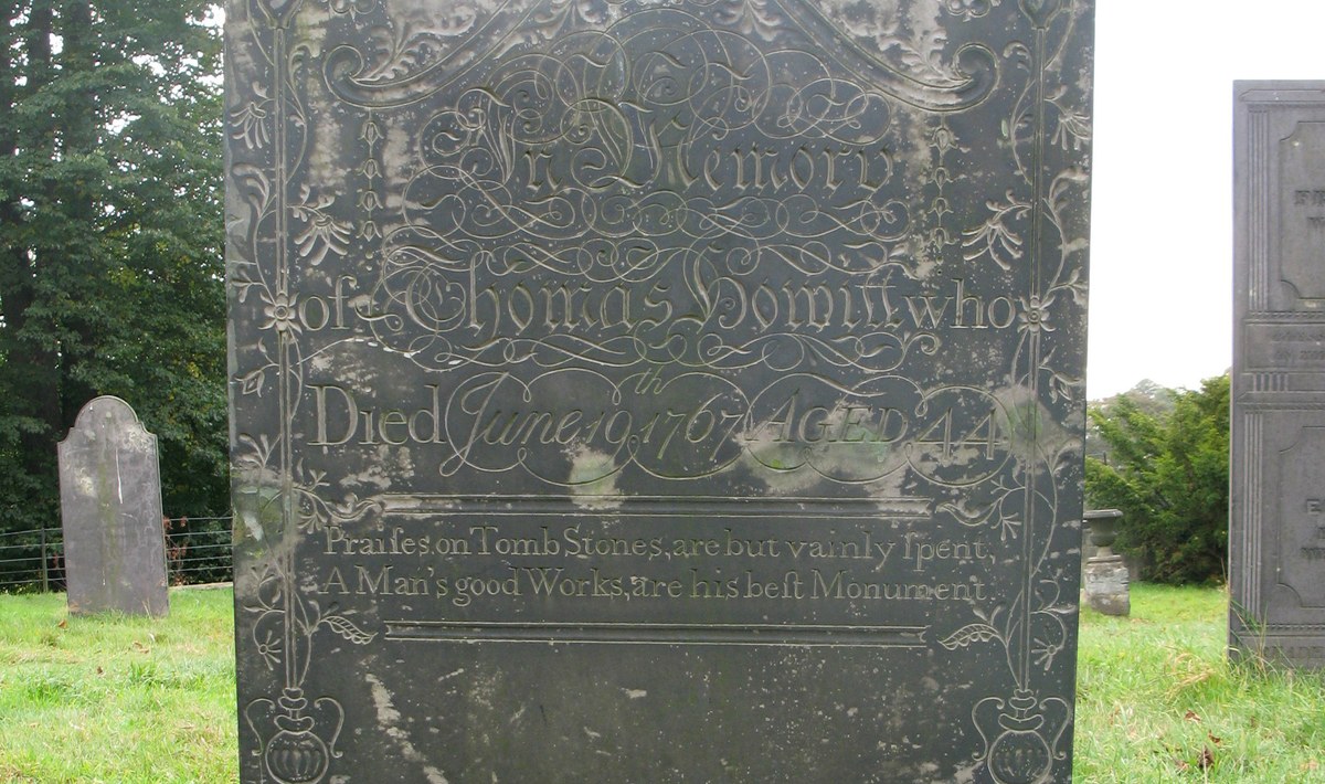
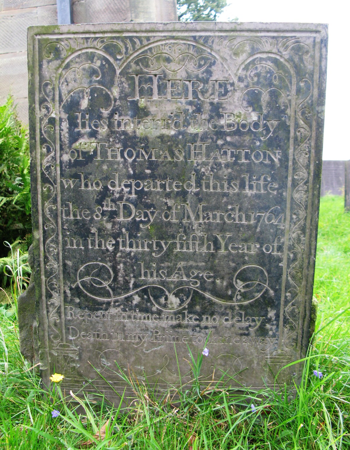
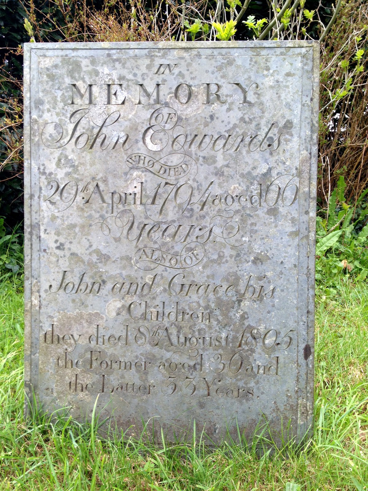
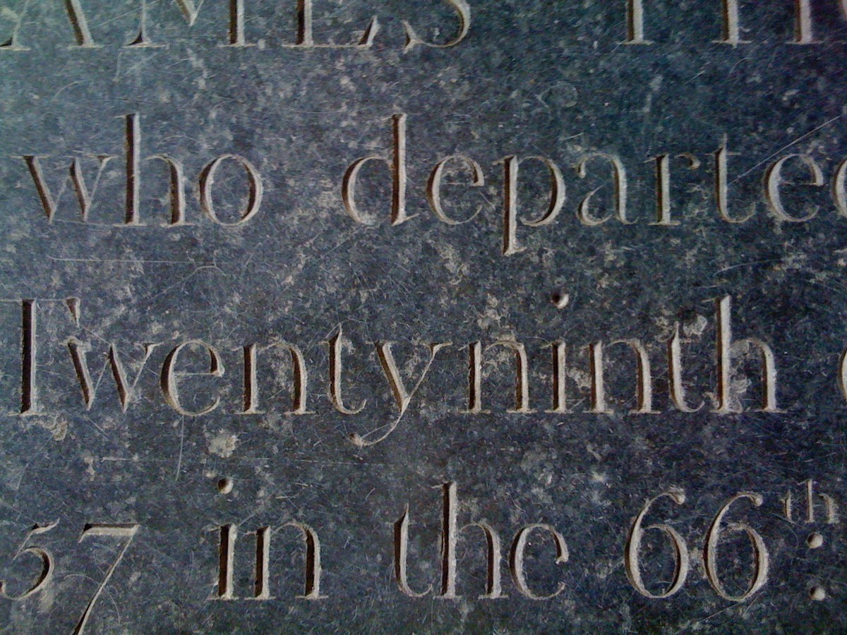
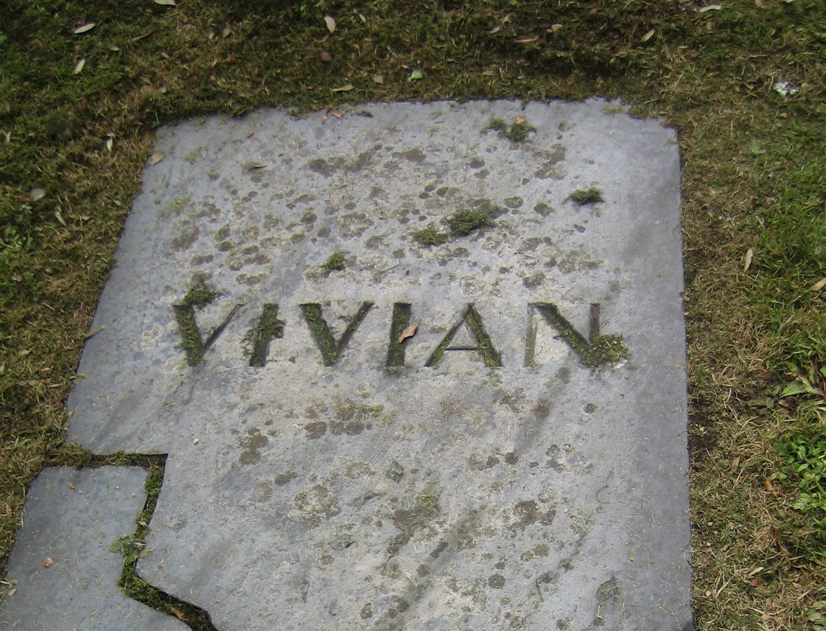
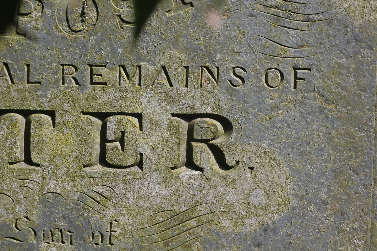
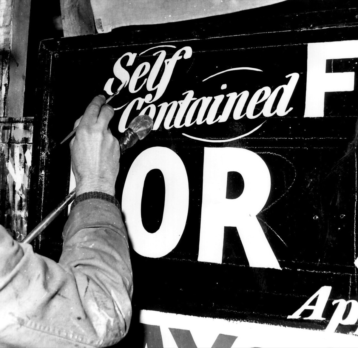
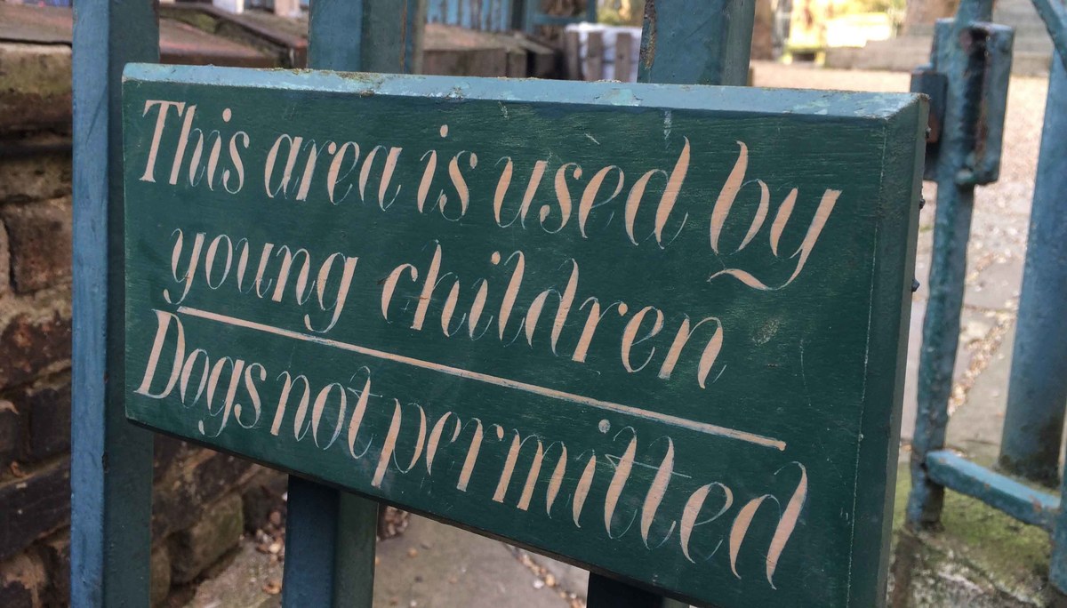
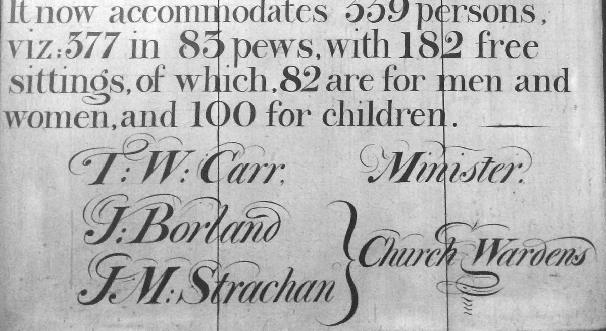
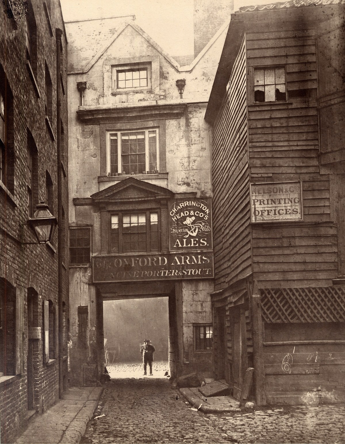
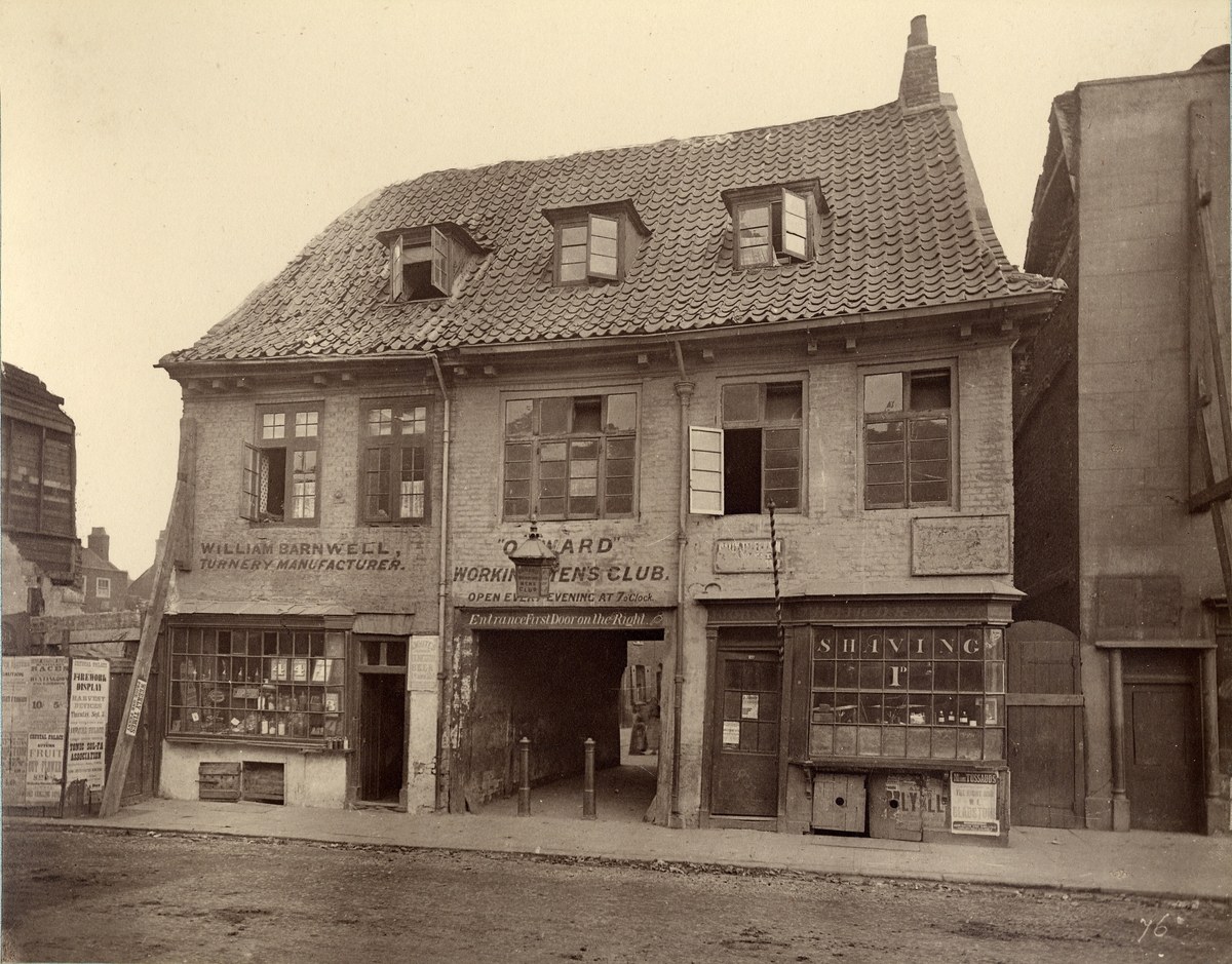
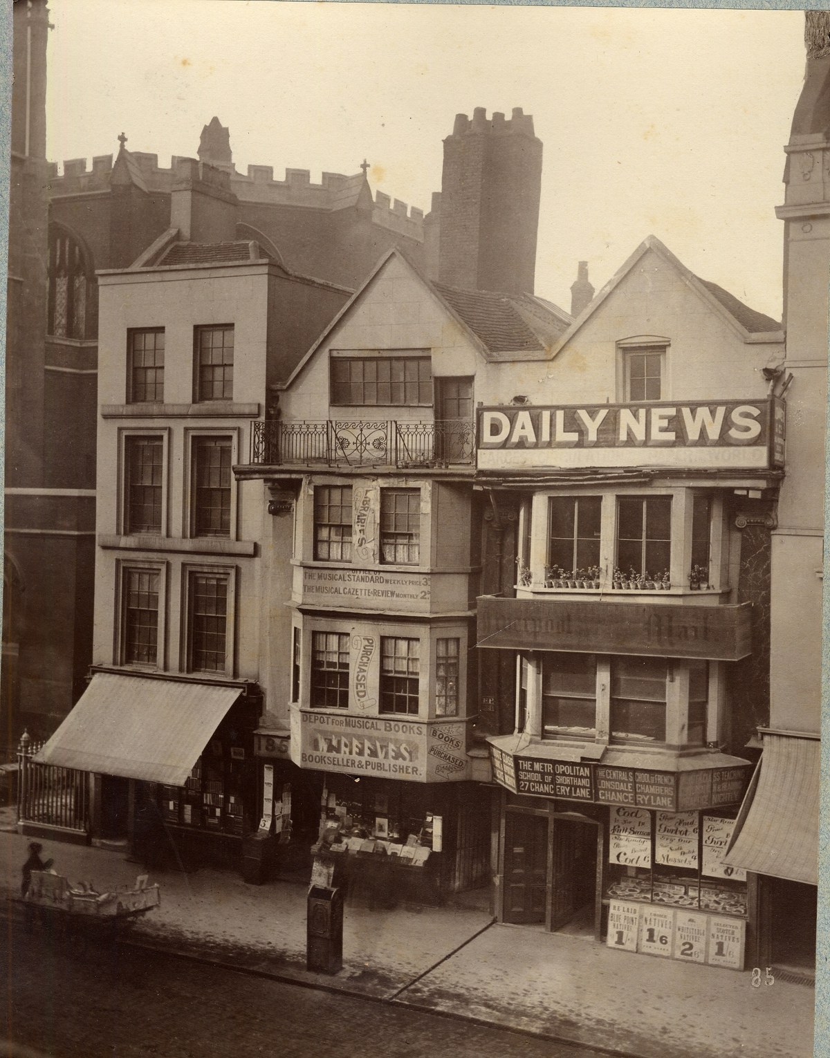
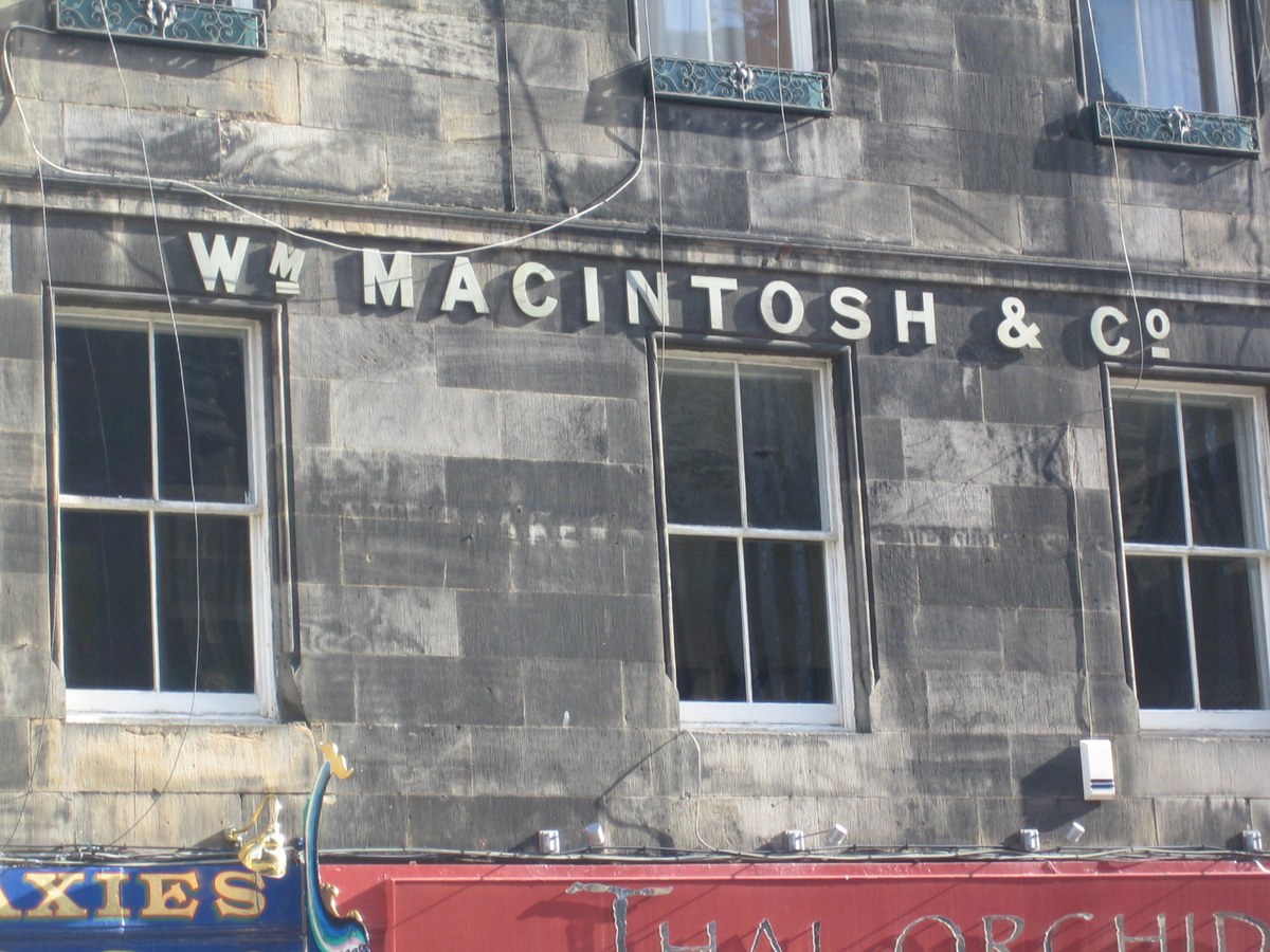
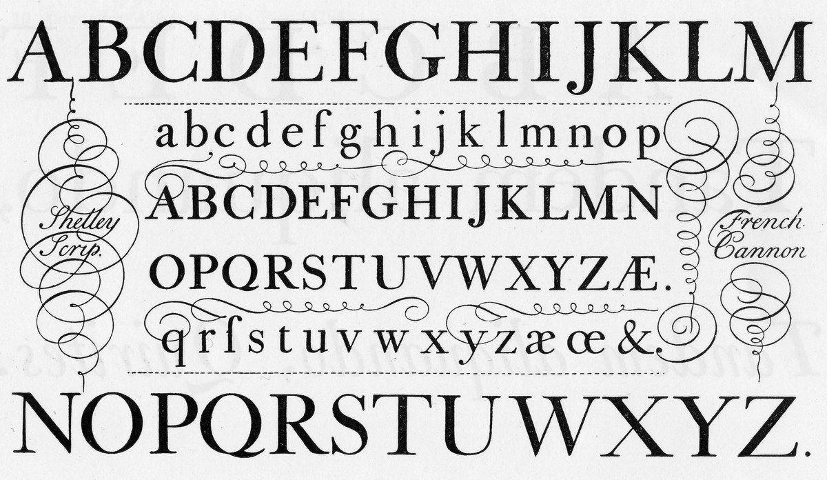
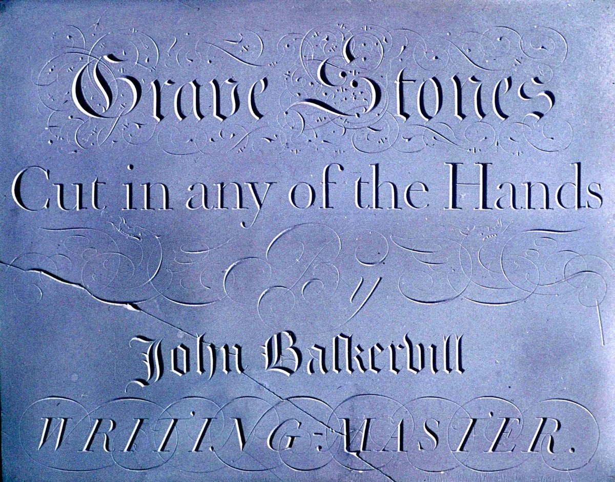
During the 18th century, a new idea of how letters should be began to crystallise in Britain, a style that would inform how they would look into the next century and beyond. It has been called the English Vernacular or English Lettering Tradition, though it could be found all over the British Isles, and could be seen anywhere letters existed, and at any scale: on buildings, on signs, on medals, on coins, on pottery, on transport, and on gravestones. With and without serifs, letterforms shared a basic structure. Some of the best surviving examples are on gravestones, particularly in the southwest of England.
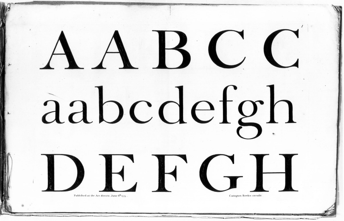
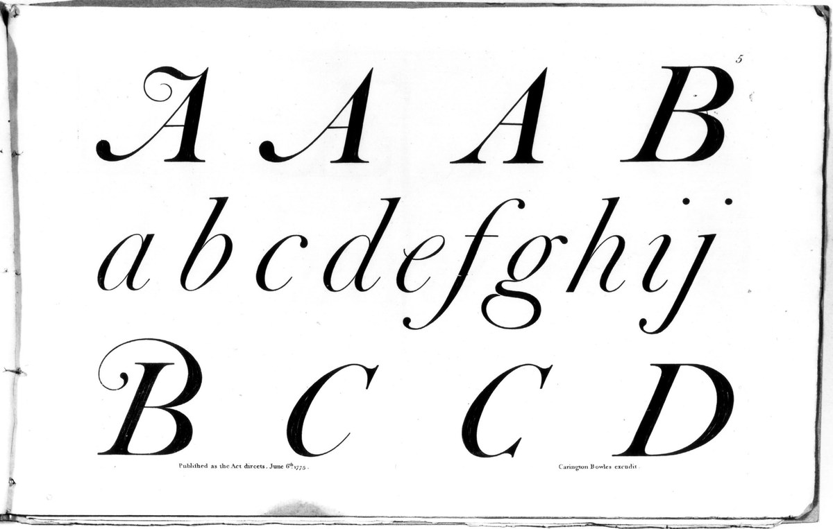
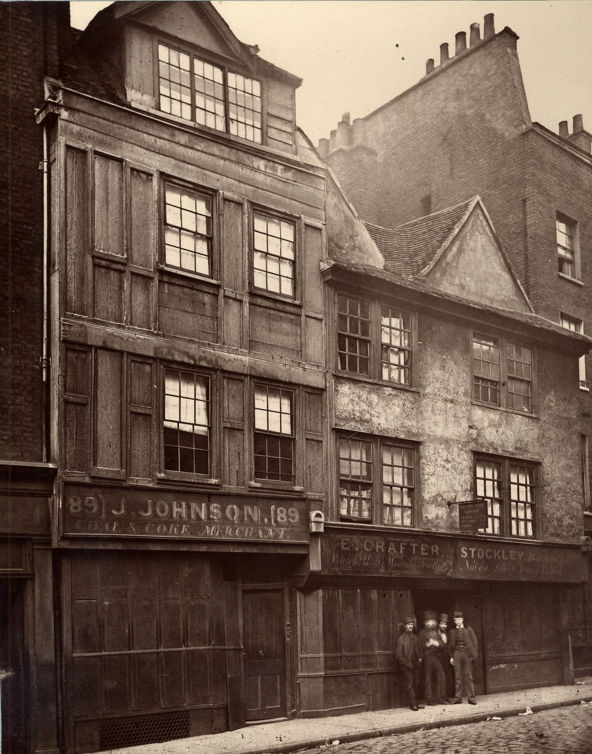
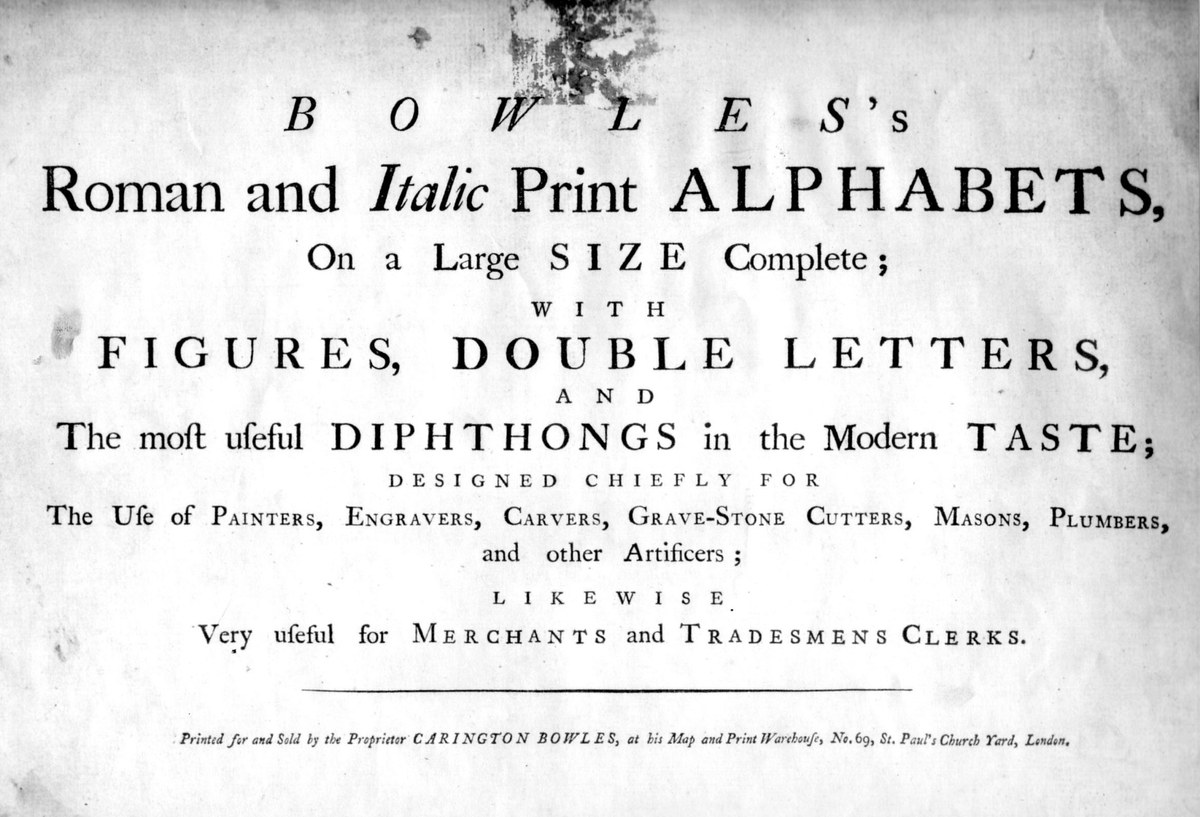
The style was also ubiquitous in painted letters, which adorned shopfronts in both urban and rural areas. The development of the rainroad network helped to facilitate lettering styles spreading throughout the British isles. Additionally, lettering manuals such as Carington Bowles’s Roman and Italic Print Alphabets on a large size complete; with figures, double letters, and the most useful diphthongs in the modern taste; designed chiefly for the use of painters, engravers, carvers, grave-stone cutters, masons, plumbers, and other artificers; likewise very useful for merchants and tradesmens clerks (its complete title) were copied by tradesmen, helping to spread a consistent style.
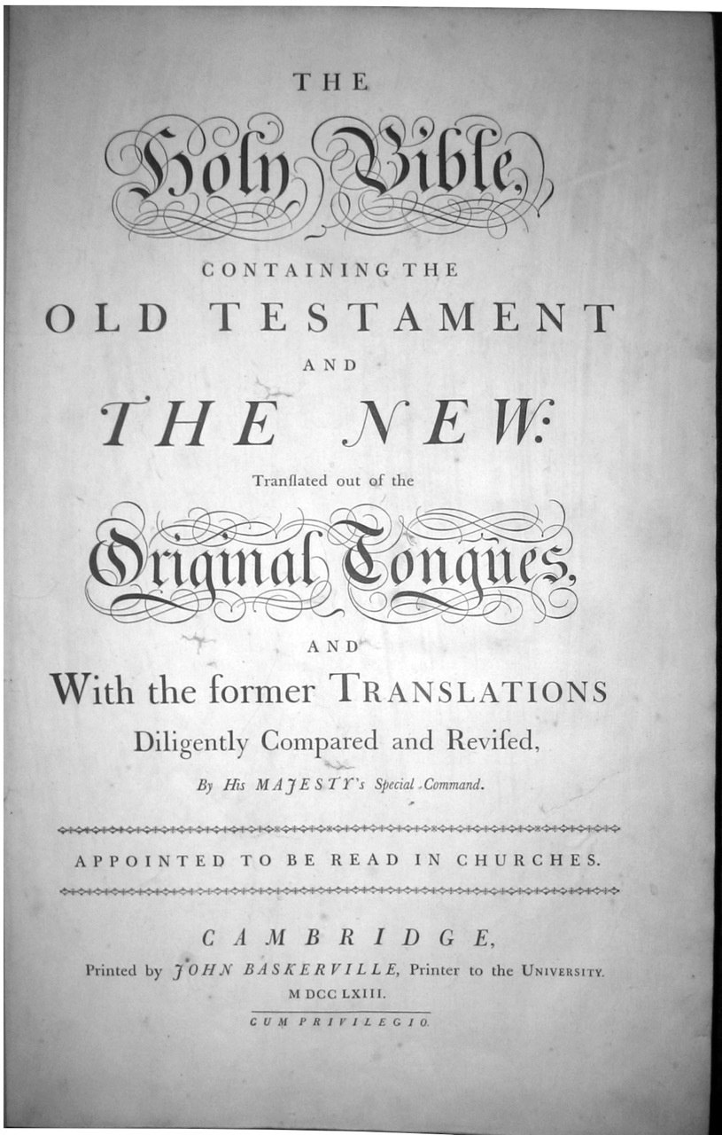
The style would go on to influence how printing types looked, the most famous example being those of John Baskerville, a former writing master. Though the styles were varied; script (informing the famous roundhand of Bickham, Snell and Champion), seriffed letters, slab serifs, sans serifs, and even ornamental letters, they all shared a common skeletal form. The Chiswick collection captures the spirit of the vernacular in three main styles: an elegant serif, a high-contrast sans, and a workmanlike grotesque.
Chiswick
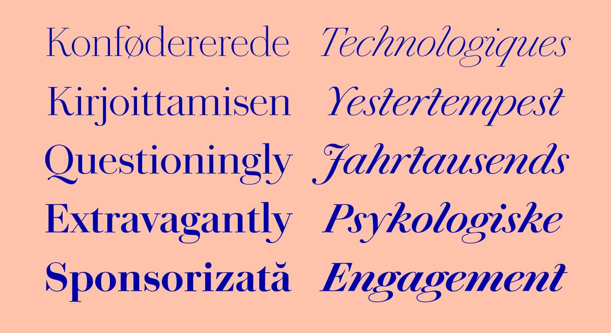
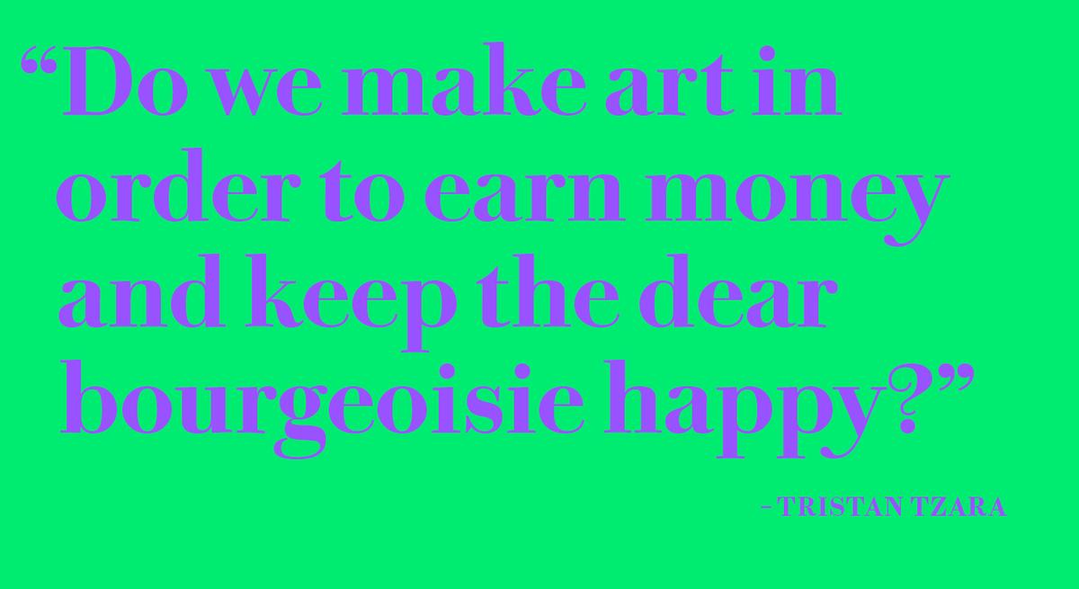
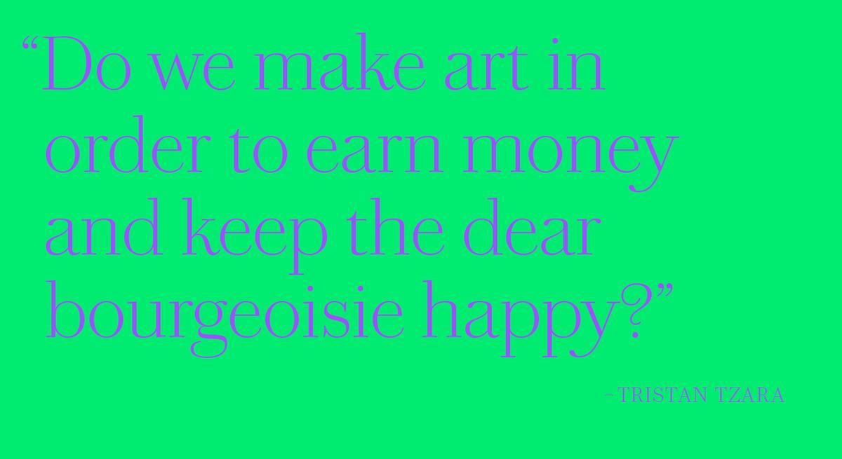
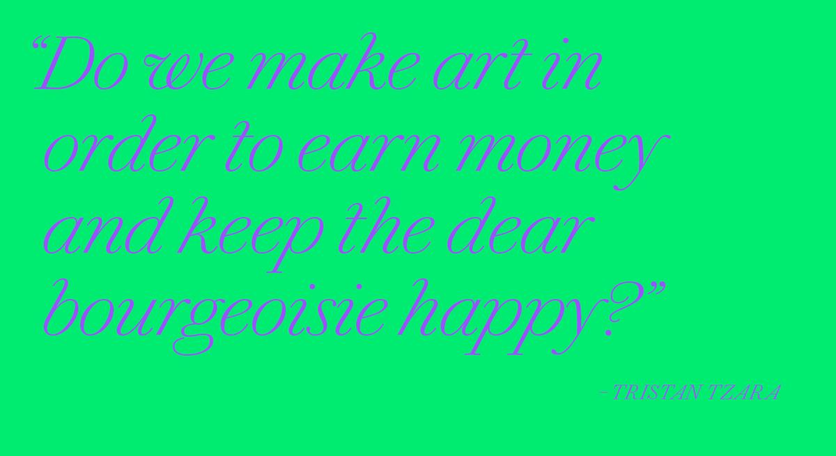
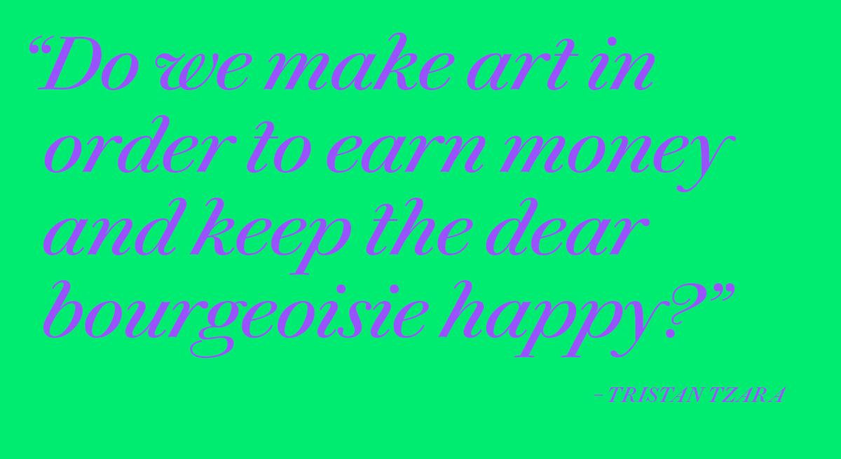
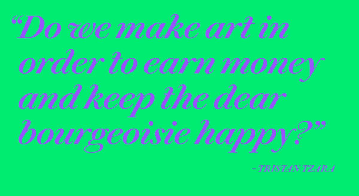
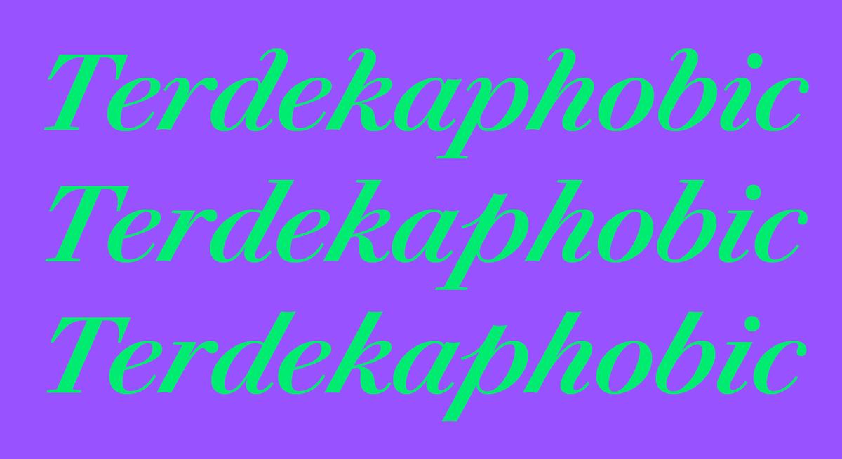
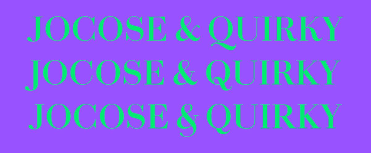
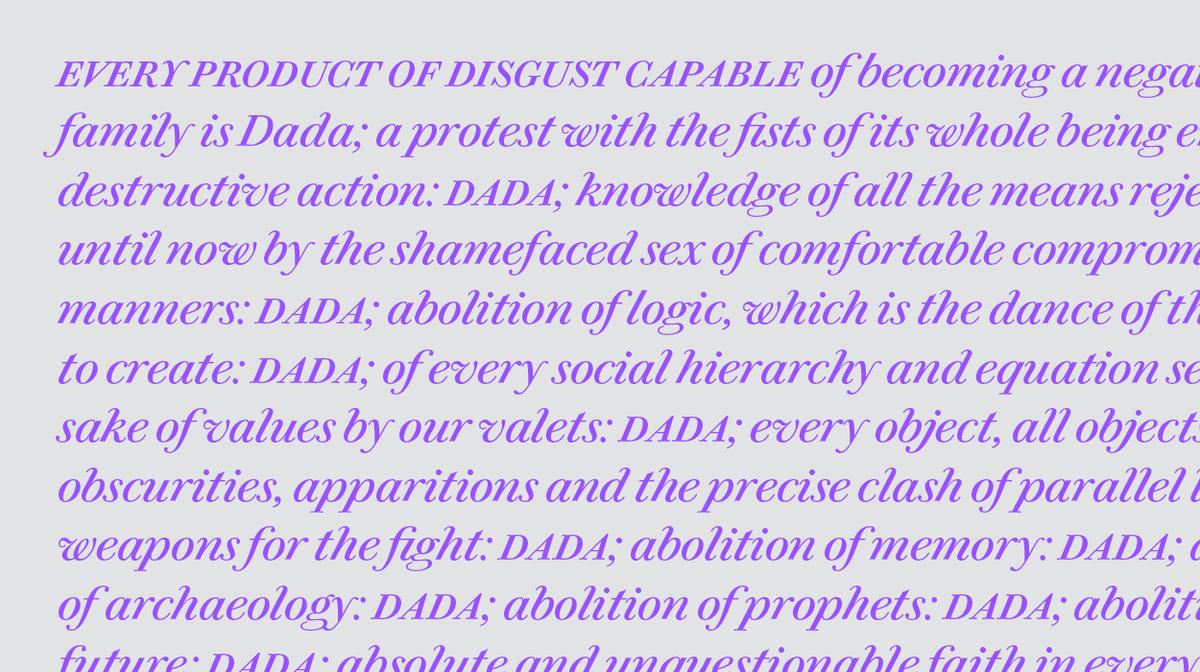
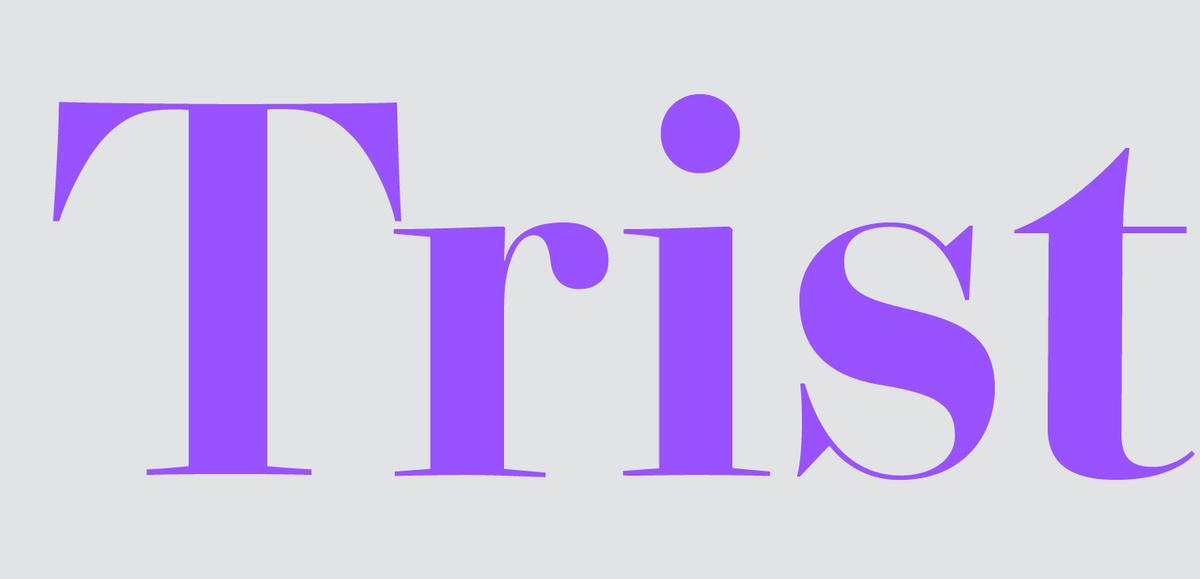
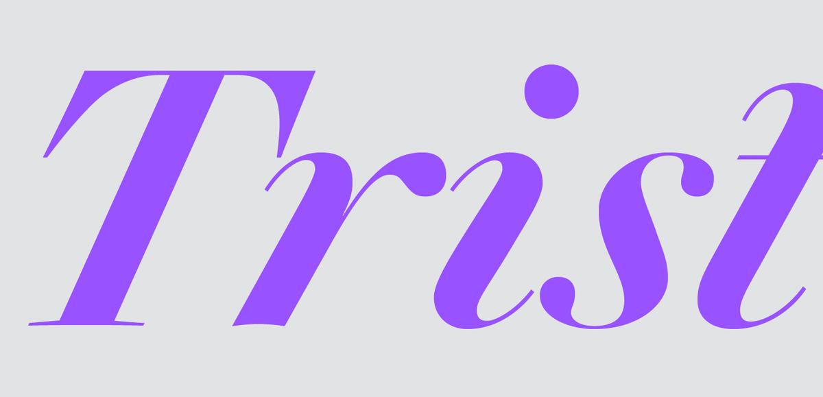
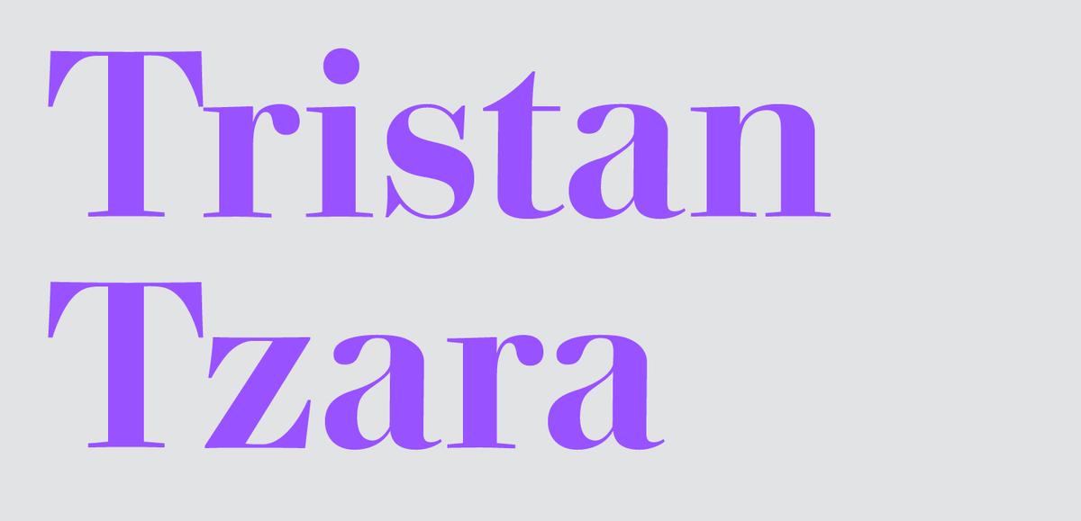
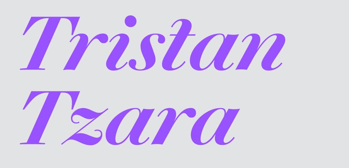
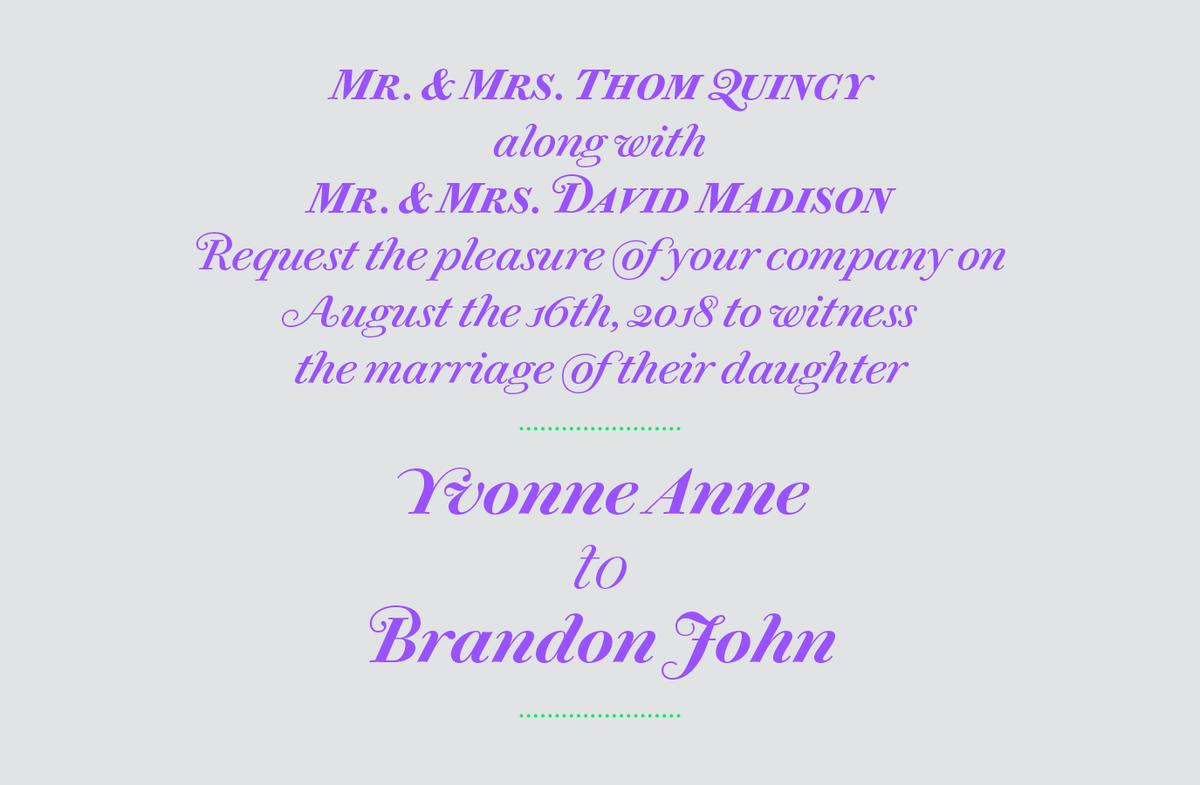
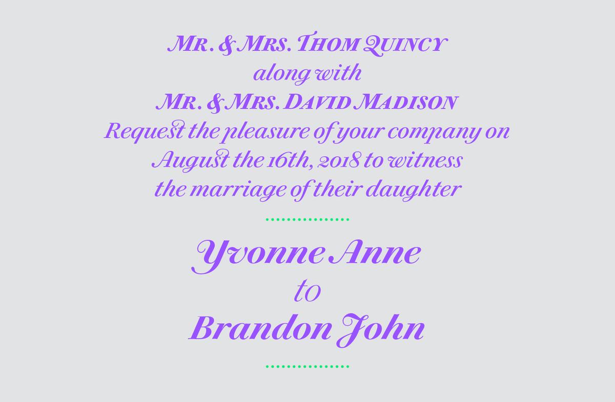
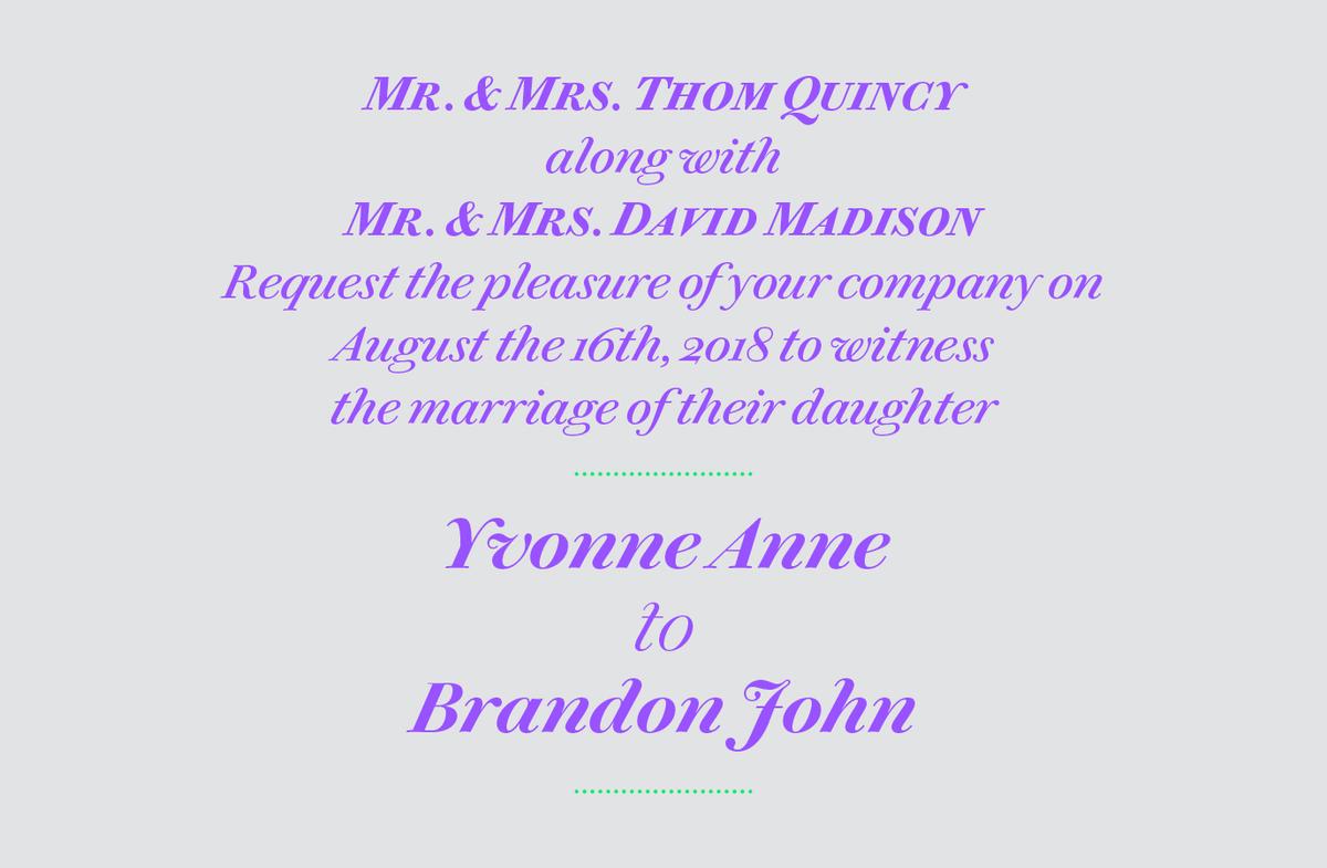
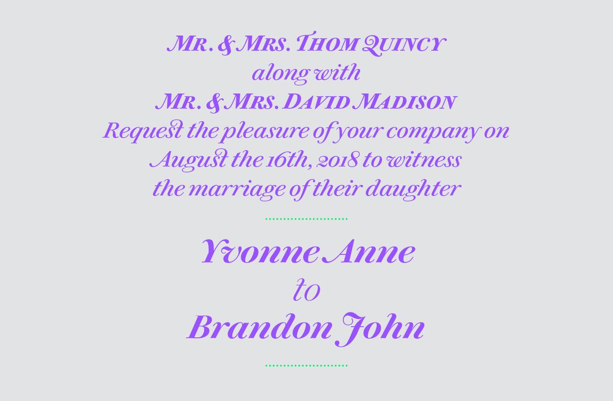
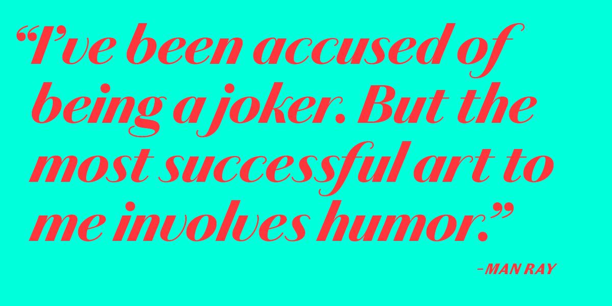
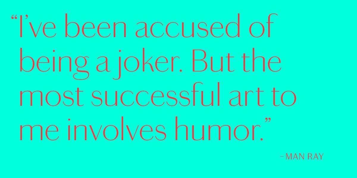
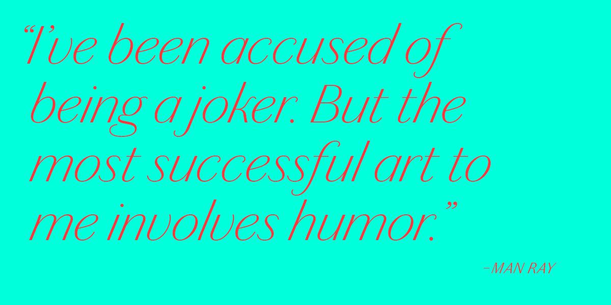
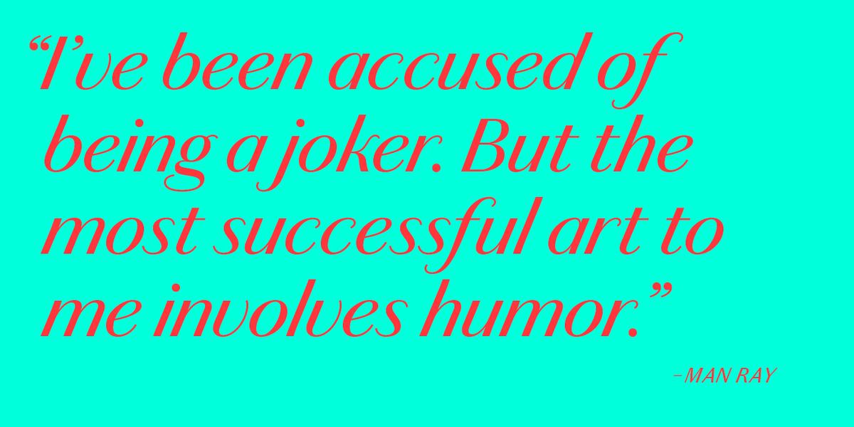
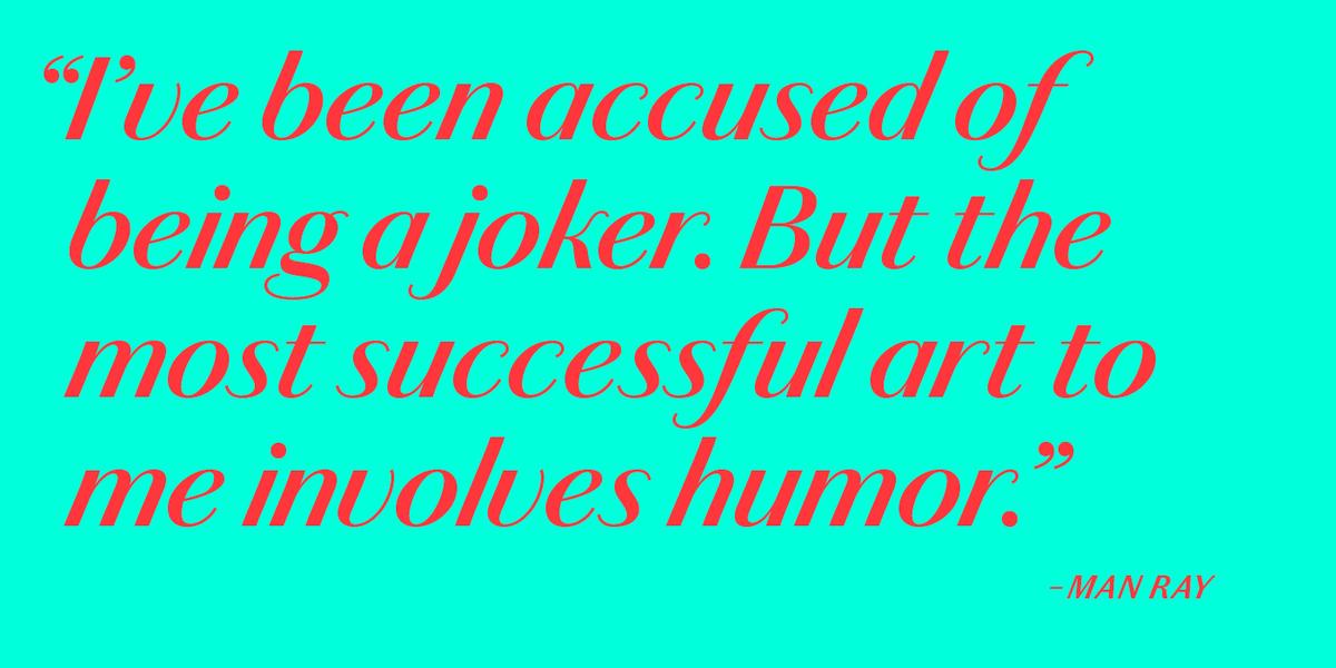
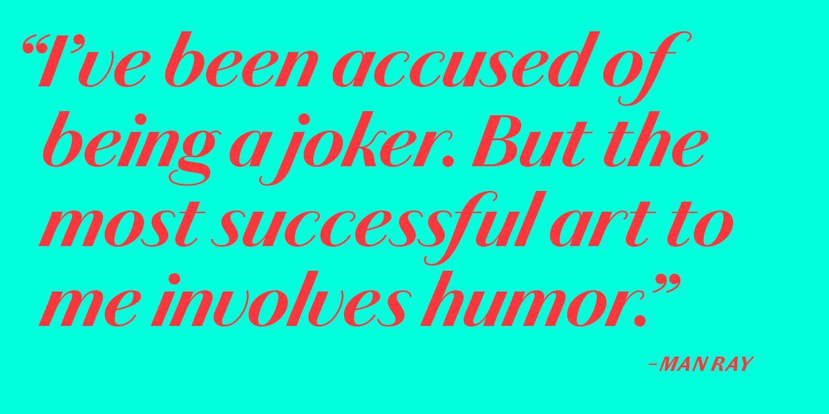
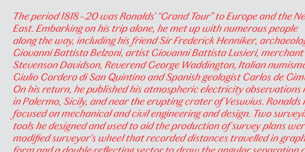
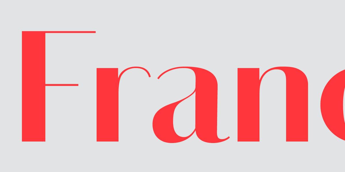
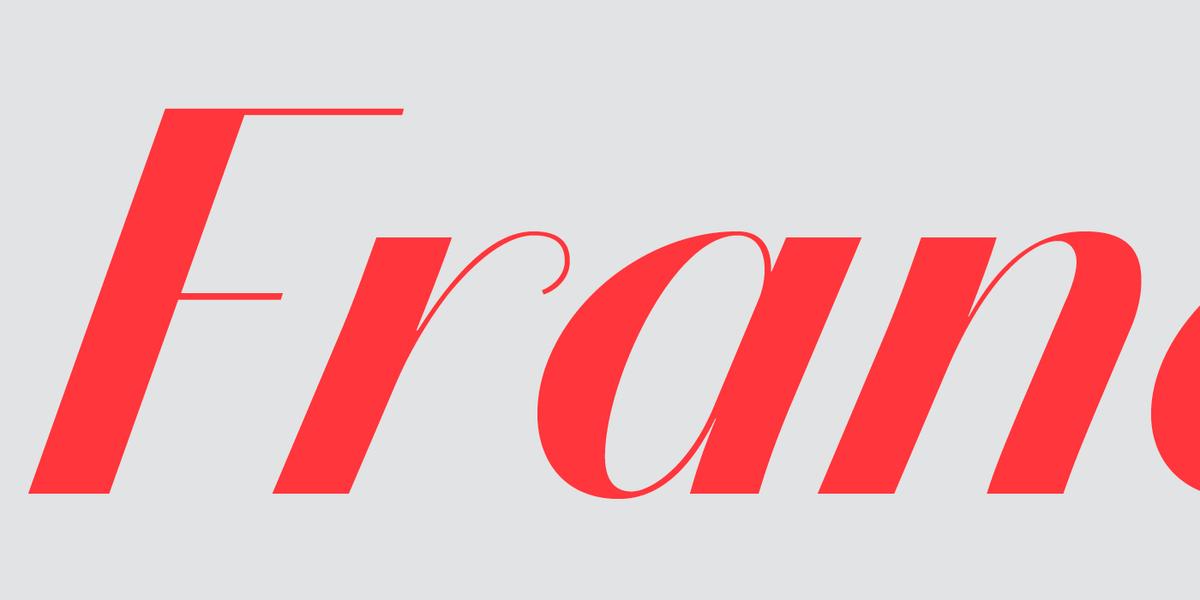
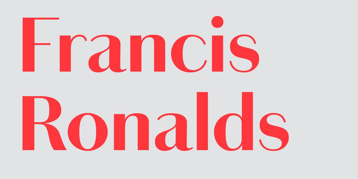
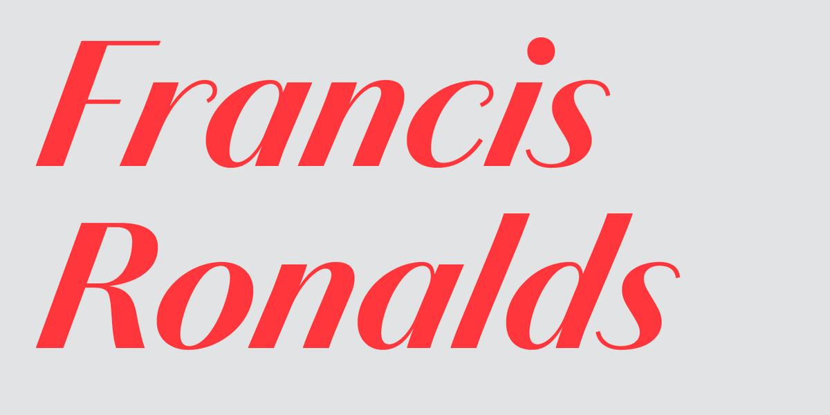
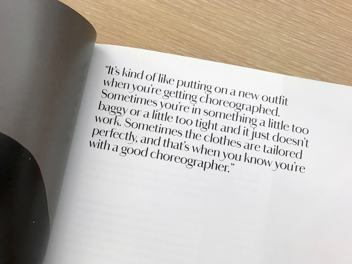
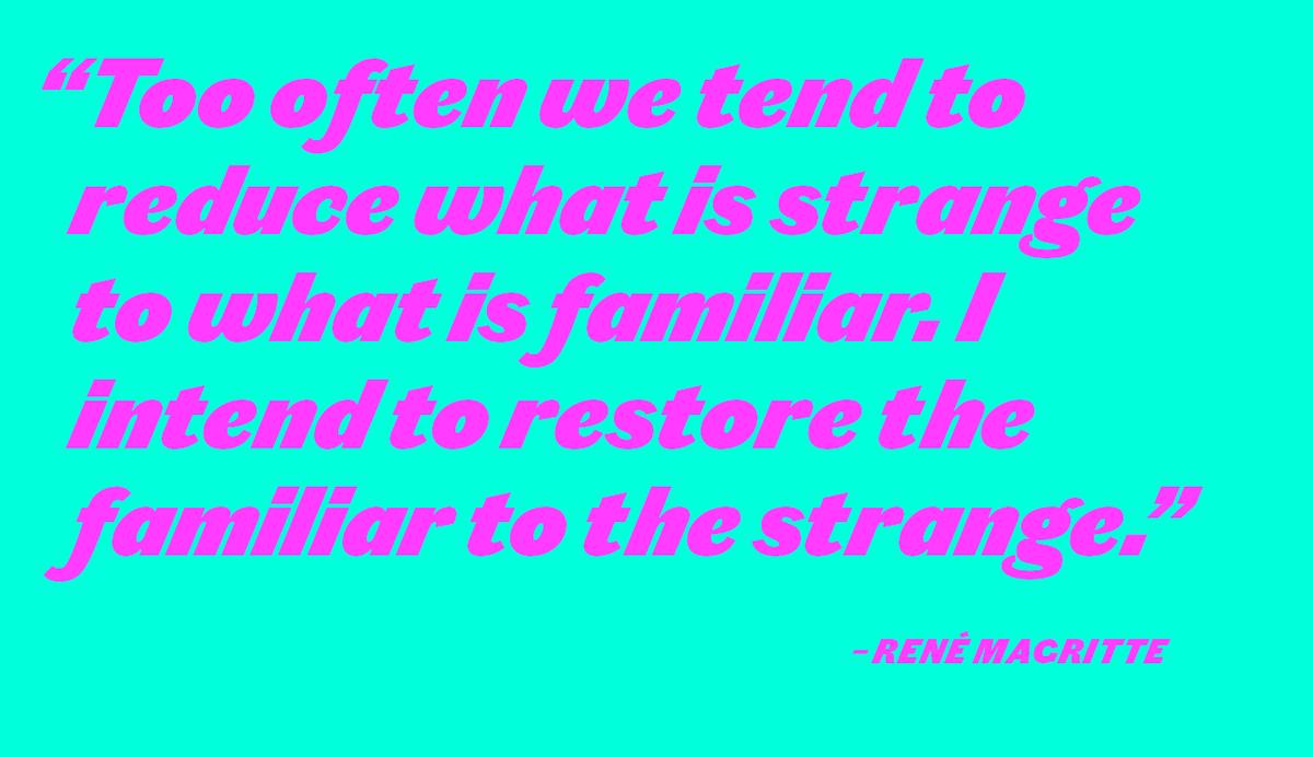
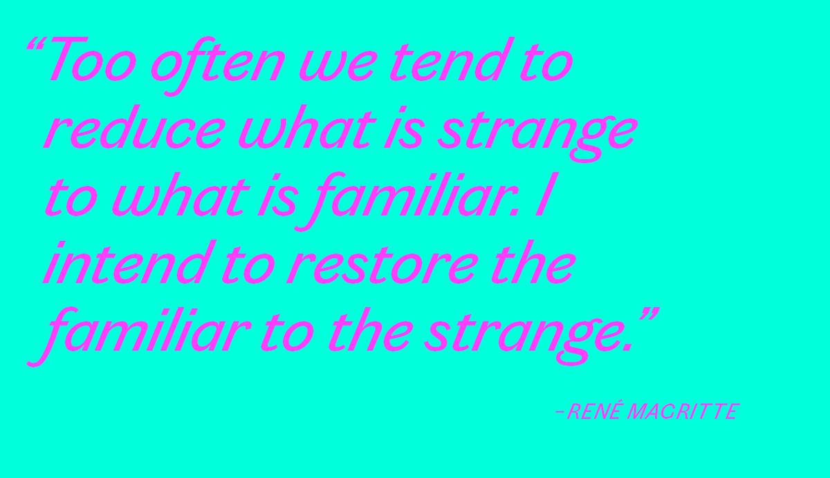
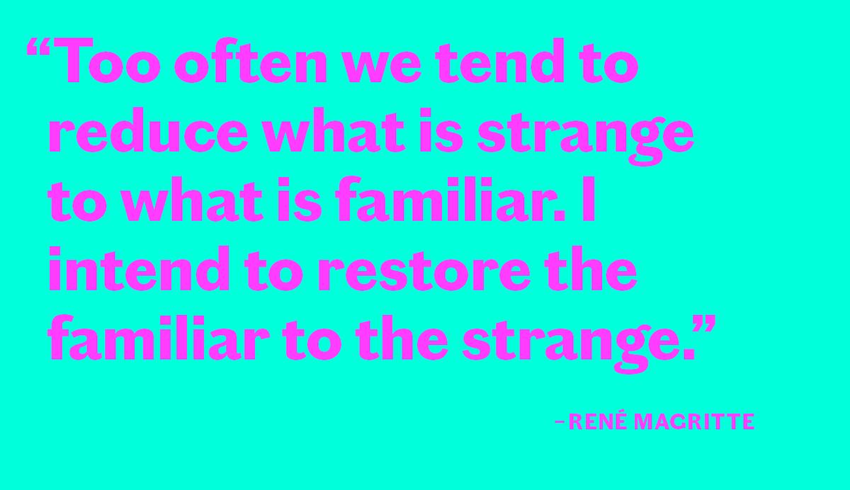
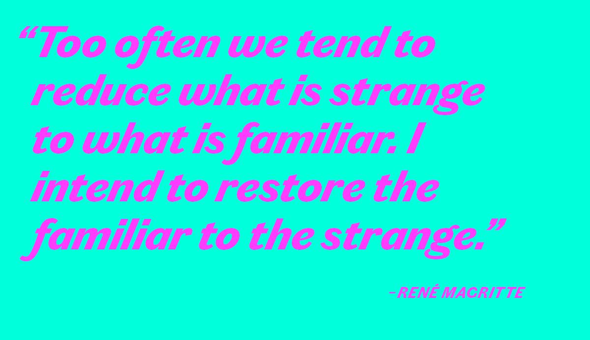
With a warm elegance, Chiswick is a seriffed typeface influenced by the British lettering tradition that began in the 18th century. High in contrast and with a beautiful, dramatically angled italic, Chiswick follows the lettering tradition rather than typographic sources. From the pen of the writing master to the chisel of the letter cutter, Chiswick takes inspiration from many sources, in doing so capturing the joyful spirit of the vernacular seriffed letters of the 18th and 19th century. Unlike the Modern typefaces of the era, which were forced to stay within the physical bounds of metal letters, Chiswick is freed from these constraints, allowing characters like y to have a more playful and expressive approach. The italic has a steep angle, akin to the roundhand copperplate script. As an anthology of seriffed forms created over the eighteenth and nineteenth century, Chiswick’s letterforms show subtle variation rather than precise repetition of details, giving an impression of handmade beauty rather than measured perfection.
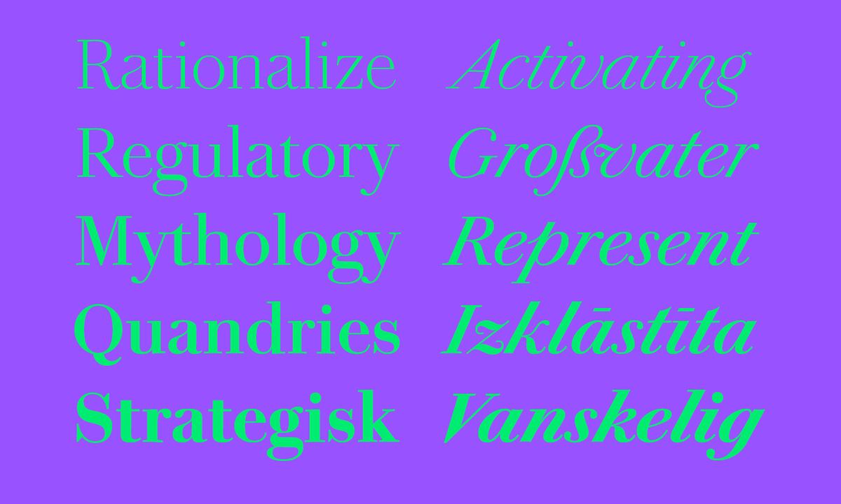
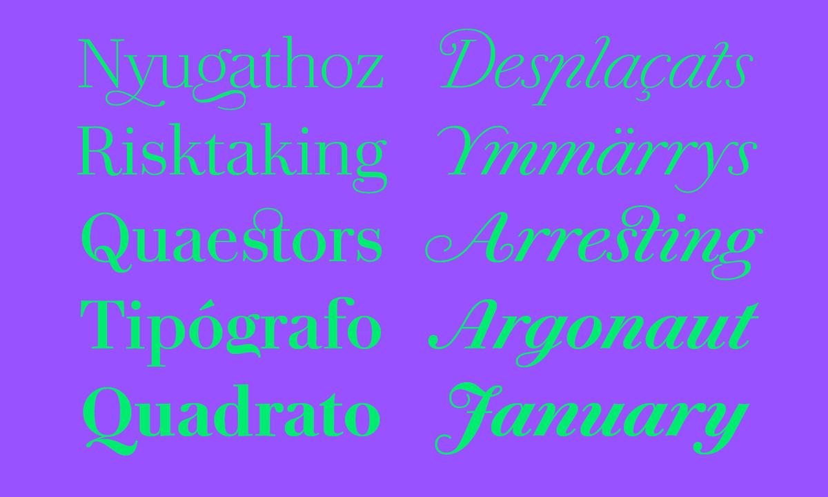
In five weights, with roman and italic from Extralight through to Bold, Chiswick’s distinctive design offers designers a typeface that fills a unique space in the typographic world. Its forms are assured but unusual, and beautifully crafted. Though formal in its contrast and overall appearance, it has an energetic and playful character, particularly in the wonderfully varied and rich italic.
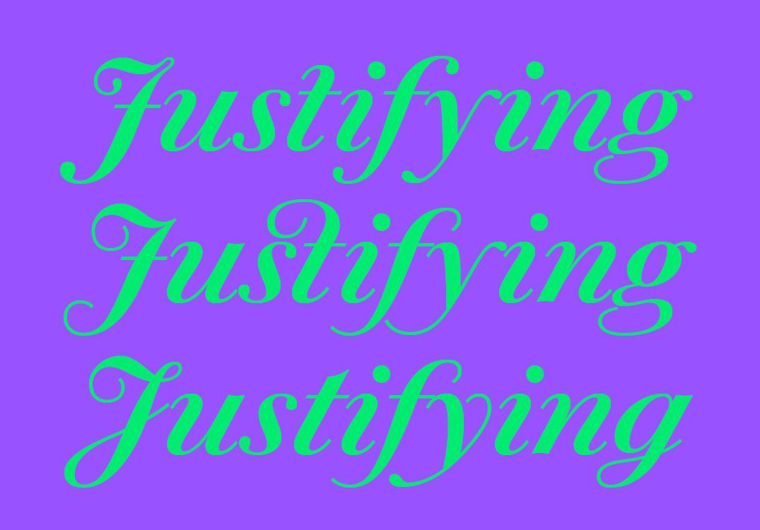
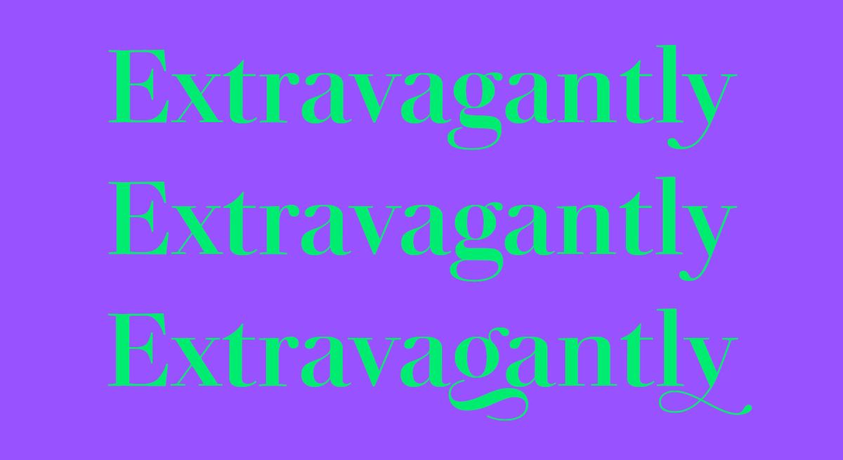
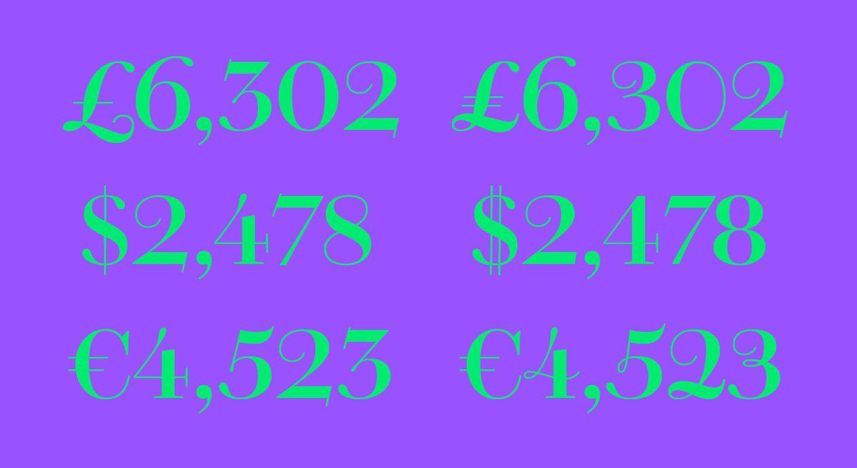
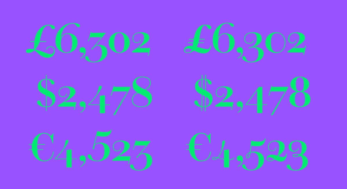
Providing stylistic options similar to what a letterer might have had in his arsenal, Chiswick has an impressive number of alternate forms and swashes, multiple figure styles and small capitals (in both roman & italic). The atypical hooks on the ascenders can also be replaced by more traditional serifs, or serifless terminals.
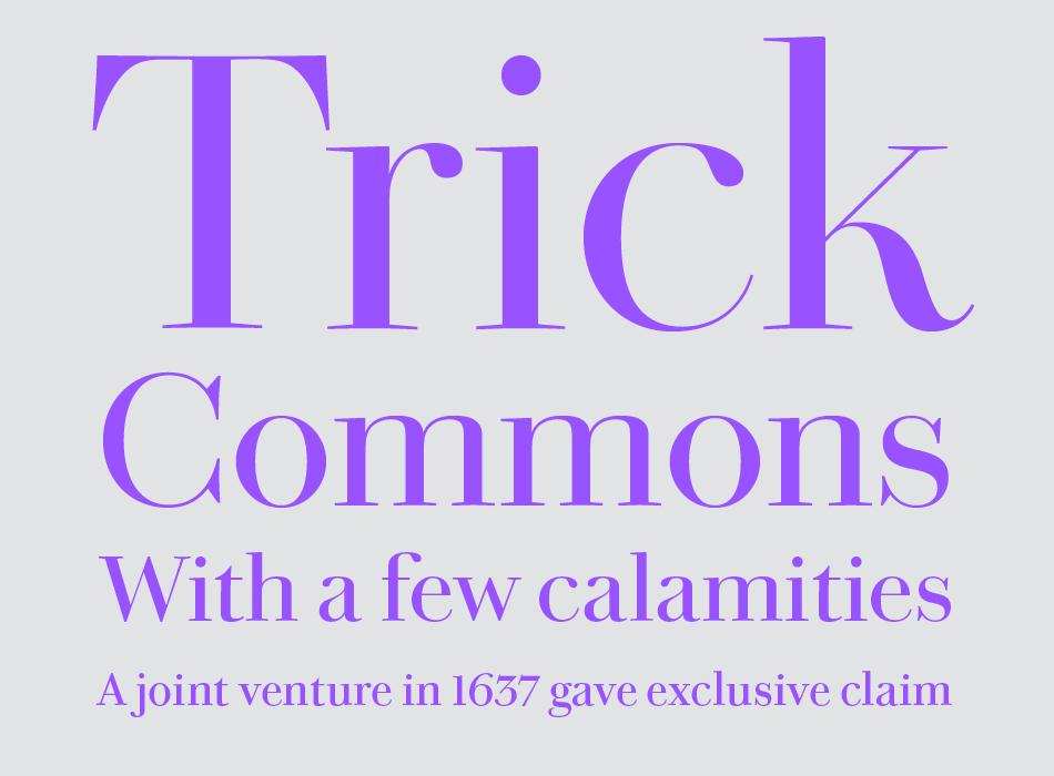
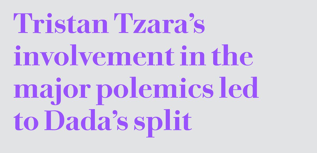
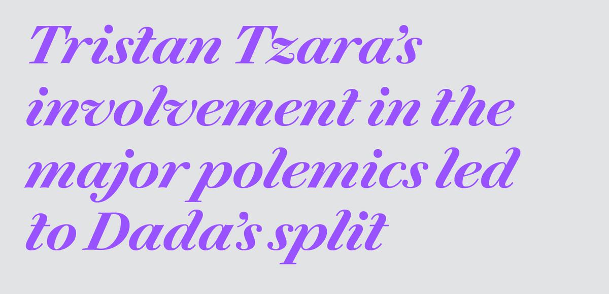
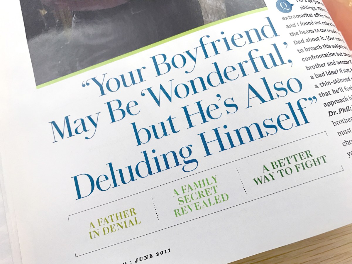
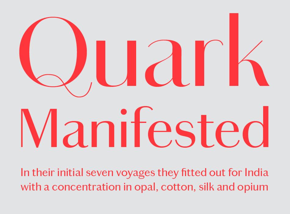
Chiswick is comprised of four families designed for different sizes, so it can have the appropriate stroke contrast from text up to giant headlines. It is well suited to a large range of uses in graphic design, social stationery and editorial design where a timeless elegance is required. Chiswick Poster is designed for the largest sizes, of 80 point and above, for headlines in magazines, for posters, for shop signs, in fact anywhere a seriffed letter with distinction and refinement is needed. Chiswick Headline is designed for situations where Chiswick Poster is too delicate; it is perfect for sizes from 30 point to 60 point. Useful for smaller headlines, as well as subheads, pull quotes, and introductory paragraphs, Chiswick Deck is intended for use from 14 to 30 point.
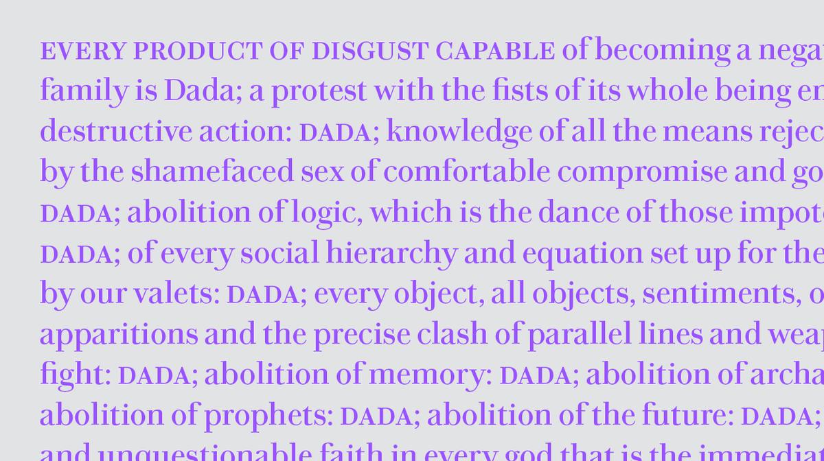
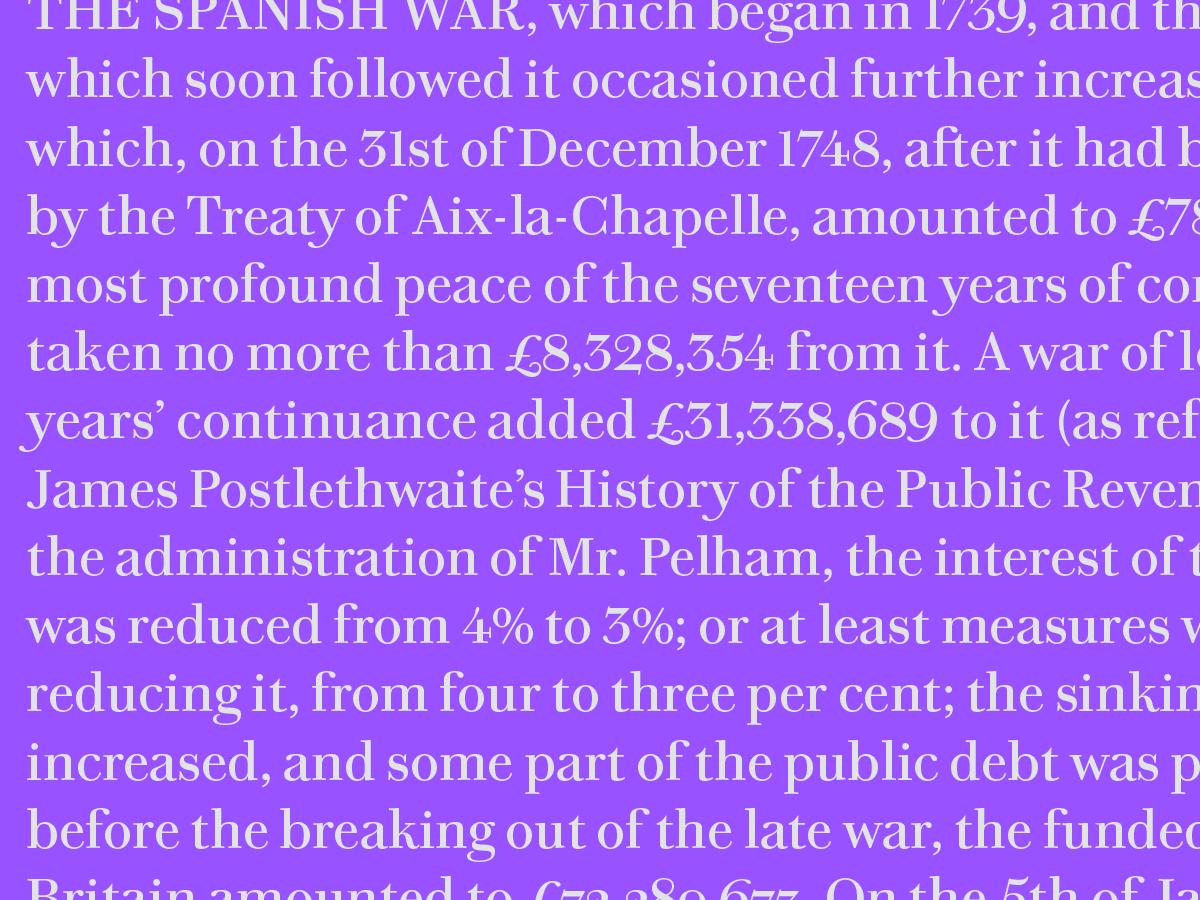
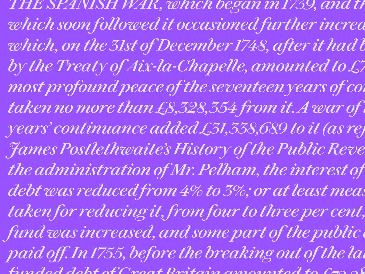
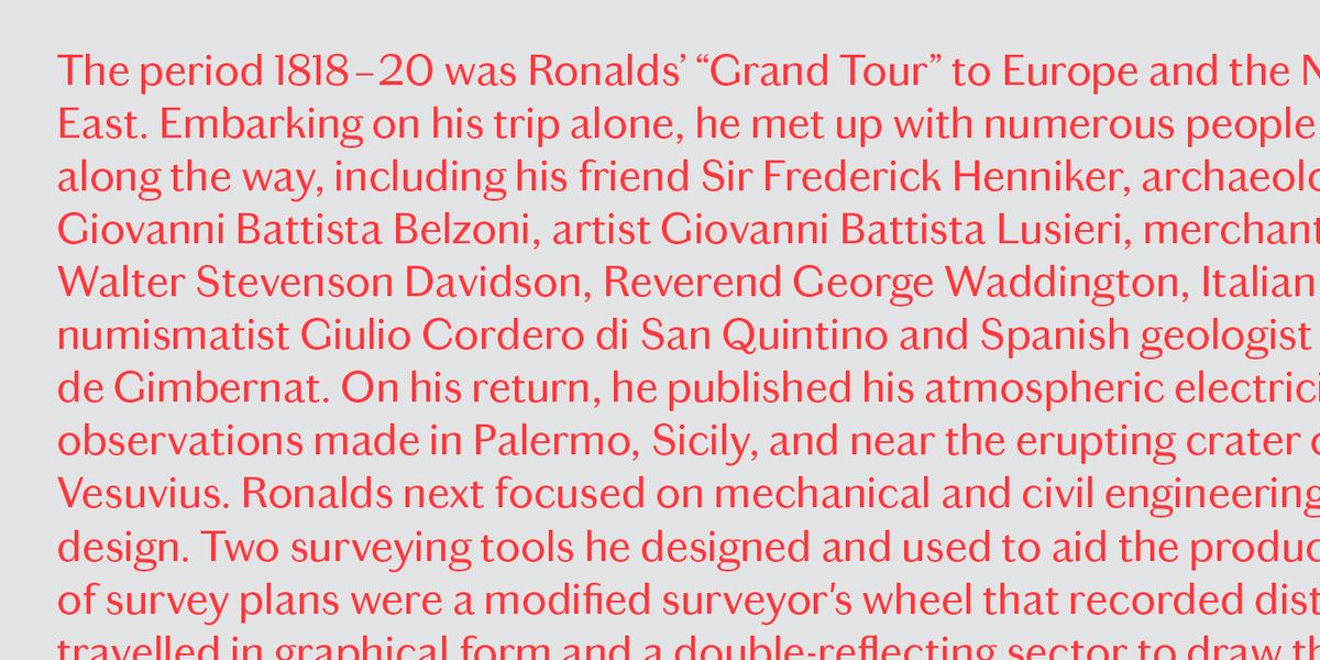
Even at small sizes, such as on a watch face or the caption of an engraving, vernacular style letterforms bear a remarkable similarity to the letters applied at the largest sizes, such as on a shopfront. Chiswick Text is intended for use up to 14 point, and brings a remarkably warm character to text. Comfortable for long-form reading, its personality is equally well-suited to short bursts of text on menus and invitations. Chiswick Text has been adapted from the display versions, toning down the style without becoming characterless. With multiple figure styles and small capitals – not to mention the full range of alternates and swashes found in the display sizes – it will satisfy the needs of even the most rigorous microtypography.
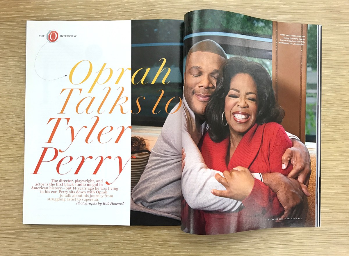
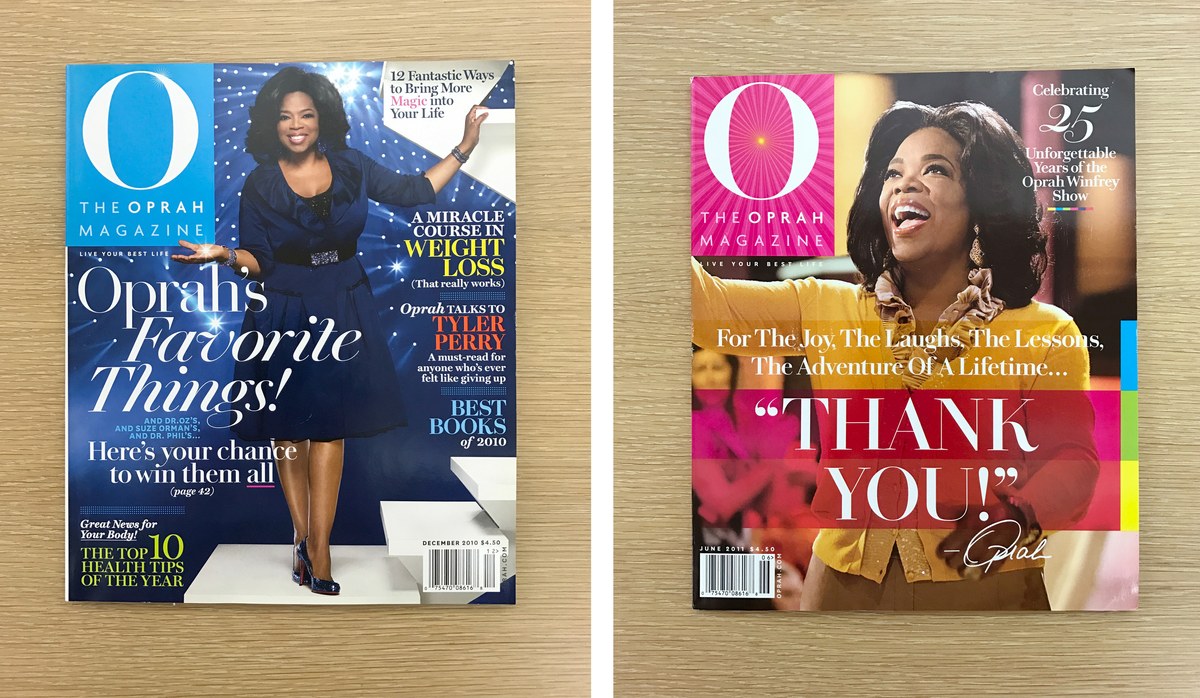
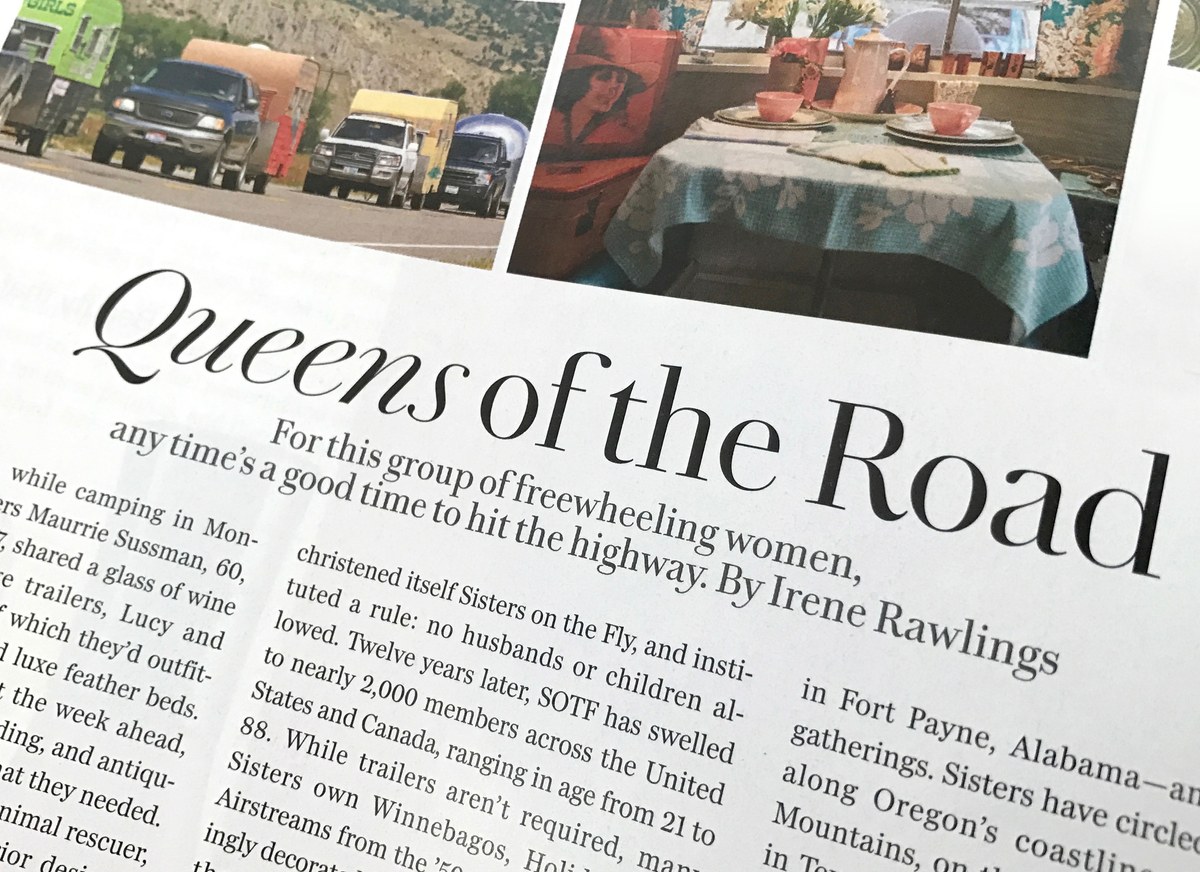
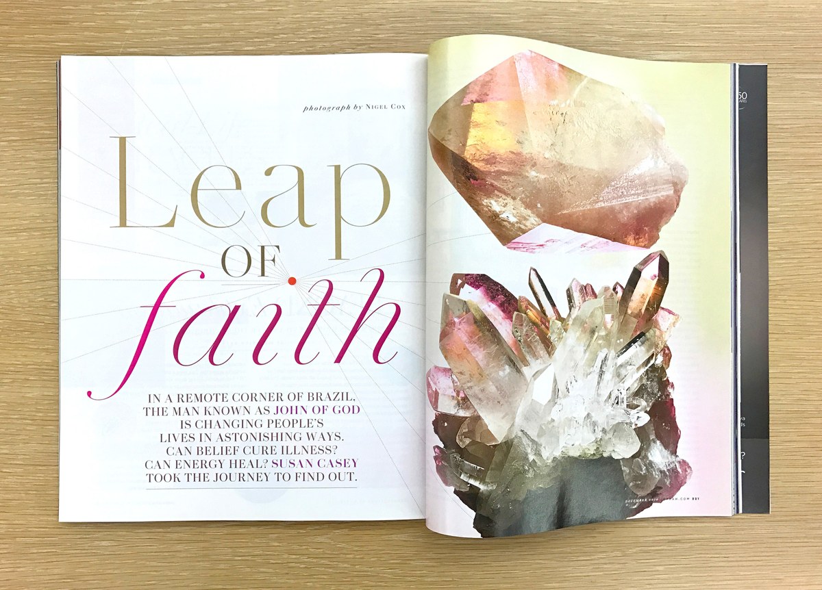
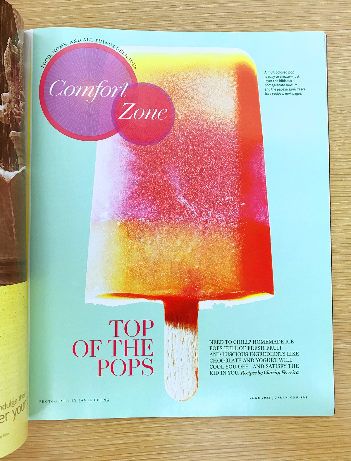
An early version of Chiswick served as the primary display typeface in the 2010 redesign of O, The Oprah Magazine by Robert Priest and Grace Lee, where its beautiful forms gave a breezy opulence to feature openers and section heads.
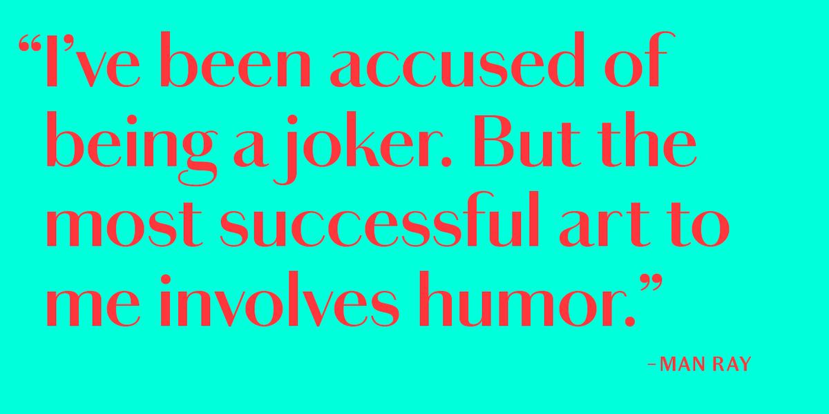
Chiswick Sans
Simply removing serifs from letters is an obvious idea, particularly in the case of a slab form. It is less obvious when the original is a high contrast serif letter. During the long process of designing Chiswick, an unusual example of a highly contrasted sans was discovered in the far west of England. These letterforms had the contrast of a modern style serif, but without any serifs. Had the lettercutter forgotten to add them, or was he creating a new style? We will never know, but before sans became codified as a genre of typeface, high contrast sans letters were surprisingly typical.
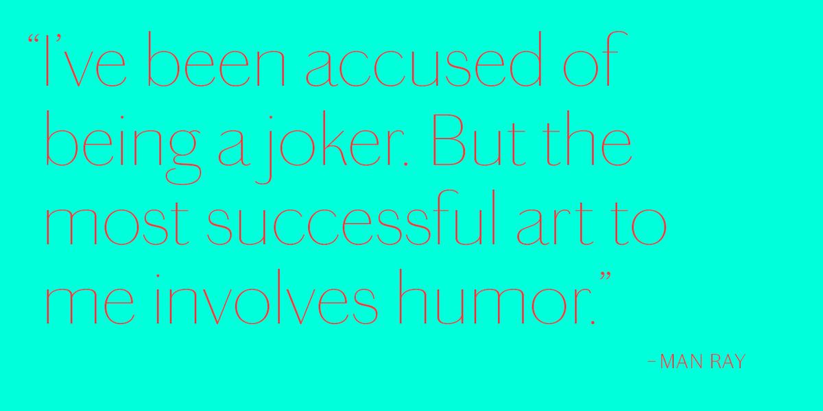
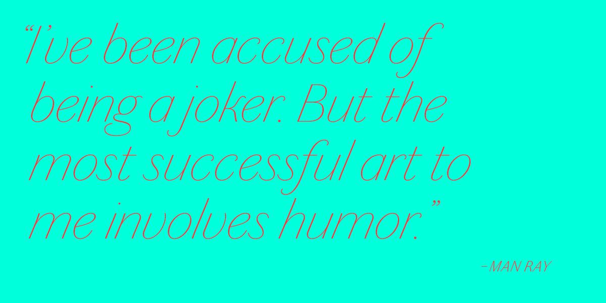
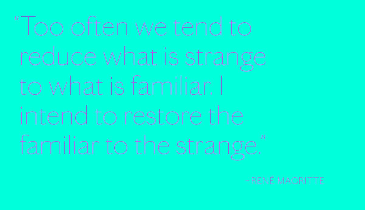
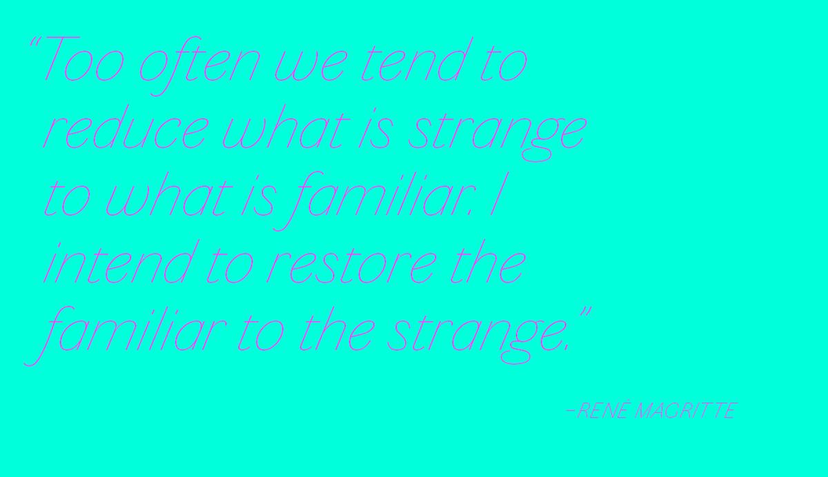
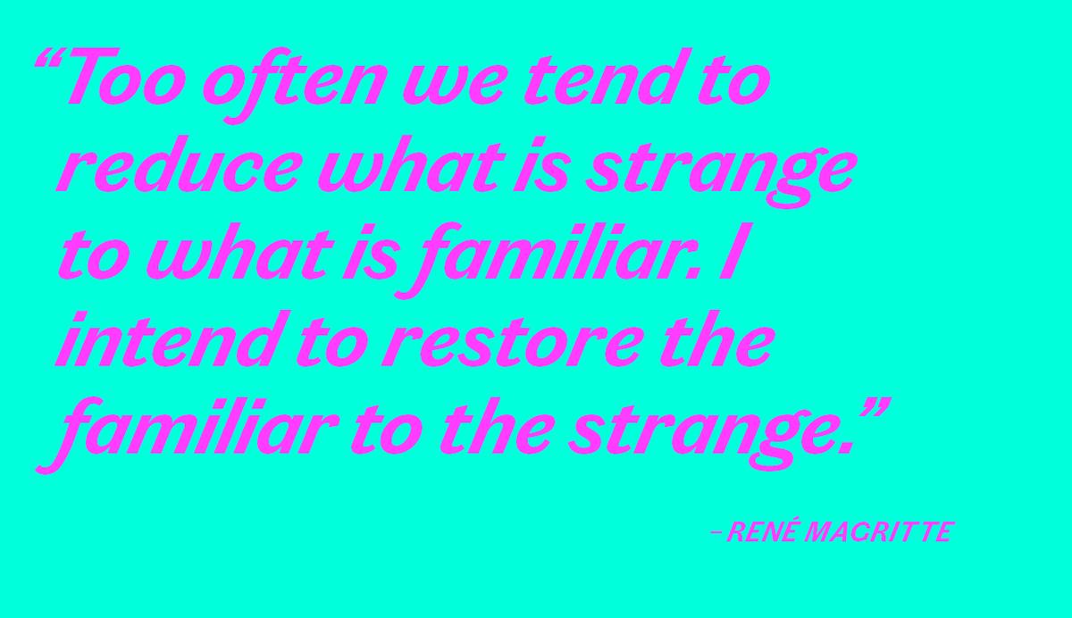
Chiswick Sans manages to retain the beauty of its serif forebearer, but in the form of a serifless letter. Its two display sizes each range across seven weights, from a dazzling thin through to a heavy fat weight, all with beautifully expressive italics. Additionally, five weights of a text size have been drawn. Despite the lack of terminals, Chiswick Sans remains an unusual but convincing proposition, useful when a sans with distinction and character is needed.
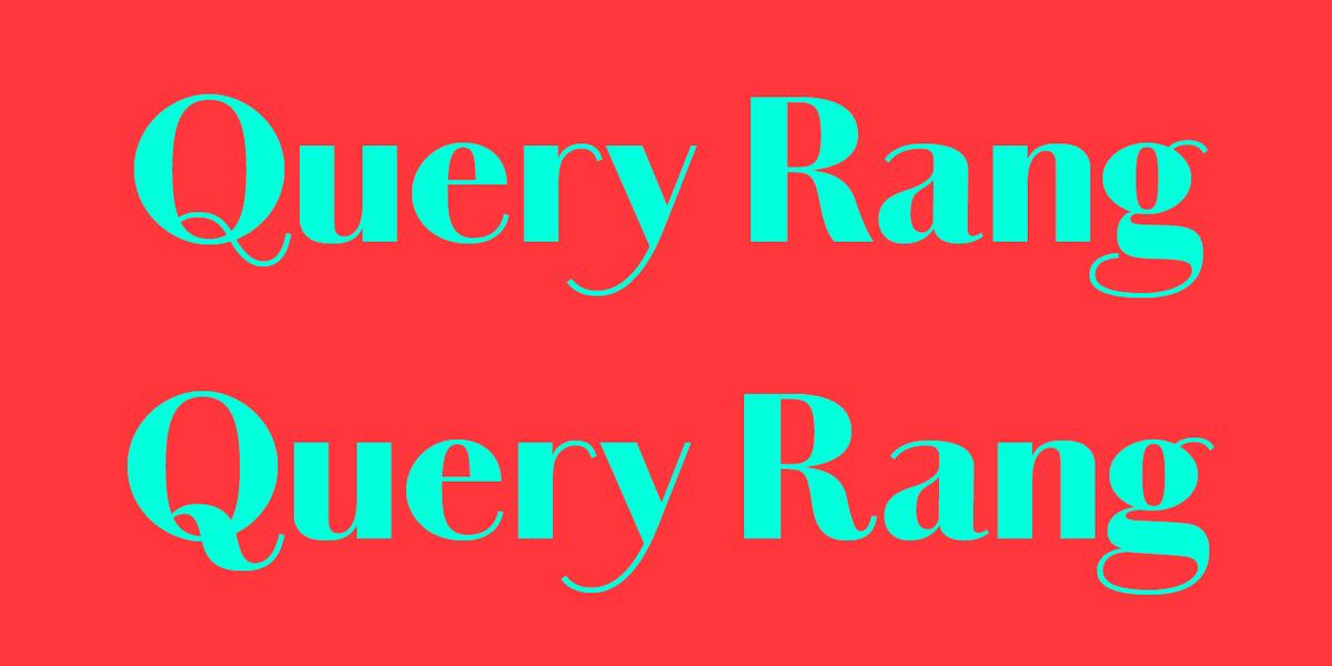
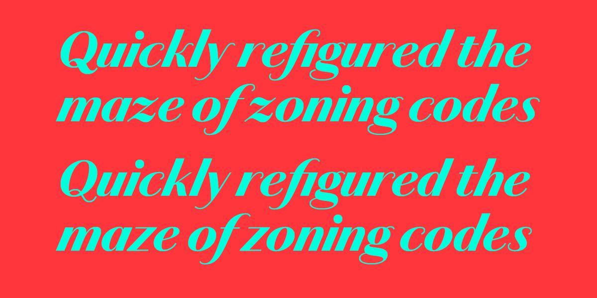
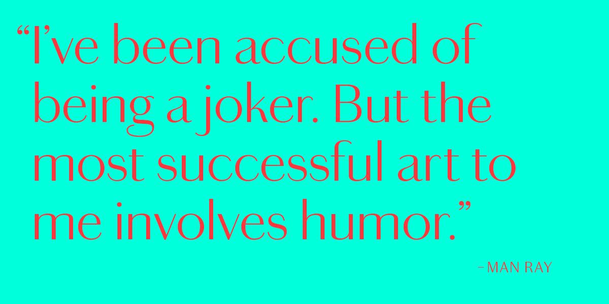
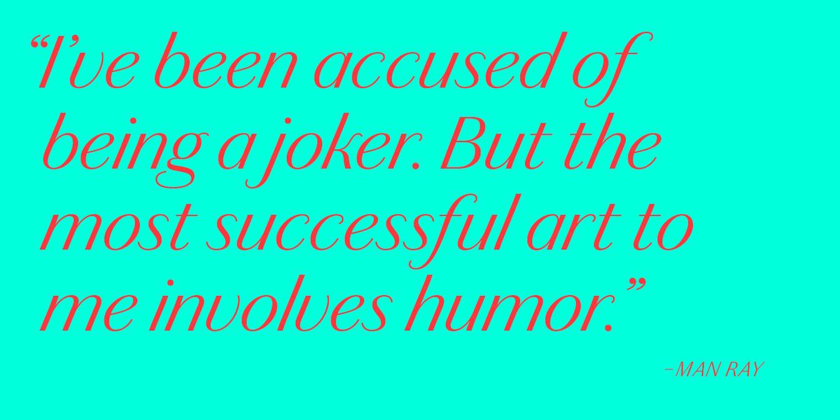
Chiswick Sans Poster has extreme contrast between thick and thin strokes, making it a clever alternative to the high contrast modern serif where an elegant and refined letterform is required. With a gloriously expressive and striking italic, it shows how a letterform from the past can resonate in the contemporary world. It is suitable for the largest display sizes in graphic design and editorial design. Chiswick Sans stands between the extremes of Poster and the utilitarian Text versions. More robust than the Poster and usable at a wider range of sizes, it is still clearly intended for headlines.
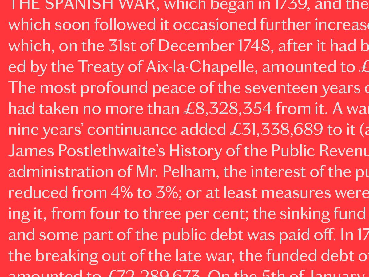
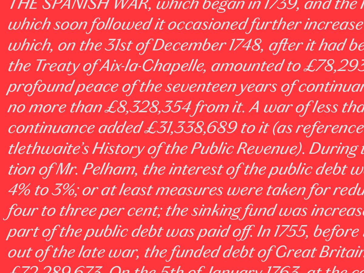
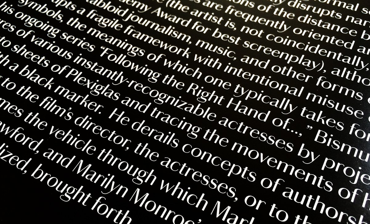
Between the elegance of Chiswick Sans and Sans Poster and the industrial Chiswick Grotesque lies Chiswick Sans Text. Its contrast is low enough to work at all sizes, but high enough to give texture, character, and personality to a block of text. Distinctly different from the typographic sans serifs of the 19th century, Chiswick Sans Text captures the expressive spirit of the era’s lettering. Its gentle contrast between strokes makes an excellent contrast to the more monolinear sans forms of Graphik or Marr Sans. Many of the characters such as the K, k and the long tailed y add a unique flavour to the utilitarian sans form, though the fussier details have been calmed down to remove distractions, particularly in the italics. Chiswick Sans Text is a simple, unusual sans that can be used in many situations where the plainness of a sans is required, but a subtle character and distinct texture are suitable.
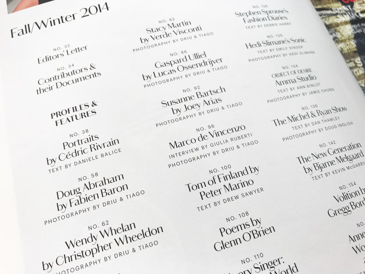
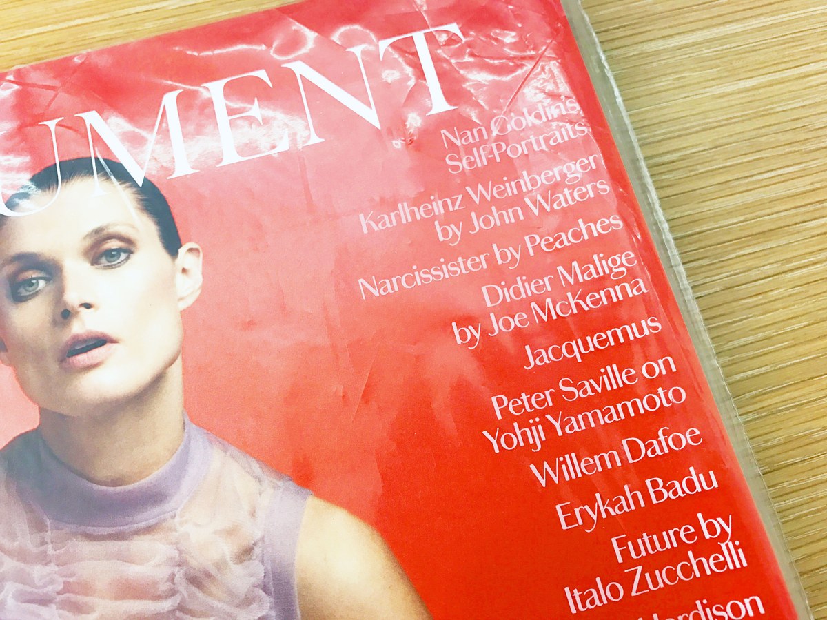
Chiswick Sans was first used in Document Journal, a fashion, arts and culture publication centered in downtown New York (and previously our studiomates), where its quiet elegance and unusual shapes paired well with avant garde fashion, art, and photography.
Chiswick Grotesque
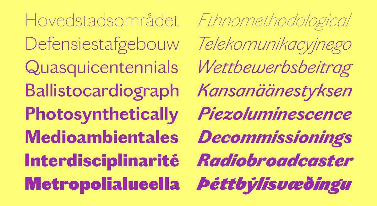
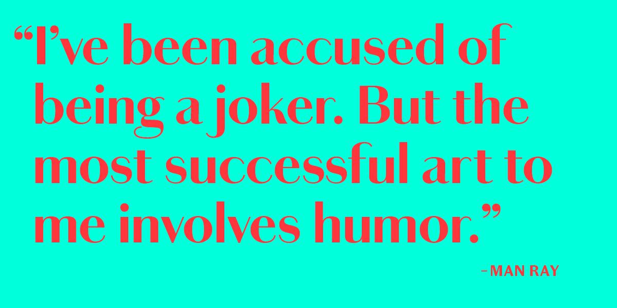
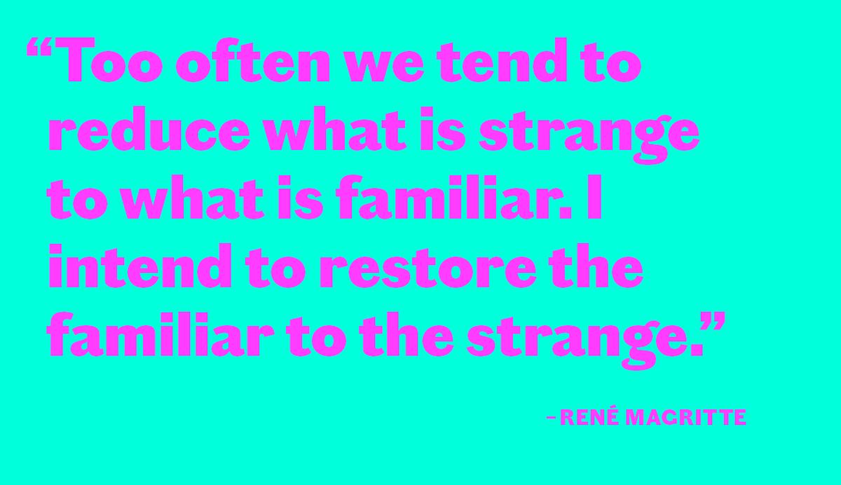
Industrial in style, while retaining the essential character of the other families in the Chiswick collection, Chiswick Grotesque is a letterform from the nineteenth century’s bustling metropolises. Its boldness and crude, no-nonsense style suggest a form as suited to architecture as to print. The use of sans serif letterforms exploded in the late 1820s & 30s. By this time, sans had gone from being a rarified choice evocative of classicism to being one of the key styles of letters, as bold as the popular slab, but with a stripped down simplicity for eye catching headlines in print and around town. Chiswick Grotesque is the letter we see in street scenes of the nineteenth century: powerful and often cruder in style than printing types, with its round, geometric bowls exhibiting an industrial aesthethic. This is the letter an engineer would use on a machine, or with which a signpainter would adorn a factory. It is a letter for casting in a metal foundry rather than a typefoundry.
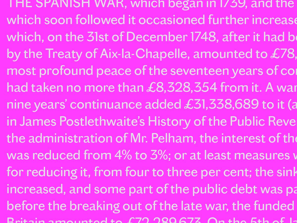
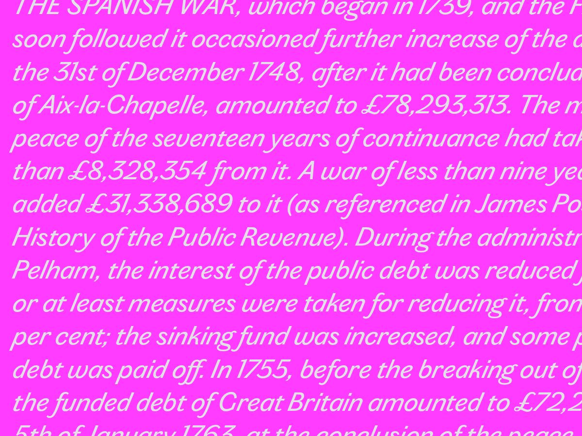
Chiswick Grotesque has eight weights, the largest range in the Chiswick collection. Its novel apperance makes it well suited to a variety of graphic design and editorial design applications, and its unusual approach to contrast and geometry can help breathe life into online interfaces and other screen-based uses. In text it is unusual but appealing, crude but organic. When seen as a mass, the eccentricities of individual letterforms recede, leaving a pleasant and lively texture.
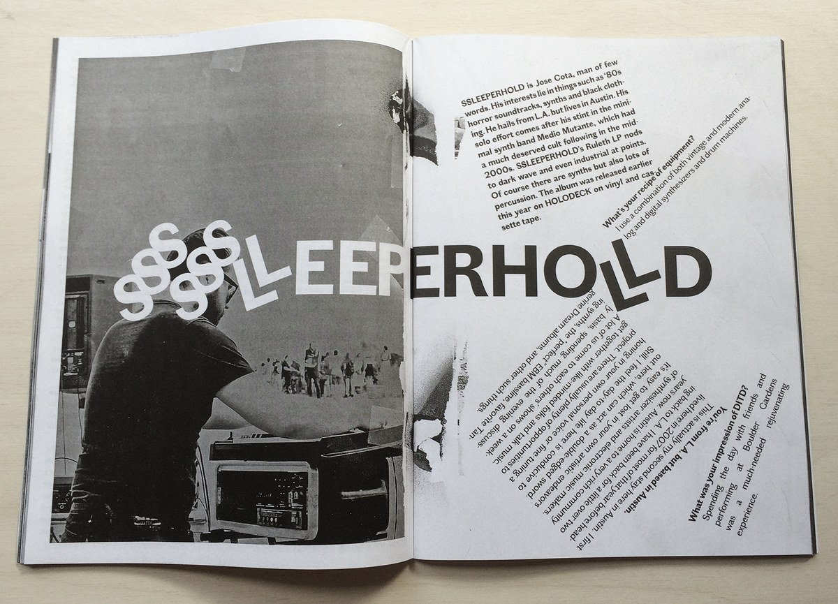
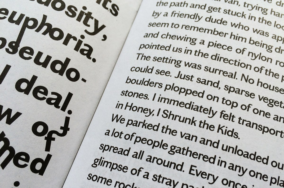
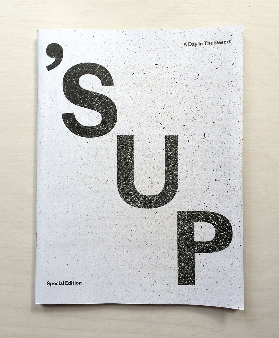
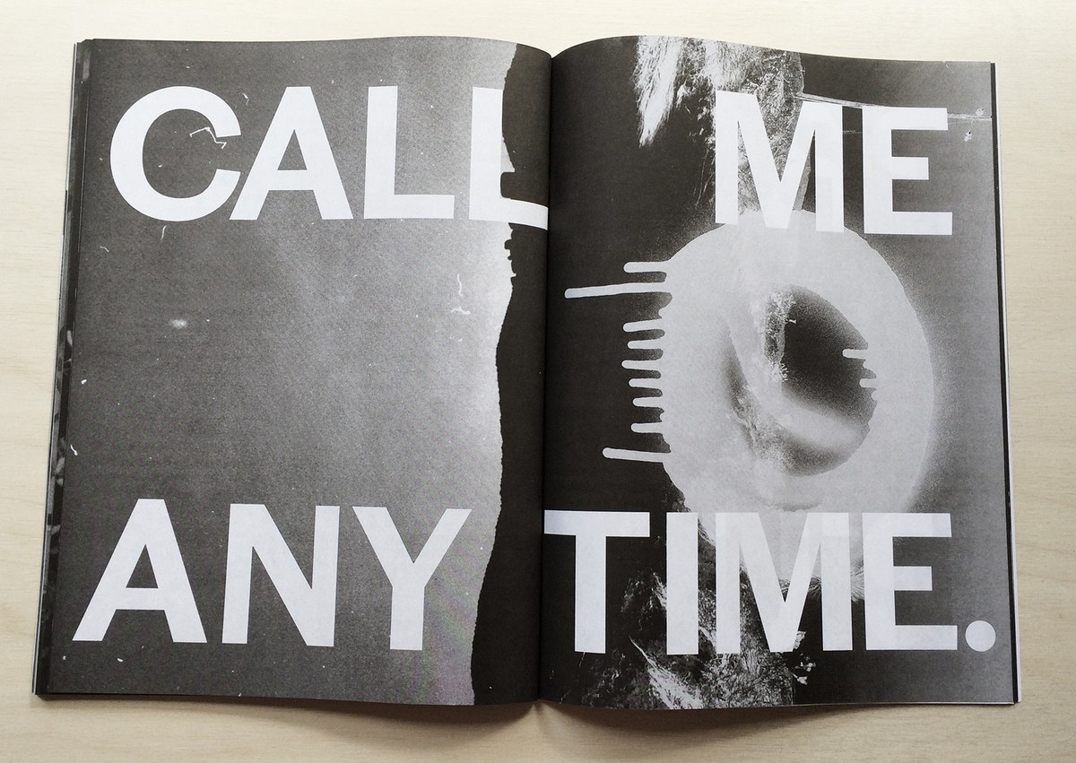
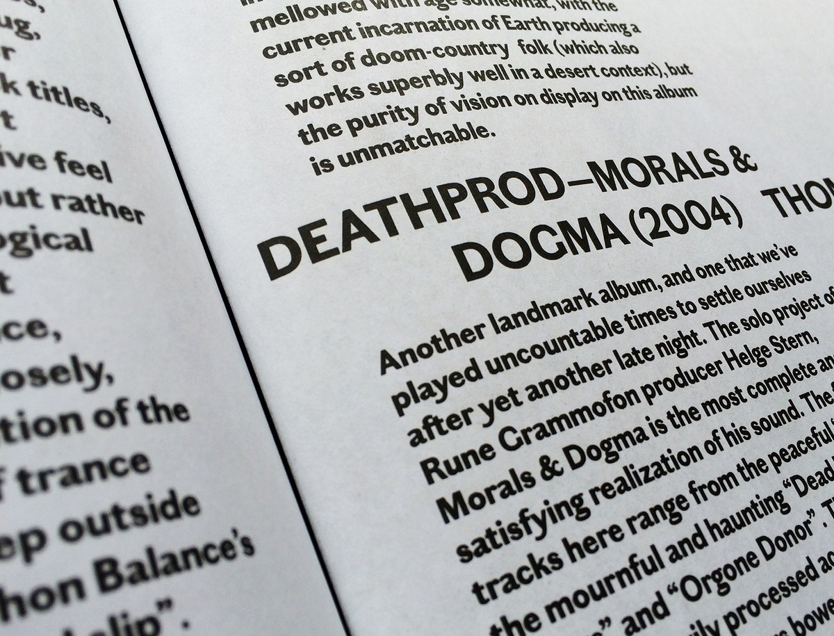
The tension between elegance and crudeness in Chiswick Grotesque made it a good fit for a special desert mini-edition of ’SUP in 2014, centered around a small music festival the team had put on in Topanga Canyon the previous winter. The issue was designed by Richard Turley and Tracy Ma, with photo editor Emily Keegin. All type in the issue was in three weights of Chiswick Grotesque, sometimes with psychedelic modifications by the designers.
Note: Photographs of historical sources in this article have been used by permission and may not be reproduced elsewhere.
