Minisite for Terza

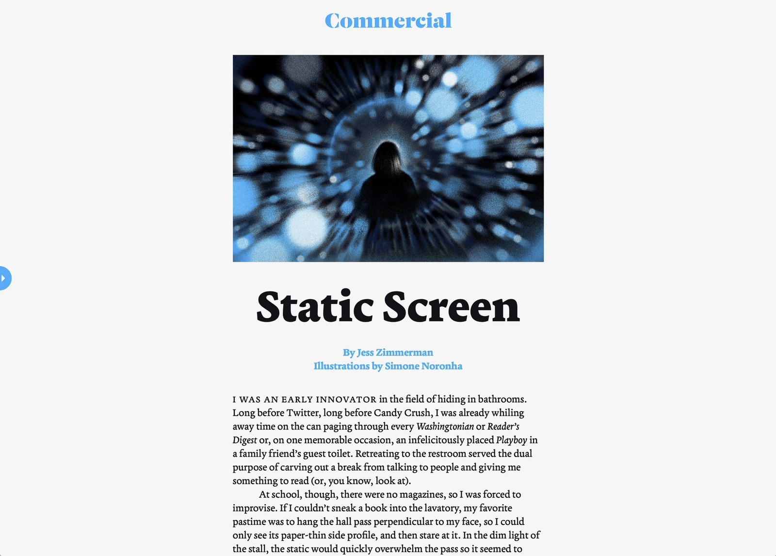
The Terza collection, made up of the Reader, Author, and Editor subfamilies, is Greg Gazdowicz’s latest solo release with Commercial Type. To celebrate this milestone, we made a site about it, featuring a previously unpublished essay by author Jess Zimmerman. The site acts as a proof of concept for Terza’s usefulness as a typeface that can negotiate all stages of a text’s production, from draft to editing to finished piece.
The idea for Terza came to Greg while he was working on another project: the much-anticipated Roboto Serif, which Google had commissioned for comfortable reading on screens. What fascinated Greg about productivity apps like Google Docs was that they are basically playgrounds for drafting new material and publishing it, all in the same space. He thought it might be interesting to structure a typeface like this, echoing the life cycle of a text as it makes its way from a rough draft through to a finished piece. Since these ideas were more speculative and specific than the original client commission, Greg funneled them into his own project.
In Ways of Seeing, John Berger wrote that “a large part of seeing depends upon habit and convention.” Early typefaces for the screen leaned heavily on the conventions of newspaper types, which, not unlike fonts on low-res screens, needed to contend with rough environments. But display technology has rapidly evolved and, with it, so have our habits of reading and interacting with text, which have taken on new tempos and rhythms—new conventions. Greg let this guide him when designing Terza.
Terza Reader is the “fastest” Terza variant and is tuned to immersive reading. When we lose ourselves in a text, we lean back and try to absorb as much information as we can, as quickly as we can. We don’t linger on each letter; we abstract letters and group them together to form words and blocks of words. Terza Author, the most experimental of the three subfamilies with no real precedent, deliberately slackens the tempo by introducing traits like longer serifs, allowing people to lean forward and focus on a text’s infrastructure—spelling, syntax, punctuation—when writing something. Terza Editor, a monospaced design that embraces the tradition of so-called typewriter typefaces, is the “slowest” and steadiest of the three because each glyph occupies the same amount of horizontal space. It encourages a more abstracted, “meta” approach to producing text and is ideal for coding or editing.
Overall, the three subfamilies exhibit pronounced contrast when viewed side by side, particularly in the italics. But because they emerge from the same source, they cross-reference one another and allow designers to create complex typographic hierarchies with them. Terza is anything but rigidly prescriptive, though. It has already appeared in projects that both observe and flout the design’s intended use: see the beautiful Ubi Sunt project, print editions of Document Journal, and special issues of the Brooklyn Rail. “What’s great about being a type designer,” says Gazdowicz, “is that you spend lots of time thinking about and agonizing over how to make a typeface succinct and make it make sense. And then no one uses it the way you intended.”