Changes at the Strib

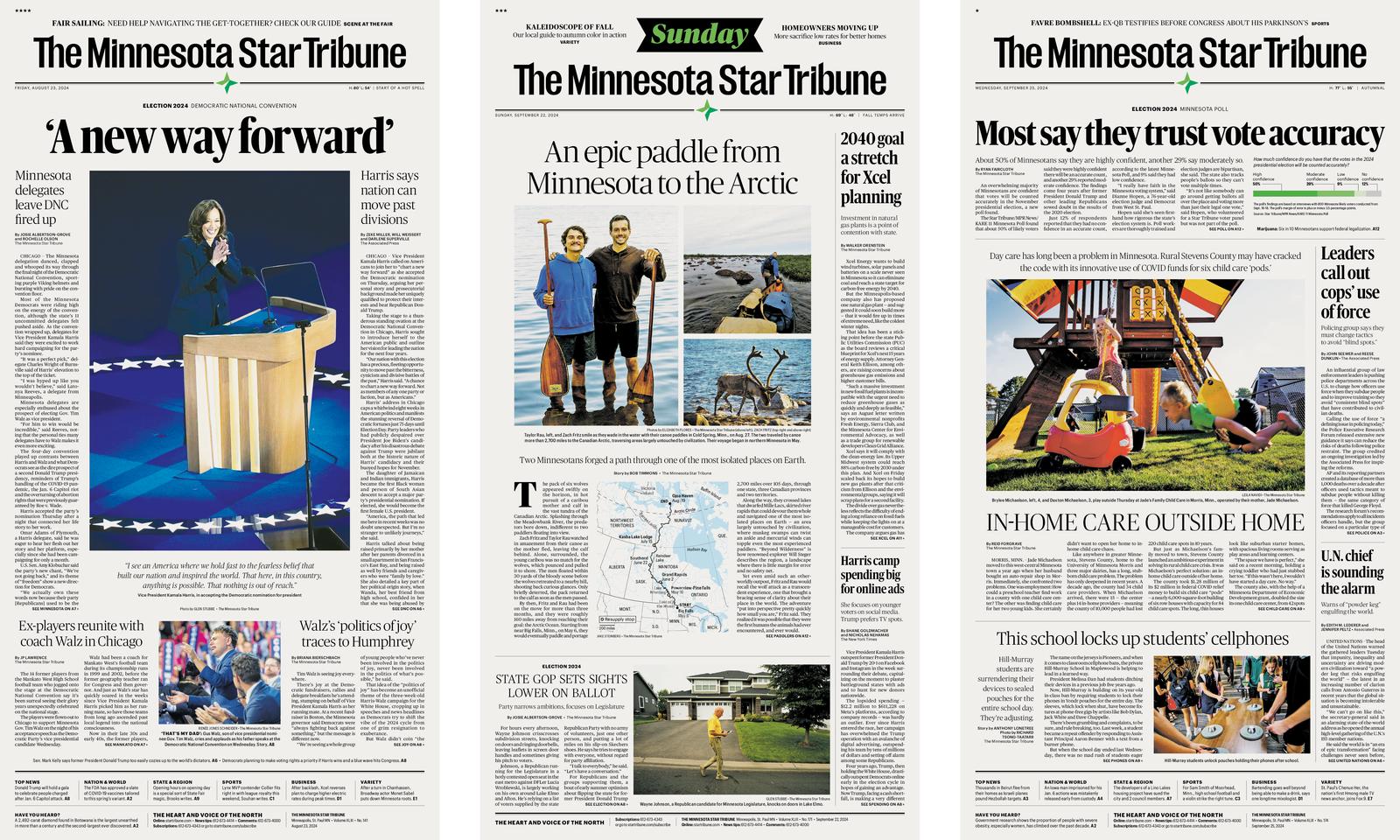
At a time when newsrooms across the country are shrinking, one major newsroom is expanding and adapting to a changing information climate. The venerable Minneapolis Star Tribune, the eighth-largest paper in the United States, finds itself relatively flush with a recent infusion of cash from its owner. Newly rechristened as the Minnesota Tribune with a broadened scope that covers the entire state, the paper has hired a raft of local reporters and hopes to have a more digital focus.
Not surprisingly, the overhaul comes with a revamped look, led by Josh Penrod and his team at the newspaper. The Strib has a redesigned logotype by Minneapolis agency Colle McVoy; a reorganization of content around five “pillars” (news and politics, business, outdoors and the environment, food and culture, and sports); a new color palette; a refreshed website and new apps; and some reconsidered type.
For more than twenty years, the Star Tribune has been using Popular, a slab serif originally designed by Christian Schwartz in 2004 for Popular Mechanics. Popular, completed for commercial release in 2024 with help from TienMin Liao, is still being used as a tertiary typeface for navigational elements and bold bursts of text. And now two Commercial Type families join the mix to round out the type palette: Publico, the primary typeface, considered by the Strib to be synonymous with the brand; and Graphik, the secondary typeface, used for everything from bylines to captions to lists. This is the first high-profile use of Publico Banner Condensed and Publico Banner X Condensed, drawn by Thomas Bouillet and Andree Paat. We’re honored to be part of this new direction for the premier newspaper of the upper Midwest.