Druk Condensed Family
Designer
Technical
Pricing
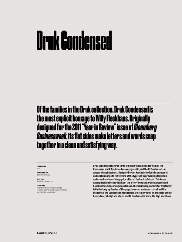
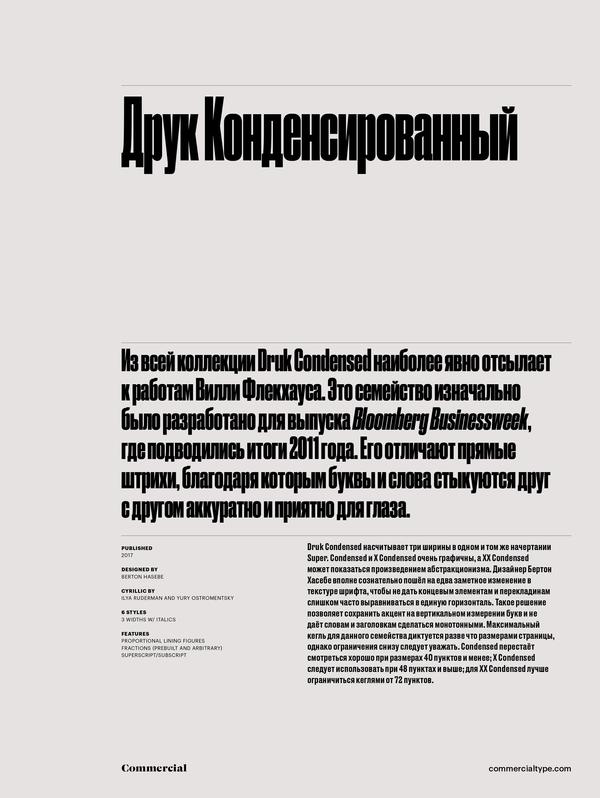
Of the families in the Druk collection, Druk Condensed is the most explicit homage to Willy Fleckhaus. Drawn for the 2011 “Year in Review” issue of Bloomberg Businessweek, Druk Condensed features three widths in the same Super weight. The Condensed and X Condensed are very graphic, and the XX Condensed can appear almost abstract. Designer Berton Hasebe introduced a purposeful and subtle change to the texture of the typeface by preventing terminals and crossbars from lining up too often on the horizontal axis. This keeps an emphasis on the verticality of the letterforms and prevents words and headlines from becoming monotonous. The maximum point size for this family is limited only by the size of the page; however, minimum sizes should be respected. The Condensed does not work well below 40pt; X Condensed should be used only at 48pt and above; and XX Condensed is limited to 72pt and above.
Druk Condensed Family
Supported Languages
Go to topCyrillic
Greek
Latin
- Afrikaans
- Albanian
- Asturian
- Basque
- Bosnian
- Breton
- Catalan
- Cebuano
- Cornish
- Corsican
- Croatian
- Czech
- Danish
- English
- Esperanto
- Estonian
- Faroese
- Faroese
- Filipino
- Finnish
- Flemish
- French
- Frisian
- Friulian
- Gaelic
- Galician
- German
- Greenlandic
- Guarani
- Haitian
- Hawaiian
- Hiligaynon
- Hungarian
- Icelandic
- Igbo
- Indonesian
- Irish
- Italian
- Kurdish (Latin)
- Latin
- Latvian
- Lithuanian
- Livonian
- Luxembourgish
- Malagasy
- Malay
- Maltese
- Maori
- Moldavian
- Nederlands
- Norwegian
- Occitan
- Polish
- Portuguese
- Provencal
- Romanian
- Romansch
- Saami
- Samoan
- Scots
- Scottish
- Slovak
- Slovenian
- Spanish
- Swahili
- Swedish
- Tagalog
- Turkish
- Walloon
- Welsh
- Wolof

