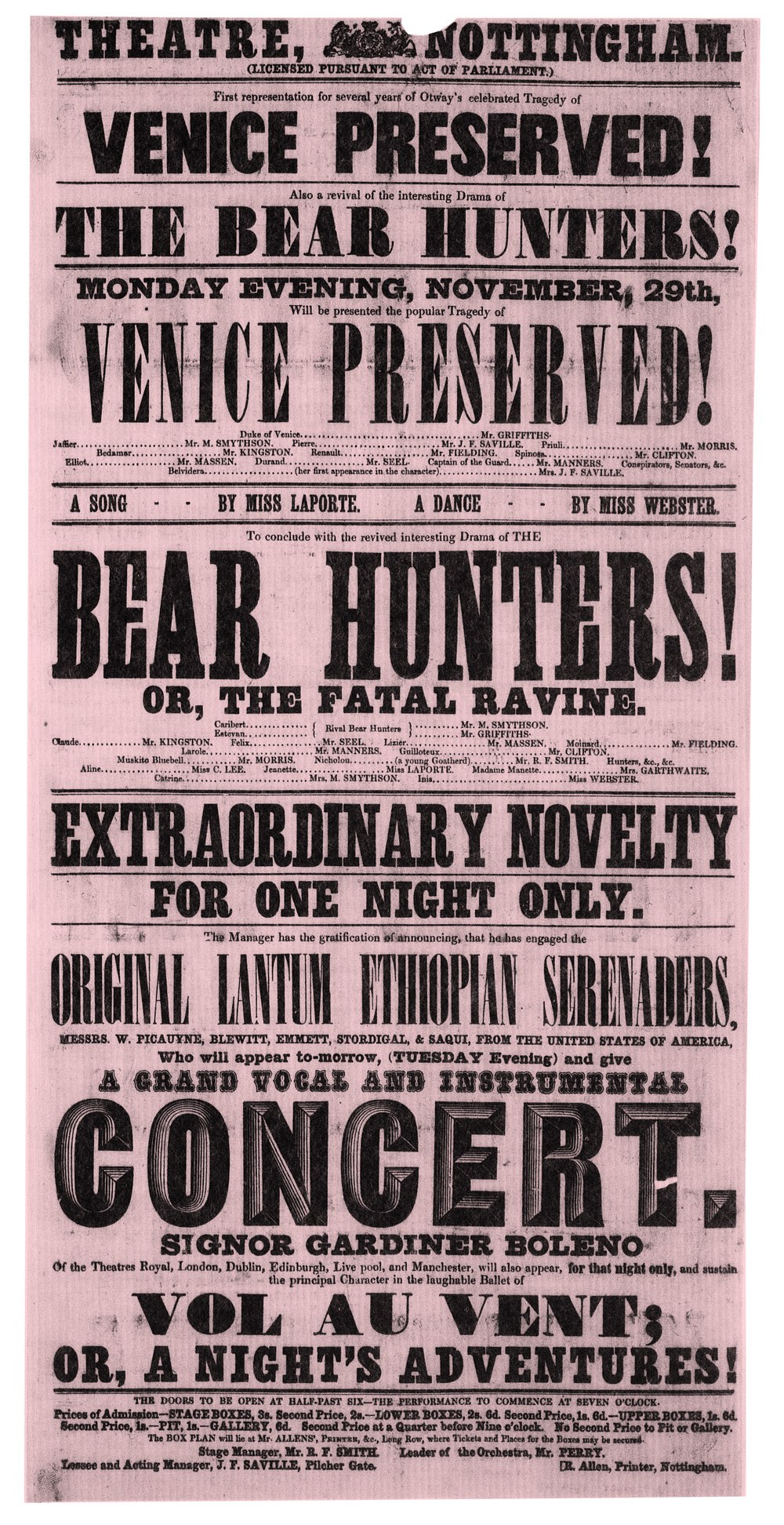
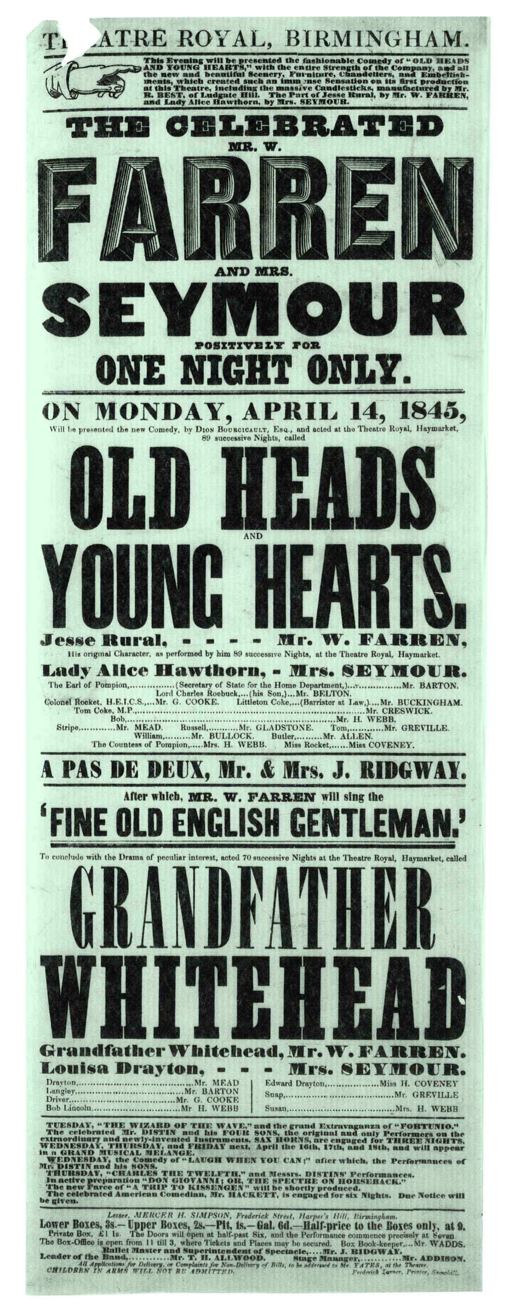
Thorowgood Grotesque
Thorowgood Egyptian
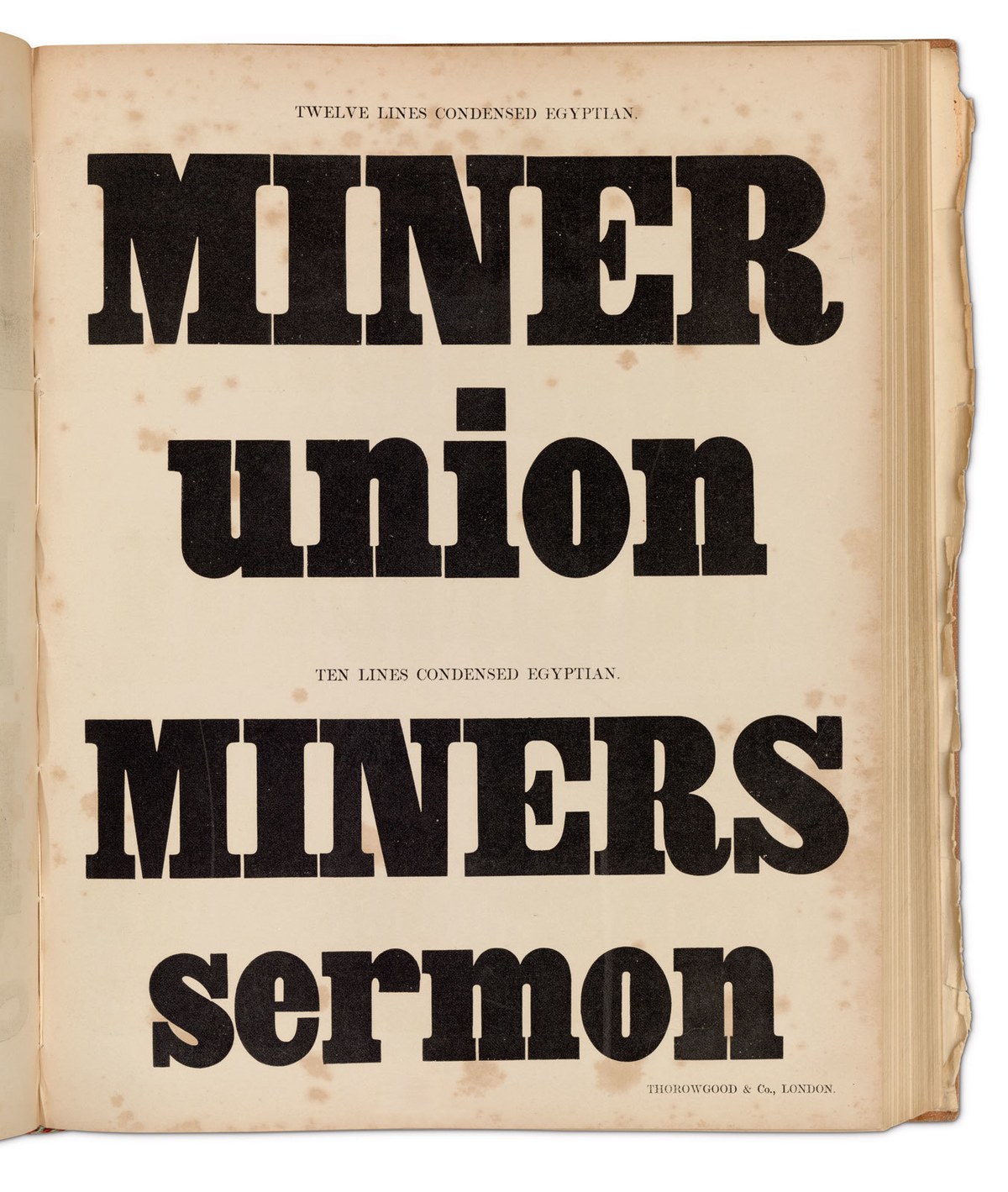
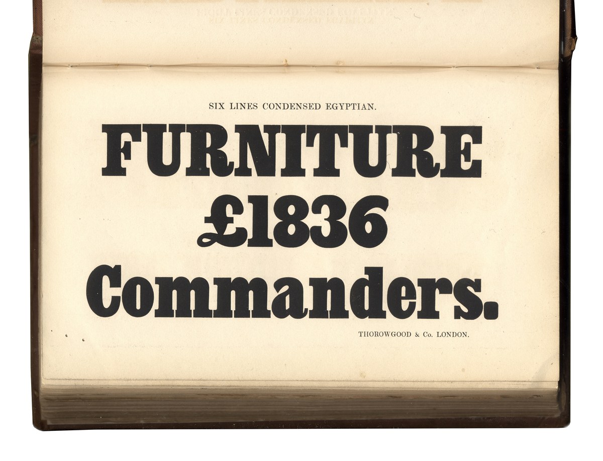
Twelve and Ten Lines Condensed Egyptian, as shown in Fann Street Letter Foundry, A General Specimen of Printing Types. London, Robert Besley and Co. [Late Wm Thorowgood and Co.], 1851. The condensed Egyptian appears first in Thorowgood’s specimens in the 1830s, with the lowercase appearing in the 1837 specimen. St Bride Library.
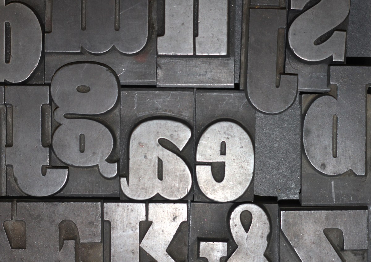
Twelve Lines Condensed Egyptian as type. Characters with descenders extend outside of the body, allowing the typeface to be tightly packed on the vertical axis. St Bride Library.
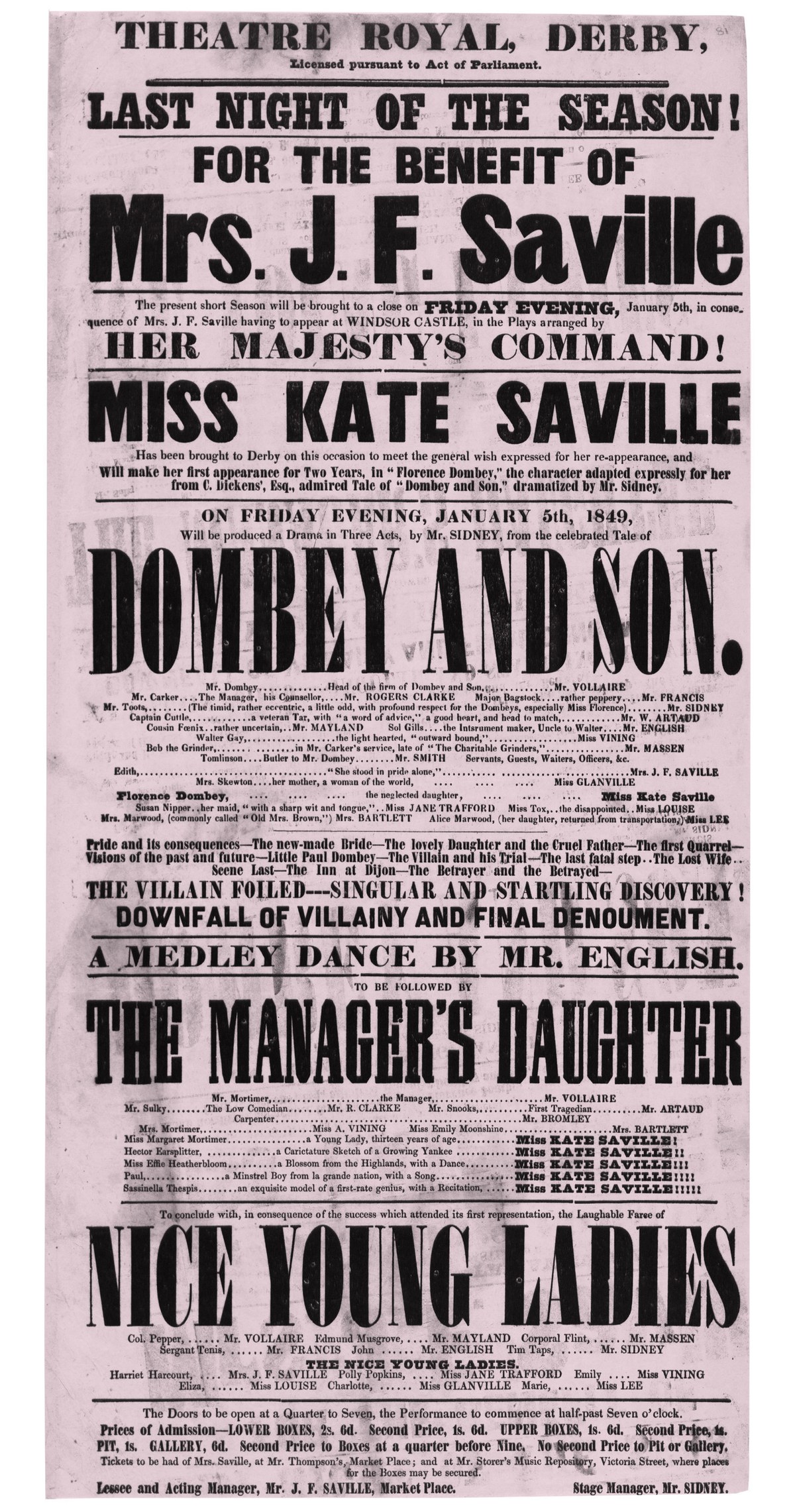
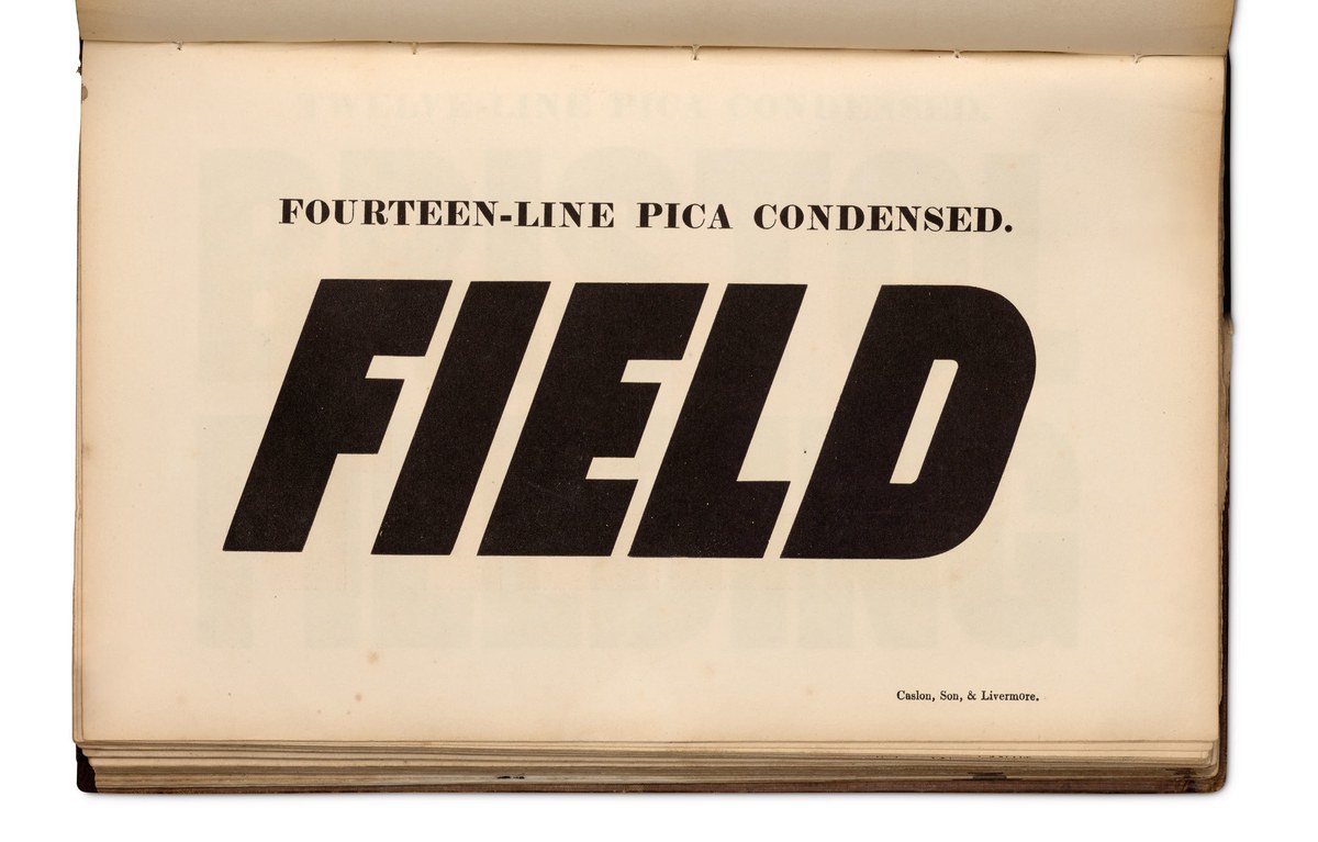
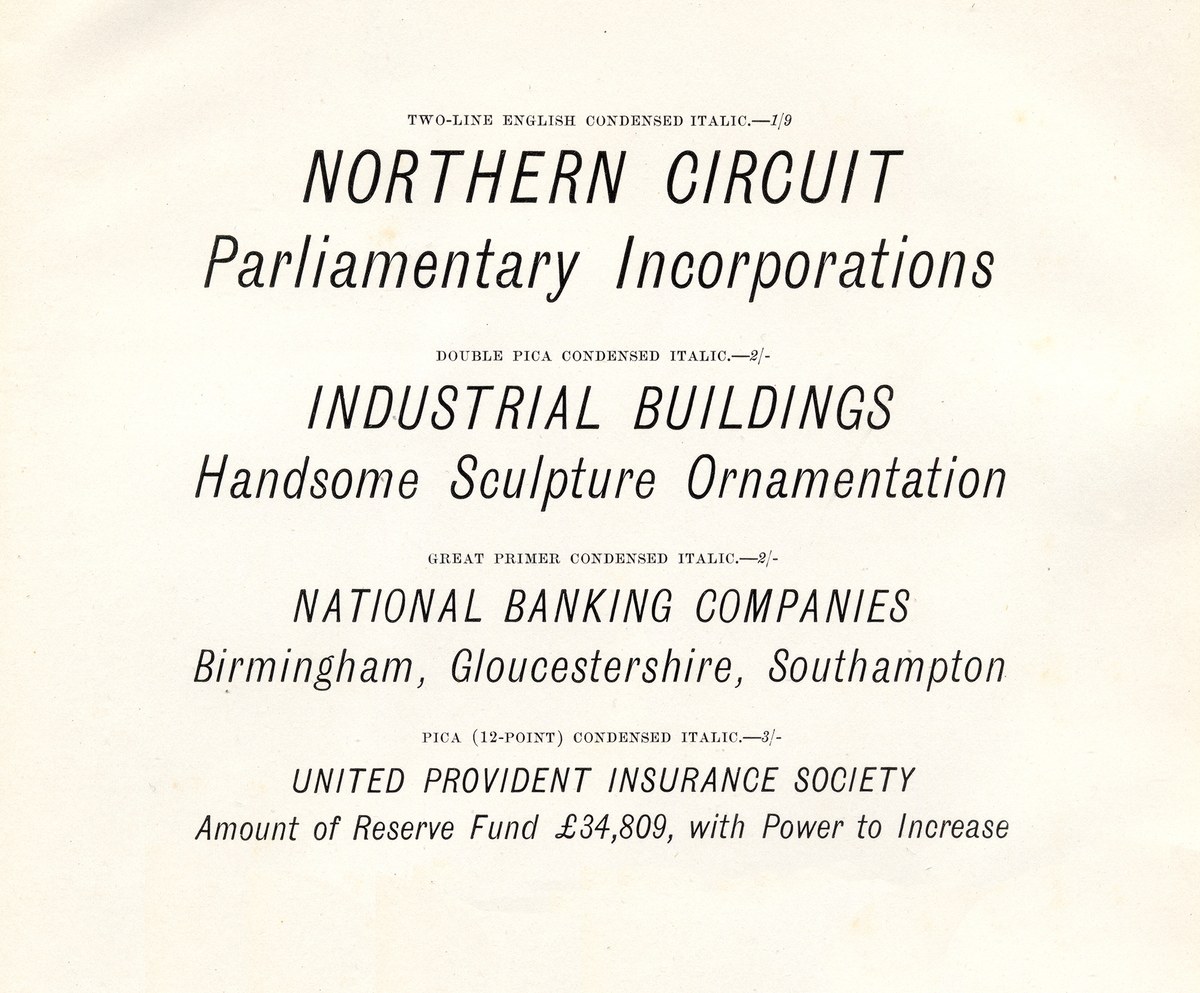
The condensed Egyptian form that Thorowgood introduced in 1832 brought a new development to the style: a curvature of the join between stroke and serif. It is not a Clarendon-like form, as the contrast has not been increased, but the rounding gives a softer appearance than that of a regular Egyptian or Grotesque. The external form is rounded in both upper- and lowercase, whereas the inner forms are flat-sided. In proportion and spacing, the Egyptian is similar to the Grotesque. These early condensed forms would disappear from the specimens by the 1860s; the large sizes (the largest is Twenty-Five-Lines, approximately 300 point) indicate that expense and convenience would prompt their replacement in a printer’s arsenal with wood letters. No example in Britain seems to exist of a condensed italic variant of the Egyptian form during the nineteenth century. The contemporary versions draw on a mixture of sources: the few contemporary Egyptian italics, the modern Thorowgood Grotesque’s italic (they share the same angle), but also to the designers experiences in making many of the Commercial Classics typefaces.
The idea of condensing forms, such as the Sans or the Egyptian, show a response from typefounders to the problems of printers trying to make words as big as possible within limited space. After making letters as bold as could be during the first three decades of the nineteenth century, making letters as big as they could be was the next innovation that resonates with us even today.
Thorowgood Grotesque Open
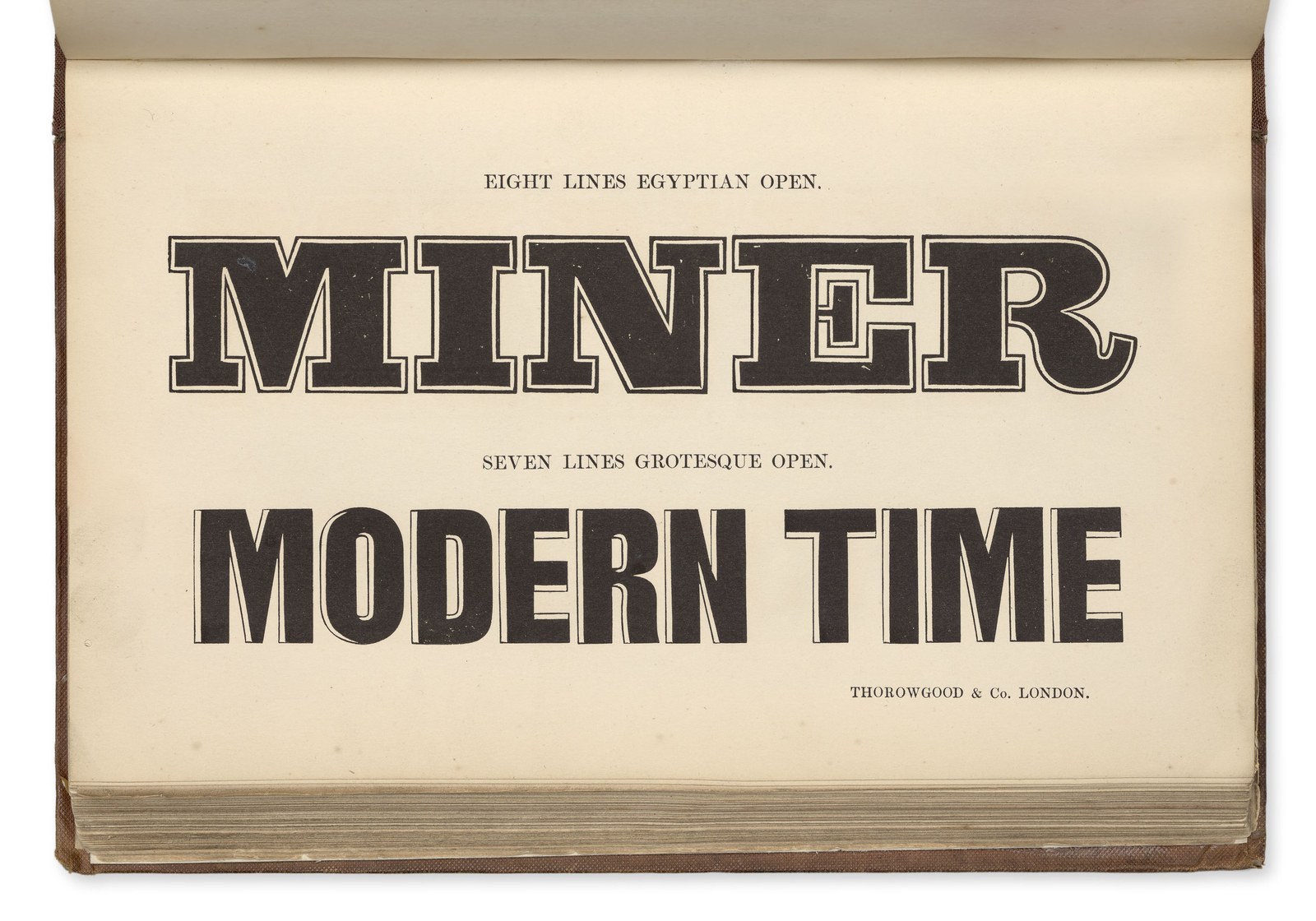
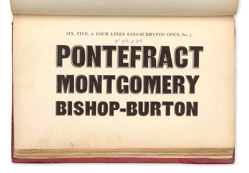
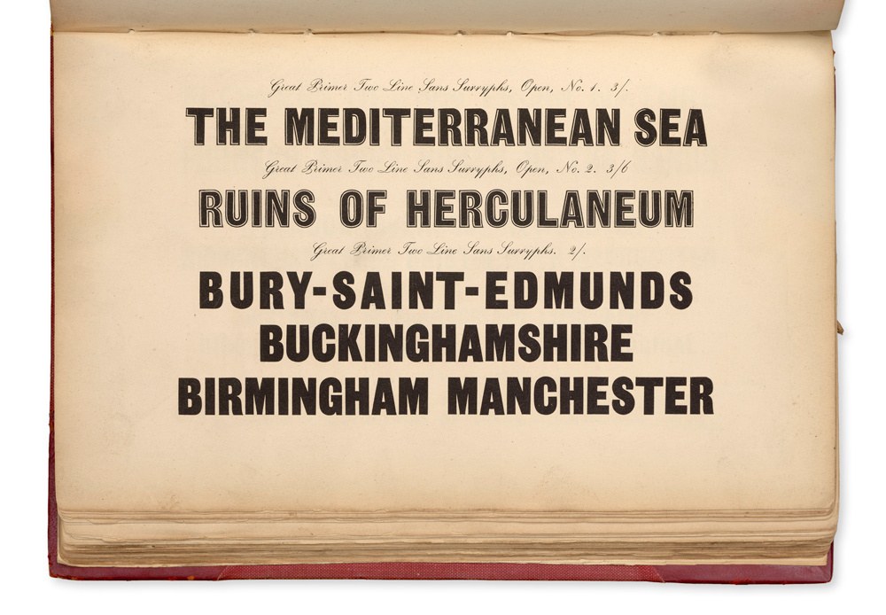
Seven Lines Grotesque Open, shown in Thorowgood & Co. Specimen of Printing Types. London, 1840.
Thorowgood Grotesque Dimensional
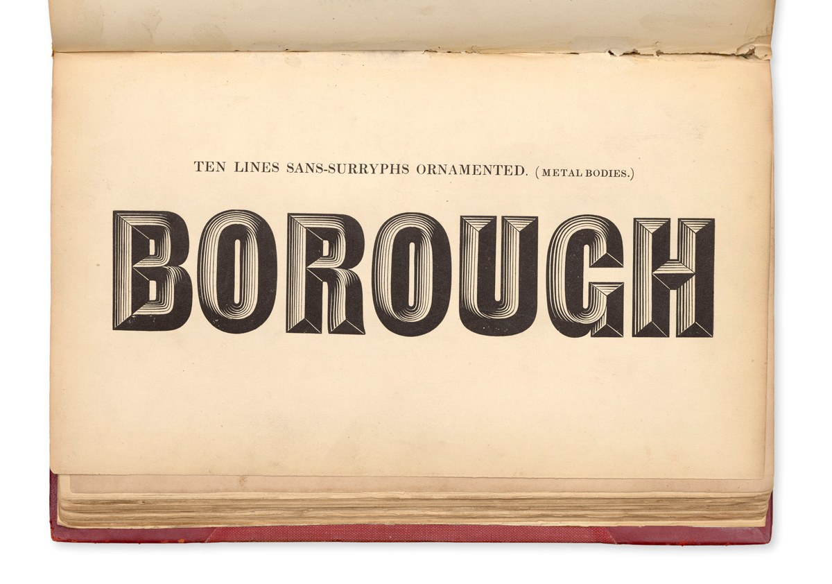
Ten Lines Sans-Surryphs Ornamented, shown in Specimen of Printing Types by Blake & Stephenson, Sheffield, 1839. St Bride Library.
