Successor
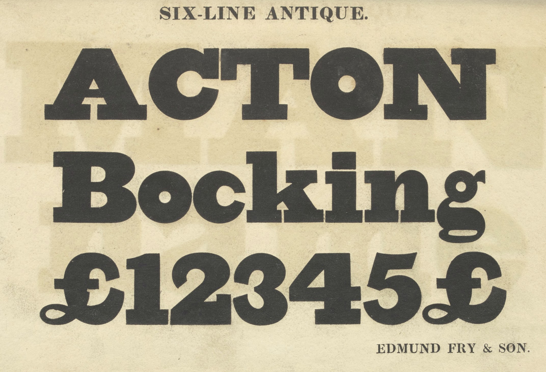
Edmund Fry & Son, Six-Line (72 point) Antique (1824).
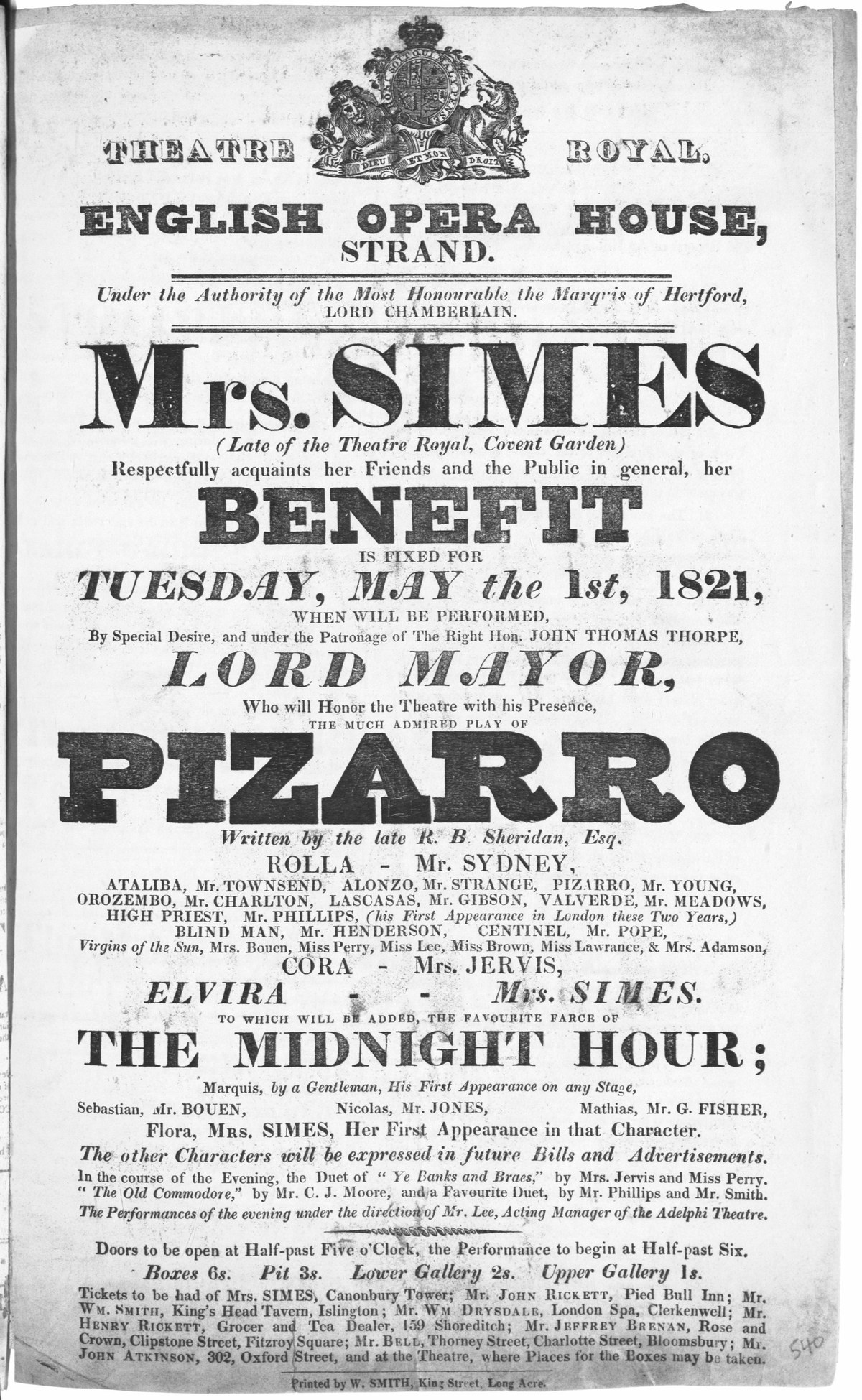
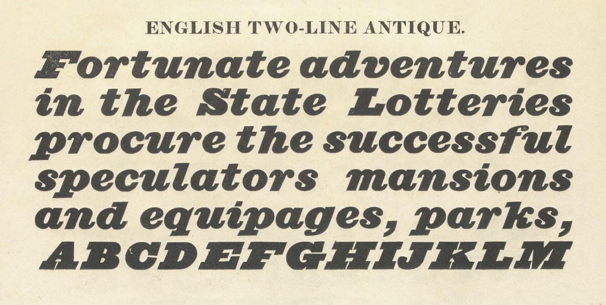
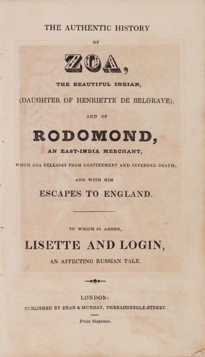
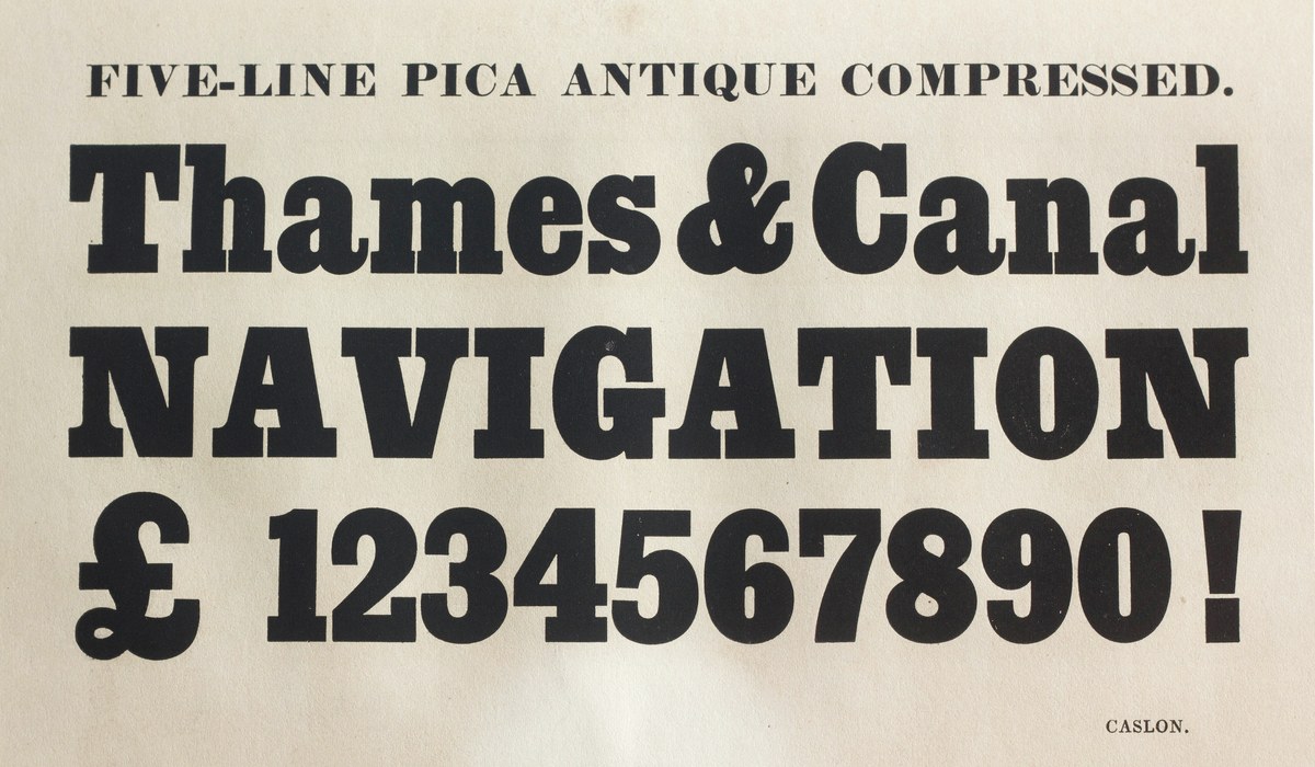
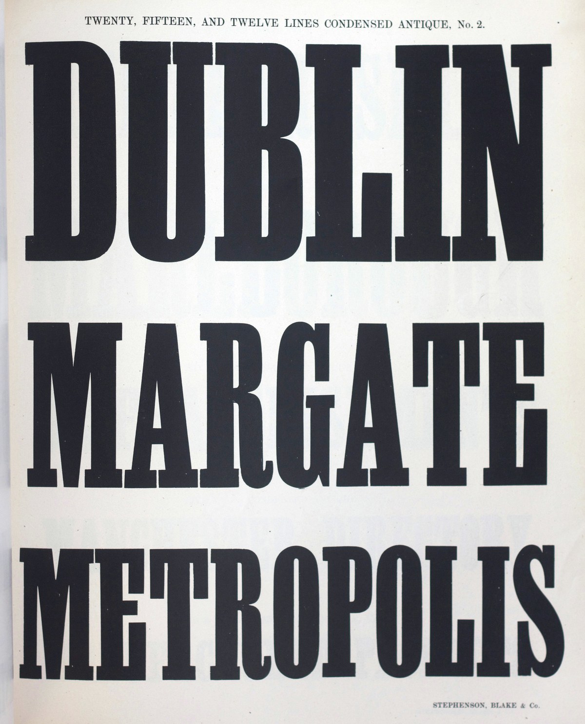
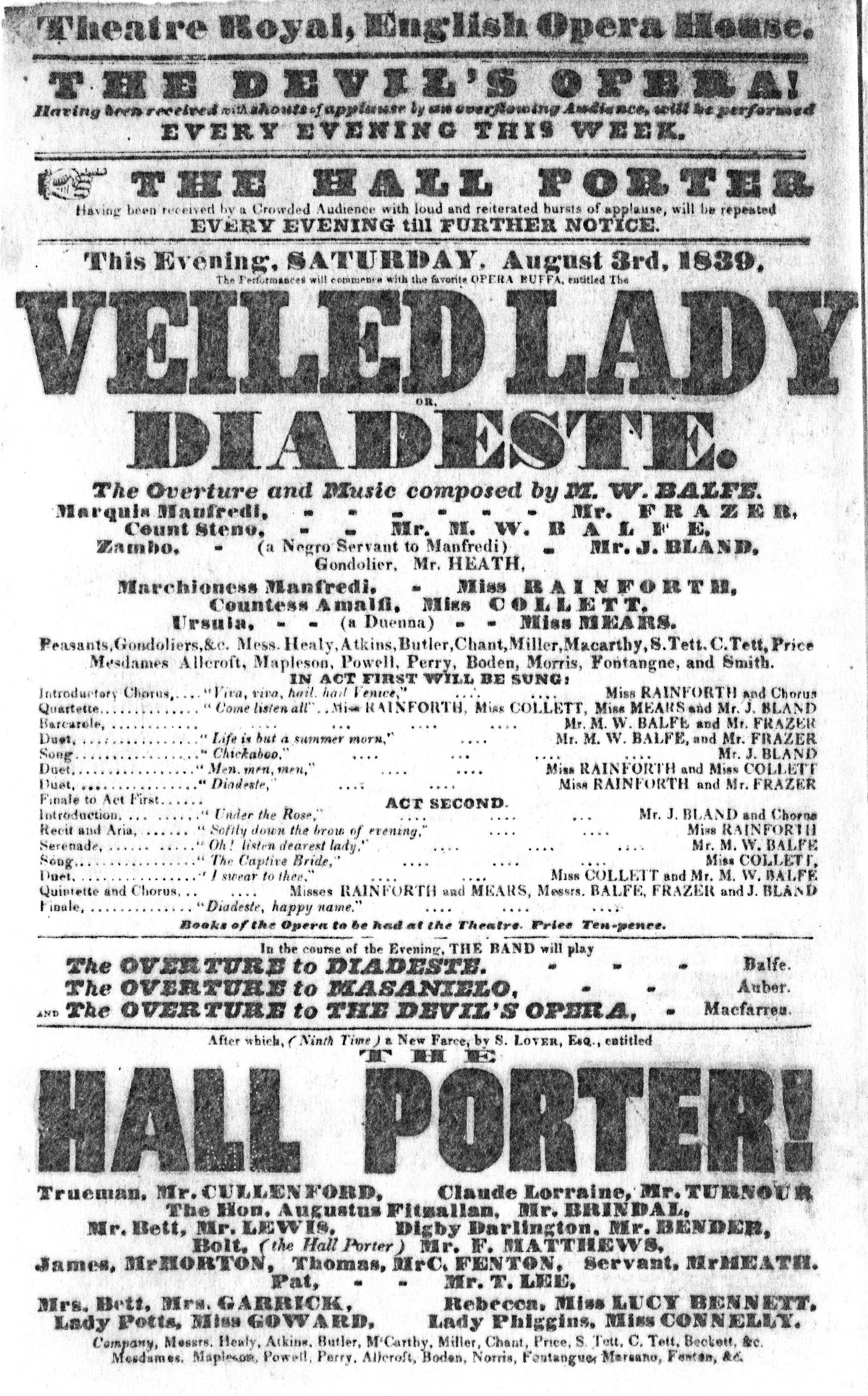
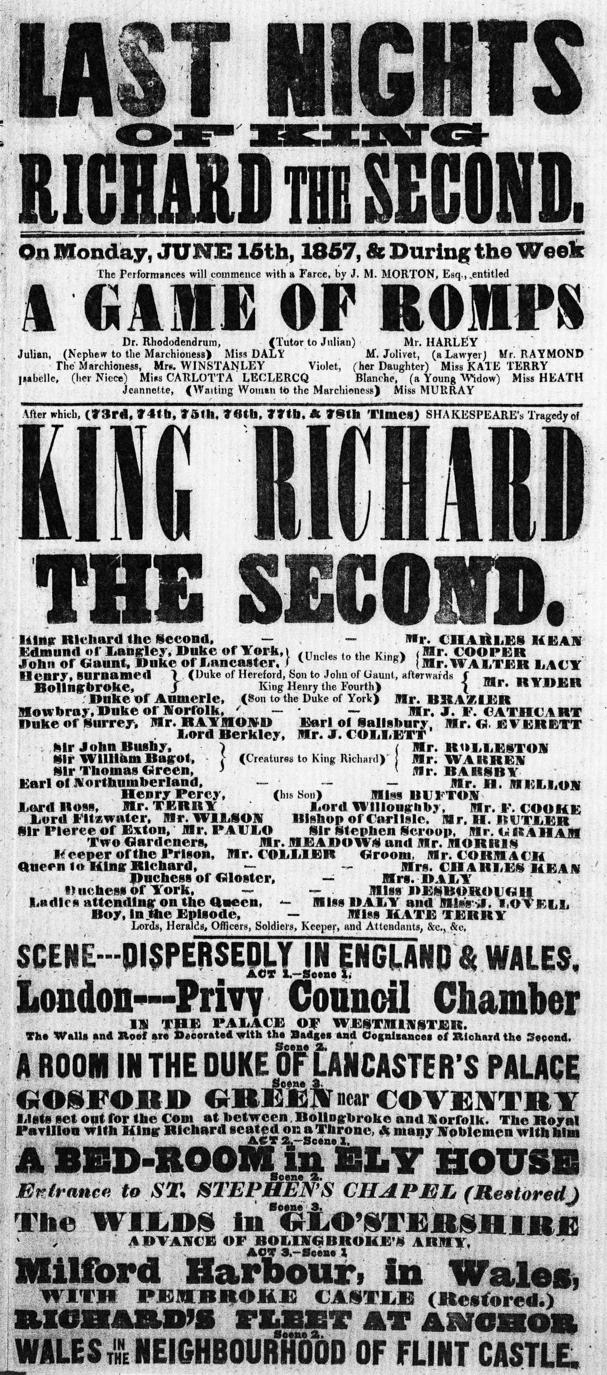
Successor is a new interpretation of the nineteenth-century English slab serif, commonly known as the Egyptian or Antique.1 Developing first from the Modern and then from the so-called “fat face,” the Egyptian was an expression of typographic weight taken to its logical conclusion. With every stroke made bold, the Egyptian gave printers a powerful new tool for creating visual impact. The robust letterforms also lent themselves to generating a whole gamut of variations in width and weight that set a precedent for display typography thereafter. Successor unites these disparate styles and expands them into a cohesive modern type family while preserving the warmth and character of their origins.
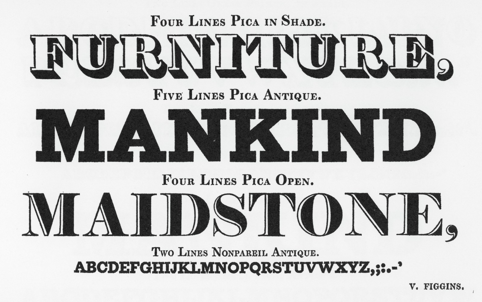
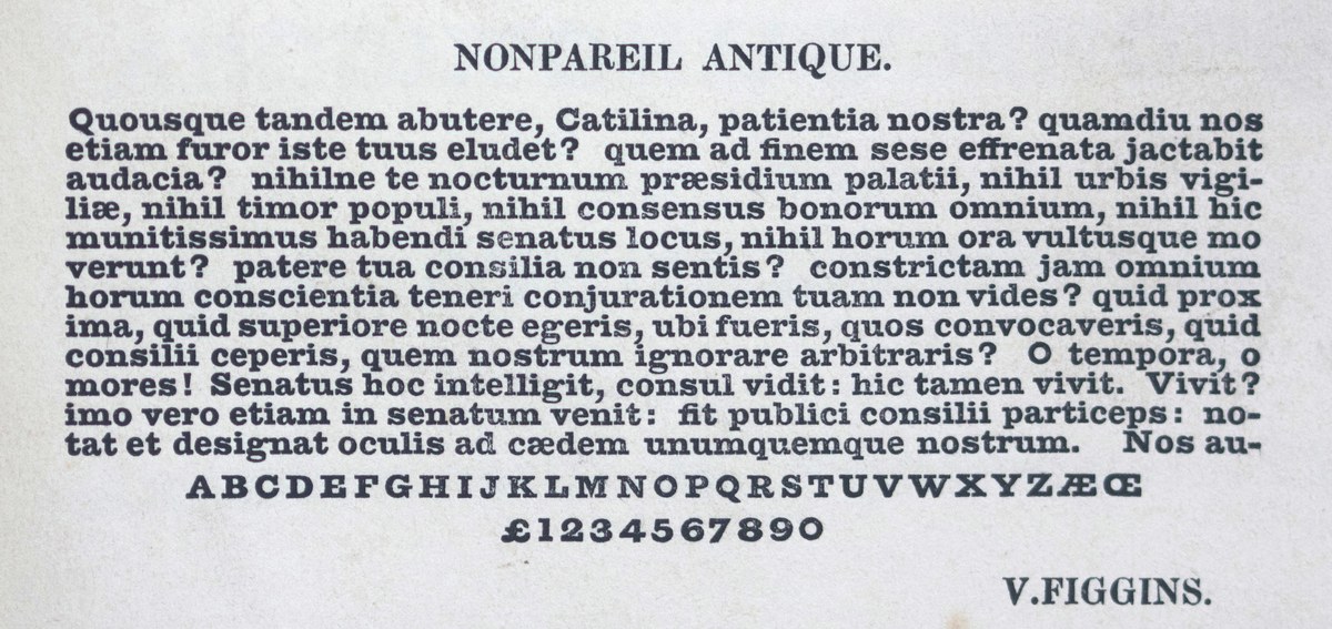
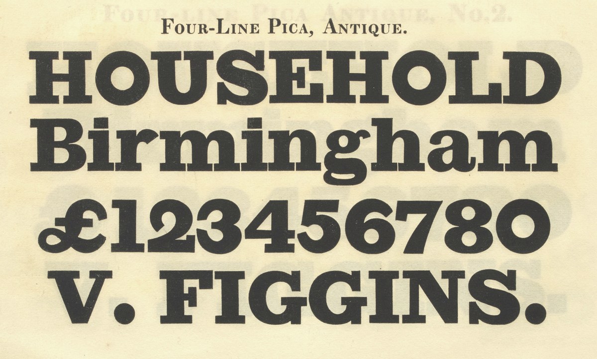
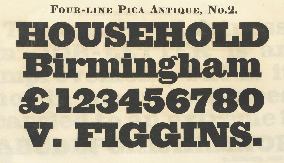
Vincent Figgins’s first specimen showing Antique faces (1817).
An English Invention
History
Successor: a new historical Egyptian
The story of the Egyptian face is one of incremental development across multiple decades, foundries, and punchcutters. Although today it is common to offer a unified design in weights, widths, and italics, not one single typefounder offered all of these variants of the Egyptian together, and some were never developed. In attempting to fill the empty slots in the matrix, Successor is as anachronistic and speculative as it is faithful. It is a hypothesis about what those missing styles might have looked like, and how they might have appeared if they had been drawn by the same person.
Table of width and weight variations of the display Egyptian. Entries show the first appearance of styles in particular parts of the width and weight range that were cut in nineteenth-century England. Only a portion of theoretically possible styles were cut, including only one example of an italic that is not normal width.
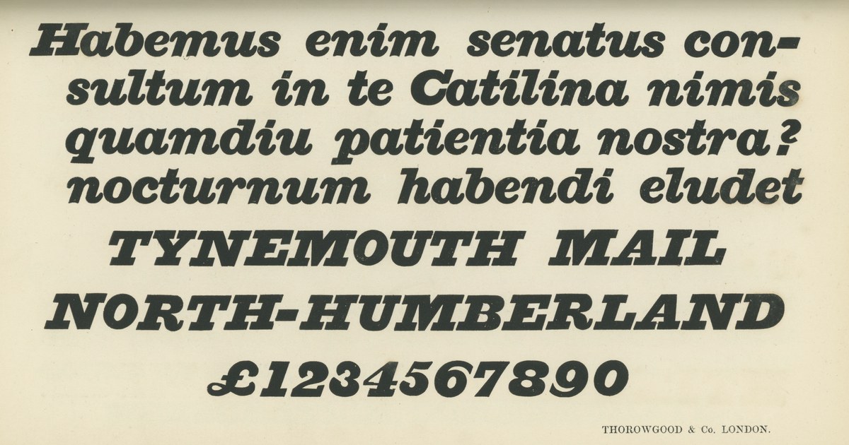
Typefounders confusingly used the names Egyptian and Antique for both slab serif and sans serif types. In Britain, “Egyptian” was the name of the first sans (Caslon’s Egyptian of 1816); slab serifs were called “Antique” by all foundries except Thorowgood. This convention was also used in the United States. In France and Germany, the naming was reversed: sans serifs were called “Antique” and slab serifs were called “Egyptienne.” It seems both faces with low stroke contrast were lumped together for their “exotic” qualities; other names for the sans, such as Grotesque, Gothic, and Doric, indicate that these types seemed primitive or atavistic to contemporary eyes. The term slab serif is a larger category of which the Egyptian is a subtype. Since not all slab serifs are Egyptians, this article favors the latter term for specificity.
In other words, the serifs lack a smooth interior curve where the serif intersects the stem.
James Mosley, “The Nymph and the Grot, an update,” Typefoundry (blog), January 6, 2007.
Alan Bartram, Lettering on Architecture (New York: Whitney Library of Design, 1975), 49.
Nicolete Gray, Slab Serif Type Design in England 1815–1845 (London: Journal of the Printing Historical Society, No. 15 [1980–1981]), 2.
Thomas Curson Hansard, Typographia: An Historical Sketch of the Origin and Progress of the Art of Printing (London: Baldwin, Cradock, and Joy, 1825), 618:
“To the razor-edged fine lines and ceriphs of type just observed upon, a reverse has succeeded, called ‘Antique’ or ‘Egyptian,’ the property of which is, that the stokes which form the letters are all of one uniform thickness!—After this, who would have thought that further extravagance could have been conceived? […] Oh! sacred shades of Moxon and Van Dijke, of Baskerville and Bodoni! what would ye have said of the typographic monstrosities here exhibited, which Fashion in our age has produced?”
Daniel Berkeley Updike, Printing Types (Cambridge, MA: Belknap Press, 1966), 195.
Nicolete Gray, Slab Serif Type Design in England 1815–1845 (London: Journal of the Printing Historical Society, No. 15 [1980–1981]), 11.
A revival of this face by Paul Barnes and Greg Gazdowicz was released by Commercial Type in 2019 as Thorowgood Egyptian.
Nicolete Gray, Nineteenth Century Ornamented Typefaces (Berkeley: University of California Press, 1976), 195.
Nicolete Gray, Nineteenth Century Ornamented Typefaces, 23.


