The Scottishness of Spectator
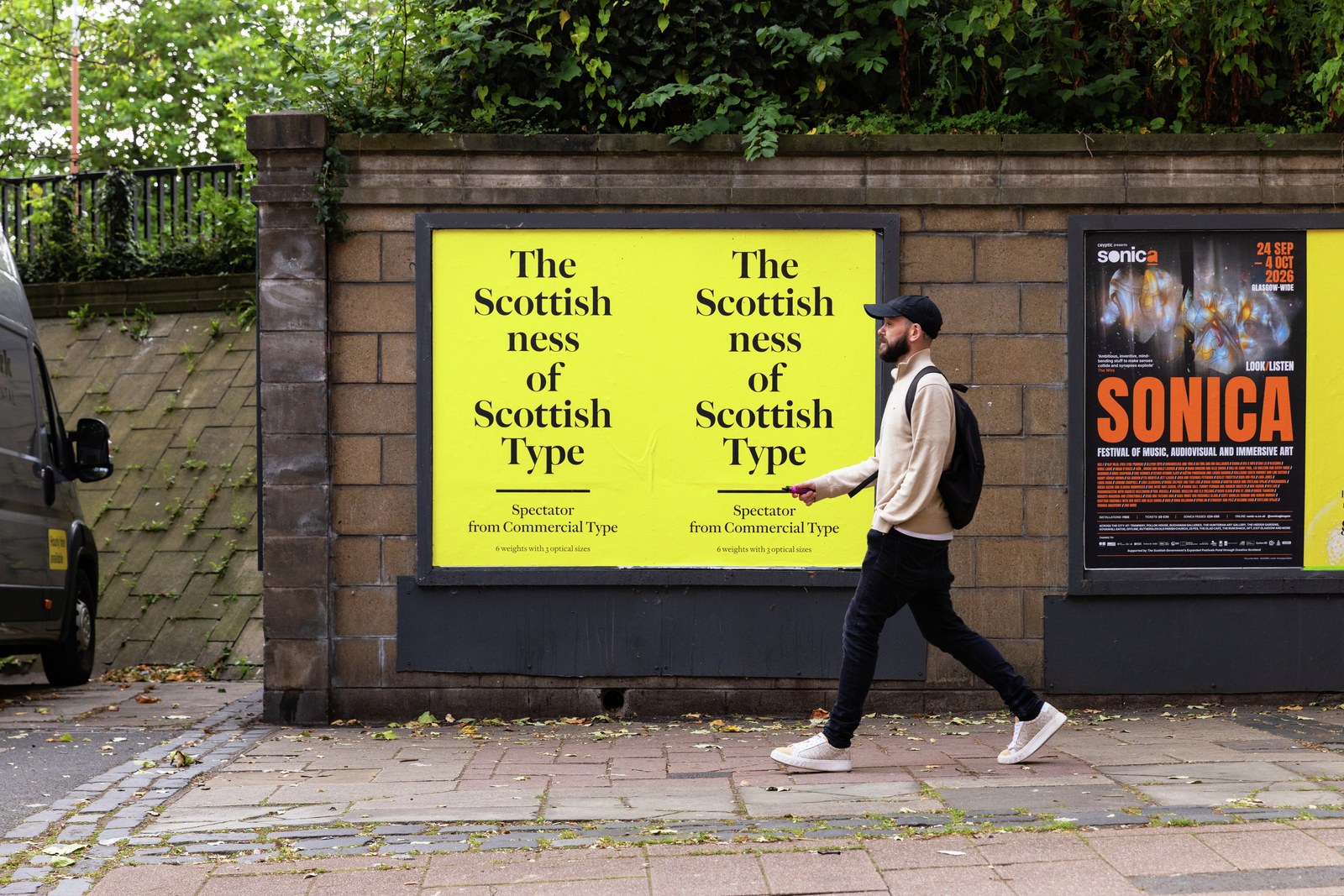
In the beginning was Caslon.
Later came Baskerville.
And in the middle was Alexander Wilson, the pioneering Scottish typefounder who launched a company in St Andrews with his partner, John Baine, in 1742 before moving to just outside Glasgow in 1744. Wilson and Baine eventually became the typefounders to the famed Foulis Press and the University of Glasgow.1
If Caslon’s typefaces are the English manifestation of the ‘Dutch’ old style and look backward, and Baskerville’s are the English manifestation of the new ‘Transitional’ style and look forward, then the types of Wilson could be considered the Scottish mixture of the two. They represent something just as well made and crafted as the English model, and in some ways surpass it. They also embody the time in which they were made: the Scottish Enlightenment was beginning its ascent, and would reach its crescendo in the 1760s.
Spectator draws on Wilson’s faces of the second half of the eighteenth century, taking the iconic English No. 1 (around 14pt) and remaking it for today, with six weights and four optical sizes. As the latest addition to the Commercial Classics collection, it fills a gap between the Caslonesque Frame and the first British Modern, Austin, in the Commercial Type library. Made to be robust for text in print and onscreen, in its large sizes Spectator displays a true sparkle, with bold weights that pack a punch without losing grace.
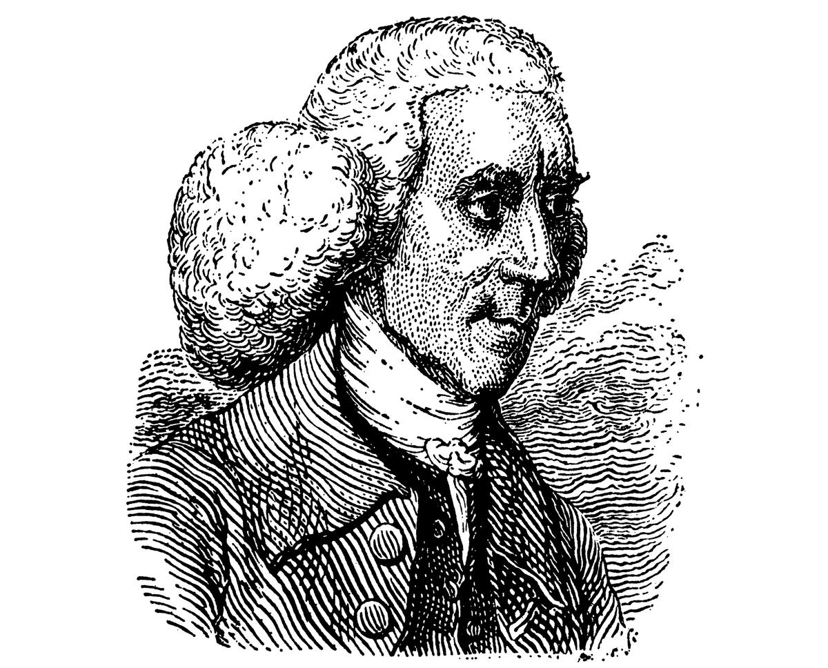
Alexander Wilson (1714–1786) was trained as a physician, but he was a polymath whose life encompassed many fields. In 1760, he was appointed the first professor of astronomy at the University of Glasgow. Typefounding, which he came upon by chance, seems to have been his way of seeking his fortune.
Portrait from Typographia by Thomas Hansard, 1825
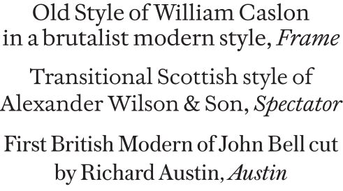
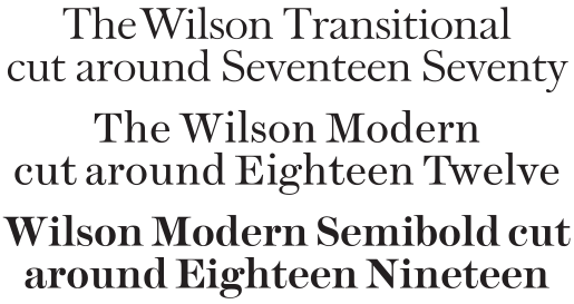
The changing fashions of the eighteenth century: the Caslon model of the 1730s personified by Frame (top); the Transitional style of the 1760s embodied by Spectator (center); and the Moderns of Richard Austin represented by Austin (bottom).
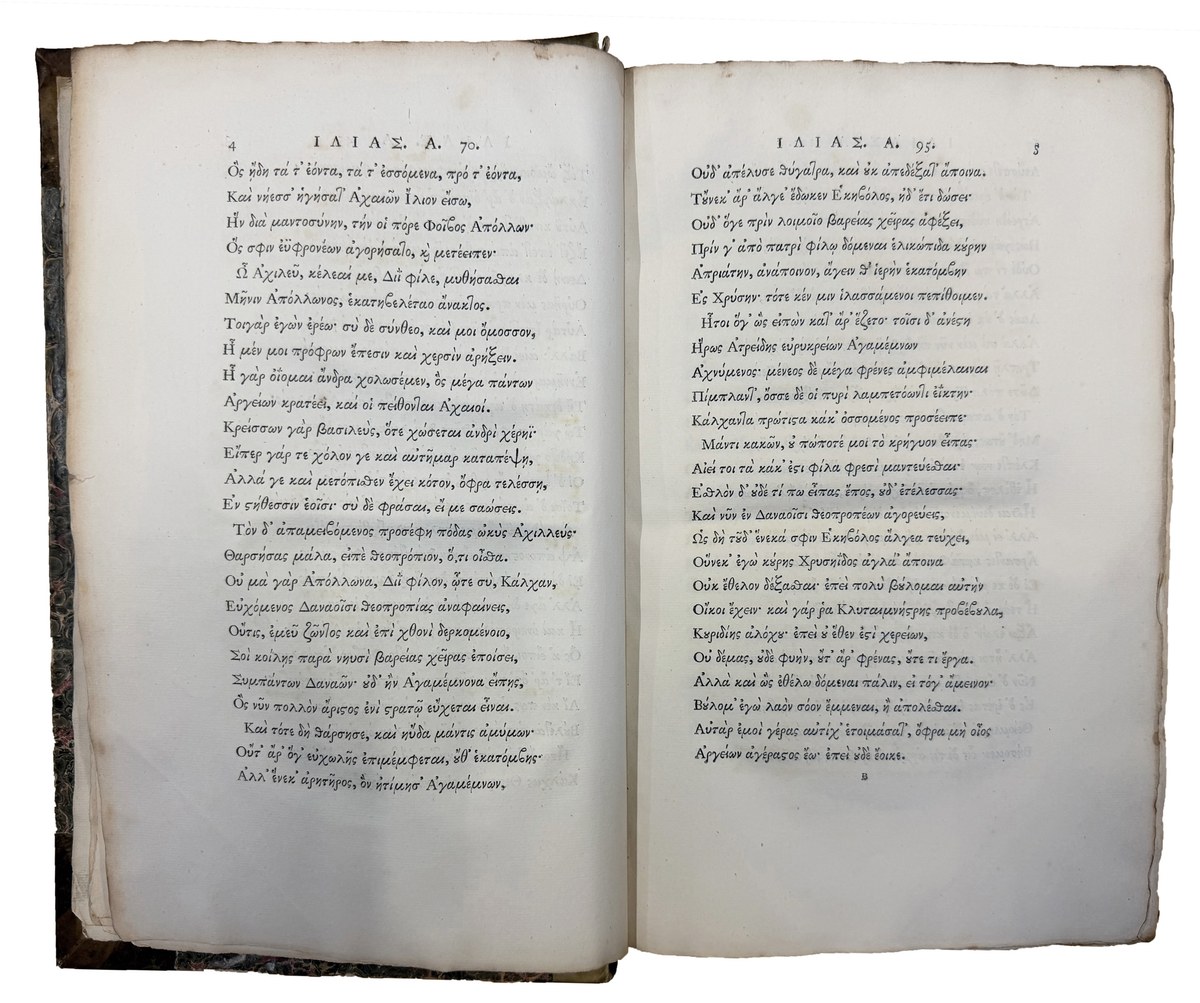
The famed edition of Homer’s Works, Foulis Press, 1756. Set in the types of Alexander Wilson & Sons, Glasgow, including Wilson’s Greek specially cut for this edition. St Bride Library, London.
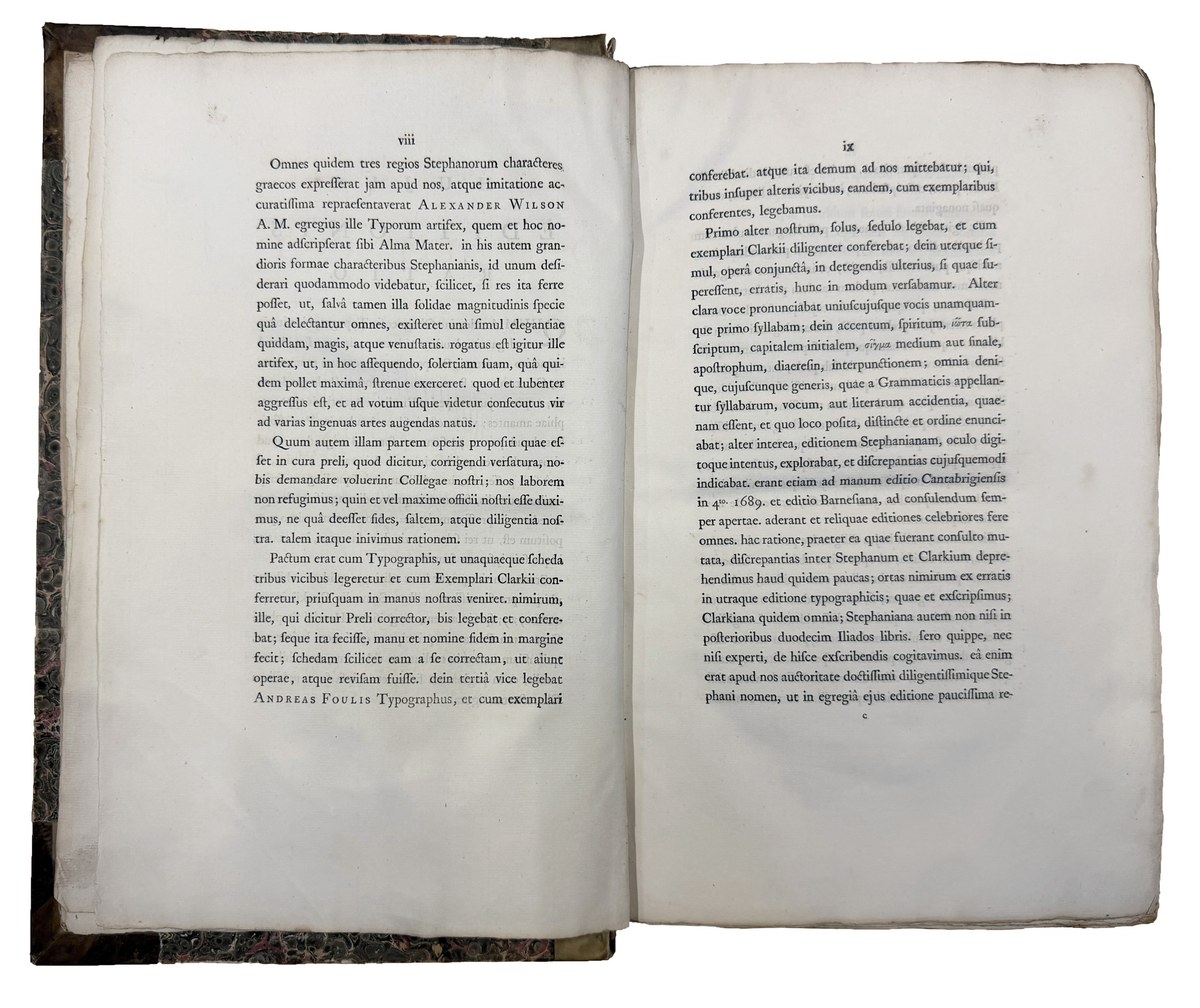
The famed edition of Homer’s Works, Foulis Press, 1756. Set in the types of Alexander Wilson & Sons, Glasgow, including Wilson’s Greek specially cut for this edition. This note in Latin on the book’s typography specifically thanks Alexander Wilson. St Bride Library, London.
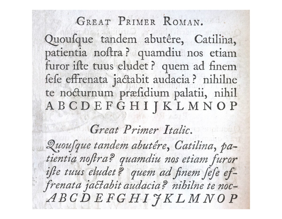
William Caslon I, Great Primer, cut around 1734. As shown in A Specimen of Printing Types by William Caslon, Letter-Founder to his Majesty, 1785. St Bride Library, London.
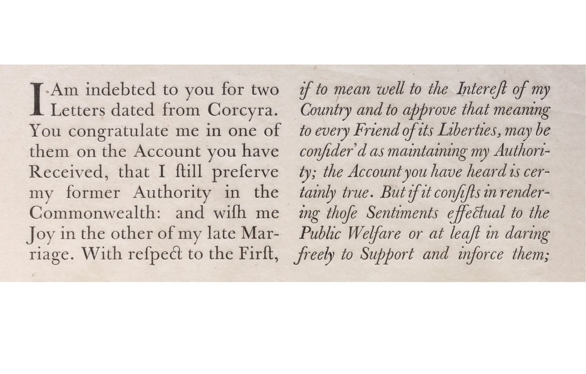
Baskerville’s roman and italic, as cut by John Handy, shown in Specimen of Type by John Baskerville of Birmingham, 1757. St Bride Library, London.
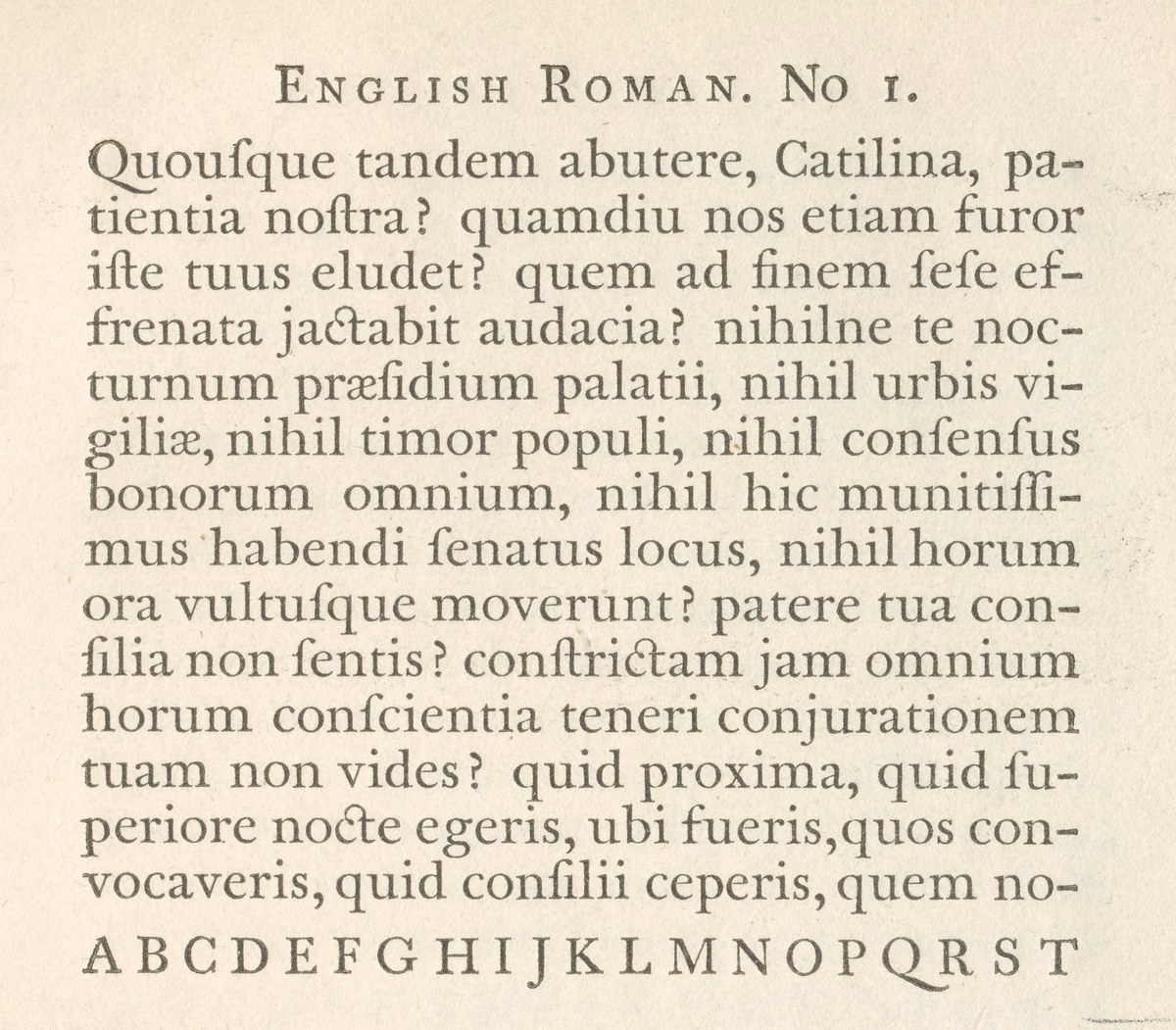
English No. 1, cut around 1760. As shown in A Specimen of Printing Types Cast in the Foundery of Alexander Wilson & Sons, Glasgow, 1789. St Bride Library, London.
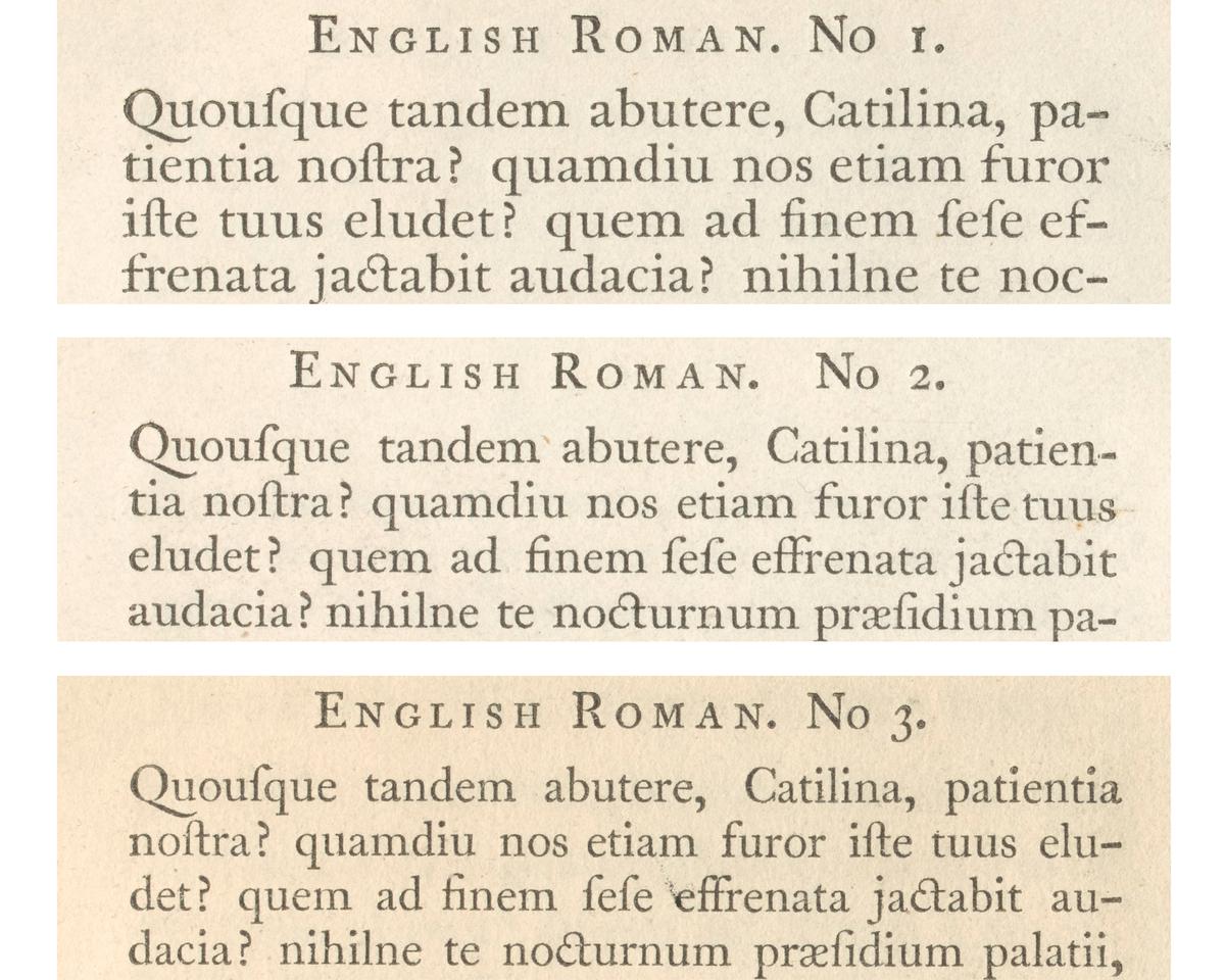
The varying x-heights of Wilson’s English as shown in A Specimen of Printing Types Cast in the Foundery of Alexander Wilson & Sons, Glasgow, 1789. St Bride Library, London.
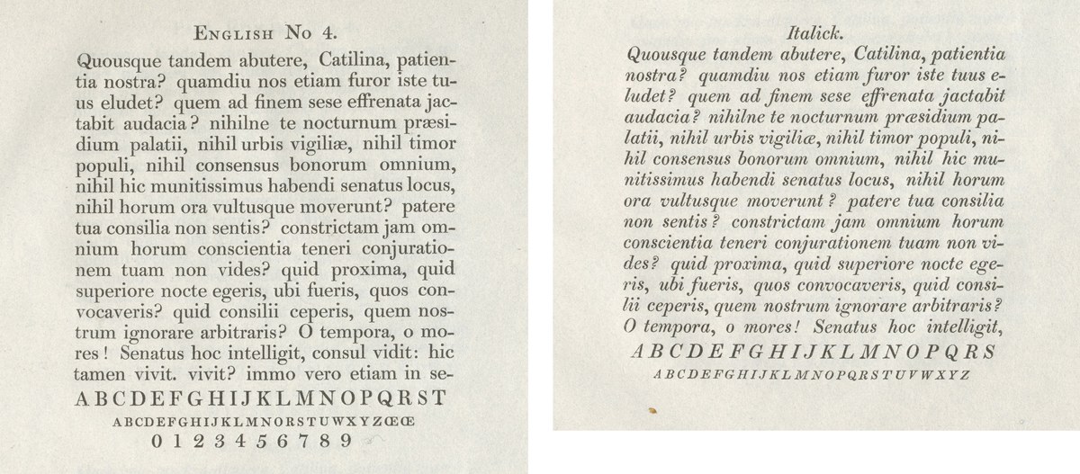
Wilson’s latest manifestation: the famed Modern and the forerunner of the ‘Scotch’ Roman, supposedly cut by Austin. As shown in A Specimen of Modern Cut Printing Types, Alexander Wilson & Sons, Glasgow, 1812. St Bride Library, London.
The famed edition of Homer’s Works, Foulis Press, 1756. Set in the types of Alexander Wilson & Sons, Glasgow, including Wilson’s Greek specially cut for this edition. St Bride Library, London.
The famed edition of Homer’s Works, Foulis Press, 1756. Set in the types of Alexander Wilson & Sons, Glasgow, including Wilson’s Greek specially cut for this edition. This note in Latin on the book’s typography specifically thanks Alexander Wilson. St Bride Library, London.
William Caslon I, Great Primer, cut around 1734. As shown in A Specimen of Printing Types by William Caslon, Letter-Founder to his Majesty, 1785. St Bride Library, London.
Baskerville’s roman and italic, as cut by John Handy, shown in Specimen of Type by John Baskerville of Birmingham, 1757. St Bride Library, London.
For many years, we have looked at Wilson’s work with delight and admiration, from his first oldstyle faces, through his transitional faces, to the latter iconic Moderns cut in the early 1800s – supposedly by Richard Austin2 – that were the originators of the so-called ‘Scotch’ style, so beloved in the United States.3 Many of these are text faces, for which Alexander Wilson and later William Miller were famed.
Of Wilson’s output, the English No. 1 has always been a favourite of ours (he made three other English-sized faces, all with smaller x-heights, though they share the same capitals). It often appeared in the work of the Foulis Press after 1760, before showing up in the specimen book of Alexander Wilson and Sons in 1772, thirty years after the foundry opened. This makes the typeface later than the first faces of Baskerville, which had begun to appear in the previous decade. By this time, Wilson’s foundry had gained a reputation for making well-cut text faces, not only for Scottish printers but also for English, Irish, and American printers. The quality and the relative inexpensiveness compared to the London founders gave Wilson a broad appeal.
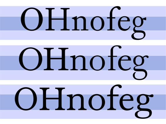
An early Wilson roman (top), Baskerville (center), and Spectator (bottom) show the relative proportions of these three faces.
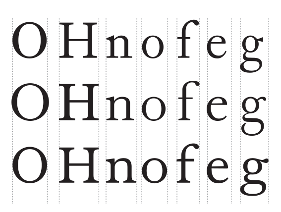
Spectator (bottom) is much wider in the lower case than the oldstyle (top) or Baskerville (center).
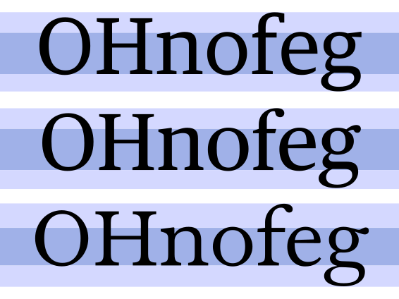
The proportions of modern text faces: Guardian Egyptian Text (top) and Publico Text (center), compared to Spectator (bottom).
We are certainly not the first to admire the English No. 1. Two modern versions have appeared: Fontana by Giovanni Mardersteig for Monotype, and Foundry Wilson by David Quay and Freda Sack, which interpret the model in different ways for differing technologies. Sitting at a size just above typical text sizes, the beauty of Wilson’s face is clearly displayed. It is distinguished by long, well-tapered serifs, with a pleasingly loose fit. Its proportions are perhaps its main characteristic: its large x-height and wide characters (larger and wider than anything produced by Baskerville or Caslon) give it a distinctly modern appearance. On first impression, it is close to Baskerville – many characters mirror his model – but on closer inspection, Caslon remains a strong presence. Consider, for example, the long-tailed Q and the incised peak of the A, with their oldstyle form. Despite the mixture of styles, the face has a remarkable harmoniousness which makes it a pleasure to read. It has several key characters, such as the a with its markedly strong tail, and the g with its distinctive ear and a closed, wide lower bowl.
Though we spent a lot of time thinking and talking about the English No. 1, we never felt ready to tackle it, worried that we wouldn’t be able to do it justice.4 Around 2010, we started expending a lot of effort on our second label, Commercial Classics; we looked again and again at Wilson’s work, but the time never felt right. Gradually, we accumulated specimens and books that showed the face, but, despite several abortive starts, we still could not quite break through.
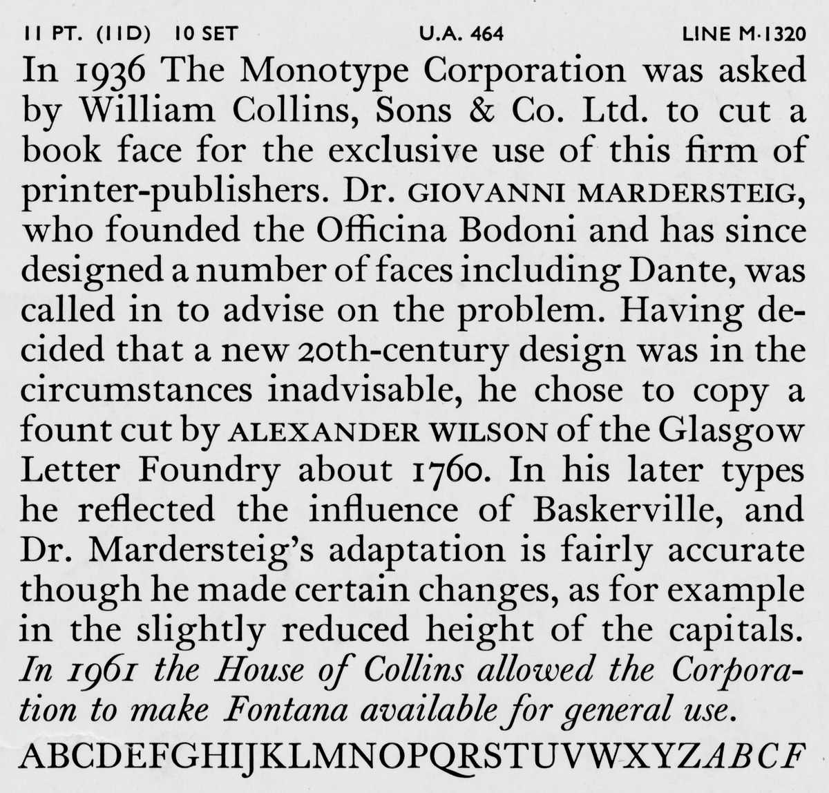
Monotype Series 403, Fontana, cut in 1936 for William Collins, Sons & Co. Ltd, under the direction of Giovanni Mardersteig.
On occasions like this, rather than waiting for the perfect moment (which may never arrive), it is often better for someone to push you on. In late 2023, the Glasgow design agency D8 contacted us about a project using Marr Sans. They were looking for a serif companion with Scottish heritage. We showed them a number of possibilities we had been working on, but suddenly felt the impetus to start again on the English, feeling an impasse had been broken. Though the project sadly petered out, we carried on, as we finally felt ready for the challenge.
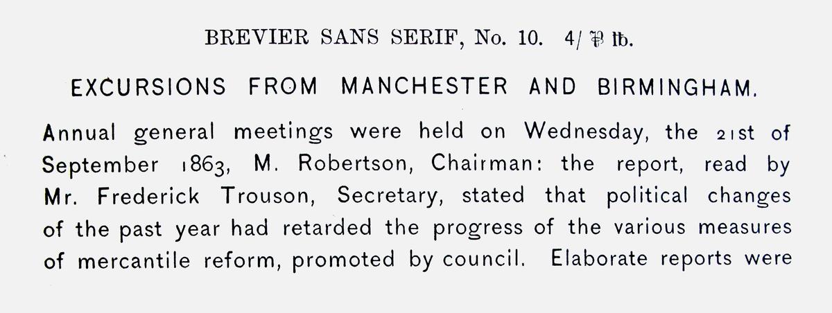
Brevier Sans Serif shown in Specimen of Modern and Ancient Printing Types, &c. by James Marr & Co., c. 1866. St Bride Library.
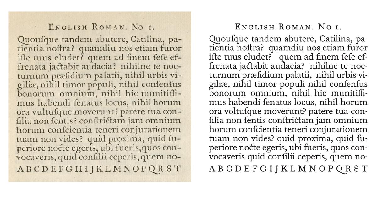
Comparison between the original (left) and Spectator (right).
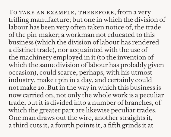
Spectator at its heart is a warm and elegant text face designed for reading.
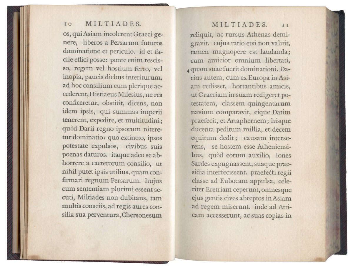
Lives of the Emperors, Cornelius Nepos
Printed by the Foulis Press, Glasgow, 1761
Set in English No. 1, Alexander Wilson & Sons, c. 1760
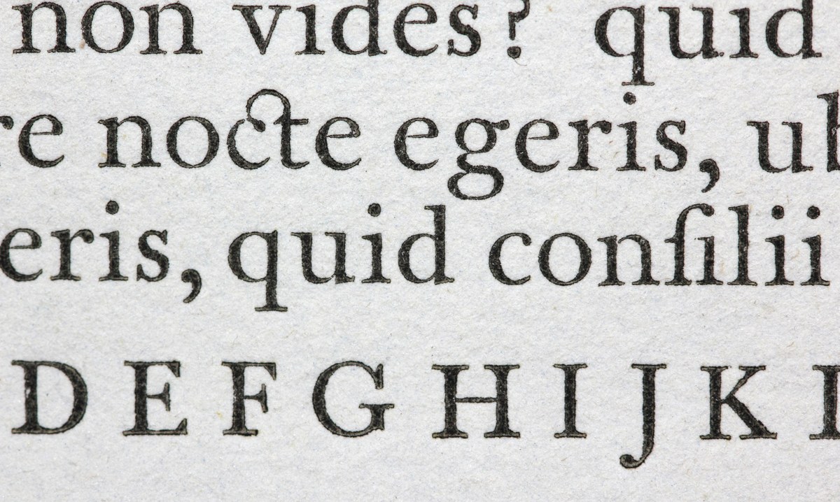
Detail of English No. 1. As shown in A Specimen of Printing Types Cast in the Foundery of Alexander Wilson & Sons, Glasgow, 1789. St Bride Library, London.
Comparison between the original (left) and Spectator (right).
Spectator at its heart is a warm and elegant text face designed for reading.
Lives of the Emperors, Cornelius Nepos
Printed by the Foulis Press, Glasgow, 1761
Set in English No. 1, Alexander Wilson & Sons, c. 1760
Detail of English No. 1. As shown in A Specimen of Printing Types Cast in the Foundery of Alexander Wilson & Sons, Glasgow, 1789. St Bride Library, London.
In making the roman, we drew on two volumes printed by the Foulis Press: Cornelius Nepos’s Lives of the Emperors from 1761, and David Dalrymple’s The Preservation of Charles II from 1766. We also closely examined the various specimens held at St Bride Library, printed from 1786 and 1789 after the Foulis Press had stopped using them. When making a revival, the task is to try to distill the qualities of the original whilst making them viable for contemporary use. It is as much an editing as a design task: sifting through the originals to find the soul of a typeface, to understand what was intended and what was accidental, to judge and understand what lies in the printed forms. How good was the casting of the type? How worn was the type? How well printed was the type?
With these questions in mind, we decided to draw a text roman that is not quite like the original, for it aims to work at smaller sizes than 14pt. So it has a lower contrast and more robust serifs, but many of the forms, like the a and g, are similar, and the spacing, which is looser than we typically design, gives an open and friendly impression. This is a text face that will work well on paper and on screen, both black on white and white on black.
Some other faces cut by Wilson’s foundry in the eighteenth and nineteenth centuries.
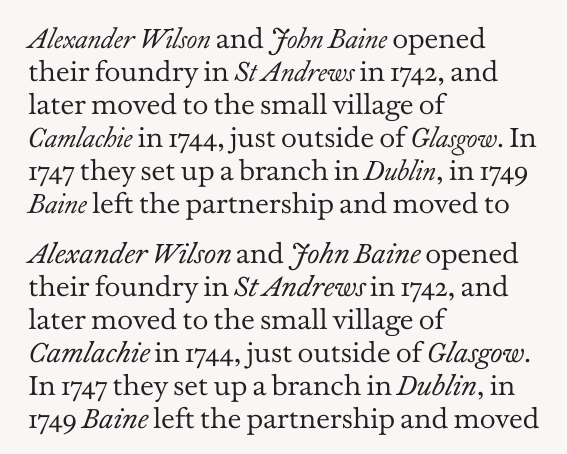
The original English italic had a smaller x-height than Spectator, as shown in the top paragraph. Below is our first italic, which is transitional in style, but with the angle of the Caslon model.
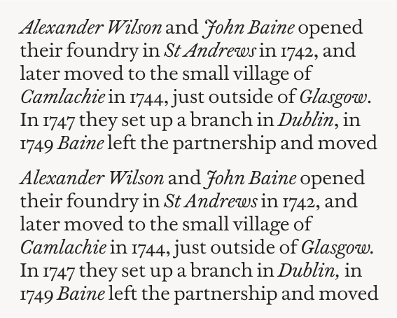
The two versions of Spectator italic: the top paragraph shows our initial ‘original’ italic, offered as a bonus cut; the bottom paragraph shows the final (default) italic, a calmer companion for text setting.
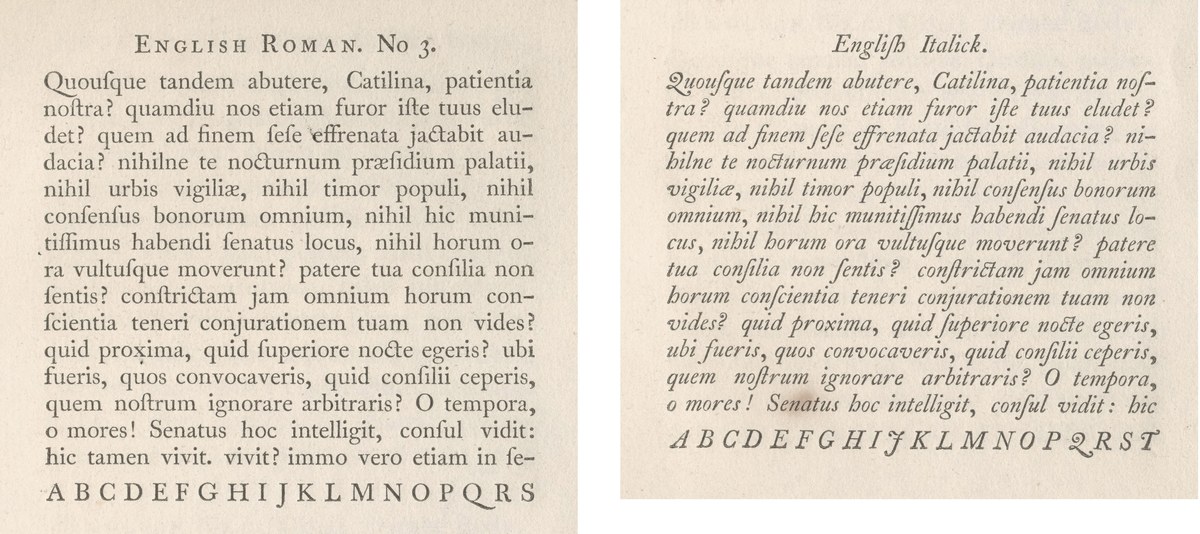
English Roman No. 3 and the English Italic are more in the style of Caslon; the g and Q in particular follow that model. As shown in A Specimen of Printing Types Cast in the Foundery of Alexander Wilson & Sons, Glasgow, 1789. St Bride Library, London.
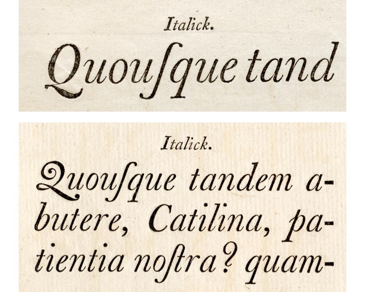
Two different styles of the Q form in Wilson’s French Canon and Two Lines Great Primer, as shown in A Specimen of Printing Types, broadside, 1783.
The original English italic had a smaller x-height than Spectator, as shown in the top paragraph. Below is our first italic, which is transitional in style, but with the angle of the Caslon model.
The two versions of Spectator italic: the top paragraph shows our initial ‘original’ italic, offered as a bonus cut; the bottom paragraph shows the final (default) italic, a calmer companion for text setting.
English Roman No. 3 and the English Italic are more in the style of Caslon; the g and Q in particular follow that model. As shown in A Specimen of Printing Types Cast in the Foundery of Alexander Wilson & Sons, Glasgow, 1789. St Bride Library, London.
Two different styles of the Q form in Wilson’s French Canon and Two Lines Great Primer, as shown in A Specimen of Printing Types, broadside, 1783.
In the specimens at St Bride, the foundry showed three sizes of the English, but only one italic, which, with its smaller x-height, seems a better match for the English No. 3 rather than our chosen size. It is also closer in style to the Caslon model, with its greater angles and letterforms such as the angled A and the swash J and Q in that tradition. In the lower case, the g and h clearly follow Caslon. In the larger sizes that were cut later, the model is closer in spirit to the faces of Baskerville’s follower, Isaac Moore of Bristol; the Q remains Caslonesque in some sizes, but also follows the new model. The lower case is more upright than the text sizes and follows the classic transitional style.
Our first attempt at an italic matched the angle of the text faces, but, with its flatter tails and arches, falls more into the transitional style. We found this perhaps too dramatic for text, though, so we also created a more upright style. Characters like the lowercase g mirror the roman, making the italic a perfect complement. We decided that we would complete the steeper-angled italic and release this as a ‘bonus cut’, where particularly in display sizes it can stand alone as a dramatic and beautiful face.
After the completion of the italic, we turned our attention to the bolder weights and the need for optical sizes. In Wilson’s time, bold faces as we know them today had yet to exist, though his former partner, John Baine, who had started his own foundry in Edinburgh in the 1760s, cut several sizes of a face he called ‘strong’, which today we might consider semibold. These appear in the first edition of the Encyclopaedia Britannica printed in Edinburgh in 1771 and in various examples in the United States.5
Our first attempts at drawing a bold were successful, but we realised that we could create an even bolder weight without losing the character of the original, so we made a Black weight. At its heaviest, it can be used for emphasis in text or for short paragraphs, but it is as a headline face that it can truly shine. The family is made up of six weights: Regular, a slightly bolder Regular No. 2, Medium, Semibold, Bold, and the emphatic Black.
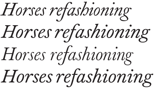
From top to bottom: the original Wilson italic, the first Spectator italic, Baskerville’s italic of 1754, and the final Spectator italic.
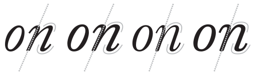
The original Wilson italic, the first Spectator italic, Baskerville’s italic of 1754, and the final Spectator italic. Note the more vertical angle in Baskerville and Spectator’s final italic and the flatness in the curves of Spectator relative to Caslon and Baskerville.
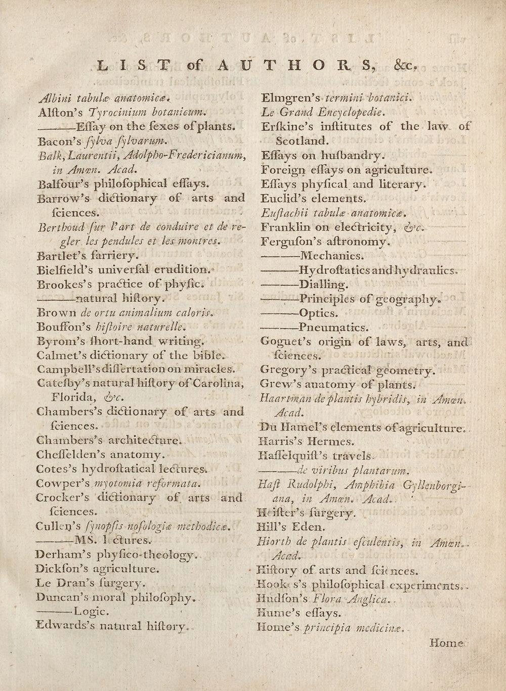
The first edition of the Encyclopaedia
Britannica (1771) using John Baine’s Great Primer Roman No. 1, a semibold face that he later took to the United States. National Library of Scotland.
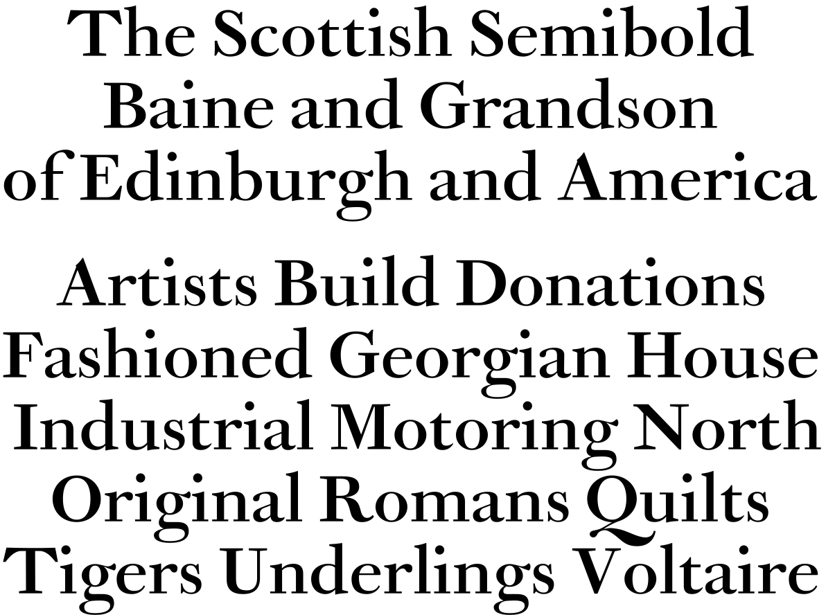
John Baine’s Great Primer Roman No. 1.
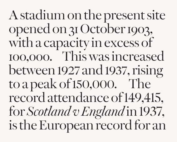
Spectator Poster with its various numeral styles: oldstyle, semi-lining, and lining.
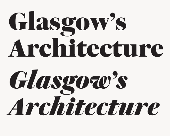
Even in the heaviest weight, Spectator Poster maintains an elegant quality. Bold but not fat, it recalls the best of photolettering headline faces in its sharpness. Note the alternative open g in both styles, and a more transitional a in the roman.
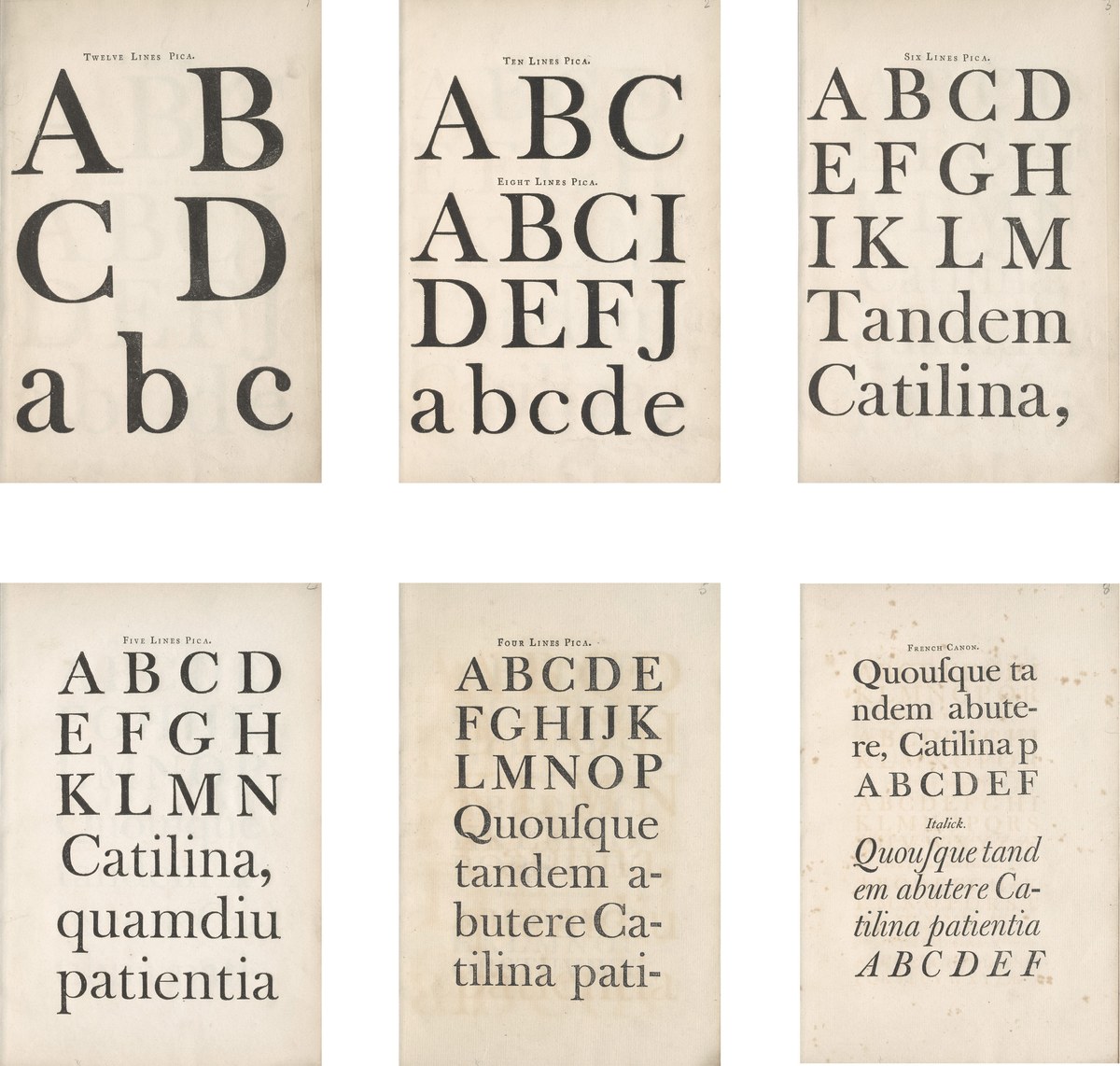
The larger sizes that Wilson cut following the transitional style, in particular those of Isaac Moore. As shown in A Specimen of Printing Types Cast in the Foundery of Alexander Wilson & Sons, Glasgow, 1789. St Bride Library, London.
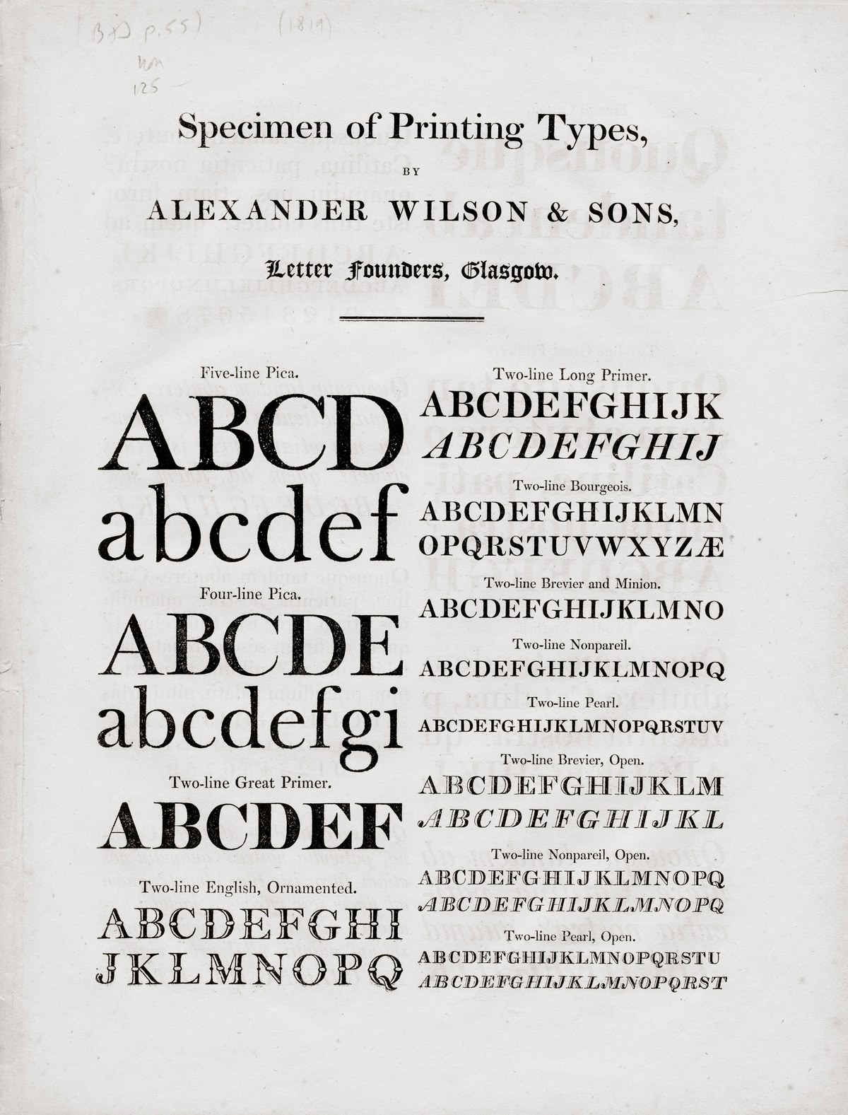
Eighteenth-century Transitional faces shown in the nineteenth century: Specimen of Printing Types by Alexander Wilson & Sons, Letter Founders, Glasgow, 1819. Note the g in the Four-line Pica; the terminal in the lower bowl is typical of the transitional style, but has been closed.
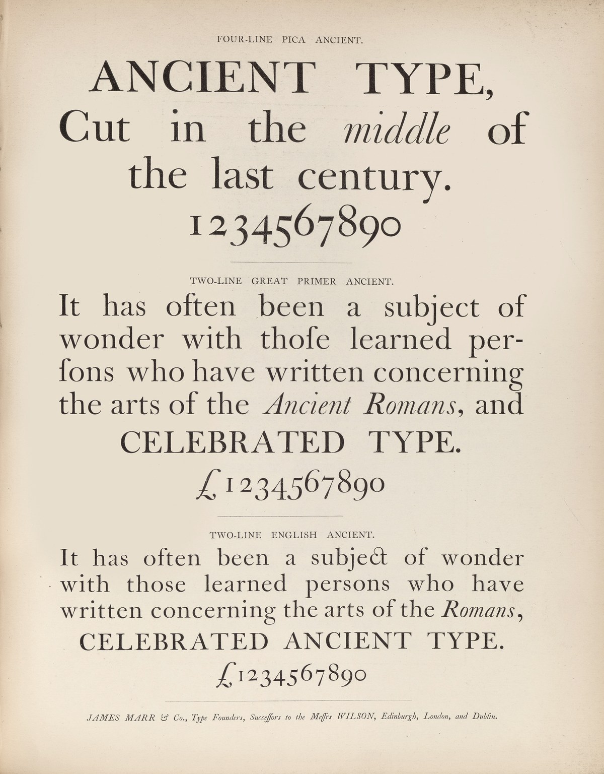
The reappearance of Wilson as the founders of the nineteenth century began to look backwards:
Specimen of Modern and Ancient Printing Types, &c. by James Marr & Co., c. 1866. St Bride Library.

Top: Spectator Text with its low contrast and open spacing. Bottom: Spectator Poster with its high contrast and tight spacing.
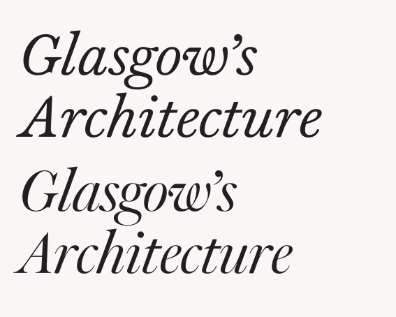
Top: Spectator Text with its low contrast and open spacing. Bottom: Spectator Poster with its high contrast and tight spacing.
Spectator Poster with its various numeral styles: oldstyle, semi-lining, and lining.
Even in the heaviest weight, Spectator Poster maintains an elegant quality. Bold but not fat, it recalls the best of photolettering headline faces in its sharpness. Note the alternative open g in both styles, and a more transitional a in the roman.
The larger sizes that Wilson cut following the transitional style, in particular those of Isaac Moore. As shown in A Specimen of Printing Types Cast in the Foundery of Alexander Wilson & Sons, Glasgow, 1789. St Bride Library, London.
Eighteenth-century Transitional faces shown in the nineteenth century: Specimen of Printing Types by Alexander Wilson & Sons, Letter Founders, Glasgow, 1819. Note the g in the Four-line Pica; the terminal in the lower bowl is typical of the transitional style, but has been closed.
In the eighteenth century, Wilson cut large display sizes that reached up to twelve lines, or 144 points. They follow the style of Moore, who had issued his first specimen in 1766, suggesting that Wilson cut his after that. They are well cut in all but the very largest sizes, and the foundry continued to cast them into the 1820s, suggesting perhaps that display types were not a priority, with most business being text faces for book printers. Rather than creating an entirely new style for Spectator, we decided to make display sizes that are variants of the text face, with greater contrast and tighter spacing. This gives the family a more uniform appearance, which is what designers today expect. The largest size, Spectator Poster, is highly contrasted with tight intercharacter spacing, far tighter than Wilson would have made, but typical for contemporary headline setting. The Poster is best used at sizes above 72pt. For smaller sizes, we made a Headline (for 30pt and up) and Deck (for 14pt and up), with the Text family made for continuous reading matter below 14pt. And because Spectator also exists as a variable font, designers can choose to make even more specific size variants.
Typefaces take time to make, and Spectator is no exception. The actual drawing and production took a little more than two years, but its gestation took several decades. This time frame gives pause for thought. How successfully did we capture the spirit of the original, and what do we make of it now? Because of its uniqueness, the English No. 1 feels a little out of place in the canon of the Wilson foundry and the Foulis Press. Why was it made the way it was? And who made it? Few traces of its shapes can be found anywhere else at this time. Was it made by an outsider who cut this single design? Possibly. But that only reaffirmed to us just how wonderful it was. It was a product of its time, an Enlightenment design: curious, forward-looking, optimistic. It feels part of, yet apart from, the British tradition.
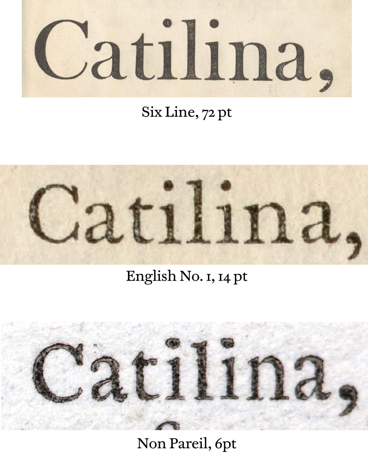
Multiple sizes of Wilson’s eighteenth-century faces showing differing spacing and widths. A Specimen of Printing Types Cast in the Foundery of Alexander Wilson & Sons, Glasgow, 1789. St Bride Library, London.
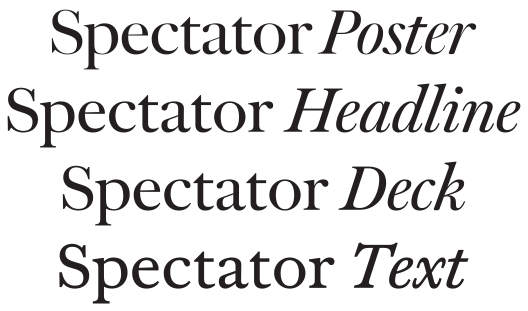
The four optical sizes of Spectator in Spectator Roman No. 2, at the same size.
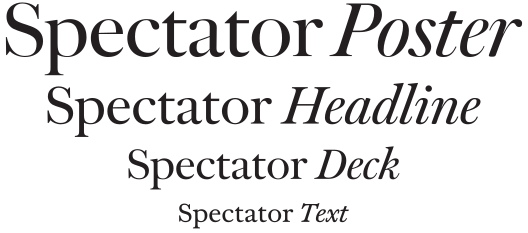
The four optical sizes of Spectator in Spectator Roman No. 2, at their relative intended scale.
We also asked ourselves whether we had captured the original spirit of the English No. 1 and then taken it too far, simply to make it useful for today’s needs. But as we looked back over the thirty years that we have been making faces that fit into the British canon, such as Austin, Brunel, Caslon Ionic, Frame, Chiswick, and Darby Serif, we realised that all of these experiences had given us the sort of confident maturity necessary to create a new design that expressed what had been so alluring in the original: the past was the present.
Spectator, perhaps even more than the Moderns of the nineteenth century, was a uniquely Scottish expression of the British letter at that time. It took the lessons of Caslon of well made type, and Baskerville’s new forms in a new direction. It is the manifestation of the Scottish Enlightenment in typographical form: the Scottishness of Scottish type.
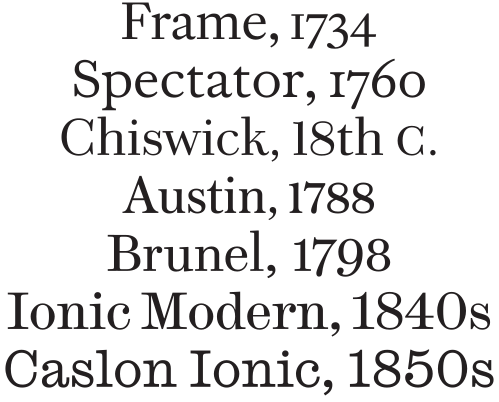
Typefaces made for reading from the eighteenth and nineteenth centuries: from the Caslon oldstyle brutalist forms of Frame through to the robust Caslon Ionic over a century later created to deal with increasingly poor printing conditions.
His foundry was later run by his sons, Patrick and Andrew, and eventually by his grandsons, Alexander and Patrick. The firm moved to London in 1834. It went bankrupt in 1845; the stock of the Edinburgh and Dublin branches was taken over by James Marr, and the London branch was folded into H. W. Caslon in 1850. Marr would later recast Wilson’s transitional romans in the 1860s, and these would be the model for George W. Jones’s much underrated Georgian, made for Linotype UK in the 1920s. Marr’s material was acquired by Miller & Richard, and later by Stephenson Blake, though at some point after 1952, it seems to have disappeared.
See T. C. Hansard, Typographia: An Historical Sketch (London: Baldwin, Cradock, and Joy, 1825), 361. ‘Mr. Austin engraved the founts of Messrs. Stevenson’s unsuccessful foundry; and has since executed most of those of Messrs. Wilson, of Glasgow; and of Mr. Miller, Edinburgh’. But cf. James Mosley, ‘Scotch Roman’, Typefoundry, 16 February 2007, ‘Although Hansard was a careful writer,’ Mosley wrote, ‘it is difficult to know how much reliance to place on his unsupported statement’.
The name ‘Scotch’ was first used in the United States in 1839. See Mosley, ‘Scotch Roman’. It should be noted that though the first Scotch was made by Wilson, by this point his foundry was based in England.
See Christian Schwartz and Paul Barnes, ‘Deep in the Archives’, Eye 75 (Spring 2010). This collection of lost classics also included Bauer’s Venus, Caslon’s Rounded Sans and Italian, Fonderie Olive’s Antique Olive, and, more contemporaneously, Erik van Blokland and Just van Rossum’s Beowulf.
Baine would later emigrate to Philadelphia with his grandson, taking his Great Primer Roman No. 1 with him.