Caslon Antique
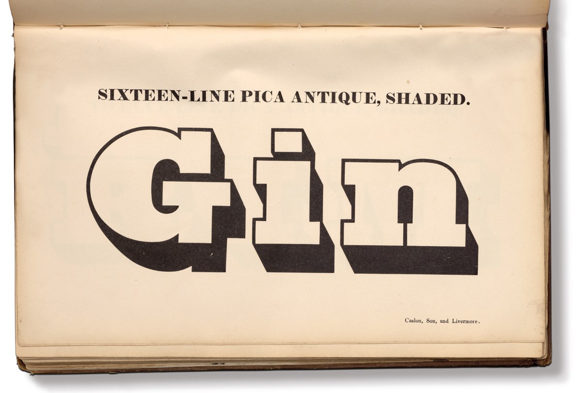
Five-Line and Two-Line Double Pica Antique Shaded as shown in Specimen of Printing Types by Henry Caslon, 1842.
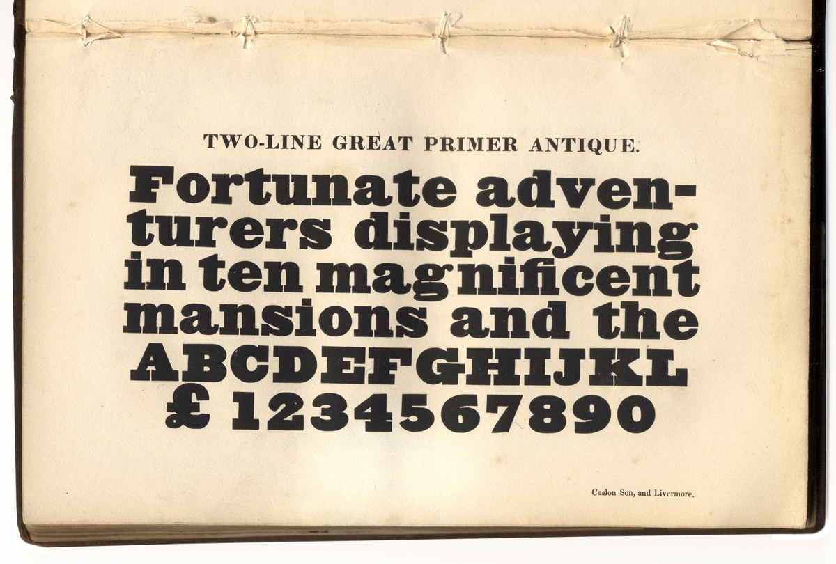
One of the sources for how the lower case of the Shaded Antique would be, Two-Line Great Primer Antique. Specimen of Printing Types by Henry Caslon, 1842.

Five-Line and Two-Line Double Pica Antique Shaded as shown in Specimen of Printing Types by Henry Caslon, 1842.

Five-Line and Two-Line Double Pica Antique Shaded as shown in Specimen of Printing Types by Henry Caslon, 1842.

One of the sources for how the lower case of the Shaded Antique would be, Two-Line Great Primer Antique. Specimen of Printing Types by Henry Caslon, 1842.

Five-Line and Two-Line Double Pica Antique Shaded as shown in Specimen of Printing Types by Henry Caslon, 1842.

Five-Line and Two-Line Double Pica Antique Shaded as shown in Specimen of Printing Types by Henry Caslon, 1842.
The first shaded letters of the nineteenth century were shaded versions of the heavier weights of modern and fat faces. Almost exclusively in capital-only form, they started a trend that was followed by the majority of type foundries, and the form went from the smallest text sizes to large display sizes (and beyond, into wood type). Slabs became fashionable, starting with Figgins in 1815, and shaded versions began to appear by the 1820s, almost exclusively by the Caslon foundry. The robust and dominant qualities of the Egyptian form make it ideal for lettering on buildings (particularly in the extruded form), and it’s easy to imagine how this would have influenced the typefounders. The shadowed form is remarkably simple: take an Egyptian, add an outline, and then a shadow descending to the lower right.1 The depth of the shadow is approximately the depth of the slab serif.
Caslon Antique Shaded is based on the smoke proofs and punches held at St Bride, particularly the Two Line Bourgeois (a size just above 18 point in modern sizes). This is a compromise between the designs made for large sizes—some were up to 144 points in size—and small, down to around 10 point. In general, the outline around the letters gets lighter as the size increases. The internal letter shapes are similar to the non-shaded forms, but in some internal counters are reduced in size, as though the whiteness of the inner letter is the most important part of the character (you can see this in the A and R). The smoke proofs show how limited the character sets cut in the nineteenth century were: capitals and some basic punctuation, but lacking numerals and many characters necessary in modern typefaces, even missing a lowercase. (Caslon made one example of a shaded face with lowercase, but the only letters that are shown are G i n, so the form of the lowercase and numerals follow the form of other Egyptians in Caslon’s specimens). With such a deep and wide shadow, the spacing of the letters must be wide to avoid the clashing of character (which would never happened in the original metal version), and so the f is deliberately narrow.
Caslon continued to cast the Antique Shaded into the 1870s, disappearing from the specimens by the 1880s, though they continued to be used by printers. The other foundries who followed Caslon’s lead were few and far between; a few sizes appear in the specimens of Alex. Wilson & Sons and Wood & Sharwoods. Five sizes of punches2 have survived at St Bride Library.

Two Line Bourgeois Antique Shaded capitals. Cut by Silkirk, about 1827. St Bride Library.
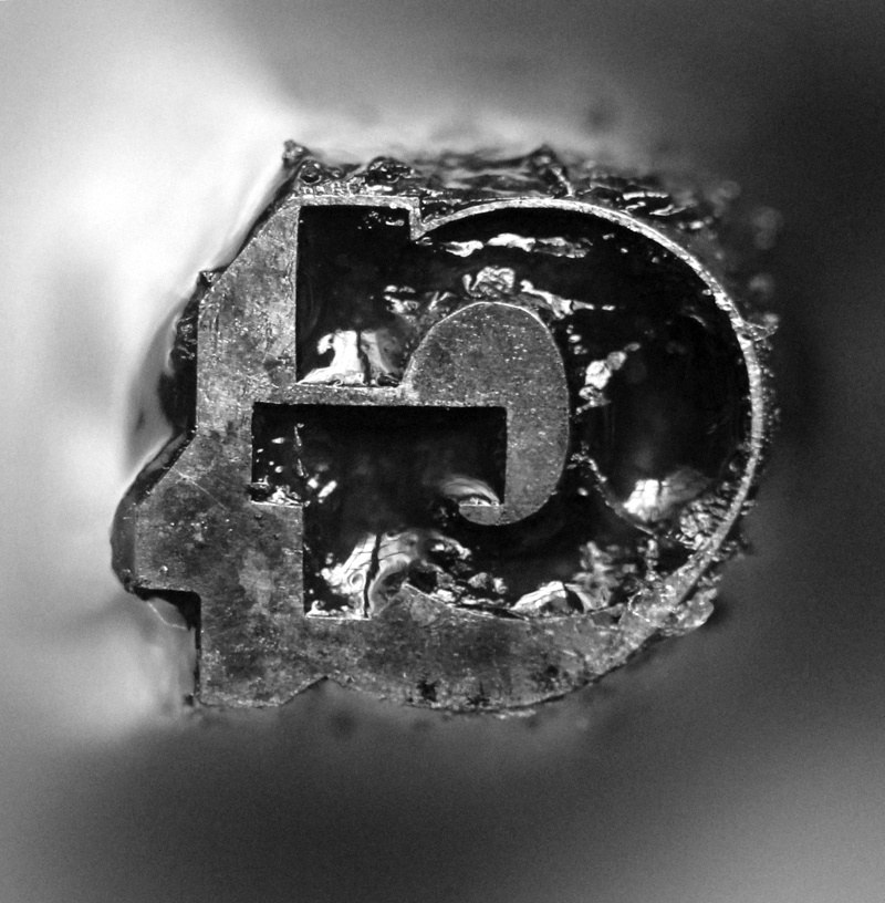
Punch of Two Line Bourgeois Caslon Antique, cut by Silkirk, c. 1827. St Bride Library.
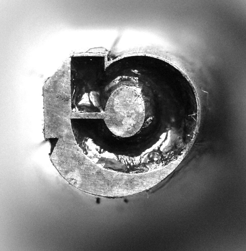
Punch of Two Line Bourgeois Caslon Antique, cut by Silkirk, c. 1827. St Bride Library.
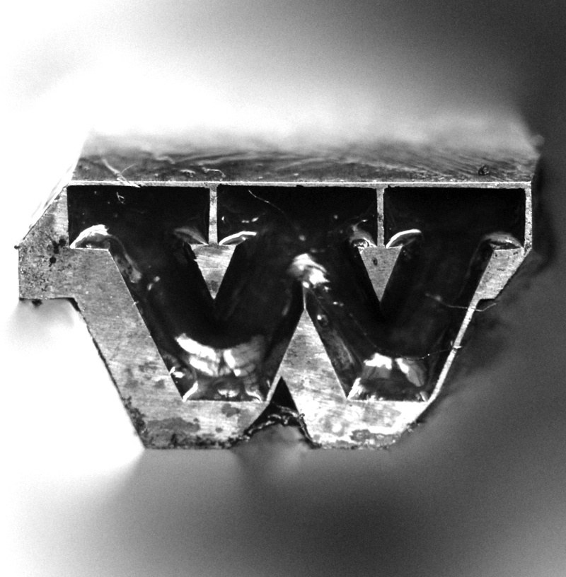
Punch of Two Line Bourgeois Caslon Antique, cut by Silkirk, c. 1827. St Bride Library.
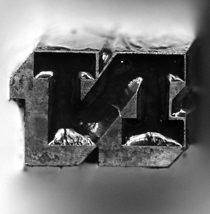
Punch of Two Line Bourgeois Caslon Antique, cut by Silkirk, c. 1827. St Bride Library.
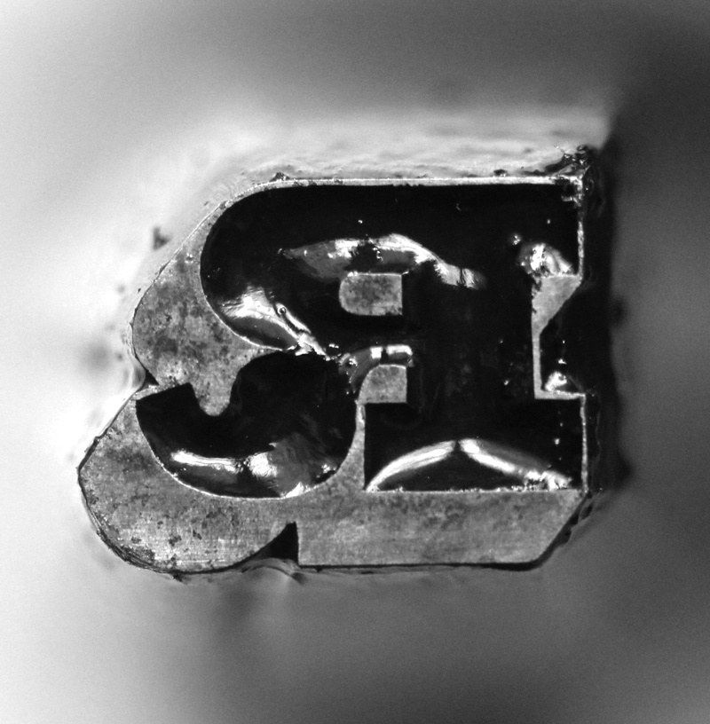
Punch of Two Line Bourgeois Caslon Antique, cut by Silkirk, c. 1827. St Bride Library.
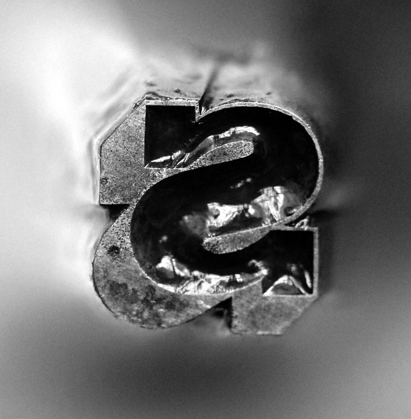
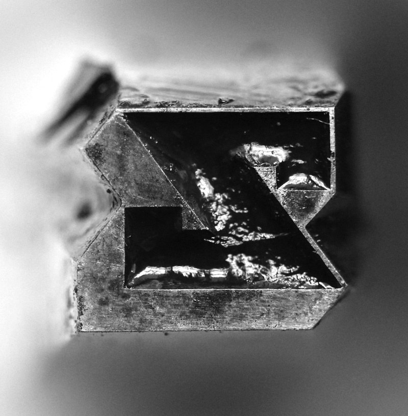
Punch of Two Line Bourgeois Caslon Antique, cut by Silkirk, c. 1827. St Bride Library.
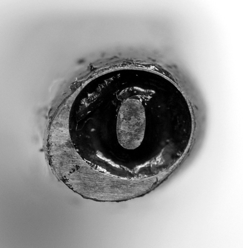
Punch of Two Line Bourgeois Caslon Antique, cut by Silkirk, c. 1827. St Bride Library.
Was this because this would indicate the natural order of reading to the right and always downwards?
2-line Pearl Antique Shaded, 2-line Nonpareil Antique Shaded, 2-line Bourgeois Antique Shaded, 2-line Pica Antique Shaded, and 5-line Pica Antique Shaded. The first four are attributed to Silkirk and have a date of c. 1827.