Shaded
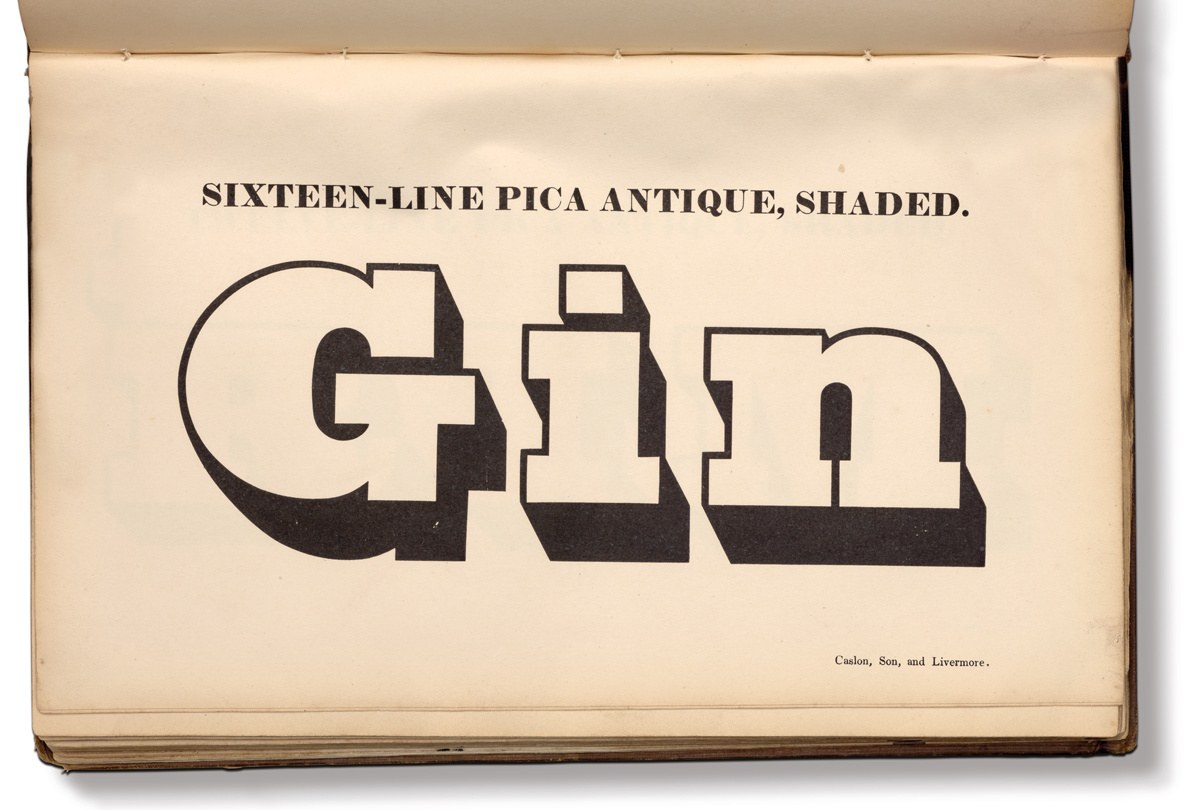
Sixteen-Line Pica by Caslon, Son and Livermore, cut around 1830. Specimen of Printing Types by Henry Caslon, 1842.

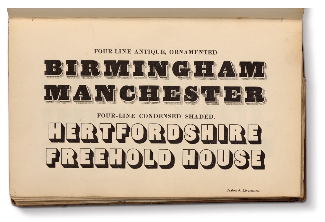
Five-Line and Two-Line Double Pica Antique Shaded, cut in the 1820s. Specimen of Printing Types by Henry Caslon, 1842.
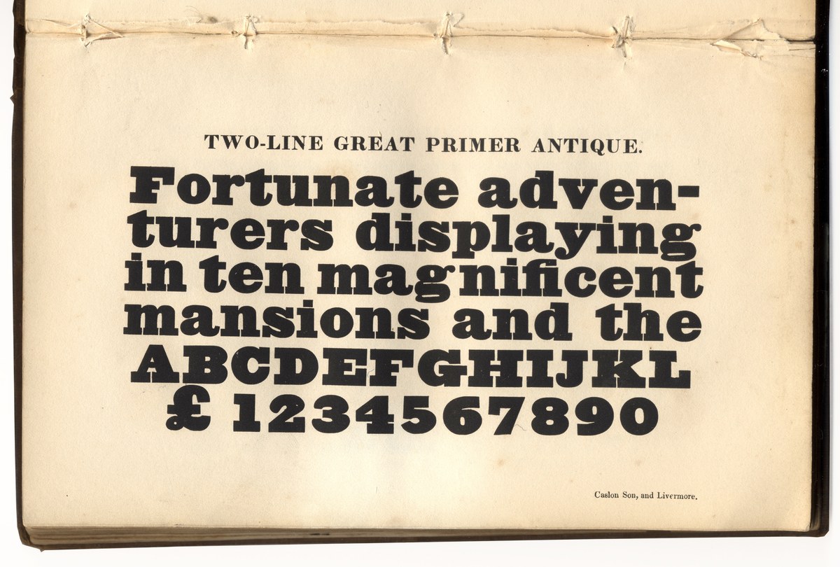
Five-Line and Two-Line Double Pica Antique Shaded, cut in the 1820s. Specimen of Printing Types by Henry Caslon, 1842.
Besley Shaded

Two Lines Small Pica Grotesque Outline. Thorowgood & Co. Specimen of Printing Types, 1840.

The filled variant of the outline: Two Lines Small Pica Grotesque. Thorowgood & Co. Specimen of Printing Types, 1840.
Blake and Stephenson Shaded & Caslon Doric Outline
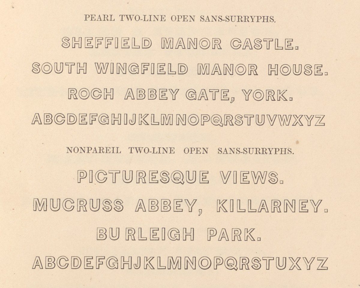
Blake and Stephenson’s Open Sans-Surryphs series. The text suggests how the founder expected the typeface to be used imitating captions on engravings. Specimen of Printing Types by Blake & Stephenson, 1839. St Bride Library.
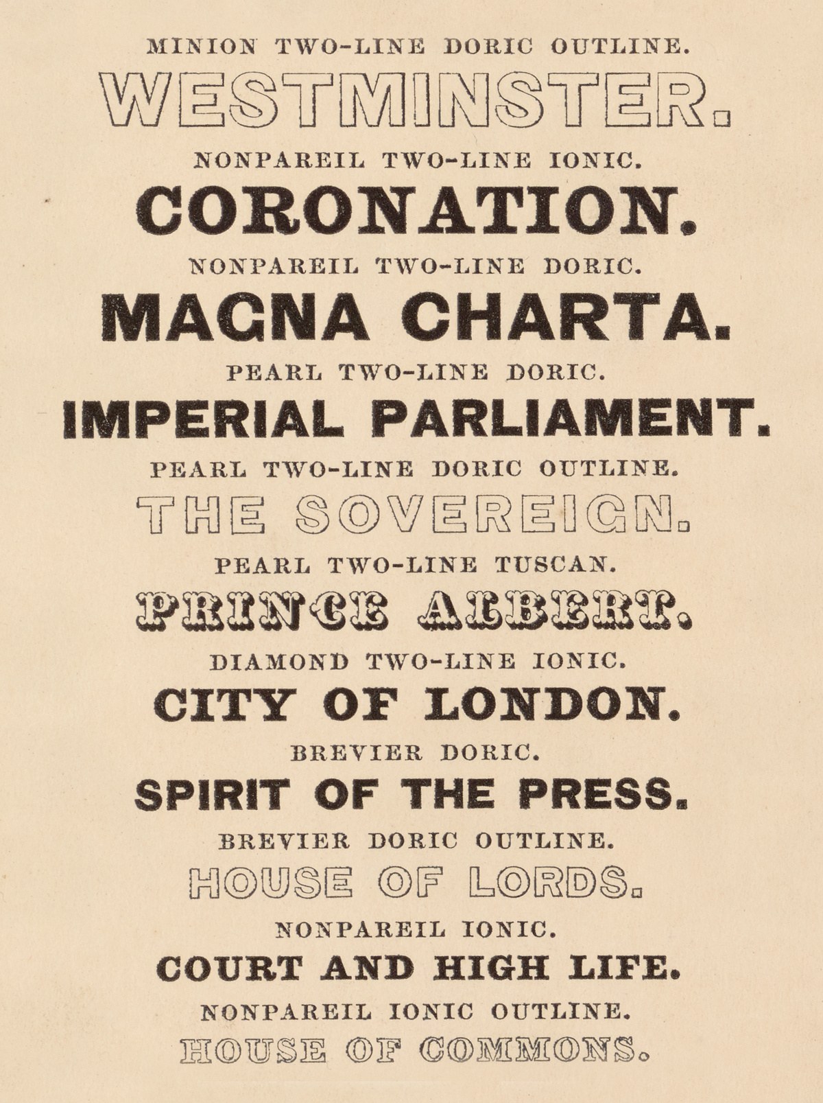
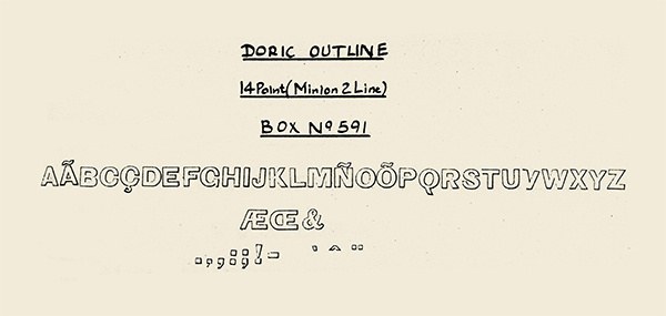
Caslon’s Doric Outline. Specimen of Printing Types by Henry Caslon, 1842.
Type foundries have always imitated the fashionable styles of hand lettering and writing, whether it be Gutenberg’s blackletter or the Copperplate-style forms that appear in specimens from the eighteenth century onwards. During the nineteenth century one of the most popular lettering forms was the style used by engravers found at the bottom of a print or on a name card.2 The foundries soon copied these styles, two examples being Blake and Stephenson Shaded and Caslon Doric Outline. They are simple sans forms, with a shallow outline which increases slightly to the bottom right. In the case of Caslon Doric Outline, it is almost a whisper. It lifts the letter gently off the page, but with less definition than other shaded typefaces. Their being cut at smaller sizes suggests that they would be used to replace the hand engravers work.
The form first appeared in the 1830s; Figgins, as well as Blake and Stephenson, show the style in specimens dated 1832. The effect would be popular for the next 20 or so years, appearing in specimens of the 1850s, but gradually decreasing in number in the second half of the century, and virtually unknown in the following century. Gill Shadow Titling, which is perhaps most like this form, has a deeper and proper shadow at an angle. The form that Blake and Stephenson entitled Sans Surryphs (shown only in Two Line Nonpareil in the 1832 specimen) is a simple sans all-caps form. It has similar form and weight in the inner shapes to Caslon’s IV original style (which would appear in the same 1832 specimen), with an analogous geometric O and C with flat terminals. The R has a curved tail, with the S having the open angled terminal. The stroke is light, and the shadow is less than double the weight. By 1839 the foundry had four sizes of the shaded, as well as the corresponding filled form.
Caslon Sans Shaded

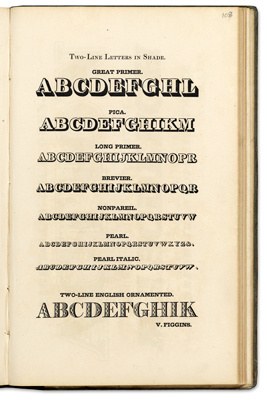
The inner shading of Figgins’ Two Line Long Primer Shaded, No. 4. Specimen of Plain & Ornamental Types from the foundry of V. & J. Figgins, London. c. 1850.
In the middle of the century, Figgins introduced an additional form of the style, where the inner letter appears to have been embossed into the top of the raised form; a second shadow is now cast to the left of the letter, which gives the impression of a letter pushed into the surface. It reflects how complex a style of letter could be made based upon a series of relatively simple design choices; a sans serif letter, condensed, with two levels of shading. Was it the time and effort that it took to make the reason only one size (Two Line Long Primer, 20 point) was cast? It seems strange that such a relatively small size was chosen—Caslon’s variant seems to work well at its size, but Figgins design surely would have benefitted from a larger size? It would be easier to print and the cleverness of its double shadow would be most apparent. Figgins did continue to show several shaded sans into the latter part of the nineteenth century, but this style seems to have disappeared as quickly as it appeared.
Nicolete Gray lists an example of the lower case shaded letter from 1809 from Bower, Bacon and Bower in the Columbia University Library collection, which can no longer be located.
Blake and Stephenson’s specimen sets several titles of grand houses, ruins, and picturesque views which one could imagine an engraving being made: Haileybury College, Hertfordshire; Fountains Abbey, North Yorkshire; Roslin Castle, Scotland; Lanercost Priory, Cumberland.
