A beautiful Place
As our library has grown, it takes more effort to perceive the gaps—not that they aren’t there, it’s just easier to see what we do have, sometimes in loosely overlapping territory. Atlas, Graphik, and Focal, for example, occupy a domain that extends even to Review and Styrene. Lyon, Portrait, Marian, and Dala Floda each highlight different aspects of sixteenth-century French Renaissance types. We have a number of typefaces that are first and foremost elegant, and we have some wide typefaces, but the intersection of elegance and wideness, particularly in a serif, has remained untouched until now. We felt that this open-ended brief would perfectly suit Julien Priez’s unique set of talents, especially his ability to look forward and create wildly inventive shapes while tapping into his deep historical knowledge of drawn, carved, and written letterforms. We didn’t have a particular era or look in mind; we wanted Julien to take the basic kernel of the idea and run with it. He did.
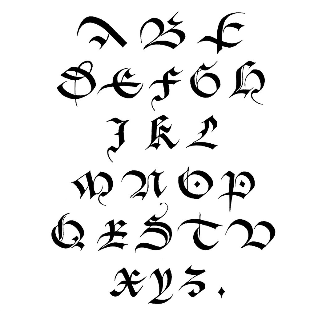
Place is a beautiful typeface. That is its main function. Its beauty is supported by the rigorous craft and thinking that went into its creation. Its stroke contrast is relatively low, expanding the range of sizes it can be used at and exploding the cliché that a typeface must have high contrast to be truly elegant. Though its star quality as a display face is unmistakable, its talents as a supporting player should not be overlooked. Its four weights enable complex typography, allowing things like headers, footers, page furniture, and other utilitarian navigational elements set in Place to be functional and poetic at the same time. Two full sets of capitals, offering both Latin and blackletter structures, also make Place an indispensable tool for logotypes. Try setting any word in Place—chances are it will look like a logo.
Wide, not stretched
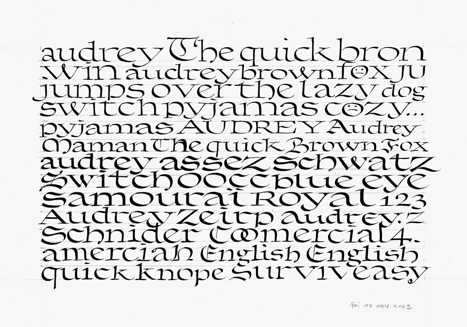
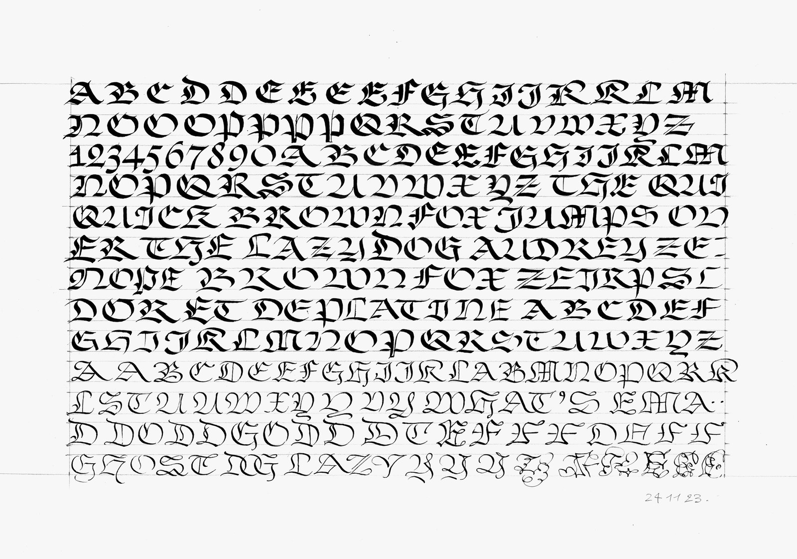
This page of calligraphy from November 17, 2023 shows Julien experimenting with the overall width of the lowercase.
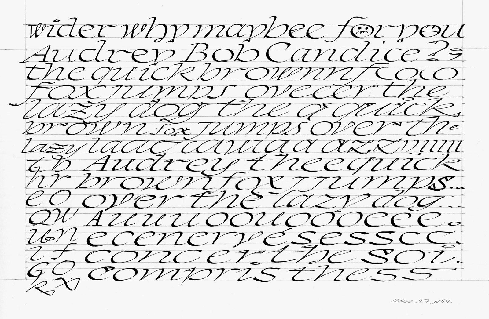
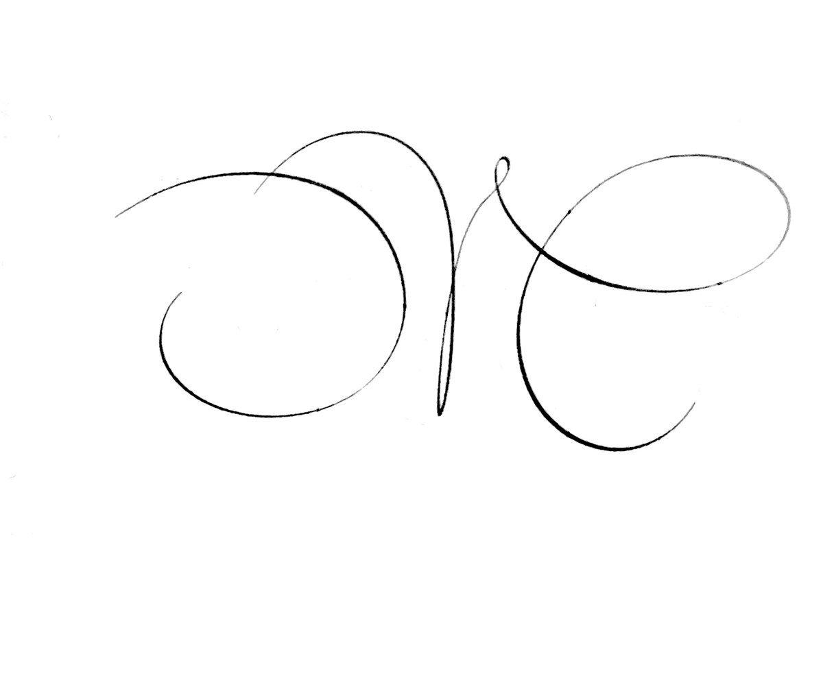
A sheet from November 27, 2023 shows the fluid forms of the italic taking shape, as well as experimentation with the overall speed, as implied by the oblique angle.
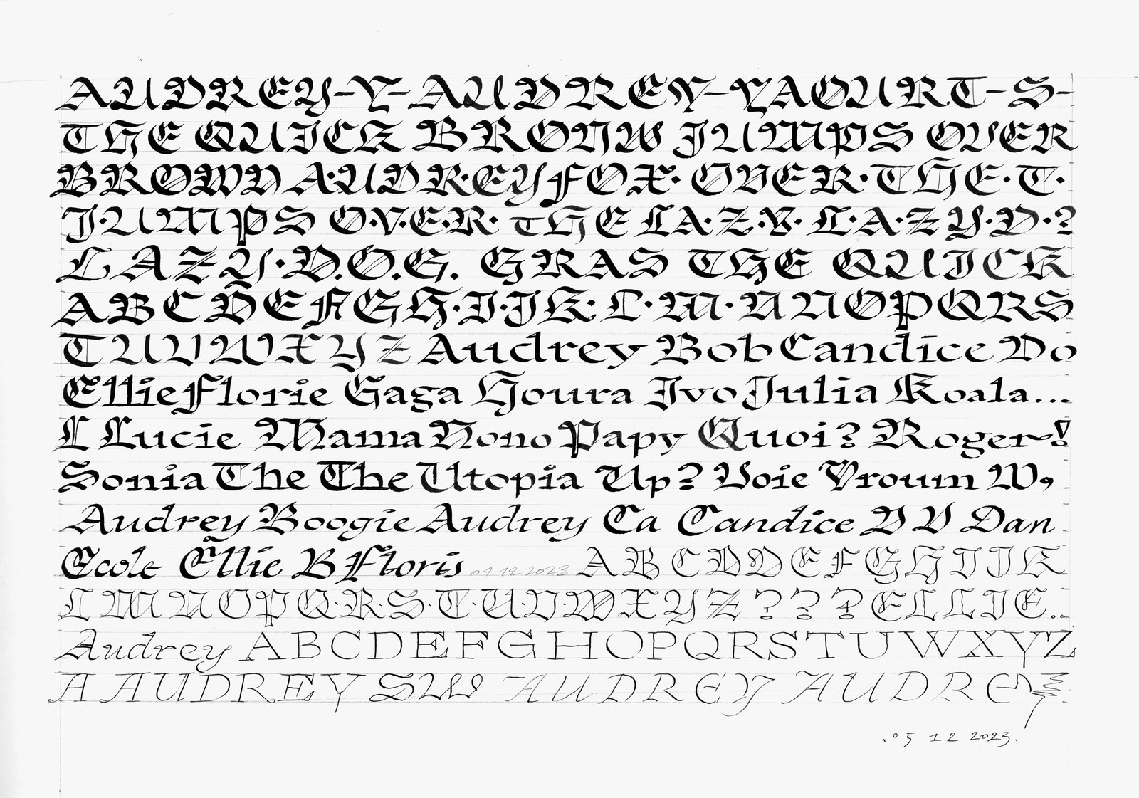
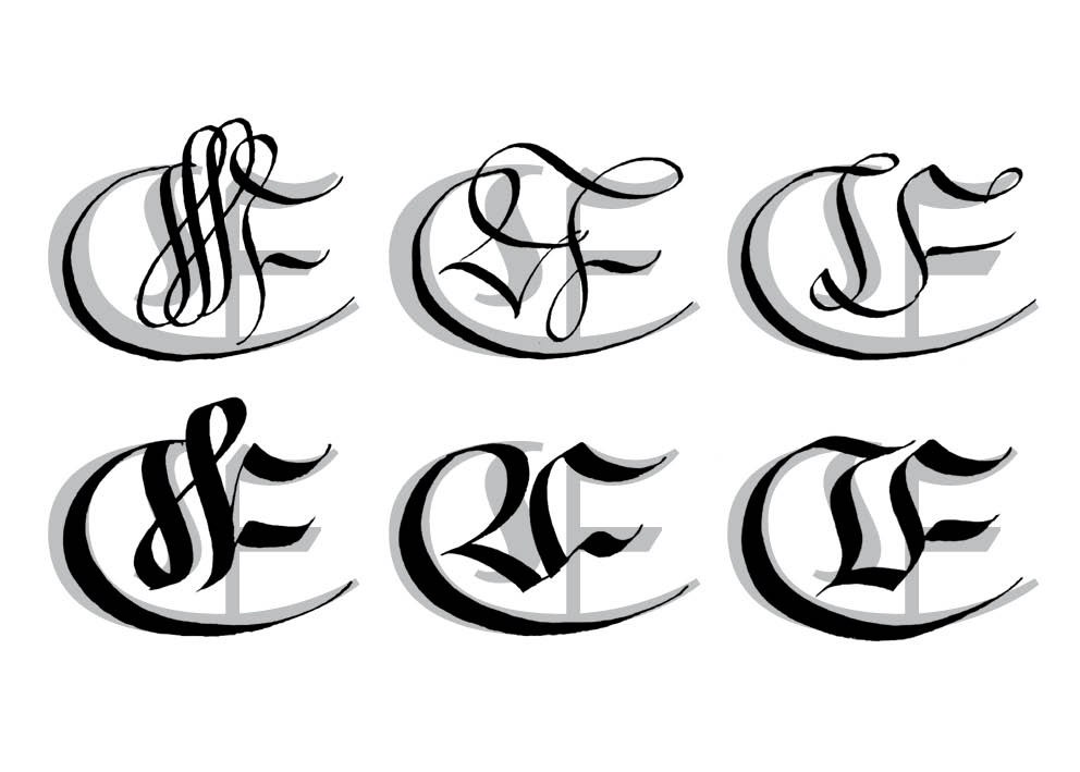
This sheet from December 5, 2023 shows the relationship between the lower case and the Latin and blackletter caps taking shape.
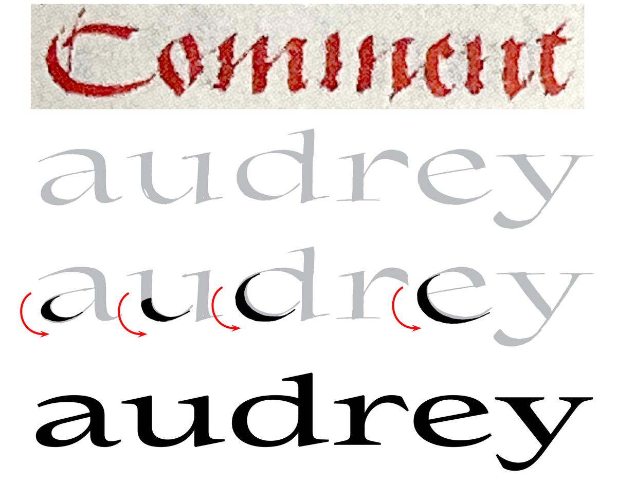
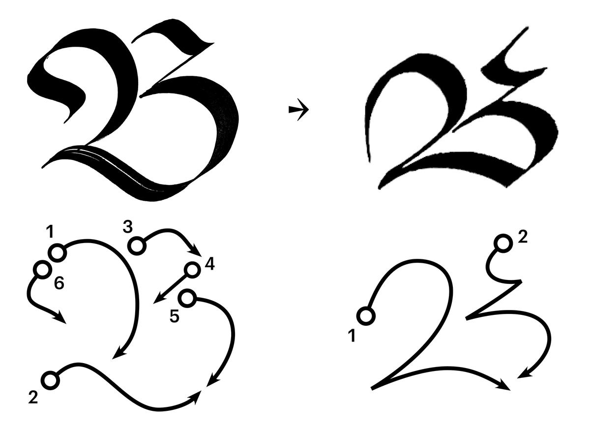
Equipped with this skeletal brief, Julien looked back through both typographic and calligraphic history, surveying natural ways to write wide letters. Several Gutenberg-era books caught his eye, some printed and some written. One was a manuscript on parchment entitled Recueil des histoires de Troie, copied by Pierrot Gousset and illuminated by the Master of Antoine Rolin around 1495. “Logically,” Julien wrote in some notes on the project, “the Lombardic drop cap and blackletter uppercase structure seemed wider than anything else.” Following this model, he experimented with directly tracing a similar curve with a broad pen, discovering that the contrast spread evenly across the letter. “For me,” he added, “designing a typeface from calligraphic research comes from school. Back in 2006, when I was at Estienne, Paris, directed by Franck Jalleau, Margaret Gray, and Michel Derre, we started projects by writing by hand, then fixing the shapes on tracing paper, and finally digitizing the typeface.” Following the same process made sense for this project.
Julien wrote dozens of practice sheets, determining the overall width and curve tension, and experimenting with different sorts of terminal shapes. We jointly decided on using sharp, minimal forms for the terminals: their elegant simplicity reinforces the forward velocity of the letterforms and avoids shapes that might come across as cute or whimsical.
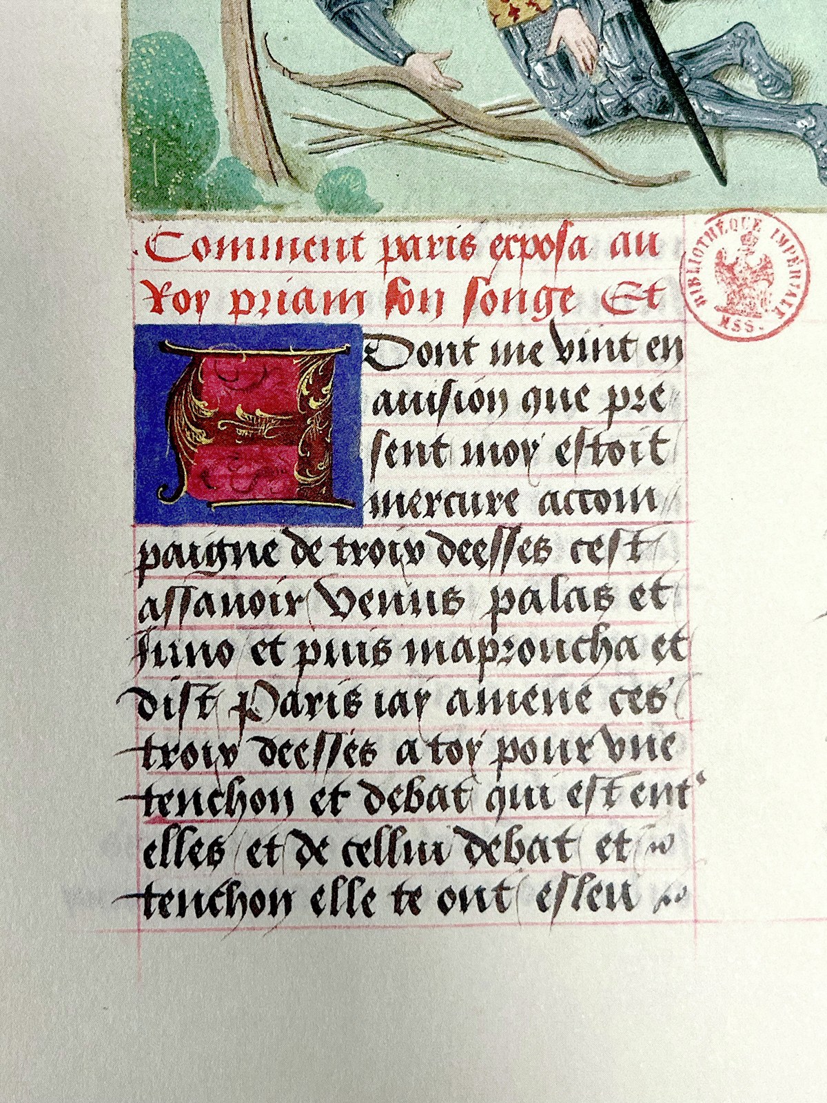
Recueil des histoires de Troie, manuscript on parchment, Hainaut, copied by Pierrot Gousset and illuminated by the Master of Antoine Rolin around 1495. From the catalog of the 2023 exhibition Imprimer ! L’Europe de Gutenberg at the Bibliothèque nationale de France.
The curve on the lower left has been extracted from the C at the top of Gousset’s page.
Blackletter
The top lines of this sheet from November 24, 2023 show Julien thinking with his hands, trying many different forms for the blackletter capitals.
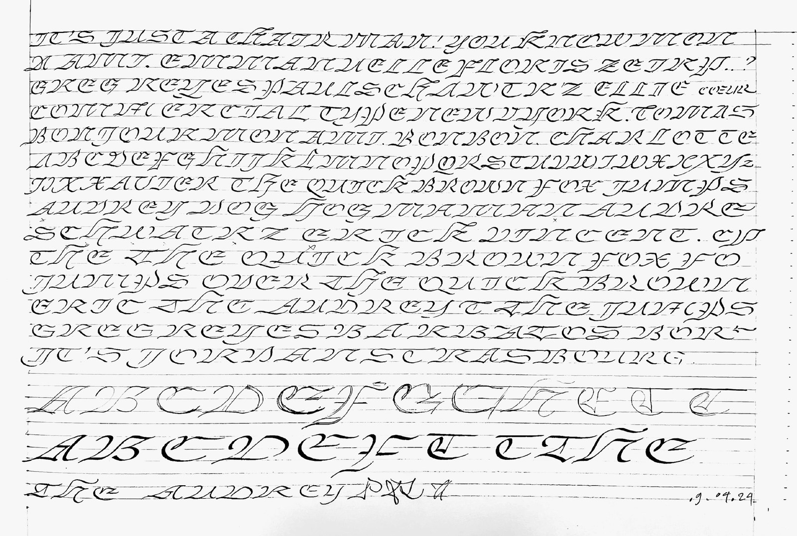
This sheet from April 9, 2024 shows a breakthrough with the cursive blackletter capitals—the overall structure made sense, and the relationship to the lowercase felt natural.
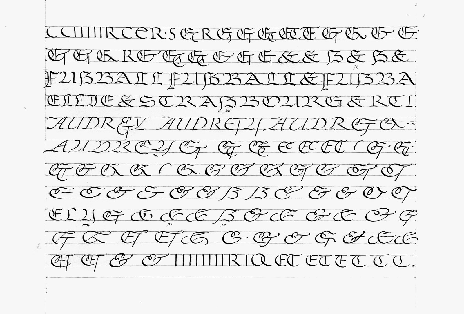
Ampersand variations from May 30, 2024. As our friend Erik van Blokland tells his students, “What if it does work, but you didn’t try it?”
Because many of the widest capitals in Julien’s historical references had been written in blackletter, he was interested in keeping these structures around, at least as a set of alternates. His tests convinced me and Paul that these capitals, included in the Extra variant of each style, could be a useful tool for designers. Removed from the context of the highly structured blackletter lower case, their lyrical curves play against the rounder forms of the Latin lower case, and even the Latin capitals, in an eye-catching way.
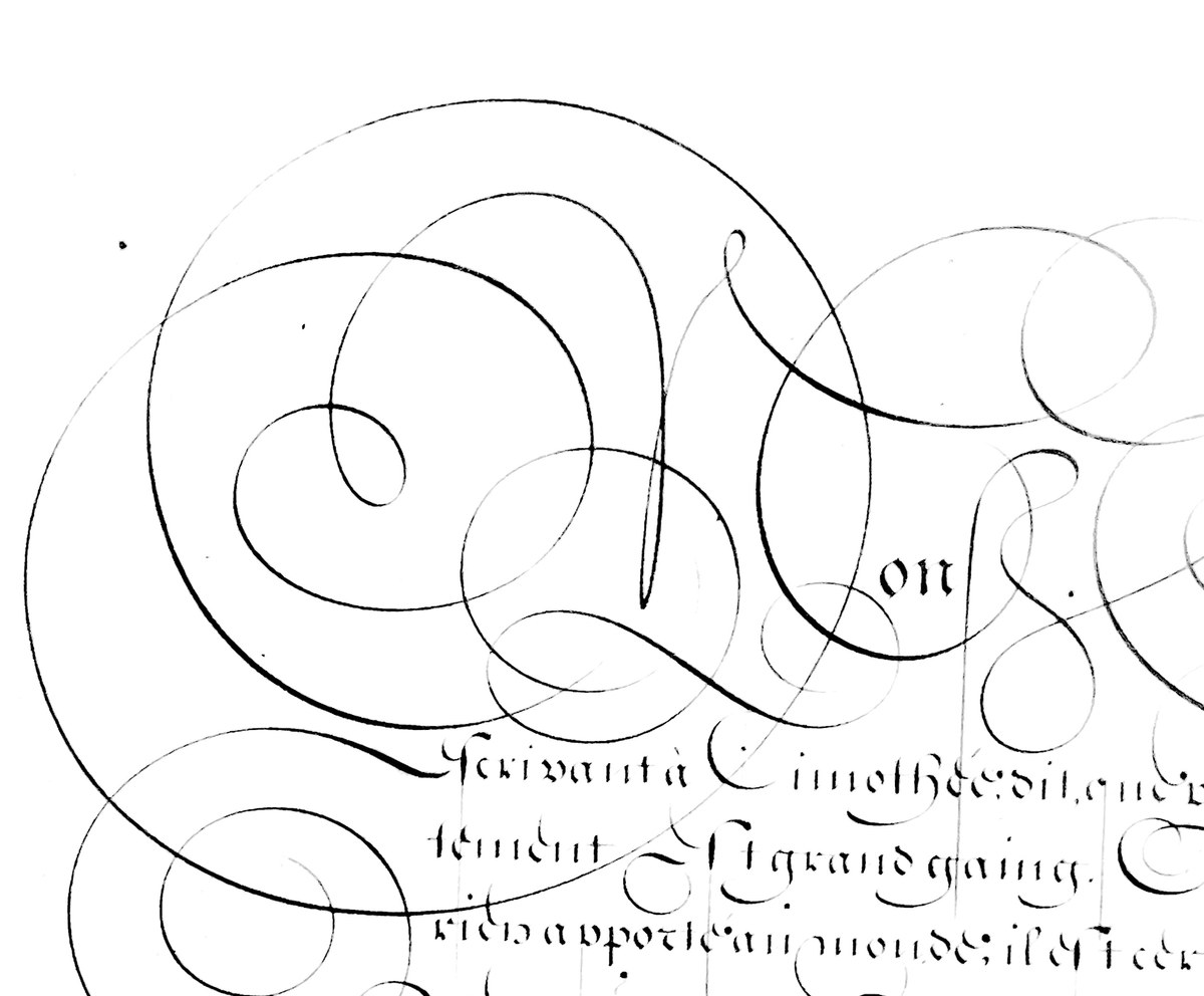
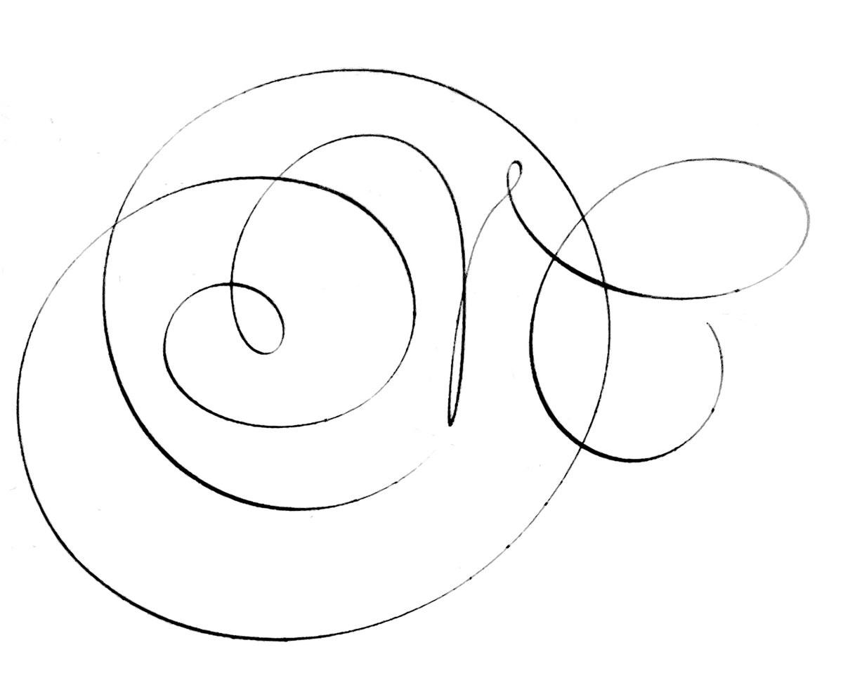
“There are cursive blackletters (see gothique bâtarde, or bastarda script), but in the history of blackletter typefaces, it is difficult to find or imagine a blackletter italic drawn to accompany an upright,” Julien noted. His solution was to increase the speed to see what happened to the forms. “Writing faster will help you find shortcuts and simplify a complicated structure,” he wrote. “It helps you find your own way of writing.” The number of strokes naturally decreases as the shapes start to flow from one to the next rather than stopping and starting, and more fluid curves emerge.
The structures of all of the main blackletter genres—textura, fraktur, rotunda, bastarda—were originally developed with a heavy weight in mind, despite their intricate construction. The capitals are normally written slowly, with a wide nib. While modulating his writing speed, Julien also experimented with the width of the nib and the size of the letterforms to help him figure out how to handle the weight range. Looking at examples written by Jan Van den Velde in the early 1600s, he was struck by how a thinner nib naturally led to faster writing and more complex structures. Julien’s process bounced back and forth between manual and digital tools as he developed the system of shapes that make up the Place family.
Champs Fleury, Geofroy Tory, lettre bâtarde (bastarda script), Paris, 1529.
A cursive structure reduces the number of strokes needed to trace a letter, making it faster to execute. Of the six strokes needed to write the fraktur B, only two remain in Tory’s bastarda B.

Writing faster helps one find shortcuts and simplify a complicated structure.
Jan Van den Velde, calligraphy on paper, 19.5 x 31.5 cm. Antwerp, 1622.
Jan Van den Velde, M in isolation.
Jan Van den Velde, M in isolation, without larger flourishes.
The width of the nib dictates how much complexity is possible in the structure.
Bigger, sharper
Soon after releasing Place at the end of 2024, we started thinking about an even sharper and more dramatic display variant—one well tailored to giant headlines, logotypes, and public lettering. Place Display, published in June 2026, comes in just one weight because that’s all it needs. Like Place, it offers both roman and blackletter capitals in an alternate set appropriately called “Extra.”
Julien kept the Extra blackletter variant in the display cut: Because so much of his initial exploration and experimentation revolved around blackletter forms, he wanted to include them in the entire Place universe. Folding these forms in here adds both visual and historical interest, and offers an expressive tool for designers. Liberated from the stricter, more predictable blackletter lower case, the Extra caps’ curves complement both the rounder forms of the Latin lower case, and also the capitals.
If the fairly low-contrast original family is comfortable playing both starring and supporting roles, Place Display—narrower and more attenuated than its sibling—is incontestably a diva. In terms of sheer ambition and elegance, it occupies roughly the same zone as other high-flying display faces in our library like Marian, Eugenia, Austin Hairline, and Schnyder.
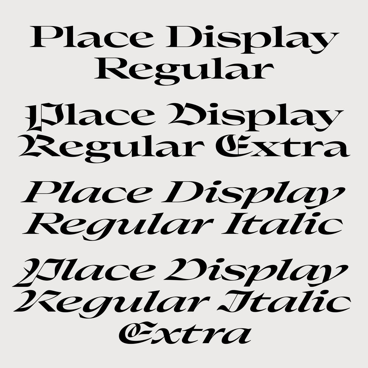
Just one weight, with italics and an “Extra” alternate style.
Collaborating with expert cabinetmakers Les Enfants Terribles, Julien has been building a prototype of a 3D specimen of Place that shows both text and display variants. We’re contemplating using the prototype to make DIY model-making kits.
Beauty and luxury
Many years ago, Dino Sanchez and I worked on a typeface collection as conceptual art project called Luxury, eventually published by House Industries. The collection ironically commented on the uniform aesthetic of luxury brand logos: If they’re so exclusive, why do they look so similar? Since many of these brands started switching over to bold sans serifs in the 2010s, the joke no longer lands the way it once did. Place also engages with the aesthetics of luxury, but centers the beauty that can be found in these generous proportions, without tongue in cheek.
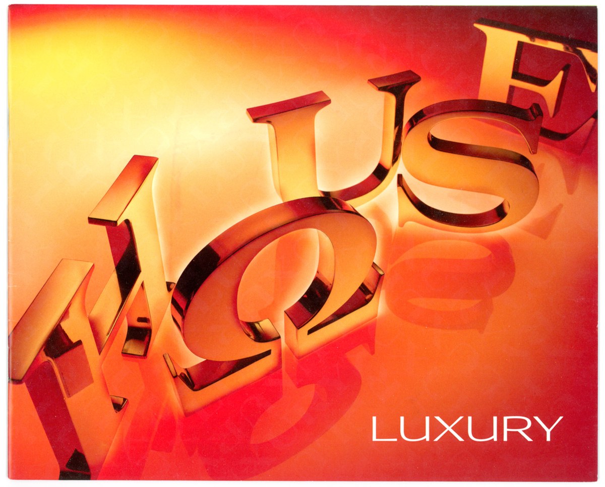
House Industries, 2006. Creative director Andy Cruz, designer Bondé Prang. Photograph by Carlos Alejandro.